Overview
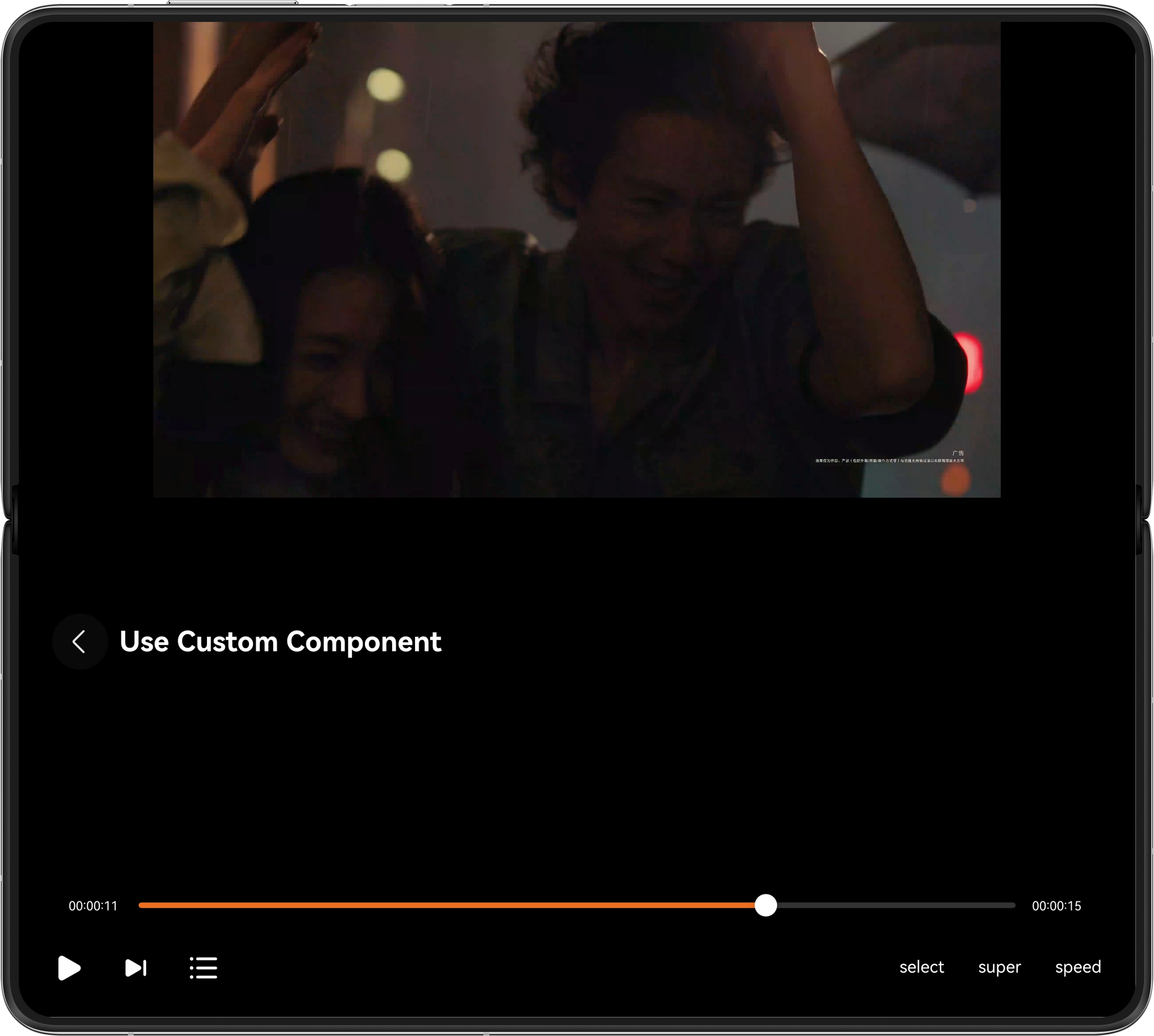
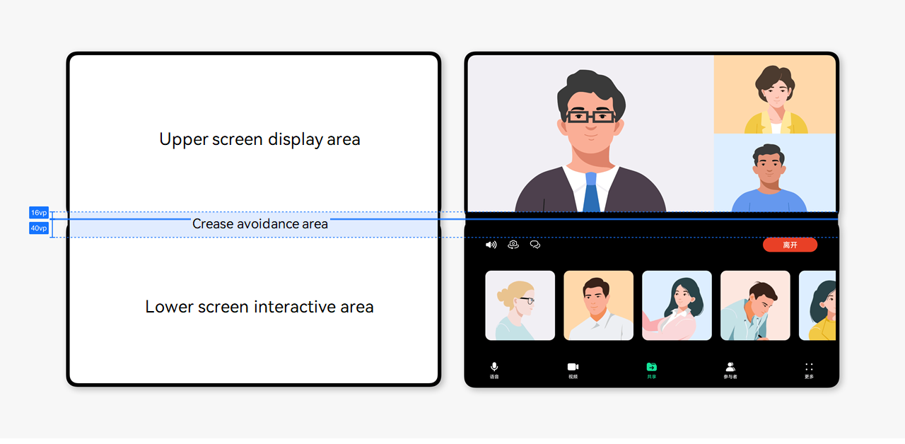
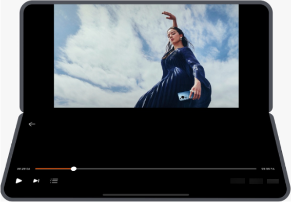
Foldable screens offer a unique handheld operation experience called semi-folded state, which allows users to half-fold the device and place it on a table for a hands-free experience. Semi-folded state is suitable for tasks that do not require frequent interaction, such as video calls, video playback, photo-taking, and music listening. When the foldable screen enters the semi-folded state, the crease area in the middle can be difficult to operate and the display content may become distorted. Therefore, avoid placing important content or interactive elements in the area where the screen folds.
This topic dives into three approaches to implement the semi-folded state:
- Use the FolderStack component to implement the semi-folded state for low-interaction scenarios like full-screen video playback.
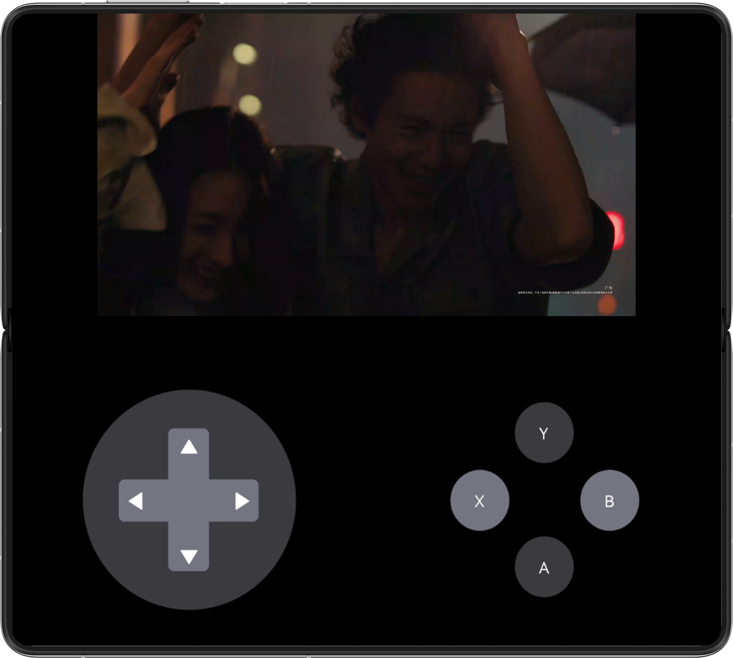
- Use the FoldSplitContainer component to implement the semi-folded state for multi-column content scenarios, such as displaying the game image alongside the operation area.
- Customize the semi-folded state implementation for complex page layouts or to specify the action that triggers semi-folded state.
Among the three methods to implement the semi-folded state, the FolderStack component is easy to use, which automatically adapts to device posture changes and supports custom page layouts. The FoldSplitContainer component is also easy to use, but its fixed dual-column and triple-column layouts limit its usage scenarios. A custom implementation of the semi-folded state requires you to monitor device posture changes and adjust layouts manually. This approach supports custom layouts and allows precise control over semi-folded state activation (for example, only in half-folding landscape mode) and window rotation policies, resulting in greater flexibility.
FolderStack | FoldSplitContainer | Custom Semi-Folded State | |
|---|---|---|---|
Support custom layouts in unfolded/folded state | Yes | No. Only allow fixed two-column or three-column layout. | Yes |
Allow entering the semi-folded state from other pages | Yes | Yes | Yes |
Allow entering the semi-folded state page from customized device state. | No | No | Yes |
Support custom rotation policy for the semi-folded window. | No | No | Yes |
Development difficulty | Easy | Easy | Hard |
This topic uses the full-screen playback page of a video playback application as an example to describe how to implement the custom semi-folded state using the FolderStack component. It uses a game page as an example to describe how to implement the semi-folded state using the FoldSplitContainer component.
[h2]Implementation Principles
FolderStack is a system-provided ArkTS component that inherits from the Stack component. It provides the capability of listening for whether the device enters semi-folded state and rearranging the layout accordingly.
FolderStack uses the upperItems field to implement the semi-folded layout. When the device enters semi-folded state, the components modified by the upperItems field are stacked on the upper half of the screen, while other components are arranged on the lower half of the screen, avoiding the crease area of the foldable screen.

FolderStack must be stretched across the entire screen. Otherwise, it functions as a Stack component.
[h2]How to Develop
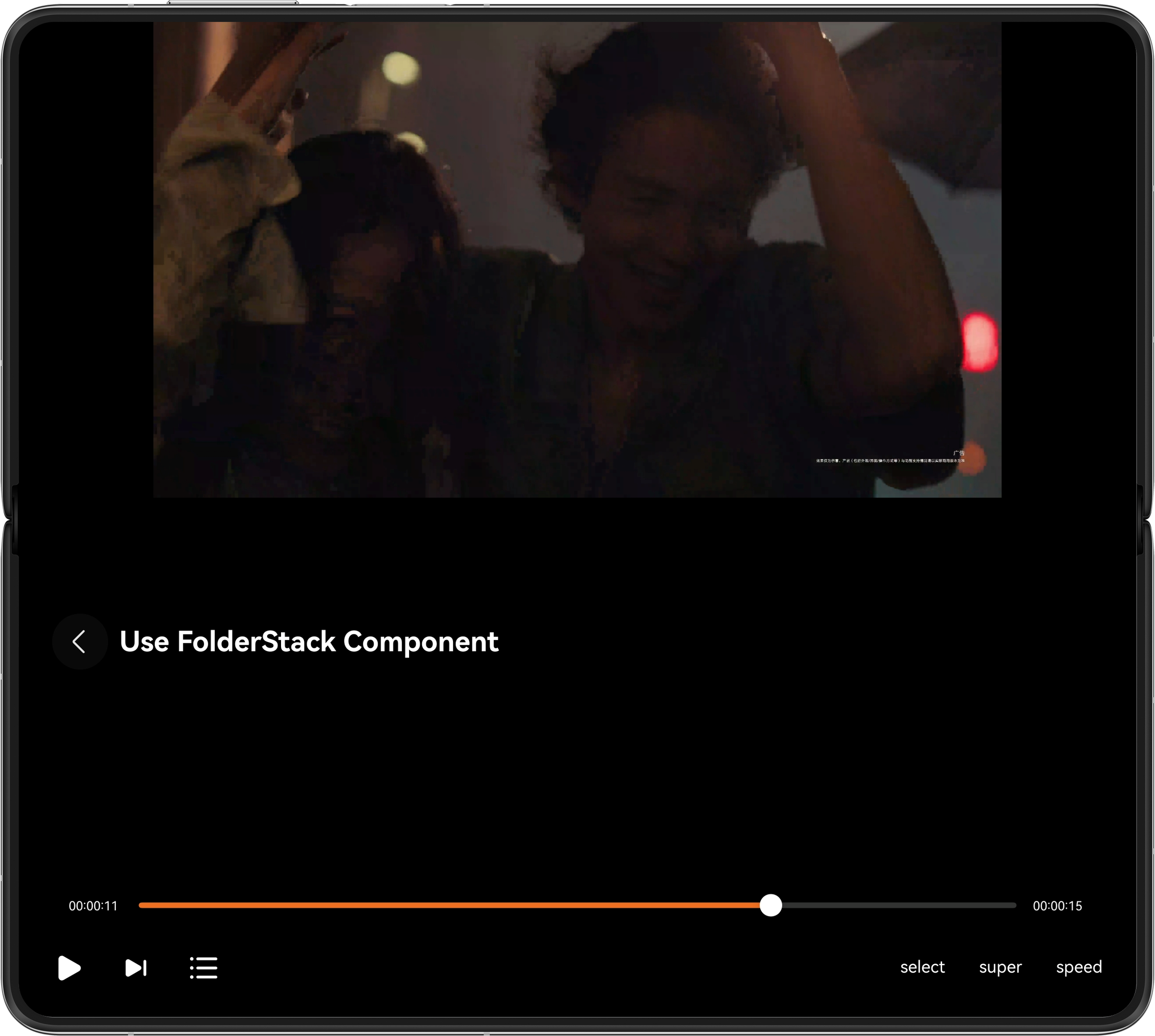
To implement the semi-folded state, use FolderStack as the parent container of the page and register the ID of the video playback component with the upperItems array. In this way, the video playback component is automatically displayed in the upper half screen, while the video control component and top return component are displayed in the lower half screen.
FolderStack({ upperItems: ['upper'] }) {
  VideoPlayView({ avPlayerUtil: this.avPlayerUtil })
    .id('upper')

  VideoControlView({ avPlayerUtil: this.avPlayerUtil })

  BackTitleView({
    title: Const.PAGE_TITLES[0]
  })
} 
[h2]Implementation Principles
The FoldSplitContainer component is a system-provided ArkTS component of the column type, capable of controlling the regions for foldable screens in dual-column and triple-column layouts during unfolded, semi-folded, and folded states. The dual-column layout is a top-and-bottom split, while the triple-column layout adds a sidebar to the dual-column configuration.
The primary and secondary parameters of FoldSplitContainer specify the layout of the upper and lower areas in the dual-column layout, respectively. The extra parameter specifies the layout of the sidebar area in the triple-column layout. The LayoutOptions parameter specifies the proportion of each area. When the device enters semi-folded state, FoldSplitContainer automatically avoids the bend area of the foldable screen.

[h2]How to Develop
Register the upper and lower screen components with the callbacks of the primary and secondary parameters. In this way, the page is displayed in the upper and lower columns, and the crease area is automatically avoided in the semi-folded state. The following example uses a dual-column layout. Therefore, the extra parameter is not specified.
FoldSplitContainer({
  primary: () => {
    this.primaryArea();
  },
  secondary: () => {
    this.secondaryArea();
  }
}) 
[h2]Implementation Principles
To customize the semi-folded state, you need to set the window to display horizontally when the foldable screen enters a half-folded state, avoid the crease area, and adjust the size and position of components within the page. This process can be divided into two parts: listening for the semi-folded state and adjusting the layout.
- Listening for the semi-folded state: Use display.on('foldStatusChange') to listen for whether the device enters the half-folded state and use orientation of display to determine whether the device is in landscape mode. If both conditions are met, the device enters semi-folded state.
- Adjusting the layout: After the device enters semi-folded state, use display.getCurrentFoldCreaseRegion() to obtain the position and size of the crease area on the foldable screen, and calculate and set the sizes and positions of the upper and lower half-screen components.

When the app exits or the page that needs to listen for the folded state change exits, call display.off('foldStatusChange') to cancel the listening to avoid unexpected problems.
[h2]How to Develop
The UI structure of the video playback page in the custom semi-folded state is the same as that of the FolderStack component, except that a common Stack component is used. The main tasks are to implement the listening for the semi-folded state and adjust the layout.
- Use the state variable isHover to listen for the semi-folded state. When the folding state of the foldable screen changes, the system determines the semi-folded state and updates the value of isHover.
Define the onFoldStatusChange callback used for listening for folding state changes.
private onFoldStatusChange: Callback<display.FoldStatus> = (data: display.FoldStatus) => {
  try {
    // ...
    let orientation: display.Orientation = display.getDefaultDisplaySync().orientation;

    if (this.pageID === 0 || this.pageID === 3) {
      if (data === display.FoldStatus.FOLD_STATUS_HALF_FOLDED && this.currentWidthBreakpoint === Const.BREAKPOINT_MD &&
        (orientation === display.Orientation.LANDSCAPE ||
          orientation === display.Orientation.LANDSCAPE_INVERTED)) {
        this.isHover = true;
        // ...
      } else {
        this.isHover = false;
      }
    }
    // ...
  } catch (error) {
    hilog.error(0x0000, TAG, `onFoldStatusChange catch error, code: ${error.code}, message: ${error.message}`);
  }
};
Register the onFoldStatusChange callback in display.on, and call display.on.
try { display.on('foldStatusChange', this.onFoldStatusChange); } catch (exception) { hilog.error(0x0000, TAG, 'Failed to register onFoldStatusChange callback. Code: ' + JSON.stringify(exception)); } - Obtain the size and position of the crease area when the device is in the semi-folded state (isHover is set to true).
static getFoldCreaseRegion(): void { try { if (display.isFoldable()) { let foldRegion: display.FoldCreaseRegion = display.getCurrentFoldCreaseRegion(); let rect: display.Rect = foldRegion.creaseRects[0]; // Height of the avoidance area in the upper half screen and height of the avoidance area. let creaseRegion: number[] = [uiContext!.px2vp(rect.top), uiContext!.px2vp(rect.height)]; AppStorage.setOrCreate('creaseRegion', creaseRegion); } } catch (error) { hilog.error(0x0000, TAG, `getFoldCreaseRegion catch error, code: ${error.code}, message: ${error.message}`); } } - Re-arrange the layout based on the size and position of the crease area.
Move the video playback component to the upper part of the screen.
Column() {
  XComponent({
    id: Const.X_COMPONENT_ID,
    type: XComponentType.SURFACE,
    controller: this.xComponentController
  })
    // ...
}
.height(this.isHover ? this.creaseRegion[0] : '100%')
Remain the video control component at the lower half of the screen, and no adjustment is required.
Move the top return component to the top of the lower half screen.
Row() {
  // ...
}
.width('80%')
.height('24vp')
.justifyContent(FlexAlign.Start)
.position({
  x: '24vp',
  y: this.isHover ? this.creaseRegion[0] + this.creaseRegion[1] + 36 : '36vp'
})