The Select component provides a drop-down menu that allows users to select among multiple options.

This component is supported since API version 8. Updates will be marked with a superscript to indicate their earliest API version.
APIs
Select(options: Array<SelectOption>)
Atomic service API: This API can be used in atomic services since API version 11.
System capability: SystemCapability.ArkUI.ArkUI.Full
Parameters
| Name | Type | Mandatory | Description |
|---|---|---|---|
| options | Array<SelectOption> | Yes | Options of the drop-down menu. |
SelectOption
Provides information about the drop-down menu options.
System capability: SystemCapability.ArkUI.ArkUI.Full
| Name | Type | Read-Only | Optional | Description |
|---|---|---|---|---|
| value | ResourceStr | No | No | Value of the drop-down menu option. Atomic service API: This API can be used in atomic services since API version 11. |
| icon | ResourceStr | No | Yes | Icon of the drop-down menu option. Atomic service API: This API can be used in atomic services since API version 11. |
| symbolIcon12+ | SymbolGlyphModifier | No | Yes | Symbol icon of the drop-down menu option. symbolIcon takes precedence over icon. Atomic service API: This API can be used in atomic services since API version 12. Model restriction: This API can be used only in the stage model. |
[h2]selected
selected(value: number | Resource)
Sets the index of the initially selected option in the drop-down menu, where the first option has an index of 0. When selected is set to an invalid value or is not set, the default default -1 is used, which indicates no selection. When selected is set to undefined or null, the first option is selected.
Since API version 10, this attribute supports two-way binding through $$.
Since API version 18, this attribute supports two-way binding through !!.
Atomic service API: This API can be used in atomic services since API version 11.
System capability: SystemCapability.ArkUI.ArkUI.Full
Parameters
| Name | Type | Mandatory | Description |
|---|---|---|---|
| value | number | Resource11+ | Yes | Index of the initially selected option. The index is zero-based. |
[h2]selected18+
selected(numCount: Optional<number | Resource>)
Sets the index of the initially selected option in the drop-down menu, where the first option has an index of 0. When selected is set to an invalid value or is not set, the default default -1 is used, which indicates no selection. When selected is set to undefined or null, the first option is selected.
This attribute supports two-way binding through $$ and !!.
Atomic service API: This API can be used in atomic services since API version 18.
Model restriction: This API can be used only in the stage model.
System capability: SystemCapability.ArkUI.ArkUI.Full
Parameters
[h2]value
value(value: ResourceStr)
Sets the text content of drop-down button. After a menu option is selected, the button text will automatically update to display the selected option's text.
Since API version 10, this attribute supports two-way binding through $$.
Since API version 18, this attribute supports two-way binding through !!.
Atomic service API: This API can be used in atomic services since API version 11.
System capability: SystemCapability.ArkUI.ArkUI.Full
Parameters
| Name | Type | Mandatory | Description |
|---|---|---|---|
| value | ResourceStr11+ | Yes | Text of the drop-down button. Note: If the text exceeds the column width, it will be truncated. |
[h2]value18+
value(resStr: Optional<ResourceStr>)
Sets the text content of drop-down button. After a menu option is selected, the button text will automatically update to display the selected option's text. Compared with value, this API supports the undefined type for the resStr parameter.
This attribute supports two-way binding through $$ and !!.
Atomic service API: This API can be used in atomic services since API version 18.
Model restriction: This API can be used only in the stage model.
System capability: SystemCapability.ArkUI.ArkUI.Full
Parameters
| Name | Type | Mandatory | Description |
|---|---|---|---|
| resStr | Optional<ResourceStr> | Yes | Text of the drop-down button. If resStr is set to undefined, the previous value is retained. |
[h2]controlSize12+
controlSize(value: ControlSize)
Sets the size of the Select component.
Atomic service API: This API can be used in atomic services since API version 12.
Model restriction: This API can be used only in the stage model.
System capability: SystemCapability.ArkUI.ArkUI.Full
Parameters
| Name | Type | Mandatory | Description |
|---|---|---|---|
| value | ControlSize11+ | Yes | Size of the Select component. Default value: ControlSize.NORMAL |
The priorities of controlSize, width, and height are as follows:
-
If only width and height are set and the text is too large to fit in the component, the text exceeds the component size and overflow text is displayed as an ellipsis (...).
-
If controlSize is set but width and height are not set, the component size automatically adapts to the text content. The text will not exceed the component, and the minWidth and minHeight settings are automatically applied.
-
If controlSize, width, and height are all set, the values of width and height take effect. However, if the values of width and height are less than the values of minWidth and minHeight set by controlSize, they will not take effect. In this case, the minimum width (minWidth) and minimum height (minHeight) settings will be enforced instead.
[h2]controlSize18+
controlSize(size: Optional<ControlSize>)
Sets the size of the Select component. Compared with controlSize12+, this API supports the undefined type for size parameter.
Atomic service API: This API can be used in atomic services since API version 18.
Model restriction: This API can be used only in the stage model.
System capability: SystemCapability.ArkUI.ArkUI.Full
Parameters
| Name | Type | Mandatory | Description |
|---|---|---|---|
| size | Optional<ControlSize> | Yes | Size of the Select component. If size is set to undefined, the default value ControlSize.NORMAL is used. |
The priorities of controlSize, width, and height are as follows:
-
If only width and height are set and the text is too large to fit in the component, the text exceeds the component size and overflow text is displayed as an ellipsis (...).
-
If controlSize is set but width and height are not set, the component size automatically adapts to the text content. The text will not exceed the component, and the minWidth and minHeight settings are automatically applied.
-
If controlSize, width, and height are all set, the values of width and height take effect. However, if the values of width and height are less than the values of minWidth and minHeight set by controlSize, they will not take effect. In this case, the minimum width (minWidth) and minimum height (minHeight) settings will be enforced instead.
[h2]menuItemContentModifier12+
menuItemContentModifier(modifier: ContentModifier<MenuItemConfiguration>)
Creates a content modifier for the drop-down menu. After menuItemContentModifier is applied, the drop-down menu content will be completely customized by the developer, and the Select component's attributes, including the divider, option color, and drop-down menu font color, will not take effect.

Atomic service API: This API can be used in atomic services since API version 12.
Model restriction: This API can be used only in the stage model.
System capability: SystemCapability.ArkUI.ArkUI.Full
Parameters
| Name | Type | Mandatory | Description |
|---|---|---|---|
| modifier | ContentModifier<MenuItemConfiguration> | Yes | Content modifier to apply to the drop-down menu. modifier: content modifier. You need a custom class to implement the ContentModifier API. |
[h2]menuItemContentModifier18+
menuItemContentModifier(modifier: Optional<ContentModifier<MenuItemConfiguration>>)
Creates a content modifier for the drop-down menu. Compared with menuItemContentModifier12+, this API supports the undefined type for modifier parameter. After menuItemContentModifier is applied, the drop-down menu content will be completely customized by the developer, and the Select component's attributes, including the divider, option color, and drop-down menu font color, will not take effect.

Atomic service API: This API can be used in atomic services since API version 18.
Model restriction: This API can be used only in the stage model.
System capability: SystemCapability.ArkUI.ArkUI.Full
Parameters
| Name | Type | Mandatory | Description |
|---|---|---|---|
| modifier | Optional<ContentModifier<MenuItemConfiguration>> | Yes | Content modifier to apply to the drop-down menu. modifier: content modifier. You need a custom class to implement the ContentModifier API. If the modifier value is set to undefined, no content modifier is applied. |
[h2]divider12+
divider(options: Optional<DividerOptions> | null)
Sets the divider style. If this attribute is not set, the divider is displayed based on the default value.
Atomic service API: This API can be used in atomic services since API version 12.
Model restriction: This API can be used only in the stage model.
System capability: SystemCapability.ArkUI.ArkUI.Full
Parameters
| Name | Type | Mandatory | Description |
|---|---|---|---|
| options | Optional<DividerOptions> | null | Yes | Divider options. 1. If DividerOptions is set, the divider is displayed in the configured style. Default value: { strokeWidth: '1px' , color: '#33182431' } 2. If this parameter is set to null, the divider is not displayed. 3. If the value of strokeWidth is too larger, the divider may overlap the text. The divider extends both upwards and downwards from the bottom of each item. 4. The default values for startMargin and endMargin are consistent with the style of the divider when the divider attribute is not set. If the sum of startMargin and endMargin is equal to the value of optionWidth, the divider is not displayed. If the sum of startMargin and endMargin exceeds the value of optionWidth, the divider line is displayed in the default style. |
[h2]dividerStyle19+
dividerStyle(style: Optional<DividerStyleOptions>)
Sets the divider style. If this attribute is not set, the divider is displayed based on the default value. This attribute cannot be used together with the divider attribute. The last one called will take effect.
Atomic service API: This API can be used in atomic services since API version 19.
Model restriction: This API can be used only in the stage model.
System capability: SystemCapability.ArkUI.ArkUI.Full
Parameters
| Name | Type | Mandatory | Description |
|---|---|---|---|
| style | Optional<DividerStyleOptions> | Yes | Divider options. 1. If DividerOptions is set, the divider is displayed in the configured style. Default value: { strokeWidth: '1px' , color: '#33182431' } 2. If this parameter is set to null or undefined, the default divider is displayed. 3. When mode is set to FLOAT_ABOVE_MENU, be careful with the strokeWidth settings to avoid covering text. The divider extends both upwards and downwards from the bottom of each item. When mode is EMBEDDED_IN_MENU, the divider expands to fill its own space within the menu. 4. The default values for startMargin and endMargin are consistent with the style of the divider when the divider attribute is not set. If the sum of startMargin and endMargin is equal to the value of optionWidth, the divider is not displayed. If the sum of startMargin and endMargin exceeds the value of optionWidth, the divider line is displayed in the default style. |
[h2]font
font(value: Font)
Sets the text style of the drop-down button. When size is set to 0, the text is not displayed. When size is set to a negative value, the text is displayed at its default size.
Atomic service API: This API can be used in atomic services since API version 11.
System capability: SystemCapability.ArkUI.ArkUI.Full
Parameters
| Name | Type | Mandatory | Description |
|---|---|---|---|
| value | Font | Yes | Text style of the drop-down button. For API versions 11 and earlier, the default value is as follows: { size: $r('sys.float.ohos_id_text_size_button1'), weight: FontWeight.Medium } Since API version 12: The default value of size is $r('sys.float.ohos_id_text_size_button2') in the case of controlSize.SMALL and $r('sys.float.ohos_id_text_size_button1') in other cases. |
[h2]font18+
font(selectFont: Optional<Font>)
Sets the text style of the drop-down button. When size is set to 0, the text is not displayed. When size is set to a negative value, the text is displayed at its default size. Compared with font, this API supports the undefined type for the selectFont parameter.
Atomic service API: This API can be used in atomic services since API version 18.
Model restriction: This API can be used only in the stage model.
System capability: SystemCapability.ArkUI.ArkUI.Full
Parameters
| Name | Type | Mandatory | Description |
|---|---|---|---|
| selectFont | Optional<Font> | Yes | Text style of the drop-down button. If controlSize is set to controlSize.SMALL, the default value of size is $r('sys.float.ohos_id_text_size_button2'). Otherwise, the default value is $r('sys.float.ohos_id_text_size_button1'). If selectFont is set to undefined, the default font style is used. |
[h2]fontColor
fontColor(value: ResourceColor)
Sets the font color of the drop-down button.
Atomic service API: This API can be used in atomic services since API version 11.
System capability: SystemCapability.ArkUI.ArkUI.Full
Parameters
| Name | Type | Mandatory | Description |
|---|---|---|---|
| value | ResourceColor | Yes | Font color of the drop-down button. Default value: $r('sys.color.ohos_id_color_text_primary') with the opacity of $r('sys.color.ohos_id_alpha_content_primary') |
[h2]fontColor18+
fontColor(resColor: Optional<ResourceColor>)
Sets the font color of the drop-down button. Compared with fontColor, this API supports the undefined type for the resColor parameter.
Atomic service API: This API can be used in atomic services since API version 18.
Model restriction: This API can be used only in the stage model.
System capability: SystemCapability.ArkUI.ArkUI.Full
Parameters
| Name | Type | Mandatory | Description |
|---|---|---|---|
| resColor | Optional<ResourceColor> | Yes | Font color of the drop-down button. When resColor is set to undefined, the default value is a blend of $r('sys.color.ohos_id_color_text_primary') with the opacity of $r('sys.color.ohos_id_alpha_content_primary'). If value is set to undefined, the previous value is retained. |
[h2]selectedOptionBgColor
selectedOptionBgColor(value: ResourceColor)
Sets the background color of the selected option in the drop-down menu.
Atomic service API: This API can be used in atomic services since API version 11.
System capability: SystemCapability.ArkUI.ArkUI.Full
Parameters
| Name | Type | Mandatory | Description |
|---|---|---|---|
| value | ResourceColor | Yes | Background color of the selected option in the drop-down menu. Default value: $r('sys.color.ohos_id_color_component_activated') with the opacity of $r('sys.color.ohos_id_alpha_highlight_bg') |
[h2]selectedOptionBgColor18+
selectedOptionBgColor(resColor: Optional<ResourceColor>)
Sets the background color of the selected option in the drop-down menu. Compared with selectedOptionBgColor, this API supports the undefined type for the resColor parameter.
Atomic service API: This API can be used in atomic services since API version 18.
Model restriction: This API can be used only in the stage model.
System capability: SystemCapability.ArkUI.ArkUI.Full
Parameters
| Name | Type | Mandatory | Description |
|---|---|---|---|
| resColor | Optional<ResourceColor> | Yes | Background color of the selected option in the drop-down menu. When resColor is set to undefined, the default value is a blend of $r('sys.color.ohos_id_color_component_activated') with the opacity of $r('sys.color.ohos_id_alpha_highlight_bg'). |
[h2]selectedOptionFont
selectedOptionFont(value: Font)
Sets the text font of the selected option in the drop-down menu. When size is set to 0, the text is not displayed. When size is set to a negative value, the text is displayed at its default size.
Atomic service API: This API can be used in atomic services since API version 11.
System capability: SystemCapability.ArkUI.ArkUI.Full
Parameters
| Name | Type | Mandatory | Description |
|---|---|---|---|
| value | Font | Yes | Text font of the selected option in the drop-down menu. Default value: { size: $r('sys.float.ohos_id_text_size_body1'), weight: FontWeight.Regular } |
[h2]selectedOptionFont18+
selectedOptionFont(selectFont: Optional<Font>)
Sets the text font of the selected option in the drop-down menu. When size is set to 0, the text is not displayed. When size is set to a negative value, the text is displayed at its default size. Compared with selectedOptionFont, this API supports the undefined type for the selectFont parameter.
Atomic service API: This API can be used in atomic services since API version 18.
Model restriction: This API can be used only in the stage model.
System capability: SystemCapability.ArkUI.ArkUI.Full
Parameters
[h2]selectedOptionFontColor
selectedOptionFontColor(value: ResourceColor)
Sets the font color of the selected option in the drop-down menu.
Atomic service API: This API can be used in atomic services since API version 11.
System capability: SystemCapability.ArkUI.ArkUI.Full
Parameters
| Name | Type | Mandatory | Description |
|---|---|---|---|
| value | ResourceColor | Yes | Font color of the selected option in the drop-down menu. Default value: $r('sys.color.ohos_id_color_text_primary_activated') |
[h2]selectedOptionFontColor18+
selectedOptionFontColor(resColor: Optional<ResourceColor>)
Sets the font color of the selected option in the drop-down menu. Compared with selectedOptionFontColor, this API supports the undefined type for the resColor parameter.
Atomic service API: This API can be used in atomic services since API version 18.
Model restriction: This API can be used only in the stage model.
System capability: SystemCapability.ArkUI.ArkUI.Full
Parameters
| Name | Type | Mandatory | Description |
|---|---|---|---|
| resColor | Optional<ResourceColor> | Yes | Font color of the selected option in the drop-down menu. If resColor is set to undefined, the default value $r('sys.color.ohos_id_color_text_primary_activated') is used. |
[h2]optionBgColor
optionBgColor(value: ResourceColor)
Sets the background color of options in the drop-down menu.
Atomic service API: This API can be used in atomic services since API version 11.
System capability: SystemCapability.ArkUI.ArkUI.Full
Parameters
| Name | Type | Mandatory | Description |
|---|---|---|---|
| value | ResourceColor | Yes | Background color of options in the drop-down menu. Default value: Versions earlier than API version 11: Color.White Since API version 11: Color.Transparent |
[h2]optionBgColor18+
optionBgColor(resColor: Optional<ResourceColor>)
Sets the background color of options in the drop-down menu. Compared with optionBgColor, this API supports the undefined type for the resColor parameter.
Atomic service API: This API can be used in atomic services since API version 18.
Model restriction: This API can be used only in the stage model.
System capability: SystemCapability.ArkUI.ArkUI.Full
Parameters
| Name | Type | Mandatory | Description |
|---|---|---|---|
| resColor | Optional<ResourceColor> | Yes | Background color of options in the drop-down menu. When the value of resColor is undefined, the background color of the drop-down menu item is Color.White. |
[h2]optionFont
optionFont(value: Font)
Sets the text font of options in the drop-down menu. When size is set to 0, the text is not displayed. When size is set to a negative value, the text is displayed at its default size.
Atomic service API: This API can be used in atomic services since API version 11.
System capability: SystemCapability.ArkUI.ArkUI.Full
Parameters
| Name | Type | Mandatory | Description |
|---|---|---|---|
| value | Font | Yes | Text font of options in the drop-down menu. Default value: { size: $r('sys.float.ohos_id_text_size_body1'), weight: FontWeight.Regular } |
[h2]optionFont18+
optionFont(selectFont: Optional<Font>)
Sets the text font of options in the drop-down menu. When size is set to 0, the text is not displayed. When size is set to a negative value, the text is displayed at its default size.
Compared with optionFont, this API supports the undefined type for the selectFont parameter.
Atomic service API: This API can be used in atomic services since API version 18.
Model restriction: This API can be used only in the stage model.
System capability: SystemCapability.ArkUI.ArkUI.Full
Parameters
[h2]optionFontColor
optionFontColor(value: ResourceColor)
Sets the font color of options in the drop-down menu.
Atomic service API: This API can be used in atomic services since API version 11.
System capability: SystemCapability.ArkUI.ArkUI.Full
Parameters
| Name | Type | Mandatory | Description |
|---|---|---|---|
| value | ResourceColor | Yes | Font color of options in the drop-down menu. Default value: $r('sys.color.ohos_id_color_text_primary') |
[h2]optionFontColor18+
optionFontColor(resColor: Optional<ResourceColor>)
Sets the font color of options in the drop-down menu. Compared with optionFontColor, this API supports the undefined type for the resColor parameter.
Atomic service API: This API can be used in atomic services since API version 18.
Model restriction: This API can be used only in the stage model.
System capability: SystemCapability.ArkUI.ArkUI.Full
Parameters
| Name | Type | Mandatory | Description |
|---|---|---|---|
| resColor | Optional<ResourceColor> | Yes | Font color of options in the drop-down menu. If resColor is set to undefined, the default value $r('sys.color.ohos_id_color_text_primary') is used. |
[h2]space10+
space(value: Length)
Sets the spacing between the text and arrow of a drop-down menu option. This attribute cannot be set in percentage. If the value specified is null, undefined, or less than or equal to 8, the default value is used.
Atomic service API: This API can be used in atomic services since API version 11.
Model restriction: This API can be used only in the stage model.
System capability: SystemCapability.ArkUI.ArkUI.Full
Parameters
| Name | Type | Mandatory | Description |
|---|---|---|---|
| value | Length | Yes | Spacing between the text and arrow of a drop-down menu option. Default value: 8 Note: For the string type, percentage values are not supported. |
[h2]space18+
space(spaceLength: Optional<Length>)
Sets the spacing between the text and arrow of a drop-down menu option. This attribute cannot be set in percentage. If the value specified is null, undefined, or less than or equal to 8, the default value is used.
Atomic service API: This API can be used in atomic services since API version 18.
Model restriction: This API can be used only in the stage model.
System capability: SystemCapability.ArkUI.ArkUI.Full
Parameters
[h2]arrowPosition10+
arrowPosition(value: ArrowPosition)
Sets the alignment between the text and arrow of an option.
Atomic service API: This API can be used in atomic services since API version 11.
Model restriction: This API can be used only in the stage model.
System capability: SystemCapability.ArkUI.ArkUI.Full
Parameters
| Name | Type | Mandatory | Description |
|---|---|---|---|
| value | ArrowPosition | Yes | Alignment between the text and arrow of an option. Default value: ArrowPosition.END |
[h2]arrowPosition18+
arrowPosition(position: Optional<ArrowPosition>)
Sets the alignment between the text and arrow of an option. Compared with arrowPosition, this API supports the undefined type for the position parameter.
Atomic service API: This API can be used in atomic services since API version 18.
Model restriction: This API can be used only in the stage model.
System capability: SystemCapability.ArkUI.ArkUI.Full
Parameters
| Name | Type | Mandatory | Description |
|---|---|---|---|
| position | Optional<ArrowPosition> | Yes | Alignment between the text and arrow of an option. If position is set to undefined, the default value ArrowPosition.END is used. |
[h2]optionWidth11+
optionWidth(value: Dimension | OptionWidthMode )
Sets the width for the drop-down menu option. Percentage values are not supported. OptionWidthMode specifies whether to inherit the width of the drop-down button.
If an invalid value or a value less than the minimum width of 56 vp is set, the attribute has no effect. In this case, the option width uses the default value, which is the width of two columns.
The Select component maintains 16 vp spacing from both left and right screen edges by default. This creates a 32 vp total horizontal margin (16 vp × 2). To prevent horizontal shifting when the drop-down menu is displayed, set the width of the component itself and its menu options to a value less than or equal to calc(100% - 32 vp).
Atomic service API: This API can be used in atomic services since API version 12.
Model restriction: This API can be used only in the stage model.
System capability: SystemCapability.ArkUI.ArkUI.Full
Parameters
| Name | Type | Mandatory | Description |
|---|---|---|---|
| value | Dimension | OptionWidthMode | Yes | Width of the drop-down menu option. |
[h2]optionWidth18+
optionWidth(width: Optional<Dimension | OptionWidthMode> )
Sets the width for the drop-down menu option. Percentage values are not supported. OptionWidthMode specifies whether to inherit the width of the drop-down button. Compared with optionWidth11+, this API supports the undefined type for the width parameter.
If an invalid value or a value less than the minimum width of 56 vp is set, the attribute has no effect. In this case, the option width uses the default value, which is the width of two columns.
The Select component maintains 16 vp spacing from both left and right screen edges by default. This creates a 32 vp total horizontal margin (16 vp × 2). To prevent horizontal shifting when the drop-down menu is displayed, set the width of the component itself and its menu options to a value less than or equal to calc(100% - 32 vp).
Atomic service API: This API can be used in atomic services since API version 18.
Model restriction: This API can be used only in the stage model.
System capability: SystemCapability.ArkUI.ArkUI.Full
Parameters
| Name | Type | Mandatory | Description |
|---|---|---|---|
| width | Optional<Dimension | OptionWidthMode> | Yes | Width of the drop-down menu option. If width is set to undefined, it has no effect. In this case, the option width uses the default value, which is the width of two columns. |
[h2]optionHeight11+
optionHeight(value: Dimension)
Sets the maximum height for the drop-down menu. Percentage values are not supported. The default maximum height is 80% of the available screen height, and any custom maximum height setting must not exceed this limit.
This attribute has no effect when set to abnormal values or zero.
If the actual height of all drop-down menu options is less than the set height, the menu will automatically adjust to the actual content height.
Atomic service API: This API can be used in atomic services since API version 12.
Model restriction: This API can be used only in the stage model.
System capability: SystemCapability.ArkUI.ArkUI.Full
Parameters
| Name | Type | Mandatory | Description |
|---|---|---|---|
| value | Dimension | Yes | Maximum height of the drop-down menu. |
[h2]optionHeight18+
optionHeight(height: Optional<Dimension>)
Sets the maximum height for the drop-down menu. Percentage values are not supported. The default maximum height is 80% of the available screen height, and any custom maximum height setting must not exceed this limit. Compared with optionHeight11+, this API supports the undefined type for the height parameter.
This attribute has no effect when set to abnormal values or zero.
If the actual height of all drop-down menu options is less than the set height, the menu will automatically adjust to the actual content height.
Atomic service API: This API can be used in atomic services since API version 18.
Model restriction: This API can be used only in the stage model.
System capability: SystemCapability.ArkUI.ArkUI.Full
Parameters
[h2]menuBackgroundColor11+
menuBackgroundColor(value: ResourceColor)
Sets the background color of the drop-down menu.

Atomic service API: This API can be used in atomic services since API version 12.
Model restriction: This API can be used only in the stage model.
System capability: SystemCapability.ArkUI.ArkUI.Full
Parameters
| Name | Type | Mandatory | Description |
|---|---|---|---|
| value | ResourceColor | Yes | Background color of the drop-down menu. Default value: Versions earlier than API version 11: $r('sys.color.ohos_id_color_card_bg') Since API version 11: Color.Transparent |
[h2]menuBackgroundBlurStyle11+
menuBackgroundBlurStyle(value: BlurStyle)
Sets the background blur style of the drop-down menu.

Atomic service API: This API can be used in atomic services since API version 12.
Model restriction: This API can be used only in the stage model.
System capability: SystemCapability.ArkUI.ArkUI.Full
Parameters
| Name | Type | Mandatory | Description |
|---|---|---|---|
| value | BlurStyle | Yes | Background blur style of the drop-down menu. Default value: BlurStyle.COMPONENT_ULTRA_THICK |
[h2]avoidance19+
avoidance(mode: AvoidanceMode)
Sets the avoidance mode for the drop-down menu.
Atomic service API: This API can be used in atomic services since API version 19.
Model restriction: This API can be used only in the stage model.
System capability: SystemCapability.ArkUI.ArkUI.Full
Parameters
| Name | Type | Mandatory | Description |
|---|---|---|---|
| mode | AvoidanceMode | Yes | Avoidance mode for the drop-down menu. Default value: AvoidanceMode.COVER_TARGET |
[h2]showDefaultSelectedIcon20+
showDefaultSelectedIcon(show: boolean)
Sets whether to display the default selection icon.
Atomic service API: This API can be used in atomic services since API version 20.
Model restriction: This API can be used only in the stage model.
System capability: SystemCapability.ArkUI.ArkUI.Full
Parameters
| Name | Type | Mandatory | Description |
|---|---|---|---|
| show | boolean | Yes | Whether to display the default selection icon. true: The default icon is displayed. false: The default icon is not displayed. The background color is highlighted to indicate that the icon is selected. Default value: false When show is set to true and the background color of the selected option is set, both the background color of the selected option and the icon selected by default are displayed. If the background color of the selected item is not set via selectedOptionBgColor, the background color is not highlighted and only the icon selected by default is displayed. |
[h2]textModifier20+
textModifier(modifier: Optional<TextModifier>)
Creates a text modifier to customize the text style of the Select button. After textModifier is applied, the text style of the Select button will be completely customized by the developer.

Atomic service API: This API can be used in atomic services since API version 20.
Model restriction: This API can be used only in the stage model.
System capability: SystemCapability.ArkUI.ArkUI.Full
Parameters
| Name | Type | Mandatory | Description |
|---|---|---|---|
| modifier | Optional<TextModifier> | Yes | Text modifier to apply to the Select button for customizing the text style. If the modifier value is undefined, no custom text style is applied. |
[h2]arrowModifier20+
arrowModifier(modifier: Optional<SymbolGlyphModifier>)
Creates an arrow modifier to customize the drop-down arrow icon style of the Select button. After arrowModifier is applied, the drop-down arrow icon style of the Select button will be completely customized by the developer.

Atomic service API: This API can be used in atomic services since API version 20.
Model restriction: This API can be used only in the stage model.
System capability: SystemCapability.ArkUI.ArkUI.Full
Parameters
| Name | Type | Mandatory | Description |
|---|---|---|---|
| modifier | Optional<SymbolGlyphModifier> | Yes | Arrow modifier to apply to the Select button for customizing the drop-down arrow icon style. When the modifier value is undefined, no custom drop-down arrow icon style is applied. |
[h2]optionTextModifier20+
optionTextModifier(modifier: Optional<TextModifier>)
Creates an option text modifier to customize the text style of unselected options in the drop-down menu. After optionTextModifier is applied, the unselected option text style will be completely customized by the developer.
If both optionFont and Font of optionTextModifier are set, optionFont takes precedence. Any unspecified attributes in optionFont will use default values.

Atomic service API: This API can be used in atomic services since API version 20.
Model restriction: This API can be used only in the stage model.
System capability: SystemCapability.ArkUI.ArkUI.Full
Parameters
| Name | Type | Mandatory | Description |
|---|---|---|---|
| modifier | Optional<TextModifier> | Yes | Option text modifier to apply to the Select component for customizing the text style of unselected options in the drop-down menu. When the modifier value is undefined, no custom text style is applied to unselected options in the drop-down menu. |
[h2]selectedOptionTextModifier20+
selectedOptionTextModifier(modifier: Optional<TextModifier>)
Creates a selected-option text modifier to customize the text style of selected options in the drop-down menu. After selectedOptionTextModifier is applied, the selected-option text style will be completely customized by the developer.
If both selectedOptionFont and Font of selectedOptionTextModifier are set, selectedOptionFont takes precedence. If selectedOptionFont is not set, optionFont settings are applied. Any unspecified attributes in selectedOptionFont or optionFont will use default values.

Atomic service API: This API can be used in atomic services since API version 20.
Model restriction: This API can be used only in the stage model.
System capability: SystemCapability.ArkUI.ArkUI.Full
Parameters
| Name | Type | Mandatory | Description |
|---|---|---|---|
| modifier | Optional<TextModifier> | Yes | Selected-option text modifier to apply to the Select component for customizing the text style of selected options in the drop-down menu. You can manage and maintain the text style as needed. When the modifier value is undefined, no custom text style is applied to selected options in the drop-down menu. |
[h2]showInSubWindow20+
showInSubWindow(showInSubWindow:Optional<boolean>)
Sets whether the drop-down menu is displayed in the subwindow. If this API is not used, the drop-down menu is not displayed in the subwindow by default.
Atomic service API: This API can be used in atomic services since API version 20.
Model restriction: This API can be used only in the stage model.
System capability: SystemCapability.ArkUI.ArkUI.Full
Device behavior difference: This API is supported on PCs and 2-in-1 devices but not available on other devices.
Parameters
| Name | Type | Mandatory | Description |
|---|---|---|---|
| showInSubWindow | Optional<boolean> | Yes | Whether the drop-down menu is displayed in the subwindow. true: The drop-down menu is displayed in the subwindow. false: The drop-down menu is not displayed in the subwindow. |
[h2]keyboardAvoidMode23+
keyboardAvoidMode(mode:Optional<MenuKeyboardAvoidMode>)
Sets whether the drop-down menu avoids the soft keyboard. If this API is not used, the drop-down menu avoids the soft keyboard by default.
Atomic service API: This API can be used in atomic services since API version 23.
System capability: SystemCapability.ArkUI.ArkUI.Full
Model restriction: This API can be used only in the stage model.
Parameters
| Name | Type | Mandatory | Description |
|---|---|---|---|
| mode | Optional<MenuKeyboardAvoidMode> | Yes | Whether the drop-down menu avoids the soft keyboard. If the value is undefined, it is treated as MenuKeyboardAvoidMode.NONE. |
[h2]minKeyboardAvoidDistance23+
minKeyboardAvoidDistance(distance:Optional<LengthMetrics>)
Sets the minimum distance for the Select component to avoid the soft keyboard. If this API is not used, the minimum distance is 8 vp by default. This API is valid only when keyboardAvoidMode is set to avoid the soft keyboard.
Atomic service API: This API can be used in atomic services since API version 23.
System capability: SystemCapability.ArkUI.ArkUI.Full
Model restriction: This API can be used only in the stage model.
Parameters
| Name | Type | Mandatory | Description |
|---|---|---|---|
| distance | Optional<LengthMetrics> | Yes | Sets the minimum distance for the drop-down menu to avoid the soft keyboard. If the value is set to a negative number or undefined, the value 8 vp will be used. |
ArrowPosition10+
Enumerates arrow positions.
Atomic service API: This API can be used in atomic services since API version 11.
Model restriction: This API can be used only in the stage model.
System capability: SystemCapability.ArkUI.ArkUI.Full
| Name | Value | Description |
|---|---|---|
| END | 0 | The text is in front of the arrow. |
| START | 1 | The arrow is in front of the text. |
AvoidanceMode19+
Enumerates the drop-down menu avoidance modes.
Atomic service API: This API can be used in atomic services since API version 19.
Model restriction: This API can be used only in the stage model.
System capability: SystemCapability.ArkUI.ArkUI.Full
| Name | Description |
|---|---|
| COVER_TARGET | If there is not enough space below the target component, cover the target component. |
| AVOID_AROUND_TARGET | If there is not enough space around the target component, compress and display in the largest available space (scrollable). |
[h2]onSelect
onSelect(callback: (index: number, value: string) => void)
Triggered when a drop-down menu option is selected.
Atomic service API: This API can be used in atomic services since API version 11.
System capability: SystemCapability.ArkUI.ArkUI.Full
Parameters
| Name | Type | Mandatory | Description |
|---|---|---|---|
| index | number | Yes | Index of the selected option. The index is zero-based. |
| value | string | Yes | Value of the selected option. |
[h2]onSelect18+
onSelect(callback: Optional<OnSelectCallback> )
Triggered when a drop-down menu option is selected. Compared with onSelect, this API supports the undefined type for the callback parameter.
Atomic service API: This API can be used in atomic services since API version 18.
Model restriction: This API can be used only in the stage model.
System capability: SystemCapability.ArkUI.ArkUI.Full
Parameters
| Name | Type | Mandatory | Description |
|---|---|---|---|
| callback | Optional<OnSelectCallback> | Yes | Callback invoked when a drop-down menu option is selected. If callback is set to undefined, the callback function is not used. |
OnSelectCallback18+
type OnSelectCallback = (index: number, selectStr: string) => void
Defines the callback invoked when a drop-down menu option is selected.
Atomic service API: This API can be used in atomic services since API version 18.
Model restriction: This API can be used only in the stage model.
System capability: SystemCapability.ArkUI.ArkUI.Full
Parameters
| Name | Type | Mandatory | Description |
|---|---|---|---|
| index | number | Yes | Index of the selected option. The index is zero-based. |
| selectStr | string | Yes | Value of the selected option. |
[h2]Example 1: Creating a Drop-down Menu
This example demonstrates how to create a drop-down menu by configuring SelectOption and how to implement menu avoidance using the avoidance attribute, available since API version 19.
// xxx.ets
@Entry
@Component
struct SelectExample {
  @State text: string = "TTTTT";
  @State index: number = 2;
  @State space: number = 8;
  @State arrowPosition: ArrowPosition = ArrowPosition.END;

  build() {
    Column() {
      // Replace $r('app.media.selection') with the image resource file you use.
      Select([{ value: 'aaa', icon: $r("app.media.selection") },
        { value: 'bbb', icon: $r("app.media.selection") },
        { value: 'ccc', icon: $r("app.media.selection") },
        { value: 'ddd', icon: $r("app.media.selection") }])
        .selected(this.index)
        .value(this.text)
        .font({ size: 16, weight: 500 })
        .fontColor('#182431')
        .selectedOptionFont({ size: 16, weight: 400 })
        .optionFont({ size: 16, weight: 400 })
        .space(this.space)
        .arrowPosition(this.arrowPosition)
        .menuAlign(MenuAlignType.START, { dx: 0, dy: 0 })
        .optionWidth(200)
        .optionHeight(300)
        .onSelect((index: number, text?: string | undefined) => {
          console.info('Select:' + index);
          this.index = index;
          if (text) {
            this.text = text;
          }
        })
        .avoidance(AvoidanceMode.COVER_TARGET);
    }.width('100%')
  }
} 
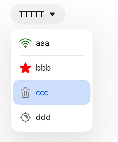
[h2]Example 2: Setting the Symbol Icon
This example demonstrates how to create a drop-down menu with symbol icons in the Select component and implement menu avoidance using the avoidance attribute, available since API version 19.
// xxx.ets
import { SymbolGlyphModifier } from '@kit.ArkUI';

@Entry
@Component
struct SelectExample {
  @State text: string = "TTTTT";
  @State index: number = 2;
  @State space: number = 8;
  @State arrowPosition: ArrowPosition = ArrowPosition.END;
  @State symbolModifier1: SymbolGlyphModifier =
    new SymbolGlyphModifier($r('sys.symbol.ohos_wifi')).fontColor([Color.Green]);
  @State symbolModifier2: SymbolGlyphModifier =
    new SymbolGlyphModifier($r('sys.symbol.ohos_star')).fontColor([Color.Red]);
  @State symbolModifier3: SymbolGlyphModifier =
    new SymbolGlyphModifier($r('sys.symbol.ohos_trash')).fontColor([Color.Gray]);
  @State symbolModifier4: SymbolGlyphModifier =
    new SymbolGlyphModifier($r('sys.symbol.exposure')).fontColor([Color.Gray]);

  build() {
    Column() {
      Select([{ value: 'aaa', symbolIcon: this.symbolModifier1 },
        { value: 'bbb', symbolIcon: this.symbolModifier2 },
        { value: 'ccc', symbolIcon: this.symbolModifier3 },
        { value: 'ddd', symbolIcon: this.symbolModifier4 }])
        .selected(this.index)
        .value(this.text)
        .font({ size: 16, weight: 500 })
        .fontColor('#182431')
        .selectedOptionFont({ size: 16, weight: 400 })
        .optionFont({ size: 16, weight: 400 })
        .space(this.space)
        .arrowPosition(this.arrowPosition)
        .menuAlign(MenuAlignType.START, { dx: 0, dy: 0 })
        .onSelect((index: number, text?: string | undefined) => {
          console.info('Select:' + index);
          this.index = index;
          if (text) {
            this.text = text;
          }
        })
        .avoidance(AvoidanceMode.COVER_TARGET);
    }.width('100%')
  }
} 
[h2]Example 3: Implementing a Custom Drop-down Menu
This example implements a custom drop-down menu, each option of which consists of text + symbol + blank area + text + drawn triangle. After a menu option is clicked, the text content of the menu option is displayed.
import { SymbolGlyphModifier } from '@kit.ArkUI';

class MyMenuItemContentModifier implements ContentModifier<MenuItemConfiguration> {
  modifierText: string = "";

  constructor(text: string) {
    this.modifierText = text;
  }

  applyContent(): WrappedBuilder<[MenuItemConfiguration]> {
    return wrapBuilder(MenuItemBuilder);
  }
}

@Builder
function MenuItemBuilder(configuration: MenuItemConfiguration) {
  Row() {
    Text(configuration.value)
    Blank()
    if (configuration.symbolIcon) {
      SymbolGlyph().attributeModifier(configuration.symbolIcon).fontSize(24)
    } else if (configuration.icon) {
      Image(configuration.icon).size({ width: 24, height: 24 })
    }
    Blank(30)
    Text((configuration.contentModifier as MyMenuItemContentModifier).modifierText)
    Blank(30)
    Path()
      .width('100px')
      .height('150px')
      .commands('M40 0 L80 100 L0 100 Z')
      .fillOpacity(0)
      .stroke(Color.Black)
      .strokeWidth(3)
  }
  .onClick(() => {
    configuration.triggerSelect(configuration.index, configuration.value.valueOf().toString());
  })
}

@Entry
@Component
struct SelectExample {
  @State text: string = "Content Modifier Select";
  @State symbolModifier1: SymbolGlyphModifier =
    new SymbolGlyphModifier($r('sys.symbol.ohos_trash')).fontColor([Color.Gray]);
  @State symbolModifier2: SymbolGlyphModifier =
    new SymbolGlyphModifier($r('sys.symbol.exposure')).fontColor([Color.Gray]);

  build() {
    Column() {
      Row() {
        // Replace $r('app.media.icon') with the image resource file you use.
        Select([{ value: 'item1', icon: $r('app.media.icon'), symbolIcon: this.symbolModifier1 },
          { value: 'item1', icon: $r('app.media.icon'), symbolIcon: this.symbolModifier2 }])
          .value(this.text)
          .onSelect((index: number, text?: string) => {
            console.info('Select index:' + index);
            console.info('Select text:' + text);
          })
          .menuItemContentModifier(new MyMenuItemContentModifier("Content Modifier"))

      }.alignItems(VerticalAlign.Center).height('50%')
    }
  }
} 
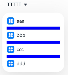
[h2]Example 4: Using the Divider Style
This example uses DividerOptions to create a divider-style drop-down menu and implements menu avoidance using the avoidance attribute, available since API version 19.
// xxx.ets
@Entry
@Component
struct SelectExample {
  @State text: string = "TTTTT";
  @State index: number = -1;
  @State arrowPosition: ArrowPosition = ArrowPosition.END;

  build() {
    Column() {
      // Replace $r('app.media.icon') with the image resource file you use.
      Select([{ value: 'aaa', icon: $r("app.media.icon") },
        { value: 'bbb', icon: $r("app.media.icon") },
        { value: 'ccc', icon: $r("app.media.icon") },
        { value: 'ddd', icon: $r("app.media.icon") }])
        .selected(this.index)
        .value(this.text)
        .font({ size: 16, weight: 500 })
        .fontColor('#182431')
        .selectedOptionFont({ size: 16, weight: 400 })
        .optionFont({ size: 16, weight: 400 })
        .arrowPosition(this.arrowPosition)
        .menuAlign(MenuAlignType.START, { dx: 0, dy: 0 })
        .optionWidth(200)
        .optionHeight(300)
        .divider({
          strokeWidth: 5,
          color: Color.Blue,
          startMargin: 10,
          endMargin: 10
        })
        .onSelect((index: number, text?: string | undefined) => {
          console.info('Select:' + index);
          this.index = index;
          if (text) {
            this.text = text;
          }
        })
        .avoidance(AvoidanceMode.COVER_TARGET);
    }.width('100%')
  }
} 
[h2]Example 5: Using the No-Divider Style
This example sets the divider attribute to null to remove dividers, and implements menu avoidance using the avoidance attribute, available since API version 19.
// xxx.ets
@Entry
@Component
struct SelectExample {
  @State text: string = "TTTTT";
  @State index: number = -1;
  @State arrowPosition: ArrowPosition = ArrowPosition.END;

  build() {
    Column() {
      // Replace $r('app.media.icon') with the image resource file you use.
      Select([{ value: 'aaa', icon: $r("app.media.icon") },
        { value: 'bbb', icon: $r("app.media.icon") },
        { value: 'ccc', icon: $r("app.media.icon") },
        { value: 'ddd', icon: $r("app.media.icon") }])
        .selected(this.index)
        .value(this.text)
        .font({ size: 16, weight: 500 })
        .fontColor('#182431')
        .selectedOptionFont({ size: 16, weight: 400 })
        .optionFont({ size: 16, weight: 400 })
        .arrowPosition(this.arrowPosition)
        .menuAlign(MenuAlignType.START, { dx: 0, dy: 0 })
        .optionWidth(200)
        .optionHeight(300)
        .divider(null)
        .onSelect((index: number, text?: string | undefined) => {
          console.info('Select:' + index);
          this.index = index;
          if (text) {
            this.text = text;
          }
        })
        .avoidance(AvoidanceMode.COVER_TARGET);
    }.width('100%')
  }
} 
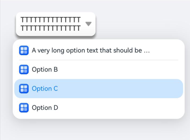
[h2]Example 6: Setting the Text and Arrow Styles of the Select Component
This example illustrates how to configure the text and arrow styles of the Select component using the textModifier and arrowModifier attributes, available since API version 20.
import { TextModifier, SymbolGlyphModifier } from "@kit.ArkUI";

@Entry
@Component
struct SelectExample {
  @State text: string = "TTTTTTTTTT".repeat(3);
  @State index: number = 2;
  textModifier: TextModifier = new TextModifier();
  symbolGlyphModifier: SymbolGlyphModifier = new SymbolGlyphModifier();

  aboutToAppear(): void {
    this.textModifier
      .maxLines(2)
      .fontSize(18)
      .textAlign(TextAlign.Center)
      .fontColor('#333333')
      .fontWeight(FontWeight.Medium)
      .textOverflow({overflow:TextOverflow.Clip})

    this.symbolGlyphModifier
      .fontSize(25)
      .fontColor(['#999999'])
  }

  build() {
    Column() {
      Select([
        // Replace $r('app.media.startIcon') with the image resource file you use.
        { value: 'A very long option text that should be truncated nicely'.repeat(3), icon: $r("app.media.startIcon") },
        { value: 'Option B', icon: $r("app.media.startIcon") },
        { value: 'Option C', icon: $r("app.media.startIcon") },
        { value: 'Option D', icon: $r("app.media.startIcon") }
      ])
        .selected(this.index)
        .value(this.text)
        .textModifier(this.textModifier)
        .arrowModifier(this.symbolGlyphModifier)
        .onSelect((index: number, text?: string) => {
          console.info('Select:' + index);
          this.index = index;
          if (text) {
            this.text = text;
          }
        })
        .margin({ top: 20,left:30 })
        .borderRadius(12)
        .width(200)
        .padding(9)
        .backgroundColor(Color.White)
        .shadow({ radius: 10, color: '#888888', offsetX: 0, offsetY: 10 })
    }
    .alignItems(HorizontalAlign.Start)
    .padding(10)
    .backgroundColor('#F0F2F5')
    .width('100%')
    .height('100%')
  }
} 
[h2]Example 7: Setting the Text Styles of Selected and Unselected Drop-Down Menu Options
This example demonstrates how to use the optionTextModifier and selectedOptionTextModifier attributes to set text styles for unselected and selected drop-down menu options, available since API version 20.
import { TextModifier } from "@kit.ArkUI";

@Entry
@Component
struct SelectExample {
  @State text: string = "TTTTTTTTTT".repeat(3);
  @State index: number = 2;
  optionTextModifier: TextModifier = new TextModifier();
  selectedOptionTextModifier: TextModifier = new TextModifier();
  aboutToAppear(): void {
    this.optionTextModifier
      .maxLines(1)
      .fontSize(16)
      .textAlign(TextAlign.Start)
      .fontColor('#666666')
      .fontWeight(FontWeight.Normal)
      .width(200)

    this.selectedOptionTextModifier
      .maxLines(1)
      .fontSize(18)
      .textAlign(TextAlign.Start)
      .fontColor('#007BFF')
      .fontWeight(FontWeight.Bold)
      .width(200)
  }

  build() {
    Column() {
      Select([
        // Replace $r('app.media.startIcon') with the image resource file you use.
        { value: 'A very long option text that should be truncated nicely'.repeat(3), icon: $r("app.media.startIcon") },
        { value: 'Option B', icon: $r("app.media.startIcon") },
        { value: 'Option C', icon: $r("app.media.startIcon") },
        { value: 'Option D', icon: $r("app.media.startIcon") }
      ])
        .selected(this.index)
        .value(this.text)
        .onSelect((index: number, text?: string) => {
          console.info('Select:' + index);
          this.index = index;
          if (text) {
            this.text = text;
          }
        })
        .optionTextModifier(this.optionTextModifier)
        .selectedOptionTextModifier(this.selectedOptionTextModifier)
        .margin({ top: 20,left:30 })
        .borderRadius(12)
        .width(200)
        .padding(9)
        .backgroundColor(Color.White)
        .shadow({ radius: 10, color: '#888888', offsetX: 0, offsetY: 10 })
    }
    .alignItems(HorizontalAlign.Start)
    .padding(10)
    .backgroundColor('#F0F2F5')
    .width('100%')
    .height('100%')
  }
} 
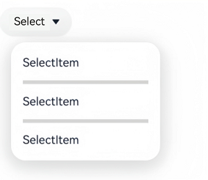
[h2]Example 8: Setting the Divider Mode
This example shows how to set the divider mode by configuring the mode property of DividerStyleOptions, supported since API version 19.
import { LengthMetrics } from '@kit.ArkUI'

@Entry
@Component
struct Index {
  build() {
    RelativeContainer() {
      Select([{ value: "SelectItem" }, { value: "SelectItem" }, { value: "SelectItem" },])
        .value("Select")
        .dividerStyle({
          strokeWidth: LengthMetrics.vp(5),
          color: '#d5d5d5',
          mode: DividerMode.EMBEDDED_IN_MENU
        })
    }
    .height('100%')
    .width('100%')
  }
} 
[h2]Example 9: Setting the Outline Style of the Drop-Down Menu
This example shows how to set the outline style of the drop-down menu using the width and color properties of menuOutline, supported since API version 20.
// xxx.ets
@Entry
@Component
struct SelectExample {
  @State text: string = "TTTTT";
  @State index: number = -1;
  @State arrowPosition: ArrowPosition = ArrowPosition.END;

  build() {
    Column() {
      Select([{ value: 'aaa' },
        { value: 'bbb' },
        { value: 'ccc' },
        { value: 'ddd' }])
        .selected(this.index)
        .value(this.text)
        .font({ size: 16, weight: 500 })
        .fontColor('#182431')
        .selectedOptionFont({ size: 16, weight: 400 })
        .optionFont({ size: 16, weight: 400 })
        .arrowPosition(this.arrowPosition)
        .menuAlign(MenuAlignType.START, { dx: 0, dy: 0 })
        .optionWidth(200)
        .optionHeight(300)
        .menuOutline({
          width: '5vp',
          color: Color.Blue
        })
        .onSelect((index: number, text?: string | undefined) => {
          console.info('Select:' + index);
          this.index = index;
          if (text) {
            this.text = text;
          }
        })
    }
    .width('100%')
    .height('100%')
    .backgroundColor('#F0F2F5')
  }
} 
[h2]Example 11: Setting System Material for the Select Component and Drop-down Menu
This example uses the menuSystemMaterial API to apply the system material effect to the drop-down menu, and the SystemUiMaterial API to apply the system material effect to the Select component.
Since API version 26.0.0, the menuSystemMaterial API is added.
import { uiMaterial } from '@kit.ArkUI';

@Entry
@Component
struct Index {
  build() {
    Column() {
      Select([{ value: 'SelectOption' },
        { value: 'SelectOption' },
        { value: 'SelectOption' },
        { value: 'SelectOption' },
        { value: 'SelectOption' }])
        .value('Click Show Options')
        .systemMaterial(new uiMaterial.ImmersiveMaterial({
            style: uiMaterial.ImmersiveStyle.ULTRA_THIN
          }))
        .menuSystemMaterial(new uiMaterial.ImmersiveMaterial({
            style: uiMaterial.ImmersiveStyle.THICK
          }))
    }
    // Replace $r('app.media.img') with the image resource file you use.
    .backgroundImage($r('app.media.img'))
  }
}
Menu without system material

Menu with system material
