Overview
Animation is an indispensable part in app development. It makes apps more vivid and easy to interact. On one hand, animation can improve user experience and enhance visual attractiveness. On the other hand, animation can guide user operations and improve data transmission efficiency. In an app, animation can be added for page transition, tap interaction, and gesture control. You can use animation properly from the following two aspects:
- Improving the smoothness of animation perception: Use appropriate animation capabilities to convert the UX design perspective to the development implementation perspective, and convert the animation provided by designers into specific code implementation. This ensures that the app achieves the desired effect of the design in actual use, improves the smoothness of animation perception, and provides a good user experience.
- Improving the smoothness of animation running: Optimize the loading and release of animation resources to avoid memory leakage and resource waste. Properly use or reuse the animation cache to reduce unnecessary repeated drawing and improve animation running efficiency.
When using animation, you need to design and use it properly according to the scenario and user requirements, and care about the performance impact of animation, and take optimization measures in time. Proper use of animation can improve the perceptual and running smoothness of animation, which offers attractive user experience and high performance of apps.
Improving the Smoothness of Animation Perception
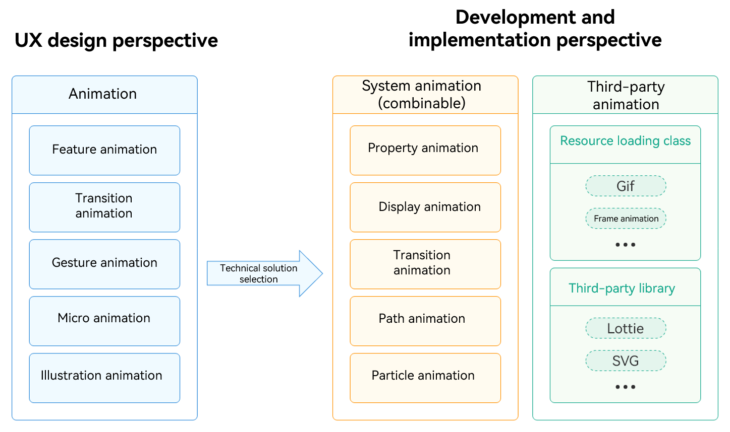
HarmonyOS gravity-inspired motion system complies with the original design concept to create a natural, smooth, and high-quality operation experience. Based on the visual effect design, animations can be classified into feature animation, transition animation, gesture animation, micro animation, and illustration animation. Feature animation presents the visual sense of the celestial movement "force". Transition animation shows the order of the "force" during the movement of an object. Gesture animation creates the sense of control in which element movements affect each other's "force". Micro animation and illustration animation empower HarmonyOS gravity-inspired motion system, making operations more interesting and browsing more enjoyable. Animation should always be centered on the operation in line with the user's expectations, the movement of objects in line with the real world, and the element expression form which highlights the brand and tonality of the product, and improves the smoothness from the perspective of user perception.
HarmonyOS provides rich animation capabilities. In the actual development process, you need to convert the preceding UX design perspective to the development implementation perspective, that is, use the animation capabilities provided by HarmonyOS to implement the UX design scenario and animation. Generally, you need to perform the following steps to convert the view angle:
- Understand system capabilities. Deeply understand the animation capabilities provided by HarmonyOS, including animation types and animation-related APIs.
- Analyze the UX design perspective. Carefully analyze the animation provided by the UX design to understand the designer's intent.
- Design an animation scheme. Design an appropriate animation scheme based on the analysis result. Determine the time of triggering animation, the type and parameters of animation, and the like.
- Use animation capabilities. Use the animation capabilities provided by HarmonyOS, such as property animation and path animation, or call third-party libraries to complete the design.
- Debug and optimize animation. Debug and optimize animation during implementation. Ensure that animation is smooth, meets the expectation, and fulfill the performance requirements.
By performing the preceding steps, you can convert the UX design perspective into the development implementation perspective and convert the animation provided by the designer into specific code implementation. This ensures that the app achieves the desired effect of the design in actual use, improves the smoothness of animation perception, and provides a good user experience.
Figure 1 Proper use of animations
[h2]Designing Animation Scenarios
When designing animation, you need to clearly understand its functions in the system. Animation reflects the smooth transition of pages, clear prompts of objects, element hierarchy, and product image.
Feature Animation
Feature animation is mainly to create "the perception of celestial objects", which provides an interactive experience for the brand effect of celestial objects and the sense of cosmic space. It imparts force to elements and intuitively conveys visual, materialized, and dynamic design concepts. It expresses novel personality in different scenes and highlights the unique product tonality. It can be widely used in scenarios such as opening, loading, and downloading animation.
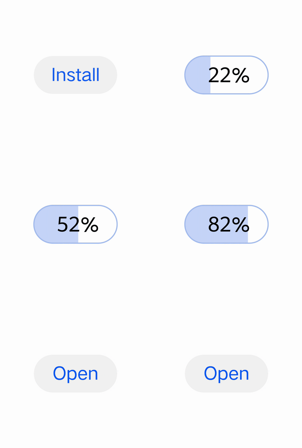
Feature animation refers to the animation effect that highlights a specific element in the UI. It can attract users' attention and improve user experience. For example, in an app, when a user taps the Download button, a progress bar is displayed in a gradient manner and an item is dynamically loaded (as shown in the following figure).
Figure 2 Feature animation triggered by a tap
Transition
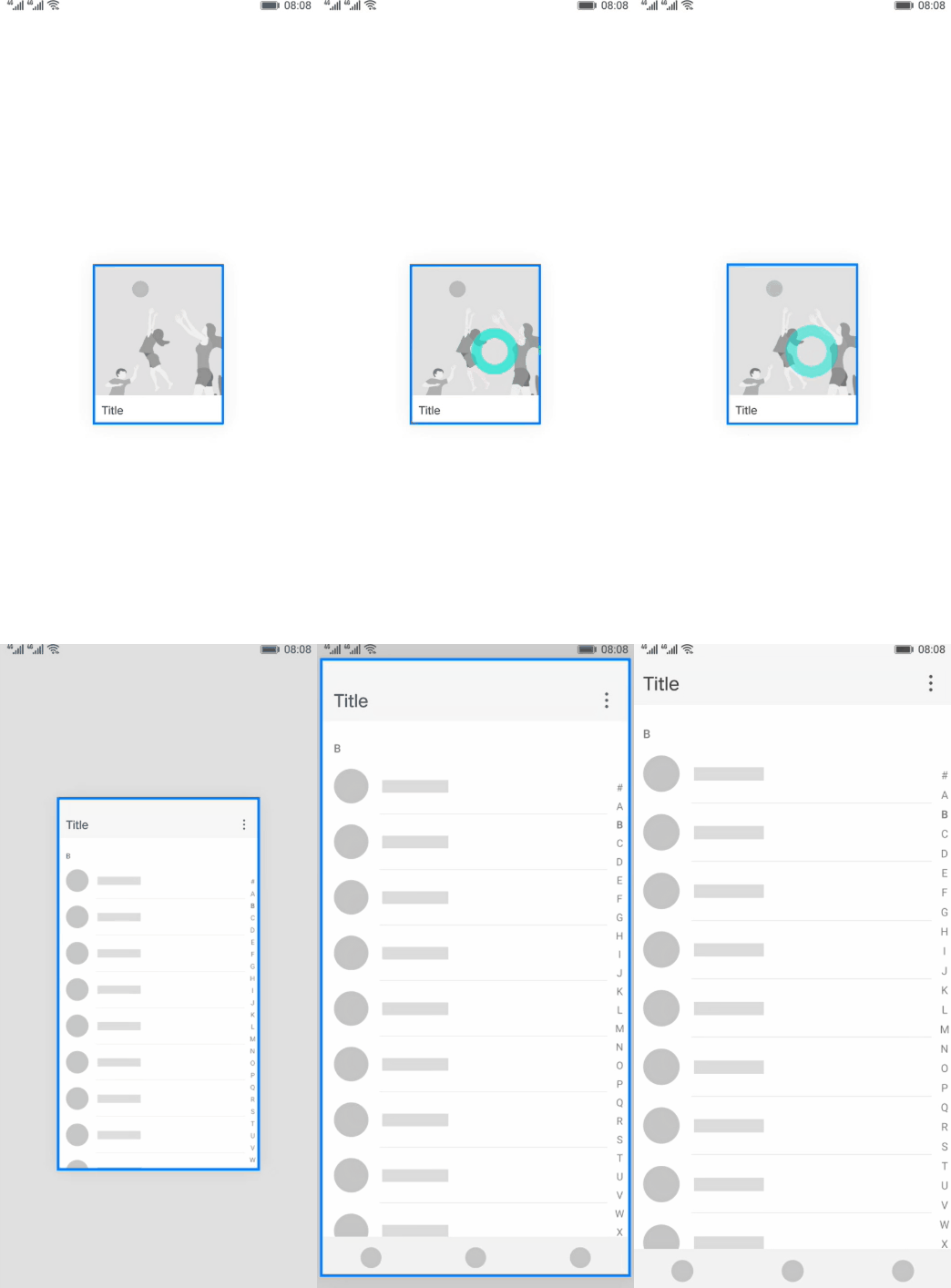
A transition animation is an animation effect used when switching between different pages or views. With transition animation, you can smoothly transition to the next page or view, increasing the continuity and smoothness between pages.
HarmonyOS provides a rich transition animation library for you to easily achieve various transition animation effects. You can apply these transition animation effects in different scenarios of the app based on specific requirements to improve user experience and UI attractiveness. It should be noted that for the best user experience, you should select proper transition animations according to the functions and features of the UI, and follow the guidelines for using the transition animation to ensure the visual and interactive consistency of the transition animation effect.
Figure 3 Transition animation
Gesture Animation
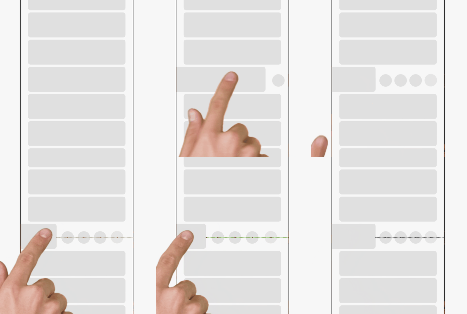
Gesture animations refer to the animation effects generated based on users' gesture operations. It can enhance the interaction experience between the user and the device.
- Tap: During the tap process, there is a period of 100 ms to 300 ms when no feedback is provided. To improve user experience, the animation feedback can be provided immediately when the user taps the screen. This advanced touch response mechanism enhances visual feedback of a UI element, and provides more clue information for understanding a UI state.
- Swipe: A swipe gesture is an animation effect generated when a user performs a swiping operation, for example, a smooth transition animation that moves with a finger, to enhance smoothness of the UI. Ensuring continuity between an object animation feedback result and a gesture action is a key to design of a swiping gesture animation effect.
- Flip: Flip gesture animation is usually used to simulate the effect of turning books or pages. You can flip pages or switch content by dragging or flinging gestures. UI elements generate page-flipping animation to provide more realistic interaction experience. If the page flipping failed, the current content is displayed. If the page flipping succeeds, the content of the next page or several pages is displayed. Sometimes, out-of-page dragging is used for prompting in the page flipping scenario.
- Pinching: Pinching refers to the action of pinching or separating two or more fingers, which is often used to zoom in or out or rotate an object. In a gesture process, an object needs to follow the gesture to make a response trend.
- Drag: A drag gesture refers to the action of moving a finger when you press a finger. An animation designs an entire process in which an object performs state transition through a drag behavior, to ensure continuity and smoothness of a user operation.
Figure 4 Gesture animation
Micro Animation
A micro animation refers to the subtle animation effect on the UI. It is used to improve the vividness and interactivity of the UI. A micro animation may be reflected in a tap effect of a button, an icon change, a text display, and the like. For example, when a user opens a panel, the panel may be represented by using a tiny zoom or color change, as shown in the figure.
Figure 5 Micro animation

Illustration Animation
An illustration animation refers to the illustration-based animation effect applied on the UI. It can be used to add fun and personalization to the UI. For example, in a game app, illustration animation can be used to display an action or an expression of a character, or a scene change, as shown in the figure.
Illustration animations can enrich the information to be expressed by visual elements, guide the interpretation of functional information, and connect neighboring screens to make them appear seamless. This enables users to understand the information and makes the picture performance more vibrant.
Figure 6 Illustration animation

[h2]Selecting Animation Capabilities
After receiving design requirements, you need to select appropriate animation capabilities to complete the design. HarmonyOS provides three methods: system capabilities, resource invoking, and third-party libraries. When selecting animation capabilities, you need to specify objectives and requirements, properly select tools that can meet requirements; and pursue high efficiency and high quality, to empower apps for better animation effects.
System Capabilities
- Property animation: The property value of a component is changed to implement a transition effect, such as scaling, rotation, and translation. Supported attributes include width, height, backgroundColor, opacity, scale, rotate, and translate.
- Explicit animation: It can be triggered by user operations or specific logic of the app, such as the scale animation triggered by a button click or the fade animation triggered when a list item is expanded. HarmonyOS provides the global animateTo explicit animation API to specify the transition animation upon insertion for state changes caused by the closure code.
- Transition animation: Transition animations can implement smooth UI transition effects, such as fade-in and fade-out, sliding, and rotating between pages, enhancing the coherence and attractiveness of the UI. For details, see Page Transition Animation (Not Recommended).
- Motion path animation: An animation effect in which an object moves along a specified path. A path may be set to move a view along a predefined path, for example, a curved motion or a circular motion, to present a more vivid interaction effect to a user.
- Particle animation: An animation effect formed by the motion of a large number of small particles. It creates a sense of atmosphere by animating the changes of particles in the aspects such as color, opacity, size, speed, acceleration, and spin angle.
- Keyframe animation: The UIContext provides the keyframeAnimateTo API to specify several key frame states and implement segmented animation.
Resource Invoking
- GIF animation: GIF animation can be played cyclically at a specific position to create a vivid visual effect on the app UI. During development, you can use the Image component to play GIF animations. By placing the Image component in a specific position and loading images in GIF format, you can easily implement the animation effect.
- Frame animation: A series of images are played frame by frame to implement the animation effect. In development, you can use the ImageAnimator component to play frame animations. You can configure the list of images to be played and the playback duration of each image to achieve refined animation effects.
Third-Party Libraries
- Lottie: parses JSON animation exported by the Adobe After Effects software using the Bodymovin plug-in and renders the animation locally on mobile devices. Lottie animation can be presented in various screen sizes and resolutions, and support animation interaction. By adding touch events or other user interaction operations, the animation is more vivid and responsive.
- SVG: parses and renders SVG images on a page, and dynamically changes the SVG image style to achieve animation. OHOS-SVG can provide high-quality graphics display, and implement real-time update of graphics styles, which brings richer visual experience to users.
[h2]Animation Practice Cases
Using an Explicit Animation to Achieve the Feature Animation
Scenario
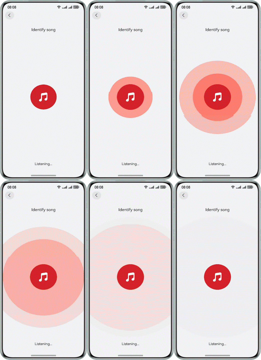
This case demonstrates a ripple effect, where multiple concentric rings sequentially appear on the round button, radiating outward from the center to emphasize the function. The implementation result is shown in the following figure.
Figure 7 Using explicit animations to implement water ripple effects
How to Implement
The ripple effect centers around the circular button, with multiple circular layers gradually expanding outward. The staggered initiation timing of animations across layers creates a sequential ripple effect. The implementation steps are as follows:
- Create circular layers as the base shapes for the ripple rings and configure their background properties.
- Use animateTo to apply the scaling animation for the circular layers and set a delay time for each layer.
How to Develop
Create circular layers and use Stack to overlay the circular layers on top of the Button component.
@Component
struct ButtonWithWaterRipples {
  @Link isListening: boolean;
  @State immediatelyOpacity: number = 0.5;
  @State immediatelyScale: Scale = { x: 1, y: 1 };
  @State delayOpacity: number = 0.5;
  @State delayScale: Scale = { x: 1, y: 1 };
  private readonly BUTTON_SIZE: number = 120;
  private readonly BUTTON_CLICK_SCALE: number = 0.8;
  private readonly ANIMATION_DURATION: number = 1300;

  @Styles
  ripplesStyle() {
    .width(this.BUTTON_SIZE * this.BUTTON_CLICK_SCALE)
    .height(this.BUTTON_SIZE * this.BUTTON_CLICK_SCALE)
    .borderRadius(this.BUTTON_SIZE * this.BUTTON_CLICK_SCALE / 2)
    .backgroundColor(Color.Red)
  }

  build() {
    Stack() {
      Stack()
        .ripplesStyle()
        .opacity(this.immediatelyOpacity)
        .scale(this.immediatelyScale)
      Stack()
        .ripplesStyle()
        .opacity(this.delayOpacity)
        .scale(this.delayScale)
      Button() {
        Image($r('app.media.ic_public_music_filled'))
          .width($r('app.float.water_ripples_width'))
          .fillColor(Color.White)
      }
      .clickEffect({ level: ClickEffectLevel.HEAVY, scale: this.BUTTON_CLICK_SCALE })
      .backgroundColor($r('app.color.music_icon'))
      .type(ButtonType.Circle)
      .width(this.BUTTON_SIZE)
      .height(this.BUTTON_SIZE)
      .zIndex(1)
      // ...
    }
  }
}
Apply the scaling animation to the circular layers and set a delay time for each.
Button() {
  Image($r('app.media.ic_public_music_filled'))
    .width($r('app.float.water_ripples_width'))
    .fillColor(Color.White)
}
.clickEffect({ level: ClickEffectLevel.HEAVY, scale: this.BUTTON_CLICK_SCALE })
.backgroundColor($r('app.color.music_icon'))
.type(ButtonType.Circle)
.width(this.BUTTON_SIZE)
.height(this.BUTTON_SIZE)
.zIndex(1)
.onClick(() => {
  this.isListening = !this.isListening;
  if (this.isListening) {
    this.getUIContext().animateTo({
      duration: this.ANIMATION_DURATION,
      iterations: CommonConstants.ITERATIONS,
      curve: Curve.EaseInOut
    }, () => {
      this.immediatelyOpacity = CommonConstants.COMMON_NUMBER_0;
      this.immediatelyScale = {
        x: CommonConstants.COMMON_NUMBER_6,
        y: CommonConstants.COMMON_NUMBER_6
      };
    })
    this.getUIContext().animateTo({
      duration: this.ANIMATION_DURATION,
      iterations: CommonConstants.ITERATIONS,
      curve: Curve.EaseInOut,
      delay: CommonConstants.DELAY_200
    }, () => {
      this.delayOpacity = CommonConstants.COMMON_NUMBER_0;
      this.delayScale = {
        x: CommonConstants.COMMON_NUMBER_6,
        y: CommonConstants.COMMON_NUMBER_6
      };
    })
  } else {
    this.getUIContext().animateTo({ duration: CommonConstants.COMMON_NUMBER_0 }, () => {
      this.immediatelyOpacity = CommonConstants.COMMON_NUMBER;
      this.delayOpacity = CommonConstants.COMMON_NUMBER;
      this.immediatelyScale = {
        x: CommonConstants.COMMON_NUMBER_1,
        y: CommonConstants.COMMON_NUMBER_1
      };
      this.delayScale = {
        x: CommonConstants.COMMON_NUMBER_1,
        y: CommonConstants.COMMON_NUMBER_1
      };
    })
  }
})
Using a Keyframe Animation to Implement the Micro Animation
Scenario
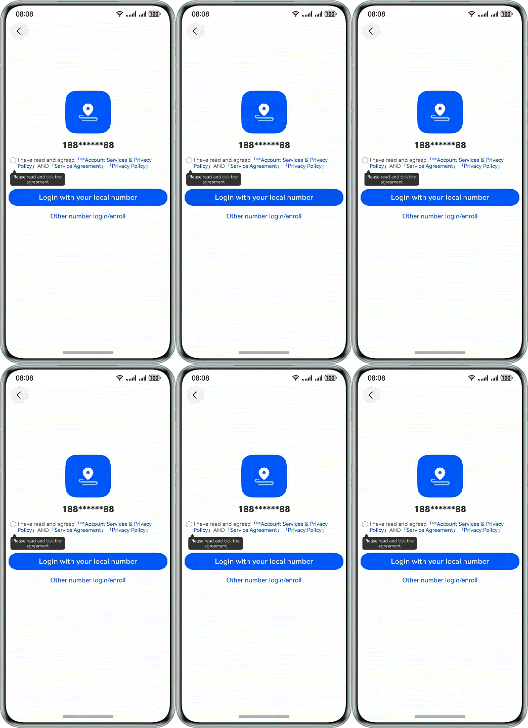
As shown in the figure, users are required to check the relevant agreements before accessing the login page. If the agreements are not checked, a prompt box will move horizontally (left and right) to draw attention to the requirement.
Figure 8 Moving left and right to give a prompt using keyframe animation
How to Implement
The process involves shifting the prompt box to the left and then to the right, repeating this cycle multiple times. The animation can be divided into two parts: the prompt box moving left and the prompt box moving right. You can use the keyframeAnimateTo API to implement segmented animation effects. The implementation steps are as follows:
- According to the desired animation effect, break down the animation into several keyframes. In this case, the animation is divided into two parts: the prompt box moving left and the prompt box moving right.
- Based on different keyframes, set the keyframe state, including the duration, animation curve, and closure function of the keyframe animation.
- Set the animation trigger conditions by using common events (such as tap or appear), and select the trigger method that meets your requirements.
How to Develop
Set the keyframe animation using keyframeAnimateTo.
startAnimation() {
  if (!this.uiContext) {
    return;
  }
  this.translateX = CONFIGURATION.POSITION_ZERO;
  this.uiContext.keyframeAnimateTo({ iterations: CONFIGURATION.PLAYBACK_COUNT }, [
    {
      duration: CONFIGURATION.ANIMATION_TIME,
      event: () => {
        this.translateX = CONFIGURATION.TRANSLATE_OFFSET_X;
      }
    },
    {
      duration: CONFIGURATION.ANIMATION_TIME,
      event: () => {
        this.translateX = CONFIGURATION.POSITION_ZERO;
      }
    }
  ]);
}
Set the onClick event to call the keyframe animation.
Button($r('app.string.login_in'))
  .type(ButtonType.Normal)
  .borderRadius($r('app.integer.comm_border_radius'))
  .fontColor($r('app.color.ohos_id_color_background'))
  .fontSize($r('app.integer.login_button_font_size'))
  .width(Constants.LAYOUT_MAX_PERCENT)
  .onClick(() => {
    if (!this.confirm) {
      this.startVibrate();
      this.startAnimation();
    } else {
      try {
        this.getUIContext().getPromptAction().showToast({
          message: $r('app.string.login_text')
        });
      } catch (err) {
        let error = err as BusinessError;
        hilog.error(0x0000, 'PageVibrateEffect', `error code=${error.code}, message=${error.message}`);
      }
    }
  })
Using a Property Animation to Achieve the Gesture Animation
Scenario
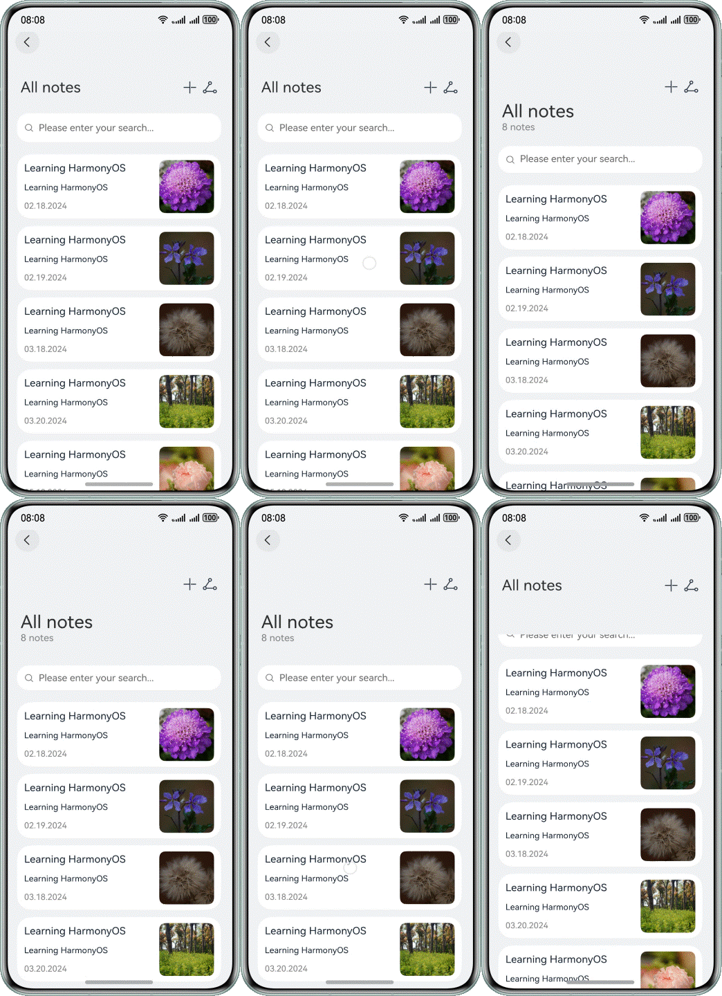
In this scenario, the user interface comprises a title section and a list beneath it. As the user engages in a downward swipe gesture on the list, the title undergoes an expansion to reveal more detailed information. The implementation effect is as follows:
Figure 9 Using a property animation to implement a gesture animation
How to Implement
The implementation primarily involves the swipe-down gesture animation for pulling down the list and the subsequent animation of the title and list after the pull-down action. The implementation steps are as follows:
- Process the gesture event. The onTouch event is used to record the current touch point and to determine whether the gesture is swiping up or down.
- When the list is scrolled up or down, change the height of the list and use the property animation for smooth transition, implementing the title scaling effect.
- Translate the content of the title while the title area is being scaled, achieving an overall scaling effect for the title section.
How to Develop
Implement the gesture event method. When a press gesture is detected, trigger the TouchType.Down event to record the current touch position. During finger movement on the screen in the pressed state, the current position of the finger is compared with the initial touch position to determine whether the gesture is a swipe-up or swipe-down. This comparison helps in dynamically adjusting the height of the list.
handleTouchEvent(event: TouchEvent): void {
  switch (event.type) {
    case TouchType.Down:
      this.downY = event.touches[0].y;
      this.lastMoveY = event.touches[0].y;
      this.isMoving = true;
      this.duration = Constants.ANIMATE_DURATION_DRAG;
      break;

    case TouchType.Move:
      const delta = event.touches[0].y - this.lastMoveY;
      this.offsetY = event.touches[0].y - this.downY;
      if (delta < 0) {
        this.heightValue = Constants.AREA_HEIGHT_BEFORE;
        this.isExpanded = false;
        this.atStart = false;
      }
      if (delta > 0 && this.atStart) {
        this.animateToThrottle(() => {
          this.heightValue = Constants.AREA_HEIGHT_AFTER;
          this.isExpanded = true;
        }, 1000);
      }
      this.lastMoveY = event.touches[0].y;
      break;

    case TouchType.Cancel:
      this.isMoving = false;
      this.duration = Constants.ANIMATE_DURATION_BACK;
      break;
    default:
      break;
  }
}
Set the onTouch event and property animation for the list to implement the scaling effect of the title area.
Column() {
  List({ space: Constants.SEARCH_MEMO_SPACE }) {
    ListItem() {
      Search({ placeholder: $r('app.string.search_placeholder') })
        .width(Constants.LAYOUT_MAX_PERCENT)
        .height(Constants.LAYOUT_EIGHT_PERCENT)
        .backgroundColor(Color.White)
        .enableKeyboardOnFocus(false)
    }

    LazyForEach(this.memoData, (item: MemoInfo) => {
      ListItem() {
        MemoItem({ memoItem: item })
      }
    }, (item: MemoInfo) => JSON.stringify(item))
  }
  .scrollBar(BarState.Off)
  .margin({ left: $r('app.float.layout_10'), right: $r('app.float.layout_10') })
  .width(Constants.LAYOUT_NINETY_PERCENT)
  .expandSafeArea([SafeAreaType.SYSTEM], [SafeAreaEdge.TOP, SafeAreaEdge.BOTTOM])
  .onReachStart(() => {
    this.atStart = true;
  })
}
.width(Constants.LAYOUT_MAX_PERCENT)
.height(this.heightValue)
.animation({ duration: this.duration, curve: Curve.FastOutLinearIn })
.onTouch((event: TouchEvent) => this.handleTouchEvent(event))
Use the animation property animation to translate the title content to implement the overall scaling effect of the title area.
Column() {
  Row() {
    Text(!this.isExpanded ? $r('app.string.memo_title') : '')
      .fontSize($r('app.float.init_title_font_size'))
    Blank()
  }
  .width(Constants.LAYOUT_MAX_PERCENT)
  .padding($r('app.float.layout_25'))
  .margin({ top: $r('app.float.layout_10') })
  .alignItems(VerticalAlign.Center)
  .translate(this.getMenuTranslateOptions())
  .animation({ duration: this.duration, curve: Curve.FastOutLinearIn })

  Column() {
    Text($r('app.string.memo_title'))
      .fontSize($r('app.float.expanded_title_font_size'))
    Text($r('app.string.memo_counts'))
      .fontSize($r('app.float.memo_counts_font_size'))
      .fontColor(Color.Grey)
  }
  .width(Constants.LAYOUT_MAX_PERCENT)
  .padding({ left: $r('app.float.layout_25') })
  .margin({ top: $r('app.float.layout_10') })
  .alignItems(HorizontalAlign.Start)
  .translate(this.getTitleTranslateOptions())
  .scale(this.getTitleScaleOptions())
  .animation({ duration: this.duration, curve: Curve.FastOutLinearIn })
  .transition({ type: TransitionType.Insert, translate: { y: Constants.TRANSLATE_Y } })
  .visibility(this.isExpanded ? Visibility.Visible : Visibility.Hidden)
}
.height(Constants.LAYOUT_MAX_PERCENT)
.width(Constants.LAYOUT_MAX_PERCENT)
[h2]Summary
During app development, animation can add vivid and smooth interaction effects to the UI, improving user experience in apps. However, abuse of animation will deteriorate app performance, consume excessive system resources, and even compromise user experience.
This topic describes how to fully utilize the animation capabilities provided by HarmonyOS in specific design scenarios to ensure that animation can enhance user experience without deteriorating app performance. When implementing animation effects, you need to control the complexity and frequency of animation to save system resources and improve app performance. To improve the smoothness of animation perception, consider the following points:
- User experience: Animation should improve user experience rather than be only for itself. It should make the UI more vivid, intuitive, and easy to understand rather than be fancy or cumbersome.
- Performance optimization: The smoothness of animation is critical to user experience. When designing animation, consider the device performance and resource consumption to avoid performance deterioration or frame freezing caused by excessive animation effects.
- Accessibility: When designing animation, consider that some users may suffer from visual or cognitive impairments. The animation effect should not affect the user's understanding and operations on the app UI.
- Contextual adaptation: The animation effect should be designed in line with the specific scenario and function of the app, and should be consistent with the overall style and design language of the app.
Proper use of animation capabilities provided by HarmonyOS can effectively improve user experience and attractiveness of apps. During design and implementation, however, you need to consider the scenario, frequency, and impact of animation on system resources, and take advantage of strengths and avoid weaknesses, to ensure the performance and stability of apps.
Improving the Smoothness of Animation Running
Animation is crucial to app development. It can improve user experience, convey information, guide user operations, improve app quality, and increase visual attractiveness. The performance of animation is also critical. It can be optimized from several aspects such as property update and layout to minimize redundant refresh. This topic describes the following five methods for optimization. You can use one or more of these methods to optimize the animation frame rate and app frame freezing, improving performance and user experience.
- Using system-provided animation APIs: Built-in animation APIs are carefully designed and optimized to deliver smooth animations across devices with minimal frame drops and no perceptible stutter.
- Changing the component layout by using the graphic transformation property: By adjusting the graphic transformation property of components instead of directly modifying the layout property of components, you can reduce unnecessary layout calculation and redrawing operations, thereby reducing the frame loss rate and improving the smoothness and response speed of the animation.
- Using the same animateTo call when the parameters are the same: When the parameters of multiple animations are the same, combine them and use the same animateTo method for processing to effectively reduce unnecessary calculation and rendering overheads.
- Uniformly updating state variables for multiple animateTo calls: When performing multiple animation operations, uniformly update state variables to avoid unnecessary state update and repeated rendering, which reduces performance overheads.
- Using renderGroup: You can use the renderGroup method to solve the frame freezing problem when there are a large number of components applying animations on a single page, which improves the drawing performance.
The following describes how to verify the benefits of the preceding optimization methods through five tests to prove the feasibility of these methods. Based on the common metrics in the industry and actual user experience, the following key metric items are compared and analyzed in the tests:
- Janky Frames: indicates the rate of lost frames in a period, that is, the proportion of faulty frames in a period. The HarmonyOS system requires that each frame be drawn within 11.1 ms (at the refresh rate of 90 Hz). If a frame is not drawn within 11.1 ms, frame loss occurs. Generally, users are unaware of the loss of partial frames. They are aware of such a situation only when consecutive frame loss occurs.
- Maximum number of consecutive lost frames (or maximum successive frame dropping count): indicates the maximum number of consecutive frames that fail to be displayed because the refresh frequency of the display is lower than the preset frame rate during the process from the time when the page starts to respond to changes to the time when the page ends to be refreshed. Generally, if the number exceeds 3, the user can obviously perceive frame freezing and frame loss. A larger value indicates a longer frame freezing time.
- Average number of serious frame freezing exceptions per second: indicates the number of exceptions that more than three consecutive frames are lost within 1s during app running. A larger value embodies poorer user experience.
Test results demonstrate that when system-provided APIs can deliver the required animation effects, they significantly outperform custom animation implementations. Custom animations, which involve substantial computations on the app side, often result in significant frame drops. In contrast, system-provided APIs, which do not rely on app-side computations, offer smoother performance. For animations involving layout changes (such as translation, scaling, and rotation), using transform properties instead of layout properties can reduce the frame drop rate from 8.1% to 3.7%, significantly decreasing the number of severe frame freezes. Additionally, consolidating multiple animation closures with identical parameters into a single closure can lower the frame drop rate from 9.6% to 4.0%. Similarly, avoiding state updates between concurrent animation closures can further reduce animation-related frame loss.
[h2]Using System-Provided Animation APIs
Generally, in HarmonyOS app development, animation can be designed by using custom animation or system-provided animation APIs.
Method 1: Using custom animation
Custom animation refers to the process of writing custom animation logic and computing processes to achieve specific animation effects. You can use custom animation algorithms and logic to create unique animation effects in line with app and design requirements. Custom animation boasts the advantage that it can achieve unique animation effects and fully control each detail of the animation. However, you must be familiar with animation algorithms and computing capabilities.
Method 2: Using system-provided animation APIs
An animation API provided by the system is to use the animation framework and API provided by the system to achieve animation effects. In mobile app development, property animation is usually used to achieve various animation effects. It refers to the continuous visual effect generated on the UI due to a change of the animation property. Property animation is the most basic and easy-to-understand animation. ArkUI provides two property animation APIs, animateTo and animation, to drive the continuous change of component attributes based on animation parameters such as the animation curve. In this way, a property animation is generated. With system-provided animation APIs, you can simplify the animation process and fully use the optimal animation computing and rendering capabilities of the system, to improve the performance and smoothness of animation.
Scenario Design
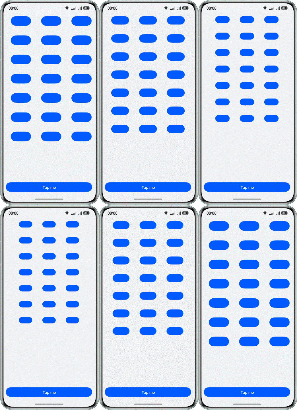
To simultaneously zoom in or out multiple buttons on the same page (as shown in the following figure), use custom animation, property animation, and explicit animation, respectively.
Figure 10 Scaling multiple buttons on the same screen at the same time
Custom Animation
When playing an animation, the system needs to complete operations, such as calculating an animation curve and drawing the component layout, within a refresh period. The following uses a custom animation. The process of calculating an animation curve may cause high load of UI threads, which is prone to frame loss.
Use custom animation to implement key scaling. The code is as follows:
@Component
export struct CustomAnimation {
  @State widthSize: number = 80
  @State heightSize: number = 40
  @State flag: boolean = true

  computeSize() {
    let duration = 2000
    let period = 1
    let widthSizeEnd = 0
    let heightSizeEnd = 0
    if (this.flag) {
      widthSizeEnd = 50
      heightSizeEnd = 25
    } else {
      widthSizeEnd = 80
      heightSizeEnd = 40
    }
    let doTimes = duration / period
    let deltaHeight = (heightSizeEnd - this.heightSize) / doTimes
    let deltaWeight = (widthSizeEnd - this.widthSize) / doTimes
    for (let i = 1; i <= doTimes; i++) {
      let t = period * (i);
      setTimeout(() => {
        this.heightSize = this.heightSize + deltaHeight
        this.widthSize = this.widthSize + deltaWeight
      }, t)
    }
    this.flag = !this.flag
  }

  build() {
    Column() {
      Column() {
        Row() {
          Button()
            .width(this.widthSize)
            .height(this.heightSize)
            .margin(20)
          Button()
            .width(this.widthSize)
            .height(this.heightSize)
            .margin(20)
          Button()
            .width(this.widthSize)
            .height(this.heightSize)
            .margin(20)
        }
        // ...
      }
      .height('85%')

      Column() {
        Button('Tap me')
          .width('100%')
          .onClick(() => {
            setTimeout(() => {
              this.computeSize()
            }, 500)
          })
      }
      .justifyContent(FlexAlign.End)
      .width('100%')
      .height('15%')
    }
    .padding({
      left: 16,
      right: 16,
      bottom: 16
    })
    .width('100%')
    .height('100%')
    .justifyContent(FlexAlign.Start)
  }
}
System-Provided Animation APIs
With system-provided animation APIs, you can set only items such as curve type, end position, and duration to achieve common animation functions and reduce the load of the UI main thread.
Use property animation to implement key scaling. The code is as follows:
@Component
export struct PropertyAnimateTo {
  @State widthSize: number = 80;
  @State heightSize: number = 40;
  @State flag: boolean = true;

  build() {
    Column() {
      Column() {
        Row() {
          Button()
            .width(this.widthSize)
            .height(this.heightSize)
            .animation({
              duration: 2000,
              curve: Curve.Linear,
              delay: 500,
              iterations: 1,
              playMode: PlayMode.Normal
            })
            .margin(20)
          // ...
        }

        // ...
      }
      .height('85%')

      Column() {
        Button('Tap me')
          .width('100%')
          .onClick((event?: ClickEvent | undefined) => {
            if (this.flag) {
              this.widthSize = 50
              this.heightSize = 25
            } else {
              this.widthSize = 80
              this.heightSize = 40
            }
            this.flag = !this.flag
          })
      }
      .height('15%')
    }
    .padding({
      left: 16,
      right: 16,
      bottom: 16
    })
    .width('100%')
    .height('100%')
    .justifyContent(FlexAlign.Start)
  }
}
Use explicit animation to implement key scaling. The code is as follows:
@Component
export struct ExplicitAnimateTo {
  @State widthSize: number = 80;
  @State heightSize: number = 40;
  @State flag: boolean = true;

  build() {
    Column() {
      Column() {
        Row() {
          Button()
            .width(this.widthSize)
            .height(this.heightSize)
            .margin(20)
          // ...
        }

        // ...
      }
      .height('85%')

      Column() {
        Button('Tap me')
          .width('100%')
          .onClick((event?: ClickEvent | undefined) => {
            if (this.flag) {
              this.getUIContext().animateTo({
                duration: 2000,
                curve: Curve.Linear,
                delay: 500,
                iterations: 1,
                playMode: PlayMode.Normal
              }, () => {
                this.widthSize = 50;
                this.heightSize = 25;
              })
            } else {
              this.getUIContext().animateTo({
                duration: 2000,
                curve: Curve.Linear,
                delay: 500,
                iterations: 1,
                playMode: PlayMode.Normal
              }, () => {
                this.widthSize = 80;
                this.heightSize = 40;
              })
            }
            this.flag = !this.flag;
          })
      }
      .height('15%')
    }
    .padding({
      left: 16,
      right: 16,
      bottom: 16
    })
    .width('100%')
    .height('100%')
    .justifyContent(FlexAlign.Start)
  }
}
Performance Analysis
The Profiler tool of DevEco Studio is used to check the following metrics. The obtained data is as follows.
Table 1 Comparison of indicators for implementing the same scenario using custom animation, property animation, and explicit animation
| Indicator | Custom Animation | Property Animation | Explicit Animation |
|---|---|---|---|
| Frame loss rate (%) | 9.2% | 0% | 0% |
| Maximum number of consecutive lost frames | 7 | 0 | 0 |
| Average number of stuttering times per second | 1.50 | 0 | 0 |
Conclusion:
When custom animation is used to implement an animation with a large amount of calculation, the frame loss rate reaches 9.2%, the maximum number of consecutive lost frames reaches 7, and the average number of stuttering times per second reaches 1.5.
When the system animation APIs are used to implement the same effect, both the property animation API and explicit animation API can achieve zero frame loss.
The result shows that the internal implementation of system-provided animation APIs is transparent and the performance has been maximized to avoid performance deterioration when you use custom animations. Custom animation is suitable for achieving unique and complex animation effects. System-provided animation APIs are suitable for achieving common animation effects and better performance. Therefore, if animation can be achieved using system-provided APIs, you should use these APIs if possible to ensure smoothness and stability of the animation, thereby enhancing the app's performance.
[h2]Using Graphic Transformation Properties to Adjust Component Layout
During app development, the layout display of components can be changed in two methods: changing layout properties; and changing graphic transformation properties.
Method 1: Changing layout properties
Common layout properties include the position, size, inner margin, outer margin, alignment mode, and weight. When these properties change, the UI is re-laid to adapt to the new property values.
Method 2: Changing graphic transformation properties
Graphic transformation properties refer to operations on transforming a component layout result, for example, translating, rotating, or scaling a component. By changing these properties, you can dynamically change the position and form of a component on the UI after the component layout is complete.
The following table lists the relationship for replacement between layout properties and graphic transformation properties.
Table 2
| Graphic Transformation Property | Layout |
|---|---|
| rotate | / |
| translate | position, offset |
| scale | width, height, Size |
| transform | / |

The mapping in the table is for reference only. You can explore more replacement relationships.
Scenario Design
If multiple images on the same page are to be zoomed and displaced simultaneously (as shown in the following figure), you can change the layout property and graphic transformation property.
Figure 11 Scaling and moving multiple images on the same screen at the same time
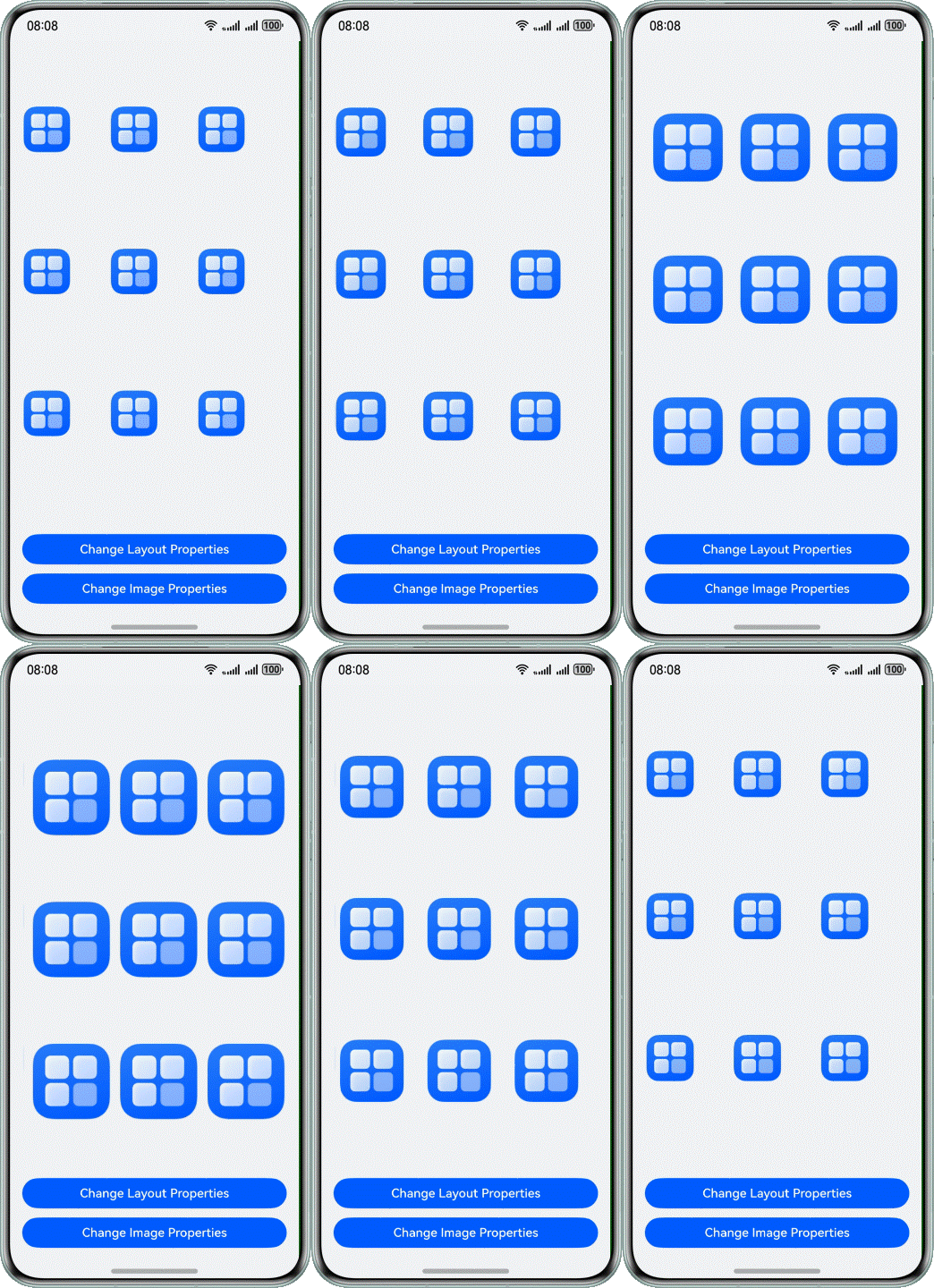
Changing Layout Properties
When a layout property changes, the system needs to recalculate the position and size of a component and then re-lay out the component. This process consumes a large amount of computing resources and time. Especially when the UI involves a large number of components or complex layout, the performance overhead is more serious.
The width, height, and position properties of a component are used to change the size and position of the component. The code is as follows:
@Component
export struct ImageAnimation {
  @State imageWidth: number = 60;
  @State imageHeight: number = 60;
  @State xPosition: number = 0;
  @State yPosition: number = 0;
  @State imageScaleX: number = 1;
  @State imageScaleY: number = 1;
  @State imageTranslateX: number = 0;
  @State imageTranslateY: number = 0;

  build() {
    Column() {
      Row() {
        Row() {
          Image($r('app.media.startIcon'))
            .width(this.imageWidth)
            .height(this.imageHeight)
            .position({ x: this.xPosition, y: this.yPosition })
            .scale({
              x: this.imageScaleX,
              y: this.imageScaleY,
              centerX: 0,
              centerY: 0
            })
            .translate({ x: this.imageTranslateX, y: this.imageTranslateY })
        }.width('33%')
        // ...
      }
      .height('25%')
      // ...
      Column() {
        Button('Change Layout Properties')
          .width('100%')
          .onClick(() => {
            for (let i = 0; i < 10; i++) {
              if (i % 2 == 0) {
                setTimeout(() => {
                  this.getUIContext().animateTo({ duration: 1000 }, () => {
                    this.imageWidth = 100;
                    this.imageHeight = 100;
                    this.xPosition = 12;
                    this.yPosition = 12;
                  })
                }, 1000 * i)
              } else {
                setTimeout(() => {
                  this.getUIContext().animateTo({ duration: 1000 }, () => {
                    this.imageWidth = 60;
                    this.imageHeight = 60;
                    this.xPosition = 0;
                    this.yPosition = 0;
                  })
                }, 1000 * i)
              }
            }
          })
        Button('Change Image Properties')
          .width('100%')
          .margin({ top: 12 })
          .onClick(() => {
            for (let i = 0; i < 10; i++) {
              if (i % 2 == 0) {
                setTimeout(() => {
                  this.getUIContext().animateTo({ duration: 1000 }, () => {
                    this.imageScaleX = 2;
                    this.imageScaleY = 2;
                    this.imageTranslateX = 12;
                    this.imageTranslateY = 12;
                  })
                }, 1000 * i)
              } else {
                setTimeout(() => {
                  this.getUIContext().animateTo({ duration: 1000 }, () => {
                    this.imageScaleX = 1;
                    this.imageScaleY = 1;
                    this.imageTranslateX = 0;
                    this.imageTranslateY = 0;
                  })
                }, 1000 * i)
              }
            }
          })
      }
      .justifyContent(FlexAlign.End)
      .height('25%')
    }
    .padding({
      left: 16,
      right: 16,
      bottom: 16
    })
    .width('100%')
    .height('100%')
    .justifyContent(FlexAlign.Start)
  }
}
Changing Graphic Transformation Properties
Graphic transformation only changes the display effect of a component, but does not change the position and size of the component in the layout. Therefore, it does not trigger the re-layout calculation process. In this way, smoothness and performance of the UI can be improved when the animation effect is implemented by using the graphic transformation property.
The scale and translate properties of a component are used to change the size and position of the component. The code is as follows:
@Component
export struct ImageAnimation {
  @State imageWidth: number = 60;
  @State imageHeight: number = 60;
  @State xPosition: number = 0;
  @State yPosition: number = 0;
  @State imageScaleX: number = 1;
  @State imageScaleY: number = 1;
  @State imageTranslateX: number = 0;
  @State imageTranslateY: number = 0;

  build() {
    Column() {
      Row() {
        Row() {
          Image($r('app.media.startIcon'))
            .width(this.imageWidth)
            .height(this.imageHeight)
            .position({ x: this.xPosition, y: this.yPosition })
            .scale({
              x: this.imageScaleX,
              y: this.imageScaleY,
              centerX: 0,
              centerY: 0
            })
            .translate({ x: this.imageTranslateX, y: this.imageTranslateY })
        }.width('33%')
        // ...
      }
      .height('25%')
      // ...
      Column() {
        // ...
        Button('Change Image Properties')
          .width('100%')
          .margin({ top: 12 })
          .onClick(() => {
            for (let i = 0; i < 10; i++) {
              if (i % 2 == 0) {
                setTimeout(() => {
                  this.getUIContext().animateTo({ duration: 1000 }, () => {
                    this.imageScaleX = 2;
                    this.imageScaleY = 2;
                    this.imageTranslateX = 12;
                    this.imageTranslateY = 12;
                  })
                }, 1000 * i)
              } else {
                setTimeout(() => {
                  this.getUIContext().animateTo({ duration: 1000 }, () => {
                    this.imageScaleX = 1;
                    this.imageScaleY = 1;
                    this.imageTranslateX = 0;
                    this.imageTranslateY = 0;
                  })
                }, 1000 * i)
              }
            }
          })
      }
      .justifyContent(FlexAlign.End)
      .height('25%')
    }
    .padding({
      left: 16,
      right: 16,
      bottom: 16
    })
    .width('100%')
    .height('100%')
    .justifyContent(FlexAlign.Start)
  }
}
Performance Analysis
The Profiler tool of DevEco Studio is used to check the following metrics. The obtained data is as follows.
Table 3 Comparison of indicators in the same scenario when the layout attributes and graphic transformation attributes are changed
| Indicator | Changing Layout Properties | Changing the Graphic Transformation Properties |
|---|---|---|
| Frame loss rate (%) | 8.1% | 3.7% |
| Maximum number of consecutive lost frames | 8 | 2 |
| Average number of stuttering times per second | 0.48 | 0 |
Conclusion:
When the layout properties are used to change the image size and position, the frame loss rate is 8.1%, a maximum of eight consecutive frames are lost, and the average number of stuttering times per second is 0.48.
When the graphic transformation properties are used to change the image size and position, the frame loss rate decreases to 3.7%, a maximum of two consecutive frames are lost, and no stuttering occurs within the same period.
The results show that the frame loss rate and the occurrence frequency of large frame freezing can be significantly reduced when the image size and position are changed by using the graphic transformation property. The UI layout is time-consuming. For this reason, frequent modification of layout properties will cause UI performance deterioration and frame freezing, which compromises user experience. Therefore, if animation can be achieved using graphic transformation properties, you should use these properties if possible to ensure smoothness and stability of the animation and improve the performance of apps.
[h2]Using the Same animateTo Method When the Parameters Are the Same

You are advised to use the Code Linter to check code, especially the follow @performance/hp-arkui-combine-same-arg-animateto rules. If issues related to this rule are identified in the scan results, adjust your code by following the optimization suggestions provided in this section.
Each call for the animateTo method will cause a property change. This means that each animation execution requires a comparison before and after the animation to determine the property change. Multiple consecutive calls for animateTo will cause additional layout calculation and drawing overhead, which degrades the performance. Especially when these animateTo operations are performed on a property of a same component, the number of updates to the component increases, which further compromises the performance.
In actual development, if multiple properties need to be changed with the same animation parameters, you are advised to put them in the same animation closure for execution. By combining the animation operations of multiple properties into the same animation closure, you can reduce the number of updates to components, avoid repeated layout calculation and drawing operations, and improve the performance of animation effects.
In addition to the performance benefits, merging animation operations for multiple properties into the same animation closure helps improve code readability and maintainability. Centralized management of associated property changes makes the code structure clearer and facilitates subsequent maintenance and modification.
Scenario Design
If multiple properties of multiple same components are to be modified simultaneously (as shown in the following figure), multiple animateTo closures and one animateTo closure are used, respectively.
Figure 12 Modifying multiple properties of the same component at the same time
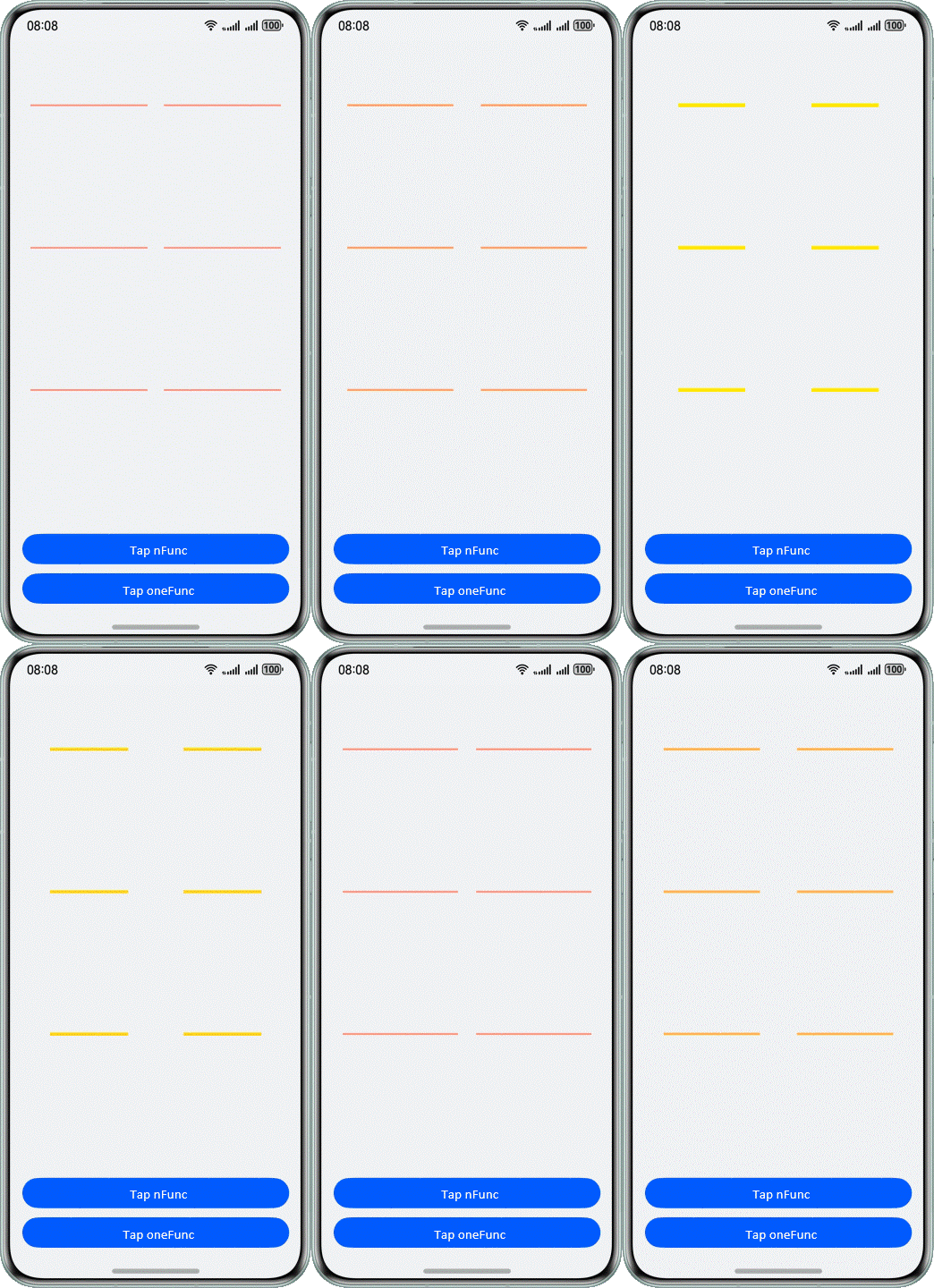
Code Implementation
Update the state variables with the same animation parameters, and save them to different animation closures. The code is as follows:
@Component
export struct MultipleProperties {
  @State w:number = 150
  @State h:number = 2
  @State brightNum:number = 1.5
  @State color:Color = Color.Red
  func1() {
    this.getUIContext().animateTo({curve: Curve.Sharp, duration: 1000}, () => {
      this.w = (this.w === 80 ? 150 : 80);
    });
  }
  func2() {
    this.getUIContext().animateTo({curve: Curve.Sharp, duration: 1000}, () => {
      this.color = (this.color === Color.Yellow ? Color.Red : Color.Yellow);
    });
  }
  func3() {
    this.getUIContext().animateTo({curve: Curve.Sharp, duration: 1000}, () => {
      this.h = (this.h === 2 ? 5 : 2);
    });
  }
  func4() {
    this.getUIContext().animateTo({curve: Curve.Sharp, duration: 1000}, () => {
      this.brightNum= (this.brightNum=== 1.5 ? 1 : 1.5);
    });
  }
  // ...
  build() {
    Column() {
      Row() {
        Row() {
          Row()
            .width(this.w)
            .backgroundColor(this.color)
            .height(this.h)
            .brightness(this.brightNum)
        }
        .justifyContent(FlexAlign.Center)
        .width('50%')

        Row() {
          Row()
            .width(this.w)
            .backgroundColor(this.color)
            .height(this.h)
            .brightness(this.brightNum)
        }
        .justifyContent(FlexAlign.Center)
        .width('50%')
      }
      .height('25%')
      .width('100%')
      // ...

      Column() {
        Button("Tap nFunc")
          .width('100%')
          .onClick(() => {
            for (let i = 0; i < 10; i++) {
              setTimeout(() => {
                this.func1();
                this.func2();
                this.func3();
                this.func4();
              }, 1000 * i)
            }
          })
        // ...
      }
      .justifyContent(FlexAlign.End)
      .height('25%')
    }
    .padding({
      left: 16,
      right: 16,
      bottom: 16
    })
    .width('100%')
    .height('100%')
    .justifyContent(FlexAlign.Start)
  }
}
Combine animation with same animation parameters into one animation closure. The code is as follows:
@Component
export struct MultipleProperties {
  @State w:number = 150
  @State h:number = 2
  @State brightNum:number = 1.5
  @State color:Color = Color.Red
  // ...
  func() {
    this.getUIContext().animateTo({curve: Curve.Sharp, duration: 1000}, () => {
      this.w = (this.w === 80 ? 150 : 80);
      this.color = (this.color === Color.Yellow ? Color.Red : Color.Yellow);
      this.h = (this.h === 2 ? 5 : 2);
      this.brightNum= (this.brightNum=== 1.5 ? 1 : 1.5);
    });
  }
  build() {
    Column() {
      Row() {
        Row() {
          Row()
            .width(this.w)
            .backgroundColor(this.color)
            .height(this.h)
            .brightness(this.brightNum)
        }
        .justifyContent(FlexAlign.Center)
        .width('50%')

        Row() {
          Row()
            .width(this.w)
            .backgroundColor(this.color)
            .height(this.h)
            .brightness(this.brightNum)
        }
        .justifyContent(FlexAlign.Center)
        .width('50%')
      }
      .height('25%')
      .width('100%')
      // ...

      Column() {
        // ...
        Button("Tap oneFunc")
          .width('100%')
          .margin({ top: 12 })
          .onClick(() => {
            for (let i = 0; i < 10; i++) {
              setTimeout(() => {
                this.func();
              }, 1000 * i)
            }
          })
      }
      .justifyContent(FlexAlign.End)
      .height('25%')
    }
    .padding({
      left: 16,
      right: 16,
      bottom: 16
    })
    .width('100%')
    .height('100%')
    .justifyContent(FlexAlign.Start)
  }
}
Performance Analysis
The Profiler tool of DevEco Studio is used to check the following metrics. The obtained data is as follows.
Table 4 Comparison of indicators when multiple animateTo closures and one animateTo closure are used to implement the same scenario
| Indicator | Multiple animateTo Closures | One animateTo Closure |
|---|---|---|
| Frame loss rate (%) | 9.6% | 4.0% |
| Maximum number of consecutive lost frames | 9 | 4 |
| Average number of stuttering times per second | 1.01 | 0.24 |
Conclusion:
When the four property change animations are placed in four animateTo animation closures, the frame loss rate is 9.6%, with a maximum of 9 consecutive lost frames, and the average number of stuttering times per second is 1.01.
When the four property change animations are placed in one animateTo animation closure, the frame loss rate decreases to 4.0%, with a maximum of 4 consecutive lost frames, and the average number of stuttering times per second is 0.24.
The results show that combining the animation with multiple property changes into one animateTo animation closure can significantly reduce the frame loss rate and the occurrence frequency of large freezing. Combining animation can reduce unnecessary layout calculation and drawing overhead, which improves the smoothness and performance of the animation and optimizes the performance of animation effects.
[h2]Uniformly Updating State Variables for Multiple animateTo Calls
When the animateTo method is used to execute animation, the state before and after the animation closure is compared, and then only the differences are animated.
In an animation execution process, a dirty node is an area that needs to be redrawn on the UI. If the state has changed, ArkUI tracks the changes and compares the state before the animation closure is executed. Related dirty nodes are marked as to be refreshed so that they can be redrawn before the animation closure is executed. In this way, only the changed parts are included in the animation process, without the need to redraw the entire UI.
This difference comparison method can significantly reduce unnecessary drawing operations, and improve the performance and smoothness of animation.
Scenario Design
If multiple properties of multiple same components are to be modified for animation (as shown in the following figure), you can update state variables respectively among multiple animateTo calls, explicitly specify the initial property values before the animateTo calls, and use the original states before the animateTo calls.
Figure 13 Modifying multiple properties of multiple identical components
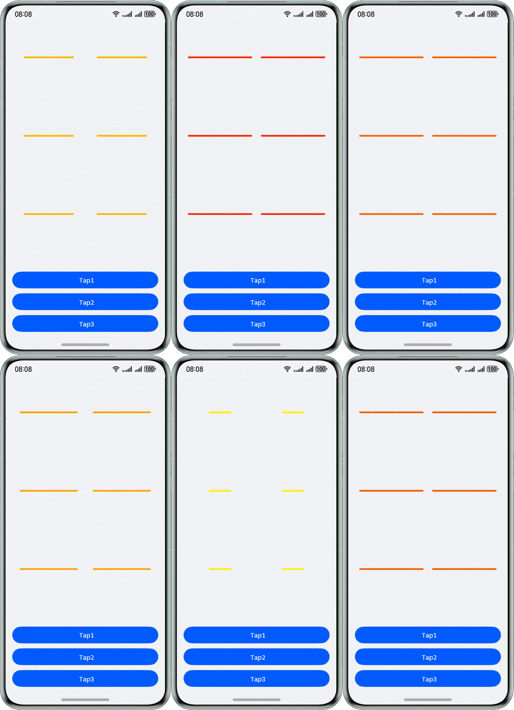
Updating State Variables Among animateTo Calls
If state variables are updated among animateTo calls, dirty nodes that need to be updated will occur before the next animateTo call, which may cause redundant updates. The following figure shows the animation update process.
Figure 14 Process of updating state variables between multiple animateTo operations

The w property is reset before the first animateTo call. Therefore, the Row component needs to be updated. In the animation closure of the first animateTo call, the w property is changed. Therefore, the Row component needs to be updated again and compared with the last update result to generate a width and height animation. Before the second animateTo call, the color property is changed. Therefore, the Row component needs to be updated again. In the animation closure of the second animateTo call, the color property is changed. Therefore, the Row component needs to be updated again to generate a background color animation. In sum, the Row component is updated four times for its property changes.
In addition, the state h irrelevant to the animation is changed. If the state does not need to be changed, it should not be changed to cause redundant updates.
The code is as follows:
@Component
export struct UpdateMultipleProperties {
  @State w: number = 100
  @State h: number = 2
  @State color: Color = Color.Red

  build() {
    Column() {
      Row() {
        Row() {
          Row()
            .width(this.w)
            .backgroundColor(this.color)
            .height(this.h)
        }
        .justifyContent(FlexAlign.Center)
        .width('50%')

        Row() {
          Row()
            .width(this.w)
            .backgroundColor(this.color)
            .height(this.h)
        }
        .justifyContent(FlexAlign.Center)
        .width('50%')
      }
      .height('25%')
      .width('100%')

      // ...
      Column() {
        Button('Tap1')
          .width('100%')
          .margin({ top: 12 })
          .onClick(() => {
            let doTimes = 5;
            for (let i = 0; i < doTimes; i++) {
              setTimeout(() => {
                this.w = 80
                this.h = 4
                this.getUIContext().animateTo({ curve: Curve.Sharp, duration: 1000 }, () => {
                  this.w = (this.w === 80 ? 150 : 80);
                });
                this.color = Color.Yellow
                this.getUIContext().animateTo({ curve: Curve.Linear, duration: 2000 }, () => {
                  this.color = (this.color === Color.Yellow ? Color.Red : Color.Yellow);
                });
              }, 2000 * i)
            }
          })
        // ...
      }
      .justifyContent(FlexAlign.End)
      .height('25%')
    }
    .padding({
      left: 16,
      right: 16,
      bottom: 16
    })
    .width('100%')
    .height('100%')
    .justifyContent(FlexAlign.Start)
  }
}
Uniformly Updating State Variables
Explicitly specifying the initial value of a property before the animateTo call
Before the animateTo call, explicitly specify the initial values of all properties that need to be animated, update the values to a node, and then make animation. The following figure shows the animation update process.
Figure 15 Process of updating the initial value of a property before animateTo

Before the first animateTo call, the w and color properties are changed. Therefore, the Row component needs to be updated again. In the animation closure of the first animateTo call, the w property is changed. Therefore, the Row component needs to be updated and compared with the last update result to generate a width and height animation. Before the second animateTo call, because no additional statement is executed, there is no dirty state variable or dirty node that needs to be updated, and no update is required. In the animation closure of the second animateTo call, the color property is changed. Therefore, the Row component needs to be updated again to generate a background color animation. In sum, the Row component is updated three times for its property changes.
The code is as follows:
@Component
export struct UpdateMultipleProperties {
  @State w: number = 100
  @State h: number = 2
  @State color: Color = Color.Red

  build() {
    Column() {
      Row() {
        Row() {
          Row()
            .width(this.w)
            .backgroundColor(this.color)
            .height(this.h)
        }
        .justifyContent(FlexAlign.Center)
        .width('50%')

        Row() {
          Row()
            .width(this.w)
            .backgroundColor(this.color)
            .height(this.h)
        }
        .justifyContent(FlexAlign.Center)
        .width('50%')
      }
      .height('25%')
      .width('100%')

      // ...
      Column() {
        // ...
        Button('Tap2')
          .width('100%')
          .margin({ top: 12 })
          .onClick(() => {
            let doTimes = 5;
            for (let i = 0; i < doTimes; i++) {
              setTimeout(() => {
                this.w = 80
                this.color = Color.Yellow
                this.getUIContext().animateTo({ curve: Curve.Sharp, duration: 1000 }, () => {
                  this.w = (this.w === 80 ? 150 : 80);
                });
                this.getUIContext().animateTo({ curve: Curve.Linear, duration: 2000 }, () => {
                  this.color = (this.color === Color.Yellow ? Color.Red : Color.Yellow);
                });
                this.h = 5
              }, 2000 * i)
            }
          })
        // ...
      }
      .justifyContent(FlexAlign.End)
      .height('25%')
    }
    .padding({
      left: 16,
      right: 16,
      bottom: 16
    })
    .width('100%')
    .height('100%')
    .justifyContent(FlexAlign.Start)
  }
}
Using the original state before the animateTo call
Before the animateTo call, use the original state to enable the animation to transition from the original state to the specified state. The following figure shows the animation update process.
Figure 16 Update process before animateTo

Before the first animateTo call, no dirty state variable or dirty node needs to be updated, and no re-render is required. In the animation closure of the first animateTo call, the w property is changed. Therefore, the Row component needs to be updated and compared with the last update result to generate a width and height animation. Before the second animateTo call, because no additional statement is executed, there is no dirty state variable or dirty node that needs to be updated, and no update is required. In the animation closure of the second animateTo call, the color property is changed. Therefore, the Row component needs to be updated again to generate a background color animation. In sum, the Row component is updated twice for its property changes.
The code is as follows:
@Component
export struct UpdateMultipleProperties {
  @State w: number = 100
  @State h: number = 2
  @State color: Color = Color.Red

  build() {
    Column() {
      Row() {
        Row() {
          Row()
            .width(this.w)
            .backgroundColor(this.color)
            .height(this.h)
        }
        .justifyContent(FlexAlign.Center)
        .width('50%')

        Row() {
          Row()
            .width(this.w)
            .backgroundColor(this.color)
            .height(this.h)
        }
        .justifyContent(FlexAlign.Center)
        .width('50%')
      }
      .height('25%')
      .width('100%')

      // ...
      Column() {
        // ...
        Button('Tap3')
          .width('100%')
          .margin({ top: 12 })
          .onClick(() => {
            let doTimes = 5;
            for (let i = 0; i < doTimes; i++) {
              setTimeout(() => {
                this.getUIContext().animateTo({ curve: Curve.Sharp, duration: 1000 }, () => {
                  this.w = (this.w === 80 ? 150 : 80);
                });
                this.getUIContext().animateTo({ curve: Curve.Linear, duration: 2000 }, () => {
                  this.color = (this.color === Color.Yellow ? Color.Red : Color.Yellow);
                });
              }, 2000 * i)
            }
          })
      }
      .justifyContent(FlexAlign.End)
      .height('25%')
    }
    .padding({
      left: 16,
      right: 16,
      bottom: 16
    })
    .width('100%')
    .height('100%')
    .justifyContent(FlexAlign.Start)
  }
}
Performance Analysis
The Profiler tool of DevEco Studio is used to check the following metrics. The obtained data is as follows.
Table 5 Comparison of indicators with different locations for updating state variables
| Indicator | Update State Variables Between Multiple animateTo Calls | Explicitly Specify the Initial Value of a Property Before animateTo | Use the Original State Before animateTo |
|---|---|---|---|
| Frame loss rate (%) | 9.1% | 5.4% | 3.5% |
| Maximum number of consecutive lost frames | 15 | 10 | 5 |
| Average number of stuttering times per second | 0.67 | 0.23 | 0.10 |
Conclusion:
When the state variable is updated between multiple animateTo calls, the frame loss rate reaches 9.1%, with a maximum of 15 consecutive frames lost and an average of 0.67 stuttering times per second.
When the initial value of the attribute is explicitly specified before the animateTo call, the frame loss rate decreases to 5.4%, with a maximum of 10 consecutive frames lost and an average of 0.23 stuttering times per second.
When the original state is used before the animateTo call, the frame loss rate decreases to 3.5%, with a maximum of 5 consecutive frames lost and an average of 0.10 stuttering times per second.
During property change animation, explicitly specifying the initial value of a property or using the original state as the start state of the animation can significantly reduce the frame loss rate and the frequency of large frame freezing exceptions. Therefore, during animation operations, properly managing the update of a state variable and setting of an initial value is critical to optimizing the performance of animation effects. You should avoid updating state variables among multiple animateTo calls if possible based on the requirements, to improve smoothness and performance of the animation.
[h2]Using RenderGroup
renderGroup is a common component method, which represents a combination of rendering and drawing. Its core function is to mark a component. During drawing, the drawing results of the component and its child components are combined and cached for reuse, which reduces the drawing load.
If a component to be drawn for the first time is marked with renderGroup enabled, the component and its child components are drawn off-screen, and the drawing results are saved to the cache. If the component needs to be redrawn, the cache is preferentially used instead of redrawing, which reduces the drawing load and optimizes the rendering performance. The following figure shows the process for rendering a component.
Figure 17 Component rendering process
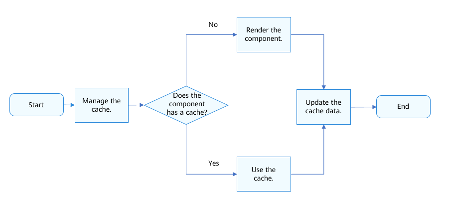
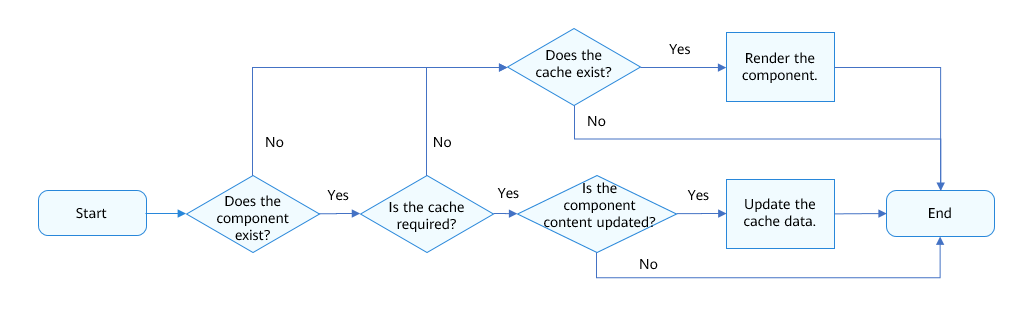
To update the cache, ensure that the following conditions are met:
- The component is in the current component tree.
- The renderGroup function of the component is marked as true.
- The component content is marked dirty.
To clear the cache, ensure that any of the following conditions is met:
- The component is not in the current component tree.
- The renderGroup function of the component is marked as false.
The following figure shows the cache management process.

To enable the renderGroup function to take effect, the component is subject to the following restrictions:
- Fixed component content: The properties of the parent component and its child components are fixed rather than being changed. If the content of the parent component is not fixed, that is, there are components whose properties or styles change in the child components of the parent component, the cache usage will be seriously reduced when renderGroup is used. In this case, frame freezing may become more serious instead of being rectified. For example, use the dynamic data bound bidirectionally as the text content, use GIF images as the image resource, or use the Video component to play videos.
- No animation effect for child components: The parent component applies the animation effect in a unified manner, and its child components have no animation effect. Otherwise, the child components are no longer static relative to the parent component. The cache may need to be updated for each frame, which also consumes system resources.
Scenario Design
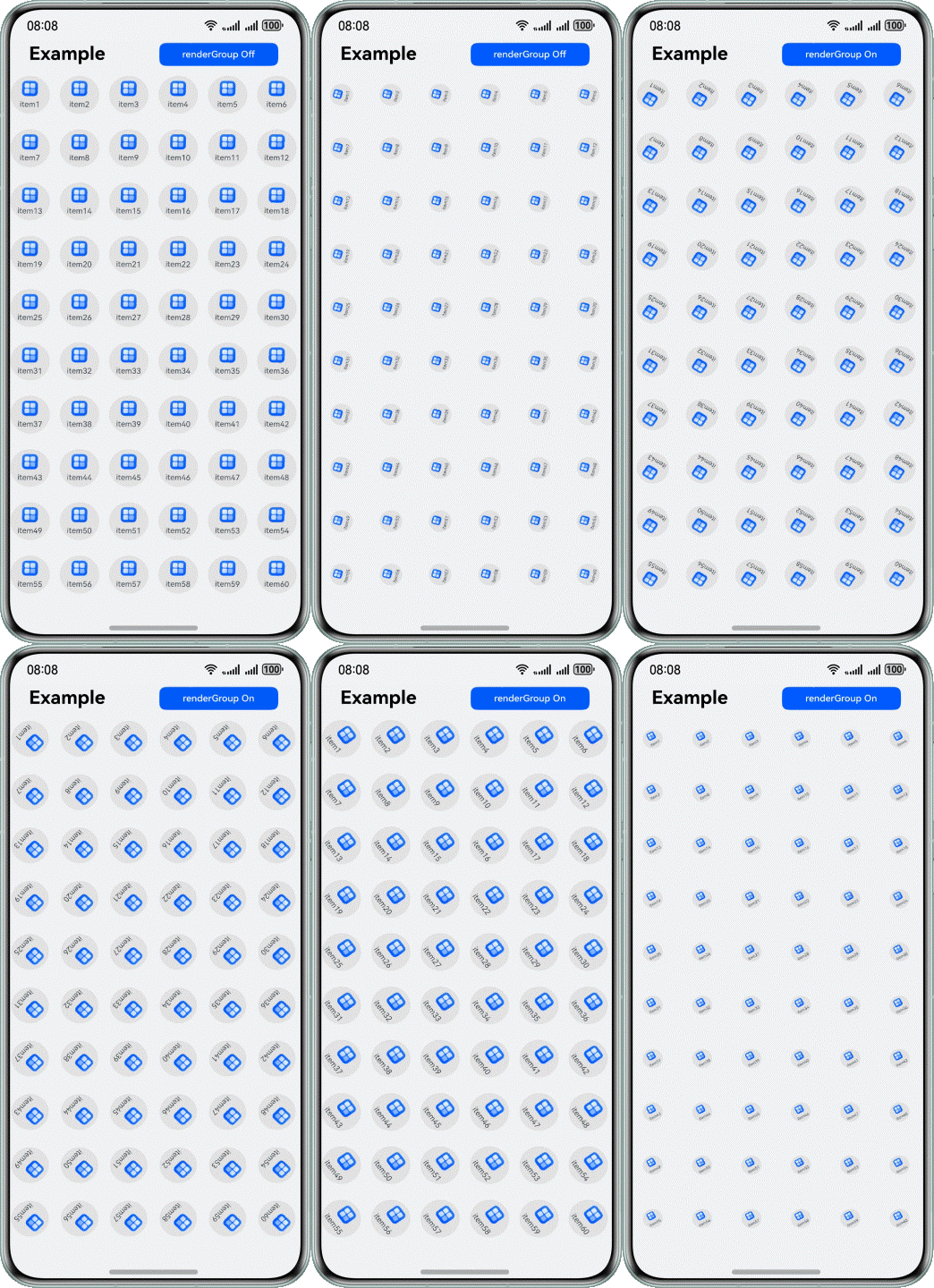
In this example, fixed images and text content are used on the same page, and each component uses the rotation and scaling effects. In addition, 60 such components are reused.
Figure 18 Implementation of the renderGroup example
Code implementation
Implement the components required on the page, set the renderGroup property, and use @StorageLink to bind renderGroupFlag. The renderGroup property must be set to ensure that the parent component applies the animation effect in a unified manner and its child components have no animation effect. Therefore, the animation effect is achieved on the parent component in a unified manner instead of being specified for IconItem. In the Flex component, Image and Text do not have animation effects. Therefore, you only need to set the renderGroup property in the outermost Flex component.
The code is as follows:
@Component
export  struct IconItem {
  @StorageLink('renderGroupFlag') renderGroupFlag: boolean = false;
  image: string | Resource = '';
  text: string | Resource = '';

  build() {
    Flex({
      direction: FlexDirection.Column,
      justifyContent: FlexAlign.Center,
      alignContent: FlexAlign.Center
    }) {
      Image(this.image)
        .height(20)
        .width(20)
        .objectFit(ImageFit.Contain)
        .margin({ left: 15 })

      Text(this.text)
        .fontSize(10)
        .fontColor('#182431')
        .margin({ top: 5 })
        .width(50)
        .opacity(0.8)
        .textAlign(TextAlign.Center)
    }
    .backgroundColor('#e3e3e3')
    .width(50)
    .height(50)
    .borderRadius(25)
    .renderGroup(this.renderGroupFlag)
  }
}
On the displayed page, save the renderGroupFlag flag that controls renderGroup to the APPStorage wrapper.
import { IconItem } from './IconItem'

class IconItemSource {
  image: string | Resource = ''
  text: string | Resource = ''

  constructor(image: string | Resource = '', text: string | Resource = '') {
    this.image = image;
    this.text = text;
  }
}

@Component
export struct RenderGroup {
  @State renderGroupFlag: boolean = false;
  private iconItemSourceList: IconItemSource[] = [];

  aboutToAppear() {
    for (let index = 0; index < 20; index++) {
      const numStart: number = index * 3;
      this.iconItemSourceList.push(
        new IconItemSource($r('app.media.app_icon'), `item${numStart + 1}`),
        new IconItemSource($r('app.media.app_icon'), `item${numStart + 2}`),
        new IconItemSource($r('app.media.app_icon'), `item${numStart + 3}`),
      );
    }
  }

  build() {
    Column() {
      Row() {
        Row() {
          Text('Example')
            .fontSize(24)
            .lineHeight(24)
            .fontColor(Color.Black)
            .fontWeight(FontWeight.Bold)
            .margin({ left: 30 })
        }

        Stack({ alignContent: Alignment.End }) {
          Button(this.renderGroupFlag ? 'renderGroup On' : 'renderGroup Off', {
            type: ButtonType.Normal,
            stateEffect: true
          })
            .fontSize(12)
            .borderRadius(8)
            .width(150)
            .height(30)
            .margin({ right: 30 })
            .onClick(() => {
              this.renderGroupFlag = !this.renderGroupFlag;
              AppStorage.setOrCreate('renderGroupFlag', this.renderGroupFlag)
            })
        }
      }
      .height(56)
      .width('100%')
      .justifyContent(FlexAlign.SpaceBetween)

      GridRow({
        columns: 6,
        gutter: { x: 0, y: 0 },
        breakpoints: {
          value: ['400vp', '600vp', '800vp'],
          reference: BreakpointsReference.WindowSize
        },
        direction: GridRowDirection.Row
      }) {
        ForEach(this.iconItemSourceList, (item: IconItemSource) => {
          GridCol() {
            IconItem({ image: item.image, text: item.text })
              .transition(
                TransitionEffect.scale({ x: 0.5, y: 0.5 })
                  .animation({ duration: 3000, curve: Curve.FastOutSlowIn, iterations: -1 })
                  .combine(TransitionEffect.rotate({ z: 1, angle: 360 }))
              )
          }
          .height(70)
          .width('25%')
        })
      }
      .width('100%')
      .height('100%')
    }
    .width('100%')
    .height('100%')
    .alignItems(HorizontalAlign.Center)
  }
}
Performance Analysis
The Profiler tool of DevEco Studio is used to check the following metrics. The obtained data is as follows.
Table 6 Comparison of indicators in the scenario where renderGroup is disabled and enabled
| Indicator | renderGroup Disabled | renderGroup Enabled |
|---|---|---|
| Frame loss rate (%) | 52.3% | 0% |
| Maximum number of consecutive lost frames | 36 | 0 |
| Average number of stuttering times per second | 2.3 | 0 |
Conclusion:
When renderGroup is disabled, the frame loss rate on the render_service side is 52.3%, with a maximum of 36 consecutive lost frames, and an average of 2.3 stuttering times per second.
When renderGroup is enabled, neither stuttering nor frame loss occurs, and the frame loss rate is 0%.
The result shows that when the preceding constraints are met, the frame loss rate, maximum number of consecutive lost frames, and average number of frame freezing times per second can be significantly reduced if renderGroup is enabled. Therefore, if a large number of components that apply animation effects exist on a single page, properties of these components and their child components are fixed, and animation effects are applied in a unified manner, you can use renderGroup to improve app performance and ensure smoothness of apps and animations.
[h2]Summary
Five tests are performed to verify the effectiveness of the following five measures: using system-provided animation APIs; using the graphic transformation property to change the component layout; using the same animateTo when the parameters are the same; uniformly updating state variables for multiple animateTo calls; using renderGroup.
Animation performance is crucial to a variety of aspects, including user experience, device resource consumption, app stability, and traffic consumption.
- User experience: Smooth animation improves user experience, which enables users to feel that the UI is more vivid and intuitive. Conversely, frame freezing or delayed animations result in poor experience.
- Device resource consumption: Animation performance directly relates to the consumption of device resources, especially the CPU and GPU usage. Low-performance animation may cause a device to heat up, increase power consumption, and even compromise the running of other apps.
- App stability: Low-performance animation may cause application crashes or frame freezing, which compromises the stability and reliability of applications.
- Reduced traffic: High-performance animation can reduce the amount of data to be transmitted. For mobile applications, this means that the traffic consumption of users can be reduced.
- Adaptable to different devices: The performance of different devices varies greatly. Improving the animation performance enables apps to run smoothly on various devices.
In actual development, you can take the four measures provided in this document and optimize the animation based on scenarios and requirements to achieve better animation performance.
Conclusion
In the actual development process, you should fully understand the importance of animation to user experience. Animations not only enhance the visual appeal of apps but also elevate user engagement and streamline the intuitiveness of interactions.
This topic describes how to properly use animation from two perspectives:
- Improving the smoothness of animation perception: First, from the perspective of UX design, you need to understand the functions and significance of animation in user experience. Second, you must have certain animation implementation technologies to properly and efficiently use animation capabilities to achieve various animation effects in line with design requirements.
- Improving animation smoothness: You need to take some measures to further improve animation performance. For example, you can take measures, such as using system-provided animation APIs, using the graphic transformation property to change component layout, using the same animateTo when parameters are the same, and uniformly updating state variables upon multiple animateTo calls, to effectively reduce the occupation of system resources by the animation, and improve smoothness and stability of the animation.
In sum, proper use of animation is critical to improving user experience. You need to transform from the UX design perspective to the development implementation perspective, fully understand the functions and significance of animation in user experience, and improve the effect and stability of animation by means of proper implementation and performance optimization.