In ArkUI, components refer to the elements displayed on the UI. They fall into two categories: built-in components (provided by the ArkUI framework out of the box) and custom components (defined by developers). When developing UIs, you need to not only combine and use system components, but also consider factors such as code reusability, separation of business logic from the UI, and future version evolution. Creating custom components, which encapsulate UI elements and service logic, serves as a critical step in achieving this goal.
Custom components offer the following features:
-
Combinability: You can combine built-in components and other components, as well as their attributes and methods.
-
Reusability: Custom components can be reused across different components, serving as distinct instances in various parent components or containers.
-
Data-driven update: When these state variables change, UI re-rendering is triggered.

Starting from API version 24, you can enable custom components to support cross-Ability migration by configuring the metadata in the module.json5 configuration file of your app project. The configuration method is as follows: Add name as "enableCustomComponentCrossAbility" and value as "true". Since custom components provide UI capabilities, the term ability here specifically refers to UIAbility. For details, see Cross-Ability Migration of Custom Components.
Basic Usage of Custom Components
The following example shows the basic usage of a custom component.
@Component
struct HelloComponent {
  @State message: string = 'Hello, World!';

  build() {
    // The HelloComponent custom component combines the system components Row and Text.
    Row() {
      Text(this.message)
        .fontSize(20)
        .margin(10)
        .onClick(() => {
          // The change of the state variable message drives UI refresh, updating the UI from 'Hello, World!' to 'Hello, ArkUI!'
          this.message = 'Hello, ArkUI!';
        })
    }
    .height('100%')
  }
} 
To reference a custom component in another file, use the keyword export to export the component and then use import to import it to the target file.
Multiple HelloComponent instances can be created in build() of other custom components. In this way, HelloComponent is reused across those components.
@Entry
@Component
struct ParentComponent {
  build() {
    Column() {
      // Create HelloComponent multiple times to reuse the custom component.
      Text('ArkUI message')
        .fontSize(20)
        .margin(10)
      HelloComponent({ message: 'Hello World!' })
      Divider()
      HelloComponent({ message: 'Hello ArkTS!' })
    }
    .width('100%')
  }
} 
To fully understand the preceding example, a knowledge of the following concepts is essential:
[h2]struct
The definition of a custom component must start with the @Component struct followed by the component name, and then component body enclosed by curly brackets. No inheritance is allowed. You can omit the new operator when instantiating a struct.

The name assigned to a class, function, or custom component must be different from the name of any built-in component.
[h2]@Entry
A custom component decorated with @Entry serves as the entry to a UI page. A single UI page can have only one @Entry decorated custom component as the page entry.

This decorator can be used in ArkTS widgets since API version 9.
Since API version 10, the @Entry decorator accepts an optional LocalStorage parameter or an optional EntryOptions10+ parameter.
This decorator can be used in atomic services since API version 11.
@Entry
@Component
struct MyComponent {
  // ...
} EntryOptions10+
Describes the named route options.
| Name | Type | Read-Only | Optional | Description |
|---|---|---|---|---|
| routeName | string | No | Yes | Name of the page used as a named route. |
| storage | LocalStorage | No | Yes | Page-level UI state storage. If not passed in, the framework creates a new LocalStorage instance as the default value. |
| useSharedStorage12+ | boolean | No | Yes | Whether to use the LocalStorage instance object passed in by loadContent. Default value: false. When the value is true, if loadContent passes in a LocalStorage instance, that instance is used; otherwise, a new LocalStorage instance is created. When the value is false, the shared LocalStorage instance object is not used. |

When useSharedStorage is set to true and storage is assigned, useSharedStorage takes precedence over the storage parameter. In this case, the storage parameter is not used regardless of whether a LocalStorage instance is passed in through loadContent.
@Entry({ routeName: 'myPage' })
@Component
struct MyComponent {
  // ...
}
[h2]@Component
A struct decorated with @Component is a V1 custom component, which can use the capabilities of state management V1 decorators.

This decorator can be used in ArkTS widgets since API version 9.
Since API version 11, @Component can accept a ComponentOptions parameter.
This decorator can be used in atomic services since API version 11.
@Component
struct MyComponent {
  // ...
}
[h2]@ComponentV2
A struct decorated with @ComponentV2 is a V2 custom component, which can use the capabilities of state management V2 decorators.

The @ComponentV2 decorator is supported since API version 12.
Since API version 12, this decorator is supported in atomic services.
Since API version 23, this decorator is supported in ArkTS widgets.
Similar to the @Component decorator, the @ComponentV2 decorator decorates custom components with the following specifications:
-
In custom components decorated with @ComponentV2, only new state variable decorators can be used, including @Local, @Param, @Once, @Event, @Provider, and @Consumer.
-
Custom components decorated with @ComponentV2 do not support existing component capabilities such as LocalStorage.
-
@ComponentV2 and @Component cannot be used on the same struct.
-
@ComponentV2 supports an optional ComponentOptions parameter to implement the component freezing function.
-
A basic @ComponentV2 decorated custom component should contain the following parts:
@Entry
@ComponentV2 // Decorator.
struct ComponentV2Test { // Data structure declared by struct.
  @Local message: string = 'Hello World';
  build() { // UI defined by build().
    RelativeContainer() {
      Text(this.message)
        .id('HelloWorld')
        // Replace $r('app.float.page_text_font_size') with the resource file required by the developer.
        .fontSize($r('app.float.page_text_font_size'))
        .fontWeight(FontWeight.Bold)
        .alignRules({
          center: { anchor: '__container__', align: VerticalAlign.Center },
          middle: { anchor: '__container__', align: HorizontalAlign.Center }
        })
        .onClick(() => {
          this.message = 'Welcome';
        })
    }
    .height('100%')
    .width('100%')
  }
}
Unless otherwise specified, a custom component decorated with @ComponentV2 maintains the same behavior as a custom component decorated with @Component.
[h2]build()
The build() function is used to define the declarative UI description of a custom component. Every custom component must define a build() function.
@Component
struct MyComponent {
  build() {
    // ...
  }
}
[h2]@Reusable
Using @Reusable to decorate V1 custom components makes them reusable. For details, see @Reusable Decorator: Reusing Components.
@Reusable
@Component
struct MyComponent {
  // ...
}
[h2]@ReusableV2
Using @ReusableV2 to decorate V2 custom components makes them reusable. For details, see @Reusable V2 Decorator: Reusing V2 Components.
@ReusableV2
@ComponentV2
struct MyComponent {
  // ...
}
Member Functions/Variables
In addition to the mandatory build(), a custom component may implement other member functions with the following restrictions:
- Member functions of a custom component can only be accessed from within the component. Avoid declaring them as static functions.
A custom component can also implement member variables with the following restrictions:
-
Member variables of a custom component can only be accessed from within the component. Avoid declaring them as static variables.
-
Local initialization is optional for some member variables and mandatory for others. For details about whether local initialization or initialization from the parent component is required, see State Management.
Rules for Custom Component Parameters
The initialization rules for member variables of a custom component vary depending on the decorator used. The rules for each decorator are shown in the following table.
Initialization Rules for @Component Member Variables
| Variable Type | Local Initialization | Passed from Parent Component |
|---|---|---|
| Regular variable | Mandatory | Optional. If a non-undefined value is passed, the passed value is used; otherwise, the local default value is used. |
| @State | Mandatory | Optional. If a non-undefined value is passed, the passed value is used; otherwise, the local default value is used. |
| @Prop | Optional | Optional. Mandatory when no local default value is provided. If a non-undefined value is passed, the passed value is used; otherwise, the local default value is used. |
| @Link | Not supported | Mandatory. A state variable must be passed in. |
| @ObjectLink | Not supported | Mandatory. An instance of a class decorated by @Observed must be passed in (complex types can be passed in since API version 19). |
| @Provide | Mandatory | Optional. If a non-undefined value is passed, the passed value is used; otherwise, the local default value is used. |
| @Consume | Not supported (optional since API version 20) | Not supported. Initialized by matching the alias or variable name with @Provide. |
| @StorageProp | Mandatory | Not supported. Initialized through the corresponding key in AppStorage. |
| @StorageLink | Mandatory | Not supported. Initialized through the corresponding key in AppStorage. |
| @LocalStorageProp | Mandatory | Not supported. Initialized through the corresponding key in LocalStorage. |
| @LocalStorageLink | Mandatory | Not supported. Initialized through the corresponding key in LocalStorage. |
Initialization Rules for @ComponentV2 Member Variables
| Variable Type | Local Initialization | Passed from Parent Component |
|---|---|---|
| Regular variable | Mandatory | Not supported. |
| @Local | Mandatory | Not supported. |
| @Param | Optional | Optional. Mandatory when no local default value is provided. If a value is passed in, the passed value is used; otherwise, the local default value is used. |
| @Event | Optional | Optional. When no local default value is provided and no value is passed from the parent component, an empty function is automatically generated as the default callback. |
| @Provider | Mandatory | Not supported. |
| @Consumer | Mandatory | Not supported. Initialized by matching the alias or variable name with @Provider. |
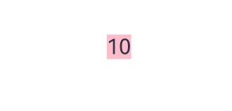
The following example uses a regular variable to demonstrate how to initialize parameters of a custom component in the build method. For usage examples of other decorators, refer to their respective documentation.
@Component
struct MyComponent {
  countDownFrom: number = 0;
  color: Color = Color.Blue;

  build() {
    Column() {
      Text(`${this.countDownFrom}`)
        .fontSize(20)
        .margin(10)
        .backgroundColor(this.color)
    }
    .width('100%')
  }
}

@Entry
@Component
struct ParentComponent {
  private someColor: Color = Color.Pink;

  build() {
    Column() {
      // Create a MyComponent instance, initialize its member variable countDownFrom to 10, and initialize its member variable color to this.someColor.
      MyComponent({ countDownFrom: 10, color: this.someColor })
    }
    .width('100%')
  }
} 
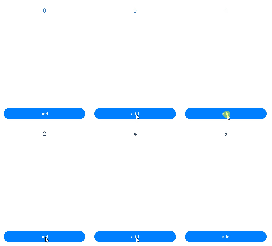
In the following example, a function in the parent component is passed to the child component and called therein.
@Entry
@Component
struct Parent {
  @State cnt: number = 0;
  submit: () => void = () => {
    this.cnt++;
  };

  build() {
    Column() {
      Text(`${this.cnt}`)
        .fontSize(20)
        .margin(10)
      // Pass the function from the parent component to the child component.
      Son({ submitArrow: this.submit })
    }
    .width('100%')
  }
}

@Component
struct Son {
  submitArrow?: () => void;

  build() {
    Row() {
      Button('add')
        .width(300)
        .margin(10)
        .onClick(() => {
          if (this.submitArrow) {
            this.submitArrow()
          }
        })
    }
    .height('100%')
  }
} 
build() Implementation Rules
Whatever declared in build() are called UI descriptions. UI descriptions must comply with the following rules:
-
For an @Entry decorated custom component, exactly one root node is required under the build() function, and it must be a container component. ForEach is not allowed as the root node. For an @Component decorated custom component, exactly one root node is required under the build() function, and it can be a non-container component. ForEach is not allowed as the root node.
@Entry @Component struct MyComponent { build() { // The root node is unique and mandatory, and must be a container component. Row() { ChildComponent() } .height('100%') } } @Component struct ChildComponent { build() { // The root node is unique and mandatory, and can be a non-container component. // Replace $r('app.media.startIcon') with the actual resource file. Image($r('app.media.startIcon')) } } -
Local variable declaration is not allowed. The following example should be avoided:
build() { // Incorrect example: Local variable declaration is not allowed. let num: number = 1; } -
console.info cannot be used in UI description, but can be used in a method or function. The following example should be avoided:
build() { // Incorrect example: console.info is not allowed. console.info('print debug log'); } -
Creation of a local scope is not allowed. The following example should be avoided:
build() { // Incorrect example: Local scope is not allowed. { // ... } } -
Calling a method not decorated by @Builder is not allowed. However, the return value of such methods can be used as parameters of system components. Refer to the code snippet below.
@Component
struct ParentComponent {
  doSomeCalculations() {
  }
  build() {
    Column() {
      // Incorrect example: Methods not decorated with @Builder cannot be called.
      this.doSomeCalculations();
    }
  }
}
@Component struct ParentComponent { calcTextValue(): string { return 'Hello World'; } @Builder doSomeRender() { Text(`Hello World`) .fontSize(20) .margin(10) } build() { Column() { // Correct example: Calling is allowed. this.doSomeRender() // Correct example: The parameter can be the return value of a TS method call. Text(this.calcTextValue()) .fontSize(20) .margin(10) } .width('100%') } } -
The switch syntax is not allowed. If conditional judgment is required, use the if statement. Refer to the code snippet below.
build() {
  Column() {
    // Incorrect example: The switch syntax is not allowed.
    switch (expression) {
      case 1:
        Text('...')
          .fontSize(20)
          .margin(10)
        break;
      case 2:
        Image('...')
        break;
      default:
        Text('...')
          .fontSize(20)
          .margin(10)
        break;
    }
  }
  .width('100%')
}
build() { Column() { // Correct example: Use if. if (this.expression == 1) { Text('...') } else if (this.expression == 2) { Image('...') } else { Text('...') } } } -
Expressions are not allowed. Use the if component instead. Refer to the code snippet below.
build() {
  Column() {
    // Incorrect example: Expressions are not allowed.
    (this.aVar > 10) ? Text('...') : Image('...')
  }
}
build() { Column() { // Correct example: Use an if statement. if (this.aVar > 10) { Text('...') } else { Image('...') } } } -
Directly changing a state variable is not allowed. The following example should be avoided.
@Component
struct MyComponent {
  @State textColor: Color = Color.Yellow;
  @State columnColor: Color = Color.Green;
  @State count: number = 1;
  build() {
    Column() {
      // Avoid directly changing the value of count in the Text component.
      Text(`${this.count++}`)
        .width(50)
        .height(50)
        .fontColor(this.textColor)
        .onClick(() => {
          this.columnColor = Color.Red;
        })
      Button("change textColor").onClick(() =>{
        this.textColor = Color.Pink;
      })
    }
    .backgroundColor(this.columnColor)
  }
}
In ArkUI state management, UI re-render is driven by state.
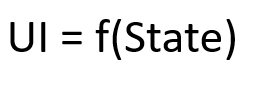
Therefore, state variables must not be directly modified in the build() function or @Builder method of a custom component, as this may cause the risk of cyclic re-rendering. Text(`${this.count++}`) has different effects under full update and minimal update:
-
Full update (API version 8 and earlier): ArkUI may fall into an infinite re-rendering loop, because each rendering of the Text component changes the app state, which triggers the next round of rendering. When this.columnColor changes, the entire build() function is executed. Consequently, the text bound to Text(`${this.count++}`) also changes. Each re-rendering of Text(`${this.count++}`) updates the this.count state variable, leading to a new round of build() execution, thus causing an infinite loop.
-
Minimal update (API version 9 and later): When this.columnColor is updated, only the Column component is updated, and the Text component is not updated. Only when this.textColor changes is the entire Text component updated, and all its attribute functions are executed. Therefore, Text(`${this.count++}`) is observed to increment. Since the UI is currently updated on a per-component basis, if an attribute of a component changes, the entire component is updated. The overall update chain is: this.textColor = Color.Pink → the entire Text component is updated → this.count++ → the entire Text component is updated again. Note that this approach causes the Text component to be rendered twice during the initial rendering, which affects performance.
The behavior of modifying the app state in the build() function may be more subtle than the example above, for instance:
-
Modifying state variables within @Builder, @Extend, or @Styles methods.
-
Modifying app state variables in functions called during parameter computation, for example, Text(`${this.calcLabel()}`).
-
Modifying the current array: sort() changes the array this.arr, and the subsequent filter() method returns a new array.
// Negative example.
@State arr : Array<...> = [ ... ];
ForEach(this.arr.sort().filter(...),
  item => {
  // ...
})
// The correct approach: filter returns a new array, so the subsequent sort method does not modify the original array this.arr. ForEach(this.arr.filter((item, index) => index >= 2).sort(), (item: number) => { // ... });
To address this issue, see FAQs appfreeze Due to State Variable Changes in the build Function
Universal Style of a Custom Component
The universal style of a custom component is configured by the chain call.
@Component
struct ChildComponent {
  build() {
    Button(`Hello World`)
      .width('90%')
      .margin(10)
  }
}

@Entry
@Component
struct MyComponent {
  build() {
    Row() {
      // The attribute is set on ChildComponent, not on the Button inside ChildComponent.
      ChildComponent()
        .width(300)
        .height(300)
        .backgroundColor(Color.Pink)
    }
    .height('100%')
  }
} 

When ArkUI applies styles to a custom component, it is equivalent to wrapping ChildComponent with an invisible container component. These styles are set on the container component, not directly on the Button component of ChildComponent. The rendering result shows that the pink background color is not directly applied to the Button, but to the invisible container component where the Button resides.
Cross-Ability Migration of Custom Components
Before API version 24, custom components did not support cross-ability migration. After a custom component instance moved across abilities, changing its state variables would not trigger a UI component refresh. Note that before the system is upgraded to API version 24, even if enableCustomComponentCrossAbility is set to true in module.json5, this feature will not take effect.
Starting from API version 24, you can enable custom components to support cross-ability migration by configuring the metadata tag in the module.json5 configuration file of your application project. The configuration method is as follows.
"metadata": [
  {
    "name": "enableCustomComponentCrossAbility",
    "value": "true"
  }
]
Note:
-
You are not advised to asynchronously modify state variables in a migrating component during the onBackground phase of the original ability. At that time, state variables can be assigned, but the refresh of associated components will not be triggered.
-
Only custom components in the component tree can be migrated. Custom components that are not attached to the component tree will not be migrated. For example, in scenarios where OH_ArkUI_GetNodeHandleFromNapiValue is used to obtain an ArkUI_NodeHandle, if the parameter received by OH_ArkUI_GetNodeHandleFromNapiValue is ComponentContent, the obtained ArkUI_NodeHandle is the first FrameNode node in the subtree of ComponentContent. Custom components skipped in between are not in the component tree and cannot be migrated.
import { UIAbility } from '@kit.AbilityKit';
import { hilog } from '@kit.PerformanceAnalysisKit';
import { window } from '@kit.ArkUI';

const DOMAIN = 0x0000;

export default class EntryAbility extends UIAbility {
  onWindowStageCreate(windowStage: window.WindowStage): void {
    windowStage.loadContent('pages/Index', (err) => {
      if (err.code) {
        hilog.error(DOMAIN, 'testTag', 'Failed to load the content. Cause: %{public}s', JSON.stringify(err));
        return;
      }
      hilog.info(DOMAIN, 'testTag', 'Succeeded in loading the content.');
    });
  }

  onBackground(): void {
    // Do not asynchronously modify the state variables in the migration component during the onBackground phase.
    hilog.info(DOMAIN, 'testTag', '%{public}s', 'Ability onBackground');
  }
}
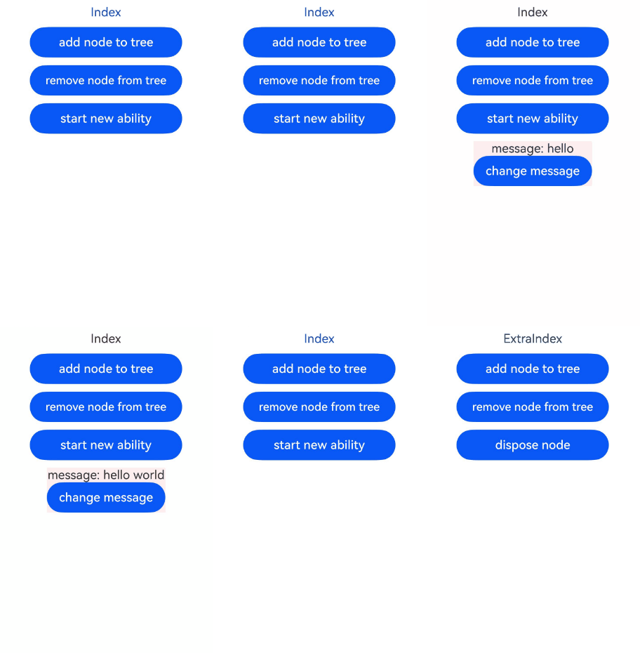
In the following example:
-
Click Button('add node to tree') to create a BuilderNode and mount it to NodeContainer.
-
Click Button('remove node from tree') to remove the BuilderNode from NodeContainer.
-
Click Button('start new ability') to start the ExtraAbility.
-
Click Button('add node to tree') in ExtraIndex to mount the BuilderNode to the NodeContainer in the ExtraIndex.
-
When the custom component ComponentUnderBuilderNode is mounted to a new ability, it instructs the custom component of the ability to update the ID of the ability instance to which it belongs.
-
Click Button('change message') in the custom component ComponentUnderBuilderNode to change the value of the state variable message, which triggers the @Watch('messageUpdate') callback and UI refresh.
-
The following example includes the process of creating a new ability. For details, see startAbility.
import { MyNodeController } from './MyNodeController';
import { hilog } from '@kit.PerformanceAnalysisKit';
import { common, Want } from '@kit.AbilityKit';
import { BusinessError } from '@kit.BasicServicesKit';

const DOMAIN = 0x0000;

@Entry
@Component
struct Index {
  private nodeController: MyNodeController = new MyNodeController();

  startNewAbility() {
    const want: Want = {
      bundleName: 'com.example.enablecustomcomponentcrossability',
      abilityName: 'ExtraAbility'
    };

    try {
      const context = this.getUIContext()?.getHostContext() as common.UIAbilityContext;
      context.startAbility(want, (err: BusinessError) => {
        if (err.code) {
          hilog.error(DOMAIN, 'testTag', `startAbility failed, code is ${err.code}, message is ${err.message}`);
          return;
        }
        hilog.info(DOMAIN, 'testTag', 'startAbility succeed');
      });
    } catch (err) {
      hilog.error(DOMAIN, 'testTag',
        `startAbility failed, code is ${(err as BusinessError).code}, message is ${(err as BusinessError).message}`);
    }
  }

  build() {
    Column({ space: 10 }) {
      Text('Index')
      // Create a globalBuilderNode and attach the nodes under it to the placeholder node of NodeContainer.
      Button('add node to tree').width(200).onClick(() => {
        this.nodeController.addBuilderNode();
      })
      // Remove the nodes under globalBuilderNode from the placeholder node of NodeContainer.
      Button('remove node from tree').width(200).onClick(() => {
        this.nodeController.removeBuilderNode();
      })
      // Start a new ability.
      Button('start new ability').width(200).onClick(() => {
        this.startNewAbility();
      })
      NodeContainer(this.nodeController).backgroundColor('#FFEEF0')
    }
    .width('100%')
    .height('100%')
  }
}
import { BuilderNode, FrameNode, NodeController } from '@kit.ArkUI';
import { hilog } from '@kit.PerformanceAnalysisKit';
const DOMAIN = 0x0000;
let globalBuilderNode: BuilderNode<[]> | undefined = undefined;
export class MyNodeController extends NodeController {
private rootNode: FrameNode | null = null;
private uiContext: UIContext | null = null;
makeNode(uiContext: UIContext): FrameNode | null {
this.rootNode = new FrameNode(uiContext);
this.uiContext = uiContext;
return this.rootNode;
}
addBuilderNode(): void {
if (!globalBuilderNode && this.uiContext) {
globalBuilderNode = new BuilderNode(this.uiContext);
globalBuilderNode.build(wrapBuilder<[]>(buildComponent), undefined);
}
if (this.rootNode && globalBuilderNode) {
this.rootNode.appendChild(globalBuilderNode.getFrameNode());
}
}
removeBuilderNode(): void {
if (this.rootNode && globalBuilderNode) {
this.rootNode.removeChild(globalBuilderNode.getFrameNode());
}
}
disposeNode(): void {
if (this.rootNode && globalBuilderNode) {
globalBuilderNode.dispose();
globalBuilderNode = undefined;
}
}
}
@Builder
function buildComponent() {
Column() {
ComponentUnderBuilderNode()
}
}
@Component
struct ComponentUnderBuilderNode {
@State @Watch('messageUpdate') message: string = 'hello';
messageUpdate() {
hilog.info(DOMAIN, 'testTag', `ComponentUnderBuilderNode message change ${this.message}`);
}
build() {
Column() {
Text(`message: ${this.message}`)
// Change the value of message, triggering the @Watch('messageUpdate') callback and refreshing the Text component.
Button('change message').onClick(() => {
this.message += ' world';
})
}
}
} import { UIAbility } from '@kit.AbilityKit';
import { hilog } from '@kit.PerformanceAnalysisKit';
import { window } from '@kit.ArkUI';
const DOMAIN = 0x0000;
export default class ExtraAbility extends UIAbility {
onWindowStageCreate(windowStage: window.WindowStage): void {
windowStage.loadContent('pages/ExtraIndex', (err) => {
if (err.code) {
// If ExtraIndex fails to load, output the error information.
hilog.error(DOMAIN, 'testTag', 'Failed to load the content. Cause: %{public}s', JSON.stringify(err));
return;
}
hilog.info(DOMAIN, 'testTag', 'Succeeded in loading the content.');
});
}
} import { MyNodeController } from './MyNodeController';
@Entry
@Component
struct ExtraIndex {
private nodeController: MyNodeController = new MyNodeController();
build() {
Column({ space: 10 }) {
Text('ExtraIndex')
// Mount the nodes under globalBuilderNode to the placeholder node of NodeContainer.
Button('add node to tree').width(200).onClick(() => {
this.nodeController.addBuilderNode();
})
// Remove the nodes under globalBuilderNode from the placeholder node of NodeContainer.
Button('remove node from tree').width(200).onClick(() => {
this.nodeController.removeBuilderNode();
})
// Destroy the nodes under globalBuilderNode.
Button('dispose node').width(200).onClick(() => {
this.nodeController.disposeNode();
})
NodeContainer(this.nodeController).backgroundColor('#FFEEF0')
}
.width('100%')
.height('100%')
}
} 
[h2]V1 Custom Components Do Not Support Static Code Blocks
Static code blocks are used to initialize static attributes.
-
When you write static code blocks in a custom component decorated with @Component or @CustomDialog, the code will not be executed. From API version 22, the verification of static code blocks is added, and a compilation warning is displayed, indicating that the static code block does not take effect.
@Component struct MyComponent { static a: string = ''; // The static code block does not take effect, and the value of a remains an empty string ''. static { this.a = 'hello world'; } // ... } -
It is supported in the custom component decorated with @ComponentV2.
@ComponentV2
struct MyComponent {
  static a: string = '';
  // The static code block takes effect, and the value of a becomes 'hello world'.
  static {
    this.a = 'hello world';
  }
  // ...
}
[h2]Mixing @Component and @ComponentV2
For details about how to mix @Component decorated custom components with @ComponentV2 decorated custom components, For details, see Mixed Use of State Management V1 and V2..
[h2]Mixing @Reusable or @ReusableV2
When a reusable component decorated by @Reusable or @ReusableV2 is used together with other custom components, see Constraints.