Overview
This topic uses long video apps as a typical example to detail how the feature of one-time development for multi-device deployment is applied in actual development.
The core of long video apps is immersive playback and user interaction, with main features including video recommendation, video search, video details, comment interaction, and full-screen playback. Based on these core features, the recommendation page, search page, and video details page are used as typical pages for development practice. The development process complies with the differentiation, consistency, flexibility, and compatibility principles, helping you quickly master the capabilities of one-time development for multi-device deployment and develop a long video app.
Currently, this app is compatible with the following devices: bar-type phones, bi-fold devices (Mate X series), tri-fold devices, widescreen foldable devices, tablets, PCs, and Visions.

Before reading this topic, you are advised to learn the ArkUI framework and the capabilities of one-time development for multi-device deployment.
The following practices will focus on these product forms and provide examples from the perspectives of UX design, project management, and page development, helping you develop long video apps that can be deployed on multiple devices.
- UX Design: describes the interaction logic and common design points of long video apps, which can be directly referenced and reused by developers of similar long video apps.
- Project Management: describes how to build a code project of one-time development for multi-device deployment based on a layered architecture, clearly defining the logic of each layer through a clear directory structure, and provides an appropriate project configuration solution for long video services.
- Mobile Page, PC Page, and Vision Page: describe the design principles and specific implementation methods of window adaptation, page development, interactive development, and function development on mobile, PC, and Vision pages by following the actual app development process, with pages as the basic unit.
UX Design
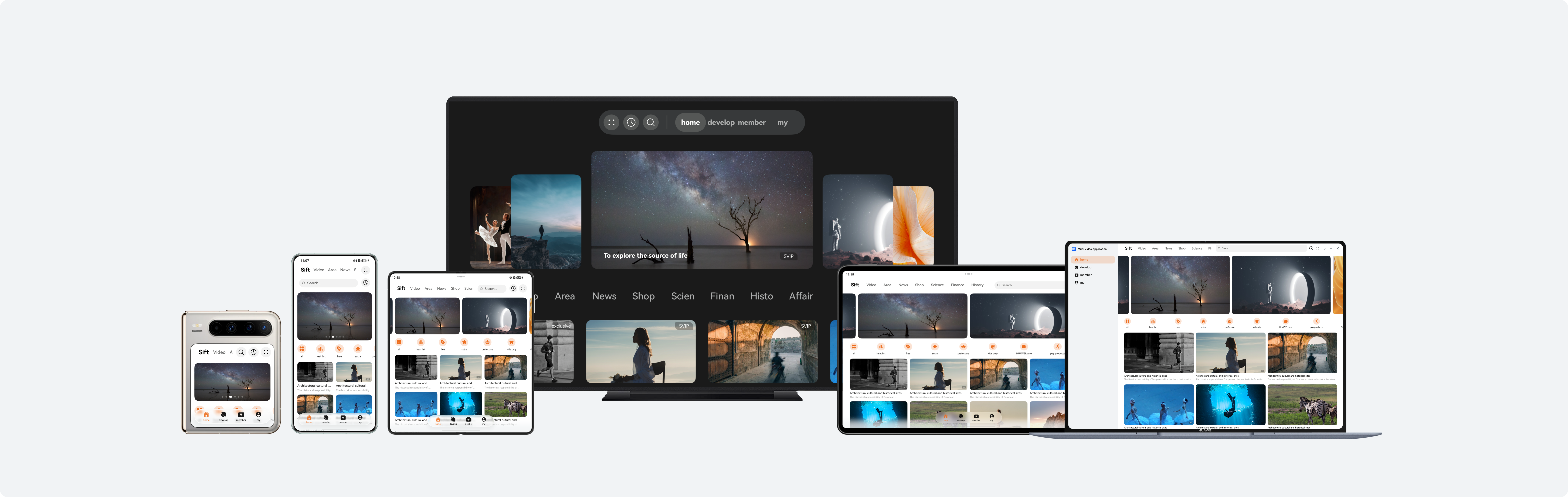
For details about the UX design of long video apps, see Long Video in Video and Music Applications. The following figure shows the design reference.
Project Management
To improve the reusability and maintainability of the project to implement one-time development for multi-device deployment, it is recommended that developers use a layered architecture to organize code projects. The architecture consists of three layers: products (product customization layer), features (basic feature layer), and common (common capability layer). Each layer has clear responsibilities and independent functions, providing developers with a clear, efficient, and scalable design architecture. For details about the layered architecture design, see Layered Architecture Design.
[h2]Project Creation
You are advised to create a template project of a layered architecture after learning how to create and configure such project by referring to Cross-Device Project Deployment and Release. You can then adjust the project based on the actual development requirements of the long video app to ensure that the project architecture aligns with the service scenario.
[h2]Project Structure
The long video app uses the recommended layered architecture, organizing the code project into three layers: products, features, and common. The design of each layer is as follows:
- products layer: The long video app needs to be compatible with the following devices: bar-type phones, bi-fold devices (Mate X series), tri-fold devices, widescreen foldable devices, tablets, PCs, and Visions. The UI layouts of Visions and PCs differ greatly from that of other devices. Therefore, HAPs named tv and pc are created separately at the products layer as the app entries of Visions and PCs. The UI layouts of bar-type phones, bi-fold devices (Mate X series), tri-fold devices, widescreen foldable devices, and tablets are similar. Some differences can be adapted through the adaptive layout and responsive layout of one-time development for multi-device deployment. Therefore, a hap named default is created at the products layer as the app entry for these devices.
- features layer: The long video app mainly consists of three core service modules: recommendation (multivideorecommended), search (multivideosearch), and video details (multivideodetail). HAR packages are created at the features layer for the three service modules, which can be referenced by the products layer as required. These service modules are independent of each other, facilitating subsequent maintenance and iteration of the project.
- common layer: To implement code reuse and reduce redundancy, a basic capability HAR package (multivideobase) is created at the common layer. This package encapsulates basic capabilities shared by multiple modules, such as common constants, media playback tools, and window management tools, enabling upper-layer modules to directly call these capabilities.
├──common                                         // Basic feature layer
│  ├──multivideobase/src/main/ets                 // ArkTS source code for basic common capabilities
│  │  ├──constants
│  │  └──utils
│  └──base/Index.ets                              // External export API for basic common capabilities
├──features                                       // Common capability layer
│  ├──multivideorecommended/src/main/ets          // ArkTS source code for the recommendation module
│  │  ├──constants
│  │  ├──model
│  │  ├──utils
│  │  ├──view
│  │  └──viewmodel
│  ├──multivideorecommended/src/main/resources    // Resource files for the recommendation module
│  ├──multivideorecommended/Index.ets             // External export API of the recommendation module
│  ├──multivideosearch/src/main/ets               // ArkTS source code for the search module
│  │  ├──constants
│  │  ├──model
│  │  ├──view
│  │  └──viewmodel
│  ├──multivideosearch/src/main/resources         // Resource files for the search module
│  ├──multivideosearch/Index.ets                  // External export API of the search module
│  ├──multivideodetail/src/main/ets               // ArkTS source code for the video details module
│  │  ├──constants
│  │  ├──model
│  │  ├──utils
│  │  ├──view
│  │  └──viewmodel
│  ├──multivideovideodetail/src/main/resources    // Resource files for the video details module
│  └──multivideodetail/Index.ets                  // External export API of the video details module
└──products                                       // Product customization layer
   ├──default/src/main/ets                        // ArkTS source code for bar-type phones, bi-fold devices (Mate X series), tri-fold devices, widescreen foldable devices
   │  ├──constants
   │  ├──defaultability
   │  ├──model
   │  ├──pages
   │  ├──view
   │  └──viewmodel
   ├──default/src/main/resources                 // Resource files for bar-type phones, bi-fold devices (Mate X series), tri-fold devices, and widescreen foldable devices
   ├──pc/src/main/ets                            // ArkTS source code for PCs
   │  ├──constants
   │  ├──model
   │  ├──pages
   │  ├──pcability
   │  ├──view
   │  └──viewmodel
   ├──pc/src/main/resources                      // Resource files for PCs
   ├──tv/src/main/ets                            // ArkTS source code for Visions
   │  ├──constants
   │  ├──tvability
   │  ├──pages
   │  └──view
   └──tv/src/main/resources                      // Resource files for Visions
Mobile Page
This section describes how to use layout capabilities to adapt a set of pages in the long video app across different devices, such as bar-type phones, bi-fold devices (Mate X series), tri-fold devices, widescreen foldable devices, and tablets. In addition, this section describes the window adaptation solutions for the preceding devices, as well as the interaction and function development of each page.
[h2]Window Adaptation
- Window mode
Long video apps support four window modes on mobile devices: full-screen, split-screen, floating window, and freeform window. For details about the implementation, see Window Mode. The split-screen and floating window modes do not require special design and can be directly accessed through system capabilities. By monitoring window size changes, the app refreshes the UI based on the breakpoints to automatically apply layouts suitable for various window modes.
- Window orientation
You can set the window orientation using window.setPreferredOrientation() in the app. For details, see Window Orientation. In a long video app, specific window orientation settings are applied only when the user switches to full-screen mode on the video details page. For details about the implementation logic, see Video Details Page & Full-Screen Playback Page. In other scenarios, the app should follow the rotation mode of the home screen. It is recommended that the orientation attribute under the abilities tag in the module.json5 file of the HAP be set to follow_desktop.
- Immersive window
According to the UX design specifications, the immersive effect needs to be implemented in multiple window modes (full-screen, split-screen, and floating window modes). For details, see Immersive Window. You can implement immersive windows in full-screen, split-screen, and floating window modes using window.setWindowLayoutFullscreen() and dynamically avoid the safe area to ensure a complete display effect.
[h2]Recommendation Page
The recommendation page is designed to recommend featured content to meet users' viewing needs. Based on the functional design, the content on the app recommendation page is divided into six areas, as shown in the following figures.
Horizontal/Vertical Breakpoint | sm/md | sm/lg | md | lg, xl |
|---|---|---|---|---|
Recommendation page - Featured tab page |
|
|
|
|


UI development
The recommendation page uses the extension capability and scaling capability of the adaptive layout of one-time development for multi-device deployment, as well as the responsive layout grid system, to implement the layout effect at different breakpoints. The following table describes the details and implementation scheme.
No. | Description | Implementation |
|---|---|---|
1 | Banner | Use the responsive component Swiper to implement this feature. The displayCount attribute is used to control the number of elements displayed in the viewport. When the horizontal breakpoint is sm or md, one element is displayed in the viewport. When the horizontal breakpoint is lg or xl, two elements are displayed in the viewport. With the aspectRatio attribute, the adaptive scaling of banners at different breakpoints is implemented. |
2 | Icon list | Use the responsive component List to implement this feature. Dynamically adjust the icon spacing by listening for breakpoint changes. |
3 | Popular videos | Use the Grid component to implement these features. Use the columnsTemplate attribute to dynamically adjust the number of columns displayed at different breakpoints. With the aspectRatio attribute, the adaptive scaling of video preview images at different breakpoints is implemented. |
4 | New video release | |
5 | Daily top videos | Use the grid system of the responsive layout to implement these features. Use the orientation layout to implement adaptive switching between the top-bottom layout and the left-right layout at different breakpoints. With the aspectRatio attribute, the adaptive scaling of video preview images at different breakpoints is implemented. |
6 | Previous videos |
In actual development, areas 1–6 are parallel in the recommendation page. Therefore, the corresponding development sequence is areas 1–6. To further improve user experience, the recommendation page implements immersive design of the community tab and innovative layout of banners. The following figure shows the effect.
- Immersive design of the community tab
Horizontal/Vertical Breakpoint
sm/md
sm/lg
md
lg, xl
Recommendation page - Community tab page


- Innovative layout of banners
Horizontal/Vertical Breakpoint
sm/md
sm/lg
md
lg, xl
Recommendation page - Video tab page


Interactive development
To improve user browsing experience on the recommendation page of a long video app, interactive development needs to be performed based on potential user scenarios. During browsing, users usually need to quickly preview video content and dynamically adjust the number of popular videos. Therefore, in addition to basic operation adaptation for multi-device interaction development, two additional interaction functions are implemented: press and hold for preview in the popular video area and scaling control in the popular video area.
- Press and hold for preview in the popular video area
The mobile video app adapts to phones and tablets, and supports input devices such as touchscreens, styluses, and mice.
The press and hold for preview operation of the preceding input devices is implemented in the LongPressGesture() callback of the first image in the popular video area. The interaction is completed by displaying a custom dialog (using CustomDialog) to play the video. The following figures show the effect.
Horizontal/Vertical Breakpoint
sm/lg
md
lg, xl
Recommended page – Press and hold for popular video preview


- Scaling control in the popular video area
The mobile long video app adapts to phones and tablets, and supports input devices such as touchscreens, mice, and keyboards. The scaling control can be triggered by a two-finger operation on the touchscreen or by pressing the Ctrl key on the keyboard and scrolling the mouse wheel.
The scaling operations of the preceding input devices are implemented in the PinchGesture() callback of the popular video area. The layout effect is dynamically adjusted by modifying the columnsTemplate attribute of the grid layout. The following figures show the effect.
Horizontal Breakpoint
md
lg, xl
Recommended page – Scaling control in the popular video area


[h2]Search Page
The search page responds to user input and displays search suggestions and results. Based on the functional design, the content on the app search page is divided into five areas, as shown in the following figures.
Horizontal/Vertical Breakpoint | sm/md | sm/lg | md | lg, xl |
|---|---|---|---|---|
Search page |
|
|
|
|
Search page - Smart tips |
|
|
|
|
Search page - Search result |
|
|
|
|


UI development
The search page uses the extension capability of the adaptive layout of one-time development for multi-device deployment and the responsive layout grid system to implement the layout effect at different breakpoints. The following table describes the details and implementation scheme.
No. | Description | Implementation |
|---|---|---|
1 | Search box | Use the TextInput component to implement this feature. The layoutWeight attribute is used to implement adaptive stretching to ensure that the search box is horizontally stretched across the screen at different breakpoints. |
2 | Suggested searches | Use the responsive component List to implement this feature. Use the lanes attribute to control the number of columns: two columns are displayed at the sm and md breakpoints, and three columns are displayed at the lg and xl breakpoints. The Blank component is used to stretch the blank area of the title bar. |
3 | Most searched | Use the responsive component List to implement this feature. Use the lanes attribute to control the number of columns: one column is displayed at the sm breakpoint, two columns are displayed at the md breakpoint, and three columns are displayed at the lg and xl breakpoints. The spacing between the top tabs is automatically adjusted based on the breakpoint. |
4 | Smart tips for "Hua" search | Use the responsive component List to implement this feature. Use the lanes attribute to control the number of columns: one column is displayed at the sm and md breakpoints, and two columns are displayed at the lg and xl breakpoints. |
5 | Search results | Use the grid system of the responsive layout to implement this feature. Use the orientation layout to implement switching between the top-bottom layout and the left-right layout. In addition, use the aspectRatio attribute to implement adaptive scaling of video preview images. |
In actual development, area 1 is the navigation bar, and areas 2, 3, 4, and 5 are parallel search page content. The development sequence is area 1 and then areas 2–5. To improve user experience on the search page, the page dynamically switches the displayed content based on the user's input in the search box. In this example, the suggested searches and most searched content are displayed by default. When the user enters "Hua", the smart tip list is displayed. When the user enters "Huawei launch event" or selects "Huawei launch event" from the smart tips, the search results are displayed. You can customize the trigger conditions and display styles for suggested searches, most searched content, smart tips, and search results as needed.
[h2]Video Details Page
The video details page is mainly used for video playback, comment interaction, and display of related information. Based on the functional differences of the page, it is divided into two parts: commenting-while-viewing page and full-screen playback page.
The commenting-while-viewing page is mainly used to display video details and provide users with the comment interaction function. Based on the functional design, the content on the commenting-while-viewing page is divided into five areas, as shown in the following figures.
Horizontal/Vertical Breakpoint | sm/md | sm/lg | md | lg, xl |
|---|---|---|---|---|
Video Details Page - Commenting while viewing |
|
|
|
|


UI development
The commenting-while-viewing page uses the extension and scaling capabilities of the adaptive layout of one-time development for multi-device deployment, as well as the display and hiding control of some components at different breakpoints, to implement layout adaptation at multiple breakpoints. The following table describes the details and implementation scheme.
No. | Description | Implementation |
|---|---|---|
1 | Video playback | Use video playback components such as AVPlayer and XComponent to implement this feature. For details about the implementation logic, see Sample Code. |
2 | Related list | The Blank component is used to stretch the blank area of the title bar. The video list area uses the List component to implement the extension capability and displays the video list horizontally. |
3 | All comments | At the sm and md breakpoints, this area is displayed at the bottom. At the lg and xl breakpoints, this area is displayed on the side. With the aspectRatio attribute, the adaptive scaling of images in the comment area at different breakpoints is implemented. |
4 | Comment | Use the TextInput component to implement this feature. The layoutWeight attribute is used to implement adaptive stretching, ensuring that the input box horizontally occupies the remaining space of the container at different breakpoints. |
5 | Video introduction | The icons in the video introduction area are implemented using the Row component. The icons are evenly arranged by setting the justifyContent attribute to FlexAlign.SpaceBetween. The episode list and surrounding video area use the List component to implement the extension capability and display related content horizontally. At the sm and md breakpoints, this area is hidden. At the lg and xl breakpoints, this area is displayed. |
In actual development, at the sm and md breakpoints, area 5 is not displayed, and areas 1–4 are displayed below the video. Areas 1–3 and area 4 are parallel content on the commenting-while-viewing page. The development sequence is area 4 and then areas 1–3. At the lg and xl breakpoints, the page is divided into two parts: the sidebar and the main content area. The main content area includes areas 1, 2, and 5, while the sidebar includes areas 3 and 4. These two parts are parallel content on the commenting-while-viewing page. The development sequence is areas 3 and 4, followed by areas 1, 2, and 5.
The full-screen playback page provides users with an immersive viewing experience and supports the episode selection function. Based on the functional design, the content on the full-screen playback page is divided into three areas, as shown in the following figures.
Horizontal/Vertical Breakpoint | sm/md | sm/lg | md | lg, xl |
|---|---|---|---|---|
Video details page - Full-screen playback |
|
|
|
|
Video details page - Episode selection |
|
|
|
|


UI development
The full-screen playback page uses the proportion capability of the adaptive layout of one-time development for multi-device deployment to implement adaptive layout adjustment at different breakpoints. The following table describes the details and implementation scheme.
No. | Description | Implementation |
|---|---|---|
1 | Full-screen video playback | Use video playback components such as AVPlayer and XComponent to implement this feature. For details about the implementation logic, see Sample Code. |
2 | Progress bar and toolbar | Use the Slider component to implement the progress bar. Use the layoutWeight attribute to ensure that the progress bar horizontally occupies the remaining space of the parent component at different breakpoints. |
3 | Episode list | Use the responsive component List to implement this feature. Use the lanes attribute to control the number of columns in the episode list to adaptively change at different breakpoints. At different breakpoints, this area is displayed on the side or at the bottom. When the breakpoint changes, the size of this area can be configured in two ways: set to a fixed size, or use the layoutWeight attribute to allocate space to area 1 and area 2 based on a fixed proportion. |
In actual development, areas 1 and 2, and area 3 are parallel content on the full-screen playback page. The development sequence is area 1 and 2, and then area 3. For details about window adaptation on the full-screen playback page, see #EN-US_TOPIC_0000002731721571__li672514218397. To further improve user experience, the full-screen playback page supports video playback on foldable devices in semi-folded state.
- Video playback on foldable devices in semi-folded state
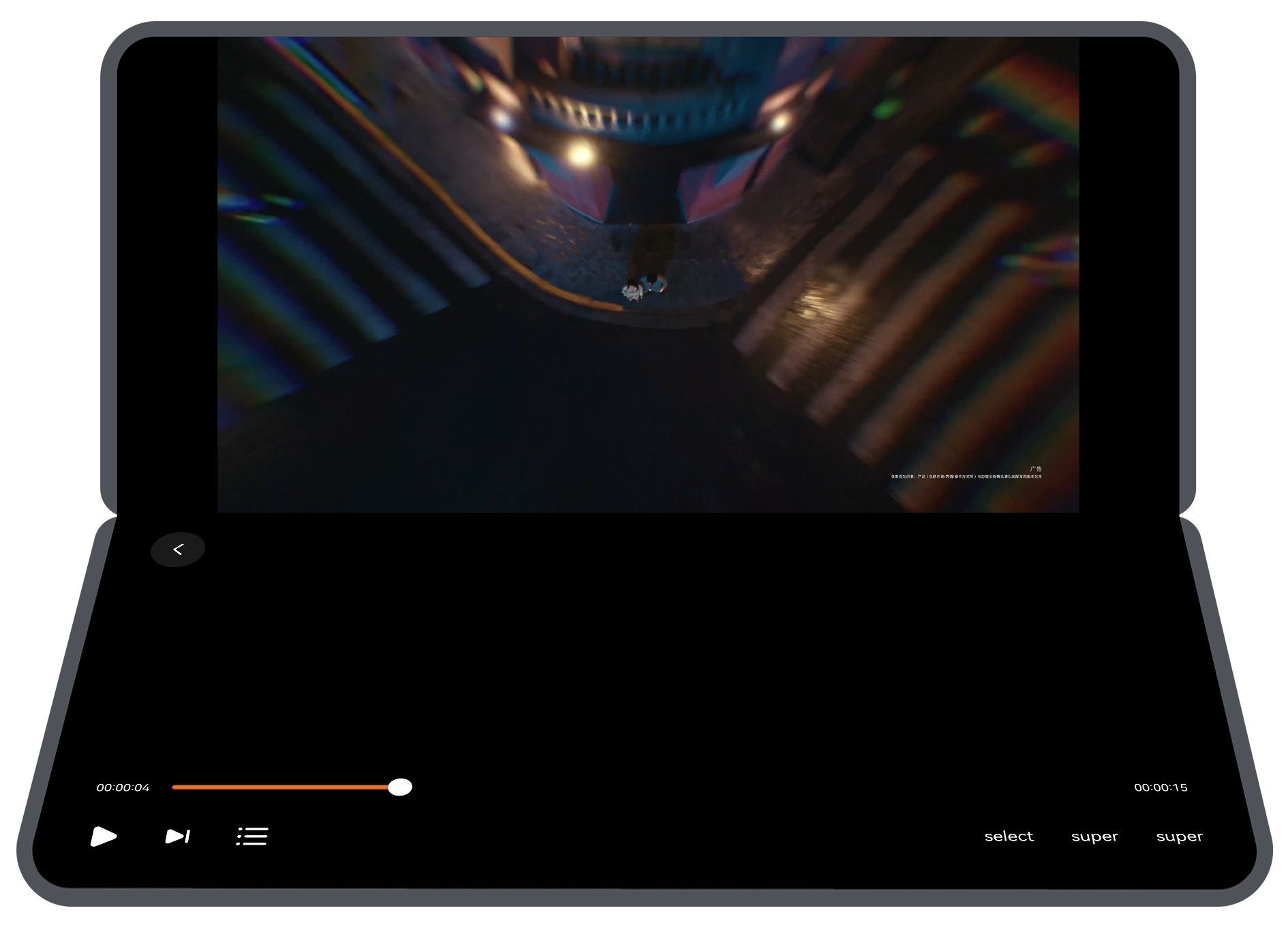
1. Triggering condition: When users browse a commenting while viewing page or full-screen playback page on a bi-fold or tri-fold device, the page automatically enters the video playback mode if the device is rotated to the landscape mode and switched to the semi-folded state, providing an immersive video viewing experience.
2. Page layout: The video image is displayed in the upper half of the screen. The middle of the screen is set as the foldable screen's crease area to be avoided. The progress bar and other operable components are arranged in the lower half of the screen. The following figure shows the effect.

For more information on how to develop a page in semi-folded state, see Semi-Folded State of Foldable Screens.
Interactive development
The full-screen playback page of a long video app provides users with an immersive video watching experience. Therefore, in addition to basic operation adaptation for multi-device interaction development, the interaction development of video playback control is implemented.
- Video playback control
The mobile long video app adapts to phones and tablets, and supports input devices such as touchscreens, styluses, mice, and keyboards. Event processing mechanisms need to be adapted based on the interaction modes of the preceding input devices.
For example, to implement playback/pause control, the onClick() event is listened for on the playback/pause component in the video playback area for touchscreens, styluses, and mice to implement playback and pause control. For keyboards, the onKeyEvent event of the space key is listened for to implement playback and pause control. For details about the interaction logic for video playback control, see Sample Code.
PC Page
This section describes how to reuse the code logic and layout based on the existing mobile UI development solution to efficiently develop long video apps for PCs. In addition, this section describes the interaction development implementation solution for each page in detail.
[h2]Window Adaptation
- Window mode
Long video apps support full-screen and freeform window modes on PCs. For details, see Window Mode. By monitoring window size changes, the app refreshes the UI based on the breakpoints to automatically apply layouts suitable for distinct window modes, such as the full-screen and freeform window modes modes.
- Immersive window
According to the UX design specifications, the immersive effect needs to be implemented in both full-screen and freeform window modes. For details, see Immersive Window. In full-screen mode, the immersive effect is implemented by calling window.setWindowLayoutFullscreen(). In freeform window mode, the title bar is hidden by calling window.setWindowDecorVisible(false), and only the three buttons in the upper right corner are retained. In this way, the page content extends to the title bar area, achieving an immersive display effect.
[h2]Recommendation Page
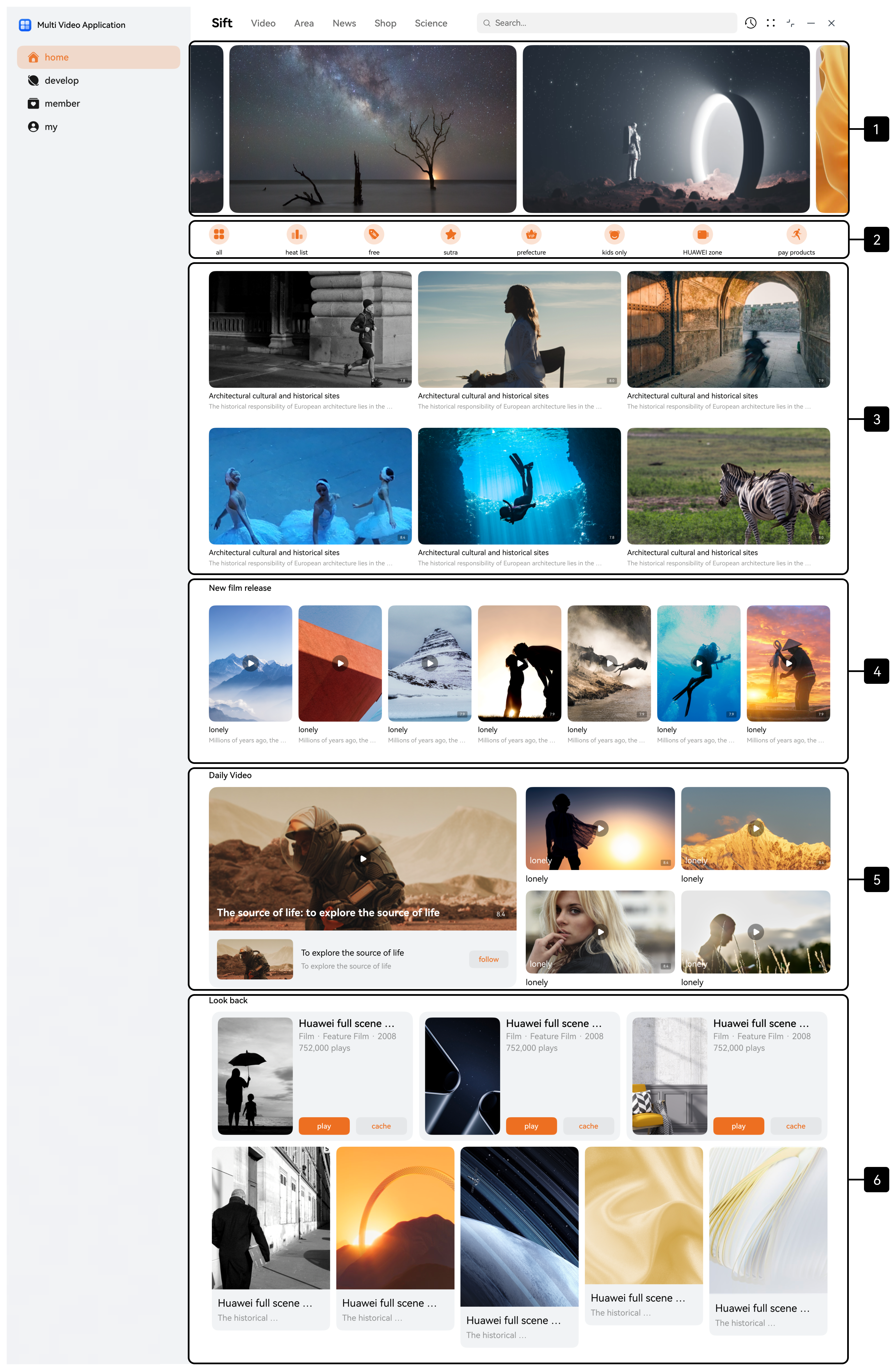
The recommendation page on the PC has the same functional positioning as that on the mobile device. Based on the functional design, the recommendation page is divided into six areas, as shown in the following figure.
UI development
The recommendation page uses the extension capability and scaling capability of the adaptive layout of one-time development for multi-device deployment, as well as the responsive layout grid system, to implement the layout effect at different breakpoints.
No. | Description | Implementation |
|---|---|---|
1 | Banner | Same as the implementation solution in Recommendation Page. |
2 | Icon list | |
3 | Popular videos | |
4 | New video release | |
5 | Daily top videos | |
6 | Previous videos |
In actual development, the development sequence of each area on the PC is the same as that on the mobile recommendation page. In addition, to ensure consistent user experience with the mobile version, the recommendation page on the PC also adapts to the immersive design of the community tab and innovative layout of banners. The following figures show the effect.


Interactive development
To ensure consistent interaction experience between the recommendation page of the long video app on the PC and that on the mobile device, the recommendation page on the PC also implements two interaction functions: press and hold for preview in the popular video area and scaling control in the popular video area.
The long video app of the PC version needs to support input devices such as touchscreens, mice, keyboards, and touchpads. The press and hold and scaling operations reuse the implementation solution of the mobile device. The following figures show the effect.
Interaction Function | Effect |
|---|---|
Press and hold for preview in the popular video area |
|
Scaling control in the popular video area |
|


[h2]Search Page
The search page on the PC has the same functional positioning as that on the mobile device. Based on the functional design, the search page is divided into five areas, as shown in the following figures.
Search page |
|
Search page - Smart tips |
|
Search page - Search result |
|


UI development
The search page uses the extension capability of the adaptive layout of one-time development for multi-device deployment and the responsive layout grid system to implement the layout effect at different breakpoints.
No. | Description | Implementation |
|---|---|---|
1 | Search box | Same as the implementation solution in Search Page. |
2 | Suggested searches | |
3 | Most searched | |
4 | Smart tips for "Hua" search | |
5 | Search results |
In actual development, the development sequence of each area on the PC is the same as that on the mobile search page.
[h2]Video Details Page
The video details page on the PC has the same functional positioning as that on the mobile device. It can be divided into two parts: commenting-while-viewing page and full-screen playback page.
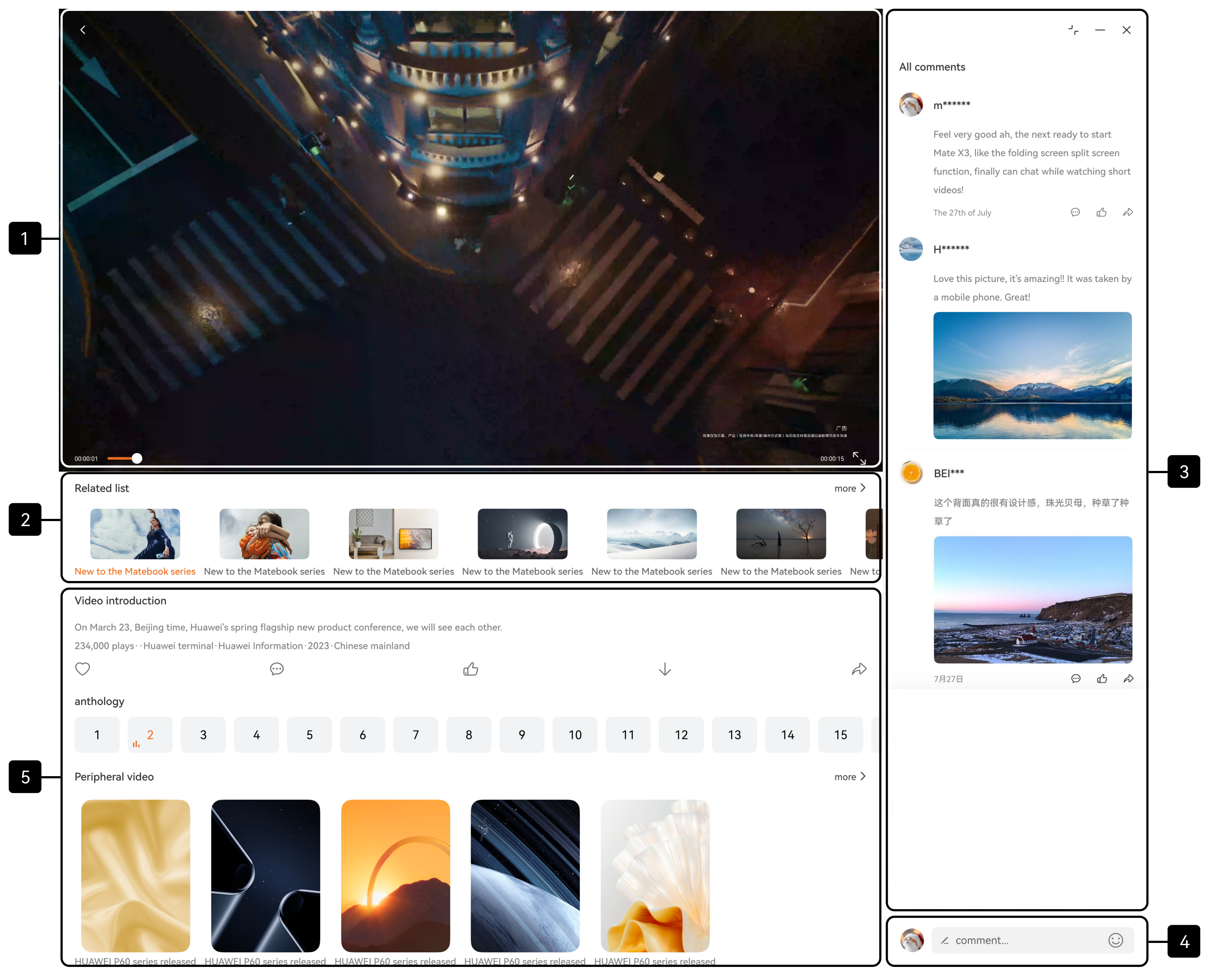
Based on the functional design, the commenting-while-viewing page is divided into five areas, as shown in the following figure.
UI development
The commenting-while-viewing page uses the extension and scaling capabilities of the adaptive layout of one-time development for multi-device deployment, as well as the display and hiding control of some components at different breakpoints, to implement layout adaptation at multiple breakpoints.
No. | Description | Implementation |
|---|---|---|
1 | Video playback | Same as the implementation solution in #EN-US_TOPIC_0000002731721571__li790319142255. |
2 | Related list | |
3 | All comments | |
4 | Comment | |
5 | Video introduction |
In actual development, the development sequence of each area on the PC is the same as that on the mobile commenting-while-viewing page.
Based on the functional design, the full-screen playback page is divided into three areas, as shown in the following figures.
Video details page - Full-screen playback |
|
Video details page - Episode selection |
|


UI development
The full-screen playback page uses the proportion capability of the adaptive layout of one-time development for multi-device deployment to implement adaptive layout adjustment at different breakpoints.
No. | Description | Implementation |
|---|---|---|
1 | Full-screen video playback | Same as the implementation solution in #EN-US_TOPIC_0000002731721571__li3446284253. |
2 | Progress bar and toolbar | |
3 | Episode list |
In actual development, the development sequence of each area on the PC is the same as that on the mobile full-screen playback page.
Interactive development
To ensure consistent interaction experience between the full-screen playback page of the long video app on the PC and that on the mobile device, the full-screen playback page on the PC also implements the video playback control interaction function.
- Video playback control
The long video app adapts to PCs and supports input devices such as touchscreens, mice, touchpads, and keyboards. Event processing mechanisms need to be adapted based on the interaction modes of different input devices.
For example, to implement playback/pause control, for touchscreens, mice, and touchpads, the onClick() event is listened for on the playback/pause component in the video playback area to control playback and pause. For keyboards, the onKeyEvent event of the space key is listened for to control playback and pause. For details about the interaction logic for video playback control, see Sample Code.
Vision Page
This section describes how to reuse the code logic and layout based on the existing mobile UI development solution to efficiently develop long video apps for Visions. In addition, this section describes the interaction development implementation solution for each page in detail.
[h2]Recommendation Page
The recommendation page on the Vision has the same functional positioning as that on the mobile device. Based on the functional design, the recommendation page is divided into six areas, as shown in the following figure.

UI development
The following table describes the details and implementation solution of each area on the recommendation page.
No. | Description | Implementation |
|---|---|---|
1 | Banner | Use the responsive component Swiper. Use the displayCount attribute to control the display of five elements in the viewport at the same time. When the positions of elements in the viewport change, different layout effects are displayed, improving visual interaction experience. |
2 | Top tab | Use the responsive component List to implement this feature. Switch the content displayed in the lower area by changing the index. |
3 | Popular videos | Same as the implementation solution in Recommendation Page. |
4 | New video release | |
5 | Daily top videos | Same as the implementation solution in Recommendation Page. |
6 | Previous videos |
In actual development, areas 1–6 are parallel in the recommendation page. Therefore, the corresponding development sequence is areas 1–6.
[h2]Search Page
The search page on the Vision has the same functional positioning as that on the mobile device. Based on the functional design, the search page is divided into five areas, as shown in the following figures.
Search page |
|
Search page - Search result |
|


UI development
The following table describes the details and implementation solution of the search page.
No. | Description | Implementation |
|---|---|---|
1 | Search box | Use the TextInput component to implement this feature. Set a fixed width and center the search box horizontally in the window. |
2 | Custom keyboard | Use the Grid component to implement two custom keyboards for letter input and number input. |
3 | Smart tips for search | Use the responsive component List to implement this feature. |
4 | Search recommendation | The title bar at the top is implemented using the Text component or responsive component List, and the video area at the bottom is implemented using the responsive component List. The implementation solution is reused in the same layout area. |
5 | Search results |
In actual development, areas 1 and 2 are the keyboard input operation areas, and areas 3 to 5 are parallel content on the search page. The development sequence is areas 1 and 2, and then areas 3 to 5. To improve user experience on the search page, the page dynamically switches the displayed content based on the user's input in the search box. In this example, the trending searches and most searched content are displayed by default. When the user enters "H", the search results are displayed. You can customize the trigger conditions and display styles for trending searches, most searched content, and search results as needed.
[h2]Video Details Page
The video details page on the Vision is mainly used for video playback and display of related information. Based on the functional design, the content on the video details page is divided into six areas, as shown in the following figures.
Video details page |
|
Video details page - Full-screen playback |
|
Video details page - Episode selection |
|


UI development
The following table describes the details and implementation solution of the video details page.
No. | Description | Implementation |
|---|---|---|
1 | Video playback | Use video playback components such as AVPlayer and XComponent to implement this feature. For details about the implementation logic, see Sample Code. |
2 | Title bar | Implement the title and episode selection areas in the parent component Row. Use the Stack component to control the component hierarchy on the video details page, ensuring that the title bar is always displayed at the top of the page. |
3 | Video introduction | Use the Text component to implement this feature. This area is displayed by default when the video details page is accessed and is hidden when the video is playing. |
4 | Episode list | Use the responsive component List to implement this feature. This area is displayed by default when the video details page is accessed and is automatically hidden when the video is playing. It is displayed again when the user selects an episode. |
5 | Progress bar | Use the Slider component to implement this feature. This area is hidden by default when the video details page is accessed and is automatically displayed when the video is playing. It is hidden again when the user selects an episode. |
6 | Video recommendation | The title bar at the top is implemented using the Text component, and the video area at the bottom is implemented using the responsive component List. This area is displayed by default when the video details page is accessed and is automatically hidden when the video is playing. It is displayed again when the user exits the video playback. |
In actual development, area 1 displays the main video content, areas 2 to 5 display video-related information, and area 6 displays recommended videos. The three areas are parallel display modules on the video details page. The development sequence is area 1, areas 2 to 5, and area 6.
Interactive development
To ensure consistent interaction experience between the full-screen playback page of the long video app on the Vision and that on the mobile device, the full-screen playback page on the Vision also implements the video playback control interaction function.
- Video playback control
The long video app adapts to the Vision and supports input devices such as the Ultra remote, Hover touch, focus-moving remote control, keyboard, and mouse. Event processing mechanisms need to be adapted based on the interaction modes of different input devices.
For example, to implement playback/pause control, the onClick() event is listened for in the video playback area for the Ultra remote, Hover touch, and mouse to control playback and pause. For the Ultra remote and focus-moving remote control, the onKeyEvent event of the OK button is listened for to control playback and pause. For keyboards, the onKeyEvent event of the space key is listened for to control playback and pause. For details about the interaction logic for video playback control, see Sample Code.