This module provides the navigation component capability, supporting dynamic blur styles of the title bar that activate with content scrolling. For 6.0.0(20) and later, you are advised to use bindToScrollable or bindToNestedScrollable to bind the navigation component to a scrollable container component. This allows you to utilize the navigation component's scrolling functions to implement features like dynamic blur effects and title bar's dynamic visibility transition during content scrolling, ultimately providing a superior UI experience.
The HdsNavigation component is the root view container for navigation. It typically functions as the root container of pages and includes a title bar, content area, and toolbar. By default, the content area switches between the home page content (child components of HdsNavigation) and non-home page content (child components of HdsNavDestination) through routing.
Since: 5.1.0(18)
Modules to Import

- HdsNavigationAttribute is essential for configuring the HdsNavigation component. In version 6.0.1(21) and earlier, you must manually import HdsNavigationAttribute after importing the HdsNavigation component. Otherwise, a compilation error is reported. However, starting from version 6.0.2(22), the compilation toolchain automatically imports HdsNavigationAttribute when it detects the HdsNavigation component, so manual import is no longer necessary.
- If you manually import HdsNavigationAttribute, DevEco Studio shows it as disabled (grayed out). In version 6.0.1(21) and earlier, removing this import causes a compilation error. But from version 6.0.2(22) onward, removing it does not affect the functionality.
Version 6.0.1(21) and earlier:
import { HdsNavigation, HdsNavigationAttribute } from '@kit.UIDesignKit'; Version 6.0.2(22) and later:
import { HdsNavigation } from '@kit.UIDesignKit'; Child Components
Child components are supported. You are advised to use NavPathStack together with the HdsNavDestination attribute for page routing.
APIs
HdsNavigation(pathInfos?: NavPathStack)
Binds a navigation stack to the HdsNavigation component.
Model restriction: This API can be used only in the stage model.
System capability: SystemCapability.UIDesign.HDSComponent.Core
Since: 5.1.0(18)
Parameters:
| Parameter | Type | Mandatory | Description |
|---|---|---|---|
| pathInfos | NavPathStack | No | Information about the routing stack. |
[h2]titleBar
titleBar(options?: HdsNavigationTitleBarOptions)
Sets the styles and content of the titleBar area (including the return icon area, title area, menu area, and background) of the HdsNavigation component.
When the title string is too long: (1) If no subtitle is set, the string is scaled down and wrapped in two lines. Any content exceeding this will be truncated with an ellipsis (...). (2) If a subtitle is set, the title string is scaled down and then clipped with an ellipsis (...).
Model restriction: This API can be used only in the stage model.
System capability: SystemCapability.UIDesign.HDSComponent.Core
Since: 5.1.0(18)
Parameters:
| Parameter | Type | Mandatory | Description |
|---|---|---|---|
| options | HdsNavigationTitleBarOptions | No | Title bar settings. |
[h2]titleMode
titleMode(value: HdsNavigationTitleMode)
Sets the display mode of the page title bar.
Model restriction: This API can be used only in the stage model.
System capability: SystemCapability.UIDesign.HDSComponent.Core
Since: 5.1.0(18)
Parameters:
| Parameter | Type | Mandatory | Description |
|---|---|---|---|
| value | HdsNavigationTitleMode | Yes | Display mode of the page title bar. The default value is HdsNavigationTitleMode.FREE. |
[h2]toolbarConfiguration
toolbarConfiguration(value: Array<ToolbarItem> | CustomBuilder, options?: NavigationToolbarOptions)

The following are not allowed: modify the icon size through the fontSize attribute of the SymbolGlyphModifier object, change the animation effects through the effectStrategy attribute, or change the type of animation effects through the symbolEffect attribute.
Sets the content of the toolbar. If this attribute is not set, no toolbar is displayed.
Model restriction: This API can be used only in the stage model.
System capability: SystemCapability.UIDesign.HDSComponent.Core
Since: 5.1.0(18)
Parameters:
| Parameter | Type | Mandatory | Description |
|---|---|---|---|
| value | Array<ToolbarItem> | CustomBuilder | Yes | Content of the toolbar. When configured with Array<ToolbarItem>, the toolbar follows the rules below: - In Stack mode, this component is not recommended. It is recommended that you use the CustomBuilder component together with the ToolBar component to avoid layout display issues. - Toolbar items are evenly distributed on the bottom toolbar, with text and icons evenly spaced in each content area. - The toolbar shows a maximum of five icons, with any additional icons placed into an automatically generated More icon. When configured with CustomBuilder, the toolbar does not follow the above rules, except for evenly distributing items at the bottom toolbar. |
| options | NavigationToolbarOptions | No | Defines the toolbar options. |
[h2]hideToolBar
hideToolBar(hide: boolean, animated?: boolean)
Sets whether to hide the toolbar and whether to animate the visibility change.
Model restriction: This API can be used only in the stage model.
System capability: SystemCapability.UIDesign.HDSComponent.Core
Since: 5.1.0(18)
Parameters:
| Parameter | Type | Mandatory | Description |
|---|---|---|---|
| hide | boolean | Yes | Indicates whether to hide the toolbar. The default value is false. - true: yes - false: no |
| animated | boolean | No | Indicates whether to animate the visibility change. The default value is false. - true: yes - false: no |
[h2]hideTitleBar
hideTitleBar(hide: boolean, animated?: boolean)
Sets whether to hide the title bar and whether to animate the visibility change.
Model restriction: This API can be used only in the stage model.
System capability: SystemCapability.UIDesign.HDSComponent.Core
Since: 5.1.0(18)
Parameters:
| Parameter | Type | Mandatory | Description |
|---|---|---|---|
| hide | boolean | Yes | Indicates whether to hide the title bar. The default value is false. - true: yes - false: no |
| animated | boolean | No | Indicates whether to animate the visibility change. The default value is false. - true: yes - false: no |
[h2]hideBackButton
hideBackButton(value: boolean)
Sets whether to hide the back button on the title bar. The back button is available only when titleMode is set to HdsNavigationTitleMode.MINI.
Model restriction: This API can be used only in the stage model.
System capability: SystemCapability.UIDesign.HDSComponent.Core
Since: 5.1.0(18)
Parameters:
| Parameter | Type | Mandatory | Description |
|---|---|---|---|
| value | boolean | Yes | Indicates whether to hide the back button on the title bar. The default value is false. - true: yes - false: no |
[h2]mode
mode(value: NavigationMode)
Sets the display mode of the navigation bar. Available options are Stack, Split, and Auto.
Model restriction: This API can be used only in the stage model.
System capability: SystemCapability.UIDesign.HDSComponent.Core
Since: 5.1.0(18)
Parameters:
| Parameter | Type | Mandatory | Description |
|---|---|---|---|
| value | NavigationMode | Yes | Display mode of the navigation bar. The default value is NavigationMode.Auto. At the default settings, the component adapts to a single column or two columns based on the component width. |
[h2]divider
divider(style: NavigationDividerStyle | null)
Sets the divider style in the split-column mode of the Navigation component.
Model restriction: This API can be used only in the stage model.
System capability: SystemCapability.UIDesign.HDSComponent.Core
Since: 6.1.0(23)
Parameters:
| Parameter | Type | Mandatory | Description |
|---|---|---|---|
| style | NavigationDividerStyle | null | Yes | Divider style of the split-column layout. If this parameter is set to null, the divider is hidden. |
[h2]minContentWidth
minContentWidth(value: Dimension)
Sets the minimum width of the navigation bar content area (effective in split-column mode).
For details about the priority rules, see NOTE below.
Model restriction: This API can be used only in the stage model.
System capability: SystemCapability.UIDesign.HDSComponent.Core
Since: 5.1.0(18)
Parameters:
| Parameter | Type | Mandatory | Description |
|---|---|---|---|
| value | Dimension | Yes | Minimum width of the navigation bar content area. The default value is 360. The unit is vp. undefined: No action is taken, and the minimum width of the navigation bar content area remains consistent with the default value. |

-
If only navBarWidth is set, no divider in the HdsNavigation component can be dragged.
-
navBarWidthRange specifies the range within which the divider can be dragged. If it is not set, the default value is used. The dragging of the divider is subject to both navBarWidthRange and minContentWidth.
-
If the size of the HdsNavigation component decreases, it carries out the following steps in sequence: a. Scale down the content area. If minContentWidth is not set, the content area can be scaled down to 0. Otherwise, the content area can be scaled down to as small as the value specified by minContentWidth.b. Scale down the navigation bar until its width reaches the value defined by navBarRange.c. Clip the displayed content.
[h2]ignoreLayoutSafeArea
ignoreLayoutSafeArea(types?: Array<LayoutSafeAreaType>, edges?: Array<LayoutSafeAreaEdge>)
Ignores the layout safe area by allowing the component to extend into the non-safe areas of the screen.
Model restriction: This API can be used only in the stage model.
System capability: SystemCapability.UIDesign.HDSComponent.Core
Since: 5.1.0(18)
Parameters:
| Parameter | Type | Mandatory | Description |
|---|---|---|---|
| types | Array <LayoutSafeAreaType> | No | Types of non-safe areas to extend into. The default value is [LayoutSafeAreaType.SYSTEM]. |
| edges | Array <LayoutSafeAreaEdge> | No | Edges for extending the safe area. The default value is [LayoutSafeAreaEdge.TOP, LayoutSafeAreaEdge.BOTTOM]. |

After LayoutSafeArea is set:
When LayoutSafeAreaType.SYSTEM is used, the component can extend into the non-safe areas if its boundaries overlap with them. For example, if the device's top status bar is 100 high, the component can extend into the non-safe areas only when there is an absolute vertical offset between 0 and 100.
If the component extends into the non-safe areas, events triggered within those areas (such as tap events) might be blocked by the system. This allows the system to prioritize responses to system components such as the status bar.
[h2]systemBarStyle
systemBarStyle(originalStyle: Optional<SystemBarStyle>, scrollEffectStyle: Optional<SystemBarStyle>)
Sets the style of the system status bar when the home page of the HdsNavigation component is displayed.
Model restriction: This API can be used only in the stage model.
System capability: SystemCapability.UIDesign.HDSComponent.Core
Since: 5.1.0(18)
Parameters:
| Parameter | Type | Mandatory | Description |
|---|---|---|---|
| originalStyle | Optional<SystemBarStyle> | Yes | Initial style of the system status bar. If the systemBarStyle attribute is not set, the font color of the main title bar is used. |
| scrollEffectStyle | Optional<SystemBarStyle> | Yes | Dynamic style of the system status bar after the final dynamic style of the HdsNavigation component takes effect. If the systemBarStyle attribute is not set, the font color of the main title bar is used. |

-
Avoid using the systemBarStyle attribute in conjunction with the status bar style APIs in the Window module, such as setWindowSystemBarProperties.
-
For the HdsNavigation component that uses the Split mode, if there is no HdsNavDestination in the content area, the settings of the HdsNavigation home page will apply. Otherwise, the settings of the top HdsNavDestination page on the navigation stack will apply.
-
The systemBarStyle attribute is effective only for the main page of the main window.
-
When different styles are set for pages, the new style takes effect at the start of the page transition.
-
The status bar style set by HdsNavigation or HdsNavDestination does not apply in non-full-screen windows.
[h2]recoverable
recoverable(recoverable: Optional<boolean>)
Sets whether the HdsNavigation component is recoverable. If set to recoverable, when the app process exits unexpectedly and restarts, the HdsNavigation component will be automatically recreated, and the navigation stack will be restored to the state at the time of the unexpected exit.
Model restriction: This API can be used only in the stage model.
System capability: SystemCapability.UIDesign.HDSComponent.Core
Since: 5.1.0(18)
Parameters:
| Parameter | Type | Mandatory | Description |
|---|---|---|---|
| recoverable | Optional<boolean> | Yes | Indicates whether the HdsNavigation component is recoverable. By default, it is not recoverable. The default value is false. - true: yes - false: no |

-
For this API to work properly, you must first set the id attribute of the HdsNavigation component.
-
This API must be used together with the recoverable API of HdsNavDestination.
-
Non-serializable information, such as non-serializable parameters and custom onPop, is discarded and cannot be restored during the recovery process.
-
If an app is terminated due to insufficient system resources after it is switched to the background, any page configured as recoverable will be automatically restored when the app is revived to the foreground. For details, see UIAbility Backup and Restore.
[h2]dynamicHideTitleBar
dynamicHideTitleBar(value: DynamicHideParams)
Sets whether to dynamically trigger the display or hiding animation of the title bar as the content area scrolls. You are advised to call this API together with bindToScrollable/bindToNestedScrollable to achieve a better scrolling effect.
Model restriction: This API can be used only in the stage model.
System capability: SystemCapability.UIDesign.HDSComponent.Core
Since: 6.0.0(20)
Parameters:
| Parameter | Type | Mandatory | Description |
|---|---|---|---|
| value | DynamicHideParams | Yes | Indicates whether to dynamically trigger the display or hiding animation of the title bar as the content area scrolls. If the title bar mode is HdsNavigationTitleMode.MODAL, settings made through this API do not take effect. Attributes cannot be dynamically changed during the display and hiding process. |
[h2]bindToScrollable
bindToScrollable(scrollers: Array<Scroller>)
Binds the navigation component and scrollable container component to achieve the function of displaying/hiding the title area, status bar, and bottom custom area, delivering a better dynamic display and hiding experience.
Model restriction: This API can be used only in the stage model.
System capability: SystemCapability.UIDesign.HDSComponent.Core
Since: 6.0.0(20)
Parameters:
| Parameter | Type | Mandatory | Description |
|---|---|---|---|
| scrollers | Array<Scroller> | Yes | Controller of the target scrollable container. |
[h2]bindToNestedScrollable
bindToNestedScrollable(scrollers: Array<NestedScrollInfo>)
Binds the navigation component and nested scrollable container component to achieve the function of displaying/hiding the title area, status bar, and bottom custom area, delivering a better dynamic display and hiding experience.
Model restriction: This API can be used only in the stage model.
System capability: SystemCapability.UIDesign.HDSComponent.Core
Since: 6.0.0(20)
Parameters:
| Parameter | Type | Mandatory | Description |
|---|---|---|---|
| scrollers | Array<NestedScrollInfo> | Yes | Controller of the target nested scrollable containers. |

If a navigation component is bound to multiple scrollable containers, scrolling in any of these containers triggers the display or hiding animation of the title bar. Specifically, when any scrollable container reaches either the bottom or the top,
the display animation for the title bar is triggered without delay. As such, to ensure the optimal user experience, avoid triggering scroll events of multiple scrollable containers simultaneously.
[h2]enableDragBar
enableDragBar(isEnabled: Optional<boolean>)
Sets whether to display a drag bar in split-column scenarios.
Model restriction: This API can be used only in the stage model.
System capability: SystemCapability.UIDesign.HDSComponent.Core
Since: 6.0.0(20)
Parameters:
| Parameter | Type | Mandatory | Description |
|---|---|---|---|
| isEnabled | Optional<boolean> | Yes | Indicates whether to enable the drag bar. By default, there is no drag bar. The default value is false. - true: yes - false: no |
[h2]enableModeChangeAnimation
enableModeChangeAnimation(isEnabled: Optional<boolean>)
Sets whether to enable the animation for switching between single and double column modes for NavigationMode.
Model restriction: This API can be used only in the stage model.
System capability: SystemCapability.UIDesign.HDSComponent.Core
Since: 6.0.0(20)
Parameters:
| Parameter | Type | Mandatory | Description |
|---|---|---|---|
| isEnabled | Optional<boolean> | Yes | Indicates whether to enable the animation for switching between single and double column modes. The default value is true. - true: yes - false: no |
[h2]withTheme
withTheme(value: WithThemeOptions)
Sets the WithTheme capability of HdsNavigation.
Model restriction: This API can be used only in the stage model.
System capability: SystemCapability.UIDesign.HDSComponent.Core
Since: 6.1.0(23)
| Parameter | Type | Mandatory | Description |
|---|---|---|---|
| value | WithThemeOptions | Yes | Options of the WithTheme component. |
[h2]splitPlaceholder
splitPlaceholder(placeholder: ComponentContent)
Sets a default placeholder page for the right column in the HdsNavigation component's split-column mode. The placeholder page is for UI display only and cannot receive focus or respond to events.
Model restriction: This API can be used only in the stage model.
System capability: SystemCapability.UIDesign.HDSComponent.Core
Since: 6.1.0(23)
| Parameter | Type | Mandatory | Description |
|---|---|---|---|
| placeholder | ComponentContent | Yes | Default placeholder page for the right column in the Navigation component's split-column mode. |
[h2]enableVisibilityLifecycleWithContentCover
enableVisibilityLifecycleWithContentCover(isEnabled: Optional<boolean>)
Sets whether to enable the linkage between the onHidden and onShown lifecycle callbacks of the HdsNavDestination page and the full-modal triggering.
Model restriction: This API can be used only in the stage model.
System capability: SystemCapability.UIDesign.HDSComponent.Core
Since: 6.1.0(23)
| Parameter | Type | Mandatory | Description |
|---|---|---|---|
| isEnabled | Optional<boolean> | Yes | Whether to enable the linkage between the onShown and onHidden lifecycle callbacks of the HdsNavDestination page and the full-modal triggering. The default value is true. - true: When a full-modal page is shown, the current HdsNavDestination page triggers onHidden. When the full-modal page is dismissed, the page triggers onShown. - false: The onShown and onHidden callbacks of the HdsNavDestination page are not triggered by the showing or dismissing of a full-modal page. |
[h2]onTitleModeChange
onTitleModeChange(callback: Callback<HdsNavigationTitleMode>)
Triggered when titleMode is set to HdsNavigationTitleMode.FREE and the title bar mode changes as content scrolls.
Model restriction: This API can be used only in the stage model.
System capability: SystemCapability.UIDesign.HDSComponent.Core
Since: 6.0.0(20)
Parameters:
| Parameter | Type | Mandatory | Description |
|---|---|---|---|
| callback | Callback<HdsNavigationTitleMode> | Yes | Callback used to return the current display mode of the title bar. |
ScrollEffectType
Defines the enumeration of the title bar blur style.
Model restriction: This API can be used only in the stage model.
System capability: SystemCapability.UIDesign.HDSComponent.Core
Since: 5.1.0(18)
| Name | Value | Description |
|---|---|---|
| COMMON_BLUR | 0 | Blur style of the title bar: common type. Using this style, the background of the title bar can also be uniformly blurred with consistent intensity and sharp boundaries, emphasizing the hierarchical division between controls and content. As content slides into or out of the title bar area, the blurred background and divider line will gradually fade in or out. This style is applicable to non-immersive scenarios. |
| GRADUAL_BLUR | 1 | Blur style of the title bar: transition blur. Using this style, the background of the title bar can also be uniformly blurred with consistent intensity and sharp boundaries, emphasizing the hierarchical division between controls and content. As content scrolls, the title bar undergoes color and state changes, which linearly animate synchronously with the scrolling motion. This style is applicable to immersive text-and-image scenarios. Since: 6.0.0(20) |
| GRADIENT_BLUR | 2 | Blur style of the title bar: gradient blur. This blur effect gradually intensifies or lessens across the screen, featuring soft, seamless edges to create a more immersive page experience. - When ScrollEffectOptions.enableScrollEffect is set to true, gradient blur takes effect in a gradual mode from originalStyle to scrollEffectStyle. - When ScrollEffectOptions.enableScrollEffect is set to false, gradient blur takes effect directly. This style is applicable to non-immersive list scenarios. Since: 6.0.0(20) |
| IMMERSIVE_GRADIENT_BLUR | 3 | Blur style of the title bar: immersive gradient blur. This blur effect gradually intensifies or lessens across the screen, featuring soft, seamless edges to create a more immersive page experience. - When ScrollEffectOptions.enableScrollEffect is set to true, gradient blur takes effect in a gradual mode from originalStyle to scrollEffectStyle. - When ScrollEffectOptions.enableScrollEffect is set to false, gradient blur takes effect directly. This style is applicable to immersive text-and-image scenarios. Since: 6.1.0(23) |
DividerShowType
Defines the enumeration of the divider display type.
Model restriction: This API can be used only in the stage model.
System capability: SystemCapability.UIDesign.HDSComponent.Core
Since: 6.0.0(20)
| Name | Value | Description |
|---|---|---|
| OFF | 0 | The divider is always hidden. |
| ON | 1 | The divider is always visible. |
| AUTO | 2 | The divider is visible or hidden with the scrolling motion of the content area. |
TextStyleMode
Defines the enumeration of the text icon mode.
Model restriction: This API can be used only in the stage model.
System capability: SystemCapability.UIDesign.HDSComponent.Core
Since: 6.0.0(20)
| Name | Value | Description |
|---|---|---|
| NORMAL | 200 | Common text mode. This mode indicates a capsule button, with a corner radius specified by sys.float.corner_radius_level10. |
| SINGLE_CHARACTER | 201 | Single-character mode. Circle button. |
BottomBuilderShowType
Defines the enumeration of the display type for the bottomBuilder.
Model restriction: This API can be used only in the stage model.
System capability: SystemCapability.UIDesign.HDSComponent.Core
Since: 6.0.0(20)
| Name | Value | Description |
|---|---|---|
| DIRECTLY_SHOW | 0 | The bottomBuilder is directly displayed. |
| OVERDRAG_SHOW | 1 | The bottomBuilder is displayed upon over-scrolling. |
HideMode
Defines the enumeration of the dynamic display/hiding mode for the title bar.
Model restriction: This API can be used only in the stage model.
System capability: SystemCapability.UIDesign.HDSComponent.Core
Since: 6.0.0(20)
| Name | Value | Description |
|---|---|---|
| SCROLL_UP_TO | 0 | The title bar is hidden on downward scroll to a fixed position and displayed on upward scroll to a fixed position. |
| SCROLL_UP | 1 | The title bar is hidden on any downward scroll and displayed on any upward scroll. This mode takes effect only in continuous scrolling scenarios but not for scrolling triggered by a scrollable component API. |
| SCROLL_DOWN | 2 | The title bar is displayed on any downward scroll and hidden on any upward scroll. This setting takes effect only when the title bar mode is HdsNavigationTitleMode.MINI or HdsNavDestinationTitleMode.MINI. This mode takes effect only in continuous scrolling scenarios but not for scrolling triggered by a scrollable component API. |
| SCROLL_UP_TO_BLEND_SCROLL_UP | 3 | The title bar is displayed in hybrid mode. The bottomBuilder uses the SCROLL_UP_TO mode, and the title bar uses the SCROLL_UP mode. |
IconStyleMode
Defines the enumeration of the image icon mode.
Model restriction: This API can be used only in the stage model.
System capability: SystemCapability.UIDesign.HDSComponent.Core
Since: 6.0.0(20)
| Name | Value | Description |
|---|---|---|
| SMALL | 100 | Small image icon mode. The default icon size is 18 x 18 vp. |
| NORMAL | 101 | Common-size image icon mode. The default icon size is 24 x 24 vp. |
| LARGE | 102 | Large image icon mode. The default icon size is 40 x 40 vp. |
BlurStrategy
Defines the enumeration of the blur effect.
Model restriction: This API can be used only in the stage model.
System capability: SystemCapability.UIDesign.HDSComponent.Core
Since: 6.0.0(20)
| Name | Value | Description |
|---|---|---|
| ENABLE | 0 | The blur effect is enabled. |
| DISABLE | 1 | The blur effect is disabled. |
| ADAPTIVE | 2 | The blur effect policy is adjusted based on the system policy. Three distinct system style policy ranks are supported: exquisite, gentle, and smooth. Blur effects can take effect only for the exquisite rank. The system style policy is configured by each device manufacturer based on device performance, with the exquisite rank executed by default if not configured. |
TitleSize
Title font size.
Model restriction: This API can be used only in the stage model.
System capability: SystemCapability.UIDesign.HDSComponent.Core
Since: 6.1.0(23)
| Name | Value | Description |
|---|---|---|
| TITLE_S | 0 | Small size. |
| TITLE_ML | 1 | Medium-large size. |
CustomTransitionDelegate
type CustomTransitionDelegate = (from: NavContentInfo, to: NavContentInfo, operation: NavigationOperation) => NavigationAnimatedTransition | undefined
Callback of the custom transition animation.
Model restriction: This API can be used only in the stage model.
System capability: SystemCapability.UIDesign.HDSComponent.Core
Since: 6.0.0(20)
Parameters:
| Parameter | Type | Mandatory | Description |
|---|---|---|---|
| from | NavContentInfo | Yes | Destination page to exit. |
| to | NavContentInfo | Yes | Destination page to enter. |
| operation | NavigationOperation | Yes | Transition type. |
Returns
| Type | Description |
|---|---|
| NavigationAnimatedTransition | undefined | Custom transition animation agreement. undefined: The default transition effect is executed. |
IconType
type IconType = ResourceStr | SymbolGlyphModifier | PixelMap
Defines the image resource type supported by a single icon-type menu item on the title bar of the HdsNavigation component.
Model restriction: This API can be used only in the stage model.
System capability: SystemCapability.UIDesign.HDSComponent.Core
Since: 5.1.0(18)
| Type | Description |
|---|---|
| ResourceStr | String. |
| SymbolGlyphModifier | Symbol resource type. |
| PixelMap | Image pixel type. Since: 6.0.0(20) |
BuilderType
type BuilderType = ComponentContent | BuilderOptions
Custom node type.
Model restriction: This API can be used only in the stage model.
System capability: SystemCapability.UIDesign.HDSComponent.Full
Since: 26.0.0
| Type | Description |
|---|---|
| ComponentContent | Encapsulation type of the component content. |
| BuilderOptions | Custom builder function type. |
HdsTitleBarContentStyle
Defines the content area style for the title bar of the HdsNavigation component.
Model restriction: This API can be used only in the stage model.
System capability: SystemCapability.UIDesign.HDSComponent.Core
Since: 5.1.0(18)
| Name | Type | Read-Only | Optional | Description |
|---|---|---|---|---|
| titleStyle | HdsNavigationTitleStyle | No | Yes | Title style of the title bar content area. |
| menuStyle | HdsNavigationIconItemStyle | No | Yes | Menu bar style of the title bar content area. |
| backIconStyle | HdsNavigationIconItemStyle | No | Yes | Back button icon style of the title bar content area. |
| subIconStyle | HdsNavigationIconItemStyle | No | Yes | Sub-icon style of the title bar content area. Since: 6.0.0(20) |
| dividerStyle | HdsNavigationDividerStyle | No | Yes | Divider style of the title bar content area. Since: 6.0.0(20) |
ScrollEffectOptions
Defines the dynamic blur style settings for the title bar of the HdsNavigation component.
Model restriction: This API can be used only in the stage model.
System capability: SystemCapability.UIDesign.HDSComponent.Core
Since: 5.1.0(18)
| Name | Type | Read-Only | Optional | Description |
|---|---|---|---|---|
| enableScrollEffect | boolean | No | Yes | Indicates whether the blur styles of the title dynamically take effect based on the total scrolling distance of the content area. The default value is true. - true: The total scrolling offset of the content area linearly transits from blurEffectiveStartOffset to blurEffectiveEndOffset, while the title bar style transits from originalStyle to scrollEffectStyle. - false: The title bar blur style does not change dynamically with the scrolling of the content area. Only originalStyle is applied. |
| scrollEffectType | ScrollEffectType | No | Yes | Blur style type of the title bar. The default value is ScrollEffectType.COMMON_BLUR. |
| enableRefreshOffsetChange | boolean | No | Yes | Indicates whether to respond to the scrolling of the Refresh component in the content area. The default value is true. - true: The title bar style changes dynamically with the scrolling of the Refresh component in the content area. - false: The title bar style does not change dynamically with the scrolling of the Refresh component in the content area. Since: 6.1.0(23) |
| blurEffectiveStartOffset | LengthMetrics | No | Yes | Start position for the linear transition of the dynamic style. When the total scrolling offset of the content area exceeds this value, the title bar style transits from originalStyle to scrollEffectStyle linearly. Value range: [0, +∞) The default value is LengthMetric.vp(0). If the value is out of the range, the default value is used. |
| blurEffectiveEndOffset | LengthMetrics | No | Yes | End position for the linear transition of the dynamic style. When the total scrolling offset of the content area exceeds this value, the dynamic style transition of the title bar ends, and the title bar style is fixed at scrollEffectStyle. Value range: [0, +∞) If the value is less than that of blurEffectiveStartOffset, the default value is used. Default value: - If the title bar blur style type is ScrollEffectType.COMMON_BLUR, the default value is LengthMetric.vp(8). - If the title bar blur style type is ScrollEffectType.GRADIENT_BLUR, the default value is LengthMetric.vp(8). Since: 6.0.0(20) - If the title bar blur style type is ScrollEffectType.GRADUAL_BLUR, the default value is LengthMetric.vp(56). Since: 6.0.0(20) - If the title bar blur style type is ScrollEffectType.IMMERSIVE_GRADIENT_BLUR, the default value is LengthMetric.vp(56). Since: 6.1.0(23) |
TitleBarStyleOptions
Defines the style settings for the title bar of the HdsNavigation component.
Model restriction: This API can be used only in the stage model.
System capability: SystemCapability.UIDesign.HDSComponent.Core
Since: 5.1.0(18)
| Name | Type | Read-Only | Optional | Description |
|---|---|---|---|---|
| scrollEffectOpts | ScrollEffectOptions | No | Yes | Dynamic blur style settings for the title bar. |
| originalStyle | HdsNavigationTitleBarStyle | No | Yes | Initial blur style of the title bar. |
| scrollEffectStyle | HdsNavigationTitleBarStyle | No | Yes | End blur style of the title bar that takes effect when the content area scrolls. If the blur effect settings do not match the blur type, the default style settings corresponding to the current blur type take effect. |
| blurStrategy | BlurStrategy | No | Yes | Effective strategy for the blur type of the title bar. The default value is BlurStrategy.ADAPTIVE. Since: 6.0.0(20) |
| thermoCtrl | boolean | No | Yes | Sets whether the effective strategy of the component style is managed based on ThermalLevel. The default value is false. - true: The component style takes effect based on the thermal management level. When a component is created, if the value of ThermalLevel is greater than the value corresponding to OVERHEATED, the component blur effect is disabled. - false: The component style does not take effect based on the thermal management level. Since: 6.1.0(23) |
| systemMaterialEffect | SystemMaterialParams | No | Yes | Immersive light style of the title bar. Since: 6.1.0(23) |
BottomBuilderParams
Defines the custom area settings at the bottom of the title bar for the HdsNavigation component.
Model restriction: This API can be used only in the stage model.
System capability: SystemCapability.UIDesign.HDSComponent.Core
Since: 6.0.0(20)
| Name | Type | Read-Only | Optional | Description |
|---|---|---|---|---|
| builder | CustomBuilder | No | No | Content in the custom area at the bottom of the title bar. |
| builderComponent | ComponentContent | No | Yes | Content in the custom area at the bottom of the title bar. If both builder and builderComponent are set, only builderComponent takes effect. Since: 6.0.1(21) |
| builderContent | BuilderType | No | Yes | Content in the custom area at the bottom of the title bar. If both the builder and builderContent attributes are configured, the builderContent attribute takes effect. If both the builderComponent and builderContent attributes are configured, the builderComponent attribute takes effect. Since: 26.0.0 |
| height | Length | No | Yes | Height of the custom area at the bottom of the title bar. The value cannot be a percentage. The default value is 56 vp. |
| showType | BottomBuilderShowType | No | Yes | Display type of the custom area at the bottom of the title bar. This parameter takes effect only when HideMode is set to HideMode.SCROLL_UP_TO. The default value is BottomBuilderShowType.DIRECTLY_SHOW. |
TitleBarContentOptions
Defines content area settings for the title bar of the HdsNavigation component.
Model restriction: This API can be used only in the stage model.
System capability: SystemCapability.UIDesign.HDSComponent.Core
Since: 5.1.0(18)
| Name | Type | Read-Only | Optional | Description |
|---|---|---|---|---|
| title | HdsNavigationTitle | No | Yes | Title content of the title bar. |
| menu | HdsNavigationMenuContentOptions | No | Yes | Menu content of the title bar. |
| backIcon | HdsNavigationBackButtonItemOptions | No | Yes | Content of the back button on the title bar. |
| stackBuilder | CustomBuilder | No | Yes | Custom area at the top of the title bar. Since: 6.0.0(20) |
| stackBuilderComponent | ComponentContent | No | Yes | Custom area at the top of the title bar. If both stackBuilder and stackBuilderComponent are set, only stackBuilderComponent takes effect. Since: 6.0.1(21) |
| stackBuilderContent | BuilderType | No | Yes | Custom area at the top of the title bar. If both stackBuilder and stackBuilderContent are set, only stackBuilderContent takes effect. If both stackBuilderComponent and stackBuilderContent are set, only stackBuilderComponent takes effect. Since: 26.0.0 |
| bottomBuilder | BottomBuilderParams | No | Yes | Custom area at the bottom of the title bar. Since: 6.0.0(20) |
| divider | HdsNavigationDividerParams | No | Yes | Divider settings of the title bar. Since: 6.0.0(20) |
| subIcon | HdsNavigationBadgeIconOptions | No | Yes | Sub-icon content of the title bar. Since: 6.0.0(20) |
PaddingOptions
Defines the padding settings of the title bar.
Model restriction: This API can be used only in the stage model.
System capability: SystemCapability.UIDesign.HDSComponent.Core
Since: 5.1.0(18)
| Name | Type | Read-Only | Optional | Description |
|---|---|---|---|---|
| start | LengthMetrics | No | Yes | Padding at the start of the title bar. Default value: 16 vp for pages with a width less than 600 vp; 32 vp for pages with a width greater than or equal to 840 vp; 24 vp for other page widths. |
| end | LengthMetrics | No | Yes | Padding at the end of the title bar. Default value: 16 vp for pages with a width less than 600 vp; 32 vp for pages with a width greater than or equal to 800 vp; 24 vp for other page widths. |
DynamicHideParams
Defines the dynamic display/hide mode of the title bar for the HdsNavigation component.
Model restriction: This API can be used only in the stage model.
System capability: SystemCapability.UIDesign.HDSComponent.Core
Since: 6.0.0(20)
| Name | Type | Read-Only | Optional | Description |
|---|---|---|---|---|
| hideTitleArea | boolean | No | Yes | Indicates whether to hide the title area. The default value is false. - true: yes - false: no |
| hideBottomBuilder | boolean | No | Yes | Indicates whether to hide the custom area at the bottom of the title bar. The default value is false. - true: yes - false: no |
| hideStatusBar | boolean | No | Yes | Indicates whether to hide the status bar area. Hiding the status bar area can take effect only when the title area is hidden. The default value is false. - true: yes - false: no |
| mode | HideMode | No | Yes | Dynamic hiding mode of the title bar. The default value is HideMode.SCROLL_UP_TO. |
| hideOffset | number | No | Yes | Scrolling distance at which the title bar starts to hide. This parameter takes effect only when HideMode is set to SCROLL_UP_TO. The default value is 0. The unit is vp. |
| hideRatio | number | No | Yes | Ratio of the content area scrolling distance to title bar hide distance. The value range is [1.0,3.0]. For every 1 vp the content area scrolls, the title bar hides by 1/hideRatio vp. If the value is out of the range, the default value is used. The default value is 2.0. |
NestedScrollInfo
Defines the information about the nested scrollable containers.
Model restriction: This API can be used only in the stage model.
System capability: SystemCapability.UIDesign.HDSComponent.Core
Since: 6.0.0(20)
WithThemeOptions
WithTheme configuration of the title bar.
Model restriction: This API can be used only in the stage model.
System capability: SystemCapability.UIDesign.HDSComponent.Core
Since: 6.1.0(23)
| Name | Type | Read-Only | Optional | Description |
|---|---|---|---|---|
| enableThemeColorMode | boolean | No | Yes | Indicates whether to support the custom color mode configuration in the WithTheme scope. The default value is false. - true: The custom color mode configuration in the WithTheme scope is supported. - false: The custom color mode configuration in the WithTheme scope is not supported. |
SystemMaterialParams
Defines material effect parameters.
Model restriction: This API can be used only in the stage model.
System capability: SystemCapability.UIDesign.HDSComponent.Core
Device behavior differences: This API is supported on phones and tablets. Before calling this API on a PC/2-in-1 device, call getSystemMaterialTypes() to query the material capabilities supported by the current device.
Since: 6.1.0(23)
| Name | Type | Read-Only | Optional | Description |
|---|---|---|---|---|
| materialType | hdsMaterial.MaterialType | No | Yes | Material type. Default value: hdsMaterial.MaterialType.NONE |
| materialLevel | hdsMaterial.MaterialLevel | No | Yes | Material level. Default value: hdsMaterial.MaterialLevel.ADAPTIVE NOTE The default value ADAPTIVE is recommended. In this mode, the system dynamically adjusts the material effect of the component based on the computing power of the current device, achieving the optimal balance between performance and display effect. If the system adaptation capability is not used, call the getSystemMaterialTypes() API to query the material capabilities supported by the current device, and then select the corresponding material effect enumeration based on the query result. 1. If the query result indicates that the current device supports the IMMERSIVE material type, you can use the EXQUISITE or GENTLE effect. 2. If the query result indicates that the current device does not support the IMMERSIVE material type, you are advised to use the SMOOTH effect to reduce stuttering and heat risks and ensure user experience. Detailed usage guide: For details, please refer to HDS Component Guide to Using Immersive Light Materials. |
BuilderOptions
Constructs the configuration of the custom component in the navigation title bar.
Model restriction: This API can be used only in the stage model.
System capability: SystemCapability.UIDesign.HDSComponent.Core
Since: 26.0.0
| Name | Type | Read-Only | Optional | Description |
|---|---|---|---|---|
| builder | CustomBuilder | No | Yes | Custom component. |
| updated | boolean | No | Yes | Indicates whether to update the custom component node. The default value is true. - true: The custom component node needs to be updated. - false: The custom component node is not updated. The original node is retained and no new node is mounted. |
[h2]Setting the Dynamic Blur Style
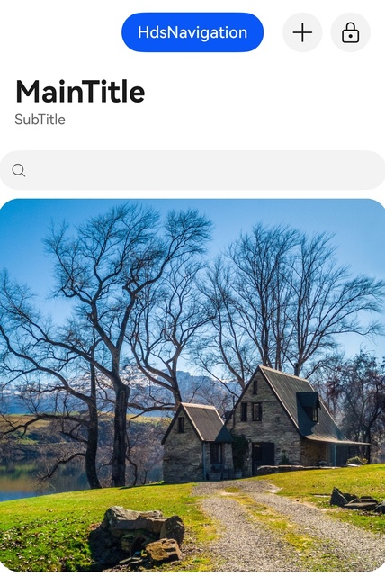
In the following code, the titleBar attribute is used to customize the dynamic blur style of the title bar when it scrolls with the content area.
// Starting from version 6.0.2(22), you do not need to manually import HdsNavigationAttribute. For details, please refer to the "Modules to Import" section of the HdsNavigation reference document.
import { HdsNavigation, HdsNavigationAttribute, ScrollEffectType, HdsNavigationTitleMode } from '@kit.UIDesignKit';
import { LengthMetrics } from '@kit.ArkUI';

const TITLE_BAR_HEIGHT_FREE: number = 138;

@Entry
@Component
struct Index {
  @Provide('pageInfos') pageInfos: NavPathStack = new NavPathStack();
  scroller: Scroller = new Scroller();
  @State blankHeight: number = TITLE_BAR_HEIGHT_FREE;
  @State isHideBackButton: boolean = false;
  @State titleMode: HdsNavigationTitleMode = HdsNavigationTitleMode.FREE;
  @State subTitle: string = 'Sub';

  build() {
    HdsNavigation(this.pageInfos) {
      Column() {
        Stack() {
          Scroll(this.scroller) {
            Column() {
              Blank().height(this.blankHeight)
              Image($r('app.media.scenery')).width('100%') // scenery is a custom resource. You need to replace it with your local resource.
            }
          }.edgeEffect(EdgeEffect.Spring).scrollBar(BarState.Off)
        }
      }
    }
    .titleBar({
      padding: {
        start: LengthMetrics.vp(2),
        end: LengthMetrics.vp(2)
      },
      style: {
        scrollEffectOpts: {
          enableScrollEffect: true,
          scrollEffectType: ScrollEffectType.COMMON_BLUR,
          blurEffectiveStartOffset: LengthMetrics.vp(0),
          blurEffectiveEndOffset: LengthMetrics.vp(20)
        },
        originalStyle: {
          backgroundStyle: {
            backgroundColor: $r('sys.color.ohos_id_color_background')
          },
          contentStyle: {
            titleStyle: { mainTitleColor: $r('sys.color.font_primary'), subTitleColor: $r('sys.color.font_secondary') },
            menuStyle: {
              backgroundColor: $r('sys.color.comp_background_tertiary'),
              iconColor: $r('sys.color.icon_primary')
            },
            backIconStyle: {
              backgroundColor: $r('sys.color.comp_background_tertiary'),
              iconColor: $r('sys.color.icon_primary')
            }
          }
        },
        scrollEffectStyle: {
          backgroundStyle: {
            backgroundColor: $r('sys.color.ohos_id_color_background_transparent')
          },
          contentStyle: {
            titleStyle: { mainTitleColor: $r('sys.color.font_primary'), subTitleColor: $r('sys.color.font_secondary') },
            menuStyle: {
              backgroundColor: $r('sys.color.comp_background_tertiary'),
              iconColor: $r('sys.color.icon_primary')
            },
            backIconStyle: {
              backgroundColor: $r('sys.color.comp_background_tertiary'),
              iconColor: $r('sys.color.icon_primary')
            }
          }
        }
      },
      content: {
        title: {
          mainTitle: 'Main',
          subTitle: this.subTitle
        },
        menu: {
          value: [{
            content: {
              label: 'menu1',
              icon: $r('sys.symbol.ohos_wifi'),
              isEnabled: true,
              action: () => {
                console.info('HdsNavigation menu1');
              }
            }
          }, {
            content: {
              label: 'menu2',
              icon: $r('sys.symbol.plus'),
              isEnabled: true,
            }
          }, {
            content: {
              label: 'menu3',
              icon: $r('sys.symbol.lock')
            }
          }, {
            content: {
              label: 'menu4',
              icon: $r('sys.symbol.trunk')
            }
          }]
        },
        backIcon: {
          label: 'backButton',
          icon: $r('sys.symbol.trunk'),
          isEnabled: true
        }
      }
    })
    .systemBarStyle({ statusBarContentColor: '#0A59F7' }, { statusBarContentColor: '#C7C7CD' })
    .titleMode(this.titleMode)
    .hideBackButton(this.isHideBackButton)
    .hideTitleBar(false)
  }
} 
[h2]Setting the Menu Message Reminder
You can add a message reminder badge to the upper right corner of a menu item by configuring the badge attribute in menu item settings of the title bar.
// Starting from version 6.0.2(22), you do not need to manually import HdsNavigationAttribute. For details, refer to the "Modules to Import" section of the HdsNavigation reference document.
import { HdsNavigation, HdsNavigationAttribute } from '@kit.UIDesignKit';

const TITLE_BAR_HEIGHT_FREE: number = 138;

@Entry
@Component
struct Index {
  @Provide('pageInfos') pageInfos: NavPathStack = new NavPathStack();
  @State blankHeight: number = TITLE_BAR_HEIGHT_FREE;
  @State subTitle: string = 'Sub';

  build() {
    HdsNavigation(this.pageInfos) {
      Column() {
        Stack() {
          Column() {
            Blank().height(this.blankHeight)
            Image($r('app.media.background1')) // background1 is a custom resource. You need to replace it with your local resource.
              .width('100%')
          }
        }
      }
    }
    .titleBar({
      content: {
        title: {
          mainTitle: 'Main',
          subTitle: this.subTitle
        },
        menu: {
          value: [{
            content: {
              label: 'menu1',
              icon: $r('sys.symbol.plus'),
              isEnabled: true
            },
            badge: {
              count: 1
            }
          }, {
            content: {
              label: 'menu2',
              icon: $r('sys.symbol.trunk'),
              isEnabled: true
            },
            badge: {
              count: 100
            }
          }]
        }
      }
    })
  }
} 
[h2]Configuring the Custom Area
You can set the stackBuilder and bottomBuilder attributes under titleBar to configure the custom area of the title bar.
// Starting from version 6.0.2(22), you do not need to manually import HdsNavigationAttribute. For details, refer to the "Modules to Import" section of the HdsNavigation reference document.
import { HdsNavigation, HdsNavigationAttribute, ScrollEffectType } from '@kit.UIDesignKit';
import { LengthMetrics } from '@kit.ArkUI';

const TITLE_BAR_HEIGHT_FREE: number = 138;
const BOTTOM_BUILDER_HEIGHT: number = 56;

@Entry
@Component
struct Index {
  scroller: Scroller = new Scroller();
  @State blankHeight: number = TITLE_BAR_HEIGHT_FREE + BOTTOM_BUILDER_HEIGHT;

  @Builder
  stackBuilder() {
    Column() {
      Button('HdsNavigation')
    }
    .height(56)
    .justifyContent(FlexAlign.Center)
  }

  @Builder
  bottomBuilder() {
    Column() {
      Search()
    }
    .width('100%')
    .height(56)
  }

  build() {
    Column() {
      HdsNavigation() {
        Scroll(this.scroller) {
          Column() {
            Blank().height(this.blankHeight).width('100%')
            Image($r('app.media.scenery')).width('100%') // scenery is a custom resource. You need to replace it with your local resource.
          }
        }.edgeEffect(EdgeEffect.Spring).scrollBar(BarState.Off)
      }
      .titleBar({
        style: {
          scrollEffectOpts: {
            enableScrollEffect: true,
            scrollEffectType: ScrollEffectType.GRADIENT_BLUR,
            blurEffectiveStartOffset: LengthMetrics.vp(0),
            blurEffectiveEndOffset: LengthMetrics.vp(20)
          },
          scrollEffectStyle: {
            backgroundStyle: { maskExtraHeight: 56.0 }
          }
        },
        content: {
          title: {
            mainTitle: 'MainTitle',
            subTitle: 'SubTitle'
          },
          stackBuilder: (): void => this.stackBuilder(),
          bottomBuilder: { builder: (): void => this.bottomBuilder() },
          menu: {
            value: [{
              content: {
                label: 'menu1',
                icon: $r('sys.symbol.plus')
              },
            }, {
              content: {
                label: 'menu2',
                icon: $r('sys.symbol.lock')
              }
            }]
          }
        }
      })
      .bindToScrollable([this.scroller])
    }
  }
} 
[h2]Dynamically Displaying and Hiding the Title Bar
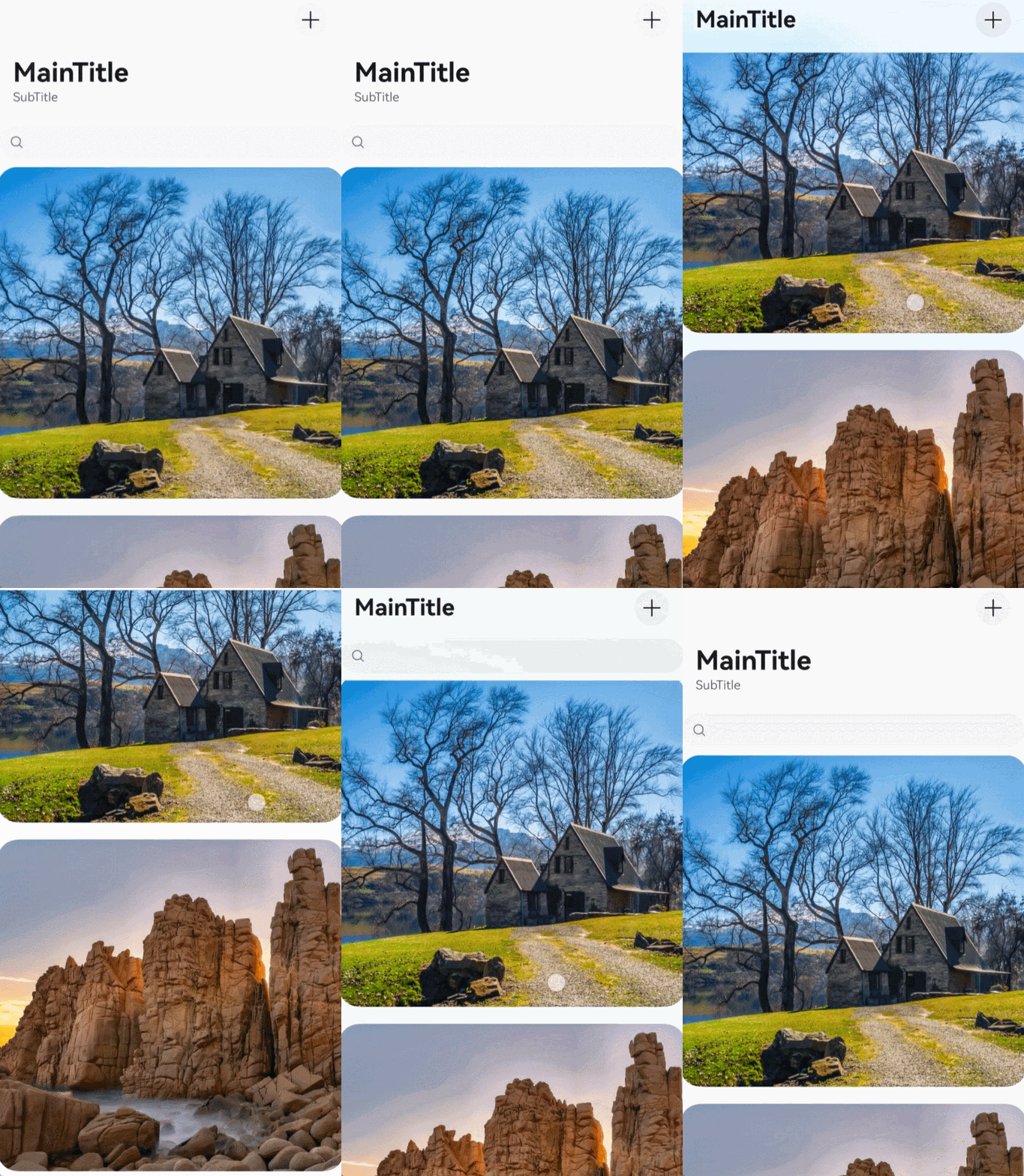
You can set the dynamicHideTitleBar attribute to dynamically display or hide the title bar as the content area scrolls.
// Starting from version 6.0.2(22), you do not need to manually import HdsNavigationAttribute. For details, refer to the "Modules to Import" section of the HdsNavigation reference document.
import { HdsNavigation, HdsNavigationAttribute, HideMode } from '@kit.UIDesignKit';

const TITLE_BAR_HEIGHT_FREE: number = 138;
const BOTTOM_BUILDER_HEIGHT: number = 56;

@Entry
@Component
struct Index {
  scroller: Scroller = new Scroller();
  @State blankHeight: number = TITLE_BAR_HEIGHT_FREE + BOTTOM_BUILDER_HEIGHT;

  @Builder
  bottomBuilder() {
    Column() {
      Search()
    }
    .width('100%')
    .height(56)
  }

  build() {
    Column() {
      HdsNavigation() {
        Scroll(this.scroller) {
          Column() {
            Blank().height(this.blankHeight).width('100%')
            Image($r('app.media.scenery')).width('100%') // scenery is a custom resource. You need to replace it with your local resource.
          }
        }.edgeEffect(EdgeEffect.Spring).scrollBar(BarState.Off)
      }
      .titleBar({
        content: {
          title: {
            mainTitle: 'MainTitle',
            subTitle: 'SubTitle'
          },
          bottomBuilder: { builder: (): void => this.bottomBuilder() },
          menu: {
            value: [{
              content: {
                label: 'menu1',
                icon: $r('sys.symbol.plus')
              }
            }]
          }
        }
      })
      .bindToScrollable([this.scroller])
      .dynamicHideTitleBar({
        hideTitleArea: true,
        hideBottomBuilder: true,
        hideStatusBar: false,
        mode: HideMode.SCROLL_UP_TO
      })
    }
  }
} 
[h2]Setting the Icon Style for the Title Bar
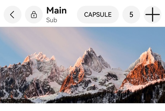
You can set the type attribute in HdsNavigationIconOptions to configure the icon type as text or image.
// Starting from version 6.0.2(22), you do not need to manually import HdsNavigationAttribute. For details, refer to the "Modules to Import" section of the HdsNavigation reference document.
import {
  HdsNavigation,
  HdsNavigationAttribute,
  HdsNavigationTitleMode,
  IconStyleMode,
  TextStyleMode,
  DividerShowType
} from '@kit.UIDesignKit';

const TITLE_BAR_HEIGHT_MINI: number = 56;

@Entry
@Component
struct Index {
  scroller: Scroller = new Scroller();
  @State blankHeight: number = TITLE_BAR_HEIGHT_MINI;

  build() {
    Column() {
      HdsNavigation() {
        Scroll(this.scroller) {
          Column() {
            Blank().height(this.blankHeight).width('100%')
            Image($r('app.media.background1')).width('100%')
          }
        }.edgeEffect(EdgeEffect.Spring).scrollBar(BarState.Off)
      }
      .titleMode(HdsNavigationTitleMode.MINI)
      .titleBar({
        content: {
          title: {
            mainTitle: 'Main',
            subTitle: 'Sub'
          },
          menu: {
            value: [{
              content: {
                label: 'CAPSULE',
                type: TextStyleMode.NORMAL
              }
            }, {
              content: {
                label: '5',
                type: TextStyleMode.SINGLE_CHARACTER
              }
            }, {
              content: {
                label: 'smallIcon',
                icon: $r('sys.symbol.plus'),
                type: IconStyleMode.LARGE
              }
            }]
          },
          subIcon: {
            content: {
              label: 'headIcon',
              icon: $r('sys.symbol.lock'),
              type: IconStyleMode.SMALL
            }
          },
          divider: { showType: DividerShowType.ON }
        }
      })
    }
  }
} 
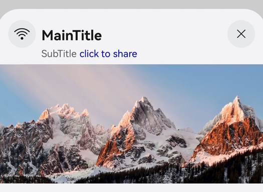
[h2]Title Bar Sheet Style
You can use titleMode to set the sheet style for the title bar. In this mode, you can use subTitleBuilder to customize the content on the right side of subTitle. In the sheet style, if the icon type is set to IconStyleMode.SMALL and no icon resource is passed, a close icon is displayed by default.
// Starting from version 6.0.2(22), you do not need to manually import HdsNavigationAttribute. For details, refer to the "Modules to Import" section of the HdsNavigation reference document.
import { HdsNavigation, HdsNavigationAttribute, HdsNavigationTitleMode, IconStyleMode } from '@kit.UIDesignKit';

const TITLE_BAR_HEIGHT_MODAL: number = 80;

@Entry
@Component
struct SheetTransitionExample {
  @State isShow: boolean = false;
  @State blankHeight: number = TITLE_BAR_HEIGHT_MODAL;
  scroller: Scroller = new Scroller();

  @Builder
  subTitleBuilder() {
    Text('click to share')
      .fontColor(Color.Blue)
      .maxFontScale(1)
      .lineHeight(`${14 * 1.49}vp`)
      .fontSize(14)
      .onClick(() => {
        console.info('click to share');
      })
  }

  // Create content to be displayed in sheet style.
  @Builder
  myBuilder() {
    Column() {
      HdsNavigation() {
        Scroll(this.scroller) {
          Column() {
            Blank().height(this.blankHeight).width('100%')
            Image($r('app.media.background1')) // background1 is a custom resource. You need to replace it with your local resource.
              .width('100%')
          }
        }.edgeEffect(EdgeEffect.Spring).scrollBar(BarState.Off)
      }
      .titleMode(HdsNavigationTitleMode.MODAL) // Configure the display mode of the HdsNavigation component as the sheet style.
      .titleBar({
        content: {
          title: {
            mainTitle: 'MainTitle',
            subTitle: 'SubTitle',
            subTitleBuilder: (): void => this.subTitleBuilder() // Customize the subtitle area.
          },
          menu: {
            value: [{
              content: {
                label: 'modal_cancel',
                isEnabled: true,
                type: IconStyleMode.SMALL,
                action: () => {
                  console.info('model cancel');
                }
              }
            }]
          },
          subIcon: {
            content: {
              label: 'leftIcon',
              icon: $r('sys.symbol.ohos_wifi'),
              isEnabled: true
            }
          }
        }
      })
    }
  }

  build() {
    Column() {
      Button('transition modal')
        .onClick(() => {
          this.isShow = true;
        })
        .fontSize(20)
        .margin(10)
        .bindSheet($$this.isShow, this.myBuilder(), { showClose: false }) // Bind the sheet page.
    }
    .justifyContent(FlexAlign.Center)
    .width('100%')
    .height('100%')
  }
} 
[h2]Binding a Custom Menu to an Icon
You can set the componentId attribute under HdsNavigationIconOptions and then call the promptAction.openMenu method to set the Id attribute in TargetInfo to the value of componentId, so that a custom menu can be displayed from a specific icon.
// Starting from version 6.0.2(22), you do not need to manually import HdsNavigationAttribute. For details, refer to the "Modules to Import" section of the HdsNavigation reference document.
import { HdsNavigation, HdsNavigationAttribute, HdsNavigationTitleMode } from '@kit.UIDesignKit';
import { ComponentContent, LengthMetrics, Prompt } from '@kit.ArkUI';
import { BusinessError } from '@kit.BasicServicesKit';

const TITLE_BAR_HEIGHT_FULL: number = 138;

@Builder
function menuComponent() {
  Menu() {
    MenuItem({ content: 'copy' }).onClick(() => {
      Prompt.showToast({ message: 'on click' });
    })
    MenuItem({ content: 'paste' }).enabled(false)
  }
  .width(224).menuItemDivider({ strokeWidth: LengthMetrics.px(1), color: $r('sys.color.comp_divider') })
}

@Entry
@Component
struct Index {
  scroller: Scroller = new Scroller();
  @State blankHeight: number = TITLE_BAR_HEIGHT_FULL;
  private targetId: string = 'bindMenu';

  build() {
    Column() {
      HdsNavigation() {
        Scroll(this.scroller) {
          Column() {
            Blank().height(this.blankHeight).width('100%')
            Image($r('app.media.background1'))
              .width('100%')
          }
        }.edgeEffect(EdgeEffect.Spring).scrollBar(BarState.Off)
      }
      .titleMode(HdsNavigationTitleMode.FULL)
      .titleBar({
        content: {
          title: {
            mainTitle: 'MainTitle',
            subTitle: 'SubTitle'
          },
          menu: {
            value: [{
              content: {
                label: 'menu1',
                icon: $r('sys.symbol.plus'),
                isEnabled: true,
                componentId: this.targetId,
                action: () => {
                  let uiContext = this.getUIContext();
                  let promptAction = uiContext.getPromptAction();
                  let contentNode = new ComponentContent(uiContext, wrapBuilder(menuComponent));
                  try {
                    promptAction.openMenu(
                      contentNode,
                      { id: this.targetId },
                      { backgroundColor: Color.Yellow })
                      .then(() => {
                        console.info('openMenu success');
                      })
                      .catch((err: BusinessError) => {
                        console.error(`openMenu error code is ${err.code}, message is ${err.message}`);
                      })
                  } catch (error) {
                    let message = (error as BusinessError).message;
                    let code = (error as BusinessError).code;
                    console.error(`openMenu args error code is ${code}, message is ${message}`);
                  }
                }
              }
            }, {
              content: {
                label: 'menu2',
                icon: $r('sys.symbol.ohos_wifi')
              }
            }]
          }
        }
      })
    }
  }
} 
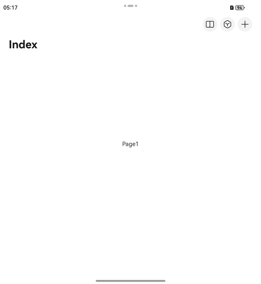
[h2]Configuring the In-App Multi-Window Icon
Create a level-1 navigation component. Then set the multiWindowEntryInAPPMenu attribute under menu in titleBar to configure the in-app multi-window icon.
// Starting from version 6.0.2(22), you do not need to manually import HdsNavigationAttribute. For details, refer to the "Modules to Import" section of the HdsNavigation reference document.
import { HdsNavigation, HdsNavigationAttribute, HdsNavigationMenuContentOptions } from '@kit.UIDesignKit';
import { Want } from '@kit.AbilityKit';

@Entry
@Component
struct MultiWindowEntryInAPPTest {
  private want: Want = {
    // Replace the values of bundleName, moduleName, and abilityName with those of your app to start the UIAbility in the app.
    bundleName: "com.example.myapplication",
    moduleName: "entry",
    abilityName: "FuncAbility",
  }
  @State menuContent: HdsNavigationMenuContentOptions = {
    multiWindowEntryInAPPMenu: {
      want: this.want,
    },
    maxCount: 3,
    value: [
      { content: { label: 'menu1', icon: $r('sys.symbol.search_things'), } },
      { content: { label: 'menu2', icon: $r('sys.symbol.plus'), } }
    ]
  }

  build() {
    HdsNavigation() {
      Stack() {
        Text("Page1")
      }.alignContent(Alignment.Center)
      .width("100%")
      .height("100%")
    }
    .hideToolBar(false)
    .navBarWidth('100%')
    .titleBar({
      content: {
        title: {
          mainTitle: "Index"
        },
        menu: this.menuContent
      }
    })
  }
} 
[h2]Setting the Split-Column Mode of HdsNavigation
This example demonstrates how to display the default placeholder page on the right side when HdsNavigation is in split-column mode.
// Starting from version 6.0.2(22), you do not need to manually import HdsNavigationAttribute. For details, refer to the "Modules to Import" section of the HdsNavigation reference document.
import { HdsNavigation, HdsNavigationAttribute, HdsNavigationTitleMode } from '@kit.UIDesignKit';
import { ComponentContent } from '@kit.ArkUI';

@Builder
function placeholderPage() {
  Column() {
    Text('Split-column mode placeholder page')
      .fontSize(28)
      .fontWeight(700)
      .margin({ top: 200 })
  }.width('100%')
  .height('100%')
}

@Entry
@Component
struct Index {
  scroller: Scroller = new Scroller();
  placeholder = new ComponentContent(this.getUIContext(), wrapBuilder(placeholderPage));
  private arr: number[] = [0, 1, 2, 3, 4, 5, 6, 7, 8, 9];

  build() {
    HdsNavigation() {
      List({ space: 12, initialIndex: 0, scroller: this.scroller }) {
        ForEach(this.arr, (item: number) => {
          ListItem() {
            Text('' + item)
              .width('90%')
              .height(72)
              .backgroundColor('#FFFFFF')
              .borderRadius(24)
              .fontSize(16)
              .fontWeight(500)
              .textAlign(TextAlign.Center)
          }
        }, (item: number) => item.toString())
      }
      .height(324)
      .width('100%')
      .margin({ top: 12, left: '10%' })
    }
    .mode(NavigationMode.Split) // Set the HdsNavigation mode to Split.
    .splitPlaceholder(this.placeholder)
    .titleMode(HdsNavigationTitleMode.MINI)
    .titleBar({
      enableComponentSafeArea: true,
      content: {
        title: {
          mainTitle: 'Main',
          subTitle: 'Sub'
        }
      }
    })
    .bindToScrollable([this.scroller])
    .divider({ startMargin: 20, endMargin: 20, color: Color.Red }) // The divider attribute is added since 6.1.0(23).
  }
} 
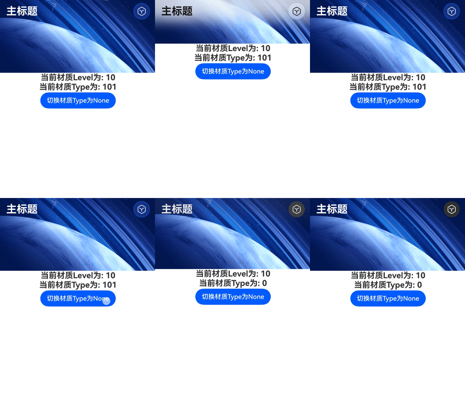
[h2]Setting the Immersive Style of the Title Bar
This example demonstrates how to configure immersive blur and material effects of HdsNavigation.
Example:
// Starting from version 6.0.2(22), you do not need to manually import HdsNavigationAttribute. For details, refer to the "Modules to Import" section of the HdsNavigation reference document.
import {
  hdsMaterial,
  HdsNavigation,
  HdsNavigationAttribute,
  HdsNavigationTitleMode,
  ScrollEffectType
} from '@kit.UIDesignKit';
import { promptAction } from '@kit.ArkUI';

@Entry
@Component
struct Index {
  private scrollerForScroll: Scroller = new Scroller();
  @State materialLevel: hdsMaterial.MaterialLevel = hdsMaterial.MaterialLevel.ADAPTIVE;
  @State materialType: hdsMaterial.MaterialType = hdsMaterial.MaterialType.IMMERSIVE;

  aboutToAppear(): void {
    // In this example, the material type supported by the system is hdsMaterial.MaterialType.IMMERSIVE.
    try {
      let materialTypes: Array<hdsMaterial.MaterialType> = hdsMaterial.getSystemMaterialTypes();
      console.info(`getSystemMaterialTypes successed, types: ${materialTypes}`);
    } catch (err) {
      let message = (err as BusinessError).message;
      let code = (err as BusinessError).code;
      console.error(`getSystemMaterialTypes failed, code: ${code}, message: ${message}`);
    }
  }

  build() {
    HdsNavigation() {
      Scroll(this.scrollerForScroll) {
        Column() {
          // Replace 'app.media.demo_img' with the required resource file.
          Image($r('app.media.demo_img'))
            .width('100%')
          Text(`Current material level: ${this.materialLevel}`).fontSize(20).fontWeight(FontWeight.Bold)
          Text(`Current material type: ${this.materialType}`).fontSize(20).fontWeight(FontWeight.Bold)
          Button('Set materialType to None').onClick(() => {
            // No material effect.
            this.materialType = hdsMaterial.MaterialType.NONE;
          }).margin({ top: 2 })
        }.height('100%')
      }.edgeEffect(EdgeEffect.Spring).height('100%')
    }
    .titleBar({
      content: {
        title: {
          mainTitle: 'Main Title'
        },
        menu: {
          value: [{
            content: {
              icon: $r('sys.symbol.search_things'),
              label: 'search',
              action: () => {
                try {
                  promptAction.openToast({ message: 'on click' })
                    .then(() => {
                      console.info('openToast success');
                    })
                    .catch((err: BusinessError) => {
                      console.error(`openToast error code is ${err.code}, message is ${err.message}`);
                    })
                } catch (error) {
                  let message = (error as BusinessError).message;
                  let code = (error as BusinessError).code;
                  console.error(`openToast args error code is ${code}, message is ${message}`);
                }
              }
            }
          }]
        }
      },
      style: {
        scrollEffectOpts: {
          // Since 6.1.0(23), the IMMERSIVE_GRADIENT_BLUR type is added, which enables the title text and icon style to transit linearly from white to black.
          scrollEffectType: ScrollEffectType.IMMERSIVE_GRADIENT_BLUR
        },
        // Since 6.1.0(23), material-related attributes are supported.
        // It is recommended that this attribute be used together with ScrollEffectType.IMMERSIVE_GRADIENT_BLUR (recommended for immersive text-and-image scenarios) or ScrollEffectType.GRADIENT_BLUR (recommended for non-immersive list scenarios).
        systemMaterialEffect: {
          materialType: this.materialType,
          materialLevel: this.materialLevel
        }
      }
    })
    .bindToScrollable([this.scrollerForScroll])
    .hideBackButton(true)
    .titleMode(HdsNavigationTitleMode.MINI)
    .ignoreLayoutSafeArea([LayoutSafeAreaType.SYSTEM], [LayoutSafeAreaEdge.TOP, LayoutSafeAreaEdge.BOTTOM])
  }
}
Final Effect:
The effect of executing the preceding code is as follows.
[h2]Obtaining the Stack Using onReady
This example demonstrates the following:
-
NavPathStack can be used to perform route stack operations without being declared as a state variable.
-
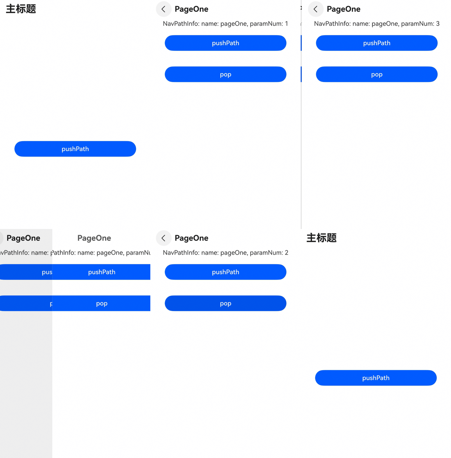
HdsNavDestination can obtain the corresponding NavPathInfo and NavPathStack through the onReady event.
Example:
import {
  HdsNavDestination,
  HdsNavigation,
  HdsNavigationAttribute,
  HdsNavDestinationAttribute,
  HdsNavigationTitleMode
} from '@kit.UIDesignKit';

class PageParam {
  constructor(num_: number) {
    this.num = num_;
  }

  num: number = 0;
}

@Builder
export function PageOneBuilder(name: string, param: Object) {
  PageOne();
}

@Component
struct PageOne {
  private stack: NavPathStack | null = null;
  private name: string = '';
  private paramNum: number = 0;

  build() {
    HdsNavDestination() {
      Column() {
        Text('NavPathInfo: name: ' + this.name + ', paramNum: ' + this.paramNum)
        Button('pushPath', { stateEffect: true, type: ButtonType.Capsule })
          .width('80%')
          .height(40)
          .margin(20)
          .onClick(() => {
            if (this.stack) {
              let p = new PageParam(this.paramNum + 1);
              this.stack.pushPath({ name: 'pageOne', param: p });
            }
          })
        Button('pop', { stateEffect: true, type: ButtonType.Capsule })
          .width('80%')
          .height(40)
          .margin(20)
          .onClick(() => {
            this.stack?.pop();
          })
      }
      .width('100%')
      .height('100%')
    }
    .titleBar({
      enableComponentSafeArea: true,
      content: {
        title: {
          mainTitle: 'PageOne'
        }
      }
    })
    .onReady((ctx: NavDestinationContext) => {
      // The passed NavPathInfo and the owning NavPathStack objects can be obtained for NavDestination.
      try {
        this.name = ctx?.pathInfo?.name;
        this.paramNum = (ctx?.pathInfo?.param as PageParam)?.num;
        this.stack = ctx.pathStack;
      } catch (e) {
        console.error(`testTag onReady catch exception: ${JSON.stringify(e)}`);
      }
    })
  }
}

@Entry
@Component
struct NavigationExample2 {
  private stack: NavPathStack = new NavPathStack();

  build() {
    HdsNavigation(this.stack) {
      Stack({ alignContent: Alignment.Center }) {
        Button('pushPath', { stateEffect: true, type: ButtonType.Capsule })
          .width('80%')
          .height(40)
          .margin(20)
          .onClick(() => {
            let p = new PageParam(1);
            this.stack.pushPath({ name: 'pageOne', param: p });
          })
      }
      .width('100%')
      .height('100%')
    }
    .width('100%')
    .height('100%')
    .titleBar({
      content: {
        title: {
          mainTitle: 'Main Title'
        }
      }
    })
    .titleMode(HdsNavigationTitleMode.MINI)
    .hideBackButton(true)
  }
}
In the module.json5 configuration file under the src/main directory, set "routerMap" to "$profile:router_map" in the module field and add the router_map.json file to the src/main/resources/base/profile directory. The following is an example of router_map.json:
{
  "routerMap": [
    {
      "name": "pageOne",
      "pageSourceFile": "src/main/ets/pages/Index.ets",
      "buildFunction": "PageOneBuilder",
      "data": {
        "description": "this is pageOne"
      }
    }
  ]
}
Final Effect:
Run the preceding code. The following figure shows the effect.