A dialog box component used to display list selection items.

The initial APIs of this module are supported since API version 8. Updates will be marked with a superscript to indicate their earliest API version.
The functionality of this module depends on UI context. This means that the APIs of this module cannot be used where the UI context is ambiguous. For details, see UIContext.
ActionSheetOptions
Provides ActionSheet configuration options.
System capability: SystemCapability.ArkUI.ArkUI.Full
| Name | Type | Read-Only | Optional | Description |
|---|---|---|---|---|
| title | string | Resource | No | No | Title of the dialog box. If the text is too long to display, it is truncated with an ellipsis (...). Atomic service API: This API can be used in atomic services since API version 11. |
| subtitle10+ | ResourceStr | No | Yes | Subtitle of the dialog box. If the text is too long to display, it is truncated with an ellipsis (...). Atomic service API: This API can be used in atomic services since API version 11. Model restriction: This API can be used only in the stage model. |
| message | string | Resource | No | No | Content of the dialog box. If the text is too long to display, a scrollbar is displayed. Atomic service API: This API can be used in atomic services since API version 11. |
| autoCancel | boolean | No | Yes | Whether to close the dialog box when the overlay is clicked. Default value: true The value true means to close the dialog box when the overlay is clicked, and false means the opposite. Atomic service API: This API can be used in atomic services since API version 11. |
| confirm | ActionSheetButtonOptions | No | Yes | Information about the confirm button. Atomic service API: This API can be used in atomic services since API version 11. |
| cancel | VoidCallback | No | Yes | Callback invoked when the dialog box is closed by tapping the mask layer. Atomic service API: This API can be used in atomic services since API version 11. |
| alignment | DialogAlignment | No | Yes | Alignment mode of the dialog box in the vertical direction. Default value: DialogAlignment.Bottom Atomic service API: This API can be used in atomic services since API version 11. NOTE If showInSubWindow is set to true in UIExtension, the dialog box is aligned with the host window based on UIExtension. |
| offset | ActionSheetOffset | No | Yes | Offset of the dialog box relative to the alignment position. Default value: 1. If alignment is set to Top, TopStart, or TopEnd, the default offset value is {dx: 0,dy: "40vp"}. 2. If alignment is set to Center, CenterStart, CenterEnd, Bottom, BottomStart, BottomEnd or Default, the default value is {dx: 0,dy: "-40vp"}. Atomic service API: This API can be used in atomic services since API version 11. |
| sheets | Array<SheetInfo> | No | No | Options in the dialog box. Each option supports the image, text, and callback. Atomic service API: This API can be used in atomic services since API version 11. |
| maskRect10+ | Rectangle | No | Yes | Mask area of the dialog box. Events outside the mask area are transparently transmitted, and events within the mask area are not. Default value: { x: 0, y: 0, width: '100%', height: '100%' } NOTE maskRect does not take effect when showInSubWindow is set to true. Atomic service API: This API can be used in atomic services since API version 11. Model restriction: This API can be used only in the stage model. |
| showInSubWindow11+ | boolean | No | Yes | Whether to show the dialog box in a subwindow when the dialog box needs to be displayed outside the main window. true: The dialog box is shown in a subwindow. Default value: false, meaning the dialog box is displayed within the application, not in a separate subwindow. NOTE A dialog box whose showInSubWindow attribute is true cannot trigger the display of another dialog box whose showInSubWindow attribute is also true. Atomic service API: This API can be used in atomic services since API version 12. Model restriction: This API can be used only in the stage model. |
| isModal11+ | boolean | No | Yes | Whether the dialog box is a modal. A modal dialog box has a mask applied, while a non-modal dialog box does not. false: The dialog box is not a modal. Default value: true Atomic service API: This API can be used in atomic services since API version 12. Model restriction: This API can be used only in the stage model. |
| backgroundColor11+ | ResourceColor | No | Yes | Background color of the dialog box. Default value: Color.Transparent NOTE The background color will be visually combined with the blur effect when both properties are set. If the resulting effect does not match your design requirements, you can disable the blur effect entirely by explicitly setting the backgroundBlurStyle property to BlurStyle.NONE. When backgroundBlurStyle is set to a value other than NONE, do not set backgroundColor. If you do, the color display may not produce the expected visual effect. Atomic service API: This API can be used in atomic services since API version 12. Model restriction: This API can be used only in the stage model. |
| backgroundBlurStyle11+ | BlurStyle | No | Yes | Background blur style of the dialog box. Default value: BlurStyle.COMPONENT_ULTRA_THICK. NOTE Setting this parameter to BlurStyle.NONE disables the background blur. When backgroundBlurStyle is set to a value other than NONE, do not set backgroundColor. If you do, the color display may not produce the expected visual effect. Atomic service API: This API can be used in atomic services since API version 12. Model restriction: This API can be used only in the stage model. |
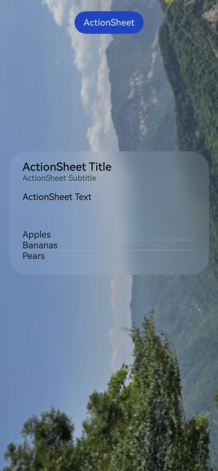
| backgroundBlurStyleOptions19+ | BackgroundBlurStyleOptions | No | Yes | Options for customizing the background blur style. For details about the default value, see BackgroundBlurStyleOptions. Atomic service API: This API can be used in atomic services since API version 19. Model restriction: This API can be used only in the stage model. |
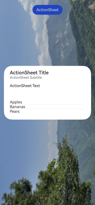
| backgroundEffect19+ | BackgroundEffectOptions | No | Yes | Options for customizing the background effect. For details about the default value, see BackgroundEffectOptions. Atomic service API: This API can be used in atomic services since API version 19. Model restriction: This API can be used only in the stage model. |
| onWillDismiss12+ | Callback<DismissDialogAction> | No | Yes | Callback for interactive closure of the dialog box. NOTE 1. If this callback is registered, the dialog box will not be dismissed immediately after the user touches the mask or the Back button, presses the Esc key, or swipes left or right on the screen. The reason parameter in the callback is used to determine whether the dialog box can be closed. To close the dialog box, call the dismiss method of DismissDialogAction in the callback. The reason returned by the component does not support the value CLOSE_BUTTON. 2. In the onWillDismiss callback, another onWillDismiss callback is not allowed. Atomic service API: This API can be used in atomic services since API version 12. Model restriction: This API can be used only in the stage model. |
| cornerRadius12+ | Dimension | BorderRadiuses | LocalizedBorderRadiuses | No | Yes | Corner radius of the background. You can set the radius for each of the four corners individually. Default value: { topLeft: '32vp', topRight: '32vp', bottomLeft: '32vp', bottomRight: '32vp' } The corner radius is subject to the component size, with the maximum value being half of the component width or height. If the value is negative, the default value is used. When set to a percentage, the value defines the radius as a percentage of the parent dialog box's width or height. NOTE When cornerRadius is of type LocalizedBorderRadiuses, the layout order can be dynamically adjusted based on the user's language settings. Atomic service API: This API can be used in atomic services since API version 12. Model restriction: This API can be used only in the stage model. |
| borderWidth12+ | Dimension | EdgeWidths | LocalizedEdgeWidths | No | Yes | Border width of the dialog box. You can set the width for all four sides or set separate widths for individual sides. Default value: 0 When set to a percentage, the value defines the border width as a percentage of the parent dialog box's width. If the left and right borders are greater than its width, or the top and bottom borders are greater than its height, the dialog box may not display as expected. NOTE When borderWidth is of type LocalizedEdgeWidths, the layout order can be dynamically adjusted based on the user's language settings. Atomic service API: This API can be used in atomic services since API version 12. Model restriction: This API can be used only in the stage model. |
| borderColor12+ | ResourceColor | EdgeColors | LocalizedEdgeColors | No | Yes | Border color of the dialog box. Default value: Color.Black borderColor must be used with borderWidth in pairs. NOTE When borderColor is of type LocalizedEdgeColors, the layout order can be dynamically adjusted based on the user's language settings. Atomic service API: This API can be used in atomic services since API version 12. Model restriction: This API can be used only in the stage model. |
| borderStyle12+ | BorderStyle | EdgeStyles | No | Yes | Border style of the dialog box. Default value: BorderStyle.Solid borderStyle must be used with borderWidth in pairs. Atomic service API: This API can be used in atomic services since API version 12. Model restriction: This API can be used only in the stage model. |
| width12+ | Dimension | No | Yes | Width of the dialog box. NOTE - Default maximum width of the dialog box: 400 vp - When this parameter is set to a percentage, the reference width of the dialog box is the width of the window where the dialog box is located. You can decrease or increase the width as needed. Atomic service API: This API can be used in atomic services since API version 12. Model restriction: This API can be used only in the stage model. |
| height12+ | Dimension | No | Yes | Height of the dialog box. NOTE - Default maximum height of the dialog box: 0.9 x (Window height – Safe area) - When this parameter is set to a percentage, the reference height of the dialog box is the height of the window where the dialog box is located minus the safe area. You can decrease or increase the height as needed. Atomic service API: This API can be used in atomic services since API version 12. Model restriction: This API can be used only in the stage model. |
| shadow12+ | ShadowOptions | ShadowStyle | No | Yes | Shadow of the dialog box. On a 2-in-1 device, the shadow of the focused dialog box is ShadowStyle.OUTER_FLOATING_MD and that of the unfocused dialog box is ShadowStyle.OUTER_FLOATING_SM by default. On other devices, the dialog box has no shadow by default. Atomic service API: This API can be used in atomic services since API version 12. Model restriction: This API can be used only in the stage model. |
| transition12+ | TransitionEffect | No | Yes | Transition effect for the entrance and exit of the dialog box. NOTE 1. If this parameter is not set, the default effect is used. 2. Touching the Back button during the entrance animation pauses the entrance animation and starts the exit animation. The final effect is one obtained after the curves of the entrance and exit animations are combined. 3. Touching the Back button during the exit animation does not affect the animation playback. Touching the Back button again closes the application. Atomic service API: This API can be used in atomic services since API version 12. Model restriction: This API can be used only in the stage model. |
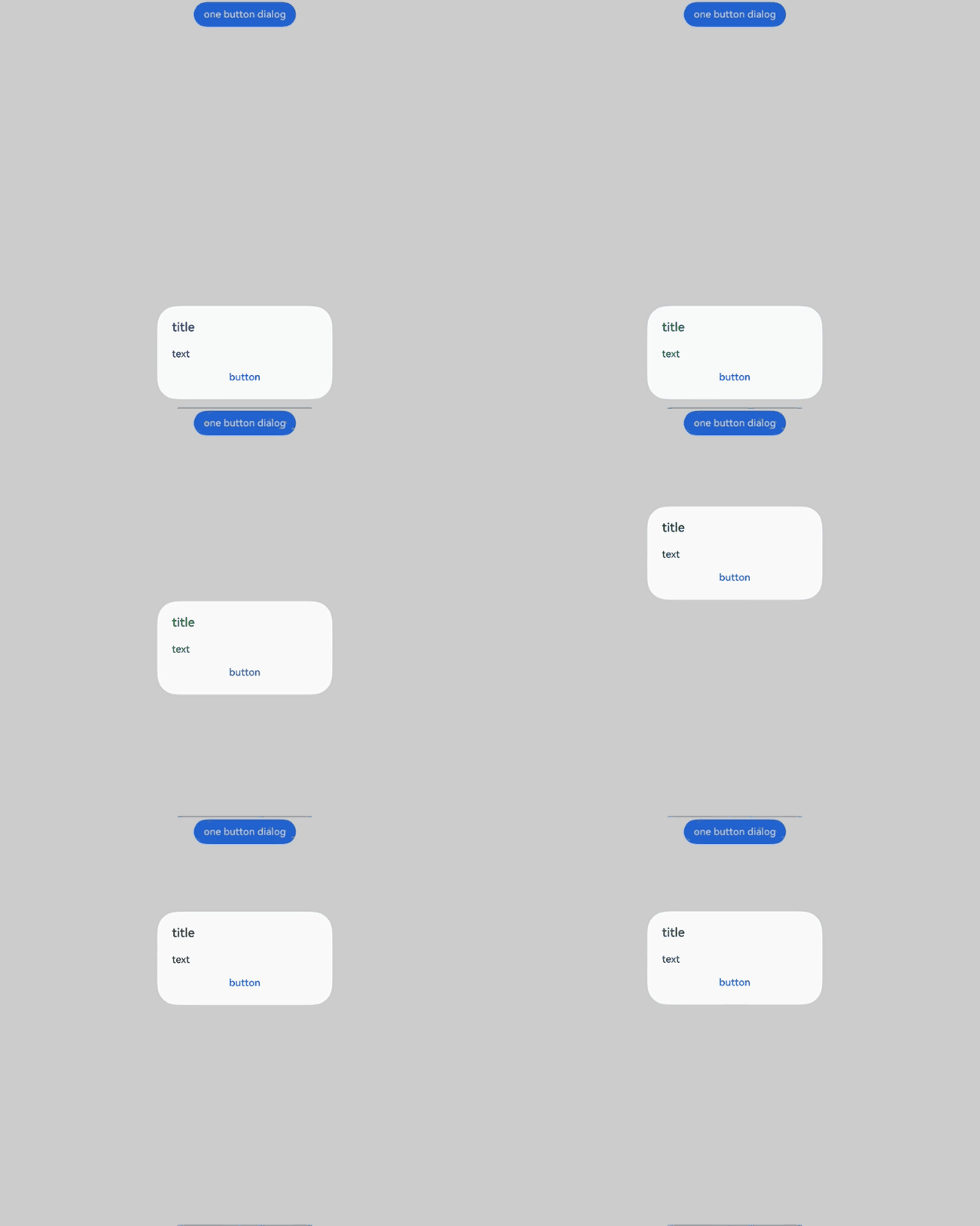
| enableHoverMode14+ | boolean | No | Yes | Whether to respond when the device is in semi-folded mode. The value true means to respond when the device is in semi-folded mode. Default value: false, meaning not to enable the hover mode. NOTE For a PC or 2-in-1 device, the dialog box is displayed on the upper half of the screen by default when enableHoverMode is set to true. You can set hoverModeArea to display the dialog box on the lower half of the screen. For other devices, the dialog box is displayed on the lower half of the screen by default when enableHoverMode is set to true. You can set hoverModeArea to display the dialog box on the upper half of the screen. Atomic service API: This API can be used in atomic services since API version 14. Model restriction: This API can be used only in the stage model. |
| hoverModeArea14+ | HoverModeAreaType | No | Yes | Display area of the dialog box in hover mode. NOTE This attribute must be used together with the enableHoverMode attribute. Default value: HoverModeAreaType.BOTTOM_SCREEN Atomic service API: This API can be used in atomic services since API version 14. Model restriction: This API can be used only in the stage model. |
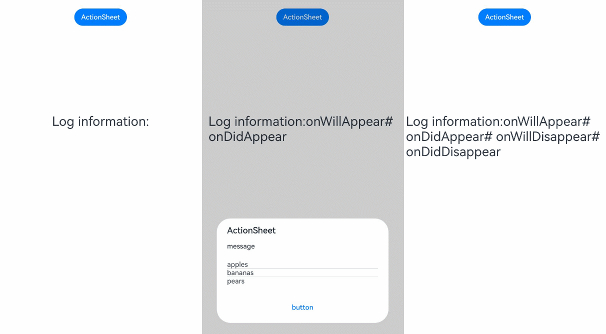
| onWillAppear19+ | Callback<void> | No | Yes | Event callback when the dialog box is about to appear. NOTE 1. The normal timing sequence is as follows: onWillAppear > onDidAppear > onWillDisappear > onDidDisappear. 2. You can set the callback event for changing the dialog box display effect in onWillAppear. The settings take effect next time the dialog box appears. Atomic service API: This API can be used in atomic services since API version 19. Model restriction: This API can be used only in the stage model. |
| onDidAppear19+ | Callback<void> | No | Yes | Event callback after the dialog box appears. NOTE 1. The normal timing sequence is as follows: onWillAppear > onDidAppear > onWillDisappear > onDidDisappear. 2. You can set the callback event for changing the dialog box display effect in onDidAppear. The settings take effect next time the dialog box appears. 3. When a dialog box is dismissed immediately after being shown, onWillDisappear may be triggered before onDidAppear. 4. If the dialog box is dismissed before its entrance animation is finished, the animation will be interrupted, and onDidAppear will not be triggered. Atomic service API: This API can be used in atomic services since API version 19. Model restriction: This API can be used only in the stage model. |
| onWillDisappear19+ | Callback<void> | No | Yes | Event callback when the dialog box is about to disappear. NOTE 1. The normal timing sequence is as follows: onWillAppear > onDidAppear > onWillDisappear > onDidDisappear. 2. When a dialog box is quickly displayed or closed, onWillDisappear may take effect before onDidAppear. Atomic service API: This API can be used in atomic services since API version 19. Model restriction: This API can be used only in the stage model. |
| onDidDisappear19+ | Callback<void> | No | Yes | Event callback after the dialog box disappears. NOTE The normal timing sequence is as follows: onWillAppear > onDidAppear > onWillDisappear > onDidDisappear. Atomic service API: This API can be used in atomic services since API version 19. Model restriction: This API can be used only in the stage model. |
| levelMode15+ | LevelMode | No | Yes | Display level of the dialog box. NOTE - Default value: LevelMode.OVERLAY - This parameter takes effect only when showInSubWindow is set to false. - If this parameter is set to LevelMode.EMBEDDED, you can use levelUniqueId to set the level of the page-level dialog box and use immersiveMode to set the mask effect of the dialog box on the page. Atomic service API: This API can be used in atomic services since API version 15. Model restriction: This API can be used only in the stage model. |
| levelUniqueId15+ | number | No | Yes | getUniqueId of the node that the page-level prompt needs to display. Value range: a number no less than 0 NOTE - This parameter takes effect only when levelMode is set to LevelMode.EMBEDDED. Atomic service API: This API can be used in atomic services since API version 15. Model restriction: This API can be used only in the stage model. |
| immersiveMode15+ | ImmersiveMode | No | Yes | Overlay effect for the page-level dialog box. NOTE - Default value: ImmersiveMode.DEFAULT - This parameter takes effect only when levelMode is set to LevelMode.EMBEDDED. Atomic service API: This API can be used in atomic services since API version 15. Model restriction: This API can be used only in the stage model. |
| levelOrder18+ | LevelOrder | No | Yes | Display order of the dialog box. NOTE - Default value: LevelOrder.clamp(0) - Dynamic updating is not supported. Atomic service API: This API can be used in atomic services since API version 18. Model restriction: This API can be used only in the stage model. |
| systemMaterial | SystemUiMaterial | No | Yes | System material of the dialog box. NOTE - Default value: ImmersiveMaterial object whose style in ImmersiveOptions is ImmersiveStyle.ULTRA_THICK If this parameter is set to undefined, the default value is used. - Different materials produce distinct effects. This API impacts the following attributes: backgroundColor, backgroundBlurStyle](ts-universal-attributes-background.md#backgroundblurstyle9), backgroundEffect, borderColor, borderWidth, and shadow. When the system material is set, the aforementioned attributes do not take effect. Since: 26.0.0 Model restriction: This API can be used only in the stage model. Atomic service API: This API can be used in atomic services since API version 26.0.0. |
SheetInfo
Defines the option content in the dialog box. You can configure the text, icon, and callback for each option.
Atomic service API: This API can be used in atomic services since API version 11.
System capability: SystemCapability.ArkUI.ArkUI.Full
| Name | Type | Read-Only | Optional | Description |
|---|---|---|---|---|
| title | string | Resource | No | No | Sheet text. If the text is too long to display, a scrollbar is displayed. |
| icon | string | Resource | No | Yes | Sheet icon. By default, no icon is displayed. The string type can be used to load local images and, more frequently, online images. The value can be a relative path to a local image, for example, Image("common/test.jpg"). |
| action | VoidCallback | No | No | Callback when the sheet is selected. |
LevelMode15+
type LevelMode = import('../api/@ohos.promptAction').LevelMode
Defines the display level mode for the dialog box.
Atomic service API: This API can be used in atomic services since API version 15.
Model restriction: This API can be used only in the stage model.
System capability: SystemCapability.ArkUI.ArkUI.Full
| Type | Description |
|---|---|
| import('../api/@ohos.promptAction').LevelMode | Display level of the dialog box. |
ImmersiveMode15+
type ImmersiveMode = import('../api/@ohos.promptAction').ImmersiveMode
Defines the overlay effect for the dialog box.
Atomic service API: This API can be used in atomic services since API version 15.
Model restriction: This API can be used only in the stage model.
System capability: SystemCapability.ArkUI.ArkUI.Full
| Type | Description |
|---|---|
| import('../api/@ohos.promptAction').ImmersiveMode | Overlay effect for the page-level dialog box. |
DismissDialogAction12+
Defines the dialog box dismissal information.
Atomic service API: This API can be used in atomic services since API version 12.
Model restriction: This API can be used only in the stage model.
System capability: SystemCapability.ArkUI.ArkUI.Full
[h2]Properties
| Name | Type | Read-Only | Optional | Description |
|---|---|---|---|---|
| dismiss | Callback<void> | No | No | Callback invoked when the dialog box is dismissed. This API is called only when the dialog box needs to be dismissed. If the dialog box does not need to be dismissed, it remains open. |
| reason | DismissReason | No | No | Type of the operation that triggers the dialog box dismissal. You can determine the user's dismissal action based on reason and decide whether to call dismiss to close the dialog box. |
ActionSheetButtonOptions18+
Provides button style configuration for the dialog box.

To standardize anonymous object definitions, the element definitions here have been revised in API version 18. While historical version information is preserved for anonymous objects, there may be cases where the outer element's @since version number is higher than inner elements'. This does not affect interface usability.
Atomic service API: This API can be used in atomic services since API version 18.
Model restriction: This API can be used only in the stage model.
System capability: SystemCapability.ArkUI.ArkUI.Full
| Name | Type | Read-Only | Optional | Description |
|---|---|---|---|---|
| enabled10+ | boolean | No | Yes | Whether to respond when the button is clicked. The value true means to respond when the button is clicked, and false means the opposite. Default value: true Atomic service API: This API can be used in atomic services since API version 11. |
| defaultFocus10+ | boolean | No | Yes | Whether the button is the default focus. The value true means that the button is the default focus, and false means the opposite. When the dialog box has focus and the Tab key is not pressed for sequential focus navigation, the button responds to the Enter key by default. Multiple dialog boxes can automatically gain focus and respond to user interactions in a sequential manner. The default response to the Enter key does not work when defaultFocus is set to true. Default value: false Atomic service API: This API can be used in atomic services since API version 11. |
| style10+ | DialogButtonStyle | No | Yes | Button style. Default value: DialogButtonStyle.DEFAULT Atomic service API: This API can be used in atomic services since API version 11. |
| value8+ | string | Resource | No | No | Button text. If the text is too long to display, it is truncated with an ellipsis (...). Atomic service API: This API can be used in atomic services since API version 11. |
| action8+ | VoidCallback | No | No | Callback invoked when the button is selected. Atomic service API: This API can be used in atomic services since API version 11. |
ActionSheetOffset18+
Offset of the dialog box relative to the alignment position.
Atomic service API: This API can be used in atomic services since API version 18.
Model restriction: This API can be used only in the stage model.
System capability: SystemCapability.ArkUI.ArkUI.Full
| Name | Type | Read-Only | Optional | Description |
|---|---|---|---|---|
| dx | number | string | Resource | No | No | Offset of the action sheet along the x-axis relative to the alignment position. You can specify the pixel unit, for example, '10px', or set a percentage string, for example, '100%'. NOTE If the unit is not specified, the default unit vp is used, in which case '10' is equivalent to '10vp'. |
| dy | number | string | Resource | No | No | Offset of the action sheet along the y-axis relative to the alignment position. You can specify the pixel unit, for example, '10px', or set a percentage string, for example, '100%'. NOTE If the unit is not specified, the default unit vp is used, in which case '10' is equivalent to '10vp'. |
[h2]show(deprecated)
static show(value: ActionSheetOptions)
Shows an action sheet in the given settings.

This API is supported since API version 8 and deprecated since API version 18. You are advised to use showActionSheet instead. showActionSheet can be called only after a UIContext instance is obtained.
Since API version 10, you can use showActionSheet in UIContext to specify the UI execution context.
Atomic service API: This API can be used in atomic services since API version 11.
System capability: SystemCapability.ArkUI.ArkUI.Full
Parameters
| Name | Type | Mandatory | Description |
|---|---|---|---|
| value | ActionSheetOptions | Yes | Parameters of the action sheet. |
Examples

Directly using ActionSheet can lead to instance ambiguity. To avoid this, obtain the UIContext object using the getUIContext() API and then use showActionSheet to invoke the ActionSheet.show() method of the bound instance.
[h2]Example 1: Displaying an Action Sheet
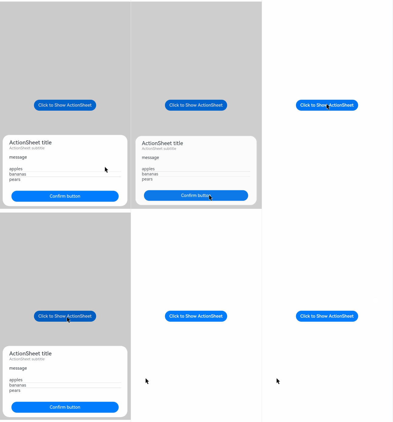
This example demonstrates how to display an action sheet when a button is touched.
// xxx.ets
@Entry
@Component
struct ActionSheetExample {
  build() {
    Flex({ direction: FlexDirection.Column, alignItems: ItemAlign.Center, justifyContent: FlexAlign.Center }) {
      Button('Click to Show ActionSheet')
        .onClick(() => {
          this.getUIContext().showActionSheet({
            title: 'ActionSheet title',
            subtitle: 'ActionSheet subtitle',
            message: 'message',
            autoCancel: true,
            confirm: {
              defaultFocus: true,
              value: 'Confirm button',
              action: () => {
                console.info('Get ActionSheet handled');
              }
            },
            cancel: () => {
              console.info('ActionSheet canceled');
            },
            onWillDismiss: (dismissDialogAction: DismissDialogAction) => {
              console.info(`reason= ${dismissDialogAction.reason}`);
              console.info('ActionSheet onWillDismiss');
              if (dismissDialogAction.reason === DismissReason.PRESS_BACK) {
                dismissDialogAction.dismiss();
              }
              if (dismissDialogAction.reason === DismissReason.TOUCH_OUTSIDE) {
                dismissDialogAction.dismiss();
              }
            },
            alignment: DialogAlignment.Bottom,
            offset: { dx: 0, dy: -10 },
            sheets: [
              {
                title: 'apples',
                action: () => {
                  console.info('apples');
                }
              },
              {
                title: 'bananas',
                action: () => {
                  console.info('bananas');
                }
              },
              {
                title: 'pears',
                action: () => {
                  console.info('pears');
                }
              }
            ]
          })
        })
    }.width('100%')
    .height('100%')
  }
} 
[h2]Example 2: Opening a Dialog Box Outside the Main Window
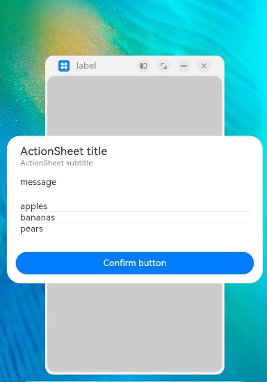
This example demonstrates how to configure a dialog box to display outside the main window on a 2-in-1 device by setting showInSubWindow to true.
// xxx.ets
@Entry
@Component
struct ActionSheetExample {
  build() {
    Flex({ direction: FlexDirection.Column, alignItems: ItemAlign.Center, justifyContent: FlexAlign.Center }) {
      Button('Click to Show ActionSheet')
        .onClick(() => {
          this.getUIContext().showActionSheet({
            title: 'ActionSheet title',
            subtitle: 'ActionSheet subtitle',
            message: 'message',
            autoCancel: true,
            showInSubWindow: true,
            isModal: true,
            confirm: {
              defaultFocus: true,
              value: 'Confirm button',
              action: () => {
                console.info('Get ActionSheet handled');
              }
            },
            cancel: () => {
              console.info('ActionSheet canceled');
            },
            onWillDismiss: (dismissDialogAction: DismissDialogAction) => {
              console.info(`reason= ${dismissDialogAction.reason}`);
              console.info('ActionSheet onWillDismiss');
              if (dismissDialogAction.reason === DismissReason.PRESS_BACK) {
                dismissDialogAction.dismiss();
              }
              if (dismissDialogAction.reason === DismissReason.TOUCH_OUTSIDE) {
                dismissDialogAction.dismiss();
              }
            },
            alignment: DialogAlignment.Center,
            offset: { dx: 0, dy: -10 },
            sheets: [
              {
                title: 'apples',
                action: () => {
                  console.info('apples');
                }
              },
              {
                title: 'bananas',
                action: () => {
                  console.info('bananas');
                }
              },
              {
                title: 'pears',
                action: () => {
                  console.info('pears');
                }
              }
            ]
          })
        })
    }.width('100%')
    .height('100%')
  }
} 
[h2]Example 3: Setting the Dialog Box Animation
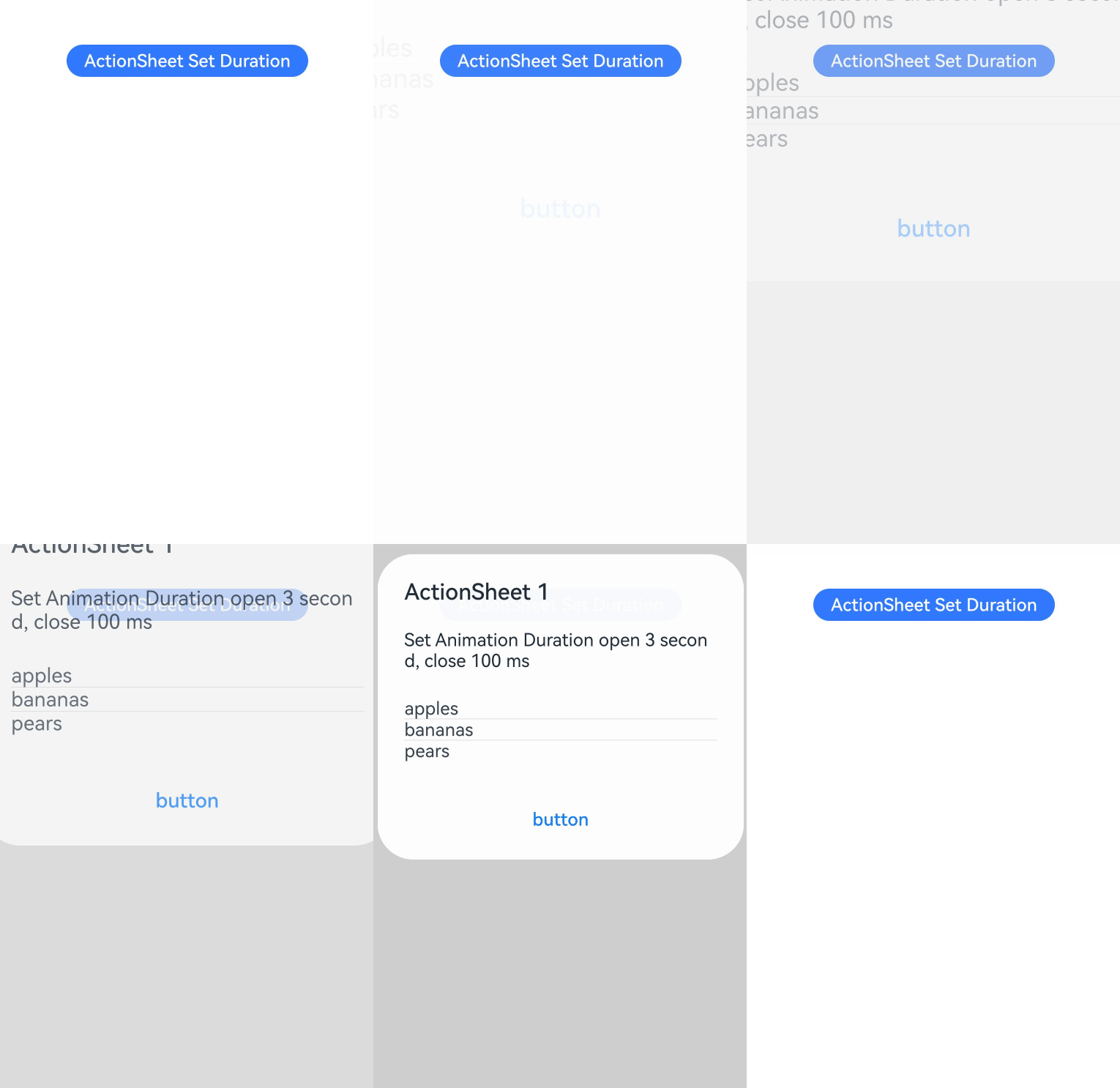
This example illustrates how to use the transition API to create custom animation effects for the dialog box's appearance and disappearance.
// xxx.ets
@Entry
@Component
struct ActionSheetExample {
  build() {
    Column({ space: 5 }) {
      Button('ActionSheet Set Duration')
        .onClick(() => {
          this.getUIContext().showActionSheet({
            title: 'ActionSheet 1',
            message: 'Set Animation Duration open 3 second, close 100 ms',
            autoCancel: true,
            alignment: DialogAlignment.Top,
            transition: TransitionEffect.asymmetric(TransitionEffect.OPACITY
              .animation({ duration: 3000, curve: Curve.Sharp })
              .combine(TransitionEffect.scale({ x: 1.5, y: 1.5 }).animation({ duration: 3000, curve: Curve.Sharp })),
              TransitionEffect.OPACITY.animation({ duration: 100, curve: Curve.Smooth })
                .combine(TransitionEffect.scale({ x: 0.5, y: 0.5 }).animation({ duration: 100, curve: Curve.Smooth }))),
            offset: { dx: 0, dy: -20 },
            confirm: {
              value: 'button',
              action: () => {
                console.info('Button-clicking callback');
              }
            },
            cancel: () => {
              console.info('Closed callbacks');
            },
            sheets: [
              {
                title: 'apples',
                action: () => {
                  console.info('apples');
                }
              },
              {
                title: 'bananas',
                action: () => {
                  console.info('bananas');
                }
              },
              {
                title: 'pears',
                action: () => {
                  console.info('pears');
                }
              }
            ]
          })
        }).backgroundColor(0x317aff).height('88px')
    }.width('100%').margin({ top: 5 })
  }
} 
[h2]Example 4: Setting the Dialog Box Style
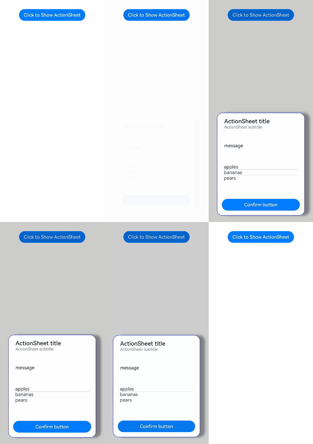
This example demonstrates how to set styles of a dialog box, including the width, height, background color, and shadow.
// xxx.ets
@Entry
@Component
struct ActionSheetExample {
  build() {
    Flex({ direction: FlexDirection.Column, alignItems: ItemAlign.Center }) {
      Button('Click to Show ActionSheet')
        .onClick(() => {
          this.getUIContext().showActionSheet({
            title: 'ActionSheet title',
            subtitle: 'ActionSheet subtitle',
            message: 'message',
            autoCancel: true,
            width: 300,
            height: 350,
            cornerRadius: 20,
            borderWidth: 1,
            borderStyle: BorderStyle.Solid, // Set the border style.
            borderColor: Color.Blue, // Set the border color.
            backgroundColor: Color.White,
            shadow: ({
              radius: 20,
              color: Color.Grey,
              offsetX: 50,
              offsetY: 0
            }),
            confirm: {
              defaultFocus: true,
              value: 'Confirm button',
              action: () => {
                console.info('Get ActionSheet handled');
              }
            },
            cancel: () => {
              console.info('ActionSheet canceled');
            },
            onWillDismiss: (dismissDialogAction: DismissDialogAction) => {
              console.info(`reason= ${dismissDialogAction.reason}`);
              console.info('ActionSheet onWillDismiss');
              if (dismissDialogAction.reason === DismissReason.PRESS_BACK) {
                dismissDialogAction.dismiss();
              }
              if (dismissDialogAction.reason === DismissReason.TOUCH_OUTSIDE) {
                dismissDialogAction.dismiss();
              }
            },
            alignment: DialogAlignment.Bottom,
            offset: { dx: 0, dy: -10 },
            sheets: [
              {
                title: 'apples',
                action: () => {
                  console.info('apples');
                }
              },
              {
                title: 'bananas',
                action: () => {
                  console.info('bananas');
                }
              },
              {
                title: 'pears',
                action: () => {
                  console.info('pears');
                }
              }
            ]
          })
        })
    }.width('100%')
  }
} 
[h2]Example 5: Configuring a Dialog Box in the Hover State
This example demonstrates how to set the layout area of a dialog box in hover mode on a foldable device.
// xxx.ets
@Entry
@Component
struct ActionSheetExample {
  build() {
    Flex({ direction: FlexDirection.Column, alignItems: ItemAlign.Center, justifyContent: FlexAlign.Center }) {
      Button('Click to Show ActionSheet')
        .onClick(() => {
          this.getUIContext().showActionSheet({
            title: 'ActionSheet title',
            subtitle: 'ActionSheet subtitle',
            message: 'message',
            autoCancel: true,
            confirm: {
              defaultFocus: true,
              value: 'Confirm button',
              action: () => {
                console.info('Get ActionSheet handled');
              }
            },
            cancel: () => {
              console.info('ActionSheet canceled');
            },
            onWillDismiss: (dismissDialogAction: DismissDialogAction) => {
              console.info(`reason= ${dismissDialogAction.reason}`);
              console.info('ActionSheet onWillDismiss');
              if (dismissDialogAction.reason === DismissReason.PRESS_BACK) {
                dismissDialogAction.dismiss();
              }
              if (dismissDialogAction.reason === DismissReason.TOUCH_OUTSIDE) {
                dismissDialogAction.dismiss();
              }
            },
            alignment: DialogAlignment.Bottom,
            offset: { dx: 0, dy: -10 },
            enableHoverMode: true,
            hoverModeArea: HoverModeAreaType.TOP_SCREEN,
            sheets: [
              {
                title: 'apples',
                action: () => {
                  console.info('apples');
                }
              },
              {
                title: 'bananas',
                action: () => {
                  console.info('bananas');
                }
              },
              {
                title: 'pears',
                action: () => {
                  console.info('pears');
                }
              }
            ]
          })
        })
    }.width('100%')
    .height('100%')
  }
} 
[h2]Example 6: Using Dialog Box Lifecycle Callbacks
This example demonstrates how to configure the lifecycle callbacks for the dialog box.
The onDidAppear, onDidDisappear, onWillAppear, and onWillDisappear properties are supported in ActionSheetOptions since API version 19.
// xxx.ets
@Entry
@Component
struct Example1 {
  @State log: string = 'Log information:';

  build() {
    Column({ space: 5 }) {
      Button('ActionSheet')
        .onClick(() => {
          this.getUIContext().showActionSheet({
            title: 'ActionSheet',
            message: 'message',
            autoCancel: true,
            alignment: DialogAlignment.Bottom,
            offset: { dx: 0, dy: -20 },
            confirm: {
              value: 'button',
              action: () => {
                console.info('ActionSheet Button-clicking callback');
              }
            },
            cancel: () => {
              console.info('ActionSheet Closed callbacks');
            },
            sheets: [
              {
                title: 'apples',
                action: () => {
                  console.info('ActionSheet apples')
                }
              },
              {
                title: 'bananas',
                action: () => {
                  console.info('ActionSheet bananas')
                }
              },
              {
                title: 'pears',
                action: () => {
                  console.info('ActionSheet pears')
                }
              }
            ],
            onDidAppear: () => {
              this.log += '# onDidAppear';
              console.info('ActionSheet,is onDidAppear!');
            },
            onDidDisappear: () => {
              this.log += '# onDidDisappear';
              console.info('ActionSheet,is onDidDisappear!');
            },
            onWillAppear: () => {
              this.log = 'Log information:onWillAppear';
              console.info('ActionSheet,is onWillAppear!');
            },
            onWillDisappear: () => {
              this.log += '# onWillDisappear';
              console.info('ActionSheet,is onWillDisappear!');
            }
          })
        })
      Text(this.log).fontSize(30).margin({ top: 200 })
    }.width('100%').margin({ top: 5 })
  }
} 
[h2]Example 7: Customizing the Background Blur Effect
This example demonstrates how to customize the background blur effect by configuring backgroundBlurStyleOptions.
The backgroundBlurStyleOptions property is supported in ActionSheetOptions since API version 19.
@Entry
@Component
struct ActionSheetExample {
  build() {
    Stack({ alignContent: Alignment.Top }) {
      Image($r('app.media.bg'))
      Column() {
        Button("ActionSheet")
          .margin(20)
          .onClick(() => {
            this.getUIContext().showActionSheet({
              title: 'ActionSheet Title',
              subtitle: 'ActionSheet Subtitle',
              message: 'ActionSheet Text',
              sheets: [
                {
                  title: 'Apples',
                  action: () => {
                    console.info('apples');
                  }
                },
                {
                  title: 'Bananas',
                  action: () => {
                    console.info('bananas');
                  }
                },
                {
                  title: 'Pears',
                  action: () => {
                    console.info('pears');
                  }
                }
              ],
              alignment: DialogAlignment.Center,
              backgroundColor: undefined,
              backgroundBlurStyle: BlurStyle.Thin,
              backgroundBlurStyleOptions: {
                colorMode: ThemeColorMode.LIGHT,
                adaptiveColor: AdaptiveColor.AVERAGE,
                scale: 1,
                blurOptions: { grayscale: [20, 20] },
              },
            });
          })
      }.width('100%')
    }
  }
} 
[h2]Example 8: Customizing the Background Effect
This example demonstrates how to customize the background effect by configuring backgroundEffect.
The backgroundEffect property is supported in ActionSheetOptions since API version 19.
@Entry
@Component
struct ActionSheetExample {
  build() {
    Stack({ alignContent: Alignment.Top }) {
      Image($r('app.media.bg'))
      Column() {
        Button("ActionSheet")
          .margin(20)
          .onClick(() => {
            this.getUIContext().showActionSheet({
              title: 'ActionSheet Title',
              subtitle: 'ActionSheet Subtitle',
              message: 'ActionSheet Text',
              sheets: [
                {
                  title: 'Apples',
                  action: () => {
                    console.info('apples');
                  }
                },
                {
                  title: 'Bananas',
                  action: () => {
                    console.info('bananas');
                  }
                },
                {
                  title: 'Pears',
                  action: () => {
                    console.info('pears');
                  }
                }
              ],
              alignment: DialogAlignment.Center,
              backgroundColor: undefined,
              backgroundBlurStyle: BlurStyle.Thin,
              backgroundEffect: {
                radius: 60,
                saturation: 0,
                brightness: 1,
                color: Color.White,
                blurOptions: { grayscale: [20, 20] }
              },
            });
          })
      }.width('100%')
    }
  }
} 
[h2]Example 9: Setting the Immersive Light Effect for the Dialog Box
This example demonstrates how to set the system material of the component by using the systemMaterial attribute in ActionSheetOptions to implement the immersive light effect. After the system material is set, non-linear deformation and edge light flow occur during the pop-up of the ActionSheet.
The figures in this example show the strong immersive light effects on a high-computing device. The immersive light effect of the component automatically adapts to the device's computing power and the immersive light effect set by the user in the system. No additional adaptation is required.
Since API version 26.0.0, the systemMaterial attribute has been added to the ActionSheetOptions object.
import { uiMaterial } from '@kit.ArkUI';

@Entry
@Component
struct ActionSheetExample {
  build() {
    Stack({ alignContent: Alignment.Top }) {
      Column() {
        Button("ActionSheet")
          .margin(20)
          .onClick(() => {
            this.getUIContext().showActionSheet({
              title: 'ActionSheet Title',
              subtitle: 'ActionSheet Subtitle',
              message: 'ActionSheet Text',
              sheets: [
                {
                  title: 'Apples',
                  action: () => {
                    console.info('apples');
                  }
                },
                {
                  title: 'Bananas',
                  action: () => {
                    console.info('bananas');
                  }
                },
                {
                  title: 'Pears',
                  action: () => {
                    console.info('pears');
                  }
                }
              ],
              alignment: DialogAlignment.Center,
              systemMaterial: new uiMaterial.ImmersiveMaterial({ style: uiMaterial.ImmersiveStyle.ULTRA_THICK })
            });
          })
      }
      .height('100%')
      .width('100%')
      // Replace the resource file with the actual one.
      .backgroundImage($r("app.media.img"))
      .backgroundImageSize({ width: '100%', height: '100%' })
    }
  }
}