The CheckboxGroup component is used to select or deselect all check boxes in a group.

This component is supported since API version 8. Updates will be marked with a superscript to indicate their earliest API version.
APIs
CheckboxGroup(options?: CheckboxGroupOptions)
Creates a check box group for controlling the select-all or deselect-all state of check boxes within the group. Check boxes and check box groups with the same group value belong to the same group.
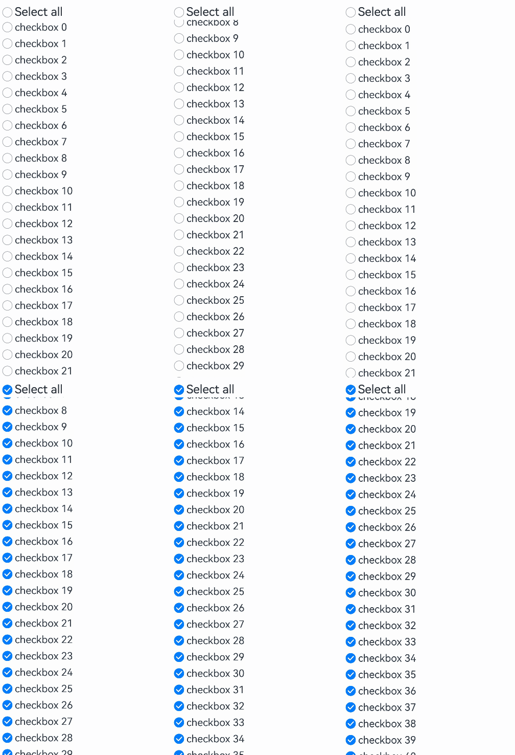
When this API is used with components that come with the caching mechanism, such as the List component, those check boxes that have not been created yet need to be manually selected or unselected. For details, see Example 4.
Widget capability: Since API version 9, this feature is supported in ArkTS widgets.
Atomic service API: This API can be used in atomic services since API version 11.
System capability: SystemCapability.ArkUI.ArkUI.Full
Parameters
| Name | Type | Mandatory | Description |
|---|---|---|---|
| options | CheckboxGroupOptions | No | Check box group parameters. The default values of the parameters in CheckboxGroupOptions apply if this parameter is not set. |
CheckboxGroupOptions
Information about the check box group.
Widget capability: Since API version 9, this feature is supported in ArkTS widgets.
Atomic service API: This API can be used in atomic services since API version 11.
System capability: SystemCapability.ArkUI.ArkUI.Full
| Name | Type | Read-Only | Optional | Description |
|---|---|---|---|---|
| group | string | No | Yes | Group name. Default value: undefined. In the default state, the options whose group value is undefined in CheckboxOptions are managed by this parameter. NOTE Among multiple check box groups with the same group name, only the first one takes effect. |
[h2]selectAll
selectAll(value: boolean)
Sets whether to select all. If the select attribute is set for a Checkbox component in the same group, the setting of the Checkbox has a higher priority.
When used with components that have caching functionality (such as List), the selection state of uncreated check boxes must be controlled by the developer.
Since API version 10, this attribute supports two-way binding through $$.
Since API version 18, this attribute supports two-way binding through !!.
Widget capability: Since API version 9, this feature is supported in ArkTS widgets.
Atomic service API: This API can be used in atomic services since API version 11.
System capability: SystemCapability.ArkUI.ArkUI.Full
Parameters
| Name | Type | Mandatory | Description |
|---|---|---|---|
| value | boolean | Yes | Whether to select all. Default value: false. The value true means to select all check boxes in the group, and false means to deselect all check boxes in the group. |
[h2]selectAll18+
selectAll(isAllSelected: Optional<boolean>)
Sets whether to select all. If the select attribute is set for a Checkbox component in the same group, the setting of the Checkbox has a higher priority. Compared with selectAll, this API supports the undefined type for the isAllSelected parameter.
When used with components that have caching functionality (such as List), the selection state of uncreated check boxes must be controlled by the developer.
This attribute supports two-way binding through $$ and !!.
Widget capability: This API can be used in ArkTS widgets since API version 18.
Atomic service API: This API can be used in atomic services since API version 18.
Model restriction: This API can be used only in the stage model.
System capability: SystemCapability.ArkUI.ArkUI.Full
Parameters
| Name | Type | Mandatory | Description |
|---|---|---|---|
| isAllSelected | Optional<boolean> | Yes | Whether to select all. If isAllSelected is set to undefined, the default value false is used. The value true means to select all check boxes in the group, and false means to deselect all check boxes in the group. |
[h2]selectedColor
selectedColor(value: ResourceColor)
Sets the color of the selected check box.
Widget capability: Since API version 9, this feature is supported in ArkTS widgets.
Atomic service API: This API can be used in atomic services since API version 11.
System capability: SystemCapability.ArkUI.ArkUI.Full
Parameters
| Name | Type | Mandatory | Description |
|---|---|---|---|
| value | ResourceColor | Yes | Color of the selected check box. Default value: $r('sys.color.ohos_id_color_text_primary_activated') An invalid value is handled as the default value. |
[h2]selectedColor18+
selectedColor(resColor: Optional<ResourceColor>)
Sets the color of the selected check box. Compared with selectedColor, this API supports the undefined type for the resColor parameter.
Widget capability: This API can be used in ArkTS widgets since API version 18.
Atomic service API: This API can be used in atomic services since API version 18.
Model restriction: This API can be used only in the stage model.
System capability: SystemCapability.ArkUI.ArkUI.Full
Parameters
| Name | Type | Mandatory | Description |
|---|---|---|---|
| resColor | Optional<ResourceColor> | Yes | Color of the selected check box. If resColor is set to undefined, the default value $r('sys.color.ohos_id_color_text_primary_activated') is used. An invalid value is handled as the default value. |
[h2]unselectedColor10+
unselectedColor(value: ResourceColor)
Sets the border color of the check box when it is not selected.
Atomic service API: This API can be used in atomic services since API version 11.
Model restriction: This API can be used only in the stage model.
System capability: SystemCapability.ArkUI.ArkUI.Full
Parameters
| Name | Type | Mandatory | Description |
|---|---|---|---|
| value | ResourceColor | Yes | Border color of the check box when it is not selected. Default value: $r('sys.color.ohos_id_color_switch_outline_off') |
[h2]unselectedColor18+
unselectedColor(resColor: Optional<ResourceColor>)
Sets the border color of the check box when it is not selected. Compared with unselectedColor10+, this API supports the undefined type for the resColor parameter.
Atomic service API: This API can be used in atomic services since API version 18.
Model restriction: This API can be used only in the stage model.
System capability: SystemCapability.ArkUI.ArkUI.Full
Parameters
| Name | Type | Mandatory | Description |
|---|---|---|---|
| resColor | Optional<ResourceColor> | Yes | Border color of the check box when it is not selected. If resColor is set to undefined, the default value $r('sys.color.ohos_id_color_switch_outline_off') is used. |
[h2]mark10+
mark(value: MarkStyle)
Sets the check mark style of the check box.
Atomic service API: This API can be used in atomic services since API version 11.
Model restriction: This API can be used only in the stage model.
System capability: SystemCapability.ArkUI.ArkUI.Full
Parameters
| Name | Type | Mandatory | Description |
|---|---|---|---|
| value | MarkStyle | Yes | Check mark style of the check box. |
[h2]mark18+
mark(style: Optional<MarkStyle>)
Sets the check mark style of the check box. Compared with mark10+, this API supports the undefined type for the style parameter.
Atomic service API: This API can be used in atomic services since API version 18.
Model restriction: This API can be used only in the stage model.
System capability: SystemCapability.ArkUI.ArkUI.Full
Parameters
[h2]checkboxShape12+
checkboxShape(value: CheckBoxShape)
Sets the check box shape of the check box group.
Widget capability: This API can be used in ArkTS widgets since API version 12.
Atomic service API: This API can be used in atomic services since API version 12.
Model restriction: This API can be used only in the stage model.
System capability: SystemCapability.ArkUI.ArkUI.Full
Parameters
| Name | Type | Mandatory | Description |
|---|---|---|---|
| value | CheckBoxShape | Yes | Check box shape of the check box group: circle or rounded square. Default value: CheckBoxShape.CIRCLE. NOTE The CheckboxGroup component is displayed according to the set shape. All check boxes in the CheckboxGroup component that do not have their shape individually set will inherit the shape of the CheckboxGroup. Check boxes in the CheckboxGroup component that have their shape individually set will prioritize their own shape setting over the shape of the CheckboxGroup. |
[h2]checkboxShape18+
checkboxShape(shape: Optional<CheckBoxShape>)
Sets the check box shape of the check box group. Available options include circle and rounded square. Compared with checkboxShape12+, this API supports the undefined type for the shape parameter.
Widget capability: This API can be used in ArkTS widgets since API version 18.
Atomic service API: This API can be used in atomic services since API version 18.
Model restriction: This API can be used only in the stage model.
System capability: SystemCapability.ArkUI.ArkUI.Full
Parameters
| Name | Type | Mandatory | Description |
|---|---|---|---|
| shape | Optional<CheckBoxShape> | Yes | Check box shape of the check box group. Available options include circle and rounded square. If shape is set to undefined, the default value CheckBoxShape.CIRCLE is used. NOTE The CheckboxGroup component is displayed according to the set shape. All check boxes in the CheckboxGroup component that do not have their shape individually set will inherit the shape of the CheckboxGroup. Check boxes in the CheckboxGroup component that have their shape individually set will prioritize their own shape setting over the shape of the CheckboxGroup. |
[h2]contentModifier21+
contentModifier(modifier: Optional<ContentModifier<CheckBoxGroupConfiguration>>)
Customize the CheckboxGroup content area. When this attribute is set, the settings of other attributes become invalid.

Atomic service API: This API can be used in atomic services since API version 21.
Model restriction: This API can be used only in the stage model.
System capability: SystemCapability.ArkUI.ArkUI.Full
Parameters
| Name | Type | Mandatory | Description |
|---|---|---|---|
| modifier | Optional<ContentModifier<CheckBoxGroupConfiguration>> | Yes | Content modifier to apply to the TextTimer component. modifier: content modifier. You need to customize a class to implement the ContentModifier interface. If modifier is set to undefined, no content modifier is used. |
[h2]onChange
onChange(callback: OnCheckboxGroupChangeCallback)
Triggered when the selected status of the check box group or any check box wherein changes.
Widget capability: Since API version 9, this feature is supported in ArkTS widgets.
Atomic service API: This API can be used in atomic services since API version 11.
System capability: SystemCapability.ArkUI.ArkUI.Full
Parameters
| Name | Type | Mandatory | Description |
|---|---|---|---|
| callback | OnCheckboxGroupChangeCallback | Yes | Information about the check box group. |
[h2]onChange18+
onChange(callback: Optional<OnCheckboxGroupChangeCallback>)
Triggered when the selected status of the check box group or any check box wherein changes. Compared with onChange, this API supports the undefined type for the callback parameter.
Widget capability: This API can be used in ArkTS widgets since API version 18.
Atomic service API: This API can be used in atomic services since API version 18.
Model restriction: This API can be used only in the stage model.
System capability: SystemCapability.ArkUI.ArkUI.Full
Parameters
| Name | Type | Mandatory | Description |
|---|---|---|---|
| callback | Optional<OnCheckboxGroupChangeCallback> | Yes | Information about the check box group. If callback is set to undefined, the callback function is not used. |
OnCheckboxGroupChangeCallback18+
type OnCheckboxGroupChangeCallback = (value: CheckboxGroupResult) => void
Information about the check box group.
Widget capability: This API can be used in ArkTS widgets since API version 18.
Atomic service API: This API can be used in atomic services since API version 18.
Model restriction: This API can be used only in the stage model.
System capability: SystemCapability.ArkUI.ArkUI.Full
Parameters
| Name | Type | Mandatory | Description |
|---|---|---|---|
| value | CheckboxGroupResult | Yes | Information about the check box group. |
CheckboxGroupResult
Name and status of a check box group.
Widget capability: Since API version 9, this feature is supported in ArkTS widgets.
Atomic service API: This API can be used in atomic services since API version 11.
System capability: SystemCapability.ArkUI.ArkUI.Full
| Name | Type | Read-Only | Optional | Description |
|---|---|---|---|---|
| name | Array<string> | No | No | Names of all the selected check boxes in the group. |
| status | SelectStatus | No | No | Selected status. |
SelectStatus
Enumerates the selection states of check boxes in the check box group.
Widget capability: Since API version 9, this feature is supported in ArkTS widgets.
Atomic service API: This API can be used in atomic services since API version 11.
System capability: SystemCapability.ArkUI.ArkUI.Full
| Name | Value | Description |
|---|---|---|
| All | 0 | All check boxes in the group are selected. |
| Part | 1 | Some check boxes in the group are selected. |
| None | 2 | None of the check boxes in the group are selected. |
CheckBoxGroupConfiguration21+
You must customize this class to implement the ContentModifier interface. For details, see contentModifier.
Atomic service API: This API can be used in atomic services since API version 21.
Model restriction: This API can be used only in the stage model.
System capability: SystemCapability.ArkUI.ArkUI.Full
| Name | Type | Read-Only | Optional | Description |
|---|---|---|---|---|
| name | string | No | No | Name of the check box group. |
| status | SelectStatus | No | No | Selected status of the check box group. |
| triggerChange | Callback<boolean> | No | No | Triggers a change in the selection state of the check box group. The value true indicates that the selected status changes from partially selected or unselected to fully selected, and the value false indicates that the selected status changes from fully selected or partially selected to unselected. |
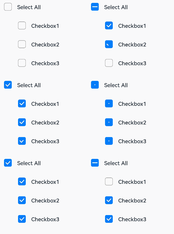
[h2]Example 1: Setting a Check Box Group
This example demonstrates how to control the state of a group of check boxes to achieve a "select all" or "deselect all" effect.
// xxx.ets
@Entry
@Component
struct CheckboxExample {
  build() {
    Scroll() {
      Column() {
        // Select All button
        Flex({ justifyContent: FlexAlign.Start, alignItems: ItemAlign.Center }) {
          CheckboxGroup({ group: 'checkboxGroup' })
            .checkboxShape(CheckBoxShape.ROUNDED_SQUARE)
            .selectedColor('#007DFF')
            .onChange((itemName: CheckboxGroupResult) => {
              console.info("checkbox group content" + JSON.stringify(itemName));
            })
          Text('Select All').fontSize(14).lineHeight(20).fontColor('#182431').fontWeight(500)
        }

        // Option 1
        Flex({ justifyContent: FlexAlign.Start, alignItems: ItemAlign.Center }) {
          Checkbox({ name: 'checkbox1', group: 'checkboxGroup' })
            .selectedColor('#007DFF')
            .shape(CheckBoxShape.ROUNDED_SQUARE)
            .onChange((value: boolean) => {
              console.info('Checkbox1 change is' + value);
            })
          Text('Checkbox1').fontSize(14).lineHeight(20).fontColor('#182431').fontWeight(500)
        }.margin({ left: 36 })

        // Option 2
        Flex({ justifyContent: FlexAlign.Start, alignItems: ItemAlign.Center }) {
          Checkbox({ name: 'checkbox2', group: 'checkboxGroup' })
            .selectedColor('#007DFF')
            .shape(CheckBoxShape.ROUNDED_SQUARE)
            .onChange((value: boolean) => {
              console.info('Checkbox2 change is' + value);
            })
          Text('Checkbox2').fontSize(14).lineHeight(20).fontColor('#182431').fontWeight(500)
        }.margin({ left: 36 })

        // Option 3
        Flex({ justifyContent: FlexAlign.Start, alignItems: ItemAlign.Center }) {
          Checkbox({ name: 'checkbox3', group: 'checkboxGroup' })
            .selectedColor('#007DFF')
            .shape(CheckBoxShape.ROUNDED_SQUARE)
            .onChange((value: boolean) => {
              console.info('Checkbox3 change is' + value);
            })
          Text('Checkbox3').fontSize(14).lineHeight(20).fontColor('#182431').fontWeight(500)
        }.margin({ left: 36 })
      }
    }
  }
} 
[h2]Example 2: Customizing Check Mark Style
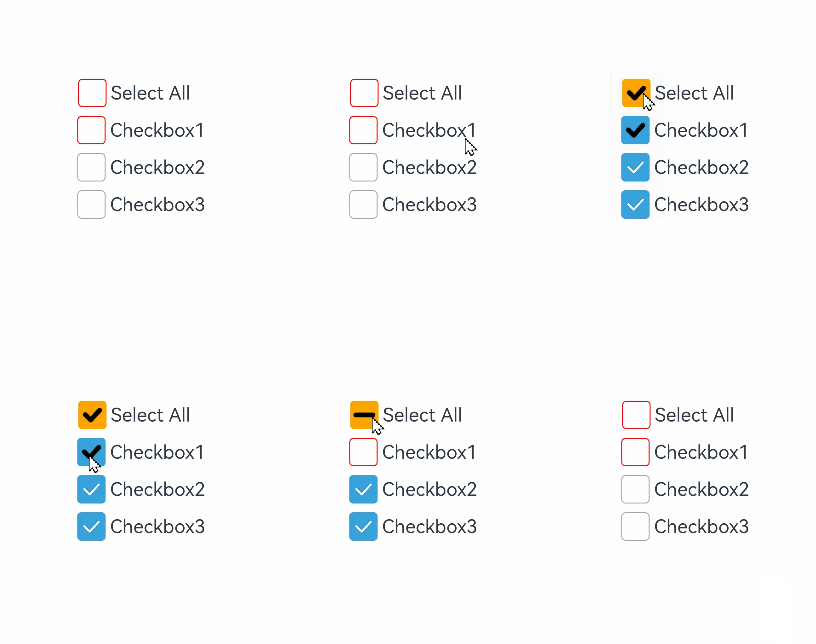
This example shows how to customize the check mark style for a check box group by configuring the mark attribute.
// xxx.ets
@Entry
@Component
struct Index {

  build() {
    Row() {
      Column() {
        Flex({ justifyContent: FlexAlign.Center, alignItems: ItemAlign.Center }) {
          CheckboxGroup({ group: 'checkboxGroup' })
            .checkboxShape(CheckBoxShape.ROUNDED_SQUARE)
            .selectedColor(Color.Orange)
            .onChange((itemName: CheckboxGroupResult) => {
              console.info("checkbox group content" + JSON.stringify(itemName));
            })
            .mark({
              strokeColor:Color.Black,
              size: 40,
              strokeWidth: 5
            })
            .unselectedColor(Color.Red)
            .width(30)
            .height(30)
          Text('Select All').fontSize(20)
        }.margin({right:15})
        Flex({ justifyContent: FlexAlign.Center, alignItems: ItemAlign.Center }) {
          Checkbox({ name: 'checkbox1', group: 'checkboxGroup' })
            .selectedColor(0x39a2db)
            .shape(CheckBoxShape.ROUNDED_SQUARE)
            .onChange((value: boolean) => {
              console.info('Checkbox1 change is'+ value);
            })
            .mark({
              strokeColor:Color.Black,
              size: 50,
              strokeWidth: 5
            })
            .unselectedColor(Color.Red)
            .width(30)
            .height(30)
          Text('Checkbox1').fontSize(20)
        }
        Flex({ justifyContent: FlexAlign.Center, alignItems: ItemAlign.Center }) {
          Checkbox({ name: 'checkbox2', group: 'checkboxGroup' })
            .selectedColor(0x39a2db)
            .shape(CheckBoxShape.ROUNDED_SQUARE)
            .onChange((value: boolean) => {
              console.info('Checkbox2 change is' + value);
            })
            .width(30)
            .height(30)
          Text('Checkbox2').fontSize(20)
        }
        Flex({ justifyContent: FlexAlign.Center, alignItems: ItemAlign.Center }) {
          Checkbox({ name: 'checkbox3', group: 'checkboxGroup' })
            .selectedColor(0x39a2db)
            .shape(CheckBoxShape.ROUNDED_SQUARE)
            .onChange((value: boolean) => {
              console.info('Checkbox3 change is' + value);
            })
            .width(30)
            .height(30)
          Text('Checkbox3').fontSize(20)
        }
      }
      .width('100%')
    }
    .height('100%')
  }
} 
[h2]Example 3: Customizing Check Box Group Style
This example demonstrates how to customize checkbox group appearances using contentModifier, available since API version 21. It implements a pentagonal custom checkbox group with the following visual rules:
- Fully selected: A red triangle appears inside the pentagon, and the label displays "fully selected".
- Partially selected: The triangle turns blue, and the label displays "partially selected".
- Unselected: The triangle disappears entirely, and the label displays "unselected".
// xxx.ets
class MyCheckboxGroupStyle implements ContentModifier<CheckBoxGroupConfiguration> {
  selectedColor: Color = Color.Black;

  constructor(selectedColor: Color) {
    this.selectedColor = selectedColor;
  }

  applyContent(): WrappedBuilder<[CheckBoxGroupConfiguration]> {
    return wrapBuilder(buildCheckboxgroup);
  }
}
let statusString: string[] = ['fully selected', 'partially selected', 'unselected'];
@Builder
function buildCheckboxgroup(config: CheckBoxGroupConfiguration) {
  Column({ space: 10 }) {
    Text(config.name + " " + statusString[config.status ]).margin({ right: 70, top: 50 })
    Text(config.enabled ? "enabled true" : "enabled false").margin({ right: 110 })
    Shape() {
      Path()
        .width(100)
        .height(100)
        .commands('M100 0 L0 100 L50 200 L150 200 L200 100 Z')
        .fillOpacity(0)
        .strokeWidth(3)
        .onClick(() => {
          console.info('checkboxgroup status ', statusString[config.status])
          if (config.status === SelectStatus.All ||  config.status === SelectStatus.Part) {
            config.triggerChange(false);
            console.info('checkboxgroup not selected')
          } else {
            config.triggerChange(true);
            console.info('checkboxgroup selected')
          }
        })
        .opacity(config.enabled ? 1 : 0.1)
      Path()
        .width(10)
        .height(10)
        .commands('M50 0 L100 100 L0 100 Z')
        .visibility(config.status === SelectStatus.All ? Visibility.Visible : Visibility.Hidden)
        .fill(config.status === SelectStatus.All ? (config.contentModifier as MyCheckboxGroupStyle).selectedColor : Color.Black)
        .stroke((config.contentModifier as MyCheckboxGroupStyle).selectedColor)
        .margin({ left: 10, top: 10 })
        .opacity(config.enabled ? 1 : 0.1)
      Path()
        .width(10)
        .height(10)
        .commands('M50 0 L100 100 L0 100 Z')
        .visibility(config.status === SelectStatus.Part ? Visibility.Visible : Visibility.Hidden)
        .fill(config.status === SelectStatus.Part ? Color.Blue : Color.Black)
        .stroke((config.contentModifier as MyCheckboxGroupStyle).selectedColor)
        .margin({ left: 10, top: 10 })
        .opacity(config.enabled ? 1 : 0.1)
    }
    .width(300)
    .height(200)
    .viewPort({
      x: 0,
      y: 0,
      width: 310,
      height: 310
    })
    .strokeLineJoin(LineJoinStyle.Miter)
    .strokeMiterLimit(5)
    .margin({ left: 50 })
  }
}

@Entry
@Component
struct Index {
  @State checkboxEnabled: boolean = true;

  build() {
    Column({ space: 100 }) {
      CheckboxGroup({  group: 'checkboxGroup' })
         .contentModifier(new MyCheckboxGroupStyle(Color.Red))
        .onChange((itemName: CheckboxGroupResult) => {
          console.info(" CheckboxGroup onChange: " + JSON.stringify(itemName));
        })
        .enabled(this.checkboxEnabled)

      Row() {
        Toggle({ type: ToggleType.Switch, isOn: true }).onChange((value: boolean) => {
          if (value) {
            this.checkboxEnabled = true;
          } else {
            this.checkboxEnabled = false;
          }
        })
      }.position({ x: 50, y: 130 })
      Row() {
        Checkbox({ name: 'Check box 1', group: 'checkboxGroup' })
          .onChange((value: boolean) => {
            console.info('Check box 1: ' + value);
          })
        Text('Check box 1').fontSize(20)
      }
        .position({ x: 50, y: 230 })
      Row() {
        Checkbox({ name: 'Check box 2', group: 'checkboxGroup' })
          .onChange((value: boolean) => {
            console.info('Check box 2 change to ' + value);
          })
        Text('Check box 2').fontSize(20)
      }
      .position({ x: 50, y: 260 })
    }.margin({ top: 30 })
  }
}
[h2]Example 4: Implementing the Select-All Functionality
This example demonstrates select-all implementation for check boxes used with caching components like List, handling items not yet created during initial rendering.
class BasicDataSource implements IDataSource {
  private listeners: DataChangeListener[] = [];
  private originDataArray: checkboxItemData[] = [];

  public totalCount(): number {
    return this.originDataArray.length;
  }

  public getData(index: number): checkboxItemData {
    return this.originDataArray[index];
  }

  registerDataChangeListener(listener: DataChangeListener): void {
    if (this.listeners.indexOf(listener) < 0) {
      console.info('add listener');
      this.listeners.push(listener);
    }
  }

  unregisterDataChangeListener(listener: DataChangeListener): void {
    const pos = this.listeners.indexOf(listener);
    if (pos >= 0) {
      console.info('remove listener');
      this.listeners.splice(pos, 1);
    }
  }

  notifyDataReload(): void {
    this.listeners.forEach(listener => {
      listener.onDataReloaded();
    });
  }

  notifyDataAdd(index: number): void {
    this.listeners.forEach(listener => {
      listener.onDataAdd(index);
    });
  }

  notifyDataChange(index: number): void {
    this.listeners.forEach(listener => {
      listener.onDataChange(index);
    });
  }

  notifyDataDelete(index: number): void {
    this.listeners.forEach(listener => {
      listener.onDataDelete(index);
    });
  }

  notifyDataMove(from: number, to: number): void {
    this.listeners.forEach(listener => {
      listener.onDataMove(from, to);
    });
  }

  notifyDatasetChange(operations: DataOperation[]): void {
    this.listeners.forEach(listener => {
      listener.onDatasetChange(operations);
    });
  }
}

interface checkboxItemData {
  isCheck: boolean;
  itemName: string;
}


class MyDataSource extends BasicDataSource {
  private dataArray: checkboxItemData[] = [];

  public totalCount(): number {
    return this.dataArray.length;
  }

  public getData(index: number): checkboxItemData {
    return this.dataArray[index];
  }

  public pushData(data: checkboxItemData): void {
    this.dataArray.push(data);
    this.notifyDataAdd(this.dataArray.length - 1);
  }

  public operateData(isSelect: boolean): void {
    this.dataArray.forEach((item) => {
      item.isCheck = isSelect
    })

    this.notifyDataReload()
  }

  public operateItem(isSelect: boolean, index: number): void {
    this.dataArray[index].isCheck = isSelect
    this.notifyDataChange(index)
  }

  public getDataSource(): checkboxItemData[] {
    return this.dataArray
  }
}

@Entry
@Component
struct MyComponent {
  private data: MyDataSource = new MyDataSource();

  aboutToAppear() {
    for (let i = 0; i <= 100; i++) {
      this.data.pushData({ isCheck: false, itemName: `checkbox ${i}` });
    }
  }

  @State isSelectAll: boolean = false

  build() {
    Column() {
      Flex({ justifyContent: FlexAlign.Start, alignItems: ItemAlign.Center }) {
        CheckboxGroup({ group: "group" })
          .selectAll(this.isSelectAll)
          .hitTestBehavior(HitTestMode.None)
        Text("Select all").fontSize(25)
      }.onClick(() => {
        this.isSelectAll = !this.isSelectAll
        this.data.operateData(this.isSelectAll)
      }).padding({ left: 10 })

      List({ space: 3 }) {
        LazyForEach(this.data, (item: checkboxItemData, index: number) => {
          ListItem() {
            Row() {
              Checkbox({ name: `checkbox-${item}` })
                .select(item.isCheck)
                .onChange((value: boolean) => {
                  this.data.operateItem(value, index)
                  let dataSource = this.data.getDataSource()
                  this.isSelectAll = dataSource.every((item) => item.isCheck === true)
                })
              Text(item.itemName).fontSize(20)
            }.margin({ left: 10, right: 10 })
          }

        }, (item: checkboxItemData) => item.itemName + item.isCheck)
      }.cachedCount(5)
    }
  }
}