With the attribute modifier, you can dynamically set component attributes, complete with the if/else syntax and polymorphic style. It is applicable to scenarios where the style needs to be dynamically switched based on the component status (such as pressed, focused, disabled, selected, and hovered), improving the flexibility of style management and code reusability.

-
This feature is supported since API version 11. Updates will be marked with a superscript to indicate their earliest API version.
-
The APIs of this module can be used only in the stage model.
-
Ensure that the attributes set in attributeModifier are different from those set in other methods. Otherwise, attributeModifier does not take effect when the page is refreshed.
-
For simple scenarios requiring conditional assignment of a single component attribute, ternary operators provide a concise alternative. Example: .width(isFullScreen ? 200 : 100).
-
attributeModifier supports custom components since API version 20.
-
If a component is in multiple states at the same time and the same attribute is set for each state, the priority of the final style is as follows: floating state < pressed state < focused state < disabled state < selected state. For example, if a component is in both the floating and pressed states and the background color is set for both states, the background color in the pressed state is displayed.
attributeModifier
attributeModifier(modifier: AttributeModifier<T>): T
Creates an attribute modifier.
Atomic service API: This API can be used in atomic services since API version 12.
System capability: SystemCapability.ArkUI.ArkUI.Full
Parameters
| Name | Type | Mandatory | Description |
|---|---|---|---|
| modifier | AttributeModifier<T> | Yes | Modifier for dynamically setting attributes on the current component. The if/else syntax is supported. modifier: attribute modifier. You need to customize classes to implement the AttributeModifier API. |
Return value
| Type | Description |
|---|---|
| T | Current component. |
AttributeModifier<T>
You need a custom class to implement the AttributeModifier API.
Atomic service API: This API can be used in atomic services since API version 12.
System capability: SystemCapability.ArkUI.ArkUI.Full

In the following APIs, setting the same value or object for the same attribute of the instance object will not trigger an update.
[h2]applyNormalAttribute
applyNormalAttribute?(instance: T): void
Applies the style of a component in the normal state.
Atomic service API: This API can be used in atomic services since API version 12.
System capability: SystemCapability.ArkUI.ArkUI.Full
Parameters
| Name | Type | Mandatory | Description |
|---|---|---|---|
| instance | T | Yes | Component attribute class, which identifies the type of component to which attributes will be applied, for example, ButtonAttribute for the Button component and TextAttribute for the Text component. For details, see Supported Attribute Types. |
[h2]applyPressedAttribute
applyPressedAttribute?(instance: T): void
Applies the style of a component in the pressed state. For implementation examples, see Example 2: Implementing the Pressed State Effect with a Modifier and Example 8: Implementing the Pressed State Effect for a Custom Component with a Modifier.
Atomic service API: This API can be used in atomic services since API version 12.
System capability: SystemCapability.ArkUI.ArkUI.Full
Parameters
| Name | Type | Mandatory | Description |
|---|---|---|---|
| instance | T | Yes | Component attribute class, which identifies the type of component to which attributes will be applied, for example, ButtonAttribute for the Button component and TextAttribute for the Text component. For details, see Supported Attribute Types. |
[h2]applyFocusedAttribute
applyFocusedAttribute?(instance: T): void
Applies the style of a component in the focused state. For the implementation example, see Example 5: Setting the Focused State Style with a Modifier.
Atomic service API: This API can be used in atomic services since API version 12.
System capability: SystemCapability.ArkUI.ArkUI.Full
Parameters
| Name | Type | Mandatory | Description |
|---|---|---|---|
| instance | T | Yes | Component attribute class, which identifies the type of component to which attributes will be applied, for example, ButtonAttribute for the Button component and TextAttribute for the Text component. For details, see Supported Attribute Types. |
[h2]applyDisabledAttribute
applyDisabledAttribute?(instance: T): void
Applies the style of a component in the disabled state. For the implementation example, see Example 6: Setting the Disabled State Style with a Modifier.
Atomic service API: This API can be used in atomic services since API version 12.
System capability: SystemCapability.ArkUI.ArkUI.Full
Parameters
| Name | Type | Mandatory | Description |
|---|---|---|---|
| instance | T | Yes | Component attribute class, which identifies the type of component to which attributes will be applied, for example, ButtonAttribute for the Button component and TextAttribute for the Text component. For details, see Supported Attribute Types. |
[h2]applySelectedAttribute
applySelectedAttribute?(instance: T): void
Applies the style of a component in the selected state.
In the preceding APIs, instance indicates the component type. You can customize these APIs and use them with the **if/else **syntax. For details, see Example 7: Setting the Selected State Style with a Modifier.
Atomic service API: This API can be used in atomic services since API version 12.
System capability: SystemCapability.ArkUI.ArkUI.Full
Parameters
| Name | Type | Mandatory | Description |
|---|---|---|---|
| instance | T | Yes | Component attribute class, which identifies the type of component to which attributes will be applied, for example, ButtonAttribute for the Button component and TextAttribute for the Text component. For details, see Supported Attribute Types. |
[h2]applyHoveredAttribute
applyHoveredAttribute?(instance: T): void
Defines the style of a component in the floating state. For details, see Example 9: Implementing the Mouse Hover Effect by Binding a Modifier to a Component.
Since: 26.0.0
Atomic service API: This API can be used in atomic services since API version 26.0.0.
System capability: SystemCapability.ArkUI.ArkUI.Full
Parameters
| Name | Type | Mandatory | Description |
|---|---|---|---|
| instance | T | Yes | Component attribute class, which identifies the type of component to which attributes will be applied, for example, ButtonAttribute for the Button component and TextAttribute for the Text component. For details, see Supported Attribute Types. |
[h2]Supported Attribute Types
| Name | Description |
|---|---|
| AlphabetIndexerAttribute | Attributes of AlphabetIndexer. |
| BadgeAttribute | Attributes of Badge. |
| BlankAttribute | Attributes of Blank. |
| ButtonAttribute | Attributes of Button. |
| CalendarPickerAttribute | Attributes of CalendarPicker. |
| CanvasAttribute | Attributes of Canvas. |
| CheckboxAttribute | Attributes of Checkbox. |
| CheckboxGroupAttribute | Attributes of CheckboxGroup. |
| CircleAttribute | Attributes of Circle. |
| ColumnAttribute | Attributes of Column. |
| ColumnSplitAttribute | Attributes of ColumnSplit. |
| CommonAttribute | Attributes of Common. |
| CounterAttribute | Attributes of Counter. |
| DataPanelAttribute | Attributes of DataPanel. |
| DatePickerAttribute | Attributes of DatePicker. |
| DividerAttribute | Attributes of Divider. |
| EllipseAttribute | Attributes of Ellipse. |
| FlexAttribute | Attributes of Flex. |
| FlowItemAttribute | Attributes of FlowItem. |
| FormLinkAttribute | Attributes of FormLink. |
| GaugeAttribute | Attributes of Gauge. |
| GridAttribute | Attributes of Grid. |
| GridColAttribute | Attributes of GridCol. |
| GridItemAttribute | Attributes of GridItem. |
| GridRowAttribute | Attributes of GridRow. |
| HyperlinkAttribute | Attributes of Hyperlink. |
| IndicatorComponentAttribute | Attributes of IndicatorComponent. |
| ImageAttribute | Attributes of Image. |
| ImageAnimatorAttribute | Attributes of ImageAnimator. |
| ImageSpanAttribute | Attributes of ImageSpan. |
| ContainerSpanAttribute | Attributes of ContainerSpan. |
| LineAttribute | Attributes of Line. |
| ListAttribute | Attributes of List. |
| ListItemAttribute | Attributes of ListItem. |
| ListItemGroupAttribute | Attributes of ListItemGroup. |
| LoadingProgressAttribute | Attributes of LoadingProgress. |
| MarqueeAttribute | Attributes of Marquee. |
| MenuAttribute | Attributes of Menu. |
| MenuItemAttribute | Attributes of MenuItem. |
| MenuItemGroupAttribute | Attributes of MenuItemGroup. |
| NavDestinationAttribute | Attributes of NavDestination. |
| NavigationAttribute | Attributes of Navigation. |
| NavigatorAttribute | Attributes of Navigator. |
| NavRouterAttribute | Attributes of NavRouter. |
| PanelAttribute | Attributes of Panel. |
| PathAttribute | Attributes of Path. |
| PatternLockAttribute | Attributes of PatternLock. |
| PolygonAttribute | Attributes of Polygon. |
| PolylineAttribute | Attributes of Polyline. |
| ProgressAttribute | Attributes of Progress. |
| QRCodeAttribute | Attributes of QRCode. |
| RadioAttribute | Attributes of Radio. |
| RatingAttribute | Attributes of Rating. |
| RectAttribute | Attributes of Rect. |
| RefreshAttribute | Attributes of Refresh. |
| RelativeContainerAttribute | Attributes of RelativeContainer. |
| RichEditorAttribute | Attributes of RichEditor. |
| RichTextAttribute | Attributes of RichText. |
| RowAttribute | Attributes of Row. |
| RowSplitAttribute | Attributes of RowSplit. |
| ScrollAttribute | Attributes of Scroll. |
| ScrollBarAttribute | Attributes of ScrollBar. |
| SearchAttribute | Attributes of Search. |
| SelectAttribute | Attributes of Select. |
| ShapeAttribute | Attributes of Shape. |
| SideBarContainerAttribute | Attributes of SideBarContainer. |
| SliderAttribute | Attributes of Slider. |
| SpanAttribute | Attributes of Span. |
| SymbolSpanAttribute | Attributes of SymbolSpan. |
| StackAttribute | Attributes of Stack. |
| StepperAttribute | Attributes of Stepper. |
| StepperItemAttribute | Attributes of StepperItem. |
| SwiperAttribute | Attributes of Swiper. |
| SymbolGlyphAttribute | Attributes of SymbolGlyph. |
| TabContentAttribute | Attributes of TabContent. |
| TabsAttribute | Attributes of Tabs. |
| TextAttribute | Attributes of Text. |
| TextAreaAttribute | Attributes of TextArea. |
| TextClockAttribute | Attributes of TextClock. |
| TextInputAttribute | Attributes of TextInput. |
| TextPickerAttribute | Attributes of TextPicker. |
| TextTimerAttribute | Attributes of TextTimer. |
| TimePickerAttribute | Attributes of TimePicker. |
| ToggleAttribute | Attributes of Toggle. |
| VideoAttribute | Attributes of Video. |
| WaterFlowAttribute | Attributes of WaterFlow. |
| XComponentAttribute | Attributes of XComponent. |
| ParticleAttribute | Attributes of Particle. |
| UIPickerComponentAttribute22+ | Attributes of UIPickerComponent. |
| UIExtensionComponentAttribute | Attributes of UIExtensionComponent. |
| ContainerReaderAttribute | Attributes of ContainerReader. Since: 26.0.0 |

- StepperAttribute is supported since API version 11 and is deprecated since API version 22. You are advised to use SwiperAttribute instead.
- StepperItemAttribute is supported since API version 11 and is deprecated since API version 22. You are advised to use SwiperAttribute instead.
- NavigatorAttribute is supported since API version 11 and is deprecated since API version 20. You are advised to use NavigationAttribute instead.
- NavRouterAttribute is supported since API version 11 and is deprecated since API version 20. You are advised to use NavigationAttribute instead.
- PanelAttribute is supported since API version 11 and deprecated since API version 20. You are advised to use the general attribute bindSheet instead.
Supported attributes
- Attributes that accept or return a CustomBuilder are not supported.
- Attributes whose input is of the modifier type are not supported. The specific attributes are as follows: attributeModifier, drawModifier, and gestureModifier.
- Attribute related to animation are not supported.
- Attributes of the gesture type are not supported.
- The stateStyles attribute is not supported.
- Deprecated attributes are not supported.
When unsupported or unimplemented attributes are used, exceptions such as "Method not implemented.", "is not callable", or "Builder is not supported." are thrown. For details about the supported modifiers, see attributeModifier Support for Attributes and Events.
Custom Modifier
Custom modifiers can be used in building components and configuring attributes since API version 12. Through the custom modifiers, you can call the attribute and style APIs of encapsulated components. This is applicable to scenarios where component property configuration needs to be encapsulated and reused. It simplifies component style management and improves code reusability.
Supported custom modifiers
| Name | Description |
|---|---|
| CommonModifier | Modifier corresponding to the general attribute. |
| ColumnModifier | - |
| ColumnSplitModifier | - |
| RowModifier | - |
| RowSplitModifier | - |
| SideBarContainerModifier | - |
| BlankModifier | - |
| DividerModifier | - |
| GridColModifier | - |
| GridRowModifier | - |
| NavDestinationModifier | - |
| NavigatorModifier | - |
| StackModifier | - |
| NavigationModifier | - |
| NavRouterModifier | - |
| StepperItemModifier | - |
| StepperModifier20+ | - |
| TabsModifier | - |
| GridModifier | - |
| GridItemModifier | - |
| ListModifier | - |
| ListItemModifier | - |
| ListItemGroupModifier | - |
| ScrollModifier | - |
| SwiperModifier | - |
| WaterFlowModifier | - |
| ButtonModifier | - |
| CounterModifier | - |
| TextPickerModifier | - |
| TimePickerModifier | - |
| ToggleModifier | - |
| CalendarPickerModifier | - |
| CheckboxModifier | - |
| CheckboxGroupModifier | - |
| DatePickerModifier | - |
| RadioModifier | - |
| RatingModifier | - |
| SelectModifier | - |
| SliderModifier | - |
| PatternLockModifier | - |
| SpanModifier | - |
| SymbolSpanModifier | - |
| ContainerSpanModifier | - |
| RichEditorModifier | - |
| RefreshModifier | - |
| SearchModifier | - |
| TextAreaModifier | - |
| TextModifier | - |
| TextInputModifier | - |
| ImageSpanModifier | - |
| ImageAnimatorModifier | - |
| ImageModifier | - |
| VideoModifier | - |
| DataPanelModifier | - |
| GaugeModifier | - |
| LoadingProgressModifier | - |
| MarqueeModifier | - |
| ProgressModifier | - |
| QRCodeModifier | - |
| TextClockModifier | - |
| TextTimerModifier | - |
| LineModifier | - |
| PathModifier | - |
| PolygonModifier | - |
| PolylineModifier | - |
| RectModifier | - |
| ShapeModifier | - |
| AlphabetIndexerModifier | - |
| FormComponentModifier | - |
| HyperlinkModifier | - |
| MenuModifier | - |
| MenuItemModifier | - |
| PanelModifier | - |
| SymbolGlyphModifier | - |
| ParticleModifier | - |
| UIPickerComponentModifier22+ | - |
| ContainerReaderModifier | Since: 26.0.0 |
CommonModifier can be used for unexposed components.

- StepperModifier is supported since API version 20 and is deprecated since API version 22. You are advised to use SwiperModifier instead.
- StepperItemModifier is supported since API version 12 and is deprecated since API version 22. You are advised to use SwiperModifier instead.
- NavigatorModifier is supported since API version 12 and is deprecated since API version 20. You are advised to use NavigationModifier instead.
- NavRouterModifier is supported since API version 12 and deprecated since API version 20. You are advised to use NavigationModifier instead.
- PanelModifier is supported since API version 12 and deprecated since API version 20. You are advised to use the general attribute bindSheet instead.
Precautions
- When a custom modifier is applied to a component, the corresponding attribute of the component takes effect.
- Updating the attribute value of a custom modifier changes the corresponding attribute of the component to which the modifier is applied. The custom modifier is a base class, and the constructed object is a child class object. When using the object, use as to assert the type as a child class.
- With a custom modifier applied to two components, updating the attribute value of the custom modifier changes the corresponding attributes of both components.
- If attributes A and B are set through a custom modifier, and then attributes C and D are set through other means, all the four attributes take effect on the component.
- Custom modifiers do not support change detection of state data decorated with @State. For details, see Example 3: Understanding Custom Modifiers Do Not Support State Data Changes.
- When attributes are set through **attributeModifier **for multiple times, the effective attributes are the union of all attributes. For the same attribute, the value of the last setting prevails.
[h2]Example 1: Switching the Background Color with a Modifier
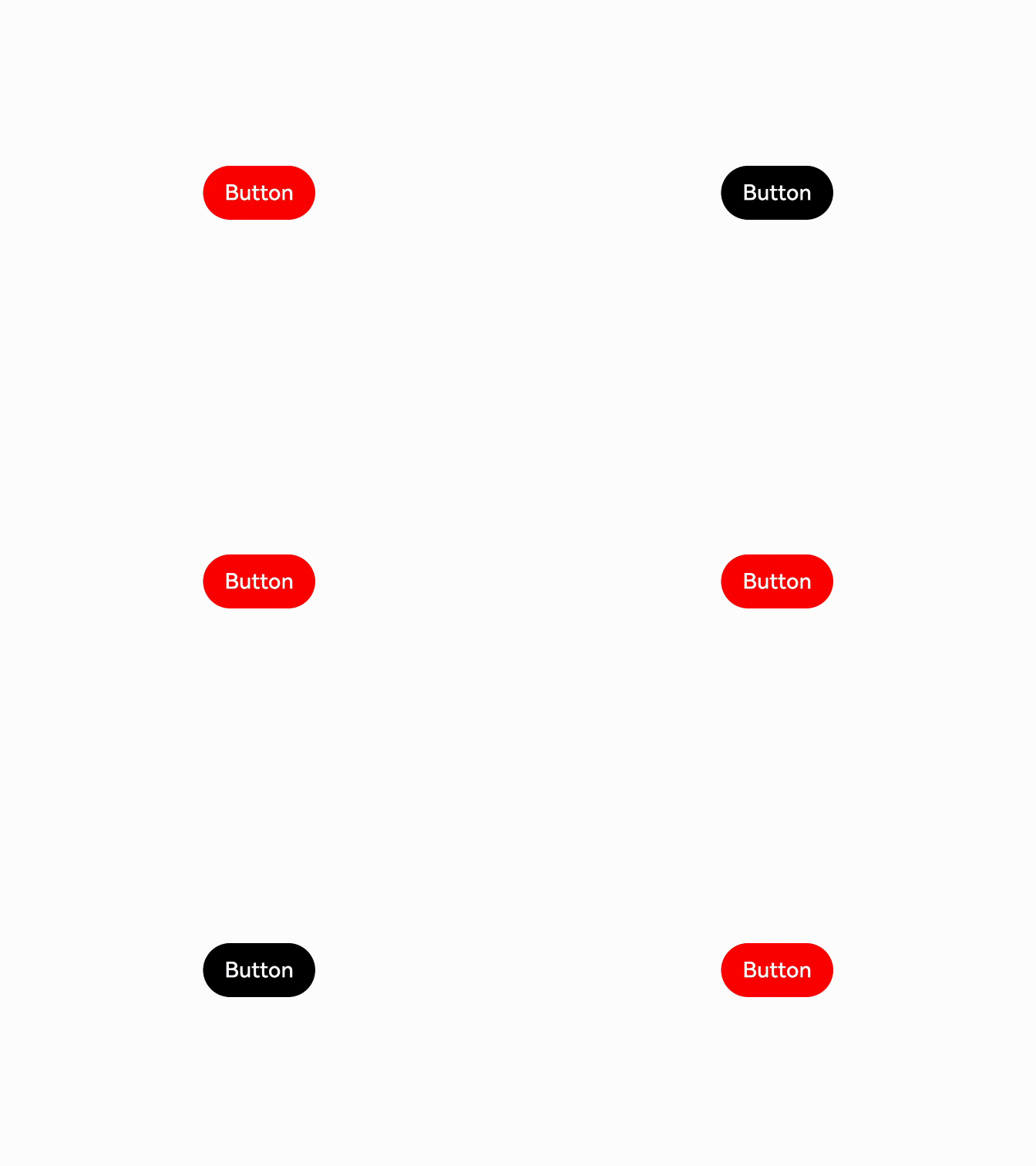
This example demonstrates how to switch the background color of a Button component by binding it to a modifier.
// xxx.ets
// Set the custom AttributeModifier for the Button component attributes.
class MyButtonModifier implements AttributeModifier<ButtonAttribute> {
  public isDark: boolean = false;

  applyNormalAttribute(instance: ButtonAttribute): void {
    if (this.isDark) {
      instance.backgroundColor(Color.Black);
    } else {
      instance.backgroundColor(Color.Red);
    }
  }
}

@Entry
@Component
struct AttributeDemo {
  @State modifier: MyButtonModifier = new MyButtonModifier();

  build() {
    Row() {
      Column() {
        Button('Button')
          .attributeModifier(this.modifier)
          .onClick(() => {
            this.modifier.isDark = !this.modifier.isDark;
          })
      }
      .width('100%')
    }
    .height('100%')
  }
} 
[h2]Example 2: Implementing the Pressed State Effect with a Modifier
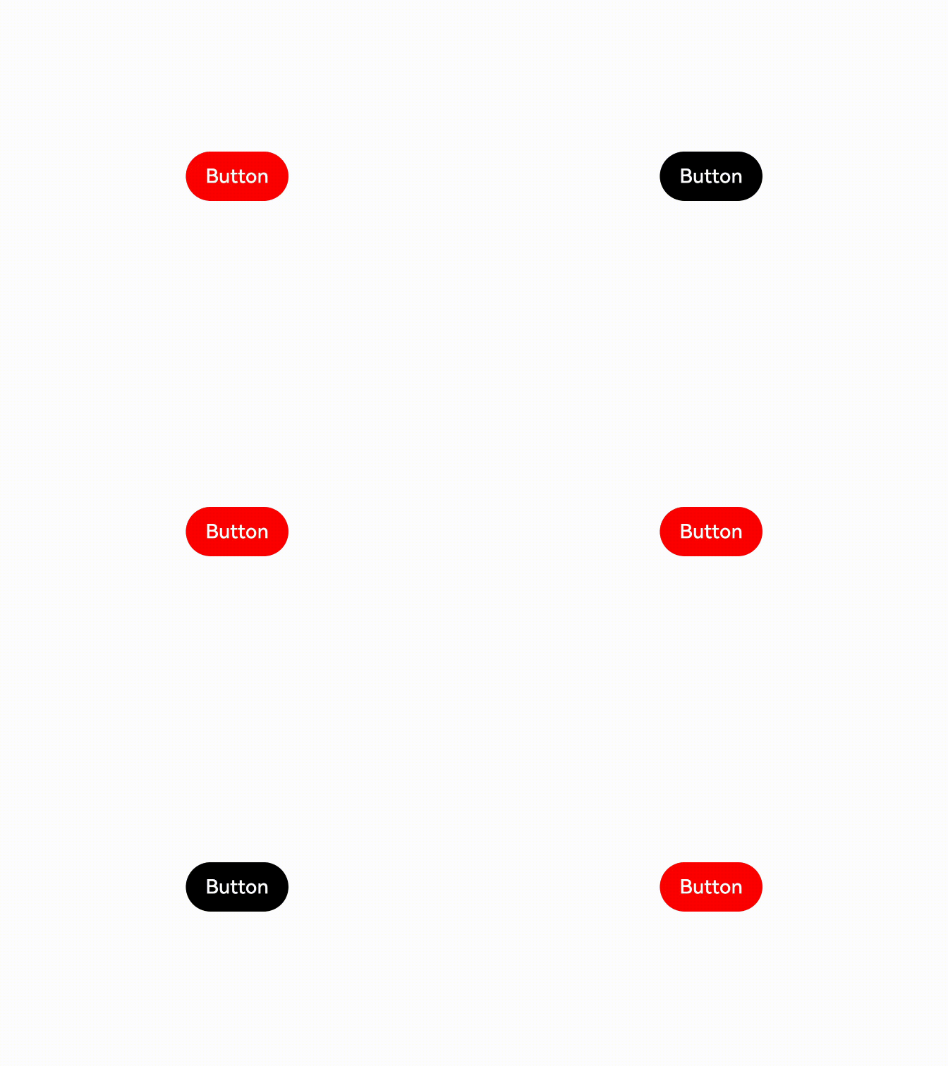
This example demonstrates how to implement a pressed state effect for a Button component by binding it to a modifier. For details about how to use the attribute modifier with state management V2, see Modifier.
// xxx.ets
// Set the custom AttributeModifier for the Button component attributes.
class MyButtonModifier implements AttributeModifier<ButtonAttribute> {
  applyNormalAttribute(instance: ButtonAttribute): void {
    instance.backgroundColor(Color.Black);
  }

  applyPressedAttribute(instance: ButtonAttribute): void {
    instance.backgroundColor(Color.Red);
  }
}

@Entry
@Component
struct AttributePressedDemo {
  @State modifier: MyButtonModifier = new MyButtonModifier();

  build() {
    Row() {
      Column() {
        Button('Button')
          .attributeModifier(this.modifier)
      }
      .width('100%')
    }
    .height('100%')
  }
} 
[h2]Example 3: Understanding Custom Modifiers Do Not Support State Data Changes
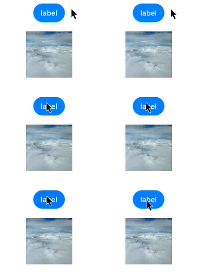
This example shows how to set the width of a custom modifier using state data. Custom modifiers do not support observing changes in data decorated with the @State decorator. Therefore, the width does not change when the button is clicked.
import { CommonModifier } from '@kit.ArkUI';

const TEST_TAG: string = 'AttributeModifier';

// Set the custom AttributeModifier for the universal component attributes.
class MyModifier extends CommonModifier {
  applyNormalAttribute(instance: CommonAttribute): void {
    super.applyNormalAttribute?.(instance);
  }
}

@Component
struct MyImage1 {
  @Link modifier: CommonModifier;

  build() {
    Image($r('app.media.startIcon')).attributeModifier(this.modifier as MyModifier)
  }
}

@Entry
@Component
struct Index {
  index: number = 0;
  @State width1: number = 100;
  @State height1: number = 100;
  @State myModifier: CommonModifier = new MyModifier().width(this.width1).height(this.height1).margin(10);

  build() {
    Column() {
      Button($r('app.string.EntryAbility_label'))
        .margin(10)
        .onClick(() => {
          console.info(TEST_TAG, 'onClick');
          this.index++;
          if (this.index % 2 === 1) {
            this.width1 = 10;
            console.info(TEST_TAG, 'setGroup1');
          } else {
            this.height1 = 10;
            console.info(TEST_TAG, 'setGroup2');
          }
        })
      MyImage1({ modifier: this.myModifier })
    }
    .width('100%')
  }
} 
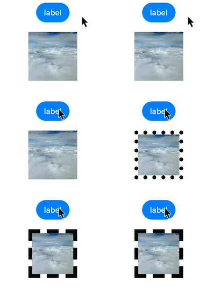
[h2]Example 4: Combining Modifier and Custom Modifier Attributes
In this example, the width, height, and margin attributes are set using a custom Modifier. When the button is clicked, the borderStyle and borderWidth attributes are set. After the button is clicked, the five attributes take effect at the same time.
import { CommonModifier } from '@kit.ArkUI';

const TEST_TAG: string = 'AttributeModifier';

// Set the custom AttributeModifier for the universal component attributes.
class MyModifier extends CommonModifier {
  applyNormalAttribute(instance: CommonAttribute): void {
    super.applyNormalAttribute?.(instance);
  }

  public setGroup1(): void {
    this.borderStyle(BorderStyle.Dotted);
    this.borderWidth(8);
  }

  public setGroup2(): void {
    this.borderStyle(BorderStyle.Dashed);
    this.borderWidth(8);
  }
}

@Component
struct MyImage1 {
  @Link modifier: CommonModifier;

  build() {
    Image($r('app.media.startIcon')).attributeModifier(this.modifier as MyModifier)
  }
}

@Entry
@Component
struct Index {
  @State myModifier: CommonModifier = new MyModifier().width(100).height(100).margin(10);
  index: number = 0;

  build() {
    Column() {
      Button($r('app.string.EntryAbility_label'))
        .margin(10)
        .onClick(() => {
          console.info(TEST_TAG, 'onClick');
          this.index++;
          if (this.index % 2 === 1) {
            (this.myModifier as MyModifier).setGroup1();
            console.info(TEST_TAG, 'setGroup1');
          } else {
            (this.myModifier as MyModifier).setGroup2();
            console.info(TEST_TAG, 'setGroup2');
          }
        })
      MyImage1({ modifier: this.myModifier })
    }
    .width('100%')
  }
} 
[h2]Example 5: Setting the Focused State Style with a Modifier
This example demonstrates how to implement a focused state style for a Button component by binding it to a modifier. After Button2 is clicked, the Button component displays the focused style when it has focus.
// Set the custom AttributeModifier for the Button component attributes.
class MyButtonModifier implements AttributeModifier<ButtonAttribute> {

  applyNormalAttribute(instance: ButtonAttribute): void {
    instance.backgroundColor(Color.Blue);
  }
  applyFocusedAttribute(instance: ButtonAttribute): void {
    instance.backgroundColor(Color.Green);
  }
}

@Entry
@Component
struct AttributeDemo {
  @State modifier: MyButtonModifier = new MyButtonModifier();
  @State isDisable: boolean = true;

  build() {
    Row() {
      Column() {
        Button('Button')
          .attributeModifier(this.modifier)
          .enabled(this.isDisable)
          .id('app')
        Divider().vertical(false).strokeWidth(15).color(Color.Transparent)
        Button('Button2')
          .onClick(() => {
            this.getUIContext().getFocusController().activate(true);
            this.getUIContext().getFocusController().requestFocus('app');
          })
      }
      .width('100%')
    }
    .height('100%')
  }
} 
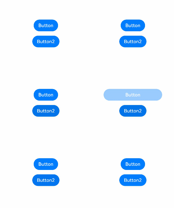
[h2]Example 6: Setting the Disabled State Style with a Modifier
This example demonstrates how to implement a disabled state style for a Button component by binding it to a modifier. After Button2 is clicked, the Button component displays the disabled style when it is disabled.
// Set the custom AttributeModifier for the Button component attributes.
class MyButtonModifier implements AttributeModifier<ButtonAttribute> {
  applyDisabledAttribute(instance: ButtonAttribute): void {
    instance.width(200);
  }
}

@Entry
@Component
struct AttributeDemo {
  @State modifier: MyButtonModifier = new MyButtonModifier();
  @State isDisable: boolean = true;

  build() {
    Row() {
      Column() {
        Button('Button')
          .attributeModifier(this.modifier)
          .enabled(this.isDisable)
        Divider().vertical(false).strokeWidth(15).color(Color.Transparent)
        Button('Button2')
          .onClick(() => {
            this.isDisable = !this.isDisable;
          })
      }
      .width('100%')
    }
    .height('100%')
  }
} 
[h2]Example 7: Setting the Selected State Style with a Modifier
This example uses Radio to bind Modifier to implement the style effect when a component is selected.
// Set the custom AttributeModifier for the Radio component attributes.
class MyRadioModifier implements AttributeModifier<RadioAttribute> {
  applyNormalAttribute(instance: RadioAttribute): void {
    instance.backgroundColor(Color.Blue);
  }

  applySelectedAttribute(instance: RadioAttribute): void {
    instance.backgroundColor(Color.Red);
    instance.borderWidth(2);
  }
}

@Entry
@Component
struct AttributeDemo {
  @State modifier: MyRadioModifier = new MyRadioModifier();
  @State value: boolean = false;

  build() {
    Row() {
      Column() {
        Radio({ value: 'Radio1', group: 'radioGroup1' })
          .checked(this.value)
          .height(50)
          .width(50)
          .borderWidth(0)
          .borderRadius(30)
          .onClick(() => {
            this.value = !this.value;
          })
          .attributeModifier(this.modifier)
      }
      .width('100%')
    }
    .height('100%')
  }
} 
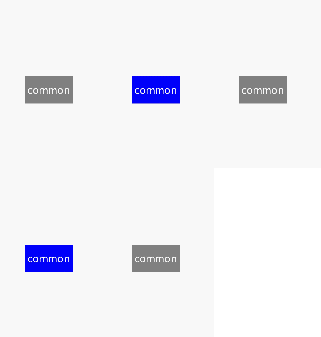
[h2]Example 8: Implementing the Pressed State Effect for a Custom Component with a Modifier
This example demonstrates how to implement a pressed state effect for a custom component (Common) by binding it to a modifier.
// xxx.ets
// Set the custom AttributeModifier for the custom component attributes.
class CustomModifier implements AttributeModifier<CommonAttribute> {
  applyNormalAttribute(instance: CommonAttribute): void {
    instance.backgroundColor(Color.Blue);
  }

  applyPressedAttribute(instance: CommonAttribute): void {
    instance.backgroundColor(Color.Gray);
  }
}

@Entry
@Component
struct AttributePressedDemo {
  @State modifier: CustomModifier = new CustomModifier();

  build() {
    Row() {
      Column() {
        ChildComponent()
          .attributeModifier(this.modifier)
      }
      .width('100%')
    }
    .height('100%')
  }
}

// Custom component
@Component
struct ChildComponent {
  build() {
    Text('common')
      .fontColor(Color.White)
      .fontSize(28)
      .textAlign(TextAlign.Center)
      .width('35%')
      .height('10%')
  }
} 
[h2]Example 9: Implementing the Mouse Hover Effect by Binding a Modifier to a Component
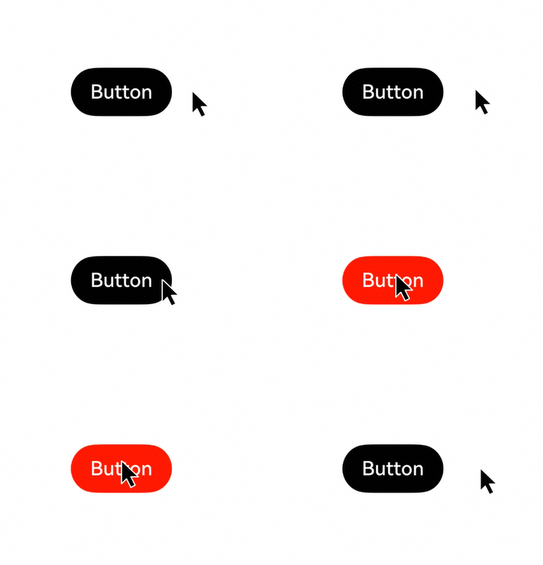
In this example, the mouse hover state is implemented by binding a button to a Modifier. When the mouse pointer moves to the button, the background color of the button changes to red, indicating the hovered state. When the mouse pointer leaves the button, the background color of the button changes to black, indicating the normal state. In addition, you can use the applyHoveredAttribute API to set the hovered state style.
The applyHoveredAttribute API is added since API version 26.0.0.
// xxx.ets
// Set the custom AttributeModifier for the Button component attributes.
class MyButtonModifier implements AttributeModifier<ButtonAttribute> {
  applyNormalAttribute(instance: ButtonAttribute): void {
    instance.backgroundColor(Color.Black);
  }

  // Set the hovered state style.
  applyHoveredAttribute(instance: ButtonAttribute): void {
    instance.backgroundColor(Color.Red);
  }
}

@Entry
@Component
struct AttributeHoveredDemo {
  @State modifier: MyButtonModifier = new MyButtonModifier();

  build() {
    Row() {
      Column() {
        Button('Button')
          .attributeModifier(this.modifier)
      }
      .width('100%')
    }
    .height('100%')
  }
}