
This component is supported since API version 4. Updates will be marked with a superscript to indicate their earliest API version.
CanvasRenderingContext2D allows you to draw rectangles, text, images, and other objects on a canvas component.
Example
<!-- xxx.hml -->
<div>
  <canvas ref="canvas1" style="width: 200px; height: 150px; background-color: #ffff00;"></canvas>
  <input type="button" style="width: 180px; height: 60px;" value="handleClick" onclick="handleClick" />
  <input type="button" style="width: 180px; height: 60px;" value="antialias" onclick="antialias" />
</div>
// xxx.js
export default {
  handleClick() {
    const el = this.$refs.canvas1;
    const ctx = el.getContext('2d');
    ctx.beginPath();
    ctx.arc(100, 75, 50, 0, 6.28);
    ctx.stroke();
  },
  antialias() {
    const el = this.$refs.canvas1;
    const ctx = el.getContext('2d', { antialias: true });
    ctx.beginPath();
    ctx.arc(100, 75, 50, 0, 6.28);
    ctx.stroke();
    }
} -
Anti-aliasing disabled

-
Anti-aliasing enabled

Properties
| Name | Type | Description |
|---|---|---|
| fillStyle | <color> | CanvasGradient | CanvasPattern | Style used to fill an area. - When the type is <color>, this parameter indicates the color of the filling area. - When the type is CanvasGradient, this parameter indicates a gradient object, which is created using the createLinearGradient() method. - When the type is CanvasPattern, this parameter indicates a canvas pattern, which is created using the createPattern() method. If the value is out of the range, the color is set to black. |
| lineWidth | number | Line width. |
| strokeStyle | <color> | CanvasGradient | CanvasPattern | Stroke style. - If the type is <color>, the color used for the stroke is set. - When the type is CanvasGradient, this parameter indicates a gradient object, which is created using the createLinearGradient() method. - When the type is CanvasPattern, this parameter indicates a canvas pattern, which is created using the createPattern() method. |
| lineCap | string | Style of the line endpoints. The options are as follows: - butt: The endpoints of the line are squared off. - round: The endpoints of the line are rounded. - square: The line endpoint ends with a square. In this style, a rectangle with the same length as the line segment thickness and half the width of the line segment thickness is added. Default value: butt |
| lineJoin | string | Style of the shape used to join line segments. The options are as follows: - round: The intersection is a sector, whose radius at the rounded corner is equal to the line width. - bevel: The intersection is a triangle. The rectangular corner of each line is independent. - miter: The intersection has a miter corner by extending the outside edges of the lines until they meet. You can view the effect of this attribute in miterLimit. Default value: miter |
| miterLimit | number | Maximum miter length. The miter length is the distance between the inner corner and the outer corner where two lines meet. Default value: 10 |
| font | string | Font style. Syntax: ctx.font="font-style font-weight font-size font-family"5+ - (Optional) font-style: font style. Available values are normal and italic. - (Optional) font-weight: font weight. Available values are as follows: normal, bold, bolder, lighter, 100, 200, 300, 400, 500, 600, 700, 800, 900. - (Optional) font-size: font size and row height. The unit can only be pixels. - (Optional) font-family: font family. Available values are as follows: sans-serif, serif, monospace. Default value: "normal normal 14px sans-serif" |
| textAlign | string | Text alignment mode. Available values are as follows: - left: The text is left-aligned. - right: The text is right-aligned. - center: The text is center-aligned. - start: The text is aligned with the start bound. - end: The text is aligned with the end bound. In the ltr layout mode, the value start equals left. In the rtl layout mode, the value start equals right. Default value: left |
| textBaseline | string | Horizontal alignment mode of text. Available values are as follows: - alphabetic: The text baseline is the normal alphabetic baseline. - top: The text baseline is on the top of the text bounding box. - hanging: The text baseline is a hanging baseline over the text. - middle: The text baseline is in the middle of the text bounding box. - ideographic: The text baseline is the ideographic baseline. If a character exceeds the alphabetic baseline, the ideographic baseline is located at the bottom of the excessive character. - bottom: The text baseline is at the bottom of the text bounding box. Its difference from the ideographic baseline is that the ideographic baseline does not consider letters in the next line. Default value: alphabetic |
| globalAlpha | number | Alpha value. The value ranges from 0.0 (completely transparent) to 1.0 (completely opaque). If the set value is less than 0.0, 0.0 will be used. If the set value is greater than 1.0, 1.0 will be used. |
| lineDashOffset | number | Offset of the dashed line. The precision is float. Default value: 0.0. |
| globalCompositeOperation | string | Composition operation type. Available values are as follows: source-over, source-atop, source-in, source-out, destination-over, destination-atop, destination-in, destination-out, lighter, copy, and xor. For details, see Operation types. Default value: source-over |
| shadowBlur | number | Blur level during shadow drawing. A larger value indicates a more blurred effect. The precision is float. Default value: 0.0. |
| shadowColor | <color> | Shadow color when a shadow is drawn. |
| shadowOffsetX | number | Horizontal offset between the shadow and the original object when a shadow is drawn. |
| shadowOffsetY | number | Vertical offset between the shadow and the original object when a shadow is drawn. |
| imageSmoothingEnabled | boolean | Whether to adjust the image smoothness during image drawing. The value true means to enable this feature, and false means the opposite. Default value: true. |
[h2]fillStyle
<!-- xxx.hml -->
<div>
  <canvas ref="canvas" style="width: 200px; height: 150px; "></canvas>
</div>
// xxx.js
export default {
  onShow() {
    const el = this.$refs.canvas;
    const ctx = el.getContext('2d');
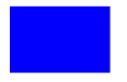
    ctx.fillStyle = '#0000ff';
    ctx.fillRect(20, 20, 150, 100);
  }
} 
[h2]lineWidth
<!-- xxx.hml -->
<div>
  <canvas ref="canvas" style="width: 200px; height: 150px; "></canvas>
</div>
// xxx.js
export default {
  onShow() {
    const el = this.$refs.canvas;
    const ctx = el.getContext('2d');
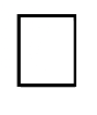
    ctx.lineWidth = 5;
    ctx.strokeRect(25, 25, 85, 105);
  }
} 
[h2]strokeStyle
<!-- xxx.hml -->
<div>
  <canvas ref="canvas" style="width: 200px; height: 150px; "></canvas>
</div>
// xxx.js
export default {
  onShow() {
    const el = this.$refs.canvas;
    const ctx = el.getContext('2d');
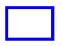
    ctx.lineWidth = 10;
    ctx.strokeStyle = '#0000ff';
    ctx.strokeRect(25, 25, 155, 105);
  }
} 
[h2]lineCap
<!-- xxx.hml -->
<div>
  <canvas ref="canvas" style="width: 200px; height: 150px; "></canvas>
</div>
// xxx.js
export default {
  onShow() {
    const el = this.$refs.canvas;
    const ctx = el.getContext('2d');
    ctx.lineWidth = 8;
    ctx.beginPath();
    ctx.lineCap = 'round';
    ctx.moveTo(30, 50);
    ctx.lineTo(220, 50);
    ctx.stroke();
  }
} 
[h2]lineJoin
<!-- xxx.hml -->
<div>
  <canvas ref="canvas" style="width: 200px; height: 150px; "></canvas>
</div>
// xxx.js
export default {
  onShow() {
    const el = this.$refs.canvas;
    const ctx = el.getContext('2d');
    ctx.beginPath();
    ctx.lineWidth = 8;
    ctx.lineJoin = 'miter';
    ctx.moveTo(30, 30);
    ctx.lineTo(120, 60);
    ctx.lineTo(30, 110);
    ctx.stroke();
  }
} 
[h2]miterLimit
<!-- xxx.hml -->
<div>
  <canvas ref="canvas" style="width: 500px; height: 500px; "></canvas>
</div>
// xxx.js
export default {
  onShow() {
    const el = this.$refs.canvas;
    const ctx = el.getContext('2d');
    ctx.lineWidth =14;
    ctx.lineJoin = 'miter';
    ctx.miterLimit = 3;
    ctx.moveTo(30, 30);
    ctx.lineTo(120, 60);
    ctx.lineTo(30, 70);
    ctx.stroke();
  }
} 
[h2]font
<!-- xxx.hml -->
<div>
  <canvas ref="canvas" style="width: 200px; height: 150px; "></canvas>
</div>
// xxx.js
export default {
  onShow() {
    const el = this.$refs.canvas;
    const ctx = el.getContext('2d');
    ctx.font = '30px sans-serif';
    ctx.fillText("Hello World", 20, 60);
  }
} 
[h2]textAlign
<!-- xxx.hml -->
<div>
  <canvas ref="canvas" style="width: 200px; height: 150px; "></canvas>
</div>
// xxx.js
export default {
  onShow() {
    const el = this.$refs.canvas;
    const ctx = el.getContext('2d');
    ctx.strokeStyle = '#0000ff';
    ctx.moveTo(140, 10);
    ctx.lineTo(140, 160);
    ctx.stroke();
    ctx.font = '18px sans-serif';
    // Show the different textAlign values
    ctx.textAlign = 'start';
    ctx.fillText('textAlign=start', 140, 60);
    ctx.textAlign = 'end';
    ctx.fillText('textAlign=end', 140, 80);
    ctx.textAlign = 'left';
    ctx.fillText('textAlign=left', 140, 100);
    ctx.textAlign = 'center';
    ctx.fillText('textAlign=center',140, 120);
    ctx.textAlign = 'right';
    ctx.fillText('textAlign=right',140, 140);
  }
} 
[h2]textBaseline
<!-- xxx.hml -->
<div>
  <canvas ref="canvas" style="width: 500px; height: 500px; "></canvas>
</div>
// xxx.js
export default {
  onShow() {
    const el = this.$refs.canvas;
    const ctx = el.getContext('2d');
    ctx.strokeStyle = '#0000ff';
    ctx.moveTo(0, 120);
    ctx.lineTo(400, 120);
    ctx.stroke();
    ctx.font = '20px sans-serif';
    ctx.textBaseline = 'top';
    ctx.fillText('Top', 10, 120);
    ctx.textBaseline = 'bottom';
    ctx.fillText('Bottom', 55, 120);
    ctx.textBaseline = 'middle';
    ctx.fillText('Middle', 125, 120);
    ctx.textBaseline = 'alphabetic';
    ctx.fillText('Alphabetic', 195, 120);
    ctx.textBaseline = 'hanging';
    ctx.fillText('Hanging', 295, 120);
  }
} 
[h2]globalAlpha
<!-- xxx.hml -->
<div>
  <canvas ref="canvas" style="width: 200px; height: 150px; "></canvas>
</div>
// xxx.js
export default {
  onShow() {
    const el = this.$refs.canvas;
    const ctx = el.getContext('2d');
    ctx.fillStyle = 'rgb(255,0,0)';
    ctx.fillRect(0, 0, 50, 50);
    ctx.globalAlpha = 0.4;
    ctx.fillStyle = 'rgb(0,0,255)';
    ctx.fillRect(50, 50, 50, 50);

  }
} 
[h2]lineDashOffset
<!-- xxx.hml -->
<div>
  <canvas ref="canvas" style="width: 200px; height: 150px; background-color: #ffff00;"></canvas>
</div>
// xxx.js
export default {
  onShow() {
    const el = this.$refs.canvas;
    const ctx = el.getContext('2d');
    ctx.arc(100, 75, 50, 0, 6.28);
    ctx.setLineDash([10,20]);
    ctx.lineDashOffset = 10.0;
    ctx.stroke();
  }
} 
[h2]globalCompositeOperation
Type description.
| Value | Description |
|---|---|
| source-over | Displays the new drawing above the existing drawing. Default value. |
| source-atop | Draws new content on top of the existing content. |
| source-in | Displays the new drawing content on the existing drawing content. |
| source-out | Displays the new drawing content outside the existing drawing content. |
| destination-over | Displays the existing drawing content above the new drawing content. |
| destination-atop | Displays the existing drawing content on top of the new drawing content. |
| destination-in | Displays the existing drawing content in the new drawing content. |
| destination-out | Displays the existing drawing content outside the new drawing content. |
| lighter | Displays both the new drawing content and the existing drawing content. |
| copy | Displays the new drawing content and ignores the existing drawing content. |
| xor | Uses the XOR operation to blend the new drawing content with the existing drawing content. |
Example
<!-- xxx.hml -->
<div>
  <canvas ref="canvas" style="width: 200px; height: 150px; "></canvas>
</div>
// xxx.js
export default {
  onShow() {
    const el = this.$refs.canvas;
    const ctx = el.getContext('2d');
    ctx.fillStyle = 'rgb(255,0,0)';
    ctx.fillRect(20, 20, 50, 50);
    ctx.globalCompositeOperation = 'source-over';
    ctx.fillStyle = 'rgb(0,0,255)';
    ctx.fillRect(50, 50, 50, 50);
    // Start drawing second example
    ctx.fillStyle = 'rgb(255,0,0)';
    ctx.fillRect(120, 20, 50, 50);
    ctx.globalCompositeOperation = 'destination-over';
    ctx.fillStyle = 'rgb(0,0,255)';
    ctx.fillRect(150, 50, 50, 50);
  }
} 
In the above example, the blue rectangle represents the new drawing, and the red rectangle represents the existing drawing.
[h2]shadowBlur
<!-- xxx.hml -->
<div>
  <canvas ref="canvas" style="width: 200px; height: 150px; "></canvas>
</div>
// xxx.js
export default {
  onShow() {
    const el = this.$refs.canvas;
    const ctx = el.getContext('2d');
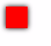
    ctx.shadowBlur = 30;
    ctx.shadowColor = 'rgb(0,0,0)';
    ctx.fillStyle = 'rgb(255,0,0)';
    ctx.fillRect(20, 20, 100, 80);
  }
} 
[h2]shadowColor
<!-- xxx.hml -->
<div>
  <canvas ref="canvas" style="width: 200px; height: 150px;"></canvas>
</div>
// xxx.js
export default {
  onShow() {
    const el = this.$refs.canvas;
    const ctx = el.getContext('2d');
    ctx.shadowBlur = 30;
    ctx.shadowColor = 'rgb(0,0,255)';
    ctx.fillStyle = 'rgb(255,0,0)';
    ctx.fillRect(30, 30, 100, 100);
  }
} 
[h2]shadowOffsetX
<!-- xxx.hml -->
<div>
  <canvas ref="canvas" style="width: 200px; height: 150px;"></canvas>
</div>
// xxx.js
export default {
  onShow() {
    const el = this.$refs.canvas;
    const ctx = el.getContext('2d');
    ctx.shadowBlur = 10;
    ctx.shadowOffsetX = 20;
    ctx.shadowColor = 'rgb(0,0,0)';
    ctx.fillStyle = 'rgb(255,0,0)';
    ctx.fillRect(20, 20, 100, 80);
  }
} 
[h2]shadowOffsetY
<!-- xxx.hml -->
<div>
  <canvas ref="canvas" style="width: 200px; height: 150px; "></canvas>
</div>
// xxx.js
export default {
  onShow() {
    const el = this.$refs.canvas;
    const ctx = el.getContext('2d');
    ctx.shadowBlur = 10;
    ctx.shadowOffsetY = 20;
    ctx.shadowColor = 'rgb(0,0,0)';
    ctx.fillStyle = 'rgb(255,0,0)';
    ctx.fillRect(30, 30, 100, 100);
 }
} 
[h2]imageSmoothingEnabled
<!-- xxx.hml -->
<div>
  <canvas ref="canvas" style="width: 200px; height: 150px; "></canvas>
</div>
// xxx.js
export default {
  onShow() {
    const el = this.$refs.canvas;
    const ctx = el.getContext('2d');
    var img = new Image();
    // Replace 'common/image/example.jpg' with the image resource file you use.
    img.src = 'common/image/example.jpg';
    img.onload = function() {
    ctx.imageSmoothingEnabled = false;
    ctx.drawImage(img, 0, 0, 400, 200);
    };
  }
} 
[h2]fillRect
fillRect(x: number, y: number, width:number, height: number): void
Fills a rectangle.
System capability: SystemCapability.ArkUI.ArkUI.Full
Parameters
| Name | Type | Mandatory | Description |
|---|---|---|---|
| x | number | Yes | X coordinate of the upper left corner of the rectangle. Unit: vp. |
| y | number | Yes | Y coordinate of the upper left corner of the rectangle. Unit: vp. |
| width | number | Yes | Width of the rectangle. Unit: vp. |
| height | number | Yes | Height of the rectangle. Unit: vp. |
Example
  <!-- xxx.hml -->
  <div>
    <canvas ref="canvas" style="width: 500px; height: 500px; background-color: #ffff00;"></canvas>
  </div>
//xxx.js
export default {
onShow() {
const el = this.$refs.canvas;
const ctx = el.getContext('2d');
ctx.fillRect(20, 20, 200, 150);
}
} 
[h2]clearRect
clearRect(x: number, y: number, width:number, height: number): void
Clears the content in a rectangle on the canvas.
System capability: SystemCapability.ArkUI.ArkUI.Full
Parameters
| Name | Type | Mandatory | Description |
|---|---|---|---|
| x | number | Yes | X-coordinate of the upper left corner of the rectangle. Unit: vp. |
| y | number | Yes | Y-coordinate of the upper left corner of the rectangle. Unit: vp. |
| width | number | Yes | Width of the rectangle. Unit: vp. |
| height | number | Yes | Height of the rectangle. Unit: vp. |
Example
<!-- xxx.hml -->
<div>
  <canvas ref="canvas" style="width: 500px; height: 500px; background-color: #ffff00;"></canvas>
</div>
//xxx.js
export default {
  onShow() {
    const el = this.$refs.canvas;
    const ctx = el.getContext('2d');
    ctx.fillStyle = 'rgb(0,0,255)';
    ctx.fillRect(0, 0, 400, 200);
    ctx.clearRect(20, 20, 150, 100);
  }
} 
[h2]strokeRect
strokeRect(x: number, y: number, width:number, height: number): void
Draws a rectangle stroke on the canvas. The rectangle's interior is not filled.
System capability: SystemCapability.ArkUI.ArkUI.Full
Parameters
| Name | Type | Mandatory | Description |
|---|---|---|---|
| x | number | Yes | X-coordinate of the upper left corner of the rectangle. Unit: vp. |
| y | number | Yes | Y-coordinate of the upper left corner of the rectangle. Unit: vp. |
| width | number | Yes | Width of the rectangle. Unit: vp. |
| height | number | Yes | Height of the rectangle. Unit: vp. |
Example
<!-- xxx.hml -->
<div>
  <canvas ref="canvas" style="width: 200px; height: 150px; "></canvas>
</div>
//xxx.js
export default {
  onShow() {
    const el = this.$refs.canvas;
    const ctx = el.getContext('2d');
    ctx.strokeRect(30, 30, 200, 150);
  }
} 
[h2]fillText
fillText(text: string, x: number, y: number): void
Draws filled text on the canvas.
System capability: SystemCapability.ArkUI.ArkUI.Full
Parameters
| Name | Type | Mandatory | Description |
|---|---|---|---|
| text | string | Yes | Text to draw. |
| x | number | Yes | X coordinate of the lower left corner of the text to be drawn. Unit: vp. |
| y | number | Yes | Y coordinate of the lower left corner of the text to be drawn. Unit: vp. |
Example
<!-- xxx.hml -->
<div>
  <canvas ref="canvas" style="width: 200px; height: 150px; "></canvas>
</div>
//xxx.js
export default {
  onShow() {
    const el = this.$refs.canvas;
    const ctx = el.getContext('2d');
    ctx.font = '35px sans-serif';
    ctx.fillText("Hello World!", 10, 60);
  }
} 
[h2]strokeText
strokeText(text: string, x: number, y: number): void
Draws a text stroke on the canvas.
System capability: SystemCapability.ArkUI.ArkUI.Full
Parameters
| Name | Type | Mandatory | Description |
|---|---|---|---|
| text | string | Yes | Text to draw. |
| x | number | Yes | X coordinate of the lower left corner of the text to be drawn. Unit: vp. |
| y | number | Yes | Y coordinate of the lower left corner of the text to be drawn. Unit: vp. |
Example
<!-- xxx.hml -->
<div>
  <canvas ref="canvas" style="width: 200px; height: 150px; "></canvas>
</div>
//xxx.js
export default {
  onShow() {
    const el = this.$refs.canvas;
    const ctx = el.getContext('2d');
    ctx.font = '25px sans-serif';
    ctx.strokeText("Hello World!", 10, 60);
  }
} 
[h2]measureText
measureText(text: string): TextMetrics
Returns a TextMetrics object used to obtain the width of specified text.
System capability: SystemCapability.ArkUI.ArkUI.Full
Parameters
| Name | Type | Mandatory | Description |
|---|---|---|---|
| text | string | Yes | Text to be measured. |
Return value
| Type | Description |
|---|---|
| TextMetrics | Object that contains the text width. You can obtain the width by TextMetrics.width. |
Example
<!-- xxx.hml -->
<div>
  <canvas ref="canvas" style="width: 200px; height: 150px;"></canvas>
</div>
//xxx.js
export default {
  onShow() {
    const el = this.$refs.canvas;
    const ctx = el.getContext('2d');
    ctx.font = '20px sans-serif';
    var txt = 'Hello World';
    ctx.fillText("width:" + ctx.measureText(txt).width, 20, 60);
    ctx.fillText(txt, 20, 110);
  }
} 
[h2]stroke
stroke(): void
Draws a stroke.
System capability: SystemCapability.ArkUI.ArkUI.Full
Example
<!-- xxx.hml -->
<div>
  <canvas ref="canvas" style="width: 200px; height: 150px; "></canvas>
</div>
//xxx.js
export default {
  onShow() {
    const el = this.$refs.canvas;
    const ctx = el.getContext('2d');
    ctx.moveTo(25, 25);
    ctx.lineTo(25, 250);
    ctx.lineWidth = '6';
    ctx.strokeStyle = 'rgb(0,0,255)';
    ctx.stroke();
  }
} 
[h2]beginPath
beginPath(): void
Creates a drawing path.
System capability: SystemCapability.ArkUI.ArkUI.Full
Example
<!-- xxx.hml -->
<div>
  <canvas ref="canvas" style="width: 500px; height: 500px; "></canvas>
</div>
//xxx.js
export default {
  onShow() {
    const el = this.$refs.canvas;
    const ctx = el.getContext('2d');
    ctx.beginPath();
    ctx.lineWidth = '6';
    ctx.strokeStyle = '#0000ff';
    ctx.moveTo(15, 80);
    ctx.lineTo(280, 80);
    ctx.stroke();
  }
} 
[h2]moveTo
moveTo(x: number, y: number): void
Moves a drawing path to a target position on the canvas.
System capability: SystemCapability.ArkUI.ArkUI.Full
Parameters
| Name | Type | Mandatory | Description |
|---|---|---|---|
| x | number | Yes | X coordinate of the target position. Unit: vp. |
| y | number | Yes | Y coordinate of the target position. Unit: vp. |
Example
<!-- xxx.hml -->
<div>
  <canvas ref="canvas" style="width: 200px; height: 150px; "></canvas>
</div>
//xxx.js
export default {
  onShow() {
    const el = this.$refs.canvas;
    const ctx = el.getContext('2d');
    ctx.beginPath();
    ctx.moveTo(10, 10);
    ctx.lineTo(280, 160);
    ctx.stroke();
  }
} 
[h2]lineTo
lineTo(x: number, y: number): void
Connects the current point to a target position using a straight line.
System capability: SystemCapability.ArkUI.ArkUI.Full
Parameters
| Name | Type | Mandatory | Description |
|---|---|---|---|
| x | number | Yes | X coordinate of the target position. Unit: vp. |
| y | number | Yes | Y coordinate of the target position. Unit: vp. |
Example
<!-- xxx.hml -->
<div>
  <canvas ref="canvas" style="width: 200px; height: 150px; "></canvas>
</div>
//xxx.js
export default {
  onShow() {
    const el = this.$refs.canvas;
    const ctx = el.getContext('2d');
    ctx.beginPath();
    ctx.moveTo(10, 10);
    ctx.lineTo(280, 160);
    ctx.stroke();
  }
} 
[h2]closePath
closePath(): void
Draws a closed path.
System capability: SystemCapability.ArkUI.ArkUI.Full
Example
<!-- xxx.hml -->
<div>
  <canvas ref="canvas" style="width: 200px; height: 150px;"></canvas>
</div>
//xxx.js
export default {
  onShow() {
    const el = this.$refs.canvas;
    const ctx = el.getContext('2d');
    ctx.beginPath();
    ctx.moveTo(30, 30);
    ctx.lineTo(110, 30);
    ctx.lineTo(70, 90);
    ctx.closePath();
    ctx.stroke();
  }
} 
[h2]createPattern
createPattern(image: Image, repetition: string): Object
Creates a pattern for image filling based on a specified source image and repetition mode.
System capability: SystemCapability.ArkUI.ArkUI.Full
Parameters
| Name | Type | Mandatory | Description |
|---|---|---|---|
| image | Image | Yes | Image source object. For details, see Image Object. |
| repetition | string | Yes | Repetition mode. The value can be "repeat", "repeat-x", "repeat-y", or "no-repeat". |
Return value
| Type | Description |
|---|---|
| Object | Pattern of image filling. |
Example
<!-- xxx.hml -->
<div>
  <canvas ref="canvas" style="width: 1000px; height: 1000px;"></canvas>
</div>
//xxx.js
export default {
  onShow() {
    const el = this.$refs.canvas;
    const ctx = el.getContext('2d');
    var img = new Image();
    // Replace 'common/images/example.jpg' with the image resource file required by the developer.
    img.src = 'common/images/example.jpg';
    var pat = ctx.createPattern(img, 'repeat');
    ctx.fillStyle = pat;
    ctx.fillRect(0, 0, 500, 500);
  }
} 
[h2]bezierCurveTo
bezierCurveTo(cp1x: number, cp1y: number, cp2x: number, cp2y: number, x: number, y: number): void
Creates a path for a cubic Bezier curve.
System capability: SystemCapability.ArkUI.ArkUI.Full
Parameters
| Name | Type | Mandatory | Description |
|---|---|---|---|
| cp1x | number | Yes | X coordinate of the first Bezier parameter. Unit: vp. |
| cp1y | number | Yes | Y coordinate of the first Bezier parameter. Unit: vp. |
| cp2x | number | Yes | X coordinate of the second Bezier parameter. Unit: vp. |
| cp2y | number | Yes | Y coordinate of the second Bezier parameter. Unit: vp. |
| x | number | Yes | X coordinate of the end point of the path. Unit: vp. |
| y | number | Yes | Y coordinate of the end point of the path. Unit: vp. |
Example
<!-- xxx.hml -->
<div>
  <canvas ref="canvas" style="width: 200px; height: 150px;"></canvas>
</div>
//xxx.js
export default {
  onShow() {
    const el = this.$refs.canvas;
    const ctx = el.getContext('2d');
    ctx.beginPath();
    ctx.moveTo(10, 10);
    ctx.bezierCurveTo(20, 100, 200, 100, 200, 20);
    ctx.stroke();
  }
} 
[h2]quadraticCurveTo
quadraticCurveTo(cpx: number, cpy: number, x: number, y: number): void
Create a path for a quadratic Bezier curve.
System capability: SystemCapability.ArkUI.ArkUI.Full
Parameters
| Name | Type | Mandatory | Description |
|---|---|---|---|
| cpx | number | Yes | X coordinate of the Bezier parameter. Unit: vp. |
| cpy | number | Yes | Y coordinate of the Bezier parameter. Unit: vp. |
| x | number | Yes | X coordinate of the end point of the path. Unit: vp. |
| y | number | Yes | Y coordinate of the end point of the path. Unit: vp. |
Example
<!-- xxx.hml -->
<div>
  <canvas ref="canvas" style="width: 200px; height: 150px; "></canvas>
</div>
//xxx.js
export default {
  onShow() {
    const el = this.$refs.canvas;
    const ctx = el.getContext('2d');
    ctx.beginPath();
    ctx.moveTo(20, 20);
    ctx.quadraticCurveTo(100, 100, 200, 20);
    ctx.stroke();
  }
} 
[h2]arc
arc(x: number, y: number, radius: number, startAngle: number, endAngle: number, counterclockwise?: boolean): void
Draws an arc on the canvas.
System capability: SystemCapability.ArkUI.ArkUI.Full
Parameters
| Name | Type | Mandatory | Description |
|---|---|---|---|
| x | number | Yes | X coordinate of the arc center. Unit: vp. |
| y | number | Yes | Y coordinate of the arc center. Unit: vp. |
| radius | number | Yes | Radius of the arc. Unit: vp. |
| startAngle | number | Yes | Start radian of the arc. Unit: vp. |
| endAngle | number | Yes | End radian of the arc. Unit: vp. |
| counterclockwise | boolean | No | Whether to draw the arc counterclockwise. The value true indicates counterclockwise, and the value false indicates clockwise. Default value: false. |
Example
<!-- xxx.hml -->
<div>
  <canvas ref="canvas" style="width: 200px; height: 150px;"></canvas>
</div>
//xxx.js
export default {
  onShow() {
    const el = this.$refs.canvas;
    const ctx = el.getContext('2d');
    ctx.beginPath();
    ctx.arc(100, 75, 50, 0, 6.28);
    ctx.stroke();
  }
} 
[h2]arcTo
arcTo(x1: number, y1: number, x2: number, y2: number, radius: number): void
Draws an arc based on the radius and points on the arc.
System capability: SystemCapability.ArkUI.ArkUI.Full
Parameters
| Name | Type | Mandatory | Description |
|---|---|---|---|
| x1 | number | Yes | X coordinate of the first point that the arc passes through. Unit: vp. |
| y1 | number | Yes | Y coordinate of the first point that the arc passes through. Unit: vp. |
| x2 | number | Yes | X coordinate of the second point that the arc passes through. Unit: vp. |
| y2 | number | Yes | Y coordinate of the second point that the arc passes through. Unit: vp. |
| radius | number | Yes | Radius of the arc. Unit: vp. |
Example
<!-- xxx.hml -->
<div>
  <canvas ref="canvas" style="width: 200px; height: 150px;"></canvas>
</div>
//xxx.js
export default {
  onShow() {
    const el = this.$refs.canvas;
    const ctx = el.getContext('2d');
    ctx.moveTo(100, 20);
    ctx.arcTo(150, 20, 150, 70, 50); // Create an arc
    ctx.stroke();
  }
} 
[h2]ellipse
ellipse(x: number, y: number, radiusX: number, radiusY: number, rotation: number, startAngle: number, endAngle: number, counterclockwise?: number): void
Draws an ellipse in the specified rectangular region on the canvas.
System capability: SystemCapability.ArkUI.ArkUI.Full
Parameters
| Name | Type | Mandatory | Description |
|---|---|---|---|
| x | number | Yes | X coordinate of the ellipse center. Unit: vp. |
| y | number | Yes | Y coordinate of the ellipse center. Unit: vp. |
| radiusX | number | Yes | Radius of the x axis of an ellipse. Unit: vp. |
| radiusY | number | Yes | Radius of the y axis of an ellipse. Unit: vp. |
| rotation | number | Yes | Rotation angle of an ellipse, in radians. Unit: vp. |
| startAngle | number | Yes | Start angle of an ellipse, in radians. Unit: vp. |
| endAngle | number | Yes | End angle of an ellipse, in radians. Unit: vp. |
| counterclockwise | number | No | Whether to draw the ellipse counterclockwise. The value 0 means clockwise, and 1 means counterclockwise. Other values are processed by default. Unit: vp. Default value: 0 |
Example
<!-- xxx.hml -->
<div>
  <canvas ref="canvas" style="width: 500px; height: 500px; background-color: #ffff00;"></canvas>
</div>
//xxx.js
export default {
  onShow() {
    const el = this.$refs.canvas;
    const ctx = el.getContext('2d');
    ctx.beginPath();
    ctx.ellipse(200, 200, 50, 100, Math.PI * 0.25, Math.PI * 0.5, Math.PI, 1);
    ctx.stroke();
  }
} 
[h2]rect
rect(x: number, y: number, width: number, height: number): void
Creates a rectangle.
System capability: SystemCapability.ArkUI.ArkUI.Full
Parameters
| Name | Type | Mandatory | Description |
|---|---|---|---|
| x | number | Yes | X coordinate of the upper left corner of a rectangle. Unit: vp. |
| y | number | Yes | Y coordinate of the upper left corner of a rectangle. Unit: vp. |
| width | number | Yes | Width of the rectangle. Unit: vp. |
| height | number | Yes | Height of the rectangle. Unit: vp. |
Example
<!-- xxx.hml -->
<div>
  <canvas ref="canvas" style="width: 200px; height: 150px; "></canvas>
</div>
//xxx.js
export default {
  onShow() {
    const el = this.$refs.canvas;
    const ctx = el.getContext('2d');
    ctx.rect(20, 20, 100, 100); // Create a 100*100 rectangle at (20, 20)
    ctx.stroke(); // Draw it
  }
} 
[h2]fill
fill(): void
Fills the area inside a closed path.
System capability: SystemCapability.ArkUI.ArkUI.Full
Example
<!-- xxx.hml -->
<div>
  <canvas ref="canvas" style="width: 200px; height: 150px;"></canvas>
</div>
//xxx.js
export default {
  onShow() {
    const el = this.$refs.canvas;
    const ctx = el.getContext('2d');
    ctx.rect(20, 20, 100, 100); // Create a 100*100 rectangle at (20, 20)
    ctx.fill(); // Draw it in default setting
  }
} 
[h2]clip
clip(): void
Sets the current path to a clipping path.
System capability: SystemCapability.ArkUI.ArkUI.Full
Example
<!-- xxx.hml -->
<div>
  <canvas ref="canvas" style="width: 200px; height: 150px;"></canvas>
</div>
//xxx.js
export default {
  onShow() {
    const el = this.$refs.canvas;
    const ctx = el.getContext('2d');
    ctx.rect(0, 0, 200, 200);
    ctx.stroke();
    ctx.clip();
    // Draw red rectangle after clip
    ctx.fillStyle = "rgb(255,0,0)";
    ctx.fillRect(0, 0, 150, 150);
  }
} 
[h2]rotate
rotate(rotate: number): void
Rotates a canvas clockwise around its coordinate axes.
System capability: SystemCapability.ArkUI.ArkUI.Full
Parameters
| Name | Type | Mandatory | Description |
|---|---|---|---|
| rotate | number | Yes | Clockwise rotation angle. You can use Math.PI / 180 to convert the angle to a radian. Unit: vp. |
Example
<!-- xxx.hml -->
<div>
  <canvas ref="canvas" style="width: 200px; height: 150px;"></canvas>
</div>
//xxx.js
export default {
  onShow() {
    const el = this.$refs.canvas;
    const ctx = el.getContext('2d');
    ctx.rotate(45 * Math.PI / 180); // Rotate the rectangle 45 degrees
    ctx.fillRect(70, 20, 50, 50);
  }
} 
[h2]scale
scale(x: number, y: number): void
Scales a canvas based on scale factors.
System capability: SystemCapability.ArkUI.ArkUI.Full
Parameters
| Name | Type | Mandatory | Description |
|---|---|---|---|
| x | number | Yes | Horizontal scaling value. Unit: vp. |
| y | number | Yes | Vertical scaling value. Unit: vp. |
Example
<!-- xxx.hml -->
<div>
  <canvas ref="canvas" style="width: 200px; height: 150px;"></canvas>
</div>
//xxx.js
export default {
  onShow() {
    const el = this.$refs.canvas;
    const ctx = el.getContext('2d');
    ctx.strokeRect(10, 10, 25, 25);
    ctx.scale(2, 2);// Scale to 200%
    ctx.strokeRect(10, 10, 25, 25);
  }
} 
[h2]transform
transform(scaleX: number, skewX: number, skewY: number, scaleY: number, translateX: number, translateY: number): void
Defines a transformation matrix. To transform a graph, you only need to set parameters of the matrix. The coordinates of the graph are multiplied by the matrix values to obtain new coordinates of the transformed graph. You can use the matrix to implement multiple transform effects.

The following formulas calculate the coordinates of a transformed graph. x and y represent the coordinates before transformation, and x' and y' represent the coordinates after transformation.
-
x' = scaleX * x + skewY * y + translateX
-
y' = skewX * x + scaleY * y + translateY
System capability: SystemCapability.ArkUI.ArkUI.Full
Parameters
| Name | Type | Mandatory | Description |
|---|---|---|---|
| scaleX | number | Yes | Horizontal scaling value. Unit: vp. |
| skewX | number | Yes | Horizontal tilt value. Unit: vp. |
| skewY | number | Yes | Vertical tilt value. Unit: vp. |
| scaleY | number | Yes | Vertical scaling value. Unit: vp. |
| translateX | number | Yes | Horizontal movement value. Unit: vp. |
| translateY | number | Yes | Vertical movement value. Unit: vp. |
Example
<!-- xxx.hml -->
<div>
  <canvas ref="canvas" style="width: 200px; height: 150px;"></canvas>
</div>
//xxx.js
export default {
  onShow() {
    const el = this.$refs.canvas;
    const ctx = el.getContext('2d');
    ctx.fillStyle = 'rgb(0,0,0)';
    ctx.fillRect(0, 0, 100, 100);
    ctx.transform(1, 0.5, -0.5, 1, 10, 10);
    ctx.fillStyle = 'rgb(255,0,0)';
    ctx.fillRect(0, 0, 100, 100);
    ctx.transform(1, 0.5, -0.5, 1, 10, 10);
    ctx.fillStyle = 'rgb(0,0,255)';
    ctx.fillRect(0, 0, 100, 100);
  }
} 
[h2]setTransform
setTransform(scaleX: number, skewX: number, skewY: number, scaleY: number, translateX: number, translateY: number): void
Resets the existing transformation matrix and creates a new transformation matrix by using the same parameters as the transform() API.
System capability: SystemCapability.ArkUI.ArkUI.Full
Parameters
| Name | Type | Mandatory | Description |
|---|---|---|---|
| scaleX | number | Yes | Horizontal scaling value. Unit: vp. |
| skewX | number | Yes | Horizontal tilt value. Unit: vp. |
| skewY | number | Yes | Vertical tilt value. Unit: vp. |
| scaleY | number | Yes | Vertical scaling value. Unit: vp. |
| translateX | number | Yes | Horizontal movement value. Unit: vp. |
| translateY | number | Yes | Vertical movement value. Unit: vp. |
Example
<!-- xxx.hml -->
<div>
  <canvas ref="canvas" style="width: 200px; height: 150px;"></canvas>
</div>
//xxx.js
export default {
  onShow() {
    const el = this.$refs.canvas;
    const ctx = el.getContext('2d');
    ctx.fillStyle = 'rgb(255,0,0)';
    ctx.fillRect(0, 0, 100, 100);
    ctx.setTransform(1,0.5, -0.5, 1, 10, 10);
    ctx.fillStyle = 'rgb(0,0,255)';
    ctx.fillRect(0, 0, 100, 100);
  }
} 
[h2]translate
translate(x: number, y: number): void
Moves the origin of the coordinate system.
System capability: SystemCapability.ArkUI.ArkUI.Full
Parameters
| Name | Type | Mandatory | Description |
|---|---|---|---|
| x | number | Yes | Horizontal translation value. Unit: vp. |
| y | number | Yes | Vertical translation value. Unit: vp. |
Example
<!-- xxx.hml -->
<div>
  <canvas ref="canvas" style="width: 200px; height: 150px;"></canvas>
</div>
//xxx.js
export default {
  onShow() {
    const el = this.$refs.canvas;
    const ctx = el.getContext('2d');
    ctx.fillRect(10, 10, 50, 50);
    ctx.translate(70, 70);
    ctx.fillRect(10, 10, 50, 50);
  }
} 
[h2]createPath2D6+
createPath2D(path: Path2D, cmds: string): Path2D
Creates a Path2D object.
System capability: SystemCapability.ArkUI.ArkUI.Full
Parameters
| Name | Type | Mandatory | Description |
|---|---|---|---|
| path | Path2D | Yes | Path2D object. |
| cmds | string | Yes | Path description of the SVG image. |
Return value
Example
<!-- xxx.hml -->
<div>
  <canvas ref="canvas" style="width: 500px; height: 500px; background-color: #ffff00;"></canvas>
</div>
//xxx.js
export default {
  onShow() {
    const el = this.$refs.canvas;
    const ctx = el.getContext('2d');
    var path1 = ctx.createPath2D();
    path1.moveTo(100, 100);
    path1.lineTo(200, 100);
    path1.lineTo(100, 200);
    path1.closePath();
    ctx.stroke(path1);
    var path2 = ctx.createPath2D("M150 150 L50 250 L250 250 Z");
    ctx.stroke(path2);
    var path3 = ctx.createPath2D(path2);
    ctx.stroke(path3);
  }
} 
[h2]drawImage
drawImage(image: Image | PixelMap, sx: number, sy: number, sWidth: number, sHeight: number, dx: number, dy: number, dWidth: number, dHeight: number):void
Draws an image.
System capability: SystemCapability.ArkUI.ArkUI.Full
Parameters
| Name | Type | Mandatory | Description |
|---|---|---|---|
| image | Image | PixelMap9+ | Yes | Image resource. For details, see Image Object or PixelMap Object. |
| sx | number | Yes | X coordinate of the upper left corner of the source image to be cropped. Unit: vp. |
| sy | number | Yes | Y coordinate of the upper left corner of the source image to be cropped. Unit: vp. |
| sWidth | number | Yes | Width of the source image to be cropped. Unit: vp. |
| sHeight | number | Yes | Height of the source image to be cropped. Unit: vp. |
| dx | number | Yes | X-coordinate of the upper left corner of the drawing area on the canvas. Unit: vp. |
| dy | number | Yes | Y-coordinate of the upper left corner of the drawing area on the canvas. Unit: vp. |
| dWidth | number | Yes | Width of the drawing area. Unit: vp. |
| dHeight | number | Yes | Height of the drawing area. Unit: vp. |
Example
<!-- xxx.hml -->
<div>
  <canvas ref="canvas" style="width: 500px; height: 500px; background-color: #ffff00;"></canvas>
</div>
//xxx.js
export default {
  onShow() {
    var test = this.$refs.canvas;
    var ctx = test.getContext('2d');
    var img = new Image();
    // Replace 'common/image/test.jpg' with the image resource file you use.
    img.src = 'common/image/test.jpg';
    ctx.drawImage(img, 0, 0, 200, 200, 10, 10, 200, 200);
  }
} 
[h2]restore
restore(): void
Restores the saved drawing context.
System capability: SystemCapability.ArkUI.ArkUI.Full
Example
<!-- xxx.hml -->
<div>
  <canvas ref="canvas" style="width: 200px; height: 150px; background-color: #ffff00;"></canvas>
</div>
//xxx.js
export default {
  onShow() {
    const el = this.$refs.canvas;
    const ctx = el.getContext('2d');
    ctx.restore();
  }
}
[h2]save
save(): void
Saves the current drawing context.
System capability: SystemCapability.ArkUI.ArkUI.Full
Example
<!-- xxx.hml -->
<div>
  <canvas ref="canvas" style="width: 200px; height: 150px; background-color: #ffff00;"></canvas>
</div>
//xxx.js
export default {
  onShow() {
    const el = this.$refs.canvas;
    const ctx = el.getContext('2d');
    ctx.save();
  }
} [h2]createLinearGradient6+
createLinearGradient(x0: number, y0: number, x1: number, y1: number): Object
Creates a linear gradient color and returns a CanvasGradient object. For details, see CanvasGradient Object.
System capability: SystemCapability.ArkUI.ArkUI.Full
Parameters
| Name | Type | Mandatory | Description |
|---|---|---|---|
| x0 | number | Yes | X coordinate of the start point. Unit: vp. |
| y0 | number | Yes | Y coordinate of the start point. Unit: vp. |
| x1 | number | Yes | X coordinate of the end point. Unit: vp. |
| y1 | number | Yes | Y coordinate of the end point. Unit: vp. |
Return value
| Type | Description |
|---|---|
| Object | Created CanvasGradient object. |
Example
<!-- xxx.hml -->
<div>
  <canvas ref="canvas" style="width: 500px; height: 500px; background-color: #ffff00;"></canvas>
  <input type="button" style="width: 180px; height: 60px;" value="fillStyle" onclick="handleClick" />
</div>
// xxx.js
export default {
  handleClick() {
    const el = this.$refs.canvas;
    const ctx = el.getContext('2d');
    // Linear gradient: start(50,0) end(300,100)
    var gradient = ctx.createLinearGradient(50,0, 300,100);
    // Add three color stops
    gradient.addColorStop(0.0, '#ff0000');
    gradient.addColorStop(0.5, '#ffffff');
    gradient.addColorStop(1.0, '#00ff00');
    // Set the fill style and draw a rectangle
    ctx.fillStyle = gradient;
    ctx.fillRect(0, 0, 500, 500);
  }
} 
[h2]createRadialGradient6+
createRadialGradient(x0: number, y0: number, r0: number, x1: number, y1: number, r1: number): Object
Creates a radial gradient and returns a CanvasGradient object. For details, see CanvasGradient.
System capability: SystemCapability.ArkUI.ArkUI.Full
Parameters
| Name | Type | Mandatory | Description |
|---|---|---|---|
| x0 | number | Yes | X coordinate of the start circle. Unit: vp. |
| y0 | number | Yes | Y coordinate of the start circle. Unit: vp. |
| r0 | number | Yes | Radius of the start circle. The value must be a non-negative finite number. Unit: vp. |
| x1 | number | Yes | X coordinate of the end circle. Unit: vp. |
| y1 | number | Yes | Y coordinate of the end circle. Unit: vp. |
| r1 | number | Yes | Radius of the end circle. The value must be a non-negative finite number. Unit: vp. |
Return value
| Type | Description |
|---|---|
| Object | Created CanvasGradient object. |
Example
<!-- xxx.hml -->
<div>
  <canvas ref="canvas" style="width: 500px; height: 500px; background-color: #ffff00;"></canvas>
  <input type="button" style="width: 180px; height: 60px;" value="fillStyle" onclick="handleClick" />
</div>
// xxx.js
export default {
  handleClick() {
    const el = this.$refs.canvas;
    const ctx = el.getContext('2d');
    // Radial gradient: inner circle(200,200,r:50) outer circle(200,200,r:200)
    var gradient = ctx.createRadialGradient(200,200,50, 200,200,200);
    // Add three color stops
    gradient.addColorStop(0.0, '#ff0000');
    gradient.addColorStop(0.5, '#ffffff');
    gradient.addColorStop(1.0, '#00ff00');
    // Set the fill style and draw a rectangle
    ctx.fillStyle = gradient;
    ctx.fillRect(0, 0, 500, 500);
  }
} 
[h2]createImageData
createImageData(width: number, height: number): ImageData
Creates a new, blank, and specified-size ImageData object. For details, see ImageData object.
System capability: SystemCapability.ArkUI.ArkUI.Full
Parameters
| Name | Type | Mandatory | Description |
|---|---|---|---|
| width | number | Yes | Width of the ImageData object. Unit: vp. |
| height | number | Yes | Height of the ImageData object. Unit: vp. |
Return value
| Type | Description |
|---|---|
| ImageData | Created ImageData object. |
Example
<!-- xxx.hml -->
<div>
  <canvas ref="canvas" style="width: 200px; height: 150px; background-color: #ffff00;"></canvas>
</div>
//xxx.js
export default {
  onShow() {
    const el = this.$refs.canvas;
    const ctx = el.getContext('2d');
    var imageData = ctx.createImageData(50, 100);  // Create ImageData with 50px width and 100px height
  }
}
[h2]createImageData
createImageData(imageData: ImageData): ImageData
Creates an ImageData object with the same width and height as the existing ImageData object, but does not copy the image data. For details, see ImageData.
System capability: SystemCapability.ArkUI.ArkUI.Full
Parameters
| Name | Type | Mandatory | Description |
|---|---|---|---|
| imageData | ImageData | Yes | ImageData object with the same width and height copied from the original ImageData object. |
Return value
| Type | Description |
|---|---|
| ImageData | Created ImageData object. |
Example
<!-- xxx.hml -->
<div>
  <canvas ref="canvas" style="width: 200px; height: 150px; background-color: #ffff00;"></canvas>
</div>
//xxx.js
export default {
  onShow() {
    const el = this.$refs.canvas;
    const ctx = el.getContext('2d');
    var imageData = ctx.createImageData(50, 100);  // Create ImageData with 50px width and 100px height
    var newImageData = ctx.createImageData(imageData);  // Create ImageData using the input imageData
  }
}
[h2]getImageData
getImageData(sx: number, sy: number, sw: number, sh: number): ImageData
Creates an ImageData object based on the pixels in the specified area of the current canvas.
System capability: SystemCapability.ArkUI.ArkUI.Full
Parameters
| Name | Type | Mandatory | Description |
|---|---|---|---|
| sx | number | Yes | X coordinate of the upper left corner of the area to be output. Unit: vp. |
| sy | number | Yes | Y coordinate of the upper left corner of the area to be output. Unit: vp. |
| sw | number | Yes | Width of the area to be output. Unit: vp. |
| sh | number | Yes | Height of the area to be output. Unit: vp. |
Return value
| Type | Description |
|---|---|
| ImageData | ImageData object that contains pixels in the specified area on the canvas. |
Example
<!-- xxx.hml -->
<div>
  <canvas id="getImageData" style="width: 200px; height: 150px; background-color: #ffff00;"></canvas>
</div>
//xxx.js
export default {
  onShow() {
    const test = this.$element('getImageData')
    const ctx = test.getContext('2d');
    var imageData = ctx.getImageData(0, 0, 280, 300);
  }
}
[h2]putImageData
putImageData(imageData: ImageData, dx: number, dy: number, dirtyX: number, dirtyY: number, dirtyWidth: number, dirtyHeight: number): void
Crops the image data and fills it into a new rectangle.
System capability: SystemCapability.ArkUI.ArkUI.Full
Parameters
| Name | Type | Mandatory | Description |
|---|---|---|---|
| imageData | ImageData | Yes | ImageData object with pixels to put onto the canvas. |
| dx | number | Yes | X-axis offset of the rectangular area on the canvas. Unit: vp. |
| dy | number | Yes | Y-axis offset of the rectangular area on the canvas. Unit: vp. |
| dirtyX | number | Yes | X-axis offset of the upper left corner of the rectangle cropping range in the source image data. Unit: vp. |
| dirtyY | number | Yes | Y-axis offset of the upper left corner of the rectangular area relative to that of the source image. Unit: vp. |
| dirtyWidth | number | Yes | Width of the rectangular area to crop the source image. Unit: vp. |
| dirtyHeight | number | Yes | Height of the rectangular area to crop the source image. Unit: vp. |
Example
<!-- xxx.hml -->
<div>
  <canvas id="putImageData" style="width: 200px; height: 150px; background-color: #D5D5D5;"></canvas>
</div>
//xxx.js
export default {
    onShow() {
        const test = this.$element('putImageData')
        const ctx = test.getContext('2d');
        var imgData = ctx.createImageData(100, 100);
        for (var i = 0; i < imgData.data.length; i += 4) {
            imgData.data[i + 0] = 39;
            imgData.data[i + 1] = 135;
            imgData.data[i + 2] = 217;
            imgData.data[i + 3] = 255;
        }
        ctx.putImageData(imgData, 10, 10, 0, 0, 100, 50);
    }
} 
[h2]putImageData
putImageData(imageData: ImageData, dx: number, dy: number): void
Puts the ImageData onto a rectangular area on the canvas.
System capability: SystemCapability.ArkUI.ArkUI.Full
Parameters
| Name | Type | Mandatory | Description |
|---|---|---|---|
| imageData | ImageData | Yes | ImageData object with pixels to put onto the canvas. |
| dx | number | Yes | X-axis offset of the rectangular area on the canvas. Unit: vp. |
| dy | number | Yes | Y-axis offset of the rectangular area on the canvas. Unit: vp. |
Example
<!-- xxx.hml -->
<div>
  <canvas id="putImageData" style="width: 200px; height: 150px; background-color: #ffff00;"></canvas>
</div>
//xxx.js
export default {
  onShow() {
    const test = this.$element('putImageData')
    const ctx = test.getContext('2d');
    var imgData = ctx.createImageData(100, 100);
    for (var i = 0; i < imgData.data.length; i += 4) {
      imgData.data[i + 0] = 255;
      imgData.data[i + 1] = 0;
      imgData.data[i + 2] = 0;
      imgData.data[i + 3] = 255;
  }
    ctx.putImageData(imgData, 10, 10);
  }
} 
[h2]getPixelMap9+
getPixelMap(sx: number, sy: number, sw: number, sh: number): PixelMap
Obtains the PixelMap object created with the pixels within the specified area on the canvas.
System capability: SystemCapability.ArkUI.ArkUI.Full
Parameters
| Name | Type | Mandatory | Description |
|---|---|---|---|
| sx | number | Yes | X-coordinate of the upper left corner of the specified area. Unit: vp. |
| sy | number | Yes | Y-coordinate of the upper left corner of the specified area. Unit: vp. |
| sw | number | Yes | Width of the specified area. Unit: vp. |
| sh | number | Yes | Height of the specified area. Unit: vp. |
Return value
| Type | Description |
|---|---|
| PixelMap | PixelMap object that contains pixels in the specified area on the canvas. |
Example
<!-- xxx.hml -->
<div>
  <canvas id="canvasId" style="width: 200px; height: 150px; background-color: #ffff00;"></canvas>
</div>
//xxx.js
export default {
  onShow() {
    const test = this.$element('canvasId')
    const ctx = test.getContext('2d');
    var pixelMap = ctx.getPixelMap(0, 0, 280, 300);
  }
}
[h2]setLineDash
setLineDash(segments: Array): void
Sets the dash line style.
System capability: SystemCapability.ArkUI.ArkUI.Full
Parameters
| Name | Type | Mandatory | Description |
|---|---|---|---|
| segments | Array | Yes | An array describing the interval of alternate line segments and length of spacing. |
Example
<!-- xxx.hml -->
<div>
  <canvas ref="canvas" style="width: 200px; height: 150px; background-color: #ffff00;"></canvas>
</div>
//xxx.js
export default {
  onShow() {
    const el = this.$refs.canvas;
    const ctx = el.getContext('2d');
    ctx.arc(100, 75, 50, 0, 6.28);
    ctx.setLineDash([10,20]);
    ctx.stroke();
  }
} 
[h2]getLineDash
getLineDash(): Array
Obtains the dash line style.
System capability: SystemCapability.ArkUI.ArkUI.Full
Return value
| Type | Description |
|---|---|
| Array | An array describing the interval of alternate line segments and length of spacing. |
Example
<!-- xxx.hml -->
<div>
  <canvas ref="canvas" style="width: 200px; height: 150px; "></canvas>
</div>
//xxx.js
export default {
  onShow() {
    const el = this.$refs.canvas;
    const ctx = el.getContext('2d');
    var info = ctx.getLineDash();
  }
} [h2]transferFromImageBitmap7+
transferFromImageBitmap(bitmap: ImageBitmap): void
Displays the specified ImageBitmap object.
System capability: SystemCapability.ArkUI.ArkUI.Full
Parameters
| Name | Type | Mandatory | Description |
|---|---|---|---|
| bitmap | ImageBitmap | Yes | ImageBitmap object to display. |
Example
<!-- xxx.hml -->
<div>
  <canvas ref="canvas" style="width: 500px; height: 500px; background-color: #ffff00;"></canvas>
</div>
//xxx.js
export default {
  onShow() {
    const el = this.$refs.canvas;
    const ctx = el.getContext('2d');
    var canvas = this.$refs.canvas.getContext('2d');
    var offscreen = new OffscreenCanvas(500,500);
    var offscreenCanvasCtx = offscreen.getContext("2d");
    offscreenCanvasCtx.fillRect(0, 0, 200, 200);

    var bitmap = offscreen.transferToImageBitmap();
    canvas.transferFromImageBitmap(bitmap);
  }
} 