By docking the Web component to the soft keyboard, you can manage the display and interaction of the soft keyboard in your application, and can also customize its features to suit your specific needs. The main scenarios are as follows:
- Bringing up the system soft keyboard to enter text: When a user taps a text box on a web page, the default soft keyboard is displayed at the bottom of the screen. The user can enter text using the soft keyboard, and the entered content is displayed in the text box.
- Customizing the Enter key type of the system soft keyboard: You can set different Enter keys. For example, Confirm, Next, and Submit.
- Specifying the soft keyboard avoidance mode: On a mobile device, the input method is usually displayed at the lower part of the screen. The application can set different soft keyboard avoidance modes for web pages. For example, relocating, resizing, or no avoidance.
- Defining a custom soft keyboard: On a mobile device, you can use a self-drawing soft keyboard to replace the system soft keyboard.
W3C Standard Attributes for the Interaction Between the Web Page Text Box and the Soft Keyboard
To support the interaction between the web page and the system soft keyboard and custom soft keyboard, ArkWeb complies with and implements the following input component attributes in the W3C specifications:
-
type
The type attribute defines the type of the input element, which affects the input validation, display mode, and keyboard type. The common type values are as follows.
Value Description text Default value. Common text. number Number. email Email address. password Password. tel Telephone number. url URL. date Date picker. time Time picker. checkbox Check box. radio Radio button. file File upload. submit Submit button. reset Reset button. button Common button. -
inputmode
The inputmode attribute is used to configure the input method type. The default value is text.
Value Description decimal Numeric keyboard, usually with a comma key. email Text keyboard with keys usually used for email addresses, such as @. none No keyboard. numeric Numeric keypad. search Text keyboard. The Enter key is displayed as Go. tel Numeric keyboard with +, *, and # keys. text Default text keyboard. url Text keyboard with keys used for websites such as the ., /, and .com keys, or other domain name terminators used locally. -
enterkeyhint
The enterkeyhint attribute specifies the display mode of the Enter key on the virtual keyboard of the mobile device. It accepts the values listed below.
Value Description enter Displays the default Enter key. done Indicates that the input is complete. go Indicates to jump or execute. next Goes to the next input field. previous Goes to the previous input field. search Searches for information. send Sends a message.

When a user taps a web page input box, the default soft keyboard is displayed at the bottom of the screen, and the user can enter text on the screen.
The type attribute affects the keyboard display, input validation, and element appearance.
The inputmode is used to optimize the keyboard input experience on mobile devices and does not affect the basic input behavior or verification.
Automatically Displaying the Soft Keyboard
To improve user experience, you can call the showTextInput() API to automatically display the soft keyboard after the page is loaded.
<!-- index.html -->
<!DOCTYPE html>
<html>
  <head>
    <title>Test Web Page</title>
  </head>
  <body>
    <h1>DEMO</h1>
    <input type="text" id="input_a">
  </body>
</html>
// Index.ets
import { webview } from '@kit.ArkWeb';
import { inputMethod } from '@kit.IMEKit';
@Entry
@Component
struct WebComponent {
controller: webview.WebviewController = new webview.WebviewController();
build() {
Column() {
Web({ src: $rawfile("index.html"), controller: this.controller})
.onPageEnd(() => {
this.controller.runJavaScript(`document.getElementById('input_a').focus()`).then(() => {
setTimeout(() => {
inputMethod.getController().showTextInput();
}, 10);
});
});
}
}
} Setting the Avoidance Mode for the Soft Keyboard
On a mobile device, you can set the avoidance mode for the soft keyboard on the web page.
-
Set the soft keyboard avoidance mode of UIContext in the app code by calling setKeyboardAvoidMode(). The ArkWeb component supports both the Resize and Offset modes.
- In the Resize mode, the height of the application window can be reduced to avoid the soft keyboard, and the ArkWeb component is re-arranged with ArkUI.
- In the Offset mode (the default mode), the height of the application window remains unchanged, and the Web component performs avoidance based on its own avoidance mode.
(1) Set the soft keyboard avoidance mode of UIContext.
import { KeyboardAvoidMode } from '@kit.ArkUI';
import { hilog } from '@kit.PerformanceAnalysisKit';

// ···
onWindowStageCreate(windowStage: window.WindowStage) {
  hilog.info(0x0000, 'testTag', '%{public}s', 'Ability onWindowStageCreate');

  windowStage.loadContent('pages/Index', (err, data) => {
    let keyboardAvoidMode = windowStage.getMainWindowSync().getUIContext().getKeyboardAvoidMode();
    // Compress the page size by the keyboard height when the virtual keyboard is raised.
  windowStage.getMainWindowSync().getUIContext().setKeyboardAvoidMode(KeyboardAvoidMode.RESIZE);
    if (err.code) {
      hilog.error(0x0000, 'testTag', 'Failed to load the content. Cause: %{public}s', JSON.stringify(err) ?? '');
      return;
    }
    hilog.info(0x0000, 'testTag', 'Succeeded in loading the content. Data: %{public}s', JSON.stringify(data) ?? '');
  });
}
(2) Enable the soft keyboard in the Web component.
<!-- index.html -->
<!DOCTYPE html>
<html>
  <head>
    <title>Test Web Page</title>
  </head>
  <body>
    <h1>DEMO</h1>
    <input type="text" id="input_a">
  </body>
</html>
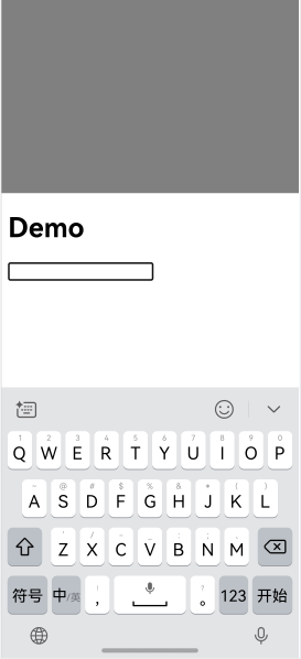
// Index.ets import { webview } from '@kit.ArkWeb'; @Entry @Component struct KeyboardAvoidExample { controller: webview.WebviewController = new webview.WebviewController(); build() { Column() { Row().height("50%").width("100%").backgroundColor(Color.Gray) Web({ src: $rawfile("index.html"),controller: this.controller}) Text("I can see the bottom of the page").width("100%").textAlign(TextAlign.Center).backgroundColor(Color.Pink).layoutWeight(1) }.width('100%').height("100%") } }The Web component is re-arranged with ArkUI, as shown in Figure 1 and Figure 2.
Figure 1 Soft keyboard in the default avoidance mode
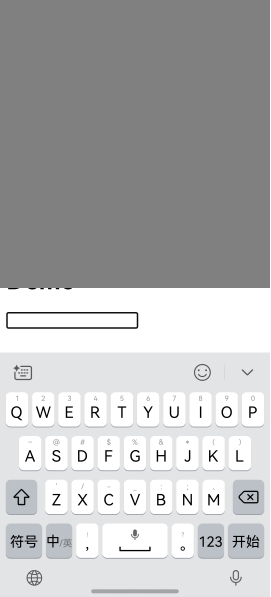
Figure 2 Soft keyboard re-arranged with ArkUI
-
When the keyboard avoidance mode of UIContext is Offset, the application can set the keyboard avoidance mode of the Web component through the WebKeyboardAvoidMode() API of the Web component. This API is at a higher priority than virtualKeyboard.overlayContent on the W3C side.
- RESIZE_VISUAL: Only the size of the visual viewport is adjusted, and the size of the layout viewport is not adjusted.
- RESIZE_CONTENT: Both the size of the visual viewport and the size of the layout viewport are adjusted.
- OVERLAYS_CONTENT: No viewport size is adjusted, and the focused input element is not scrolled into the visible area.

The visual viewport refers to the area of the website that the user is currently viewing, whose width equals the width of the browser window on the mobile device.
The layout viewport refers to the width of the web page itself.
Set the soft keyboard avoidance mode of the Web component in the application code.
// Index.ets
import { webview } from '@kit.ArkWeb';

@Entry
@Component
struct KeyboardAvoidExample {
  controller: webview.WebviewController = new webview.WebviewController();
  build() {
    Column() {
      Row().height('50%').width('100%').backgroundColor(Color.Gray)
      Web({ src: $rawfile('index.html'),controller: this.controller})
        .keyboardAvoidMode(WebKeyboardAvoidMode.OVERLAYS_CONTENT) // At this point, the ArkWeb component does not adjust the size of any viewport.
      Text('I can see the bottom of the page')
        .width('100%')
        .textAlign(TextAlign.Center)
        .backgroundColor(Color.Pink)
        .layoutWeight(1)
    }.width('100%').height('100%')
  }
}
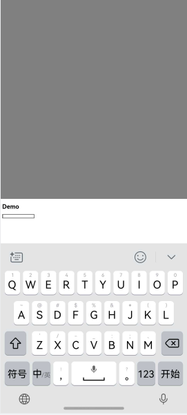
The Web component performs avoidance based on its avoidance mode, as shown in Figure 3.
Figure 3 Soft keyboard avoidance mode of the Web component page
-
When the soft keyboard is displayed, you can call expandSafeArea() to expand the safe area of the Web component to prevent the Web component from avoiding the soft keyboard. For more examples, see Calculating and Adjusting Safe Area Insets.
// xxx.ets
import { webview } from '@kit.ArkWeb';

@Entry
@Component
struct WebComponent {
  controller: webview.WebviewController = new webview.WebviewController();

  build() {
    Column() {
      Web({ src: 'www.example.com', controller: this.controller })
        .width('100%').height('100%')
        .expandSafeArea([SafeAreaType.KEYBOARD, SafeAreaType.SYSTEM])
    }
  }
}
The following are interaction scenarios with other Web component behaviors.
| Overlapping Scenario | Specifications |
|---|---|
| Same-layer rendering | Same-layer Web: The soft keyboard avoidance method is the same as in the normal scenario. Same-layer system component: ArkUI is responsible for the soft keyboard avoidance mode. |
| Offscreen component creation | By default, the soft keyboard avoidance mode used in non-offscreen created component is used. You can set other avoidance modes before attaching the component to the tree. |
| customDialog | The customDialog component avoids the keyboard by itself. |
| Foldable device | The soft keyboard avoidance behavior is the same as that in common scenarios. The soft keyboard is opened and closed based on the screen status. |
| Soft keyboard docking | The soft keyboard avoidance behavior is the same as that in common scenarios. |
| Web nested scrolling | In the nested scrolling scenario, the soft keyboard avoidance mode of the Web component is not recommended, including RESIZE_VISUAL and RESIZE_CONTENT. |
Blocking System Soft Keyboard and Custom Soft Keyboard
An application can listen for the onInterceptKeyboardAttach callback to control the display of the soft keyboard and use any of the following options:
- The system soft keyboard with default settings
- The system soft keyboard with a custom Enter key
- The custom soft keyboard of the application
  // Index.ets
  import { webview } from '@kit.ArkWeb';
  import { inputMethodEngine } from '@kit.IMEKit';

  @Entry
  @Component
  struct WebComponent {
    controller: webview.WebviewController = new webview.WebviewController();
    webKeyboardController: WebKeyboardController = new WebKeyboardController();
    inputAttributeMap: Map<string, number> = new Map([
        ['UNSPECIFIED', inputMethodEngine.ENTER_KEY_TYPE_UNSPECIFIED],
        ['GO', inputMethodEngine.ENTER_KEY_TYPE_GO],
        ['SEARCH', inputMethodEngine.ENTER_KEY_TYPE_SEARCH],
        ['SEND', inputMethodEngine.ENTER_KEY_TYPE_SEND],
        ['NEXT', inputMethodEngine.ENTER_KEY_TYPE_NEXT],
        ['DONE', inputMethodEngine.ENTER_KEY_TYPE_DONE],
        ['PREVIOUS', inputMethodEngine.ENTER_KEY_TYPE_PREVIOUS]
      ])

      /**
       * Builder for a custom keyboard component
       */
      @Builder
      customKeyboardBuilder() {
      // Implement the custom keyboard component here, and connect it to WebKeyboardController to implement input, deletion, closing, and other operations.
        Row() {
          Text("Finish")
            .fontSize(20)
            .fontColor(Color.Blue)
            .onClick(() => {
              this.webKeyboardController.close();
            })
          // Insert characters.
          Button("insertText").onClick(() => {
            this.webKeyboardController.insertText('insert ');
          }).margin({
            bottom: 200,
          })
          // Delete characters from the end to the beginning for the length specified by the length parameter.
          Button("deleteForward").onClick(() => {
            this.webKeyboardController.deleteForward(1);
          }).margin({
            bottom: 200,
          })
          // Delete characters from the beginning to the end for the length specified by the length parameter.
          Button("deleteBackward").onClick(() => {
            this.webKeyboardController.deleteBackward(1);
          }).margin({
            left: -220,
          })
          // Insert a function key.
          Button("sendFunctionKey").onClick(() => {
            this.webKeyboardController.sendFunctionKey(6);
          })
        }
      }

    build() {
      Column() {
        Web({ src: $rawfile('index.html'), controller: this.controller })
        .onInterceptKeyboardAttach((KeyboardCallbackInfo) => {
          // Initialize option. By default, the default keyboard is used.
          let option: WebKeyboardOptions = {
            useSystemKeyboard: true,
          };
          if (!KeyboardCallbackInfo) {
            return option;
          }

          // Save the WebKeyboardController. When a custom keyboard is used, this handler is required to control behaviors such as input, deletion, and closing of the keyboard.
          this.webKeyboardController = KeyboardCallbackInfo.controller;
          let attributes: Record<string, string> = KeyboardCallbackInfo.attributes;
          // Traverse attributes.
          let attributeKeys = Object.keys(attributes);
          for (let i = 0; i < attributeKeys.length; i++) {
            console.info('WebCustomKeyboard key = ' + attributeKeys[i] + ', value = ' + attributes[attributeKeys[i]]);
          }

          if (attributes) {
            if (attributes['data-keyboard'] == 'customKeyboard') {
              // Determine the soft keyboard to use based on the attributes of editable HTML elements. For example, if the attribute includes data-keyboard and its value is customKeyboard, use a custom keyboard.
              console.info('WebCustomKeyboard use custom keyboard');
              option.useSystemKeyboard = false;
              // Set the custom keyboard builder.
              option.customKeyboard = () => {
                this.customKeyboardBuilder()
              }
              return option;
            }

            if (attributes['keyboard-return'] != undefined) {
              // Determine the soft keyboard to use based on the attributes of editable HTML elements. For example, if the attribute includes keyboard-return, use the system keyboard and specify the type of the system soft keyboard's Enter key.
              option.useSystemKeyboard = true;
              let enterKeyType: number | undefined = this.inputAttributeMap.get(attributes['keyboard-return']);
              if (enterKeyType != undefined) {
                option.enterKeyType = enterKeyType;
              }
              return option;
            }
          }

          return option;
        })
      }
    }
  }
<!-- index.html -->
<!DOCTYPE html>
<html>
<head>
<meta charset="utf-8">
<meta name="viewport" content="width=device-width,minimum-scale=1.0,maximum-scale=1.0">
</head>
<body>
<p style="font-size:12px">input tag. Original default behavior: </p>
<input type="text" style="width: 300px; height: 20px"><br>
<hr style="height:2px;border-width:0;color:gray;background-color:gray">
<p style="font-size:12px">input tag. System keyboard with enterKeyType as UNSPECIFIED: </p>
<input type="text" keyboard-return="UNSPECIFIED" style="width: 300px; height: 20px"><br>
<hr style="height:2px;border-width:0;color:gray;background-color:gray">
<p style="font-size:12px">input tag. System keyboard with enterKeyType as GO: </p>
<input type="text" keyboard-return="GO" style="width: 300px; height: 20px"><br>
<hr style="height:2px;border-width:0;color:gray;background-color:gray">
<p style="font-size:12px">input tag. System keyboard with enterKeyType as SEARCH: </p>
<input type="text" keyboard-return="SEARCH" style="width: 300px; height: 20px"><br>
<hr style="height:2px;border-width:0;color:gray;background-color:gray">
<p style="font-size:12px">input tag. System keyboard with enterKeyType as SEND: </p>
<input type="text" keyboard-return="SEND" style="width: 300px; height: 20px"><br>
<hr style="height:2px;border-width:0;color:gray;background-color:gray">
<p style="font-size:12px">input tag. System keyboard with enterKeyType as NEXT: </p>
<input type="text" keyboard-return="NEXT" style="width: 300px; height: 20px"><br>
<hr style="height:2px;border-width:0;color:gray;background-color:gray">
<p style="font-size:12px">input tag. System keyboard with enterKeyType as DONE: </p>
<input type="text" keyboard-return="DONE" style="width: 300px; height: 20px"><br>
<hr style="height:2px;border-width:0;color:gray;background-color:gray">
<p style="font-size:12px">input tag. System keyboard with enterKeyType as PREVIOUS: </p>
<input type="text" keyboard-return="PREVIOUS" style="width: 300px; height: 20px"><br>
<hr style="height:2px;border-width:0;color:gray;background-color:gray">
<p style="font-size:12px">input tag. Custom keyboard: </p>
<input type="text" data-keyboard="customKeyboard" style="width: 300px; height: 20px"><br>
</body>
</html> Figure 4, Figure 5, and Figure 6 show the ArkWeb custom keyboard examples.
Figure 4 Custom numeric keyboard
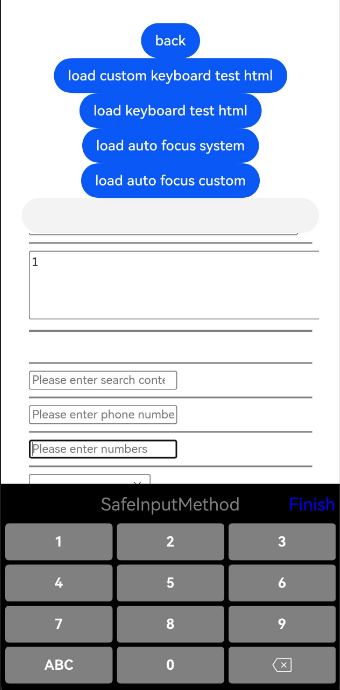
Figure 5 Custom alphabetic keyboard
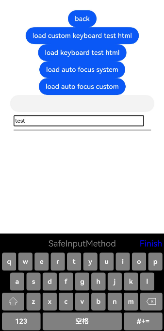
Figure 6 Custom symbol keyboard
