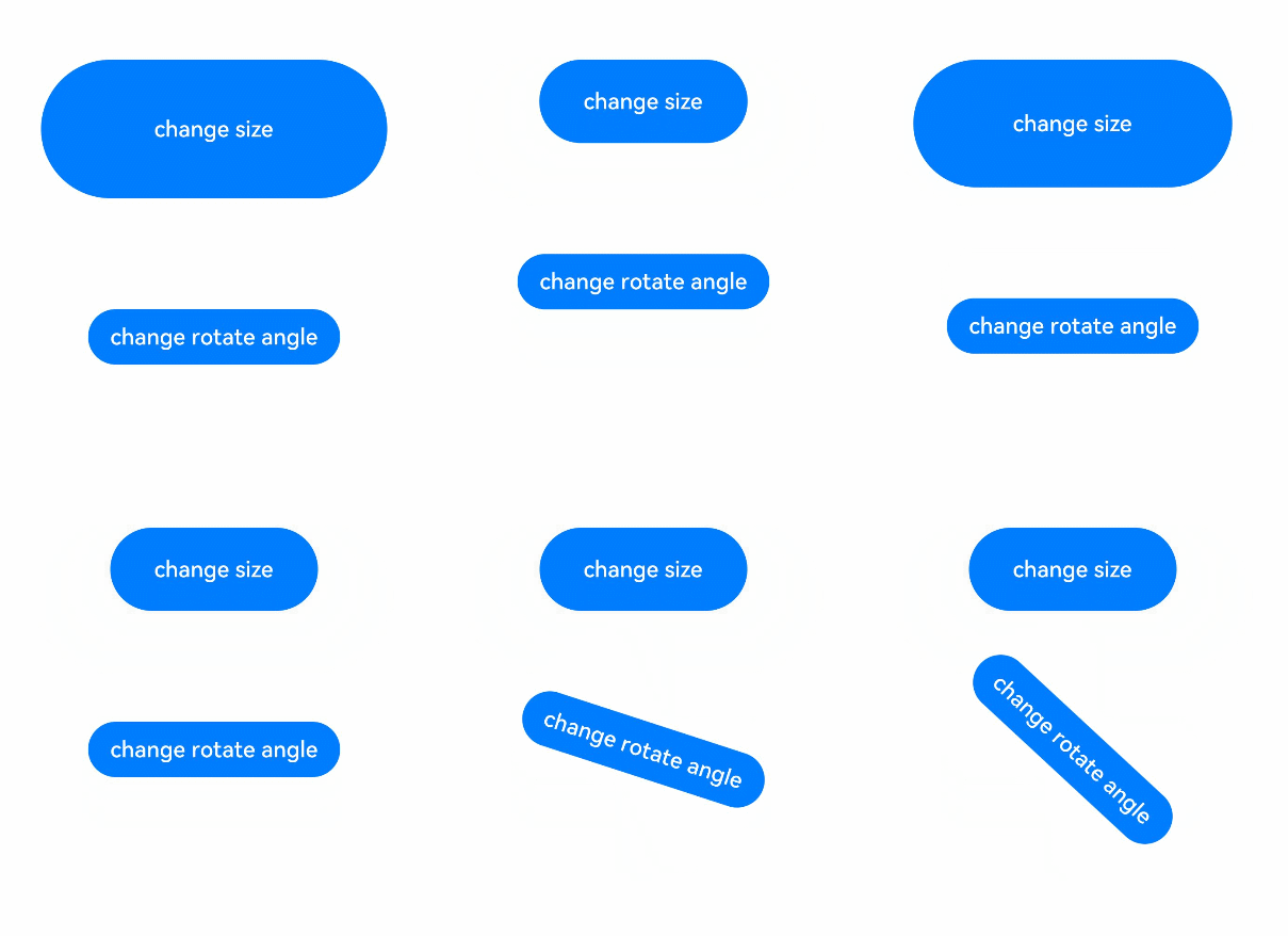
With property animations, you can animate changes to certain component properties, such as width, height, backgroundColor, opacity, scale, rotate and translate. In an animation that involves layout (for example, width and height) changes, a component's content (such as text and canvas content) is changed straight to the final state. To enable the content to change with the width and height during the animation process, you can use the renderFit attribute.

This feature is supported since API version 7. Updates will be marked with a superscript to indicate their earliest API version.
animation
animation(value:AnimateParam): T
Sets a property animation for the component.

When a single page contains a large number of components with animations, use renderGroup to minimize frame freezing and improve animation performance. For best practices, see Animation Usage Guide – Using RenderGroup.
This API cannot be called within attributeModifier.
Widget capability: This API can be used in ArkTS widgets since API version 9.
Atomic service API: This API can be used in atomic services since API version 11.
System capability: SystemCapability.ArkUI.ArkUI.Full
Parameters
| Name | Type | Mandatory | Description |
|---|---|---|---|
| value | AnimateParam | Yes | Animation settings. |
Return value
| Type | Description |
|---|---|
| T | Current component. |
Property animations only affect attributes that are specified before the animation API and do not affect properties of the component constructor.
@Entry
@Component
struct AnimationExample {
  @State widthSize: number = 250;
  @State heightSize: number = 100;
  @State rotateAngle: number = 0;
  @State flag: boolean = true;
  @State space: number = 10;

  build() {
    Column() {
      Column({ space: this.space }) // Changing space in the Column constructor will not be animated.
        .onClick(() => {
          if (this.flag) {
            this.widthSize = 150;
            this.heightSize = 60;
            this.space = 20; // Changing this.space will not be animated.
          } else {
            this.widthSize = 250;
            this.heightSize = 100;
            this.space = 10; //  Changing this.space will not be animated.
          }
          this.flag = !this.flag;
        })
        .backgroundColor(Color.Black)
        .margin(30)
        .width(this.widthSize) // Only effective if specified before the animation API.
        .height(this.heightSize) // Only effective if specified before the animation API.
        .animation({
          duration: 2000,
          curve: Curve.EaseOut,
          iterations: 3,
          playMode: PlayMode.Normal
        })
        // .width(this.widthSize) // The animation API does not take effect here.
        // .height(this.heightSize) //  The animation API does not take effect here.
    }
  }
}
Example
This example demonstrates property animations using the animation API.
// xxx.ets
@Entry
@Component
struct AttrAnimationExample {
  @State widthSize: number = 250
  @State heightSize: number = 100
  @State rotateAngle: number = 0
  @State flag: boolean = true

  build() {
    Column() {
      Button('change size')
        .onClick(() => {
          if (this.flag) {
            this.widthSize = 150
            this.heightSize = 60
          } else {
            this.widthSize = 250
            this.heightSize = 100
          }
          this.flag = !this.flag
        })
        .margin(30)
        .width(this.widthSize)
        .height(this.heightSize)
        .animation({
          duration: 2000,
          curve: Curve.EaseOut,
          iterations: 3,
          playMode: PlayMode.Normal
        })
      Button('change rotate angle')
        .onClick(() => {
          this.rotateAngle = 90
        })
        .margin(50)
        .rotate({ angle: this.rotateAngle })
        .animation({
          duration: 1200,
          curve: Curve.Friction,
          delay: 500,
          iterations: -1, // The value -1 indicates that the animation is played for an unlimited number of times.
          playMode: PlayMode.Alternate,
          expectedFrameRateRange: {
            min: 20,
            max: 120,
            expected: 90,
          }
        })
    }.width('100%').margin({ top: 20 })
  }
}