The <text> component is used to display a piece of textual information. For details, see text.
Creating a <text> Component
Create a <text> component in the .hml file under pages/index.
<!-- xxx.hml -->
<div class="container" style="text-align: center;justify-content: center; align-items: center;">
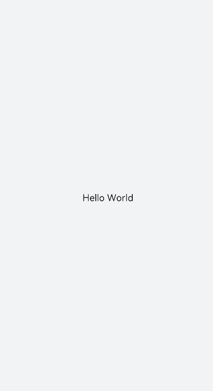
  <text>Hello World</text>
</div>
/* xxx.css */
.container {
  width: 100%;
  height: 100%;
  flex-direction: column;
  align-items: center;
  justify-content: center;
  background-color: #F1F3F5;
} 
Setting the Text Style and Attributes
-
Adding a text style
Set the color, font-size, allow-scale, word-spacing, and text-align attributes to add the color, size, zoom, text spacing, and vertical alignment of the text.
<!-- xxx.hml -->
<div class="container" style="background-color:#F1F3F5;flex-direction: column;justify-content: center; align-items: center;">
  <text style="color: blueviolet; font-size: 40px; allow-scale:true">
    This is a passage
  </text>
  <text style="color: blueviolet; font-size: 40px; margin-top: 20px; allow-scale:true;word-spacing: 20px;text-align: center">
    This is a passage
  </text>
</div>
/* xxx.css */ .container { display: flex; width: 100%; height: 100%; flex-direction: column; align-items: center; justify-content: center; background-color: #F1F3F5; }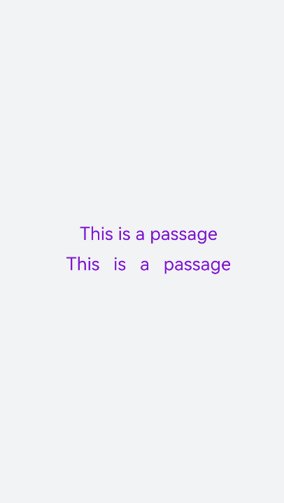
-
Adding a text decoration
Set the text-decoration attribute to add a decoration line to selected text. Set the text-decoration-color attribute to apply specific color to the decoration line. For values of text-decoration, see text styles.
<!-- xxx.hml -->
<div class="container" style="background-color:#F1F3F5;">
  <text style="text-decoration:underline">
    This is a passage
  </text>
  <text style="text-decoration:line-through;text-decoration-color: red">
    This is a passage
   </text>
</div>
/* xxx.css */ .container { width: 100%; height: 100%; flex-direction: column; align-items: center; justify-content: center; } text{ font-size: 50px; }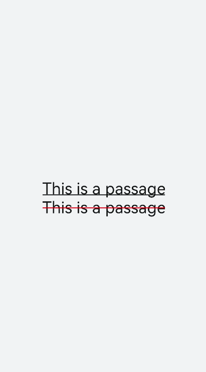
-
Hiding text content
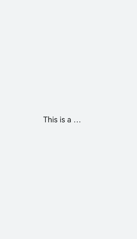
Set the text-overflow attribute to ellipsis so that overflowed text is displayed as an ellipsis.
<!-- xxx.hml -->
<div class="container">
  <text class="text">
    This is a passage
  </text>
</div>
/* xxx.css */ .container { width: 100%; height: 100%; flex-direction: column; align-items: center; background-color: #F1F3F5; justify-content: center; } .text{ width: 200px; max-lines: 1; text-overflow:ellipsis; }
- text-overflow must be used together with max-lines.
- max-lines indicates the maximum number of lines in the text.
-
Setting the <span> child component
<!-- xxx.hml -->
<div class="container" style="justify-content: center; align-items: center;flex-direction: column;background-color: #F1F3F5;  width: 100%;height: 100%;">
  <text style="font-size: 45px;">
    This is a passage
  </text>
  <text style="font-size: 45px;">
    <span style="color: aqua;">This </span><span style="color: #F1F3F5;">      1
    </span>
    <span style="color: blue;"> is a </span>    <span style="color: #F1F3F5;">      1    </span>
    <span style="color: red;">  passage </span>
  </text>
</div>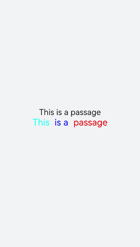

-
When the <span> child component is used to form a text paragraph, incorrect <span> attribute settings (for example, setting of font-weight to 1000) will result in abnormal display of the text paragraph.
-
When the <span> child component is being used, do not include any text you want to show in the <text> component, as such text will not be displayed if you do so.
-
Example Scenario
Use the <text> component to display text content through data binding. Use the <span> child component to hide or display text content by setting the show attribute.
<!-- xxx.hml -->
<div class="container">
  <div style="align-items: center;justify-content: center;">
    <text class="title">
      {{ content }}
    </text>
    <switch checked="true" onchange="test"></switch>
  </div>
  <text class="span-container" style="color: #ff00ff;">
    <span show="{{isShow}}">  {{ content  }}  </span>
    <span style="color: white;">
        1
    </span>
    <span style="color: #f76160">Hide clip </span>
  </text>
</div>
/* xxx.css */
.container {
width: 100%;
height: 100%;
align-items: center;
flex-direction: column;
justify-content: center;
background-color: #F1F3F5;
}
.title {
font-size: 26px;
text-align:center;
width: 200px;
height: 200px;
} // xxx.js
export default {
data: {
isShow:true,
content: 'Hello World'
},
onInit(){ },
test(e) {
this.isShow = e.checked
}
} 