This topic addresses frequently asked questions regarding buttons and selection components.
How Are the Slider Thumb and Track of the Slider Component Aligned?
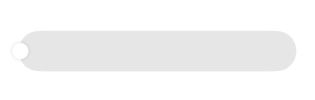
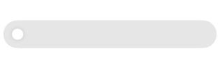
The Slider component supports three display styles defined by SliderStyle. Both SliderStyle.OutSet and SliderStyle.InSet include visible slider thumbs. When the slider progress is at the minimum value, the alignment behavior differs between these two styles:
SliderStyle.OutSet: The thumb center aligns with the track endpoint.
SliderStyle.InSet: The slider thumb aligns with the track centerline (midpoint of the track endpoint height).
Example
@Entry
@Component
struct Index {
  build() {
    Column() {
      Slider({
        style: SliderStyle.OutSet
      })
        .blockSize({
          width: 20,
          height: 20
        })
        .trackThickness(50)
      Slider({
        style: SliderStyle.InSet
      })
        .blockSize({
          width: 20,
          height: 20
        })
        .trackThickness(50)
    }
    .height('100%')
    .width('100%')
  }
}
Inconsistent Default Font Weight When AttributeModifier Is Used to Set LabelStyle of a Button
Symptom
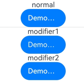
When LabelStyle is set for the Button component, the default font weight of the label text is inconsistent in different setting modes.
Possible Causes
There are two ways to set LabelStyle:
-
Set LabelStyle directly. In this case, the default value of the weight attribute in font is FontWeight.Medium, which corresponds to the value 500.
-
Set LabelStyle through the AttributeModifier API. In this case, the default value of the weight attribute in font is 400, which is different from the default value described in the LabelStyle description.
Solution
To avoid display differences caused by different setting ways, you are advised to explicitly specify the weight value when setting LabelStyle through the AttributeModifier API to ensure that the text style meets the expectation. The following is an example:
// pages/ButtonModifierFAQ.ets
class MyButtonModifier1 implements AttributeModifier<ButtonAttribute> {
  applyNormalAttribute(instance: ButtonAttribute): void {
    instance.labelStyle({});
  }
}

class MyButtonModifier2 implements AttributeModifier<ButtonAttribute> {
  applyNormalAttribute(instance: ButtonAttribute): void {
    instance.labelStyle({
      font: {
        weight: FontWeight.Medium
      }
    });
  }
}

@Entry
@Component
struct Index {
  @State modifier1: MyButtonModifier1 = new MyButtonModifier1();
  @State modifier2: MyButtonModifier2 = new MyButtonModifier2();

  build() {
    Column() {
      Text('normal')
      // Set labelStyle for the Button component. The default value of weight in the font attribute is 500.
      Button('DemoButtonTest')
        .width(100)
        .labelStyle({})
      Divider()
      // Set labelStyle via AttributeModifier. The default value of weight in the font attribute is 400.
      Text('modifier1')
      Button('DemoButtonTest')
        .width(100)
        .attributeModifier(this.modifier1)

      Text('modifier2')
      Button('DemoButtonTest')
        .width(100)
        .attributeModifier(this.modifier2)
    }.height('100%')
  }
} 
Inconsistency Between ButtonType Enum Values and Numeric Values When Setting the Button Component Type
Symptom
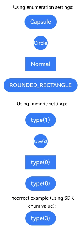
The type attribute of the Button component supports setting via the ButtonType enum or a numeric value. However, the enum values defined in the SDK do not match the actual numeric values accepted by type. For example, the ButtonType.ROUNDED_RECTANGLE enum value is 3, but type(ButtonType.ROUNDED_RECTANGLE) and type(3) produce different effects.
Possible Causes
The numeric values defined in the ButtonType enum only represent the indices of the enum items and differ from the actual numeric values accepted by the type attribute. The mapping is as follows:
| ButtonType Enum | Enum Value | Actual type Value |
|---|---|---|
| Normal | 2 | 0 |
| Capsule | 0 | 1 |
| Circle | 1 | 2 |
| ROUNDED_RECTANGLE | 3 | 8 |
Therefore, type(8) produces the same effect as type(ButtonType.ROUNDED_RECTANGLE), while type(3) does not correspond to any valid type. Before API version 18, the default value ButtonType.Capsule is used; in API version 18 and later, the default value ButtonType.ROUNDED_RECTANGLE is used.
Solution
You are advised to use the ButtonType enum for configuration to avoid potential confusion caused by using numeric values directly. If you must use a numeric value, refer to the "Actual type Value" column in the table above.
Example
// pages/ButtonTypeFAQ.ets
@Entry
@Component
struct ButtonTypeDemo {
  build() {
    Column({ space: 20 }) {
      // Use enum settings (recommended).
      Text('Use enum settings:')
      Button('Capsule')
        .type(ButtonType.Capsule)
      Button('Circle')
        .type(ButtonType.Circle)
      Button('Normal')
        .type(ButtonType.Normal)
      Button('ROUNDED_RECTANGLE')
        .type(ButtonType.ROUNDED_RECTANGLE)

      // Use numeric settings (the actual type value is required).
      Text('Use numeric settings:')
      Button('type(1)')
        .type(1) // Equivalent to ButtonType.Capsule.
      Button('type(2)')
        .type(2) // Equivalent to ButtonType.Circle.
      Button('type(0)')
        .type(0) // Equivalent to ButtonType.Normal.
      Button('type(8)')
        .type(8) // Equivalent to ButtonType.ROUNDED_RECTANGLE.

      // Incorrect example: using SDK enum values as the type number.
      Text('Incorrect example (using SDK enum values):')
      Button('type(3)')
        .type(3) // Does not correspond to any type; the default style is used.
    }
    .width('100%')
    .height('100%')
    .backgroundColor(Color.White)
    .justifyContent(FlexAlign.Center)
  }
}