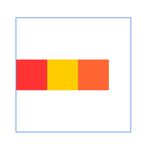
The RelativeContainer component is a container component used for relative layout of elements in complex scenarios.
Child components can define their alignment rules within the container using alignRules.

- This component is supported since API version 9. Updates will be marked with a superscript to indicate their earliest API version.
- When width and height are not set, RelativeContainer defaults to 100% in both dimensions.
- Since API version 11, setting width or height to "auto" enables child-adaptive sizing. However, if the child components use the container as an anchor in the horizontal direction, the auto value of width has no effect (equivalent to width not being set). The same rule applies to the vertical direction.
- Since API version 20, the size adaptation behavior of child components in the RelativeContainer component follows the following rules, depending on the LayoutPolicy setting for width and height: LayoutPolicy.wrapContent: The child component adapts to its content size and is constrained by the size of the ancestor node. LayoutPolicy.fixAtIdealSize: The child component adapts to its ideal content size and is not constrained by the size of the ancestor node. If width is set to wrapContent or fixAtIdealSize, and the child component (in the horizontal direction) directly or indirectly uses the RelativeContainer as its anchor, the container's horizontal size will not adapt to the child component. The same rule applies to the vertical direction.
- For a child component of the container, margin has a different meaning from the universal attribute margin. It indicates the distance to the anchor in the respective direction. If there is no anchor in the respective direction, margin in that direction does not take effect.
APIs
RelativeContainer()
The RelativeContainer component is a container component used for relative layout of elements in complex scenarios.
Widget capability: This API can be used in ArkTS widgets since API version 9.
Atomic service API: This API can be used in atomic services since API version 11.
System capability: SystemCapability.ArkUI.ArkUI.Full
[h2]guideLine12+
guideLine(value: Array<GuideLineStyle>)
Sets the guidelines in the RelativeContainer component. The value is an array, each element of which is a guideline.
Atomic service API: This API can be used in atomic services since API version 12.
System capability: SystemCapability.ArkUI.ArkUI.Full
Parameters
| Name | Type | Mandatory | Description |
|---|---|---|---|
| value | Array<GuideLineStyle> | Yes | Guidelines in the RelativeContainer component. |
[h2]barrier12+
barrier(value: Array<BarrierStyle>)
Sets the barriers in the RelativeContainer component. The value is an array, each element of which is a barrier.
Atomic service API: This API can be used in atomic services since API version 12.
System capability: SystemCapability.ArkUI.ArkUI.Full
Parameters
| Name | Type | Mandatory | Description |
|---|---|---|---|
| value | Array<BarrierStyle> | Yes | Barriers in the RelativeContainer component. |
[h2]barrier12+
barrier(barrierStyle: Array<LocalizedBarrierStyle>)
Sets barriers in the RelativeContainer component. Each array element defines a barrier. Barriers can be defined in mirrored layout mode.
Atomic service API: This API can be used in atomic services since API version 12.
System capability: SystemCapability.ArkUI.ArkUI.Full
Parameters
| Name | Type | Mandatory | Description |
|---|---|---|---|
| barrierStyle | Array<LocalizedBarrierStyle> | Yes | Barriers in the RelativeContainer component. |
GuideLineStyle12+
Defines the ID, direction, and position of a guideline.
Atomic service API: This API can be used in atomic services since API version 12.
System capability: SystemCapability.ArkUI.ArkUI.Full
| Name | Type | Read-Only | Optional | Description |
|---|---|---|---|---|
| id | string | No | No | ID of the guideline, which must be unique and cannot be the same as the name of any component in the container. |
| direction | Axis | No | No | Direction of the guideline. A guideline in the vertical direction can only be used as the anchor of the component in the horizontal direction, and the value is 0 when it is used as the anchor in the vertical direction. A guideline in the horizontal direction can only be used as the anchor of the component in the vertical direction, and the value is 0 when it is used as the anchor in the horizontal direction. Default value: Axis.Vertical Invalid values are treated as the default value. |
| position | GuideLinePosition | No | No | Position of the guideline. If no value is specified or an invalid value (for example, undefined) is provided, the guideline position defaults to start: 0. Only start or end can be selected for the guideline position. If both are declared, only start takes effect. If the container size in a certain direction is set to "auto", the guideline position in that direction must be declared in start mode, and the value cannot be a percentage. Default value: { start: 0 } Invalid values are treated as the default value. |
GuideLinePosition12+
Defines the position of a guideline.
Atomic service API: This API can be used in atomic services since API version 12.
System capability: SystemCapability.ArkUI.ArkUI.Full
BarrierStyle12+
Defines the ID, direction, and referenced components of a barrier.
Atomic service API: This API can be used in atomic services since API version 12.
System capability: SystemCapability.ArkUI.ArkUI.Full
| Name | Type | Read-Only | Optional | Description |
|---|---|---|---|---|
| id | string | No | No | ID of the barrier, which must be unique and cannot be the same as the name of any component in the container. |
| direction | BarrierDirection | No | No | Direction of the barrier. Vertical-direction barriers (including TOP and BOTTOM) can only serve as the horizontal anchor of a component. If they are used as a vertical anchor, the anchor value will be 0. Horizontal-direction barriers (including LEFT and RIGHT) can only serve as the vertical anchor of a component. If they are used as a horizontal anchor, the anchor value will be 0. Default value: BarrierDirection.LEFT Invalid values are treated as the default value. |
| referencedId | Array<string> | No | No | Referenced components of the barrier. |
BarrierDirection12+
Defines the direction of a barrier.
Atomic service API: This API can be used in atomic services since API version 12.
System capability: SystemCapability.ArkUI.ArkUI.Full
| Name | Value | Description |
|---|---|---|
| LEFT | 0 | The barrier is on the left side of all the referenced components specified by referencedId. |
| RIGHT | 1 | The barrier is on the right side of all the referenced components specified by referencedId. |
| TOP | 2 | The barrier is at the top of all the referenced components specified by referencedId. |
| BOTTOM | 3 | The barrier is at the bottom of all the referenced components specified by referencedId. |
LocalizedBarrierStyle12+
Defines the ID, direction, and referenced components of a barrier.
Atomic service API: This API can be used in atomic services since API version 12.
System capability: SystemCapability.ArkUI.ArkUI.Full
| Name | Type | Read-Only | Optional | Description |
|---|---|---|---|---|
| id | string | No | No | ID of the barrier, which must be unique and cannot be the same as the name of any component in the container. |
| localizedDirection | LocalizedBarrierDirection | No | No | Direction of the barrier. Vertical-direction barriers (including TOP and BOTTOM) can only serve as the horizontal anchor of a component. If they are used as a vertical anchor, the anchor value will be 0. Horizontal-direction barriers (including START and END) can only serve as the vertical anchor of a component. If they are used as a horizontal anchor, the anchor value will be 0. |
| referencedId | Array<string> | No | No | Referenced components of the barrier. |
LocalizedBarrierDirection12+
Enumerates the directions of barriers with mirror mode support.
Atomic service API: This API can be used in atomic services since API version 12.
System capability: SystemCapability.ArkUI.ArkUI.Full
| Name | Value | Description |
|---|---|---|
| START | 0 | The barrier is on the left (for left-to-right scripts) or right (for right-to-left scripts) side of all the referenced components specified by referencedId. |
| END | 1 | The barrier is on the right (for left-to-right scripts) or left (for right-to-left scripts) side of all the referenced components specified by referencedId. |
| TOP | 2 | The barrier is at the top of all the referenced components specified by referencedId. |
| BOTTOM | 3 | The barrier is at the bottom of all the referenced components specified by referencedId. |
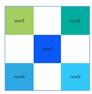
[h2]Example 1: Implementing a Layout Using Containers and Components as Anchors
This example demonstrates how to use the alignRules API to implement a layout with containers and their internal components as anchors.
@Entry
@Component
struct Index {
  build() {
    Row() {
      RelativeContainer() {
        Row() {
          Text('row1')
        }
        .justifyContent(FlexAlign.Center)
        .width(100)
        .height(100)
        .backgroundColor('#a3cf62')
        .alignRules({
          top: { anchor: "__container__", align: VerticalAlign.Top },
          left: { anchor: "__container__", align: HorizontalAlign.Start }
        })
        .id("row1")

        Row() {
          Text('row2')
        }
        .justifyContent(FlexAlign.Center)
        .width(100)
        .height(100)
        .backgroundColor('#00ae9d')
        .alignRules({
          top: { anchor: "__container__", align: VerticalAlign.Top },
          right: { anchor: "__container__", align: HorizontalAlign.End }
        })
        .id("row2")

        Row() {
          Text('row3')
        }
        .justifyContent(FlexAlign.Center)
        .height(100)
        .backgroundColor('#0a59f7')
        .alignRules({
          top: { anchor: "row1", align: VerticalAlign.Bottom },
          left: { anchor: "row1", align: HorizontalAlign.End },
          right: { anchor: "row2", align: HorizontalAlign.Start }
        })
        .id("row3")

        Row() {
          Text('row4')
        }.justifyContent(FlexAlign.Center)
        .backgroundColor('#2ca9e0')
        .alignRules({
          top: { anchor: "row3", align: VerticalAlign.Bottom },
          bottom: { anchor: "__container__", align: VerticalAlign.Bottom },
          left: { anchor: "__container__", align: HorizontalAlign.Start },
          right: { anchor: "row1", align: HorizontalAlign.End }
        })
        .id("row4")

        Row() {
          Text('row5')
        }.justifyContent(FlexAlign.Center)
        .backgroundColor('#30c9f7')
        .alignRules({
          top: { anchor: "row3", align: VerticalAlign.Bottom },
          bottom: { anchor: "__container__", align: VerticalAlign.Bottom },
          left: { anchor: "row2", align: HorizontalAlign.Start },
          right: { anchor: "__container__", align: HorizontalAlign.End }
        })
        .id("row5")
      }
      .width(300).height(300)
      .margin({ left: 50 })
      .border({ width: 2, color: "#6699FF" })
    }
    .height('100%')
  }
} 
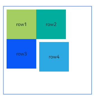
[h2]Example 2: Setting Margins for Child Components
This example shows how to set margins for child components in the container.
@Entry
@Component
struct Index {
  build() {
    Row() {
      RelativeContainer() {
        Row() {
          Text('row1')
        }
        .justifyContent(FlexAlign.Center)
        .width(100)
        .height(100)
        .backgroundColor('#a3cf62')
        .alignRules({
          top: { anchor: "__container__", align: VerticalAlign.Top },
          left: { anchor: "__container__", align: HorizontalAlign.Start }
        })
        .id("row1")
        .margin(10)

        Row() {
          Text('row2')
        }
        .justifyContent(FlexAlign.Center)
        .width(100)
        .height(100)
        .backgroundColor('#00ae9d')
        .alignRules({
          left: { anchor: "row1", align: HorizontalAlign.End },
          top: { anchor: "row1", align: VerticalAlign.Top }
        })
        .id("row2")

        Row() {
          Text('row3')
        }
        .justifyContent(FlexAlign.Center)
        .width(100)
        .height(100)
        .backgroundColor('#0a59f7')
        .alignRules({
          left: { anchor: "row1", align: HorizontalAlign.Start },
          top: { anchor: "row1", align: VerticalAlign.Bottom }
        })
        .id("row3")

        Row() {
          Text('row4')
        }
        .justifyContent(FlexAlign.Center)
        .width(100)
        .height(100)
        .backgroundColor('#2ca9e0')
        .alignRules({
          left: { anchor: "row3", align: HorizontalAlign.End },
          top: { anchor: "row2", align: VerticalAlign.Bottom }
        })
        .id("row4")
        .margin(10)
      }
      .width(300).height(300)
      .margin({ left: 50 })
      .border({ width: 2, color: "#6699FF" })
    }
    .height('100%')
  }
} 
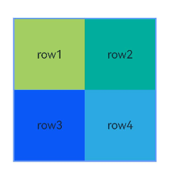
[h2]Example 3: Configuring the Container to Adapt Its Size to Content
This example shows how to configure the container to adapt its size to content by setting width or height to "auto".
@Entry
@Component
struct Index {
  build() {
    Row() {
      RelativeContainer() {
        Row() {
          Text('row1')
        }
        .justifyContent(FlexAlign.Center)
        .width(100)
        .height(100)
        .backgroundColor('#a3cf62')
        .id("row1")

        Row() {
          Text('row2')
        }
        .justifyContent(FlexAlign.Center)
        .width(100)
        .height(100)
        .backgroundColor('#00ae9d')
        .alignRules({
          left: { anchor: "row1", align: HorizontalAlign.End },
          top: { anchor: "row1", align: VerticalAlign.Top }
        })
        .id("row2")

        Row() {
          Text('row3')
        }
        .justifyContent(FlexAlign.Center)
        .width(100)
        .height(100)
        .backgroundColor('#0a59f7')
        .alignRules({
          left: { anchor: "row1", align: HorizontalAlign.Start },
          top: { anchor: "row1", align: VerticalAlign.Bottom }
        })
        .id("row3")

        Row() {
          Text('row4')
        }
        .justifyContent(FlexAlign.Center)
        .width(100)
        .height(100)
        .backgroundColor('#2ca9e0')
        .alignRules({
          left: { anchor: "row3", align: HorizontalAlign.End },
          top: { anchor: "row2", align: VerticalAlign.Bottom }
        })
        .id("row4")
      }
      .width("auto").height("auto")
      .margin({ left: 50 })
      .border({ width: 2, color: "#6699FF" })
    }
    .height('100%')
  }
} 
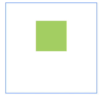
[h2]Example 4: Applying Vertical Offsets
This example uses the bias API to create a vertical offset for a child component between two anchors.
@Entry
@Component
struct Index {
  build() {
    Row() {
      RelativeContainer() {
        Row()
          .width(100)
          .height(100)
          .backgroundColor('#a3cf62')
          .alignRules({
            top: { anchor: "__container__", align: VerticalAlign.Top },
            bottom: { anchor: "__container__", align: VerticalAlign.Bottom },
            left: { anchor: "__container__", align: HorizontalAlign.Start },
            right: { anchor: "__container__", align: HorizontalAlign.End },
            bias: { vertical: 0.3 }
          })
          .id("row1")
      }
      .width(300).height(300)
      .margin({ left: 50 })
      .border({ width: 2, color: "#6699FF" })
    }
    .height('100%')
  }
} 
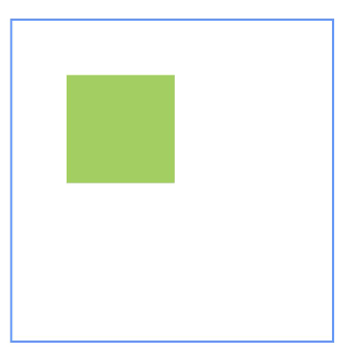
[h2]Example 5: Setting Guidelines
This example demonstrates how to set guidelines in a relative layout using the guideLine API, with child components using these guidelines as anchors.
@Entry
@Component
struct Index {
  build() {
    Row() {
      RelativeContainer() {
        Row()
          .width(100)
          .height(100)
          .backgroundColor('#a3cf62')
          .alignRules({
            left: { anchor: "guideline1", align: HorizontalAlign.End },
            top: { anchor: "guideline2", align: VerticalAlign.Top }
          })
          .id("row1")
      }
      .width(300)
      .height(300)
      .margin({ left: 50 })
      .border({ width: 2, color: "#6699FF" })
      .guideLine([{ id: "guideline1", direction: Axis.Vertical, position: { start: 50 } },
        { id: "guideline2", direction: Axis.Horizontal, position: { start: 50 } }])
    }
    .height('100%')
  }
} 
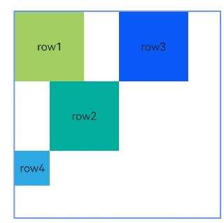
[h2]Example 6: Implementing Barriers
This example shows how to set barriers in a relative layout using the barrier API, with child components using these barriers as anchors.
@Entry
@Component
struct Index {
  build() {
    Row() {
      RelativeContainer() {
        Row() {
          Text('row1')
        }
        .justifyContent(FlexAlign.Center)
        .width(100)
        .height(100)
        .backgroundColor('#a3cf62')
        .id("row1")

        Row() {
          Text('row2')
        }
        .justifyContent(FlexAlign.Center)
        .width(100)
        .height(100)
        .backgroundColor('#00ae9d')
        .alignRules({
          middle: { anchor: "row1", align: HorizontalAlign.End },
          top: { anchor: "row1", align: VerticalAlign.Bottom }
        })
        .id("row2")

        Row() {
          Text('row3')
        }
        .justifyContent(FlexAlign.Center)
        .width(100)
        .height(100)
        .backgroundColor('#0a59f7')
        .alignRules({
          left: { anchor: "barrier1", align: HorizontalAlign.End },
          top: { anchor: "row1", align: VerticalAlign.Top }
        })
        .id("row3")

        Row() {
          Text('row4')
        }
        .justifyContent(FlexAlign.Center)
        .width(50)
        .height(50)
        .backgroundColor('#2ca9e0')
        .alignRules({
          left: { anchor: "row1", align: HorizontalAlign.Start },
          top: { anchor: "barrier2", align: VerticalAlign.Bottom }
        })
        .id("row4")
      }
      .width(300)
      .height(300)
      .margin({ left: 50 })
      .border({ width: 2, color: "#6699FF" })
      .barrier([{ id: "barrier1", direction: BarrierDirection.RIGHT, referencedId: ["row1", "row2"] },
        { id: "barrier2", direction: BarrierDirection.BOTTOM, referencedId: ["row1", "row2"] }])
    }
    .height('100%')
  }
} 
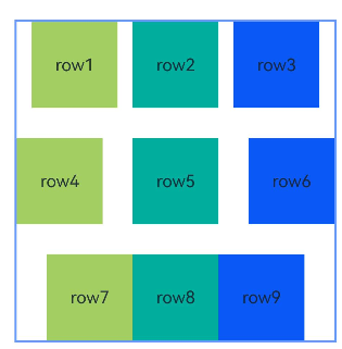
[h2]Example 7: Creating Chains
This example uses the chainMode API to create horizontal chains, including SPREAD, SPREAD_INSIDE, and PACKED chains, from top to bottom.
@Entry
@Component
struct Index {
  build() {
    Row() {
      RelativeContainer() {
        Row() {
          Text('row1')
        }
        .justifyContent(FlexAlign.Center)
        .width(80)
        .height(80)
        .backgroundColor('#a3cf62')
        .alignRules({
          left: { anchor: "__container__", align: HorizontalAlign.Start },
          right: { anchor: "row2", align: HorizontalAlign.Start },
          top: { anchor: "__container__", align: VerticalAlign.Top }
        })
        .id("row1")
        .chainMode(Axis.Horizontal, ChainStyle.SPREAD)

        Row() {
          Text('row2')
        }
        .justifyContent(FlexAlign.Center)
        .width(80)
        .height(80)
        .backgroundColor('#00ae9d')
        .alignRules({
          left: { anchor: "row1", align: HorizontalAlign.End },
          right: { anchor: "row3", align: HorizontalAlign.Start },
          top: { anchor: "row1", align: VerticalAlign.Top }
        })
        .id("row2")

        Row() {
          Text('row3')
        }
        .justifyContent(FlexAlign.Center)
        .width(80)
        .height(80)
        .backgroundColor('#0a59f7')
        .alignRules({
          left: { anchor: "row2", align: HorizontalAlign.End },
          right: { anchor: "__container__", align: HorizontalAlign.End },
          top: { anchor: "row1", align: VerticalAlign.Top }
        })
        .id("row3")

        Row() {
          Text('row4')
        }
        .justifyContent(FlexAlign.Center)
        .width(80)
        .height(80)
        .backgroundColor('#a3cf62')
        .alignRules({
          left: { anchor: "__container__", align: HorizontalAlign.Start },
          right: { anchor: "row5", align: HorizontalAlign.Start },
          center: { anchor: "__container__", align: VerticalAlign.Center }
        })
        .id("row4")
        .chainMode(Axis.Horizontal, ChainStyle.SPREAD_INSIDE)

        Row() {
          Text('row5')
        }
        .justifyContent(FlexAlign.Center)
        .width(80)
        .height(80)
        .backgroundColor('#00ae9d')
        .alignRules({
          left: { anchor: "row4", align: HorizontalAlign.End },
          right: { anchor: "row6", align: HorizontalAlign.Start },
          top: { anchor: "row4", align: VerticalAlign.Top }
        })
        .id("row5")

        Row() {
          Text('row6')
        }
        .justifyContent(FlexAlign.Center)
        .width(80)
        .height(80)
        .backgroundColor('#0a59f7')
        .alignRules({
          left: { anchor: "row5", align: HorizontalAlign.End },
          right: { anchor: "__container__", align: HorizontalAlign.End },
          top: { anchor: "row4", align: VerticalAlign.Top }
        })
        .id("row6")

        Row() {
          Text('row7')
        }
        .justifyContent(FlexAlign.Center)
        .width(80)
        .height(80)
        .backgroundColor('#a3cf62')
        .alignRules({
          left: { anchor: "__container__", align: HorizontalAlign.Start },
          right: { anchor: "row8", align: HorizontalAlign.Start },
          bottom: { anchor: "__container__", align: VerticalAlign.Bottom }
        })
        .id("row7")
        .chainMode(Axis.Horizontal, ChainStyle.PACKED)

        Row() {
          Text('row8')
        }
        .justifyContent(FlexAlign.Center)
        .width(80)
        .height(80)
        .backgroundColor('#00ae9d')
        .alignRules({
          left: { anchor: "row7", align: HorizontalAlign.End },
          right: { anchor: "row9", align: HorizontalAlign.Start },
          top: { anchor: "row7", align: VerticalAlign.Top }
        })
        .id("row8")

        Row() {
          Text('row9')
        }
        .justifyContent(FlexAlign.Center)
        .width(80)
        .height(80)
        .backgroundColor('#0a59f7')
        .alignRules({
          left: { anchor: "row8", align: HorizontalAlign.End },
          right: { anchor: "__container__", align: HorizontalAlign.End },
          top: { anchor: "row7", align: VerticalAlign.Top }
        })
        .id("row9")
      }
      .width(300).height(300)
      .margin({ left: 50 })
      .border({ width: 2, color: "#6699FF" })
    }
    .height('100%')
  }
} 
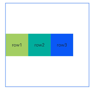
[h2]Example 8: Creating a Chain with Offsets
This example combines the chainMode and bias APIs to create a horizontal PACKED chain with offsets.
@Entry
@Component
struct Index {
  build() {
    Row() {
      RelativeContainer() {
        Row() {
          Text('row1')
        }
        .justifyContent(FlexAlign.Center)
        .width(80)
        .height(80)
        .backgroundColor('#a3cf62')
        .alignRules({
          left: { anchor: "__container__", align: HorizontalAlign.Start },
          right: { anchor: "row2", align: HorizontalAlign.Start },
          center: { anchor: "__container__", align: VerticalAlign.Center },
          bias: { horizontal: 0 }
        })
        .id("row1")
        .chainMode(Axis.Horizontal, ChainStyle.PACKED)

        Row() {
          Text('row2')
        }
        .justifyContent(FlexAlign.Center)
        .width(80)
        .height(80)
        .backgroundColor('#00ae9d')
        .alignRules({
          left: { anchor: "row1", align: HorizontalAlign.End },
          right: { anchor: "row3", align: HorizontalAlign.Start },
          top: { anchor: "row1", align: VerticalAlign.Top }
        })
        .id("row2")

        Row() {
          Text('row3')
        }
        .justifyContent(FlexAlign.Center)
        .width(80)
        .height(80)
        .backgroundColor('#0a59f7')
        .alignRules({
          left: { anchor: "row2", align: HorizontalAlign.End },
          right: { anchor: "__container__", align: HorizontalAlign.End },
          top: { anchor: "row1", align: VerticalAlign.Top }
        })
        .id("row3")
      }
      .width(300).height(300)
      .margin({ left: 50 })
      .border({ width: 2, color: "#6699FF" })
    }
    .height('100%')
  }
} 
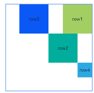
[h2]Example 9: Implementing a Mirror Effect
This example demonstrates how to use LocalizedAlignRuleOptions and LocalizedBarrierDirection for alignment when using barriers as anchors in mirror mode (direction set to Direction.Rtl).
@Entry
@Component
struct Index {
  build() {
    Row() {
      RelativeContainer() {
        Row() {
          Text('row1')
        }
        .justifyContent(FlexAlign.Center)
        .width(100)
        .height(100)
        .backgroundColor('#a3cf62')
        .id("row1")

        Row() {
          Text('row2')
        }
        .justifyContent(FlexAlign.Center)
        .width(100)
        .height(100)
        .backgroundColor('#00ae9d')
        .alignRules({
          middle: { anchor: "row1", align: HorizontalAlign.End },
          top: { anchor: "row1", align: VerticalAlign.Bottom }
        })
        .id("row2")

        Row() {
          Text('row3')
        }
        .justifyContent(FlexAlign.Center)
        .width(100)
        .height(100)
        .backgroundColor('#0a59f7')
        .alignRules({
          start: { anchor: "barrier1", align: HorizontalAlign.End },
          top: { anchor: "row1", align: VerticalAlign.Top }
        })
        .id("row3")

        Row() {
          Text('row4')
        }
        .justifyContent(FlexAlign.Center)
        .width(50)
        .height(50)
        .backgroundColor('#2ca9e0')
        .alignRules({
          start: { anchor: "row1", align: HorizontalAlign.Start },
          top: { anchor: "barrier2", align: VerticalAlign.Bottom }
        })
        .id("row4")
      }
      .direction(Direction.Rtl)
      .width(300)
      .height(300)
      .margin({ left: 50 })
      .border({ width: 2, color: "#6699FF" })
      .barrier([{ id: "barrier1", localizedDirection: LocalizedBarrierDirection.END, referencedId: ["row1", "row2"] },
        { id: "barrier2", localizedDirection: LocalizedBarrierDirection.BOTTOM, referencedId: ["row1", "row2"] }])
    }
    .height('100%')
  }
} 
[h2]Example 10: Setting Component Weights in a Chain
This example demonstrates how to use chainWeight to set the size weights of components in a chain.
@Entry
@Component
struct Index {
  build() {
    Row() {
      RelativeContainer() {
        Row() {
          Text('row1')
        }
        .justifyContent(FlexAlign.Center)
        .width(80)
        .height(80)
        .backgroundColor('#a3cf62')
        .alignRules({
          left: { anchor: "__container__", align: HorizontalAlign.Start },
          right: { anchor: "row2", align: HorizontalAlign.Start },
          center: { anchor: "__container__", align: VerticalAlign.Center },
        })
        .id("row1")
        .chainMode(Axis.Horizontal, ChainStyle.PACKED)

        Row() {
          Text('row2')
        }
        .justifyContent(FlexAlign.Center)
        .width(80)
        .height(80)
        .backgroundColor('#00ae9d')
        .alignRules({
          left: { anchor: "row1", align: HorizontalAlign.End },
          right: { anchor: "row3", align: HorizontalAlign.Start },
          top: { anchor: "row1", align: VerticalAlign.Top }
        })
        .id("row2")
        .chainWeight({ horizontal: 1 })

        Row() {
          Text('row3')
        }
        .justifyContent(FlexAlign.Center)
        .width(80)
        .height(80)
        .backgroundColor('#0a59f7')
        .alignRules({
          left: { anchor: "row2", align: HorizontalAlign.End },
          right: { anchor: "__container__", align: HorizontalAlign.End },
          top: { anchor: "row1", align: VerticalAlign.Top }
        })
        .id("row3")
        .chainWeight({ horizontal: 2 })
      }
      .width(300).height(300)
      .margin({ left: 50 })
      .border({ width: 2, color: "#6699FF" })
    }
    .height('100%')
  }
}