This topic describes the definition and objectives of one-time development for multi-device deployment (one-for-multi for short), and provides device-to-device guidance from the perspectives of UX design, page development, and feature development, helping you quickly develop apps that adapt to various types of devices. Before developing an app, you should fully consider the scenario where the app can be run on multiple devices, avoiding significant adjustment to the app architecture when new types of devices are added.

This series focuses on the general basic guidance for multi-device adaptation. For more information about the hardware parameters and experience optimization design of specific devices, see Multi-Device Experience Optimization.
Background
As terminal devices grow more diverse in form and scale, the number of smart devices per person and per household will keep rising. This makes connectivity and collaboration between multiple devices increasingly critical—by tapping into the unique strengths of different device forms, we can deliver a dramatic leap in user experience. When interacting with devices, users will gradually move away from the current device-centric model toward a scenario-centric model. In any given scenario, each device brings its unique features to the table, fostering cross-device support and collaboration—while app services work across devices to deliver seamless task completion.
For app developers, a wide range of device types can also bring a large number of potential users to the app. However, if an app needs to provide same content on multiple devices, different screen sizes and hardware devices need to be adapted. As a result, development costs are relatively high. This is where one-for-multi capabilities, provided by HarmonyOS, come into the picture, allowing you to efficiently build apps that can run on multiple devices based on one design.

Chapter Overview
The chapters in this guide are described as follows:
-
This topic introduces the background, definition, objectives, and basic knowledge of the one-for-multi solution and provides basic guidance for subsequent development.
- Getting Started with an Example describes the one-for-multi development process through an example, helping you have an intuitive understanding of one-for-multi capabilities.
-
Cross-Device UX Design describes the app UX design philosophy, and elaborates on the principles and key points in the early design phase, and examines the considerations of differentiation, consistency, flexibility, and compatibility in multi-device design.
- Cross-Device UI Development and Cross-Device Feature Development describe the one-for-multi capabilities. Each capability section provides code examples and UX effects, enabling you to quickly learn them.
-
Cross-Device Project Deployment describes how to develop apps using DevEco Studio, enabling you to directly start creating cross-device app projects. This serves as a foundational guide for learning the one-for-multi capabilities in subsequent chapters.
-
Cross-Device UI Development Cases provides one-for-multi cases in various service scenarios, helping you learn how to develop one-for-multi apps from the perspective of actual services.
Key Technologies
To implement one-for-multi app development, address the following three issues:
- How to adapt pages to different screen sizes and color styles.
- How to make features compatible with system capabilities of different devices, such as NFC and SIM card support.
- How to organize a code project that can be deployed on various devices.
To address these issues, HarmonyOS provides solutions in terms of page adaptation, feature compatibility, and code deployment.

- Project-level: implements project management and package management based on a three-layer architecture to implement unified management of project code and on-demand deployment on multiple devices.
- Feature-level: improves the flexibility of feature modules and the code reuse rate based on the project-level one-for-many capabilities and the API capability binding mechanism.
- UI-level: achieves adaptive display and consistent experience of UIs on multiple devices based on the feature-level UI one-for-multi capabilities including typical layouts, responsive and adaptive layouts, and unified visual and interaction design.
NOTE
- For small-screen devices such as watches and special screens such as PuraX cover screens, the app design layout varies greatly and cannot be adapted through a set of layout adjustment.
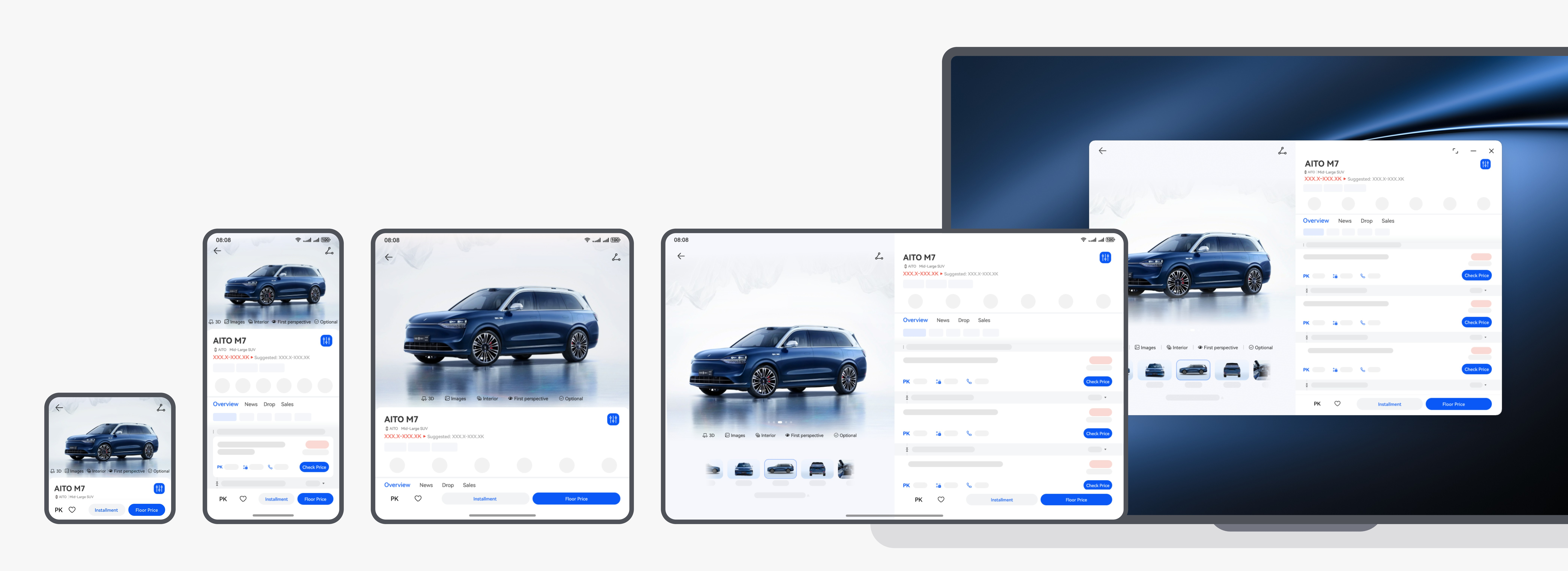
- In most scenarios, the page is too complex. It is costly to use a set of code to directly implement the page through the UI-level one-for-multi capability, and the code readability is poor. Therefore, you need to design the UX separately and use the if-else breakpoint to implement a set of layout or create a device HAP (project-level multi-layer architecture). As shown in the following figure, a HAP is created separately for the watch to implement the watch layout.

- In a few scenarios, use the adaptive and responsive capabilities and use the UX design diagram for description. For example, the PuraX cover screen uses the grid layout. The detailed differences in components are determined by the breakpoints of the responsive capability.
Development Process
Once the requirements for an app are clarified, its development process typically includes the following steps: experience design (including UI UX design and service feature design), architecture design, UI development, and feature development. Cross-device apps follow this same process, and this guide is structured accordingly. By leveraging the system capabilities of HarmonyOS, create a complete technical path to develop a single codebase that can be deployed on various devices. This aims to support developers in quickly and efficiently developing apps for various devices, ensuring compatibility with different devices while providing a distributed experience of cross-device hopping, migration, and collaboration.
[h2]Experience Design
For cross-device app development, you are advised to incorporate considerations for multi-device adaptation early in the product design phase. Through unified planning, we can achieve consistent cross-device feature layout and user experience.
For cross-device apps, differentiation, consistency, flexibility, and compatibility should be incorporated into UX design principles.
For details about UX design in one-for-multi development, see Cross-Device Experience Design.
[h2]Architecture Design
To realize one-time development for multi-device deployment, sound app architecture design is crucial for HarmonyOS apps. This enables them to support Huawei 1+8 all-scenario devices—such as smartphones and PCs/2-in-1 devices—through a single code project and one build. To address these issues, developers should focus on layered and modular architecture design, which can clarify service logic, reduce code coupling, achieve flexible deployment and module-level reuse, and meet the deployment requirements of multiple devices such as smartphones, foldable phones, tablets, and PCs.
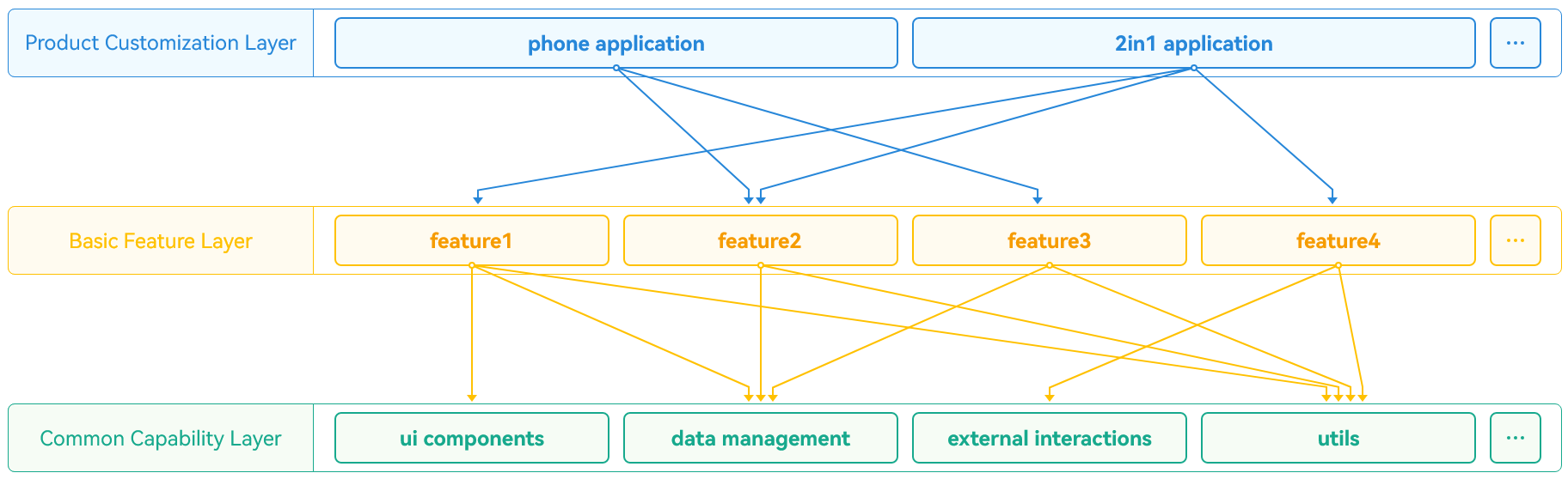
- Product customization layer
Addresses the personalized needs of different devices and scenarios, covering UI design, resource configuration, and interaction logic. As the UI for direct user interaction, it features flexible adjustment and expansion capabilities to adapt to diverse application scenarios.
- Basic feature layer
Built on top of the common capabilities layer, encapsulates independent feature modules and service logic. It features high cohesion, low coupling, and easy customization, providing basic functional support for the product customization layer while enabling flexible deployment.
- Common capability layer
Offers universal capability support, including shared resources such as UI components, data management, and toolkits. It ensures system stability and maintainability, while providing unified service support for both the basic feature layer and the product customization layer.
For details about the architecture design principles, see Layered Architecture Design and Modular Design.
[h2]Page Development
- Window adaptation
In the one-for-multi development process, you need to adapt your app to multiple window types and pay attention to the differentiated properties of the same window type across different devices, such as size specifications, system area restrictions, support for immersive display, and whether a freeform window includes the title bar. To ensure your app works well across devices, focus on:
- Screen orientation switching strategies and implementations: Based on usage scenarios and user habits of different devices, develop reasonable screen rotation control logic and implement adaptations.
- Adaptation methods for immersive window pages: For immersive experience requirements, properly configure the hiding and interaction logic of the status bar and navigation bar to enhance visual integrity.
- Freeform window adaptation on PCs/2-in-1 devices: This includes windowed layout, title bar display control, and full-screen immersive experience implementation—all to ensure smooth, consistent home screen-level interactions.

For details about the development practice principles and steps, see Multi-Device Window Forms.
- Breakpoints and Responsive Layout
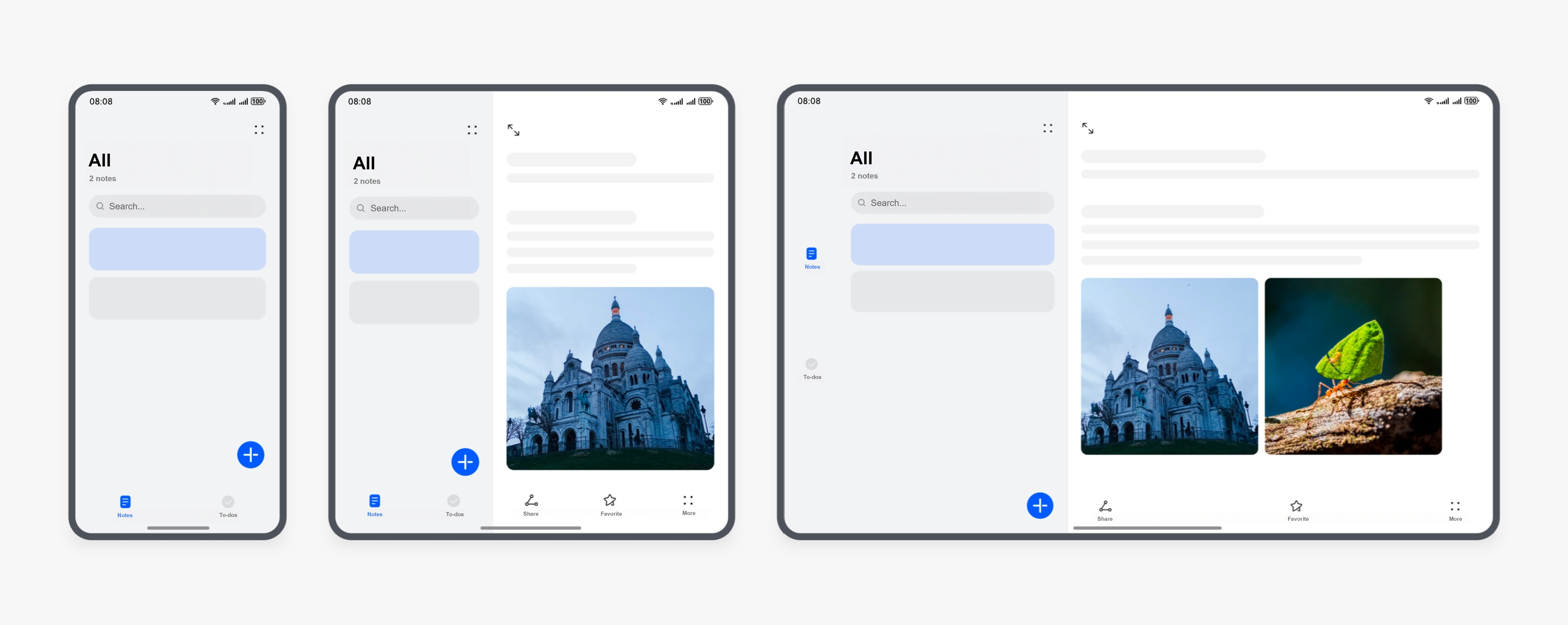
Responsive layout allows elements on a page to automatically adjust based on the window size. As the most frequently used feature, the screen width is divided into different ranges (that is, breakpoints) by the system. When the window width transitions between breakpoints, the page layout changes (for example, switching from single-column to double-column or even triple-column arrangement) to achieve better display effects.
For details about how to implement responsive layout, see Responsive Layout.
- Interaction Unification
In the development of cross-device apps, user interaction experience is a key indicator for evaluating overall app quality. With various input methods such as touchscreens, mouse devices, keyboards, and remote controls, you need to consider interaction adaptation for different devices.
Interaction unification is a response framework for adapting to multi-device inputs. It unifies various input behaviors into standardized events, ensuring consistent interactive experience across different devices. You only need to call the unified APIs without any adaptation to each input device, which greatly simplifies the development process.

For details about how to develop interaction events, see Cross-Device Interaction.
[h2]Feature Development
SystemCapability (SysCap) refers to a standalone feature in the operating system, such as Bluetooth, Wi-Fi, NFC, and camera. Each SysCap corresponds to multiple APIs, whose availability depends on the support of the target device.
During cross-device app development, the default required SysCap set is an intersection of multiple supported SysCap sets, and the default associated SysCap set is a union of multiple supported SysCap sets. An app can be distributed, installed, and run on a device only when the required SysCap set is a subset of the device's supported SysCap set. Therefore, the SysCap mechanism can be used to intercept and control operations at each phase to ensure that apps are installed successfully and function correctly on target devices.
For details about how to develop cross-device features, see Cross-Device Feature Development.
Scenario Cases
Leveraging the one-for-multi capabilities provided by HarmonyOS, you can efficiently adapt to multiple vertical service scenarios based on a single code system, enabling cross-device and cross-form app deployment. By flexibly utilizing this system-level feature, you cannot only ensure that your apps cover various device forms—such as smartphones, tablets, and wearables—but also quickly respond to diverse needs from industries like finance, healthcare, education, and transportation. This comprehensively boosts your app development efficiency and deployment quality.
[h2]Service Scenario Cases
Adapt the one-for-multi feature to multiple scenarios to deliver a better browsing and interaction experience. The following are design suggestions provided for typical pages in specific vertical scenarios.
- Entertainment
Apps or service scenarios such as long videos, short videos, live streaming, and music are common. The core of these scenarios lies in immersive video playback and interaction. Centered around this core, such apps feature: massive video resources (enabling users to browse quickly); immersive video playback status (with sustained user engagement); simple information architecture with a flat hierarchy (suitable for special design optimizations); quick gesture interactions that are easy to learn and highly immersive (smooth operation flow); emphasis on interactions between creators and viewers (social elements); and exploration and expansion of related services such as multi-party co-hosted live streams, in-video product promotion (business opportunities).

Best practice: Long Video
- Social communication
The social communication scenario mainly involves apps for social feeds, instant messaging, calls, and conferences. This scenario aims to enable users to enjoy efficient browsing and interaction, which requires an app to avoid displaying some elements too large because this may deteriorate the interaction efficiency on the large screen. You are advised to focus on the adaptation of the following pages for better user experience: home page, details page, instant messaging page, and call page.

Best practice: Instant Messaging
- News
News apps are essentially about information aggregation. Typical scenarios for such apps are the home page and details page. On wide-screen devices, the home page needs to be adapted to the extended layout or repetition layout to ensure higher browsing efficiency. The left-right layout can be used for the details page to implement commenting while browsing, offering users a more comfortable reading experience.


Best practice: News & Reading
- E-commerce shopping
Apps or scenarios such as shopping and grocery purchase aim to enable users to enjoy efficient browsing and interaction. They mainly include product browsing, price comparison, and livestream shopping. A large-screen device can display more product choices and provide a more lightweight and efficient interaction experience. Apps of this type feature: comfortable and visually appealing UI layout, more product information displayed per screen, efficient details comparison, quick and smooth UI interactions, and key information free from interference.

Best practice: Shopping
- Lifestyle
Lifestyle scenarios include ordering meals, watching movies, and reading guides. In such scenarios, users can enjoy more efficient and smooth experience on a wide screen.

Best practice: Lifestyle
- Travel and accommodation
Travel and accommodation, and ticket booking scenarios usually include core functions such as train/air ticket booking, hotel booking, and ticket information query. Based on these core functions, the scenarios aim to provide smooth and immersive user experience and more lightweight and efficient interaction experience.

Best practice: Travel Booking
- Travel and navigation
Travel and navigation scenarios typically include core functions such as location information query, route suggestions, navigation, and ride-hailing. Users can experience interactions between the floating panel and the underlying map. For these core scenarios, apps of this type feature: a bottom semi-modal panel on smartphones and a side semi-modal panel on other devices; a panel supporting multi-level height adjustment using swipes; the default panel height varying with screen size to fully leverage the advantages of different screen sizes; a side semi-modal panel on foldable phones and tablets allowing users to manually drag it to the left or right; tabs placed within the semi-modal panel on widescreen devices such as foldable phones and tablets.

Best practice: Map Navigation
[h2]Device Scenario Cases
Adaptation to different devices can make full use of their hardware features, such as the semi-folded state of foldable phones and large screens of tablets and PCs/2-in-1 devices, to provide a better experience.
- Foldable phone adaptation
The foldable phone can be folded at a right angle, allowing it to stand upright on a flat surface for hands-free use. This state is suitable for tasks that do not require frequent interaction, such as video calls, video playback, photo taking, and music playing.


During switching from the folded state to the unfolded state, avoid UX degradation caused by page jumps, increased operation steps, or more complex operations. The original immersive experience of the app should be retained, and changes made to user experience and habits for the sake of content expansion or screen splitting should be avoided. During switching between the folded and unfolded states, the continuity of the current task must be ensured. Tasks and related state before the switch can be saved and continued, or can be quickly restored, providing continuous user experience. No exceptions such as unexpected exit or restart occur.

For details about how to adapt your app to foldable phones, see Semi-Folded State of Foldable Screens and Bi-fold Phone App Development.
- Multi-device support
You need to take the hardware capabilities and use cases of different devices into full consideration during development, to design and adapt apps accordingly.
Take tablets and PCs as examples. As important devices in the 1+8 all-scenario ecosystem of HarmonyOS, they play a key role in daily scenarios such as learning, office, and entertainment. To develop apps delivering better experiences, you must understand the unique features of these devices:
- Large screen with high resolution: Compared with smartphones, they have larger screens and higher resolutions, enabling richer content display and information layout.
- Support for both landscape and portrait modes: Users can freely switch between landscape and portrait modes based on their habits.
- Support for multi-window mode: Full-screen display and freeform window layout are supported, improving multi-task processing efficiency.
- Support for keyboard and mouse input: They are compatible with keyboard and mouse operations, meeting desktop-level interaction requirements.
For details about how to implement device feature adaptation, see Mobile Phones, Tablets, PCs, and Wearables.
Basics
This section describes some basic knowledge for you to better understand the upcoming chapters.
[h2]ArkUI
ArkUI is a UI development framework that provides what you'll need to develop app UIs.
ArkUI comes with two development paradigms: JavaScript-based web-like development paradigm (web-like development paradigm for short) and ArkTS-based declarative development paradigm (declarative development paradigm for short).
-
Declarative development paradigm: uses the TypeScript programming language and extends the declarative UI syntax, providing UI drawing capabilities from three key aspects: components, animations, and state management. The programming mode used is closer to natural semantics. You can intuitively describe the UI without caring about how the framework implements UI drawing and rendering, leading to simplified and efficient development. With type annotations in TypeScript, you can enforce type checking at compile time. If you are developing large-scale apps, the declarative development paradigm is more applicable.
-
Web-like development paradigm: uses the classical three-stage programming model, in which HarmonyOS Markup Language (HML) is used for building layouts, CSS for defining styles, and JavaScript for adding processing logic. UI components are associated with data through one-way data-binding. This means that when data changes, the UI automatically updates with the new data. This development paradigm has a low learning curve for frontend web developers, allowing them to quickly transform existing web apps into ArkUI apps. It could be helpful if you are developing small- and medium-scale apps with simple UIs.
The following table compares the two development paradigms.
| Development Paradigm | Programming Language | UI Update Mode | Applicable To | Intended Audience |
|---|---|---|---|---|
| Declarative development paradigm | ArkTS | Data-driven | Apps with high complexity and intensive team collaboration | Mobile app and system app developers |
| Web-like development paradigm | JavaScript | Data-driven | Small- and medium-scale apps and service widgets with simple UIs | Frontend web developers |

The declarative development paradigm occupies less memory. It is recommended that you use this development paradigm to set up app UIs.
[h2]Project Structure
Based on a single code project, the layered architecture design of HarmonyOS apps aims to support Huawei 1+8 all-scenario devices, such as smartphones and PCs/2-in-1 devices, achieving one-time development for multi-device deployment. The layered architecture consists of product customization layer, basic feature layer, and common capability layer, providing a clear, efficient, and scalable design architecture. The following three-layer project structure is recommended for app development.

-
common (common capability layer)
This layer stores common basic capabilities, such as common UI components, data management, external interaction, and tool library for cross-app use.
Its stable and reliable functionalities ensure the stability and maintainability of apps.
The common layer can be compiled into one or more HAR or HSP packages. This layer can only be depended on by products and features, but it must not depend on them in return.
-
features (basic feature layer)
This layer is above the common capability layer and stores relatively independent feature UIs and service logic implementations. Each feature module boasts high cohesion, low coupling, and customizability, enabling flexible deployment across products.
This layer delivers a suite of stable and basic features, including UI components and basic services, while the common capability layer provides common functionalities and services for it.
Features at the basic feature layer are modularized to enhance system scalability and maintainability. For example, each option on the bottom navigation bar of an app represents an independent service module.
-
products (product customization layer)
This layer is designed to meet personalized requirements of different devices or scenarios, including UI design, resources and configurations, interaction logic, and functionalities.
Each subdirectory of the products layer is compiled into an entry HAP as the main entry of an app. The products layer cannot be called laterally.
As the entry point of the app and the UI for user interaction, this layer can be flexibly adjusted and extended to accommodate various scenarios.
The abstracted code structure is as follows:
/application
├── common                  # Optional. Common capability layer, which will be compiled into one or more HARs or HSPs.
├── features                # Optional. Basic feature layer.
│   ├── feature1            # Sub-feature 1, which will be compiled into a HAR, an HSP, or a feature HAP.
│   ├── feature2            # Sub-feature 2, which will be compiled into a HAR, an HSP, or a feature HAP.
│   └── ...
└── products                # Mandatory. Product customization layer.
    ├── wearable            # Category of wearables, which will be compiled into an entry HAP.
    ├── default             # Category of default devices, which will be compiled into an entry HAP.
└── ... 
-
The code structure varies with the deployment model. The main differences between deployment model A and model B lie in the products layer. In model A, functions and features are integrated in the same subdirectory under the products directory. In model B, differential functions and features are integrated for different products in different subdirectories under the products directory.
-
In the development phase, maximize the code reuse among different types of devices to reduce the workload of development and subsequent maintenance.
-
The entire code project is built into an application package, which will be released to the AppGallery.
- For details, see Layered Architecture Design.
[h2]Application Bundle Structure
During app development, an app usually contains one or more modules. As a basic functional unit of apps/atomic services, a module contains source code, resource files, third-party libraries, and app/atomic service configuration files. Each module can be built and run independently.
Modules are classified into two types: Ability and Library.
-
Ability modules generate HAPs after compilation.
An app is released as an APP Pack, which contains one or more HAPs. A HAP is the basic unit for app installation and it can be classified into two types:
-
Entry type: main module of the app. In an app, each type of device supports only one entry HAP, which is typically used to implement the app's entry screen, entry icon, or primary feature.
-
Feature type: dynamic feature module of the app. An app package may or may not contain one or more feature HAPs used to implement the app features.

For details about the entry HAP, feature HAP, HAR, HSP, and APP Pack, see Application Package Structure in Stage Model.
[h2]Deployment Model
There are two one-for-multi deployment models:
-
Model A: Based on a certain project structure, the same HAPs (or HAP combinations) are generated through one-time build for different types of devices.
-
Model B: Based on a certain project structure, the different HAPs (or HAP combinations) are generated through one-time build for different types of devices.
You can choose one of the two deployment models based on the app UX design and features in specific service scenarios. Also, you can quickly choose the appropriate model by device type.
Based on the screen size, interaction mode, and interaction distance, devices can be classified into the following categories:
-
Smartphones and tablets
-
In-vehicle infotainment (IVI) systems and Visions
-
Wearables
-
…

Once an app completes adaptation with one-for-multi capabilities, in scenarios where smartphones and IVI systems collaborate, the app can be transferred to the vehicle's display via Super Home Screen without re-adaptation.
For devices of the same category, model A is preferred. For devices of different categories, model B is preferred.

-
Model A is applicable when minimal variations exist in UX designs or features across different categories of devices.
-
Model B is applicable when significant variations exist in UX designs or features across different devices of the same category. Ensure that these designs and features are properly implemented for each device.
-
The concepts of the two deployment models are introduced to help you better understand the basic knowledge. During cross-device app development, if there are multiple types of target devices, model A and model B are usually used together.
-
No matter which model is used, one-time build should be performed.