Powered by the ArkTS-based declarative development paradigm, ArkUI is a simplified, high-performance UI development framework for cross-device applications. It provides the capabilities required for building the application UI, including:
-
ArkTS
ArkTS is the preferred programming language for application development. Extending the TypeScript ecosystem, ArkTS enhances it with capabilities tailored for application development, including declarative UI description, custom components, dynamic UI element extension, state management, and rendering control. State management in ArkTS provides clear page re-render processes and pipes through decorators with different functions. It covers UI component states and application states, allowing for a comprehensive data update and UI rendering mechanism across the application. To learn more about ArkTS, see Getting Started with ArkTS.
-
Layout
Layout defines how components are laid out in the UI. ArkUI offers a diverse array of layout options. Besides the basic layouts, such as linear, stack, flex, and relative, advanced layouts including list, grid, and swiper are available for more complex UI design requirements.
-
Component
Components are essential elements of the UI, working together to shape the UI. They can be classified as system components provided by ArkUI and custom components defined by developers. The system components include buttons, radio buttons, progress indicators, and text. You can set the rendering effect of these components in method chaining mode. You can combine system components to create custom components. In this way, page components are divided into independent UI units to implement individual creation, development, and reuse of different units on pages, making pages more engineering-oriented.
-
Page routing and component navigation
You can design the application's UI into multiple functional pages using NavDestination. These pages are managed in a stack structure, and transitions between them, such as navigating to a new page or going back to the previous one, are handled by the navigation container Navigation, enabling functional decoupling within the application.
-
Graphics
ArkUI offers diversified graphics capabilities, including capabilities to display images in various formats and custom drawing capabilities. By leveraging these capabilities, you can easily bring your custom drawing ideas into reality.
-
Animation
Apart from animations embedded in components, ArkUI offers additional animation features: attribute animation, explicit animation, transition animation, and animation APIs. You can customize animation tracks by calling the provided animation APIs in addition to using the encapsulated physical models.
-
Interaction event
Interaction events are important for interactions between the UI and users. ArkUI allows users to interact with your application UI, with support for various universal events and gesture events. Universal events include touch events, mouse events, key events, and focus events. Gesture events accept single gestures (tap, long press, pan, pinch, rotation, and swipe), and a combination of gestures.
-
Customization
ArkUI offers comprehensive customization capabilities for UI development and personalization: custom combinations, extensions, nodes, and rendering techniques.
Highlights
-
Simplified and efficient development
- Simple code: You can describe the UI in pseudo-natural language, without caring about how the framework implements UI drawing and rendering.
- Data-driven UI change: This allows you to better focus on your service logic processing. When the UI changes, you do not need to write code for switching between different UIs. Instead, you only need to write the data that causes the UI change and let the framework take over the rest.
- Improved development experience: Just code to get the UI developed.
-
High performance
- Declarative UI frontend and backend layering: The UI backend, constructed using the C++ programming language, provides basic components, layout, animations, interaction events, component state management, and rendering pipelines for the frontend.
- Language compiler and runtime optimization: The productivity punch includes unified bytecode, efficient Foreign Function Interface (FFI), ahead-of-time (AOT), engine minimization, and type optimization.
-
Promising ecosystem
ArkUI can gain traction with its relatively neutral and developer-friendly programming language. It can tap on the ecosystems of mainstream languages and advance along an evolutionary path with standards organizations.
Architecture
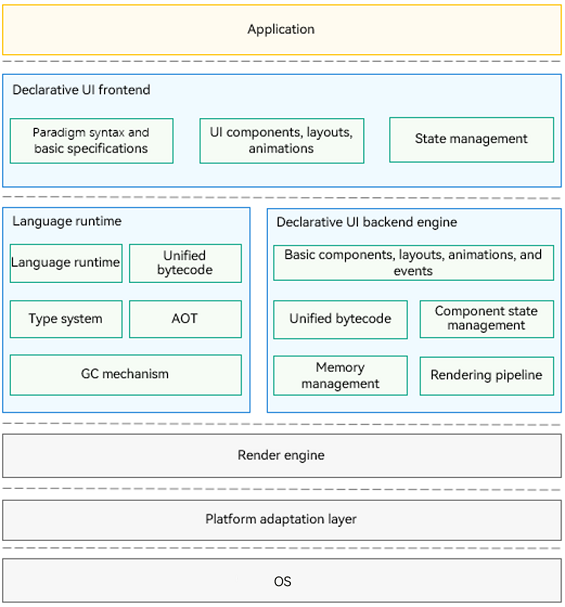
Figure 1 Overall architecture
-
Declarative UI frontend
Provides basic language specifications of the UI development paradigm, built-in UI components, layout, and animations, and multiple state management mechanisms, with a wide array of APIs for you to call as required.
-
Language runtime
Provides the parsing capability for the UI paradigm syntax and allows for cross-language API calls for a high-performance operating environment of the TS language.
-
Declarative UI backend engine
Provides UI rendering pipelines that are compatible with different development paradigms, multiple basic components, layout calculation, animations, and interaction events, with state management and drawing capabilities.
-
Render engine
Provides efficient drawing capabilities, which enable rendering instructions collected by the rendering pipeline to be drawn to the screen.
-
Platform adaptation layer
Provides abstract APIs to connect to different systems, such as system rendering pipelines and lifecycle scheduling.
Development Process
The table below lists the main tasks involved in UI development with ArkUI.
| Task | Description | Guide |
|---|---|---|
| Get started with ArkTS | Learn the basic syntax, state management, and rendering control scenarios of ArkTS. | |
| Set component navigation and page routing | Set up navigation between components and implement page routing. | |
| Lay out components | Implement your UI using common layout techniques. | - Layout Overview |
| Use lists and grids | Work with list and grid components. | - List and Grid Overview |
| Use text | Integrate and manage text components such as text boxes, rich text, and styled strings. | |
| Display media | Show media content using media display components. | |
| Buttons and selections | Describe how to use several commonly used button and selection components. | - Button and Selection Component Overview |
| Add components | Use the XComponent component for custom rendering and Progress indicators. | |
| Use popup windows | Learn when and how to use popup windows. | - Toast |
| Graph Drawing | Understand how to draw custom geometry and make custom graphics on the canvas. | |
| Implement interactions | Implement interactions using basic mechanisms, input device events, and gesture response. | |
| Use animations | Apply animations to components and pages for various visual effects. | |
| Use customization capabilities | Learn the basic concepts of customization capabilities and how to apply them. | |
| Implement UI internationalization | Implement an internationalized application UI, including resource configuration and support for right-to-left (RTL) layouts. | - Implementing UI Internationalization |
| Implement accessibility and aging-friendly support | Implement accessibility features and aging-friendly adaptations. | |
| Set the theme | Explore application-level and page-level theme setting capabilities. | |
| Utilize UI contextual capabilities | Use UIContext APIs to access instance-bound objects and launch atomic services in full-screen mode. |
General Rules
-
Default Unit
The default unit for input parameters representing length is vp, which means that input parameters of number type, as well as the number units in Length and Dimension types, are in vp.
-
Abnormal Value Processing
If the input parameter is undefined, null, or an invalid value, the following processing rules apply:
(1) If a default value is specified for the parameter, it is used.
(2) If no default value is specified for the parameter, the property or API associated with that parameter is ineffective.