The ArkUI development framework provides seven adaptive layout capabilities for common development scenarios. These layouts can be used independently or together.
Layout Type | Capability | When to Use | How to Implement |
|---|---|---|---|
Adaptive stretching | As the container resizes, the incremental or decremental space is all allocated to the specified area in the container component. | Use the flexGrow and flexShrink properties of Flex layout. | |
As the container resizes, the incremental or decremental space is evenly allocated to all blank areas in the container component. | Set the justifyContent property of the Row, Column, or Flex component to FlexAlign.SpaceEvenly. | ||
Adaptive scaling | Child components dynamically adjust their width or height according to preset ratios as the container resizes. | Two implementation methods based on common properties: - Set the width and height of the child components to a percentage of that of the parent component. - Use the layoutWeight property. | |
Child components dynamically adjust their width or height according to preset ratios as the container resizes, with its aspect ratio fixed. | Use the aspectRatio property in Layout Constraints. | ||
Adaptive extension | The child components within a container component are displayed or hidden according to their sequence in the list as the container resizes. | Two implementation methods based on container components: - Use the List component. - Use the Scroll component together with the Row or Column component. | |
The child components within a container component are displayed or hidden according to their preset priority as the container resizes. Child components with the same priority are displayed or hidden at the same time. | Use the displayPriority property in Layout Constraints. | ||
Adaptive wrapping | If the screen is insufficient to display the complete content as the container resizes, the system automatically wraps the content. | Set the wrap property of the Flex component to FlexWrap.Wrap. |
The following describes these adaptive layout capabilities in sequence.
Stretching Capability
The stretching capability refers to that as the container resizes, all the incremental or decremental space is allocated to the specified area in the container component.
It is usually implemented through the flexGrow and flexShrink properties of the Flex layout. These two properties are often used together with the flexBasis property. Therefore, the three properties are described together in the following table.
Property | Type | Default Value | Description |
|---|---|---|---|
flexGrow | number | 0 | This property takes effect only when the width of the parent container is greater than the total width of all child components. Child components configured with this property stretch proportionally to allocate the incremental space of the parent container. |
flexShrink | number | 1 | This property takes effect only when the width of the parent container is less than the total width of all child components. Child components configured with this property shrink proportionally to distribute all space deficits of the parent container. |
flexBasis | 'auto' | Length | 'auto' | This property sets the base dimension of a component in the main axis of the Flex layout. 'auto' means to use the original size of the component without making any changes. The flexBasis property is optional. The same effect can be achieved by setting width or height. When the flexBasis property conflicts with width or height, the flexBasis property takes effect. |

If you want to allocate all the remaining space of the parent container to a blank area, use the Blank component. Note that the Blank component takes effect only when the parent component is a Row, Column, or Flex component.
The web-like development paradigm also uses flex-grow and flex-shrink to implement the stretching capability. In addition, flex-basis can also be configured. For details, see Universal Styles.
The web-like development paradigm does not provide the Blank component, but the div component can be used to simulate the behavior of the Blank component, for example, <div style='flex-grow: 1; flex-shrink: 0; flex-basis: 0'></div>.
Example 1
This example consists of the content area (including an image) in the middle and the blank areas on the left and right sides. The properties of each area are configured as follows:
Set the width of the content area to 300 vp, flexGrow to 1, and flexShrink to 0.
Set the width of the left and right margins to 150 vp, flexGrow to 0, and flexShrink to 1.
In this case, the base dimension of the parent container is 600 vp (150 vp + 300 vp + 150 vp).
You can drag the slider at the bottom to resize the parent container and view the layout change.
When the size of the parent container is greater than 600 vp, all the incremental space in the parent container is allocated to the content area.
When the size of the parent container is less than 600 vp, the blank areas on both sides shrink in the ratio of 1:1, that is, the space deficits of the parent container are evenly distributed.

@Entry
@Component
struct FlexibleCapability1 {
  @State sliderWidth: number = 1000;

  // Bottom slider - adjust container size by dragging the slider.
  @Builder
  slider() {
    Slider({ value: this.sliderWidth, min: 300, max: 1000 })
      .blockColor(Color.White)
      .width('60%')
      .onChange((value: number) => {
        this.sliderWidth = value;
      })
      .position({ x: '20%', y: '80%' })
  }

  build() {
    Column() {
      Flex({ justifyContent: FlexAlign.Center, alignItems: ItemAlign.Center }) {
        // Distribute all extra space to the image using flexGrow and allocate all insufficient space to the side margins using flexShrink.
        Row()
          .width(150)
          .height(400)
          .backgroundColor($r('sys.color.comp_background_primary'))
          .flexGrow(0)
          .flexShrink(1)
        Image($r('app.media.illustrator'))
          .width(300)
          .height(400)
          .objectFit(ImageFit.Contain)
          .backgroundColor('#66F1CCB8')
          .flexGrow(1)
          .flexShrink(0)
        Row()
          .width(150)
          .height(400)
          .backgroundColor($r('sys.color.comp_background_primary'))
          .flexGrow(0)
          .flexShrink(1)
      }
      .width(this.sliderWidth)

      this.slider()
    }
    .width('100%')
    .height('100%')
    .backgroundColor($r('sys.color.background_secondary'))
    .alignItems(HorizontalAlign.Center)
    .justifyContent(FlexAlign.Center)
  }
}
Example 2
The size of the text and switch is fixed. Only the blank area in the middle (Blank component) scales with the size of the parent container.

@Entry
@Component
struct FlexibleCapability2 {
  @State rate: number = 0.8;

  // Bottom slider - resize container by dragging the slider control.
  @Builder
  slider() {
    Slider({ value: this.rate * 100, min: 55, max: 80 })
      .blockColor(Color.White)
      .width('60%')
      .onChange((value: number) => {
        this.rate = value / 100;
      })
      .position({ x: '20%', y: '80%' })
  }

  build() {
    Row() {
      Row() {
        Text($r('app.string.healthy_use_phone'))
          .fontSize(16)
          .width(135)
          .height(22)
          .fontWeight(FontWeight.Medium)
          .lineHeight(22)
        // Implement stretch capability using the Blank component.
        Blank()
        Toggle({ type: ToggleType.Switch })
          .width(36)
          .height(20)
      }
      .height(55)
      .borderRadius(12)
      .padding({ left: 13, right: 13 })
      .backgroundColor($r('sys.color.comp_background_primary'))
      .width(this.rate * 100 + '%')

      this.slider()
    }
    .width('100%')
    .height('100%')
    .backgroundColor($r('sys.color.background_secondary'))
    .alignItems(VerticalAlign.Center)
    .justifyContent(FlexAlign.Center)
  }
}
Equal Space Distribution Capability
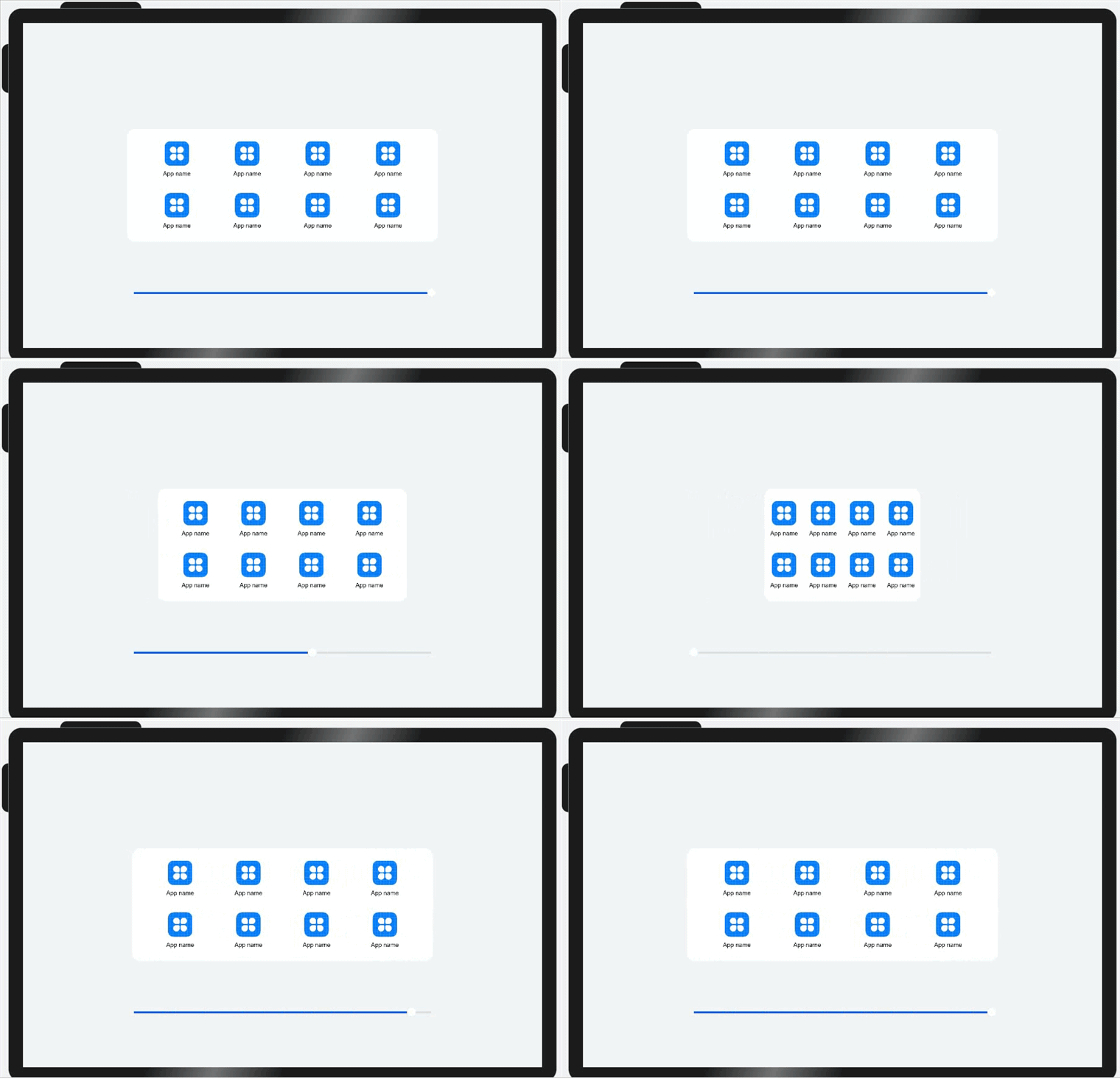
The equal space distribution capability refers to that as the container resizes, the incremental or decremental space is evenly allocated to all blank areas in the container component. It is usually used in scenarios where the number of content items is fixed and these items are evenly displayed, such as the toolbar and bottom menu bar.
Equal space distribution is achieved by setting the justifyContent property of the Row, Column, or Flex component to FlexAlign.SpaceEvenly. This results in child elements being laid out with equal spacing along the main axis, where the intervals between adjacent elements, as well as the spacing before the first element and after the last element, are identical.

Example
As the parent container resizes, icon and text sizes remain constant while gutters between adjacent icons and margins from container edges adjust equally.
@Entry
@Component
struct EquipartitionCapability {
  @State rate: number = 0.6;
  private list: number [] = [0, 1, 2, 3];

  // Bottom slider - adjust container dimensions via slider drag interaction.
  @Builder
  slider() {
    Slider({ value: this.rate * 100, min: 30, max: 60 })
      .blockColor(Color.White)
      .width('60%')
      .height(50)
      .onChange((value: number) => {
        this.rate = value / 100;
      })
      .position({ x: '20%', y: '80%' })
  }

  @Builder
  Item() {
    Column() {
      Image($r('app.media.icon'))
        .width(48)
        .height(48)
        .margin(({ top: 8 }))
      Text($r('app.string.show_app_name'))
        .width(64)
        .height(30)
        .lineHeight(15)
        .fontSize(12)
        .textAlign(TextAlign.Center)
        .margin({ top: 8 })
        .padding({ bottom: 15 })
    }
    .width(80)
    .height(102)
  }

  build() {
    Row() {
      Column() {
        // Distribute remaining space evenly along the main axis of the parent container.
        Flex({ justifyContent: FlexAlign.SpaceEvenly }) {
          ForEach(this.list, () => {
            this.Item();
          }, (item: number, index: number) => item.toString() + index)
        }

        // Distribute remaining space evenly along the main axis of the parent container.
        Flex({ justifyContent: FlexAlign.SpaceEvenly }) {
          ForEach(this.list, () => {
            this.Item();
          }, (item: number, index: number) => item.toString() + index)
        }
      }
      .width(this.rate * 100 + '%')
      .height(222)
      .padding({ top: 16 })
      .backgroundColor($r('sys.color.font_on_primary'))
      .borderRadius(16)

      this.slider()
    }
    .width('100%')
    .height('100%')
    .backgroundColor($r('sys.color.background_secondary'))
    .alignItems(VerticalAlign.Center)
    .justifyContent(FlexAlign.Center)
  }
}
Proportional Scaling Capability
The proportional scaling capability refers to that the width and height of child components vary with the container component according to the preset ratio.
It can be implemented in either of the following ways:
Set the width/height of the child component to a percentage of the width/height of the parent component. For details, see Size and Length.
Use the layoutWeight property to configure the layout weight of sibling components along the main axis of the parent container. For details, see Size.
- When the size of the parent container is determined, the space along the main axis of the parent container is allocated to the child components based on the preset weight.
- The layoutWeight property takes effect only when the parent container is the Row, Column, or Flex component.
- After layoutWeight is set, the size of the component becomes invalid. For example, if both .width('40%') and .layoutWeight(1) are set, only .layoutWeight(1) takes effect.
The layoutWeight property has usage limitations. Therefore, in actual use, the width and height of child components are typically set as percentages of the parent component to implement the proportional scaling capability.

The proportional scaling capability is widely applied in development and can be implemented through various approaches. For example, the columnsTemplate property of the Grid component can be used to set the number of columns and their width ratios in the grid container. Alternatively, proportional scaling can be achieved by configuring child components to occupy different numbers of columns in the grid system.
The web-like development paradigm also supports setting the width and height of components as percentages. For details, see the introduction to width and height in Universal Styles and Length Type.
Similar to the layoutWeight property in the declarative development paradigm, the web-like development paradigm provides a flex-weight style to configure the layout weight of sibling components in the main axis direction of the parent container.
Example
For a basic playback control bar, the layoutWeight properties of the Previous, Play/Pause, and Next buttons are all set to 1. Therefore, the space along the main axis of the parent container is evenly distributed in the ratio of 1:1:1.
Replacing .layoutWeight(1) of the three buttons with .width('33%'), .width('34%'), and .width('33%') respectively can achieve the same display effect.

@Entry
@Component
struct ProportionCapability {
  @State rate: number = 0.5;

  // Bottom slider - adjust container size through slider drag interaction.
  @Builder
  slider() {
    Slider({ value: 100, min: 25, max: 50 })
      .blockColor(Color.White)
      .width('60%')
      .height(50)
      .onChange((value: number) => {
        this.rate = value / 100;
      })
      .position({ x: '20%', y: '80%' })
  }

  build() {
    Row() {
      Row() {
        Column() {
          Image($r('app.media.down'))
            .width(48)
            .height(48)
        }
        .height(96)
        // Set the layout weight of child components along the main axis of the parent container.
        .layoutWeight(1)
        .justifyContent(FlexAlign.Center)

        Column() {
          Image($r('app.media.pause'))
            .width(48)
            .height(48)
        }
        .height(96)
        .layoutWeight(1)
        .backgroundColor('#66F1CCB8')
        .justifyContent(FlexAlign.Center)

        Column() {
          Image($r("app.media.next"))
            .width(48)
            .height(48)
        }
        .height(96)
        .layoutWeight(1)
        .justifyContent(FlexAlign.Center)
      }
      .width(this.rate * 100 + '%')
      .height(96)
      .borderRadius(16)
      .backgroundColor($r('sys.color.comp_background_primary'))

      this.slider()
    }
    .width('100%')
    .height('100%')
    .backgroundColor($r('sys.color.background_secondary'))
    .alignItems(VerticalAlign.Center)
    .justifyContent(FlexAlign.Center)
  }
}
Scaling Capability
The scaling capability refers to that the width and height of a child component change with the container component, with its aspect ratio fixed during the process.
It uses the percentage-based layout and fixed aspect ratio (aspectRatio property) to implement adaptive content adjustment as the container resizes.
You can access Layout Constraints to learn more about the aspectRatio property.

The web-like development paradigm also provides the aspect-ratio style to fix the aspect ratio of a component.
Example
A border is added to the Column component in the example for a clear view. When the Column component scales up or down as the Flex parent component resizes, the preset aspect ratio remains unchanged and the image in the Column component is always displayed properly.

@Entry
@Component
struct ScaleCapability {
  @State sliderWidth: number = 400;
  @State sliderHeight: number = 400;

  // Bottom slider - adjust container size through slider drag interaction.
  @Builder
  slider() {
    Slider({
      value: this.sliderWidth,
      min: 100,
      max: 400,
      style: SliderStyle.OutSet
    })
      .blockColor(Color.White)
      .width('60%')
      .height(50)
      .onChange((value: number) => {
        this.sliderWidth = value;
      })
      .position({ x: '20%', y: '80%' })
    Slider({
      value: this.sliderHeight,
      min: 100,
      max: 400,
      style: SliderStyle.OutSet
    })
      .blockColor(Color.White)
      .width('60%')
      .height(50)
      .onChange((value: number) => {
        this.sliderHeight = value;
      })
      .position({ x: '20%', y: '87%' })
  }

  build() {
    Column() {
      Column() {
        Column() {
          Image($r('app.media.illustrator'))
            .width('100%')
            .height('100%')
        }
        // Maintain fixed aspect ratio.
        .aspectRatio(1)
        // Decorative border (purely for visual demonstration purposes).
        .border({ width: 2, color: '#66F1CCB8' })
      }
      .backgroundColor($r('sys.color.comp_background_primary'))
      .height(this.sliderHeight)
      .width(this.sliderWidth)
      .alignItems(HorizontalAlign.Center)
      .justifyContent(FlexAlign.Center)

      this.slider()
    }
    .height('100%')
    .width('100%')
    .backgroundColor($r('sys.color.background_secondary'))
    .alignItems(HorizontalAlign.Center)
    .justifyContent(FlexAlign.Center)
  }
}
Extension Capability
The extension capability refers to the behavior where child components within a container component show or hide in their list order as the container component resizes. Different numbers of elements can be displayed based on the size of the display area.
It can be implemented in either of the following ways:

The layout calculation and rendering of all subnodes in the List, Row, or Column component are done when the page is displayed. However, only part of the subnodes can be viewed by users due to the size of the parent container. As the size of the parent container increases, more subnodes are exposed to users. The user can also swipe the list to view hidden subnodes.
The web-like development paradigm can also use the List component to implement extension capability.
The web-like development paradigm does not provide the Scroll component. Instead, you can set the overflow style of the div component to scroll to simulate its behavior (that is, when the size of child elements along the main axis of the div component exceeds the size of the div component, scrolling is enabled to display the content).
Example
Ad the parent container resizes, the number of icons displayed on the page changes accordingly.
This example demonstrates implementations using the List component, and alternatively using the Scroll component in conjunction with the Row component.

(1) Use the List component.
@Entry
@Component
struct ExtensionCapability2 {
  @State rate: number = 0.60;
  private appList: number [] = [0, 1, 2, 3, 4, 5, 6, 7];

  @Builder
  slider() {
    Slider({ value: this.rate * 100, min: 8, max: 60 })
      .blockColor(Color.White)
      .width('60%')
      .height(50)
      .onChange((value: number) => {
        this.rate = value / 100;
      })
      .position({ x: '20%', y: '80%' })
  }

  build() {
    Row() {
      Row({ space: 10 }) {
        // Implement extension capability through List component.
        List({ space: 10 }) {
          ForEach(this.appList, () => {
            ListItem() {
              Column() {
                Image($r('app.media.icon'))
                  .width(48)
                  .height(48)
                  .margin({ top: 8 })
                Text($r('app.string.show_app_name'))
                  .width(64)
                  .height(30)
                  .lineHeight(15)
                  .fontSize(12)
                  .textAlign(TextAlign.Center)
                  .margin({ top: 8 })
                  .padding({ bottom: 15 })
              }
              .width(80)
              .height(102)
            }
            .width(80)
            .height(102)
          }, (item: number, index: number) => item.toString() + index)
        }
        .padding({ top: 16, left: 10 })
        .listDirection(Axis.Horizontal)
        .width('100%')
        .height(118)
        .borderRadius(16)
        .backgroundColor(Color.White)
      }
      .width(this.rate * 100 + '%')

      this.slider()
    }
    .width('100%')
    .height('100%')
    .justifyContent(FlexAlign.Center)
    .alignItems(VerticalAlign.Center)
  }
}
(2) Use the Scroll component in conjunction with the Row component.
@Entry
@Component
struct ExtensionCapability1 {
  @State rate: number = 0.60;
  private appList: number [] = [0, 1, 2, 3, 4, 5, 6, 7];

  @Builder
  slider() {
    Slider({ value: this.rate * 100, min: 8, max: 60 })
      .blockColor(Color.White)
      .width('60%')
      .height(50)
      .onChange((value: number) => {
        this.rate = value / 100;
      })
      .position({ x: '20%', y: '80%' })
  }

  build() {
    Row() {
      // Implement extension capability through Scroll and Row(or Column) components.
      Scroll() {
        Row({ space: 10 }) {
          ForEach(this.appList, () => {
            Column() {
              Image($r('app.media.icon'))
                .width(48)
                .height(48)
                .margin({ top: 8 })
              Text($r('app.string.show_app_name'))
                .width(64)
                .height(30)
                .lineHeight(15)
                .fontSize(12)
                .textAlign(TextAlign.Center)
                .margin({ top: 8 })
                .padding({ bottom: 15 })
            }
            .width(80)
            .height(102)
          }, (item: number, index: number) => item.toString() + index)
        }
        .padding({ top: 16, left: 10 })
        .height(118)
        .borderRadius(16)
        .backgroundColor(Color.White)
      }
      .scrollable(ScrollDirection.Horizontal)
      .width(this.rate * 100 + '%')

      this.slider()
    }
    .width('100%')
    .height('100%')
    .alignItems(VerticalAlign.Center)
    .justifyContent(FlexAlign.Center)
  }
}
Hiding Capability
The hiding capability refers to that the visibility of a child component within a container component is subject to its preset display priority and the size of the container component. Child components with the same display priority are displayed or hidden simultaneously. This is an advanced layout technique, typically used in scenarios with significant resolution changes where displayed content varies across different resolutions. The core concept is to maintain optimal display effects by adjusting the amount of visible content.
The hiding capability is controlled by the displayPriority property. When the remaining space along the main axis of the container is insufficient for all elements, the elements are hidden in ascending order of the display priority until the container can fully display the remaining elements. Elements with the same display priority are displayed or hidden simultaneously.
You can access Layout Constraints to learn more about the displayPriority property.

Example
As the parent container resizes, its child elements are displayed or hidden according to the preset priority.

@Entry
@Component
struct HiddenCapability {
  @State rate: number = 0.8;

  @Builder
  slider() {
    Slider({ value: this.rate * 100, min: 10, max: 80 })
      .blockColor(Color.White)
      .width('60%')
      .height(50)
      .onChange((value: number) => {
        this.rate = value / 100;
      })
      .position({ x: '20%', y: '80%' })
  }

  build() {
    Column() {
      Row() {
        Row() {
          Image($r('app.media.favorite'))
            .width(48)
            .height(48)
            .objectFit(ImageFit.Contain)
        }
        // Layout priority.
        .displayPriority(1)
        .padding({ left: 12, right: 12 })

        Row() {
          Image($r('app.media.down'))
            .width(48)
            .height(48)
            .objectFit(ImageFit.Contain)
        }
        // Layout priority.
        .displayPriority(2)
        .padding({ left: 12, right: 12 })

        Row() {
          Image($r('app.media.pause'))
            .width(48)
            .height(48)
            .objectFit(ImageFit.Contain)
        }
        // Layout priority.
        .displayPriority(3)
        .padding({ left: 12, right: 12 })

        Row() {
          Image($r('app.media.next'))
            .width(48)
            .height(48)
            .objectFit(ImageFit.Contain)
        }
        // Layout priority.
        .displayPriority(2)
        .padding({ left: 12, right: 12 })

        Row() {
          Image($r('app.media.list'))
            .width(48)
            .height(48)
            .objectFit(ImageFit.Contain)
        }
        // Layout priority.
        .displayPriority(1)
        .padding({ left: 12, right: 12 })
      }
      .width(this.rate * 100 + '%')
      .height(96)
      .borderRadius(16)
      .backgroundColor($r('sys.color.comp_background_primary'))
      .justifyContent(FlexAlign.Center)

      this.slider()
    }
    .width('100%')
    .height('100%')
    .backgroundColor($r('sys.color.background_secondary'))
    .alignItems(HorizontalAlign.Center)
    .justifyContent(FlexAlign.Center)
  }
}
Wrapping Capability
The wrapping capability enables a container component to automatically wrap content when the layout direction size is insufficient to display all content as the container size changes. It is often used in screen orientation adaptation or switching from the default device to the tablet.
The wrapping capability is implemented using the Flex wrapping layout (by setting the wrap property to FlexWrap.Wrap), which wraps elements to the next line below when the horizontal layout size is insufficient to fully display the content elements.
You can access Flex to learn more about the Flex component.

The web-like development paradigm implements the wrapping capability by setting the flex-wrap style of the div component to wrap.
Example
The size of the images in the parent container is fixed. When the size of the parent container changes, the images are wrapped adaptively.

@Entry
@Component
struct WrapCapabilitySample {
  @State rate: number = 0.7;
  imageList: Resource [] = [
    $r('app.media.flexWrap1'),
    $r('app.media.flexWrap2'),
    $r('app.media.flexWrap3'),
    $r('app.media.flexWrap4'),
    $r('app.media.flexWrap5'),
    $r('app.media.flexWrap6')
  ];

  @Builder
  slider() {
    Slider({ value: this.rate * 100, min: 50, max: 70 })
      .blockColor(Color.White)
      .width('60%')
      .height(50)
      .onChange((value: number) => {
        this.rate = value / 100;
      })
      .position({ x: '20%', y: '87%' })
  }

  build() {
    Column() {
      Flex({
        alignItems: ItemAlign.Center,
        justifyContent: FlexAlign.Center,
        wrap: FlexWrap.Wrap
      }) {
        ForEach(this.imageList, (item: Resource) => {
          Image(item)
            .width(192)
            .height(138)
            .padding(10)
        }, (item: Resource, index: number) => item.toString() + index)
      }
      .backgroundColor($r('sys.color.comp_background_primary'))
      .padding(20)
      .width(this.rate * 100 + '%')
      .borderRadius(16)

      this.slider()
    }
    .width('100%')
    .height('100%')
    .backgroundColor($r('sys.color.background_secondary'))
    .alignItems(HorizontalAlign.Center)
    .justifyContent(FlexAlign.Center)
  }
}