Overview
In a typical full-screen application window, the UI elements consist of the top status bar, the main application interface, and the bottom navigation area (displayed as a navigation bar or three-button navigation, depending on user settings). In immersive layouts, the status bar and the navigation area are usually referred to as an avoid area, while the reset of the screen is referred to as a safe area. You can create an immersive effect for your application by fine-tuning the visibility and appearance of the aforementioned elements.
To create an immersive application experience, focus on the following key design elements:
UI element avoidance: The bottom navigation area can respond to click events. It is not recommended that other interactive UI elements and key application information be placed in this area. The status bar displays system information. In the case of a conflict, UI elements should avoid the status bar.
Immersive effect processing: Adjust the status bar color and navigation area visibility to blend seamlessly with the UI elements, ensuring a smooth and cohesive visual experience.
Based on the preceding design requirements, the immersive effect can be implemented in the following methods:
Full-screen layout scheme: Lay out your application window in full screen, extending UI elements to the status bar and navigation area. When the avoid area is not hidden, you can query the status bar and navigation area through the related API to avoid interaction, and set attributes such as the color and visibility of the status bar or navigation area to match the UI elements. When the avoid area is hidden, set the full-screen layout through corresponding APIs.
Component safe area scheme: Keep your application window within the safe area and extending drawn content (such as the background color and background image) to the status bar and navigation area.
With this scheme, UI elements are only extended but cannot be separately deployed to the status bar and navigation area. To deploy UI elements separately to the status bar and navigation area, you are advised to adopt the full-screen layout scheme.
Full-Screen Layout Scheme
The full-screen layout scheme includes the following: Application Extended Layout, Full-screen Display, with Avoid Area Not Hidden and Application Extended Layout with Hidden Avoid Areas.


Component Safe Area Scheme
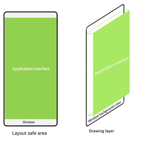
If the setWindowLayoutFullScreen() API is not called to set the window to full screen, the window is laid out within the safe area by default.
By default, the window background is displayed in full screen. However, UI elements are arranged in the safe area so that they are not blocked by the status bar or navigation area.
Figure3 Automatic avoidance of the status bar and navigation area
If the colors of the status bar and navigation area do not match the color of application UI elements, use either of the following methods to achieve the immersive effect:
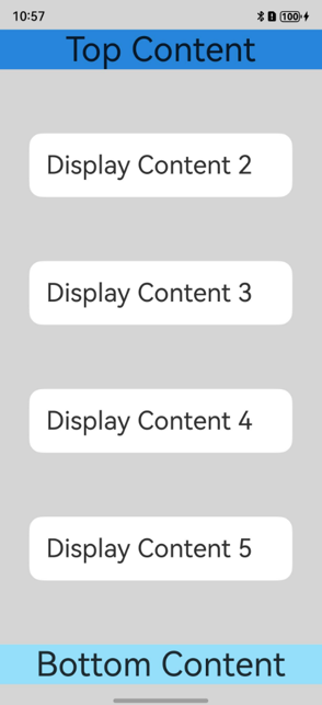
If the status bar and the navigation area have the same color, set the background color of the application window by calling setWindowBackgroundColor().
import { AbilityConstant, UIAbility, Want } from '@kit.AbilityKit';
import { window } from '@kit.ArkUI';

export default class EntryAbility extends UIAbility {
  //...

  onWindowStageCreate(windowStage: window.WindowStage): void {
    windowStage.loadContent('pages/Index', (err) => {
      if (err.code) {
        return;
      }

      // Set the color of the entire window to be the same as that of the application element.
      windowStage.getMainWindowSync().setWindowBackgroundColor('#d5d5d5');
    });
  }
}
Below is an example where the status bar and the navigation area have the same color.
// xxx.ets
@Entry
@Component
struct Example {
  build() {
    Column() {
      Row() {
        Text('Top Content').fontSize(40).textAlign(TextAlign.Center).width('100%')
      }.backgroundColor('#2786d9')

      Row() {
        Text('Display Content 2').fontSize(30)
      }.backgroundColor(Color.White).padding(20).borderRadius(15).width('80%')

      Row() {
        Text('Display Content 3').fontSize(30)
      }.backgroundColor(Color.White).padding(20).borderRadius(15).width('80%')

      Row() {
        Text('Display Content 4').fontSize(30)
      }.backgroundColor(Color.White).padding(20).borderRadius(15).width('80%')

      Row() {
        Text('Display Content 5').fontSize(30)
      }.backgroundColor(Color.White).padding(20).borderRadius(15).width('80%')

      Row() {
        Text('Bottom Content').fontSize(40).textAlign(TextAlign.Center).width('100%')
      }.backgroundColor('#96dffa')
    }
    .width('100%').height('100%')
    .alignItems(HorizontalAlign.Center)
    .backgroundColor('#d5d5d5')
    .justifyContent(FlexAlign.SpaceBetween)
  }
}
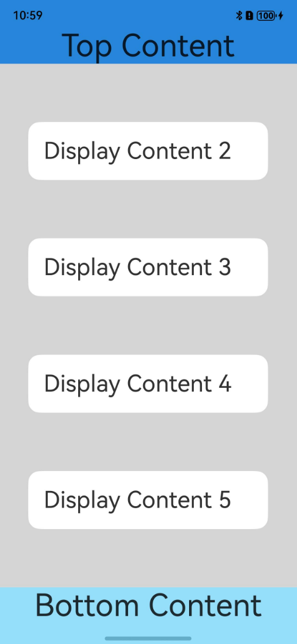
If the status bar and the navigation area have different colors, use the expandSafeArea attribute to expand the safe area.
// xxx.ets
@Entry
@Component
struct Example {
  build() {
    Column() {
      Row() {
        Text('Top Content').fontSize(40).textAlign(TextAlign.Center).width('100%')
      }.backgroundColor('#2786d9')
      // Expand the safe area to the top edge (status bar).
      .expandSafeArea([SafeAreaType.SYSTEM], [SafeAreaEdge.TOP])

      Row() {
        Text('Display Content 2').fontSize(30)
      }.backgroundColor(Color.White).padding(20).borderRadius(15).width('80%')

      Row() {
        Text('Display Content 3').fontSize(30)
      }.backgroundColor(Color.White).padding(20).borderRadius(15).width('80%')

      Row() {
        Text('Display Content 4').fontSize(30)
      }.backgroundColor(Color.White).padding(20).borderRadius(15).width('80%')

      Row() {
        Text('Display Content 5').fontSize(30)
      }.backgroundColor(Color.White).padding(20).borderRadius(15).width('80%')

      Row() {
        Text('Bottom Content').fontSize(40).textAlign(TextAlign.Center).width('100%')
      }.backgroundColor('#96dffa')
      // Expand the safe area to the bottom edge (navigation area).
      .expandSafeArea([SafeAreaType.SYSTEM], [SafeAreaEdge.BOTTOM])
    }
    .width('100%').height('100%')
    .alignItems(HorizontalAlign.Center)
    .backgroundColor('#d5d5d5')
    .justifyContent(FlexAlign.SpaceBetween)
  }
}
[h2]Principles of the expandSafeArea Attribute
During the layout, UI elements are placed based on the size of the safe area.
After the layout, the boundary (excluding margin) of the component with expandSafeArea set is checked whether it intersects the boundary of the safe area.
If the component for which expandSafeArea is set intersects the boundary of the safe area, the size of the component area is further expanded to cover the non-safe areas such as the status bar and navigation area based on the attributes transferred by expandSafeArea.
In the preceding process, only the component size is changed, and no secondary layout is performed. Therefore, the sizes and positions of subnodes and sibling nodes are not affected.
The expandSafeArea attribute can be set separately for a subnode. The subnode can extend its size to the non-safe area as long as its boundary overlaps with the safe area, and the clip attributes such as clip are not set for the parent component.
If a component has the expandSafeArea attribute set, ensure that the component is not configured with a fixed width and height. A fixed percentage is acceptable.
You can inset a certain amount of space into the safe area of a component using the universal attribute safeAreaPadding. The special space serves as both a layout constraint and a safe area for certain built-in components.
The space specified by safeAreaPadding is located inside the regular padding. The layers of a container, from outermost to innermost, are as follows: border, padding, safeAreaPadding, and content area. In scenarios where the available space within the container is insufficient to accommodate the safeAreaPadding after the border and padding have been applied, the space is preferentially allocated to the left and upper safeAreaPadding, followed by the right and lower safeAreaPadding. Once the size of the safeAreaPadding has been established, the remaining space is used as the content area.
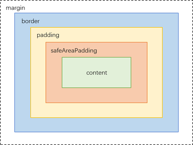
Built-in components such as Navigation, List, Scroll, and Tabs can use the outer layer or the container's safeAreaPadding attribute to expand their clipping area.
[h2]Background Image and Video Scenario
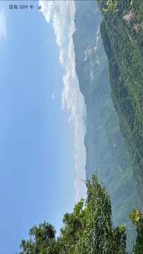
Set the size of the background image and Video component to the size of the safe area and configure the expandSafeArea attribute.

When using expandSafeArea to extend into safe areas, the Video component's content display area does not support expansion.
// xxx.ets
@Entry
@Component
struct SafeAreaExample1 {
  build() {
    Stack() {
      Image($r('app.media.bg'))
        .height('100%').width('100%')
        .expandSafeArea([SafeAreaType.SYSTEM], [SafeAreaEdge.TOP, SafeAreaEdge.BOTTOM]) // Extend the image component area to the status bar and navigation area.
    }.height('100%').width('100%')
  }
} 
[h2]Scrolling Scenario
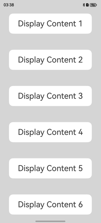
The expandSafeArea attribute on the scroll container takes effect. However, if the parent component is a scroll container, the expandSafeArea attribute on child components does not take effect. You can use either of the following methods to implement the immersive effect for child components of a scroll container:
Set the same background color for the parent scroll container and the child components, and apply the expandSafeArea attribute to the parent scroll container to expand the safe area.
// xxx.ets
@Entry
@Component
struct ScrollExample {
  scroller: Scroller = new Scroller()
  private arr: number[] = [1, 2, 3, 4, 5, 6, 7, 8, 9]

  build() {
    Stack({ alignContent: Alignment.TopStart }) {
      Scroll(this.scroller) {
        Column() {
          ForEach(this.arr, (item: number) => {
            Stack() {
              Text('Display Content ' + item.toString()).fontSize(30)
            }
            .width('80%').padding(20).borderRadius(15).backgroundColor(Color.White).margin({ top:30, bottom:30 })
          }, (item: string) => item)
        }.width('100%').backgroundColor('rgb(213,213,213)')
      }.backgroundColor('rgb(213,213,213)')
      .expandSafeArea([SafeAreaType.SYSTEM], [SafeAreaEdge.TOP, SafeAreaEdge.BOTTOM])
    }.width('100%').height('100%')
    .expandSafeArea([SafeAreaType.SYSTEM], [SafeAreaEdge.TOP, SafeAreaEdge.BOTTOM])
  }
}
Figure4 Setting expandSafeArea for a scroll container to implement the immersive effect
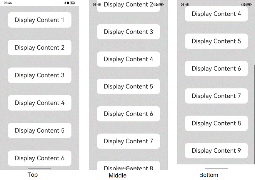
Set the same background color for the parent scroll container and the child components, and set the clipContent attribute of the parent scroll container to ContentClipMode.SAFE_AREA to extend the content clipping area to the avoid area.
// xxx.ets
@Entry
@Component
struct ScrollExample {
  scroller: Scroller = new Scroller()
  private arr: number[] = [1, 2, 3, 4, 5, 6, 7, 8, 9]

  build() {
    Stack({ alignContent: Alignment.TopStart }) {
      Scroll(this.scroller) {
        Column() {
          ForEach(this.arr, (item: number) => {
            Stack() {
              Text('Display Content ' + item.toString()).fontSize(30)
            }
            .width('80%').padding(20).borderRadius(15).backgroundColor(Color.White).margin({ top:30, bottom:30 })
          }, (item: string) => item)
        }.width('100%').backgroundColor('rgb(213,213,213)')
      }.backgroundColor('rgb(213,213,213)')
      .clipContent(ContentClipMode.SAFE_AREA)
    }.width('100%').height('100%')
  }
}
Figure5 Setting clipContent for a scroll container to implement the immersive effect
[h2]Bottom Tab Scenario
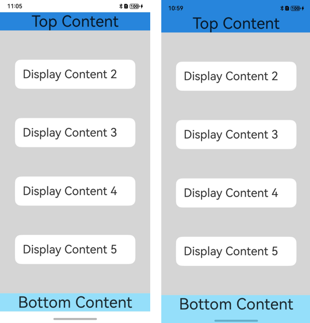
The background color of the tab bar must extend to the navigation area (navigation bar is used as an example here). However, the operable elements in the tab bar must be above the navigation area.
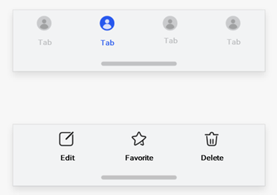
For the tabs at the bottom, the Navigation and Tabs components implement tab extension by default. Ensure that the bottom boundary of the Navigation and Tabs components overlaps with the bottom navigation area. If the expandSafeArea API is explicitly called, the safe area effect is specified by the expandSafeArea parameter.
If a custom tab bar is implemented without using the preceding components, you can set the expandSafeArea attribute for the bottom element to extend its background.
Figure6 Top and bottom UI elements with and without the expandSafeArea setting
// xxx.ets
@Entry
@Component
struct Example {
  build() {
    Column() {
      Row() {
        Text('Top Content').fontSize(40).textAlign(TextAlign.Center).width('100%')
      }.backgroundColor('#2786d9')
      // Expand the safe area to the top edge (status bar).
      .expandSafeArea([SafeAreaType.SYSTEM], [SafeAreaEdge.TOP])

      Row() {
        Text('Display Content 2').fontSize(30)
      }.backgroundColor(Color.White).padding(20).borderRadius(15).width('80%')

      Row() {
        Text('Display Content 3').fontSize(30)
      }.backgroundColor(Color.White).padding(20).borderRadius(15).width('80%')

      Row() {
        Text('Display Content 4').fontSize(30)
      }.backgroundColor(Color.White).padding(20).borderRadius(15).width('80%')

      Row() {
        Text('Display Content 5').fontSize(30)
      }.backgroundColor(Color.White).padding(20).borderRadius(15).width('80%')

      Row() {
        Text('Bottom Content').fontSize(40).textAlign(TextAlign.Center).width('100%')
      }.backgroundColor('#96dffa')
      // Expand the safe area to the bottom edge (navigation area).
      .expandSafeArea([SafeAreaType.SYSTEM], [SafeAreaEdge.BOTTOM])
    }
    .width('100%').height('100%')
    .alignItems(HorizontalAlign.Center)
    .backgroundColor('#d5d5d5')
    .justifyContent(FlexAlign.SpaceBetween)
  }
}
[h2]Image and Text Scenario
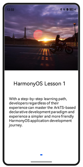
If the component on the status bar is different from that on the navigation area, extending the window background color or image could not achieve the immersive effect. In this case, you need to configure the expandSafeArea attribute as follows: Set expandSafeArea([SafeAreaType.SYSTEM],[SafeAreaEdge.TOP]) for the top component. Set expandSafeArea([SafeAreaType.SYSTEM],[SafeAreaEdge.BOTTOM]) for the bottom component.
@Entry
@Component
struct Index {
  build() {
    Swiper() {
      Column() {
        Image($r('app.media.start'))
          .height('50%').width('100%')
          // Expand the image to the status bar.
          .expandSafeArea([SafeAreaType.SYSTEM], [SafeAreaEdge.TOP])
        Column() {
          Text ('HarmonyOS Lesson 1')
            .fontSize(32)
            .margin(30)
          Text('With a step-by-step learning path, developers regardless of their experience can master the ArkTS declarative development paradigm and experience a simpler and more friendly HarmonyOS application development journey.')
            .fontSize(20).margin(20)
        }.height('50%').width('100%')
        .backgroundColor(Color.White)
        // Expand the background of the text content area to the navigation bar.
        .expandSafeArea([SafeAreaType.SYSTEM], [SafeAreaEdge.BOTTOM])
      }
    }
    .width('100%')
    .height('100%')
    // Disable the default clip effect of the Swiper component so that subnodes can be drawn outside it.
    .clip(false)
  }
}