The SelectionContainer component provides cross-node text selection, copying, and menu extension capabilities for multiple text nodes. It supports unified configuration of the caret color and background color of selected text, flexible text concatenation policies, and custom selection menus and menu extension options. It is suitable for scenarios where continuous text selection, unified copying, style customization, and menu extension are required across multiple Text components. It resolves the problem of fragmented text selection experience in multi-Text component scenarios and improves the user interaction experience in complex text layouts.

- The text content returned by the selected text related callbacks in this component is concatenated in the top-to-bottom display order of the Text components.
- The APIs of this module can be used only in the stage model.
- By default, this component uses the Stack layout. If other container layout requirements exist, place a container component in SelectionContainer.
- When text is selected in SelectionContainer, the magnifier is not displayed, and getMagnifier cannot be used to proactively set the magnifier.
- Dragging is not supported when text is selected in SelectionContainer.
- Text under the Repeat component in SelectionContainer does not support cross-node selection.
- Only the text content in Text components participates in cross-node selection and text concatenation.
Since: 26.0.0
APIs
SelectionContainer(value?: SelectionContainerOptions)
Creates a SelectionContainer component.
Since: 26.0.0
Atomic service API: This API can be used in atomic services since API version 26.0.0.
System capability: SystemCapability.ArkUI.ArkUI.Full
Parameters
| Name | Type | Mandatory | Description |
|---|---|---|---|
| value | SelectionContainerOptions | No | Initial configuration options of the component. |
Attributes
Universal attributes are supported.

- The obscuring attribute is not supported.
- The transformation attribute is not supported. In the SelectionContainer container, the Text child component does not support transformation.
[h2]copyOption
copyOption(value: Optional<CopyOptions>)
Sets the copy option for the component. If this attribute is not used, the default value is CopyOptions.InApp.

If the Text child component has explicitly set copyOption, the configuration of the Text child component takes precedence. If this attribute is not set, the configuration of SelectionContainer is used.
Since: 26.0.0
Atomic service API: This API can be used in atomic services since API version 26.0.0.
System capability: SystemCapability.ArkUI.ArkUI.Full
Parameters
| Name | Type | Mandatory | Description |
|---|---|---|---|
| value | Optional<CopyOptions> | Yes | Copy options, used to set the copyable range of text. For details, see the CopyOptions enumeration. |
[h2]caretColor
caretColor(color: Optional<ResourceColor>)
Sets the caret color of the selected text. If this attribute is not used, the default caret color is '#007DFF' (blue).

- In the SelectionContainer container, this attribute is used to set the caret color of the selected text in each Text child component.
- In the SelectionContainer container, the caretColor setting of the Text child component does not take effect, and the configuration of SelectionContainer is always used.
Since: 26.0.0
Atomic service API: This API can be used in atomic services since API version 26.0.0.
System capability: SystemCapability.ArkUI.ArkUI.Full
Parameters
| Name | Type | Mandatory | Description |
|---|---|---|---|
| color | Optional<ResourceColor> | Yes | Caret color. |
[h2]selectedBackgroundColor
selectedBackgroundColor(color: Optional<ResourceColor>)
Sets the background color of the selected text. If this attribute is not used, the default background color of the selected text is '#007DFF' (blue). If the opacity is not set, the default opacity is 20%.

- In the SelectionContainer container, this attribute is used to control the highlight color of the selected area of each Text child component.
- If the Text child component has explicitly set selectedBackgroundColor, the configuration of the Text child component takes preference. Otherwise, use the configuration of SelectionContainer.
Since: 26.0.0
Atomic service API: This API can be used in atomic services since API version 26.0.0.
System capability: SystemCapability.ArkUI.ArkUI.Full
Parameters
| Name | Type | Mandatory | Description |
|---|---|---|---|
| color | Optional<ResourceColor> | Yes | Background color of the selected text. |
[h2]enableHapticFeedback
enableHapticFeedback(isEnabled: Optional<boolean>)
Sets whether to enable haptic feedback. If this attribute is not used, haptic feedback is enabled by default.
When haptic feedback is enabled, you need to set the requestPermissions field in the module.json5 configuration file of the project to enable the vibration permission. The configuration is as follows:
"requestPermissions": [
  {
    "name": "ohos.permission.VIBRATE"
  }
]
Since: 26.0.0
Atomic service API: This API can be used in atomic services since API version 26.0.0.
System capability: SystemCapability.ArkUI.ArkUI.Full
Parameters
| Name | Type | Mandatory | Description |
|---|---|---|---|
| isEnabled | Optional<boolean> | Yes | Whether to enable haptic feedback. true indicates to enable, and false indicates to disable. |
[h2]textJoinStyle
textJoinStyle(style: Optional<SelectionContainerTextJoinStyle>)
Sets the concatenation method for the aggregated text in SelectionContainer. If this attribute is not used, the default value is SelectionContainerTextJoinStyle.NEWLINE, which means that different text nodes are concatenated with newline characters (\n).

- This configuration affects the text content returned in the callbacks of onWillCopy, onCopy, and bindSelectionMenu.
- This configuration also affects the logic that depends on the text concatenation result in the built-in system menu items. For example, when text in two Text nodes is selected, if the configuration is SelectionContainerTextJoinStyle.NEWLINE, a newline character is inserted between the two text segments after copying; if the configuration is SelectionContainerTextJoinStyle.DIRECT, the two text segments are directly concatenated after copying.
Since: 26.0.0
Atomic service API: This API can be used in atomic services since API version 26.0.0.
System capability: SystemCapability.ArkUI.ArkUI.Full
Parameters
| Name | Type | Mandatory | Description |
|---|---|---|---|
| style | Optional<SelectionContainerTextJoinStyle> | Yes | Concatenation method of the aggregated text. |
[h2]bindSelectionMenu
bindSelectionMenu(spanType: Optional<TextSpanType>, content: Optional<CustomBuilder>, responseType: Optional<TextResponseType>, options?: Optional<SelectionContainerMenuOptions>)
Sets a custom selection menu. If this attribute is not used, the default value of spanType is TextSpanType.TEXT and the default value of responseType is TextResponseType.LONG_PRESS.

- The long-press response duration of bindSelectionMenu is 600 ms, while that of bindContextMenu is 800 ms. When both are bound and both are triggered by a long press, bindSelectionMenu is responded to first.
- When the custom menu is too long, you are advised to nest a Scroll component inside it to prevent the keyboard from being obscured.
- When the selection spans non-copyable text, the menu is displayed and processed based only on the copyable text actually selected.
- In the SelectionContainer container, the bindSelectionMenu setting of the Text child component does not take effect, and the configuration of SelectionContainer is always used.
Since: 26.0.0
Atomic service API: This API can be used in atomic services since API version 26.0.0.
System capability: SystemCapability.ArkUI.ArkUI.Full
Parameters
| Name | Type | Mandatory | Description |
|---|---|---|---|
| spanType | Optional<TextSpanType> | Yes | Type of the selection menu. It specifies the range of text types on which the selection menu acts. Different types correspond to different menu behavior. For details about the meaning and applicable scenarios of each enumerated value, see TextSpanType. |
| content | Optional<CustomBuilder> | Yes | Content of the selection menu. |
| responseType | Optional<TextResponseType> | Yes | Response type of the selection menu. |
| options | Optional<SelectionContainerMenuOptions> | No | Options of the selection menu, used to configure callbacks for events such as menu appearance, disappearance, display, and hiding. Pass this parameter when you need to listen for these menu events. If it is not passed, menu events are not listened for by default. |
[h2]editMenuOptions
editMenuOptions(editMenu: Optional<SelectionContainerEditMenuOptions>)
Sets the edit menu options for the selected text, including the menu text, icon, and callback.

- When both bindSelectionMenu and editMenuOptions are set for the current scenario, bindSelectionMenu takes precedence and editMenuOptions does not take effect. bindSelectionMenu is used to fully customize the menu style and trigger conditions, with all menu items defined by you. editMenuOptions is used to add extension items on top of the system default menu, with the trigger conditions unchanged. It is recommended that you choose based on the required degree of customization.
- In the SelectionContainer container, the editMenuOptions setting of the Text child component does not take effect, and the configuration of SelectionContainer is always used.
Since: 26.0.0
Atomic service API: This API can be used in atomic services since API version 26.0.0.
System capability: SystemCapability.ArkUI.ArkUI.Full
Parameters
| Name | Type | Mandatory | Description |
|---|---|---|---|
| editMenu | Optional<SelectionContainerEditMenuOptions> | Yes | Custom edit menu options. |

[h2]onTextSelectionChange
onTextSelectionChange(callback: Optional<Callback<Array<string>>>)
Triggered when the selected text in SelectionContainer changes. This API returns the result asynchronously through a callback.

- The order of items in the callback parameter array is consistent with the visual order of the Text components.
- Each item in the array corresponds to the selected text of a Text child component.
- The array contains only Text child components that have selected text. It does not include Text child components without selected text, nor does it include empty string placeholders for non-copyable text.
Since: 26.0.0
Atomic service API: This API can be used in atomic services since API version 26.0.0.
System capability: SystemCapability.ArkUI.ArkUI.Full
Parameters
[h2]onWillCopy
onWillCopy(callback: Optional<Callback<string, boolean>>)
Triggered before a copy operation is performed. This API returns the result asynchronously through a callback.

- The callback parameter is the selected text concatenated in the visual order of the Text components, and the concatenation method is determined by textJoinStyle.
- Returning false blocks this cross-node copy operation and the container-level onCopy callback triggering, but does not affect the copy event logic that each Text child component has already processed independently.
Since: 26.0.0
Atomic service API: This API can be used in atomic services since API version 26.0.0.
System capability: SystemCapability.ArkUI.ArkUI.Full
Parameters
[h2]onCopy
onCopy(callback: Optional<Callback<string>>)
Triggered when the copy button on the selection menu is tapped after the selection menu is displayed by long-pressing the inner area of the text. Only text copying is supported. This API returns the result asynchronously through a callback.

- The callback parameter is the selected text concatenated in the visual order of the Text components. The concatenation method is determined by textJoinStyle.
- This callback is triggered only when the container-level onWillCopy returns true.
Since: 26.0.0
Atomic service API: This API can be used in atomic services since API version 26.0.0.
System capability: SystemCapability.ArkUI.ArkUI.Full
Parameters
SelectionContainerTextJoinStyle
Provides the concatenation method for text aggregation.
Since: 26.0.0
Atomic service API: This API can be used in atomic services since API version 26.0.0.
System capability: SystemCapability.ArkUI.ArkUI.Full
| Name | Value | Description |
|---|---|---|
| NEWLINE | 0 | Different text nodes are concatenated with newline characters (\n). |
| DIRECT | 1 | Different text nodes are concatenated directly without separators. |
SelectionContainerController
Provides the controller of the SelectionContainer component.
Since: 26.0.0
[h2]clearTextSelection
clearTextSelection(): void
Clears the current text selection state of SelectionContainer. If the selection menu is being displayed, it is also closed.
Since: 26.0.0
Atomic service API: This API can be used in atomic services since API version 26.0.0.
System capability: SystemCapability.ArkUI.ArkUI.Full
SelectionContainerOptions
Provides the initial configuration options of the component.
Since: 26.0.0
Atomic service API: This API can be used in atomic services since API version 26.0.0.
System capability: SystemCapability.ArkUI.ArkUI.Full
| Name | Type | Read-Only | Optional | Description |
|---|---|---|---|---|
| controller | SelectionContainerController | No | No | Controller of SelectionContainer. |
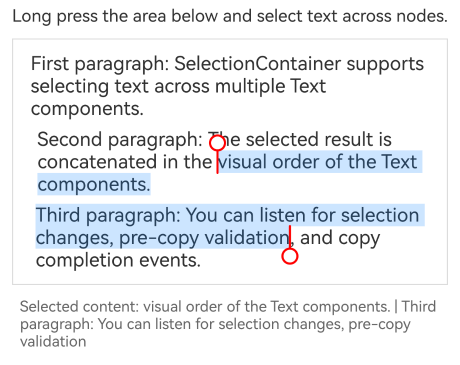
[h2]Example 1: Selecting Text Across Nodes and Copying the Text
This example demonstrates how to select text across multiple Text components, concatenate the selected text, and handle copy callbacks by using SelectionContainer, copyOption, textJoinStyle, onTextSelectionChange, onWillCopy, and onCopy.
Since API version 26.0.0, the SelectionContainer component and APIs such as copyOption are added.
import {
  SelectionContainer,
  SelectionContainerAttribute,
  SelectionContainerTextJoinStyle
} from '@kit.ArkUI';

@Entry
@Component
struct SelectionContainerExample1 {
  @State selectedParts: string[] = [];
  @State copiedText: string = '';

  build() {
    Column({ space: 12 }) {
      Text('Long press the area below and select text across nodes.')
        .fontSize(16)

      SelectionContainer() {
        Column({ space: 8 }) {
          Text('First paragraph: SelectionContainer supports selecting text across multiple Text components.')
            .fontSize(18)
            .copyOption(CopyOptions.InApp)
          Text('Second paragraph: The selected result is concatenated in the visual order of the Text components.')
            .fontSize(18)
            .copyOption(CopyOptions.InApp)
          Text('Third paragraph: You can listen for selection changes, pre-copy validation, and copy completion events.')
            .fontSize(18)
            .copyOption(CopyOptions.InApp)
        }
      }
      .copyOption(CopyOptions.InApp)
      .textJoinStyle(SelectionContainerTextJoinStyle.NEWLINE)
      .caretColor(Color.Red)
      .selectedBackgroundColor('#33007DFF')
      .onTextSelectionChange((value: Array<string>) => {
        this.selectedParts = value;
        console.info(`Selected text changed: ${JSON.stringify(value)}`);
      })
      .onWillCopy((value: string) => {
        this.copiedText = `Ready to copy: ${value}`;
        console.info(`Text ready to copy: ${value}`);
        return true;
      })
      .onCopy((value: string) => {
        this.copiedText = `Copy succeeded: ${value}`;
        console.info(`Copied text: ${value}`);
      })
      .border({ width: 1, color: '#DCDCDC' })
      .padding(12)
      .width('100%')

      Text(`Selected content: ${this.selectedParts.join(' | ')}`)
        .fontSize(14)
        .fontColor('#666666')

      Text(this.copiedText)
        .fontSize(14)
        .fontColor('#666666')
    }
    .width('100%')
    .padding(16)
  }
} 
[h2]Example 2: Binding a Custom Selection Menu
This example demonstrates how to bind a custom menu when selecting text across nodes through bindSelectionMenu.
Since API version 26.0.0, the bindSelectionMenu attribute is added.
import {
  SelectionContainer,
  SelectionContainerAttribute,
  SelectionContainerMenuOptions,
  SelectionContainerTextJoinStyle
} from '@kit.ArkUI';

@Entry
@Component
struct SelectionContainerExample2 {
  @State selectedText: string = '';
  @State menuLog: string = '';

  build() {
    Column({ space: 12 }) {
      Text('Long press the area below to select text and experience the custom menu.')
        .fontSize(16)

      SelectionContainer() {
        Column({ space: 8 }) {
          Text('First paragraph: SelectionContainer supports custom selection menus.')
            .fontSize(18)
          Text('Second paragraph: Bind a complete custom menu through bindSelectionMenu.')
            .fontSize(18)
        }
      }
      .copyOption(CopyOptions.InApp)
      .textJoinStyle(SelectionContainerTextJoinStyle.DIRECT)
      .bindSelectionMenu(
        TextSpanType.TEXT,
        this.menuBuilder,
        TextResponseType.LONG_PRESS,
        {
          onAppear: (text: string) => {
            this.menuLog = `Menu appears: ${text}`;
            console.info(`Menu appears: ${text}`);
          },
          onDisappear: () => {
            this.menuLog = 'Menu disappears';
            console.info('Menu disappears');
          },
          onMenuShow: (text: string) => {
            this.menuLog = `Menu shown: ${text}`;
            console.info(`Menu shown: ${text}`);
          },
          onMenuHide: (text: string) => {
            this.menuLog = `Menu hidden: ${text}`;
            console.info(`Menu hidden: ${text}`);
          }
        } as SelectionContainerMenuOptions
      )
      .onTextSelectionChange((value: Array<string>) => {
        this.selectedText = `Selected: ${value.join(' | ')}`;
        console.info(`Selection changed: ${JSON.stringify(value)}`);
      })
      .border({ width: 1, color: '#DCDCDC' })
      .padding(12)
      .width('100%')
    }
    .width('100%')
    .padding(16)
  }

  @Builder
  menuBuilder() {
    Column() {
      Menu() {
        MenuItemGroup() {
          MenuItem({ content: 'Custom Copy', labelInfo: '' })
            .onClick(() => {
              console.info('Custom copy clicked');
            })
          MenuItem({ content: 'Custom Sharing', labelInfo: '' })
            .onClick(() => {
              console.info('Custom sharing clicked');
            })
          MenuItem({ content: 'Custom Translation', labelInfo: '' })
            .onClick(() => {
              console.info('Custom translation clicked.');
            })
        }
      }
      .radius($r('sys.float.ohos_id_corner_radius_card'))
      .clip(true)
      .backgroundColor('#F0F0F0')
    }
  }
} 
[h2]Example 3: Extending Menu Options
This example uses editMenuOptions to remove the translation and search menu items from the system menu and add five custom menu items. It also demonstrates, in the onMenuItemClick callback, the difference between intercepting the system copy operation (returning true) and not intercepting the select-all operation (returning false).
The editMenuOptions attribute is added since API version 26.0.0.
import {
  OnMenuItemClickWithTextCallback,
  SelectionContainer,
  SelectionContainerAttribute,
  SelectionContainerEditMenuOptions,
  SelectionContainerTextJoinStyle
} from '@kit.ArkUI';

@Entry
@Component
struct SelectionContainerExample3 {
  @State selectedText: string = '';
  @State menuClickLog: string = '';
  onCreateMenu = (menuItems: Array<TextMenuItem>) => {
    let targetIndex = menuItems.findIndex(item => item.id.equals(TextMenuItemId.TRANSLATE));
    if (targetIndex !== -1) {
      menuItems.splice(targetIndex, 1);
    }
    targetIndex = menuItems.findIndex(item => item.id.equals(TextMenuItemId.SEARCH));
    if (targetIndex !== -1) {
      menuItems.splice(targetIndex, 1);
    }
    let customItem1: TextMenuItem = {
      content: 'Highlight',
      id: TextMenuItemId.of('highlight'),
    };
    let customItem2: TextMenuItem = {
      content: 'Bookmark',
      id: TextMenuItemId.of('bookmark'),
    };
    let customItem3: TextMenuItem = {
      content: 'Comment',
      id: TextMenuItemId.of('comment'),
    };
    let customItem4: TextMenuItem = {
      content: 'Export',
      id: TextMenuItemId.of('export'),
    };
    // Replace $r('app.media.startIcon') with the image resource file you use.
    let customItem5: TextMenuItem = {
      content: 'Push',
      icon: $r('app.media.startIcon'),
      id: TextMenuItemId.of('push'),
    };
    menuItems.push(customItem1);
    menuItems.push(customItem2);
    menuItems.push(customItem3);
    menuItems.push(customItem4);
    menuItems.push(customItem5);
    return menuItems;
  }
  onMenuItemClick: OnMenuItemClickWithTextCallback = (menuItem: TextMenuItem, text: string) => {
    this.menuClickLog = `Menu item clicked: ${menuItem.content}, text: ${text}`;
    console.info(`Menu item clicked: ${menuItem.content}, text: ${text}`);
    if (menuItem.id.equals(TextMenuItemId.COPY)) {
      this.selectedText = `Copied: ${text}`;
      console.info(`Intercept the system copy operation, return true: ${text}`);
      return true;
    }
    if (menuItem.id.equals(TextMenuItemId.SELECT_ALL)) {
      this.selectedText = `Select-all operation: ${text}`;
      console.info(`Do not intercept the select-all operation, return false: Execute the system default behavior`);
      return false;
    }
    if (menuItem.id.equals(TextMenuItemId.of('highlight'))) {
      this.selectedText = `Highlighted: ${text}`;
      console.info(`Custom menu item clicked: Highlight, text: ${text}`);
      return true;
    }
    if (menuItem.id.equals(TextMenuItemId.of('bookmark'))) {
      this.selectedText = `Bookmarked: ${text}`;
      console.info(`Custom menu item clicked: Bookmark, text: ${text}`);
      return true;
    }
    if (menuItem.id.equals(TextMenuItemId.of('comment'))) {
      this.selectedText = `Commented: ${text}`;
      console.info(`Custom menu item clicked: Comment, text: ${text}`);
      return true;
    }
    if (menuItem.id.equals(TextMenuItemId.of('export'))) {
      this.selectedText = `Exported: ${text}`;
      console.info(`Custom menu item clicked: Export, text: ${text}`);
      return true;
    }
    if (menuItem.id.equals(TextMenuItemId.of('push'))) {
      this.selectedText = `Pushed: ${text}`;
      console.info(`Custom menu item clicked: Push, text: ${text}`);
      return true;
    }
    return false;
  }
  @State editMenuOptions: SelectionContainerEditMenuOptions = {
    onCreateMenu: this.onCreateMenu,
    onMenuItemClick: this.onMenuItemClick
  };

  build() {
    Column({ space: 12 }) {
      Text('Long press the area below to select text and experience the extension menu.')
        .fontSize(16)

      SelectionContainer() {
        Column({ space: 8 }) {
          Text('First paragraph: SelectionContainer supports extension menu options.')
            .fontSize(18)
          Text('Second paragraph: You can remove system menu items and add custom menu items.')
            .fontSize(18)
        }
      }
      .copyOption(CopyOptions.InApp)
      .textJoinStyle(SelectionContainerTextJoinStyle.DIRECT)
      .editMenuOptions(this.editMenuOptions)
      .onTextSelectionChange((value: Array<string>) => {
        this.selectedText = `Selected: ${value.join(' | ')}`;
        console.info(`Selection changed: ${JSON.stringify(value)}`);
      })
      .border({ width: 1, color: '#DCDCDC' })
      .padding(12)
      .width('100%')

      Text(this.selectedText)
        .fontSize(14)
        .fontColor('#666666')

      Text(this.menuClickLog)
        .fontSize(14)
        .fontColor('#999999')
    }
    .width('100%')
    .padding(16)
  }
} 
[h2]Example 4: Closing the Selection Menu and Clearing Text Selection Through the Controllers
This example demonstrates how to close the selection menu and clear the text selection by passing SelectionContainerController through SelectionContainer and calling closeSelectionMenu and clearTextSelection.
Since API version 26.0.0, the SelectionContainerController and SelectionContainerOptions APIs are added.
import {
  SelectionContainer,
  SelectionContainerController,
  SelectionContainerAttribute
} from '@kit.ArkUI';

@Entry
@Component
struct SelectionContainerControllerExample {
  private controller: SelectionContainerController = new SelectionContainerController();

  build() {
    Column({ space: 12 }) {
      Text('Long press the area below to select text across nodes, and then click the button to close the selection menu or clear the text selection.')
        .fontSize(16)

      SelectionContainer({ controller: this.controller }) {
        Column({ space: 8 }) {
          Text('First paragraph: SelectionContainer supports selecting text across multiple Text components.')
            .fontSize(18)
            .copyOption(CopyOptions.InApp)
          Text('Second paragraph: After selection, you can close the selection menu or clear the text selection through the controller.')
            .fontSize(18)
            .copyOption(CopyOptions.InApp)
        }
      }
      .copyOption(CopyOptions.InApp)
      .border({ width: 1, color: '#DCDCDC' })
      .padding(12)
      .width('100%')

      Row({ space: 12 }) {
        Button('Close Selection Menu')
          .onClick(() => {
            this.controller.closeSelectionMenu();
          })
        Button('Clear Text Selection')
          .onClick(() => {
            this.controller.clearTextSelection();
          })
      }
    }
    .width('100%')
    .padding(16)
  }
} 