Overview
When developing apps that meet the characteristic of one-time development for multi-device deployment, you need to address not only hardware variations across smartphones, tablets, PCs, wearables, and Visions, but also differences in interaction patterns. Each device relies on distinct input methods that shape user interactions: touch screens for smartphones or tablets, mouse controls for PCs, and Ultra remotes for Visions. To ensure natural and seamless usability across all devices, you need to focus on the device types and adapt the app to different interaction events during development.
Cross-Device Interaction
Cross-device interaction allows an app to adapt to different input devices to implement the same functionality across devices. For example, to play or pause a video in a video app, the interactions vary according to the following devices:
- Bar phone: tapping the screen.
The play or pause logic is triggered by tapping the screen with a finger.
- Tablet: tapping the screen, clicking the left button of an external mouse, or pressing the space bar of an external keyboard.
Multimodal input is supported to respond to touch events, left-click events, and keyboard events (such as pressing the space bar).
- PC: tapping the screen, clicking the left button of an external mouse, tapping the touchpad or pressing its left button, or pressing the space bar of an external keyboard.
Multimodal input is supported to respond to touch events, left-click events, press events on touchpads, and keyboard events (such as pressing the space bar).
- Vision: pressing the OK button on the Ultra remote or tapping the touchpad via Hover touch.
Ultra remote is a unique input device for Vision. Users can press the OK button to trigger the click logic after they locate the cursor to a desired position using the Ultra remote, or they can tap the touchpad with Hover touch to trigger the click logic.
- Wearable: tapping the screen.
The play or pause logic is triggered by tapping the screen with a finger.
Cross-device interaction should be developed based on distinct interaction specifications of different input devices, such as the touchpad, mouse, keyboard, and remote control, to ensure functionality consistency and smooth app experience.
Unified Interaction
Unified interaction is a response framework that abstracts interaction behaviors of different input devices into standardized events, simplifying the development logic. For example, tapping the screen or touchpad, left-clicking the mouse, and pressing the OK key on the remote control are considered as touch events; pressing function keys on the remote control and keyboard shortcuts are considered as key events. This framework ensures consistent behavior logic and user experience of components in different interaction scenarios.
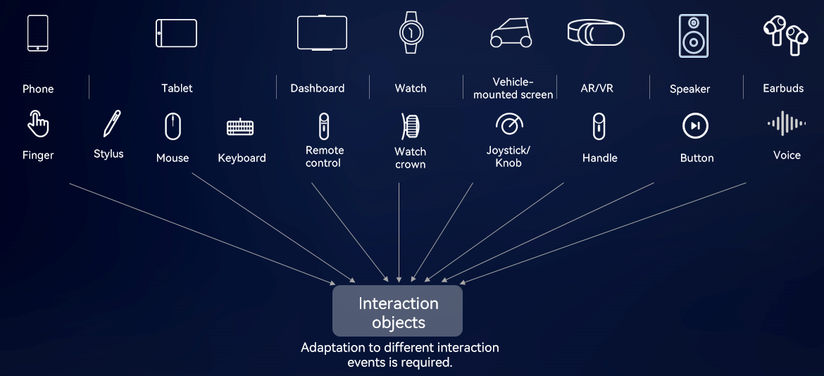
Unified interaction does not merge all input modes into single events or APIs. Instead, it semantically abstracts and classifies dozens of underlying interaction events from different devices, significantly reducing the number of event types while ensuring that the interaction differences are controllable. Finally, a set of standardized interaction APIs is provided. This requires you to select and adapt the corresponding abstract events based on specific scenarios to achieve consistent and flexible interaction experience across devices.
The ArkUI framework provides various interaction functionalities to process basic input events and gesture events driven by these events. In addition, it supports complex interactions such as drag events and focus events.
[h2]Basic Input Events
When a user interacts with an input device (such as a touchscreen, keyboard, mouse, or touchpad), the device driver layer detects and generates corresponding original signals. The OS captures these underlying signals, encapsulates them into standardized basic events, and then passes them to upper-layer apps for processing.
Basic events are broadly categorized into two types: pointer and non-pointer events. The following describes these two types of events from the perspective of interactions with the target components.
- Pointer events: When the user interacts with the input device (for example, tapping with a finger or clicking with the mouse), the hit component on the screen becomes the target for subsequent interactions (including movement and lifting). Events include touch event, mouse event, axis event, and stylus event.
Example: When a stylus is used to write on the screen, the first hit component (such as the canvas) on the screen is the target component of the interaction.
Figure 2 Display effect of the stylus event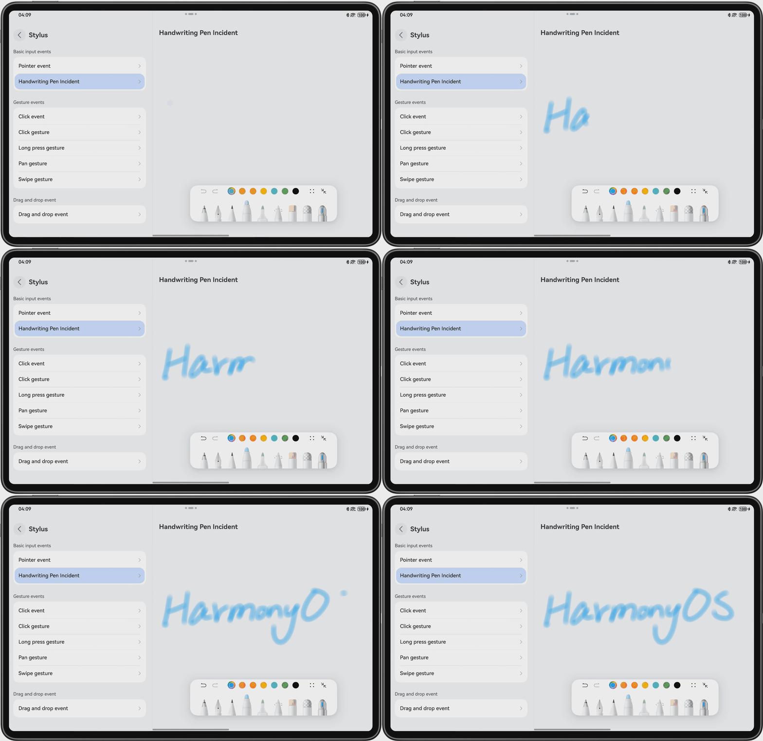
The sample code of the stylus event is as follows:
if (canIUse('SystemCapability.Stylus.Handwrite')) { // Using the canIUse interface to prevent the stylus event from not being supported by some devices HandwriteComponent({ handwriteController: this.controller, defaultPenType: PenType.PEN, defaultPenInfo: [{ penType: PenType.PEN, penWidth: this.penWidth }, { penType: PenType.BALLPOINT_PEN, penWidth: this.ballpointPenWidth }] as PenHspInfo[], widthRatio: 1, heightRatio: 1, }) } else { Text($r('app.string.HandwriteDescInfo')) } - Non-pointer events: The target component that responses to the event is subject to the component where the focus is located. Events include key event, crown event, and focus axis event.
Example: When filling in a form with a keyboard, users can switch between multiple text boxes by pressing the Tab key and the focused text box is usually highlighted. Entering content is considered as an interaction with the focused text box and is sent directly to this component for processing.
The sample code of the key event is as follows. The key events performed by a mouse are processed through mouse events.

To respond to the left mouse key event, you are advised to use the onClick event. To respond to other key events, use the mouse event.
.onKeyEvent((event?: KeyEvent) => {
  if (event) {
    if (event.type === KeyType.Down) {
      this.eventType = 'Down';
    } else if (event.type === KeyType.Up) {
      this.eventType = 'Up';
    }
    this.keyText = event.keyText;
    this.sourceTool = event.keySource;
    this.getUserTextData();
  }
  return true;
})
.onMouse((event: MouseEvent): void => {
  if (event) {
    // ...
  }
})
The following figure shows the basic input events and corresponding interactions that trigger them.

onKeyEvent bubbles up by default. In the callback of onKeyEvent, return true if this event has been processed. This action stops the event from continuing to bubble up and avoids repeated responses from upper layers, thereby preventing the key event from being triggered multiple times.
Ultra stylus does not respond to the onHover event. The data in the table above applies only to other styluses.

[h2]Gesture Events
A gesture is an interaction that occurs when a series of basic events meet specific conditions. For example, a tap gesture consists of a quick press and a lift.
In ArkUI, system components support basic gestures by default (for example, buttons support tap events), and you can bind one or more gestures to components. Generally, the system matches and processes multiple gestures in the order they are registered.
- To ensure that only one gesture takes effect at a time, you can use an exclusive recognition mechanism to avoid response conflicts.
- To execute multiple gestures simultaneously, you can use a parallel recognition mechanism to concurrently process gestures, improving interaction flexibility.
- To determine which gestures can be recognized and prevent gestures from competing for recognition, you can use a gesture conflict handling mechanism.
The following figure shows the basic gesture events and corresponding interactions that trigger them.

The sample code of the rotation gesture is as follows:
.gesture(
  RotationGesture()
    .onActionUpdate((event: GestureEvent) => {
      if (event) {
        // Obtain the rotation angle and change the rotation angle of the image
        this.angle = this.rotateValue + event.angle;
        this.sourceType = event.source;
        this.sourceTool = event.sourceTool;
        this.getUserTextData();
      }
    })
    .onActionEnd(() => {
      this.rotateValue = this.angle;
    })
)
Typical scenarios are as follows: To rearrange UI elements, you can trigger PinchGesture by pinching on the screen with two fingers. This gesture triggers a dynamic modification to the columnsTemplate attribute of the grid layout. In a video app, you can pinch two fingers to change the number of video elements displayed.
The display effects are as follows.
md | lg |
|---|---|
|
|


Grid() {
  // ...
}
// ...
.gesture(PinchGesture({ fingers: 2 }).onActionUpdate((event: GestureEvent) => {
  if (event.scale > 1 && this.currentWidthBreakpoint !== 'sm') {
    if (this.currentWidthBreakpoint === 'md') {
      this.getUIContext().animateTo({
        duration: 500
      }, () => {
        this.videoGridColumn = '1fr 1fr 1fr';
      })
    } else {
      this.getUIContext().animateTo({
        duration: 500
      }, () => {
        this.videoGridColumn = '1fr 1fr 1fr 1fr';
      })
    }
  } else if (event.scale < 1 && this.currentWidthBreakpoint !== 'sm') {
    if (this.currentWidthBreakpoint === 'md') {
      this.getUIContext().animateTo({
        duration: 500
      }, () => {
        this.videoGridColumn = '1fr 1fr 1fr 1fr';
      })
    } else {
      this.getUIContext().animateTo({
        duration: 500
      }, () => {
        this.videoGridColumn = '1fr 1fr 1fr 1fr 1fr';
      })
    }
  } else {
    Logger.info(`Two-finger operation is not supported`);
  }
}))
[h2]Focus Events
When users interact with an app using non-pointer input devices such as keyboards, TV remote controls, joysticks, and knobs, you are advised to set interactive elements to a focusable state and configure visual effects for focus states to enhance interaction experience.
- Focus gain/loss: The onFocus and onBlur events are used to listen for component focus changes. The system follows a child-first principle for focus handling. If a child component requires a focus, all its parent components must also be focusable. Conversely, when a container component requires a focus, its child components should be made non-focusable and a click event must be configured for the container component.
Certain components, such as basic components like Button and TextInput, and container components like Column and Row, are focusable by default. For a component that is not focusable by default, such as Text and Image, you can set focusable to true to make it focusable. Components that do not support interaction, such as Blank and Circle, cannot gain focus. For details about the focusability of components, see Component Focusability.
- Focus traversal: When focus traversal is triggered, the system traverses focusable components in the component tree. The current focus framework supports three focus traversal algorithms. Linear focus traversal performs focus navigation based on the mounting sequence of child nodes in the node tree; projection-based focus traversal determines the best focus target based on spatial relationships, suitable for containers with child components of different sizes; custom focus traversal allows you to flexibly customize the focus logic through tabIndex and nextFocus to meet complex interaction requirements. For details, see Focus Traversal Guidelines and Focus Traversal Algorithms.Figure 5 Focus traversal through the keyboard
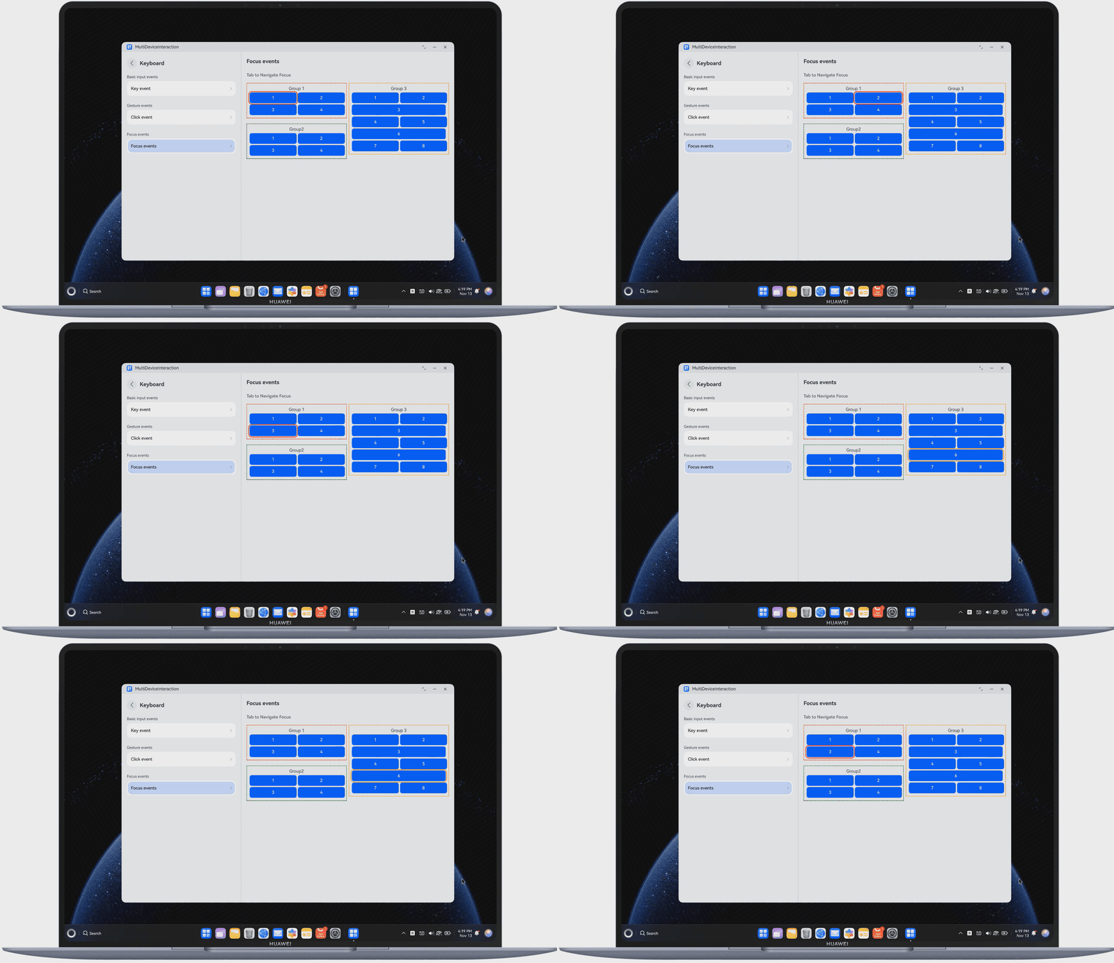
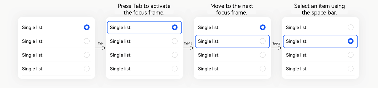
For details about the capabilities and specifications of focus events, see Implementing Focus Support.
Property | Parameter | Description |
|---|---|---|
boolean | Sets whether the component is focusable. | |
number | Sets the order of components in sequential focus traversal with the Tab key. | |
boolean | Sets whether the current component is the default focus on the page. | |
boolean | Sets whether the current container component is a focus stop. | |
Optional<FocusMovement> | Sets the custom focus traversal logic for the current component. |
The following figure lists whether focus events are supported on different input devices.

[h2]Drag Events
Dragging occurs between two components. It is not a simple single input, but a process. Take dragging component A to component B as an example, which includes the following steps:
Long press or click component A. Dragging is triggered.
Keep pressing to drag component A towards component B.
Stop pressing after component A reaching component B. Dragging is completed.
Stop pressing before component A reaching component B. Dragging is canceled.
A complete drag event contains multiple subevents, as described in the following table.
Name | Description |
|---|---|
Bound to component A. This event is triggered when a user long presses the touchscreen or presses the left mouse button. | |
Bound to component B. This event is triggered when a finger or a mouse reaches component B. | |
Bound to component B. This event is triggered when a finger or a mouse moves inside component B. | |
Bound to component B. This event is triggered when a finger or a mouse exits component B. | |
Bound to component B. This event is triggered when a finger lifts or the left mouse button is released inside component B. |
The following figure shows how drag events are triggered on different input devices.

The sample code of dragging an image is as follows:
.allowDrop([uniformTypeDescriptor.UniformDataType.IMAGE])
.onDrop((event: DragEvent) => {
  try {
    let dragData: UnifiedData = (event as DragEvent).getData() as UnifiedData;
    if (dragData !== undefined) {
      let records: unifiedDataChannel.UnifiedRecord[] = dragData.getRecords();
      if (records.length > 0) {
        for (let i = 0; i < records.length; i++) {
          let types = records[i].getTypes();
          if (types.includes(uniformTypeDescriptor.UniformDataType.FILE_URI)) {
            // Retrieve the image resource URLs from the record and assign them
            const fileUriUds =
              records[i].getEntry(uniformTypeDescriptor.UniformDataType.FILE_URI) as uniformDataStruct.FileUri;
            let typeDescriptor = uniformTypeDescriptor.getTypeDescriptor(fileUriUds.fileType);
            if (typeDescriptor.belongsTo(uniformTypeDescriptor.UniformDataType.IMAGE)) {
              this.targetImage = fileUriUds.oriUri;
            }
          }
        }
      } else {
        hilog.info(0x0000, TAG, `%{public}s`, `dragData arr is null`);
      }
    } else {
      hilog.info(0x0000, TAG, `%{public}s`, `dragData is undefined`);
    }
    this.dragSuccess = true;
  } catch (error) {
    const err = error as BusinessError;
    hilog.error(0x0000, TAG, `startDataLoading errorCode: ${err.code}, errorMessage: ${err.message}`);
  }
})
How to Develop
During app development, it is crucial to identify the target devices based on the specific service scenario. For example, video apps generally need to support smartphones, tablets, PCs, and Visions, whereas sports and health apps primarily focus on smartphones and wearables. You should determine the scope of adaptation based on service characteristics and high-frequency usage scenarios. Once the target devices are clear, future design and adapt interaction events based on the input methods supported by each device (such as touchscreen, mouse, keyboard, and crown) to ensure a good user experience.
The following table lists the input devices supported by target devices.
Device | Input Device |
|---|---|
Bar phone | Touchscreen |
Foldable phone | Touchscreen |
Widescreen foldable phone | Touchscreen and stylus (Pura X Max) |
Tri-fold phone | Touchscreen and stylus (Mate XTs) |
Tablet | Touchscreen, mouse, keyboard, and stylus |
PC | Touchscreen, touchpad, mouse, keyboard, and game controller |
Vision | Ultra remote, Hover touch, focus-moving remote control, keyboard, mouse, and game controller |
Wearable | Touchscreen and crown |
The following walks you through the development roadmap and procedure of video play/pause across devices:
- Specify the target devices for long video apps, which are smartphones, tablets, PCs, and Visions.
- Determine the supported input devices. According to the table of supported input devices, these target devices support touchscreen, stylus, mouse, keyboard, game controller, Ultra remote, Hover touch, and focus-moving remote control as their input devices.
- When implementing the play/pause functionality, apply the event processing mechanism based on the interaction mode of different input devices. According to the table of basic gesture events and specific interactions, the touchscreen, mouse, Ultra remote, and focus-moving remote control can trigger operations by responding to the onClick event; as can be seen from the table of basic input events and specific interactions, you need to listen for onKeyEvent of the specific key (such as the space bar and Enter key) when a keyboard is used to execute corresponding logic.
- Touchscreen: tapping the screen. Mouse: clicking the left button. Ultra remote: pressing the OK button. Focus-moving remote control: pressing the OK button.
Flex({ // ... }) { Column() { // ... } .width('100%') .onClick(() => { // ... }) - Keyboard: pressing the space bar. The key code of the space bar is KEYCODE_SPACE. For key codes of other keys, you can query through the keyCode enum. For example, the key code of the Enter key is KEYCODE_ENTER. Flexibly adapt your app to different keys based on actual interaction requirements.
.onKeyEvent((event?: KeyEvent) => {
  //If the key type is pressed, the subsequent code will not be executed,
  // and the specific key logic will be executed when released.
  if (!event || event.type !== KeyType.Down) {
    return;
  }
  // Space key controls pause/play.
  if (event.keyCode === KeyCode.KEYCODE_SPACE) {
    this.avPlayerUtil?.playerStateControl();
  } else if (event.keyCode === KeyCode.KEYCODE_ESCAPE) {
    //Press ESC to exit full screen.
    if (this.isFullScreen) {
      this.exitFullScreen();
    }
  } else if (event.keyCode === KeyCode.KEYCODE_DPAD_RIGHT) {
    //Right-click fast forward
    this.avPlayerUtil?.fastForward();
  } else if (event.keyCode === KeyCode.KEYCODE_DPAD_LEFT) {
    //Left click to go back quickly
    this.avPlayerUtil?.rewind();
  } else {
    return;
  }
})
- Touchscreen: tapping the screen. Mouse: clicking the left button. Ultra remote: pressing the OK button. Focus-moving remote control: pressing the OK button.
In summary, you need to specify the target devices for app adaptation based on the service scenarios and flexibly use interaction events supported by specific input devices.