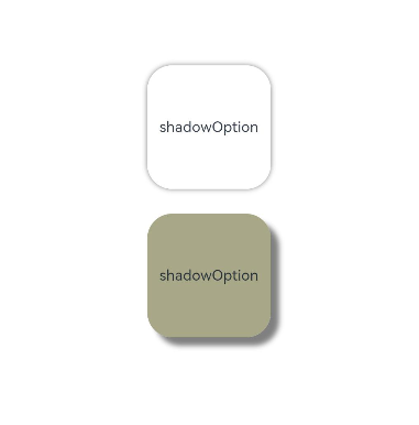
The shadow API applies a shadow effect to the current component. This API supports two types of parameters, and you can configure ShadowOptions to customize the shadow effect. In ShadowOptions mode, no shadow effect is produced when the alpha value of color is 0.

For the radius parameter of ShadowOptions, before API version 26.0.0, the valid range is [0, +∞). When the value is set to 0, no shadow is drawn (values less than 0 are treated as 0). Starting from API version 26.0.0, the valid range changes to (-∞, +∞), and no shadow is drawn when the value is less than 0.
@Entry
@Component
struct ShadowOptionDemo {
  build() {
    Row() {
      Column() {
        Column() {
          Text('shadowOption').fontSize(12)
        }
        .width(100)
        .aspectRatio(1)
        .margin(10)
        .justifyContent(FlexAlign.Center)
        .backgroundColor(Color.White)
        .borderRadius(20)
        .shadow({ radius: 10, color: Color.Gray })

        Column() {
          Text('shadowOption').fontSize(12)
        }
        .width(100)
        .aspectRatio(1)
        .margin(10)
        .justifyContent(FlexAlign.Center)
        .backgroundColor('#a8a888')
        .borderRadius(20)
        .shadow({
          radius: 10,
          color: Color.Gray,
          offsetX: 20,
          offsetY: 20
        })
      }
      .width('100%')
      .height('100%')
      .justifyContent(FlexAlign.Center)
    }
    .height('100%')
  }
}