Overview
This topic uses bank wealth management apps as a typical example to detail how the feature of one-time development for multi-device deployment is applied in actual development. When used on large-screen devices, bank wealth management apps need to ensure that users can use them to smoothly handle financial services, as well as improve the interaction efficiency on the large screens. A bank wealth management app that can be deployed on multiple devices focuses on the home page, account overview, wealth management details, and purchase process, covering the core link from asset browsing, product viewing, to purchase confirmation.
Currently, this app is compatible with the following devices: bar-type phones, bi-fold devices (Mate X series), tri-fold devices, widescreen foldable devices, tablets, and PCs.

Before reading this topic, you are advised to learn the ArkUI framework and the capabilities of one-time development for multi-device deployment.
The following practices will focus on these product forms and provide examples from the perspectives of UX design, project management, and page development, helping you develop wealth management apps that can be deployed on multiple devices.
- UX Design: describes the interaction logic and common design points of wealth management apps. You can directly refer to the design points of similar apps.
- Project Management: describes the configurations required for a project of one-time development for multi-device deployment and recommends a clearly three-layer architecture.
- Mobile Pages and PC Pages: describe the design principles and implementation methods of window adaptation and page development by following the actual app development process, with pages as the basic unit.
UX Design
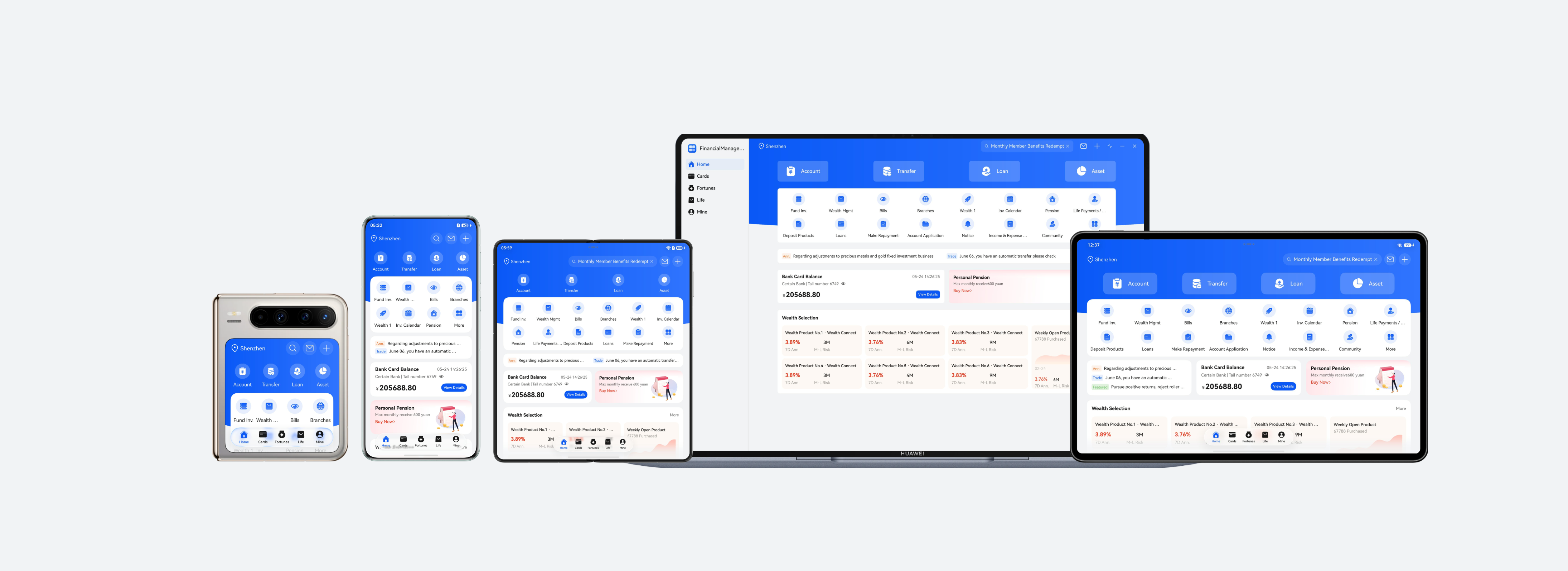
For details about the UX design, see the multi-device responsive design guide for bank wealth management. See the following figure for reference.
Project Management
To ensure the reusability and maintainability of the project to implement one-time development for multi-device deployment, it is recommended that developers use a layered architecture to organize code projects. The architecture consists of three layers: products (product customization layer), features (basic feature layer), and common (common capability layer). Each layer has clear responsibilities and independent functions, providing developers with a clear, efficient, and scalable design solution. For details about the layered architecture design, see Layered Architecture Design.
[h2]Project Creation
You are advised to create a template project after learning how to create and configure a layered architecture project by referring to Cross-Device Project Deployment and Release. Modify the project based on the development requirements of the bank wealth management app to ensure that the project architecture meets the actual service requirements.
[h2]Project Structure
The bank wealth management app uses the recommended layered architecture, organizing the code project into three layers: products, features, and common. The design of each layer is as follows:
- products layer: The bank wealth management app needs to be compatible with the following devices: bar-type phones, bi-fold devices (Mate X series), tri-fold devices, widescreen foldable devices, tablets, and PCs. The UI layout of PCs differs greatly from that of other devices. Therefore, a hap package named pc needs to be created separately as the app entry for PCs. The UI layouts of bar-type phones, bi-fold devices (Mate X series), tri-fold devices, widescreen foldable devices, and tablets are similar. Some differences can be adapted through the adaptive layout and responsive layout of one-time development for multi-device deployment. Therefore, a hap package named default is created as the app entry for these devices.
- features layer: contains the four core service modules of account, investment, wealth, and recommend. A HAR package is created for each module, which can be referenced by the products layer as required. The modules are independent of each other, facilitating subsequent maintenance and iteration.
- common layer: stores basic capabilities such as common constants, the log utility class, and window management utility in a centralized manner to implement code reuse and reduce redundancy. These capabilities can be uniformly called by other modules.
The project structure is as follows:
├──commons/financialbase
│  └──src/main
│     ├──ets
│     │  ├──constants                         // Common constants
│     │  └──utils                             // Encapsulate utilities and window capabilities.
│     └──resources                            // Public resources
├──features
│  ├──account                                 // Account module
│  │  └──src/main
│  │     ├──ets
│  │     │  ├──components                     // Account module components
│  │     │  ├──constants                      // Account module constants
│  │     │  ├──model                          // Data model of the account module
│  │     │  └──viewmodel                      // View model of the account module
│  │     └──resources                         // Account module resources
│  ├──investment                              // Investment module
│  │  └──src/main
│  │     ├──ets
│  │     │  ├──components                     // Purchase module components
│  │     │  ├──model                          // Data model of the purchase module
│  │     │  └──viewmodel                      // View model of the investment module
│  │     └──resources                         // Investment module resources
│  ├──wealth                                  // Wealth management module
│  │  └──src/main
│  │     ├──ets
│  │     │  ├──components                     // Product and selling point display components
│  │     │  ├──model                          // Data model of the product module
│  │     │  └──viewmodel                      // View model of the product module
│  │     └──resources                         // Product module resources
│  └──recommend                               // Recommended content
│     └──src/main
│        ├──ets
│        │  ├──components                     // Recommendation module components
│        │  ├──model                          // Data model of the recommendation module
│        │  └──viewmodel                      // View model of the recommendation module
│        └──resources                         // Recommendation module resources
└──products
   ├──default                                 // Mobile phone/Tablet
   │  └──src/main
   │     ├──ets
   │     │  ├──entryability                   // Entry ability
   │     │  ├──model                          // Data model
   │     │  ├──pages                          // Pages
   │     │  ├──view                           // Components
   │     │  └──viewmodel                      // View model
   │     └──resources                         // Resource file
   └──pc                                      // PC
      └──src/main
         │  ├──model                          // Data structure
         │  ├──pages                          // Pages
         │  ├──pcbackupability                // Data backup and restoration extension ability
         │  ├──view                           // Components
         │  └──viewmodel                      // View model
         └──resources                         // Resource file
Mobile Pages
This section describes how to use layout capabilities to adapt a set of pages in the bank wealth management app across different devices, such as bar-type phones, bi-fold devices (Mate X series), tri-fold devices, widescreen foldable devices, and tablets. It also describes the window adaptation solutions for these devices.
[h2]Window Adaptation
- Window Mode
Adapted devices support full-screen, split-screen, floating window, and freeform window modes. For details, see Window Mode. The split-screen and floating window modes can be easily accessed through the system. By listening for window size changes, the app refreshes the UI based on the breakpoints to automatically apply layouts suitable for distinct window modes.
- Window Orientation
In the model.json5 configuration file, set the orientation field to follow_desktop (following the orientation of the home screen.). For details, see Controlling the Display Orientation Using Window Properties.
- Immersive Window
You can implement the immersive windows in different modes (full-screen, split-screen, floating window, and freeform window modes) based on the UX design. For details, see Immersive Window. You are advised to use the component-level immersive solution (component-based page immersion) to implement the immersive effect and dynamically avoid the safe area to ensure the immersive display effect. In freeform window mode, the title bar is hidden by calling window.setWindowDecorVisible(false), and only the three buttons in the upper right corner are retained. In this way, the app page extends to the title bar area, achieving an immersive display effect.
[h2]Home Page
The home page of the wealth management app mainly displays the service entry, message bulletin, widget content, and wealth recommendation in an aggregated manner. According to the function design, the app home page is divided into six areas, as shown in the following table.
Horizontal Breakpoint | sm | md | lg, xl |
|---|---|---|---|
Home page |
|
|
|


UI Development
The following table describes the details and implementation scheme.
No. | Description | How to Implement |
|---|---|---|
1 | Bottom tabs | Use HdsTabs to implement bottom tabss. Use the barfloatingstyle attribute to set the floating style for tabs, and make sure that tabs on the bottom can be easily reached on mobile devices. |
2 | Top bar | Display the city, search box, and common operations. Use the layoutWeight attribute of the component to implement the adaptive stretching effect of the city on the left at different breakpoints. On small screens, the search function is collapsed into a search icon. On medium and large screens, the search function is expanded into a search box, and the left and right padding changes with the breakpoint. |
3 | Main service shortcut area | Use the Row component for horizontal layout and dynamically adjust the left and right padding by monitoring the changes of different breakpoints. At sm and md breakpoints, icons and text are arranged vertically. At the lg and xl breakpoints, they are arranged horizontally. |
4 | Service grid area | Use the Grid component to implement this area. Use the columnsTemplate attribute to dynamically adjust the number of columns displayed at different breakpoints. |
5 | Message widget, bank card information, and personal pension | Use the responsive grid system (GridRow and GridCol) to implement these features. Implement the responsive layout by monitoring breakpoint changes. At the sm horizontal breakpoint, the three widgets are stacked vertically. At the md breakpoint, the message widget occupies a single row, and the bank card information and personal pension widgets are displayed side by side. At breakpoints above lg, the three widgets are evenly distributed in the same row. |
6 | Featured fortune | Use the responsive grid system (GridRow and GridCol) to implement this feature. When the breakpoint changes, adjust the number of lists and the extended content on the right accordingly to ensure balanced information density on different devices. |
[h2]Account Overview
The account overview page displays the user's total assets, yesterday income, and different asset modules such as the demand deposit, investment, and liability modules. According to the function design, the account overview page is divided into six areas, as shown in the following table.
Horizontal Breakpoint | sm | md | lg, xl |
|---|---|---|---|
Account overview |
|
|
|


UI Development
The following table describes the details and implementation scheme.
No. | Description | How to Implement |
|---|---|---|
1 | Title bar | Use the titleBar attribute of the HdsNavDestination component to set the immersive style and dynamic blur style for the title bar. |
2 | Overview panel | A two-column layout is implemented using the responsive grid system (GridRow and GridCol). Use the columns attribute to define the number of grid columns at different breakpoints. For details, see the description of the GridRowOptions object. Use the span attribute to control the proportion of each area at different breakpoints. |
3 | Product recommendation (personal pension) | Use the Row component for horizontal layout and dynamically adjust the left and right padding by monitoring the changes of different breakpoints. |
4 | Demand deposits |
|
5 | Investment (wealth management widget and fund widget) | |
6 | Liabilities |
|
[h2]Wealth Management Details Page
The wealth management details page displays key information, transaction timeline, and product highlights of a wealth management product, and provides the Follow/Buy entry at the bottom. According to the function design, the app home page is divided into five areas, as shown in the following table.
Horizontal Breakpoint | sm | md | lg, xl |
|---|---|---|---|
Wealth Management Details Page |
|
|
|


UI Development
The following table describes the details and implementation scheme.
No. | Description | How to Implement |
|---|---|---|
1 | Title bar | Implement the back button and title text in the parent component Row. Use the Stack component to control the component hierarchy on the wealth management details page, ensuring that the title bar is always displayed at the top of the page. |
2 | Product information widget | Use the Flex layout and conditional rendering. Dynamically adjust the inner padding by monitoring breakpoint changes.
|
3 | Timeline widget | Use the Grid container to define a four-column grid with a fixed ratio. Dynamically adjust the inner padding by monitoring breakpoint changes. Use the constraintSize attribute to limit the maximum width of the widget to avoid excessive stretching on the large screen. |
4 | Product Highlights | Use the responsive grid system (GridRow and GridCol) to implement these features. Implement the responsive layout by monitoring breakpoint changes.
|
5 | Bottom operation bar | Implement the Follow and Buy buttons in the parent component Row. Use the layoutWeight attribute to control the layout weight at different breakpoints. Use the Stack component to control the component hierarchy on the wealth management details page, ensuring that the bottom operation bar is always displayed at the bottom of the page. |
[h2]Purchase page
The purchase page is used to confirm the purchase of a wealth management product. The user can confirm the amount, select a payment method, and check the product information on this page. According to the function design, the app home page is divided into six areas, as shown in the following table.
Horizontal Breakpoint | sm | md | lg, xl |
|---|---|---|---|
Purchase page |
|
|
|


UI Development
At the sm breakpoint, use bindsheet to bind the sheet page to the component. At md and larger breakpoints, use Navigation to implement the two-column layout. The following table describes the implementation scheme.
No. | Description | How to Implement |
|---|---|---|
1 | Title bar | Implement the title text and close button in the parent component Row, and use the justifycontent attribute to evenly distribute the flexible elements horizontally. Use the Stack component to control the component hierarchy on the purchase page, ensuring that the title bar is always displayed at the top of the page. |
2 | Product name | The Text component is used to implement this feature. |
3 | Purchase amount widget | Use the Row layout. The purchase amount is displayed on the left, and the transaction rules are displayed on the right. Input area: The TextInput component is used to implement this feature. The type attribute is used to restrict the input type. Shortcut amount buttons: Use the Row component to arrange them horizontally. |
4 | Payment method widget | Use Row to implement the horizontal layout. The payment method is displayed on the left, and the bank card information and drop-down arrow are displayed on the right. |
5 | Product summary | Use the Column component to vertically arrange the seven summary items, and use the space attribute to control the vertical margin. |
6 | Bottom confirm button | Use the Stack component to control the component hierarchy on the purchase page, ensuring that the bottom confirm button is always displayed at the bottom of the page. |
PC Pages
This section describes how to reuse the code logic and layout based on the existing mobile UI development solution to efficiently develop banking wealth management apps for PCs.
[h2]Home Page
The home page of the wealth management app mainly displays the service entry, message bulletin, widget content, and wealth recommendation in an aggregated manner. According to the function design, the app home page is divided into six areas, as shown in the following table.

UI Development
The following table describes the details and implementation scheme.
No. | Description | How to Implement |
|---|---|---|
1 | Sidebar | Use SideBarContainer to implement this feature. |
2 | Top bar | Display the city, search box, and common operations. Use the layoutWeight attribute of the component to implement the adaptive stretching effect of the city on the left at different breakpoints. |
3 | Main service shortcut area | Use the Row component for horizontal layout and dynamically adjust the left and right padding by monitoring the changes of different breakpoints. At sm and md breakpoints, icons and text are arranged vertically. At the lg and xl breakpoints, they are arranged horizontally. |
4 | Service grid area | Use the Grid component to implement this area. Use the columnsTemplate attribute to dynamically adjust the number of columns displayed at different breakpoints. |
5 | Message widget, bank card information, and personal pension | Use the responsive grid system (GridRow and GridCol) to implement these features. The message widget occupies one row, and the bank card information and personal pension widgets are displayed side by side. |
6 | Featured fortune | Reuse the layout solution for mobile devices. The implementation solution is the same as that for implementing the layout of area 6 on the home page on mobile devices. |
[h2]Account Overview
The account overview page displays the user's total assets, yesterday income, and different asset modules such as the demand deposit, investment, and liability modules. According to the function design, the account overview page is divided into six areas, as shown in the following table.
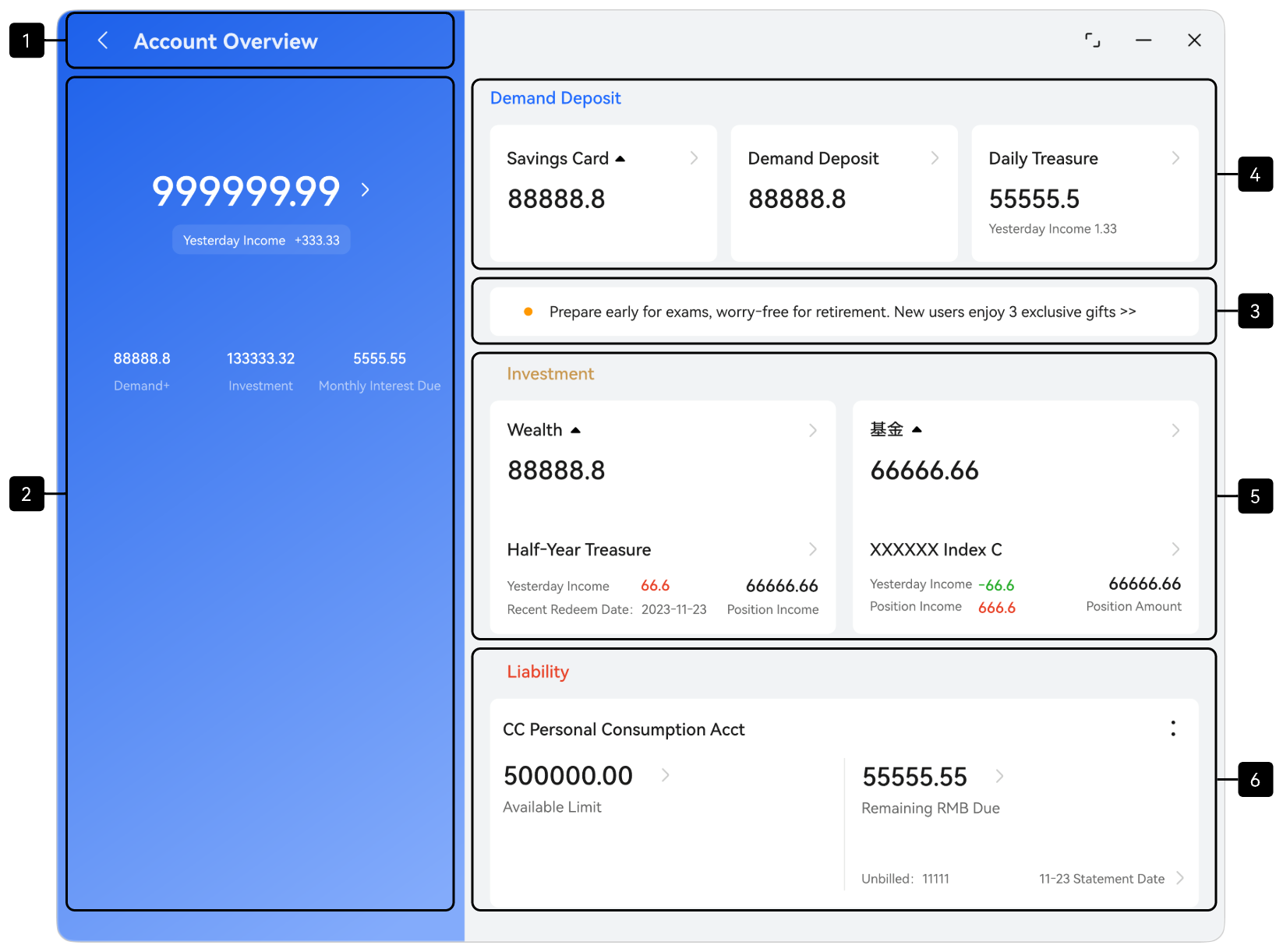
UI Development
The following table describes the details and implementation scheme.
No. | Description | How to Implement |
|---|---|---|
1 | Title bar | Implement the back button and title text in the parent component Row. Use the Stack component to control the component hierarchy on the account overview page, ensuring that the title bar is always displayed at the top of the page. |
2 | Overview panel | Reuse the layout solution for mobile devices. The implementation solution is the same as that for implementing the layout of the corresponding area on the account overview page on mobile devices. |
3 | Product recommendation | |
4 | Demand deposits | |
5 | Investment (wealth management widget and fund widget) | |
6 | Liability information |
[h2]Wealth Management Details Page
The wealth management details page displays key information, transaction timeline, and product highlights of a single wealth management product, and provides the Follow/Buy entry at the bottom. According to the function design, the app home page is divided into five areas, as shown in the following table.
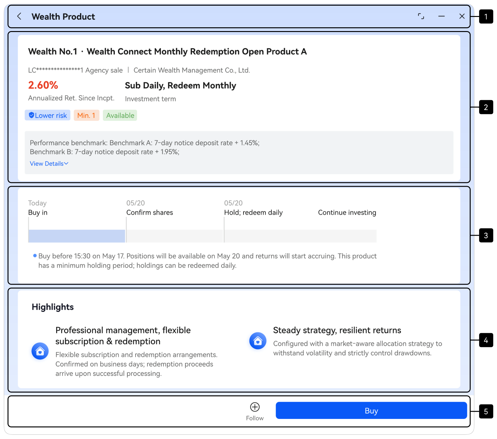
UI Development
The following table describes the details and implementation scheme.
No. | Description | How to Implement |
|---|---|---|
1 | Title bar | Implement the back button and title text in the parent component Row. |
2 | Product information widget | Reuse the layout solution for mobile devices. The implementation solution is the same as that for implementing the layout of the corresponding area on the wealth management details page on mobile devices. |
3 | Timeline widget | |
4 | Product highlights | |
5 | Bottom operation bar | Implement the Follow and Buy buttons in the parent component Row. Implement a fixed width for the purchase button and align the button at the end horizontally using the justifycontent attribute. |
[h2]Purchase page
The purchase page is used to confirm the purchase of a wealth management product. The user can confirm the amount, select a payment method, and check the product information on this page. According to the function design, the app home page is divided into six areas, as shown in the following table.
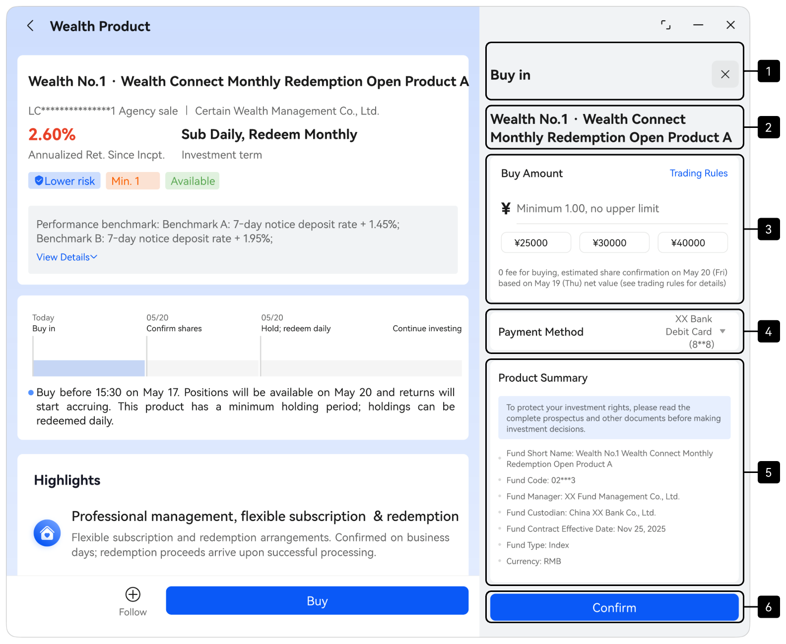
UI Development
The following table describes the details and implementation scheme.
No. | Description | How to Implement |
|---|---|---|
1 | Title bar | Reuse the layout solution for mobile devices. The implementation solution is the same as that for implementing the layout of the corresponding area on the purchase page on mobile devices. |
2 | Product name | |
3 | Purchase amount widget | |
4 | Payment method widget | |
5 | Product summary | |
6 | Bottom confirm button |