With a basic understanding of the ArkTS language, let's examine its structural composition through a practical example.
The following demonstration shows a text element that changes from Hello World to Hello ArkUI when a button is clicked.
Figure 1 Example

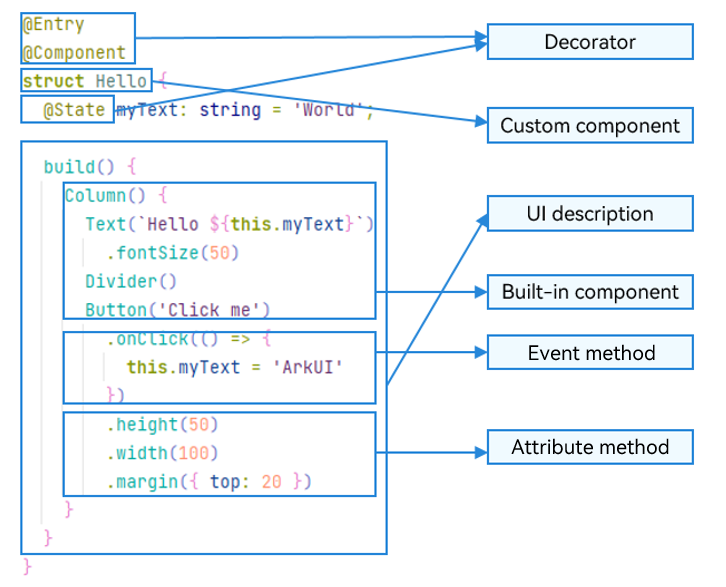
In this example, the basic composition of ArkTS is as follows.
Figure 2 Basic composition of ArkTS

Custom variables must not share names with universal attributes or events.
-
UI decorators: used to decorate classes, structs, methods, and variables, giving them special meanings. In the example above, @Entry, @Component, and @State are all decorators. @Component indicates a custom component, @Entry indicates that the custom component serves as the entry component, and @State indicates a state variable within the component, where changes to the state variable trigger UI refresh.
-
UI description: declarative description of the UI structure, such as the code block of build().
-
Custom component: reusable UI unit that can be used with other components, such as the struct Hello decorated by @Component.
-
Built-in component: default basic or container component preset in ArkTS, which can be directly invoked, such as Column, Text, Divider, and Button components in the sample code.
-
Attribute method: chainable method for configuring a component attribute, such as fontSize(), width(), height(), and backgroundColor().
-
Event method: chainable method for defining interaction logic, for example, onClick() for the Button component.
ArkTS introduces several advanced syntax features designed to improve developer productivity and code maintainability.
-
@Builder/@BuilderParam: specialized mechanism for encapsulating UI descriptions, enabling fine-grained reuse of UI descriptions.
-
@Extend/@Styles: decorator that extends built-in components and encapsulates attribute styles to combine built-in components more flexibly.
-
stateStyles: feature that implements polymorphic styles that dynamically adapt to a component's internal state.