The GridCol component must be used as a child component of the GridRow container.

This component is supported since API version 9. Updates will be marked with a superscript to indicate their earliest API version.
APIs
GridCol(option?: GridColOptions)
Creates a GridCol component.
Widget capability: This API can be used in ArkTS widgets since API version 9.
Atomic service API: This API can be used in atomic services since API version 11.
System capability: SystemCapability.ArkUI.ArkUI.Full
Parameters
| Name | Type | Mandatory | Description |
|---|---|---|---|
| option | GridColOptions | No | Options of the GridCol component. |
GridColOptions
Defines the options of the GridCol component.
Widget capability: This API can be used in ArkTS widgets since API version 9.
Atomic service API: This API can be used in atomic services since API version 11.
System capability: SystemCapability.ArkUI.ArkUI.Full
| Name | Type | Read-Only | Optional | Description |
|---|---|---|---|---|
| span | number | GridColColumnOption | No | Yes | Number of columns occupied by the component. If it is set to 0, the component is not involved in layout calculation, that is, the component is not rendered. The value must be a non-negative integer. Default value: 1. Invalid values are treated as the default value. |
| offset | number | GridColColumnOption | No | Yes | Number of offset columns relative to the original position of the component. The value must be a non-negative integer. Default value: 0. Invalid values are treated as the default value. |
| order | number | GridColColumnOption | No | Yes | Sequence number of the component. Child components of the grid are sorted in ascending order based on their sequence numbers. The value must be a non-negative integer. Default value: 0. Invalid values are treated as the default value. NOTE If a child component shares an order value with another child component or does not have order set, it is displayed based on its code sequence number. If order is not set for all child components, those that have order set are displayed after those that do not and are sorted in ascending order based on the value. |
The values of span, offset, and order attributes are inherited in the sequence of xs, sm, md, lg, xl, and xxl. If no value is set for a breakpoint, the value is obtained from the previous breakpoint.
Since API version 20, inheritance of the span property follows rules detailed in GridColColumnOption.
[h2]span
span(value: number | GridColColumnOption)
Sets the number of columns occupied by the component. If it is set to 0, the element is not involved in layout calculation, that is, the element is not rendered.
Widget capability: This API can be used in ArkTS widgets since API version 9.
Atomic service API: This API can be used in atomic services since API version 11.
System capability: SystemCapability.ArkUI.ArkUI.Full
Parameters
| Name | Type | Mandatory | Description |
|---|---|---|---|
| value | number | GridColColumnOption | Yes | Number of occupied columns. The value must be a non-negative integer. Default value: 1. Invalid values are treated as the default value. |
[h2]gridColOffset
gridColOffset(value: number | GridColColumnOption)
Sets the number of offset columns relative to the original position of the component.
Widget capability: This API can be used in ArkTS widgets since API version 9.
Atomic service API: This API can be used in atomic services since API version 11.
System capability: SystemCapability.ArkUI.ArkUI.Full
Parameters
| Name | Type | Mandatory | Description |
|---|---|---|---|
| value | number | GridColColumnOption | Yes | Number of offset columns relative to the previous child component of the grid The value must be a non-negative integer. Default value: 0. Invalid values are treated as the default value. |
[h2]order
order(value: number | GridColColumnOption)
Sets the display order of the grid child component. Grid child components are sorted in ascending order based on their sequence numbers.
Widget capability: This API can be used in ArkTS widgets since API version 9.
Atomic service API: This API can be used in atomic services since API version 11.
System capability: SystemCapability.ArkUI.ArkUI.Full
Parameters
| Name | Type | Mandatory | Description |
|---|---|---|---|
| value | number | GridColColumnOption | Yes | Sequence number of the component. Child components of the grid are sorted in ascending order based on their sequence numbers. The value must be a non-negative integer. Default value: 0. Invalid values are treated as the default value. |
GridColColumnOption
Describes the numbers of grid columns occupied by the GridCol component on devices with different width types.
- In versions earlier than API version 20: When you configure GridCol column spans only at specific breakpoints, unconfigured breakpoints inherit values from the next smaller configured breakpoint. If no smaller breakpoint is configured, the default value of 1 is used.
span: {xs:2, md:4, lg:8} // Equivalent to span: {xs:2, sm:2, md:4, lg:8, xl:8, xxl:8}. span: {md:4, lg:8} // Equivalent to span: {xs:1, sm:1, md:4, lg:8, xl:8, xxl:8}. - Since API version 20: When you configure GridCol column spans only at specific breakpoints, unconfigured breakpoints inherit values from the next smaller configured breakpoint. If no smaller breakpoint exists, values are inherited from the next larger configured breakpoint.
span: {xs:2, md:4, lg:8} // Equivalent to span: {xs:2, sm:2, md:4, lg:8, xl:8, xxl:8}. span: {md:4, lg:8} // Equivalent to span: {xs:4, sm:4, md:4, lg:8, xl:8, xxl:8}. - Recommendation: Explicitly configure GridCol column spans for all required breakpoints to prevent unexpected layout behavior caused by automatic value inheritance.
Widget capability: This API can be used in ArkTS widgets since API version 9.
Atomic service API: This API can be used in atomic services since API version 11.
System capability: SystemCapability.ArkUI.ArkUI.Full
| Name | Type | Read-Only | Optional | Description |
|---|---|---|---|---|
| xs | number | No | Yes | Number of grid columns on the device where the grid size is xs. |
| sm | number | No | Yes | Number of grid columns on the device where the grid size is sm. |
| md | number | No | Yes | Number of grid columns on the device where the grid size is md. |
| lg | number | No | Yes | Number of grid columns on the device where the grid size is lg. |
| xl | number | No | Yes | Number of grid columns on the device where the grid size is xl. |
| xxl | number | No | Yes | Number of grid columns on the device where the grid size is xxl. |
Example
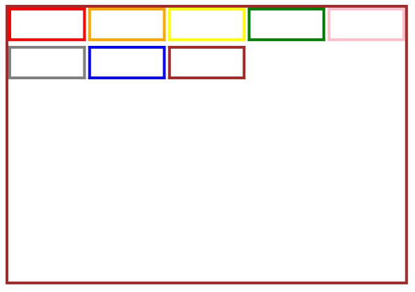
This example demonstrates the basic usage of GridCol.
// xxx.ets
@Entry
@Component
struct GridColExample {
  @State bgColors: Color[] =
    [Color.Red, Color.Orange, Color.Yellow, Color.Green, Color.Pink, Color.Grey, Color.Blue, Color.Brown]
  @State currentBp: string = 'unknown'

  build() {
    Column() {
      GridRow({
        columns: 5,
        gutter: { x: 5, y: 10 },
        breakpoints: {
          value: ['400vp', '600vp', '800vp'],
          reference: BreakpointsReference.WindowSize
        },
        direction: GridRowDirection.Row
      }) {
        ForEach(this.bgColors, (color: Color) => {
          GridCol({
            span: { xs: 1, sm: 2, md: 3, lg: 4 },
            offset: 0,
            order: 0
          }) {
            Row().width('100%').height('20vp')
          }.borderColor(color).borderWidth(2)
        })
      }.width('100%').height('100%')
      .onBreakpointChange((breakpoint) => {
        this.currentBp = breakpoint
      })
    }.width('80%').margin({ left: 10, top: 5, bottom: 5 }).height(200)
    .border({ color: '#880606', width: 2 })
  }
}