Overview
This topic uses mobile payment apps as a typical example to detail how the feature of one-time development for multi-device deployment is applied in actual development.
Mobile payment apps mainly provide users with convenient financial payment services. The main functions include QR code payment, showing payment QR code, and investment and wealth management. Based on these core features, the recommendation page, scan page, and payment page are used as typical pages for development practice. The development process complies with the differentiation, consistency, flexibility, and compatibility principles, helping you quickly master the capabilities of one-time development for multi-device deployment and develop a mobile payment app.
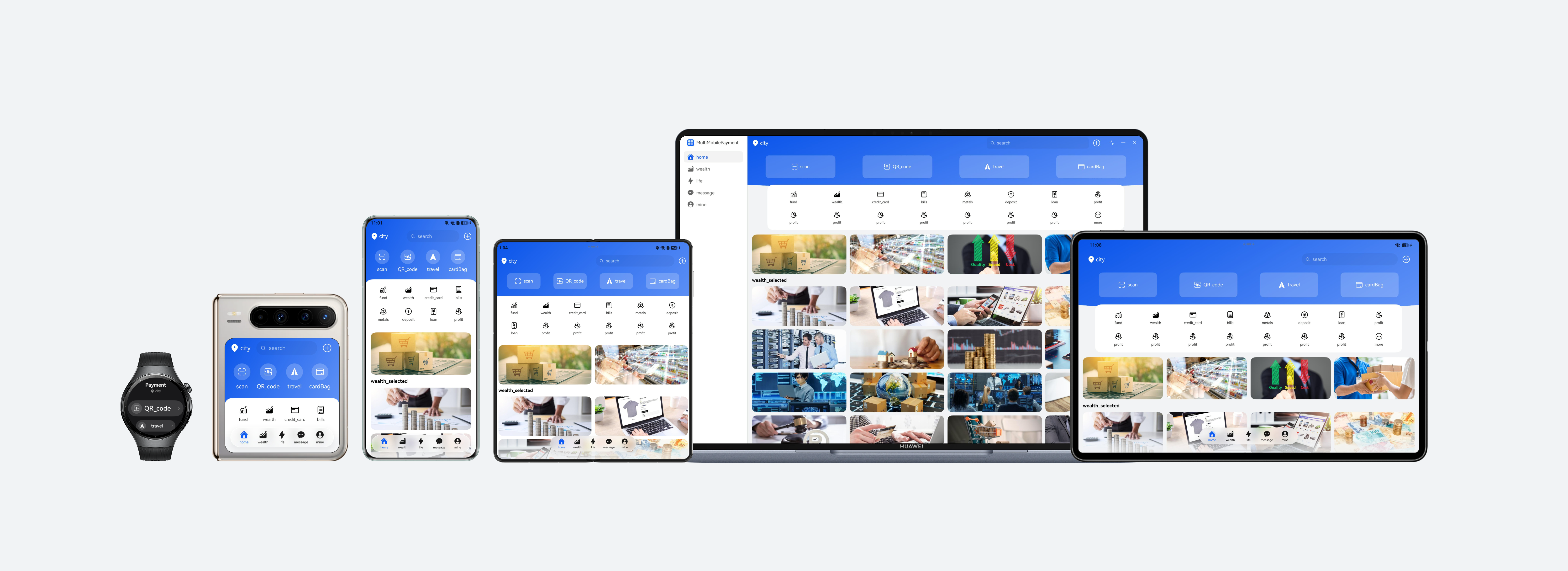
Currently, this app is compatible with the following devices: bar-type phones, bi-fold devices (Mate X series), tri-fold devices, widescreen foldable devices, tablets, PCs, and wearables.

Before reading this topic, you are advised to learn the ArkUI framework and the capabilities of one-time development for multi-device deployment.
The following practices will focus on these product forms and provide examples from the perspectives of UX design, project management, and page development, helping you develop mobile payment apps that can be deployed on multiple devices.
- UX Design: describes the interaction logic and design points of mobile payment apps. It can be directly referenced and reused for developing mobile payment apps of the same type.
- Project Management: describes how to build a code project of one-time development for multi-device deployment based on a layered architecture, clearly defining the logic of each layer through a clear directory structure, and provides an appropriate project configuration solution for mobile payment services.
- Mobile Pages, PC Pages, and Wearable Pages: describe the design principles and specific implementation methods of window adaptation, page development, and function development on mobile, PC, and wearable pages by following the actual app development process, with pages as the basic unit.
UX Design
For details about the UX design of mobile payment apps, see the multi-device responsive design guide for mobile payment apps. See the following figure for reference.
Project Management
To improve the reusability and maintainability of the project to implement one-time development for multi-device deployment, it is recommended that developers use a layered architecture to organize code projects. The architecture consists of three layers: products (product customization layer), features (basic feature layer), and common (common capability layer). Each layer has clear responsibilities and independent functions, providing developers with a clear, efficient, and scalable design architecture. For details about the layered architecture design, see Layered Architecture Design.
[h2]Project Creation
You are advised to create a template project of a layered architecture after learning how to create and configure such project by referring to Cross-Device Project Deployment and Release. You can then adjust the project based on the actual development requirements of the mobile payment app to ensure that the project architecture aligns with the service scenario.
[h2]Project Structure
The mobile payment app uses the recommended layered architecture, organizing the code project into three layers: products, features, and common. The design of each layer is as follows:
- products layer: The mobile payment app needs to be compatible with the following devices: bar-type phones, bi-fold devices (Mate X series), tri-fold devices, widescreen foldable devices, tablets, PCs, and wearables. The UI layouts of PCs and wearables differ greatly from that of other devices. Therefore, hap packages named pc and watch are created separately at the products layer as the app entries for PCs and wearables. The UI layouts of bar-type phones, bi-fold devices (Mate X series), tri-fold devices, widescreen foldable devices, and tablets are similar. Some differences can be adapted through the adaptive layout and responsive layout of one-time development for multi-device deployment. Therefore, a hap package named default is created at the products layer as the app entry for these devices.
- features layer: The mobile payment app mainly consists of three core service modules: recommendation page (multimobilepaymentrecommend), scan (multimobilepaymentscan), and payment (multimobilepaymentpay). A HAR package is created at the features layer for the three service modules, which can be referenced by the products layer as required. These service modules are independent of each other, facilitating subsequent maintenance and iteration of the project.
- common layer: A basic capability HAR package (multimobilepaymentbase) is created at the common layer to implement code reuse and reduce redundancy. This layer encapsulates basic capabilities shared by multiple modules, such as common constants, breakpoint utilities, and window management utilities. Upper-layer modules can directly call these capabilities.
The project structure is as follows:
├──common                                        // Common capability layer
│  └──multimobilepaymentbase/src/main
│     ├──ets
│     │  ├──data
│     │  ├──db
│     │  └──utils
│     └──resources                                // App resources
├──features                                       // Basic feature layer
│  ├──multimobilepaymentpay/src/main              // Payment module
│  │  ├──ets
│  │  │  ├──view
│  │  │  └──viewmodel
│  │  └──resources                                // App resources
│  ├──multimobilepaymentrecommend/src/main        // Recommendation module
│  │  ├──ets
│  │  │  ├──model
│  │  │  ├──view
│  │  │  └──viewmodel
│  │  └──resources                                // App resources
│  └──multimobilepaymentscan/src/main             // Scanning module
│     ├──ets
│     │  ├──model
│     │  ├──view
│     │  └──viewmodel
│     └──resources
└──products                                       // Product customization layer
   ├──default/src/main                            // Phone and tablet
   │  ├──ets
   │  │  ├──entryability
   │  │  ├──entrybackupability
   │  │  ├──model
   │  │  ├──pages
   │  │  ├──view
   │  │  └──viewmodel
   │  └──resources                                // App resources
   ├──pc/src/main                                 // PC
   │  ├──ets
   │  │  ├──model
   │  │  ├──pages
   │  │  ├──pcability
   │  │  ├──pcbackupability
   │  │  └──viewmodel
   │  └──resources
   └──watch/src/main                              // Watch
      ├──ets
      │  ├──model
      │  ├──pages
      │  ├──view
      │  ├──viewmodel
      │  ├──wearableability
      │  └──wearablebackupability
      └──resources
Mobile Pages
This section describes how to use layout capabilities to adapt a set of pages in the mobile payment app across different devices, such as bar-type phones, bi-fold devices (Mate X series), tri-fold devices, widescreen foldable devices, and tablets. It also describes the window adaptation solutions for these devices.
[h2]Window Adaptation
- Window Mode
Adapted devices support full-screen, split-screen, and floating window modes. For details, see Window Mode. The split-screen and floating window modes can be easily accessed through the system without any special design. By monitoring window size changes, the app refreshes the UI based on the breakpoints to automatically apply layouts suitable for distinct window modes.
- Window Orientation
The window orientation in implemented by setting the orientation attribute under abilities to follow_desktop in the module.json5 file, indicating that the window orientation follows the orientation of the home screen..
- Immersive Window
According to the UX design specifications, the immersive effect needs to be implemented. For details, see Immersive Window. On the recommendation page, you can use window.setWindowLayoutFullscreen() to implement the immersive effect and combine dynamic safe area avoidance to ensure a complete display effect.

The scan and payment pages are implemented through sheet transition, and the immersive effect cannot be achieved using setWindowLayoutFullscreen(). Therefore, immersive processing is required:
On the scan page, you can use ignoreLayoutSafeArea to extend the safe area during camera preview.
On the payment page, you can use the background attribute to set the background color and extend the safe area of the parent component to achieve an immersive display effect.
[h2]Recommendation Page
Item | sm | md | lg/xl |
|---|---|---|---|
Effect |
|
|
|


UI Development
The recommendation page uses the stretching and proportion capabilities of the adaptive layout of one-time development for multi-device deployment to implement the layout effect at different breakpoints.
The following table describes the details and implementation scheme.
No. | Description | How to Implement |
|---|---|---|
1 | Bottom tab | Use the HdsTabs component to implement this feature. Set the floating style of the tab bar using the HdsTabsFloatingStyle attribute. |
2 | City and search box | Use the Blank component to fill the blank area in the middle to implement the stretching capability. |
3 | Icon grid module | Change the form of shortcuts by monitoring the breakpoint changes. When the horizontal breakpoint is sm, the top-bottom layout is displayed. When the horizontal breakpoint is larger than sm, the left-right layout is displayed. In addition, the proportion scaling capability is used to enable the layout to change with the window width in the left-right layout. |
4 | Access path set | Combine the repeated layout with breakpoint monitoring to implement this feature. When the horizontal breakpoint is sm, the feature is displayed in two rows and four columns. When the horizontal breakpoint is md, the feature is displayed in two rows and six columns. When the horizontal breakpoint is lg or xl, the feature is displayed in two rows and eight columns. |
5 | Service widget | Combine the repeated layout with breakpoint monitoring to implement this feature. When the horizontal breakpoint is sm, one element is displayed in the window. When the horizontal breakpoint is md, two elements are displayed in the window. When the horizontal breakpoint is lg or xl, four elements are displayed. |
6 | Featured fortune | Combine the repeated layout with breakpoint monitoring to implement this feature, which is the same as implementation of the service widget. |
In actual development, area 1 is the outer tab, and areas 2–6 are parallel recommendation pages. Therefore, the development sequence is areas 1 and areas 2–6.
In this example, when you tap the scan or payment icon, different effects are displayed at different breakpoints. If the horizontal breakpoint is sm, an independent page is displayed. If the horizontal breakpoint is greater than sm, a dialog box is started. The sheet transition is used to implement this feature. When the horizontal breakpoint is sm, sheetType is set to CONTENT_COVER, indicating the full-screen sheet mode. When the horizontal breakpoint is greater than sm, sheetType is set to CENTER, indicating the center sheet mode. For details about the implementation, see Sample Code.
[h2]Scan Page
The scan page mainly starts the camera for scanning, which provides entries to other related functions. Based on the function design, the scan page is divided into four areas, as described in the following table.
Item | sm | md | lg/xl |
|---|---|---|---|
Effect |
|
|
|


UI Development
The scan page uses the equal space distribution capability of the adaptive layout of one-time development for multi-device deployment to implement layout at different breakpoints.
The following table describes the details and implementation scheme.
No. | Description | How to Implement |
|---|---|---|
1 | Image preview area | Use the XComponent component to implement this feature. For details about the implementation logic, see Sample Code. |
2 | Top button area | Use the Row and Button components to implement this feature. This area is displayed in full-screen sheet mode, and is not displayed in center sheet mode. |
3 | Action Area | Use the justifyContent attribute of the Row component to implement the equal space distribution capability. Set this attribute to SpaceEvenly so that the distance between adjacent elements, the distance between the first element and the start of the row, and the distance between the last element and the end of the row are the same. |
4 | Scanning mode area | Similar to the functional area, the equal space distribution capability is implemented using the justifyContent attribute of the Row component. |
In actual development, area 1 is the bottom layer, and areas 2–4 are parallel scanning pages. Therefore, the development sequence is areas 1 and areas 2–4.
Functionality Development
The scanning function is implemented using Scan Kit. During multi-device development, some devices may not support the scanning function. In this case, you need to use the canIUse API to query the system capability. If the device supports the scanning function, request authorization from the user, call the camera service, and open the scanning dialog box.
In this example, only the camera preview stream is started and the scanned data is saved. In actual development, the scanned data needs to be further processed based on the service logic. For details about the implementation logic, see Sample Code.
[h2]Payment and Collection Page
The payment and collection page mainly displays the payment and collection QR code and provides entries to other related functions. Based on the function design, the payment and collection page is divided into four areas, as described in the following table.
Item | sm | md | lg/xl |
|---|---|---|---|
Effect |
|
|
|


UI Development
The payment and collection page uses the stretching capability of the adaptive layout of one-time development for multi-device deployment to implement layout at different breakpoints.
The following table describes the details and implementation scheme.
No. | Description | How to Implement |
|---|---|---|
1 | Title area | Use the Blank component to fill the blank area in the middle to implement the stretching capability. Combine the breakpoint capability to display and hide the title area. When the horizontal breakpoint is sm, the title area is displayed. When the horizontal breakpoint is greater than sm, the title area is hidden. |
2 | QR code area | Use the Blank component to fill the blank area vertically to implement the stretching capability and improve visual experience. |
3 | Collection Records | Determine whether the area is inside or outside the QR code area based on the breakpoint, and use the visibility attribute to control its display status. |
4 | Action area | Use the Blank component to fill the blank area in the middle to implement the stretching capability, ensuring that the content is always located at both ends of the container. |
In actual development, areas 1, 2, and 4 are parallel, and the container where area 3 is located needs to be determined. Therefore, the development sequence is areas 1, 2, 4, and area 3.
Functionality Development
The QR code is implemented using the generateBarcode capability, which requires the barcode generation capability of the device. Therefore, during development, you need to use the canIUse API to check whether the device has this capability to prevent function exceptions or crashes caused by device incompatibility.
PC Pages
This section describes how to reuse the code logic and layout based on the existing mobile UI development solution to efficiently develop mobile payment apps for PCs.
[h2]Window Adaptation
- Window Mode
Adapted devices support the freeform window mode. For details, see Window Mode. By monitoring window size changes, the app refreshes the UI based on the breakpoints to automatically apply layouts suitable for the freeform window modes mode.
- Immersive Window
In freeform window mode, call window.setWindowDecorVisible(false) to hide the title bar and display only the three buttons in the upper-right corner. In this case, the app page is extended to the title bar area, implementing the immersive display effect.
[h2]Recommendation Page
The recommendation page on PCs is basically the same as that on mobile devices. The difference is that content views are switched using tabs on mobile devices but using the sidebar on PCs. Based on the module, the recommendation page is divided into two areas, as described in the following table.

UI Development
An independent sidebar is defined for the recommendation page, and the existing code used to implement the mobile recommendation page is reused.
The following table describes the details and implementation scheme.
No. | Description | How to Implement |
|---|---|---|
1 | Sidebar | Use the SideBarContainer component to define the sidebar content separately. |
2 | Content area | Reuse the content of mobile pages. |
In actual development, area 1 is the outer container. Therefore, the development sequence is area 1 and then area 2.
Wearable Pages
This section describes how to develop a mobile payment app on wearables and the implementation solution.
[h2]Recommendation Page
The recommendation page on wearables displays only the core functions of the icon grid module. In addition, wearables do not have cameras and do not support the scanning capability. Therefore, only the payment, travel, and card functions are provided. The display effect is as follows.
Item | xs |
|---|---|
Effect |
|

UI Development
The recommendation page is implemented using the ArcList component, which allows you to customize the title bar style and child component style. This component is commonly used in wearable development.
The payment and collection page displays only the QR code. The display effect is as follows.
Item | xs |
|---|---|
Effect |
|

UI Development
Page redirection is implemented using the Navigation and NavDestination components, and the title bar is hidden.
Functionality Development
The QR code is implemented using the generateBarcode capability, which requires the barcode generation capability of the device. Therefore, during development, you need to use the canIUse API to check whether the device has this capability to prevent function exceptions or crashes caused by device incompatibility.