A scrollable container component. When the layout size of a child component exceeds the size of its parent component, the content can be scrolled. It supports setting the scroll direction, scroll bar, edge effect, nested scroll, and free scroll zoom, and is suitable for scenarios where the content exceeds the display area or complex scroll interactions are required.

- This component is supported since API version 7. Updates will be marked with a superscript to indicate their earliest API version.
- When a List child component is nested in this component for scrolling, if the width and height of the List are not set, all items are loaded by default. In performance-sensitive scenarios, developers should specify the width and height of the List to avoid the performance impact caused by loading all items by default. For best practices, see Optimizing Performance Using LazyForEach - On-Demand Loading Failure Due to the Scroll-Nested List.
- The prerequisite for this component to scroll is that the size along the main axis is smaller than the content size.
- The default value of the universal attribute clip of the Scroll component is true.
- When the height of the Scroll component exceeds the display range of the screen, you can set the universal attribute layoutWeight to make the height of the Scroll component adapt to the remaining space along the main axis.
- When a finger touches the screen, the scroll animations of all scroll components within the current touch range are stopped (except for the scroll animations triggered by the scrollTo and scrollToIndex APIs), including the edge bounce animation.
- The component has built-in gestures for functions such as finger-following scrolling. To add custom gesture operations, see Gesture Blocking Enhancement.
Child Components
This component supports only one child component.
Starting from API version 21, the maximum width or height for a single child component inside a Scroll container is 16,777,216 px. In API version 20 and earlier versions, the limit was 1,000,000 px. If a child component exceeds the applicable size limit, scrolling or display behavior may become abnormal.
APIs
Scroll(scroller?: Scroller)
Creates a Scroll component.
Atomic service API: This API can be used in atomic services since API version 11.
System capability: SystemCapability.ArkUI.ArkUI.Full
Parameters
| Name | Type | Mandatory | Description |
|---|---|---|---|
| scroller | Scroller | No | Controller of the scrollable component. It is used to bind to the scrollable component and control scrolling through the controller APIs. When not passed, the Scroll component cannot be controlled through the controller APIs. NOTE It is not allowed to bind the same scroll control object to other scrollable components, such as ArcList, List, Grid, Scroll, and WaterFlow. |
Attributes
In addition to universal attributes and scrollable component common attributes, the following attributes are also supported.
[h2]scrollable
scrollable(value: ScrollDirection)
Sets the scroll direction. After this value is modified, the scroll offset is reset. You can select vertical scroll, horizontal scroll, or free scroll based on the layout.
Atomic service API: This API can be used in atomic services since API version 11.
System capability: SystemCapability.ArkUI.ArkUI.Full
Parameters
| Name | Type | Mandatory | Description |
|---|---|---|---|
| value | ScrollDirection | Yes | Scrolling direction. Default value: ScrollDirection.Vertical |
When the scrolling direction is set to ScrollDirection.FREE, the Scroll component supports only partial capabilities. For details, see the capabilities supported in ScrollDirection.FREE.
[h2]scrollBar
scrollBar(barState: BarState)
Sets the scroll bar state. If the container component cannot scroll, the scroll bar is not displayed. If the size of the child component of the container component is infinite, the scroll bar does not support dragging and accompanying scrolling. This attribute can be used to control whether the scroll bar is always displayed, automatically displayed, or hidden.
Since API version 10, when the scrollable component has rounded corners, to prevent the scrollbar from being cut off by the corners, the scrollbar will automatically calculate the clearance distance from the top and bottom.
Atomic service API: This API can be used in atomic services since API version 11.
System capability: SystemCapability.ArkUI.ArkUI.Full
Parameters
| Name | Type | Mandatory | Description |
|---|---|---|---|
| barState | BarState | Yes | Scrollbar state. Default value: BarState.Auto |
[h2]scrollBarColor
scrollBarColor(color: Color | number | string)
Sets the scrollbar color.
Atomic service API: This API can be used in atomic services since API version 11.
System capability: SystemCapability.ArkUI.ArkUI.Full
Parameters
| Name | Type | Mandatory | Description |
|---|---|---|---|
| color | Color | number | string | Yes | Scrollbar color. Default value: '#66182431' A number value indicates a HEX color in RGB or ARGB format, value range: [0x0, 0xFFFFFFFF], for example, 0xffffff. A string value indicates a color in RGB or ARGB format, for example, '#ffffff'. |
[h2]scrollBarColor22+
scrollBarColor(color: Color | number | string | Resource)
Sets the scrollbar color. Compared with scrollBarColor, this API supports the Resource type for the color parameter.
Atomic service API: This API can be used in atomic services since API version 22.
Model restriction: This API can be used only in the stage model.
System capability: SystemCapability.ArkUI.ArkUI.Full
Parameters
| Name | Type | Mandatory | Description |
|---|---|---|---|
| color | Color | number | string | Resource | Yes | Scrollbar color. Default value: '#66182431' A number value indicates a HEX color in RGB or ARGB format, with a value range of [0x0, 0xFFFFFFFF], for example, 0xffffff. A string value indicates a color in RGB or ARGB format, for example, '#ffffff'. |
[h2]scrollBarWidth
scrollBarWidth(value: number | string)
Sets the width of the scroll bar. Percentage values are not supported. After the width is set, the scroll bar width in both the normal state and the pressed state is the set value. If the scroll bar width exceeds the visible size of the Scroll component along the main axis, the default value of 4 vp is used.
Atomic service API: This API can be used in atomic services since API version 11.
System capability: SystemCapability.ArkUI.ArkUI.Full
Parameters
| Name | Type | Mandatory | Description |
|---|---|---|---|
| value | number | string | Yes | Width of the scrollbar. Default value: 4 Unit: vp Value range: If the value is less than 0, the default value 4 vp is used. If the value is 0, the scrollbar is not displayed. |
[h2]scrollBarWidth
scrollBarWidth(value: number | string | Resource)
Sets the width of the scrollbar. Percentage values are not supported. After the width is set, the scrollbar width in both the normal state and the pressed state is the set value. If the scrollbar width exceeds the visible size of the Scroll component along the main axis, the scrollbar width changes to the default value of 4 vp. Resource type is supported.
If this attribute is not set, the scrollbar width is 4 vp.
Since: 26.0.0
Model restriction: This API can be used only in the stage model.
Atomic service API: This API can be used in atomic services since API version 26.0.0.
System capability: SystemCapability.ArkUI.ArkUI.Full
Parameters
| Name | Type | Mandatory | Description |
|---|---|---|---|
| value | number | string | Resource | Yes | Scrollbar width. Default value: 4 Unit: vp The value range is [0, +∞). If this parameter is set to a value less than 0, the default value 4vp is used. The value 0 means not to show the scrollbar. |
[h2]scrollSnap10+
scrollSnap(value: ScrollSnapOptions)
Sets the scroll snap mode of the Scroll component, which is used to implement scenarios such as paging scroll and card alignment that require positioning to a specified position after scrolling ends.
During the snap animation, the scroll operation source type reported by the onWillScroll event is ScrollSource.FLING.
Atomic service API: This API can be used in atomic services since API version 11.
Model restriction: This API can be used only in the stage model.
System capability: SystemCapability.ArkUI.ArkUI.Full
Parameters
| Name | Type | Mandatory | Description |
|---|---|---|---|
| value | ScrollSnapOptions | Yes | Scroll snap mode of the Scroll component. This object contains attributes such as snapAlign (alignment), snapPagination (pagination), enableSnapToStart (whether to snap to the start), and enableSnapToEnd (whether to snap to the end). |
[h2]edgeEffect
edgeEffect(edgeEffect: EdgeEffect, options?: EdgeEffectOptions)
Sets the effect used when the scroll boundary is reached.
Atomic service API: This API can be used in atomic services since API version 11.
System capability: SystemCapability.ArkUI.ArkUI.Full
Parameters
| Name | Type | Mandatory | Description |
|---|---|---|---|
| edgeEffect | EdgeEffect | Yes | Effect used when the scroll boundary is reached. The spring and shadow effects are supported. Default value: EdgeEffect.None |
| options11+ | EdgeEffectOptions | No | Whether to enable the effect when the component content is smaller than the component itself. The value { alwaysEnabled: true } enables the sliding effect, and { alwaysEnabled: false } disables it. When not passed, the default value is used. Default value: { alwaysEnabled: true } Model restriction: This API can be used only in the stage model. |
[h2]enableScrollInteraction10+
enableScrollInteraction(value: boolean)
Sets whether to support scroll gestures. It can be used to temporarily disable user gesture scrolling of the scroll component in scenarios where services such as custom dragging and custom scrolling need to take over the swipe gesture.
Atomic service API: This API can be used in atomic services since API version 11.
Model restriction: This API can be used only in the stage model.
System capability: SystemCapability.ArkUI.ArkUI.Full
Parameters
| Name | Type | Mandatory | Description |
|---|---|---|---|
| value | boolean | Yes | Whether to enable scroll gestures. With the value true, scrolling via finger or mouse is enabled. With the value false, scrolling via finger or mouse is disabled, but this does not affect the scrolling APIs of the Scroller. Default value: true |

The component cannot be scrolled by dragging the mouse.
[h2]nestedScroll10+
nestedScroll(value: NestedScrollOptions)
Sets the nested scroll mode in both forward and backward directions to implement scroll linkage with the parent component. It is applicable to nested scroll scenarios such as linkage between a list in a page and an outer scroll area.
Atomic service API: This API can be used in atomic services since API version 11.
Model restriction: This API can be used only in the stage model.
System capability: SystemCapability.ArkUI.ArkUI.Full
Parameters
| Name | Type | Mandatory | Description |
|---|---|---|---|
| value | NestedScrollOptions | Yes | Nested scroll options, used to configure the nested scroll modes in the forward and backward directions, including the scrollForward (forward scroll mode) and scrollBackward (backward scroll mode) fields. NestedScrollMode.SELF_ONLY indicates that only the component itself scrolls, NestedScrollMode.SELF_FIRST indicates that the component itself scrolls first, NestedScrollMode.PARENT_FIRST indicates that the parent component scrolls first, and NestedScrollMode.PARALLEL indicates that the component itself and the parent component scroll simultaneously. Default value: { scrollForward: NestedScrollMode.SELF_ONLY, scrollBackward: NestedScrollMode.SELF_ONLY } When Scroll sets enablePaging or scrollSnap and also sets parent-first nested scroll, the nested scroll does not take effect. |
[h2]friction10+
friction(value: number | Resource)
Sets the friction coefficient. It takes effect when the scroll area is swiped, and affects only the inertial scrolling process. It has an indirect impact on the chained effect during inertial scrolling.
Atomic service API: This API can be used in atomic services since API version 11.
Model restriction: This API can be used only in the stage model.
System capability: SystemCapability.ArkUI.ArkUI.Full
Parameters
| Name | Type | Mandatory | Description |
|---|---|---|---|
| value | number | Resource | Yes | Friction coefficient. Default value: 0.9 for wearable devices and 0.6 for non-wearable devices Since API version 11, the default value for non-wearable devices is 0.7. Since API version 12, the default value for non-wearable devices is 0.75. Value range: (0, +∞). If the value is less than or equal to 0, the default value is used. |
[h2]enablePaging11+
enablePaging(value: boolean)
Sets whether to enable swipe paging. If both swipe paging (enablePaging) and scrollSnap are set, scrollSnap takes effect first and enablePaging does not take effect. This attribute can be used in scenarios such as book page turning and card paging browsing.
Atomic service API: This API can be used in atomic services since API version 12.
Model restriction: This API can be used only in the stage model.
System capability: SystemCapability.ArkUI.ArkUI.Full
Parameters
| Name | Type | Mandatory | Description |
|---|---|---|---|
| value | boolean | Yes | Whether to support swipe paging. The value true means that swipe paging is supported, and false means the opposite. Default value: false |
[h2]initialOffset12+
initialOffset(value: OffsetOptions)
Sets the initial scroll offset. It takes effect only during the first layout, and subsequent dynamic changes to this attribute value do not take effect. It can be used to locate a specified scroll position when the page is displayed for the first time.
Atomic service API: This API can be used in atomic services since API version 12.
Model restriction: This API can be used only in the stage model.
System capability: SystemCapability.ArkUI.ArkUI.Full
Parameters
| Name | Type | Mandatory | Description |
|---|---|---|---|
| value | OffsetOptions | Yes | Initial scrolling offset. When the value specified is a percentage, the initial scrolling offset is calculated as the product of the Scroll component's size in the main axis direction and the percentage value. |
[h2]maxZoomScale20+
maxZoomScale(scale: number)
Sets the maximum gesture-based zoom scale for the Scroll component's content.
Atomic service API: This API can be used in atomic services since API version 20.
Model restriction: This API can be used only in the stage model.
System capability: SystemCapability.ArkUI.ArkUI.Full
Parameters
| Name | Type | Mandatory | Description |
|---|---|---|---|
| scale | number | Yes | Maximum gesture-based zoom scale for the Scroll component's content. Default value: 1. Value range: (0, +∞). If the value is less than or equal to 0, the default value 1 is used. |
[h2]minZoomScale20+
minZoomScale(scale: number)
Sets the minimum gesture-based zoom scale for the Scroll component's content.
Atomic service API: This API can be used in atomic services since API version 20.
Model restriction: This API can be used only in the stage model.
System capability: SystemCapability.ArkUI.ArkUI.Full
Parameters
| Name | Type | Mandatory | Description |
|---|---|---|---|
| scale | number | Yes | Minimum gesture-based zoom scale for the Scroll component's content. Default value: 1. Value range: (0, maxZoomScale]. If the value is less than or equal to 0, the default value 1 is used. If the value is greater than maxZoomScale, maxZoomScale is used. |

Setting either maxZoomScale and minZoomScale to a value other than 1 automatically enables the zoom gesture.
[h2]zoomScale20+
zoomScale(scale: number)
Sets the zoom scale of the Scroll component's content.
Atomic service API: This API can be used in atomic services since API version 20.
Model restriction: This API can be used only in the stage model.
System capability: SystemCapability.ArkUI.ArkUI.Full
Parameters
| Name | Type | Mandatory | Description |
|---|---|---|---|
| scale | number | Yes | Zoom scale of the Scroll component's content. This parameter supports two-way binding through !!. Default value: 1. Value range: (0, +∞). If the value is less than or equal to 0, the default value 1 is used. |
[h2]enableBouncesZoom20+
enableBouncesZoom(enable: boolean)
Sets whether to enable the zoom bounce effect.
Atomic service API: This API can be used in atomic services since API version 20.
Model restriction: This API can be used only in the stage model.
System capability: SystemCapability.ArkUI.ArkUI.Full
Parameters
| Name | Type | Mandatory | Description |
|---|---|---|---|
| enable | boolean | Yes | Whether to enable the zoom bounce effect. When the user zooms beyond the maximum or minimum zoom ratio, the content bounces back to the maximum or minimum zoom ratio after the gesture is released. The value true means to enable the effect, and false means to disable it. Default value: true |
ScrollDirection
Enumerates the scrolling directions.
System capability: SystemCapability.ArkUI.ArkUI.Full
| Name | Value | Description |
|---|---|---|
| Vertical | 0 | Vertical scrolling only. Atomic service API: This API can be used in atomic services since API version 11. |
| Horizontal | 1 | Horizontal scrolling only. Atomic service API: This API can be used in atomic services since API version 11. |
| Free(deprecated) | 2 | Both vertical and horizontal scrolling. Note: This API is supported since API version 7 and deprecated since API version 9. You are advised to use FREE instead. The enum value FREE is supported since API version 20. |
| None | 3 | Scrolling disabled. Atomic service API: This API can be used in atomic services since API version 11. |
| FREE20+ | 4 | Free scrolling in both directions. Atomic service API: This API can be used in atomic services since API version 20. Model restriction: This API can be used only in the stage model. |
Capabilities Supported in Free Scrolling Mode
| Supported Attribute | Supported Event | Supported Scroller API |
|---|---|---|
| scrollBar | onWillScroll | scrollTo |
| scrollBarColor | onDidScroll | scrollEdge |
| scrollBarWidth | onScrollEdge | scrollPage |
| scrollBarMargin | onScrollStart | currentOffset |
| edgeEffect | onScrollStop | offset |
| enableScrollInteraction | - | scrollBy |
| friction | - | getItemRect |
| clipContent | - | - |
| initialOffset | - | - |
| scrollable | - | - |

- The edgeEffect attribute supports only the Spring and None edge scrolling effects.
- The onWillScroll callback supports reloading the offset only during the finger-following scrolling phase.
- The onScrollEdge callback is triggered only once when the edge is reached, and is not triggered repeatedly after the bounce.
- Switching the edge mode during a fling animation does not interrupt the animation.
ScrollSnapOptions10+
Defines a scroll snapping mode object.
Atomic service API: This API can be used in atomic services since API version 11.
Model restriction: This API can be used only in the stage model.
System capability: SystemCapability.ArkUI.ArkUI.Full
| Name | Type | Read Only | Optional | Description |
|---|---|---|---|---|
| snapAlign | ScrollSnapAlign | No | No | Alignment mode for scroll snapping of the Scroll component. NOTE 1. The default value of this attribute is ScrollSnapAlign.NONE. |
| snapPagination | Dimension | Array<Dimension> | No | Yes | Pagination points for scroll snapping of the Scroll component. NOTE 1. When the attribute is of the Dimension type, Dimension indicates the size of each page, and the system paginates based on this size. 2. When the attribute is of the Array<Dimension> type, each Dimension indicates a pagination point, and the system paginates based on these pagination points. The value range of each Dimension is [0, scrollable distance]. 3. When this attribute is not set or Dimension is less than or equal to 0, the value is treated as an abnormal value, and no scroll snapping is applied. When the attribute value is an Array<Dimension> array, the values in the array must be monotonically increasing. 4. When the input is a percentage, the actual size is the product of the viewport of the Scroll component and the percentage value. |
| enableSnapToStart | boolean | No | Yes | In the scroll snapping mode of the Scroll component, when this attribute is set to true, the Scroll component is not allowed to slide freely between the start and the first page. When this attribute is set to false, the Scroll component is allowed to scroll freely between the start and the first page. NOTE 1. The default value of this attribute is true. 2. This attribute takes effect only when snapPagination is set to Array<Dimension>. It does not support Dimension. |
| enableSnapToEnd | boolean | No | Yes | In the scroll snapping mode of the Scroll component, when this attribute is set to true, the Scroll component is not allowed to scroll freely between the last page and the end. When this attribute is set to false, the Scroll component is allowed to scroll freely between the last page and the end. NOTE 1. The default value of this attribute is true. 2. This attribute takes effect only when snapPagination is set to Array<Dimension>. It does not support Dimension. |
Events
In addition to universal events and scrollable component common events, the following events are also supported.

[h2]onScrollFrameBegin9+
onScrollFrameBegin(event: OnScrollFrameBeginCallback)
Triggered at the beginning of each scroll frame. The event parameter provides the pending scroll offset. The event handler can calculate the actual scroll amount based on the use case and return this value as its result. The Scroll component then scrolls according to the returned actual scroll amount.
The value of offsetRemain can be negative.
If the onScrollFrameBegin event and scrollBy method are used to implement nested scrolling, set the EdgeEffect attribute of the scrollable child component to None. For example, if a List component is nested in the Scroll container, edgeEffect of the List component must be set to EdgeEffect.None. Otherwise, swiping the List triggers its edge bounce animation, which results in failed nested scrolling.
This event is triggered when any of the following conditions is met:
-
Scrolling is initiated by user interaction (for example, finger swipe, keyboard, or mouse operation).
-
The Scroll component scrolls by inertia.
-
Scrolling is triggered by calling the fling API.
This event is not triggered when any of the following conditions is met:
-
A scroll control API other than fling is called.
-
The out-of-bounds bounce effect is active.
-
The scrollbar is dragged.
Atomic service API: This API can be used in atomic services since API version 11.
System capability: SystemCapability.ArkUI.ArkUI.Full
Parameters
| Name | Type | Mandatory | Description |
|---|---|---|---|
| event | OnScrollFrameBeginCallback | Yes | Callback triggered when each frame scrolling starts. |
[h2]onScroll(deprecated)
onScroll(event: (xOffset: number, yOffset: number) => void)
Triggered to return the horizontal and vertical offsets, in vp, during scrolling when the specified scroll event occurs.
Trigger conditions:
-
Triggered when the scroll component triggers scrolling. It supports keyboard and mouse operations and other input settings that trigger scrolling.
-
The scroll controller API is called.
-
The out-of-bounds bounce effect is active.

This API is supported since API version 7 and deprecated since API version 12. You are advised to use onWillScroll instead.
Atomic service API: This API can be used in atomic services since API version 11.
System capability: SystemCapability.ArkUI.ArkUI.Full
Parameters
| Name | Type | Mandatory | Description |
|---|---|---|---|
| xOffset | number | Yes | Horizontal offset relative to the previous frame. A positive offset indicates scrolling to the left, and a negative offset indicates scrolling to the right. Unit: vp |
| yOffset | number | Yes | Vertical offset relative to the previous frame. A positive offset indicates scrolling upward, and a negative offset indicates scrolling downward. Unit: vp |
[h2]onWillScroll12+
onWillScroll(handler: ScrollOnWillScrollCallback)
Triggered before scrolling.
The callback provides the amount of offset that is about to be scrolled in the current frame, along with the current scroll status and the source of the scrolling operation. The offset provided in the callback is the calculated intended scrolling offset, not the final actual scrolling offset. You can specify the intended scrolling offset for the Scroll through the return value of this callback.
Trigger conditions:
-
Triggered when the scroll component triggers scrolling. It supports keyboard and mouse operations and other input settings that trigger scrolling.
-
The scroll controller API is called.
-
The out-of-bounds bounce effect is active.

The scrolling event callback is triggered frequently during scrolling. To avoid frame freezing or dropped frames, do not perform time-consuming operations in this callback. For best practices, see High-Frequency Callback Scenarios.
Atomic service API: This API can be used in atomic services since API version 12.
Model restriction: This API can be used only in the stage model.
System capability: SystemCapability.ArkUI.ArkUI.Full
Parameters
| Name | Type | Mandatory | Description |
|---|---|---|---|
| handler | ScrollOnWillScrollCallback | Yes | Callback triggered before scrolling. |
[h2]onDidScroll12+
onDidScroll(handler: ScrollOnScrollCallback)
Triggered when the Scroll component scrolls.
The return value is the scrolling offset amount in the current frame, along with the current scroll state.
Trigger conditions:
-
Triggered when the scroll component triggers scrolling. It supports keyboard and mouse operations and other input settings that trigger scrolling.
-
The scroll controller API is called.
-
The out-of-bounds bounce effect is active.
Atomic service API: This API can be used in atomic services since API version 12.
Model restriction: This API can be used only in the stage model.
System capability: SystemCapability.ArkUI.ArkUI.Full
Parameters
| Name | Type | Mandatory | Description |
|---|---|---|---|
| handler | ScrollOnScrollCallback | Yes | Represents the callback triggered when the Scroll component scrolls. |
[h2]onScrollEdge
onScrollEdge(event: OnScrollEdgeCallback)
Triggered when scrolling reaches the edge.
Trigger conditions:
-
Triggered when the scroll component scrolls to the edge. It supports keyboard and mouse operations and other input settings that trigger scrolling.
2. The scroll controller API is called.
3. The out-of-bounds bounce effect is active.
Atomic service API: This API can be used in atomic services since API version 11.
System capability: SystemCapability.ArkUI.ArkUI.Full
Parameters
| Name | Type | Mandatory | Description |
|---|---|---|---|
| event | OnScrollEdgeCallback | Yes | Edge position to scroll to. For horizontal scrolling, Edge.Center represents the start position, and Edge.Baseline represents the end position. Note: The enum values Edge.Center and Edge.Baseline are deprecated. You are advised to use the onReachStart and onReachEnd to detect when the component reaches its boundary. |
[h2]onScrollEnd(deprecated)
onScrollEnd(event: () => void)
Triggered when scrolling stops.
Trigger conditions:
-
Triggered when the scroll component stops after scrolling is triggered. It supports keyboard and mouse operations and other input settings that trigger scrolling.
2. The scroll controller API is called and then stops, with a transition animation.

This API is supported since API version 7 and deprecated since API version 9. You are advised to use onScrollStop instead.
System capability: SystemCapability.ArkUI.ArkUI.Full
Parameters
| Name | Type | Mandatory | Description |
|---|---|---|---|
| event | () => void | Yes | Callback triggered when scrolling stops. |
[h2]onScrollStart9+
onScrollStart(event: VoidCallback)
Triggered when scrolling starts and is initiated by the user's finger dragging the Scroll component or its scrollbar. This event is also triggered when the animation contained in the scrolling triggered by Scroller starts.
Trigger conditions:
-
Triggered when the scroll component starts scrolling. It supports keyboard and mouse operations and other input settings that trigger scrolling.
2. The scroll controller API is called and then starts, with a transition animation.
Atomic service API: This API can be used in atomic services since API version 11.
System capability: SystemCapability.ArkUI.ArkUI.Full
Parameters
| Name | Type | Mandatory | Description |
|---|---|---|---|
| event | VoidCallback | Yes | Callback triggered when scrolling starts. |
[h2]onScrollStop9+
onScrollStop(event: VoidCallback)
Triggered when scrolling stops after the user's finger leaves the screen. This event is also triggered when the animation contained in the scrolling triggered by Scroller stops.
Trigger conditions:
-
Triggered when the scroll component stops after scrolling is triggered. It supports keyboard and mouse operations and other input settings that trigger scrolling.
2. The scroll controller API is called and then starts, with a transition animation.
Atomic service API: This API can be used in atomic services since API version 11.
System capability: SystemCapability.ArkUI.ArkUI.Full
Parameters
| Name | Type | Mandatory | Description |
|---|---|---|---|
| event | VoidCallback | Yes | Callback triggered when scrolling stops. |
[h2]onDidZoom20+
onDidZoom(event: ScrollOnDidZoomCallback)
Triggered when the zoom operation of each frame is completed.
Atomic service API: This API can be used in atomic services since API version 20.
Model restriction: This API can be used only in the stage model.
System capability: SystemCapability.ArkUI.ArkUI.Full
Parameters
| Name | Type | Mandatory | Description |
|---|---|---|---|
| event | ScrollOnDidZoomCallback | Yes | Callback triggered when the zoom operation of each frame is completed. |
[h2]onZoomStart20+
onZoomStart(event: VoidCallback)
Triggered when a zoom gesture starts.
Atomic service API: This API can be used in atomic services since API version 20.
Model restriction: This API can be used only in the stage model.
System capability: SystemCapability.ArkUI.ArkUI.Full
Parameters
| Name | Type | Mandatory | Description |
|---|---|---|---|
| event | VoidCallback | Yes | Callback triggered when the zoom gesture starts. |
[h2]onZoomStop20+
onZoomStop(event: VoidCallback)
Triggered when a zoom gesture stops.
Atomic service API: This API can be used in atomic services since API version 20.
Model restriction: This API can be used only in the stage model.
System capability: SystemCapability.ArkUI.ArkUI.Full
Parameters
| Name | Type | Mandatory | Description |
|---|---|---|---|
| event | VoidCallback | Yes | Callback triggered when the zoom gesture stops. |
ScrollOnScrollCallback12+
type ScrollOnScrollCallback = (xOffset: number, yOffset: number, scrollState: ScrollState) => void
Represents the callback triggered when the Scroll component scrolls.
Atomic service API: This API can be used in atomic services since API version 12.
Model restriction: This API can be used only in the stage model.
System capability: SystemCapability.ArkUI.ArkUI.Full
Parameters
| Name | Type | Mandatory | Description |
|---|---|---|---|
| xOffset | number | Yes | Horizontal offset relative to the previous frame. A positive offset indicates scrolling to the left, and a negative offset indicates scrolling to the right. Unit: vp |
| yOffset | number | Yes | Vertical offset relative to the previous frame. A positive offset indicates scrolling upward, and a negative offset indicates scrolling downward. Unit: vp |
| scrollState | ScrollState | Yes | Current scroll state. Idle indicates the idle state, Scroll indicates the scrolling state, and Fling indicates the inertial scroll state. |

If the onScrollFrameBegin event and scrollBy method are used to implement nested scrolling, set the EdgeEffect attribute of the scrollable child component to None. For example, if a List component is nested in the Scroll container, edgeEffect of the List component must be set to EdgeEffect.None.
ScrollOnWillScrollCallback12+
type ScrollOnWillScrollCallback = (xOffset: number, yOffset: number, scrollState: ScrollState, scrollSource: ScrollSource) => void | OffsetResult
Callback triggered before scrolling.
Atomic service API: This API can be used in atomic services since API version 12.
Model restriction: This API can be used only in the stage model.
System capability: SystemCapability.ArkUI.ArkUI.Full
Parameters
| Name | Type | Mandatory | Description |
|---|---|---|---|
| xOffset | number | Yes | Horizontal offset relative to the previous frame. A positive offset indicates scrolling to the left, and a negative offset indicates scrolling to the right. Unit: vp |
| yOffset | number | Yes | Vertical offset relative to the previous frame. A positive offset indicates scrolling upward, and a negative offset indicates scrolling downward. Unit: vp |
| scrollState | ScrollState | Yes | Current scroll state. Idle indicates the idle state, Scroll indicates the scroll state, and Fling indicates the inertial scroll state. |
| scrollSource | ScrollSource | Yes | Source of the current scroll operation. DRAG indicates that the scroll is triggered by dragging, FLING indicates that the scroll is triggered by inertial sliding, SCROLLER indicates that the scroll is triggered by a Scroller method without animation, and SCROLLER_ANIMATION indicates that the scroll is triggered by a Scroller method with animation. |
Return value
| Type | Description |
|---|---|
| void | OffsetResult | If OffsetResult is returned, the scrolling will be performed with the offsets specified. Otherwise, the scrolling will be performed with the offsets determined by (xOffset, yOffset). |
OnScrollEdgeCallback18+
type OnScrollEdgeCallback = (side: Edge) => void
Represents the callback triggered when scrolling reaches an edge.
Atomic service API: This API can be used in atomic services since API version 18.
Model restriction: This API can be used only in the stage model.
System capability: SystemCapability.ArkUI.ArkUI.Full
Parameters
| Name | Type | Mandatory | Description |
|---|---|---|---|
| side | Edge | Yes | Edge position to scroll to. In vertical scroll, Edge.Top and Edge.Start indicate the start edge, and Edge.Bottom and Edge.End indicate the end edge. In horizontal scroll, Edge.Center indicates the start position in the horizontal direction, and Edge.Baseline indicates the end position in the horizontal direction. |
OnScrollFrameBeginCallback18+
type OnScrollFrameBeginCallback = (offset: number, state: ScrollState) => OnScrollFrameBeginHandlerResult;
Represents the callback triggered before each frame scrolling starts.
Atomic service API: This API can be used in atomic services since API version 18.
Model restriction: This API can be used only in the stage model.
System capability: SystemCapability.ArkUI.ArkUI.Full
Parameters
| Name | Type | Mandatory | Description |
|---|---|---|---|
| offset | number | Yes | Amount to scroll by, in vp. |
| state | ScrollState | Yes | Current scroll state. Idle indicates the idle state, Scroll indicates the scroll state, and Fling indicates the inertial scroll state. |
Return value
| Type | Description |
|---|---|
| OnScrollFrameBeginHandlerResult | Actual scroll amount. The Scroll component will scroll based on the offsetRemain in the return value. |
OnScrollFrameBeginHandlerResult18+
Represents the actual scroll offset relative to the previous frame returned by OnScrollFrameBeginCallback.

To standardize anonymous object definitions, the element definitions here have been revised in API version 18. While historical version information is preserved for anonymous objects, there may be cases where the outer element's @since version number is higher than inner elements'. This does not affect interface usability.
Atomic service API: This API can be used in atomic services since API version 18.
Model restriction: This API can be used only in the stage model.
System capability: SystemCapability.ArkUI.ArkUI.Full
| Name | Type | Read Only | Optional | Description |
|---|---|---|---|---|
| offsetRemain9+ | number | No | No | Actual scroll offset relative to the previous frame. Unit: vp Atomic service API: This API can be used in atomic services since API version 11. |
ScrollOnDidZoomCallback20+
type ScrollOnDidZoomCallback = (scale: number) => void
Defines the callback triggered when the scroll scaling of each frame is complete.
Atomic service API: This API can be used in atomic services since API version 20.
Model restriction: This API can be used only in the stage model.
System capability: SystemCapability.ArkUI.ArkUI.Full
Parameters
| Name | Type | Mandatory | Description |
|---|---|---|---|
| scale | number | Yes | Current scale factor. |
Scroller
Defines a controller for scrollable container components. It can be bound to a container component to control its scrolling behavior. A single Scroller instance cannot control multiple container components simultaneously. Currently, it can be bound to the following components: ArcList, ArcScrollBar, List, Scroll, ScrollBar, Grid, and WaterFlow.

-
The binding between the Scroller controller and the scroll container component occurs during component creation.
-
The Scroller methods can be called normally only after the Scroller controller is bound to the scroll container component. Otherwise, depending on the API called, the call may not take effect or may throw an exception.
-
Take aboutToAppear as an example. aboutToAppear is executed after a new instance of the custom component is created and before its build() method is executed. Therefore, if the scroll component is inside the build() of a custom component, the internal scroll component has not been created yet when aboutToAppear of the custom component is executed, and the Scroller methods cannot be called normally.
- Take onAppear as an example. This callback is triggered after the component is mounted and displayed. Therefore, when the onAppear callback of the scroll component is executed, the scroll component has been created and successfully bound to the Scroller, and the Scroller methods can be called normally.
[h2]constructor
constructor()
A constructor used to create a Scroller object.
Atomic service API: This API can be used in atomic services since API version 11.
System capability: SystemCapability.ArkUI.ArkUI.Full
[h2]scrollTo
scrollTo(options: ScrollOptions)
Scrolls to a specified position. This API can be used for scenarios such as directory navigation, returning to the top, and locating search results.

-
If the scrolling speed of the scrollTo animation exceeds 200 vp/s, the components within the scrollable area will not respond to click events.
-
Component behavior varies:
-
The ArcList and List components load and lay out all items that are passed through.
-
The Grid components and the WaterFlow components in SLIDING_WINDOW mode directly estimate the items to be displayed when the jump distance is large (greater than twice the component main axis height). A jump refers to a one-frame scroll.
-
The WaterFlow components in ALWAYS_TOP_DOWN mode load and lay out all items passed through when jumping backward (when dx or dy is positive), and jump directly to the corresponding position when jumping forward (when dx or dy is negative). A jump refers to a one-frame scroll.
-
Atomic service API: This API can be used in atomic services since API version 11.
System capability: SystemCapability.ArkUI.ArkUI.Full
Parameters
| Name | Type | Mandatory | Description |
|---|---|---|---|
| options | ScrollOptions | Yes | Parameters for scrolling to a specified position, including fields such as xOffset, yOffset, animation, and canOverScroll, used to specify the scroll target position and scroll behavior. |
[h2]scrollEdge
scrollEdge(value: Edge, options?: ScrollEdgeOptions)
Scrolls to the edge of the container, regardless of the scroll axis direction. Edge.Top and Edge.Start behave the same, and Edge.Bottom and Edge.End behave the same. This API can be used for scenarios such as returning to the top and jumping to the end of the content.
By default, the Scroll component comes with an animation, while the Grid, List, and WaterFlow components do not.
Atomic service API: This API can be used in atomic services since API version 11.
System capability: SystemCapability.ArkUI.ArkUI.Full
Parameters
| Name | Type | Mandatory | Description |
|---|---|---|---|
| value | Edge | Yes | Edge position to scroll to. |
| options12+ | ScrollEdgeOptions | No | Mode for scrolling to the edge position. The fixed scroll speed can be set through the velocity field. Model restriction: This API can be used only in the stage model. |
[h2]fling12+
fling(velocity: number): void
The scroll component performs inertial scrolling based on the initial velocity passed in. This API can be used to simulate a fling effect.
Atomic service API: This API can be used in atomic services since API version 12.
Model restriction: This API can be used only in the stage model.
System capability: SystemCapability.ArkUI.ArkUI.Full
Parameters
| Name | Type | Mandatory | Description |
|---|---|---|---|
| velocity | number | Yes | Initial velocity of the inertial scroll. Unit: vp/s Note: If velocity is set to 0, the current scroll does not take effect and no scroll animation is generated. If the value is positive, the component scrolls toward the top; if the value is negative, the component scrolls toward the bottom. |
Error codes
For details about the error codes, see Universal Error Codes and Scrollable Component Error Codes.
| ID | Error Message |
|---|---|
| 401 | Parameter error. Possible causes: 1. Mandatory parameters are left unspecified; 2.Incorrect parameters types; 3. Parameter verification failed. |
| 100004 | Controller not bound to a component. |
[h2]scrollPage9+
scrollPage(value: ScrollPageOptions)
Scrolls to the next or previous page.
Atomic service API: This API can be used in atomic services since API version 11.
System capability: SystemCapability.ArkUI.ArkUI.Full
Parameters
| Name | Type | Mandatory | Description |
|---|---|---|---|
| value | ScrollPageOptions | Yes | Paging mode. It contains the next (whether to page down) and animation (whether to enable the paging animation) fields, which are used to specify the paging behavior. |
[h2]scrollPage(deprecated)
scrollPage(value: { next: boolean, direction?: Axis })
Scrolls to the next or previous page.

This API is supported since API version 7 and deprecated since API version 9. You are advised to use scrollPage9+ instead.
System capability: SystemCapability.ArkUI.ArkUI.Full
Parameters
| Name | Type | Mandatory | Description |
|---|---|---|---|
| next | boolean | Yes | Whether to turn to the next page. The value true means to scroll to the next page, and false means to scroll to the previous page. |
| direction | Axis | No | Scrolling direction: horizontal or vertical. |
[h2]currentOffset
currentOffset(): OffsetResult
Obtains the current scroll offset.

-
When the Scroller is not bound to a component, this API returns undefined, which is not declared in the API. It is recommended to use the offset function, whose return type explicitly includes undefined.
-
The Grid, List, and WaterFlow components have a lazy loading mechanism. When the component content has not been loaded and laid out, the total content offset is obtained through estimation, and the estimation result may contain errors. For the List component, the childrenMainSize attribute can be used to resolve the inaccurate estimation. For Grid and WaterFlow, there is currently no solution for the inaccurate estimation.
Atomic service API: This API can be used in atomic services since API version 11.
System capability: SystemCapability.ArkUI.ArkUI.Full
Return value
| Type | Description |
|---|---|
| OffsetResult11+ | Current total scroll offset. xOffset indicates the total horizontal scroll offset, and yOffset indicates the total vertical scroll offset. Model restriction: This API can be used only in the stage model. |
[h2]offset23+
offset(): OffsetResult | undefined
Obtains the current scroll offset. Except for undefined in the API declaration, other information is the same as that of the currentOffset API.
Atomic service API: This API can be used in atomic services since API version 23.
Model restriction: This API can be used only in the stage model.
System capability: SystemCapability.ArkUI.ArkUI.Full
Return value
| Type | Description |
|---|---|
| OffsetResult | undefined | Current total scroll offset. xOffset indicates the total horizontal scroll offset, and yOffset indicates the total vertical scroll offset. If the Scroller is not bound to a component, this API returns undefined. |
[h2]scrollToIndex
scrollToIndex(value: number, smooth?: boolean, align?: ScrollAlign, options?: ScrollToIndexOptions)
Scrolls to a specified index, with support for setting an extra offset for the scroll.
When the smooth animation is enabled, all items passed through are loaded and laid out. Loading a large number of items may cause performance issues. To optimize performance, you should first call scrollToIndex without animation to jump to a position near the target, and then call scrollToIndex with animation to scroll to the target position.

-
This API is supported only by the ArcList, Grid, List, and WaterFlow components.
-
When refreshing the data source in LazyForEach, ForEach, or Repeat, ensure that this API is called after the data refresh is complete.
-
Since API version 11, contentStartOffset and contentEndOffset are supported in List. Since API version 22, contentStartOffset and contentEndOffset can be set in the Grid and WaterFlow components.
-
When contentStartOffset is set for the scroll container component and ScrollAlign is set to START, the head of the specified item is aligned with the contentStartOffset position of the scroll container component when scrolling ends.
-
When contentEndOffset is set for the scroll container component and ScrollAlign is set to END, the tail of the specified item is aligned with the contentEndOffset position of the scroll container component when scrolling ends.
-
When contentStartOffset or contentEndOffset is set for the scroll container component and ScrollAlign is set to AUTO, no adjustment is made if the specified item is completely within the display area. Otherwise, based on the principle of the shortest scrolling distance, the head of the specified item is aligned with the contentStartOffset position of the scroll component, or the tail of the specified item is aligned with the contentEndOffset position of the scroll component, so that the specified item is fully displayed.
-
Atomic service API: This API can be used in atomic services since API version 11.
System capability: SystemCapability.ArkUI.ArkUI.Full
Parameters
| Name | Type | Mandatory | Description |
|---|---|---|---|
| value | number | Yes | Index of the item to be scrolled to in the container. NOTE If the value set is a negative value or greater than the maximum index of the items in the container, the value is deemed abnormal, and no scrolling will be performed. |
| smooth | boolean | No | Whether to animate scrolling to the index of a list item. The value true indicates that animation is used, and false indicates that no animation is used. When not passed, no animation is used by default. Default value: false. |
| align | ScrollAlign | No | Alignment between the element to scroll to and the current container. You can select the corresponding alignment based on whether the item is expected to be displayed at the start, end, or center. Default value: ScrollAlign.START for List, ScrollAlign.AUTO for Grid, and ScrollAlign.START for WaterFlow. NOTE This parameter is supported only by the List, Grid, and WaterFlow components. |
| options12+ | ScrollToIndexOptions | No | Options for scrolling to the specified index, including the extraOffset field, which specifies the extra offset after scrolling. When not passed, there is no extra offset. Model restriction: This API can be used only in the stage model. |
[h2]scrollBy9+
scrollBy(dx: Length, dy: Length)
Scrolls by the specified amount.

-
This API is available for the ArcList, Scroll, List, Grid, and WaterFlow components.
-
Component behavior varies:
-
The ArcList and List components load and lay out all items that are passed through.
-
The Grid components and the WaterFlow components in SLIDING_WINDOW mode directly estimate the items to be displayed when the jump distance is large (greater than twice the component main axis height). A jump refers to a one-frame scroll.
-
The WaterFlow components in ALWAYS_TOP_DOWN mode load and lay out all items passed through when jumping backward (when dx or dy is positive), and jump directly to the corresponding position when jumping forward (when dx or dy is negative). A jump refers to a one-frame scroll.
-
Atomic service API: This API can be used in atomic services since API version 11.
System capability: SystemCapability.ArkUI.ArkUI.Full
Parameters
[h2]isAtEnd10+
isAtEnd(): boolean
Checks whether the component has scrolled to the bottom.

This API is available for the ArcList, Scroll, List, Grid, and WaterFlow components.
Atomic service API: This API can be used in atomic services since API version 11.
Model restriction: This API can be used only in the stage model.
System capability: SystemCapability.ArkUI.ArkUI.Full
Return value
| Type | Description |
|---|---|
| boolean | The value true means that the component has scrolled to the bottom, and false means the opposite. |
[h2]getItemRect11+
getItemRect(index: number): RectResult
Obtains the size and position of a child component relative to its container.

This API is available for the ArcList, Scroll, List, Grid, and WaterFlow components.
Atomic service API: This API can be used in atomic services since API version 12.
Model restriction: This API can be used only in the stage model.
System capability: SystemCapability.ArkUI.ArkUI.Full
Parameters
| Name | Type | Mandatory | Description |
|---|---|---|---|
| index | number | Yes | Index of the target child component. |

- The value of index must be the index of a child component visible in the display area. Otherwise, the value is considered invalid.
- The size and position returned for an invalid value are both 0.
Return value
| Type | Description |
|---|---|
| RectResult | Size and position of the child component relative to the component. Unit: vp |
Error codes
For details about the error codes, see Universal Error Codes and Scrollable Component Error Codes.
| ID | Error Message |
|---|---|
| 401 | Parameter error. Possible causes: 1. Mandatory parameters are left unspecified; 2.Incorrect parameters types; 3. Parameter verification failed. |
| 100004 | Controller not bound to a component. |
[h2]getItemIndex14+
getItemIndex(x: number, y: number): number
Obtains the index of a child component based on coordinates.

This API is available for the List, Grid, and WaterFlow components.
Atomic service API: This API can be used in atomic services since API version 14.
Model restriction: This API can be used only in the stage model.
System capability: SystemCapability.ArkUI.ArkUI.Full
Parameters
| Name | Type | Mandatory | Description |
|---|---|---|---|
| x | number | Yes | X-coordinate, in vp. |
| y | number | Yes | Y-coordinate, in vp. |
Note: If the coordinates do not hit any child component, -1 is returned.
Return value
| Type | Description |
|---|---|
| number | Index of the child component hit by the coordinates. If the coordinates do not hit any child component, -1 is returned. |
Error codes
For details about the error codes, see Universal Error Codes and Scrollable Component Error Codes.
| ID | Error Message |
|---|---|
| 401 | Parameter error. Possible causes: 1. Mandatory parameters are left unspecified; 2.Incorrect parameters types; 3. Parameter verification failed. |
| 100004 | Controller not bound to a component. |
[h2]contentSize22+
contentSize(): SizeResult
Obtains the total size of the scrollable component's content.

-
For the Grid, List, WaterFlow, and Scroll components, the content size along the main axis is the total size of all child components after layout, and the content size along the cross axis is the component's own cross-axis size minus the padding and border.
-
The Grid, List, and WaterFlow components have a lazy loading mechanism. This API relies on the laid-out child nodes for estimation. If the component content is not fully laid out and the child component heights are inconsistent, the estimation result may be inaccurate, and developers need to adapt accordingly. For example, the List component can use the childrenMainSize attribute to resolve the estimation inaccuracy.
-
If the app dynamically adds or removes child nodes, the app needs to dynamically obtain the total content size to ensure the timeliness of the result returned by this API.
-
When scrollable of the Scroll component is set to ScrollDirection.FREE (free scroll mode), the total content size obtained is the total size of the child components after scaling.
-
When scrollable of the Scroll component is set to ScrollDirection.None (non-scrollable), the total content size obtained is 0.
-
When the Grid component has both columnsTemplate and rowsTemplate set, or neither of them set, it is in a non-scrollable scenario. In this case, the total content size obtained has a height of 0 and a width equal to the width of the Grid component's content area.
Atomic service API: This API can be used in atomic services since API version 22.
Model restriction: This API can be used only in the stage model.
System capability: SystemCapability.ArkUI.ArkUI.Full
Return value
| Type | Description |
|---|---|
| SizeResult | Total size of the scroll component content. The content size in the main axis direction is the total size of all child components after layout, and the content size in the cross axis direction is the size of the component itself in the cross axis direction minus the padding and border. Unit: vp |
Error codes
For details about the error codes, see Scrollable Component Error Codes.
| ID | Error Message |
|---|---|
| 100004 | Controller not bound to a component. |
[h2]getFrameNode
getFrameNode(): FrameNode | undefined
Obtains the FrameNode bound to the current Scroller.
Atomic service API: This API can be used in atomic services since API version 26.0.0.
Model restriction: This API can be used only in the stage model.
System capability: SystemCapability.ArkUI.ArkUI.Full
Since: 26.0.0
Return value
| Type | Description |
|---|---|
| FrameNode | undefined | If the scroller has been bound to a scrolling component such as Scroll, List, Grid, or WaterFlow, the FrameNode of the corresponding component is returned. Otherwise, undefined is returned. |
OffsetResult11+
Represents the offset values resulting from a scroll operation.
Atomic service API: This API can be used in atomic services since API version 11.
Model restriction: This API can be used only in the stage model.
System capability: SystemCapability.ArkUI.ArkUI.Full
| Name | Type | Read Only | Optional | Description |
|---|---|---|---|---|
| xOffset | number | No | No | Horizontal scroll offset. Unit: vp. |
| yOffset | number | No | No | Vertical scroll offset. Unit: vp. |
ScrollAnimationOptions12+
Provides parameters for customizing scroll animations.
Atomic service API: This API can be used in atomic services since API version 12.
Model restriction: This API can be used only in the stage model.
System capability: SystemCapability.ArkUI.ArkUI.Full
| Name | Type | Read Only | Optional | Description |
|---|---|---|---|---|
| duration | number | No | Yes | Scrolling duration. Default value: 1000 Unit: ms NOTE A value less than 0 evaluates to the default value. |
| curve | Curve | ICurve | No | Yes | Scrolling curve. Default value: Curve.Ease |
| canOverScroll | boolean | No | Yes | Whether the scroll animation is converted to an out-of-bounds bounce animation after reaching the boundary. Default value: false NOTE This conversion occurs only when canOverScroll is true and the component's edgeEffect attribute is set to EdgeEffect.Spring. When canOverScroll is false, the animation stops directly at the boundary without converting to a bounce animation. Since API version 20, if canOverScroll in ScrollOptions is true, the scroll animation can remain at the boundary. After exceeding the boundary, it will not be converted to a bounce animation. |
ScrollAlign10+
Enumerates alignment modes.
Atomic service API: This API can be used in atomic services since API version 11.
Model restriction: This API can be used only in the stage model.
System capability: SystemCapability.ArkUI.ArkUI.Full
| Name | Value | Description |
|---|---|---|
| START | 0 | Start alignment. Aligns the start of the specified item with the start of the scrollable container. |
| CENTER | 1 | Center alignment. Centers the specified item along the main axis within the scrollable container. |
| END | 2 | End alignment. Aligns the end of the specified item with the end of the scrollable container. |
| AUTO | 3 | Automatic alignment. If the specified item is entirely within the visible area, no adjustment is made. Otherwise, following the shortest-scroll-distance principle, either the start or the end of the item is aligned with the scrollable container to make the item fully visible. |
ScrollToIndexOptions12+
Provides parameters for scrolling to a specific index.
Atomic service API: This API can be used in atomic services since API version 12.
Model restriction: This API can be used only in the stage model.
System capability: SystemCapability.ArkUI.ArkUI.Full
| Name | Type | Read Only | Optional | Description |
|---|---|---|---|---|
| extraOffset | LengthMetrics | No | Yes | Extra offset for scrolling to a specified index. A positive value offsets the scroll position downward (or toward the end); a negative value offsets it upward (or toward the start). |
ScrollPageOptions14+
Provides parameters for page scrolling behavior.
Atomic service API: This API can be used in atomic services since API version 14.
Model restriction: This API can be used only in the stage model.
System capability: SystemCapability.ArkUI.ArkUI.Full
| Name | Type | Read Only | Optional | Description |
|---|---|---|---|---|
| next | boolean | No | No | Whether to turn to the next page. The value true means to scroll to the next page, and false means to scroll to the previous page. |
| animation | boolean | No | Yes | Whether to enable the page-turning animation. The value true means to enable the page-turning animation, and false means the opposite. Default value: false |
OffsetOptions12+
Provides parameters for setting the initial scrolling offset.
Atomic service API: This API can be used in atomic services since API version 12.
Model restriction: This API can be used only in the stage model.
System capability: SystemCapability.ArkUI.ArkUI.Full
ScrollEdgeOptions12+
Provides parameters for scrolling to the edge of a scrollable container.
Atomic service API: This API can be used in atomic services since API version 12.
Model restriction: This API can be used only in the stage model.
System capability: SystemCapability.ArkUI.ArkUI.Full
| Name | Type | Read Only | Optional | Description |
|---|---|---|---|---|
| velocity | number | No | Yes | Fixed velocity for scrolling to the container edge. When not set or set to a value less than or equal to 0, the fixed velocity setting does not take effect. Default value: 0 Unit: vp/s |
ScrollOptions18+
Provides parameters for scrolling to a specific position in a scrollable container.

To standardize anonymous object definitions, the element definitions here have been revised in API version 18. While historical version information is preserved for anonymous objects, there may be cases where the outer element's @since version number is higher than inner elements'. This does not affect interface usability.
Atomic service API: This API can be used in atomic services since API version 18.
Model restriction: This API can be used only in the stage model.
System capability: SystemCapability.ArkUI.ArkUI.Full
| Name | Type | Read Only | Optional | Description |
|---|---|---|---|---|
| xOffset10+ | number | string | No | No | Total horizontal scroll offset. NOTE Percentage is not supported. This parameter takes effect only when the scroll axis is the x-axis. Value range: when the value is less than 0, for scrolling without animation, the value is processed as 0. For scrolling with animation, scrolling stops after reaching the start position by default. The animation parameter can be set to enable the bounce animation when scrolling goes beyond the boundary. When the parameter type is number, the unit is vp. Atomic service API: This API can be used in atomic services since API version 11. |
| yOffset10+ | number | string | No | No | Total vertical scroll offset. NOTE Percentage is not supported. This parameter takes effect only when the scroll axis is the y-axis. Value range: when the value is less than 0, for scrolling without animation, the value is processed as 0. For scrolling with animation, scrolling stops after reaching the start position by default. The animation parameter can be set to enable the bounce animation when scrolling goes beyond the boundary. When the parameter type is number, the unit is vp. Atomic service API: This API can be used in atomic services since API version 11. |
| animation10+ | ScrollAnimationOptions | boolean | No | Yes | Animation configuration. - ScrollAnimationOptions: custom scroll animation effect. - boolean: enables the default spring animation effect. Default value: ScrollAnimationOptions: { duration: 1000, curve: Curve.Ease, canOverScroll: false } boolean: false NOTE Currently, List, Scroll, Grid, and WaterFlow all support the boolean type and the ICurve curve. Atomic service API: This API can be used in atomic services since API version 11. |
| canOverScroll20+ | boolean | No | Yes | Whether the scroll target position is allowed to stay beyond the boundary. This setting only takes effect when the component's edgeEffect is set to EdgeEffect.Spring. true: The scroll position can stay beyond the boundary. false: The scroll position cannot stay beyond the boundary. Default value: false Atomic service API: This API can be used in atomic services since API version 20. |
UIScrollEvent19+
Represents the return value of the getEvent('Scroll') method in frameNode, which can be used to set scroll events for a Scroll node.
UIScrollEvent inherits from UIScrollableCommonEvent.
[h2]setOnWillScroll19+
setOnWillScroll(callback: ScrollOnWillScrollCallback | undefined): void
Triggered for the onWillScroll event.
Passing undefined as the input parameter resets the event callback.
Atomic service API: This API can be used in atomic services since API version 19.
Model restriction: This API can be used only in the stage model.
System capability: SystemCapability.ArkUI.ArkUI.Full
Parameters
| Name | Type | Mandatory | Description |
|---|---|---|---|
| callback | ScrollOnWillScrollCallback | undefined | Yes | Callback for the onWillScroll event. |
[h2]setOnDidScroll19+
setOnDidScroll(callback: ScrollOnScrollCallback | undefined): void
Triggered for the onDidScroll event.
Passing undefined as the input parameter resets the event callback.
Atomic service API: This API can be used in atomic services since API version 19.
Model restriction: This API can be used only in the stage model.
System capability: SystemCapability.ArkUI.ArkUI.Full
Parameters
| Name | Type | Mandatory | Description |
|---|---|---|---|
| callback | ScrollOnScrollCallback | undefined | Yes | Callback for the onDidScroll event. |
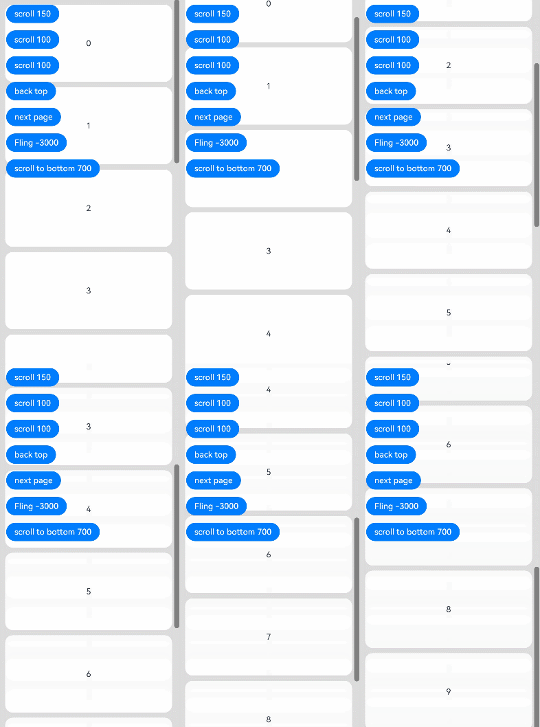
[h2]Example 1: Setting the Scroller
This example demonstrates the use of some attributes of the Scroll component and the Scroller.
// xxx.ets
import { curves } from '@kit.ArkUI';
import { BusinessError } from '@kit.BasicServicesKit';

@Entry
@Component
struct ScrollExample {
  scroller: Scroller = new Scroller();
  private arr: number[] = [0, 1, 2, 3, 4, 5, 6, 7, 8, 9];

  build() {
    Stack({ alignContent: Alignment.TopStart }) {
      Scroll(this.scroller) {
        Column() {
          ForEach(this.arr, (item: number) => {
            Text(item.toString())
              .width('90%')
              .height(150)
              .backgroundColor(0xFFFFFF)
              .borderRadius(15)
              .fontSize(16)
              .textAlign(TextAlign.Center)
              .margin({ top: 10 })
          }, (item: number) => item.toString())
        }.width('100%')
      }
      .scrollable(ScrollDirection.Vertical) // The scrollbar scrolls in the vertical direction.
      .scrollBar(BarState.On) // The scrollbar is always displayed.
      .scrollBarColor(Color.Gray) // The scrollbar color is gray.
      .scrollBarWidth(10) // The scrollbar width is 10.
      .friction(0.6)
      .edgeEffect(EdgeEffect.None)
      .onWillScroll((xOffset: number, yOffset: number, scrollState: ScrollState) => {
        console.info(`onWillScroll xOffset = ${xOffset}, yOffset = ${yOffset}, scrollState = ${scrollState}`);
      })
      .onScrollEdge((side: Edge) => {
        console.info('To the edge');
      })
      .onScrollStop(() => {
        console.info('Scroll Stop');
      })

      Button('scroll 150')
        .height('5%')
        .onClick(() => { // Scroll down 150.0vp.
          this.scroller.scrollBy(0, 150);
        })
        .margin({ top: 10, left: 20 })
      Button('scroll 100')
        .height('5%')
        .onClick(() => { // Click to scroll down by 100.0 vp.
          const yOffset: number = this.scroller.currentOffset().yOffset;
          this.scroller.scrollTo({ xOffset: 0, yOffset: yOffset + 100 });
        })
        .margin({ top: 60, left: 20 })
      Button('scroll 100')
        .height('5%')
        .onClick(() => {// Click to scroll down by 100.0 vp. An animation is applied to the scrolling.
          let curve = curves.interpolatingSpring(10, 1, 228, 30); // Create a spring curve.
          const yOffset: number = this.scroller.currentOffset().yOffset;
          this.scroller.scrollTo({ xOffset: 0, yOffset: yOffset + 100, animation: { duration: 1000, curve: curve } });
        })
        .margin({ top: 110, left: 20 })
      Button('back top')
        .height('5%')
        .onClick(() => { // Click to go back to the top.
          this.scroller.scrollEdge(Edge.Top);
        })
        .margin({ top: 160, left: 20 })
      Button('next page')
        .height('5%')
        .onClick(() => { // Click to go to the next page.
          this.scroller.scrollPage({ next: true ,animation: true });
        })
        .margin({ top: 210, left: 20 })
      Button('fling -3000')
        .height('5%')
        .onClick(() => { // Trigger a fling with an initial velocity of -3000 vp/s.
          try {
            this.scroller.fling(-3000);
          } catch (error) {
            let err: BusinessError = error as BusinessError;
            console.error(`Failed to execute fling scroll. Code: ${err.code}, message: ${err.message}`);
          }
        })
        .margin({ top: 260, left: 20 })
      Button('scroll to bottom 700')
        .height('5%')
        .onClick(() => {// After the button is clicked, the component scrolls to the bottom edge at a velocity of 700 vp/s.
          this.scroller.scrollEdge(Edge.Bottom, { velocity: 700 });
        })
        .margin({ top: 310, left: 20 })
    }.width('100%').height('100%').backgroundColor(0xDCDCDC)
  }
} 
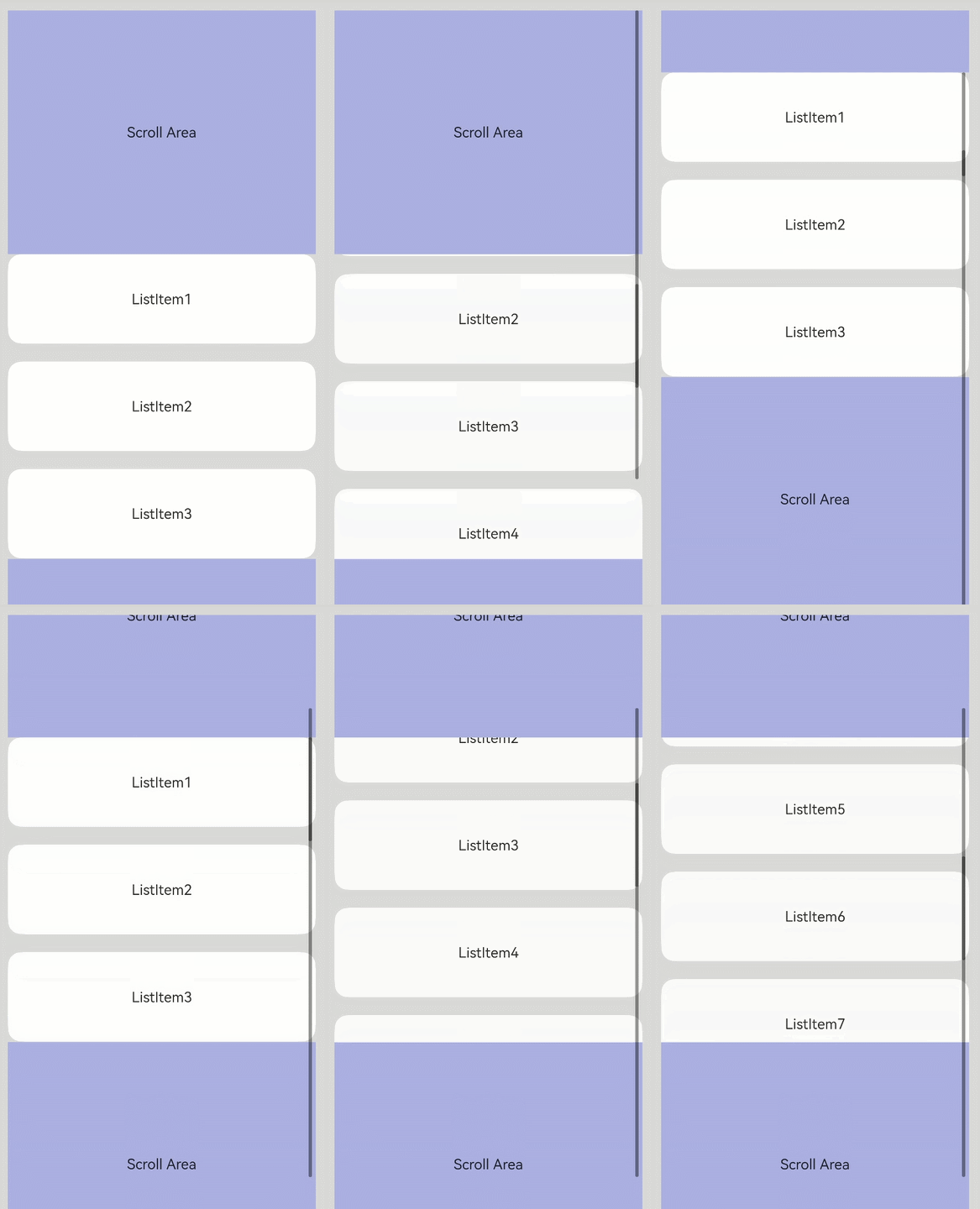
[h2]Example 2: Implementing Nested Scrolling (Method 1)
This example uses the onScrollFrameBegin event to achieve nested scrolling between an inner List component and an outer Scroll component.
import { LengthMetrics } from '@kit.ArkUI';

@Entry
@Component
struct NestedScroll {
  @State listPosition: number = 0; // 0 indicates scrolling to the top of the list, 1 indicates scrolling to the middle of the list, and 2 indicates scrolling to the bottom of the list.
  private arr: number[] = [1, 2, 3, 4, 5, 6, 7, 8, 9, 10];
  private scrollerForScroll: Scroller = new Scroller();
  private scrollerForList: Scroller = new Scroller();

  build() {
    Flex() {
      Scroll(this.scrollerForScroll) {
        Column() {
          Text('Scroll Area')
            .width('100%')
            .height('40%')
            .backgroundColor(0X330000FF)
            .fontSize(16)
            .textAlign(TextAlign.Center)
            .onClick(() => {
              this.scrollerForList.scrollToIndex(5, false, ScrollAlign.START, { extraOffset: LengthMetrics.vp(5) });
            })

          List({ space: 20, scroller: this.scrollerForList }) {
            ForEach(this.arr, (item: number) => {
              ListItem() {
                Text('ListItem' + item)
                  .width('100%')
                  .height('100%')
                  .borderRadius(15)
                  .fontSize(16)
                  .textAlign(TextAlign.Center)
                  .backgroundColor(Color.White)
              }.width('100%').height(100)
            }, (item: number) => item.toString())
          }
          .width('100%')
          .height('50%')
          .edgeEffect(EdgeEffect.None)
          .friction(0.6)
          .onReachStart(() => {
            this.listPosition = 0;
          })
          .onReachEnd(() => {
            this.listPosition = 2;
          })
          .onScrollFrameBegin((offset: number) => {
            if ((this.listPosition == 0 && offset <= 0) || (this.listPosition == 2 && offset >= 0)) {
              this.scrollerForScroll.scrollBy(0, offset);
              return { offsetRemain: 0 };
            }
            this.listPosition = 1;
            return { offsetRemain: offset };
          })

          Text('Scroll Area')
            .width('100%')
            .height('40%')
            .backgroundColor(0X330000FF)
            .fontSize(16)
            .textAlign(TextAlign.Center)
        }
      }
      .width('100%').height('100%')
    }.width('100%').height('100%').backgroundColor(0xDCDCDC).padding(20)
  }
} 
[h2]Example 3: Implementing Nested Scrolling (Method 2)
This example uses the nestedScroll attribute to achieve nested scrolling between an inner List component and an outer Scroll component.
@Entry
@Component
struct StickyNestedScroll {
  @State arr: number[] = [];

  @Styles
  listCard() {
    .backgroundColor(Color.White)
    .height(72)
    .width('100%')
    .borderRadius(12)
  }

  build() {
    Scroll() {
      Column() {
        Text('Scroll Area')
          .width('100%')
          .height('40%')
          .backgroundColor('#0080DC')
          .textAlign(TextAlign.Center)
        Tabs({ barPosition: BarPosition.Start }) {
          TabContent() {
            List({ space: 10 }) {
              ForEach(this.arr, (item: number) => {
                ListItem() {
                  Text('item' + item)
                    .fontSize(16)
                }.listCard()
              }, (item: number) => item.toString())
            }.width('100%')
            .edgeEffect(EdgeEffect.Spring)
            .nestedScroll({
              scrollForward: NestedScrollMode.PARENT_FIRST,
              scrollBackward: NestedScrollMode.SELF_FIRST
            })
          }.tabBar('Tab1')

          TabContent() {
          }.tabBar('Tab2')
        }
        .vertical(false)
        .height('100%')
      }.width('100%')
    }
    .edgeEffect(EdgeEffect.Spring)
    .friction(0.6)
    .backgroundColor('#DCDCDC')
    .scrollBar(BarState.Off)
    .width('100%')
    .height('100%')
  }

  aboutToAppear() {
    for (let i = 0; i < 30; i++) {
      this.arr.push(i);
    }
  }
} 
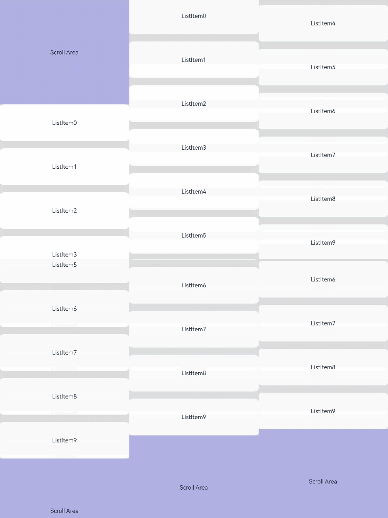
[h2]Example 4: Implementing Nested Scrolling with Parent-to-Child Scrolling Propagation
This example demonstrates how to propagate scrolling from a parent component to a child component using the enableScrollInteraction attribute and the onScrollFrameBegin event.
@Entry
@Component
struct NestedScroll {
  private headerHeight: number = 0;
  private arr: number[] = [];
  private scrollerForParent: Scroller = new Scroller();
  private scrollerForChild: Scroller = new Scroller();

  aboutToAppear(): void {
    for (let i = 0; i < 10; i++) {
      this.arr.push(i);
    }
  }

  build() {
    Scroll(this.scrollerForParent) {
      Column() {
        Text('Scroll Area')
          .width('100%')
          .height('40%')
          .backgroundColor(0X330000FF)
          .fontSize(16)
          .textAlign(TextAlign.Center)
          .onClick(() => {
            this.scrollerForChild.scrollToIndex(5);
          })
          .onSizeChange((oldValue: SizeOptions, newValue: SizeOptions) => {
            this.headerHeight = newValue.height! as number;
          })
        List({ space: 20, scroller: this.scrollerForChild }) {
          ForEach(this.arr, (item: number) => {
            ListItem() {
              Text('ListItem' + item)
                .width('100%')
                .height('100%')
                .borderRadius(15)
                .fontSize(16)
                .textAlign(TextAlign.Center)
                .backgroundColor(Color.White)
            }.width('100%').height(100)
          }, (item: number) => item.toString())
        }
        .width('100%')
        .height('100%')
        .edgeEffect(EdgeEffect.None)
        .scrollBar(BarState.Off)
        .enableScrollInteraction(false)

        Text('Scroll Area')
          .width('100%')
          .height('40%')
          .backgroundColor(0X330000FF)
          .fontSize(16)
          .textAlign(TextAlign.Center)
      }
    }
    .scrollBar(BarState.Off)
    .edgeEffect(EdgeEffect.Spring)
    .onScrollFrameBegin((offset: number, state: ScrollState) => {
      let retOffset = offset;
      let currOffset = this.scrollerForParent.currentOffset().yOffset;
      let newOffset = currOffset + offset;
      if (offset > 0) {
        if (this.scrollerForChild.isAtEnd()) {
          return { offsetRemain: offset };
        }
        if (newOffset > this.headerHeight) {
          retOffset = this.headerHeight - currOffset;
        }
        this.scrollerForChild.scrollBy(0, offset - retOffset);
      } else {
        if (this.scrollerForChild.currentOffset().yOffset <= 0) {
          return { offsetRemain: offset };
        }
        if (newOffset < this.headerHeight) {
          retOffset = this.headerHeight - currOffset;
        }
        this.scrollerForChild.scrollBy(0, offset - retOffset);
      }
      return { offsetRemain: retOffset };
    })
    .width('100%')
    .height('100%')
    .backgroundColor(0xDCDCDC)
  }
} 
[h2]Example 5: Setting Scroll Snapping
This example shows how to set scroll snapping for a Scroll component.
@Entry
@Component
struct Index {
  scroller: Scroller = new Scroller();
  private arr: number[] = [0, 1, 2, 3, 4, 5, 6, 7, 8, 9, 10, 11, 12, 13, 14, 15];
  build() {
    Scroll(this.scroller) {
      Column() {
        ForEach(this.arr, (item: number) => {
          Text(item.toString())
            .width('90%')
            .height(200)
            .backgroundColor(0xFFFFFF)
            .borderWidth(1)
            .borderColor(Color.Black)
            .borderRadius(15)
            .fontSize(16)
            .textAlign(TextAlign.Center)
        }, (item: number) => item.toString())
      }.width('100%').backgroundColor(0xDCDCDC)
    }
    .backgroundColor(Color.Yellow)
    .height('100%')
    .edgeEffect(EdgeEffect.Spring)
    .scrollSnap({snapAlign:ScrollSnapAlign.START, snapPagination:400, enableSnapToStart:true, enableSnapToEnd:true})
  }
} 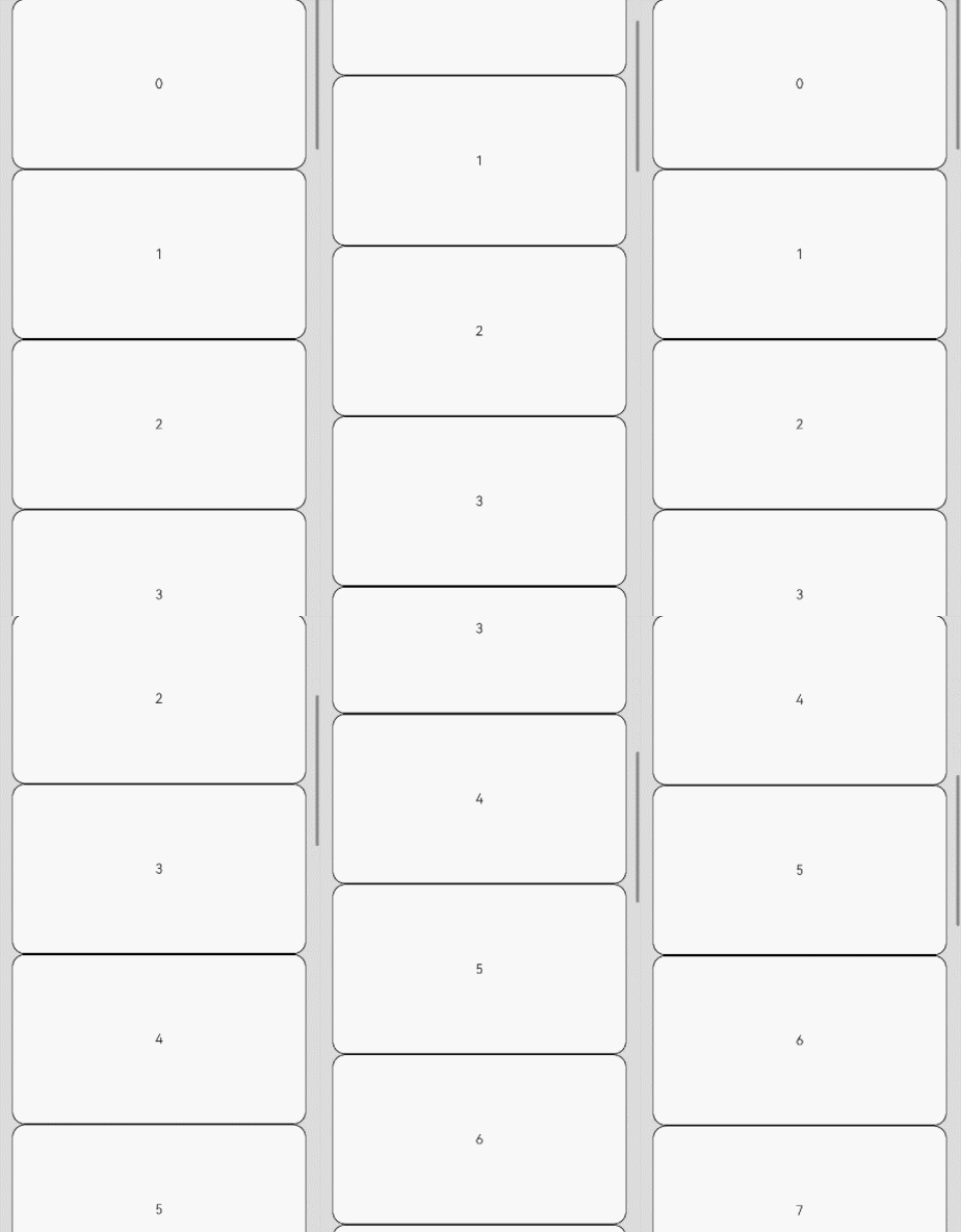
[h2]Example 6: Obtaining the Index of a Child Component
This example demonstrates how to obtain the index of a child component in a List component.
// xxx.ets
import { BusinessError } from '@kit.BasicServicesKit';

@Entry
@Component
struct ListExample {
  private arr: number[] = [];
  private scroller: ListScroller = new ListScroller();
  @State listSpace: number = 10;
  @State listChildrenSize: ChildrenMainSize = new ChildrenMainSize(120);
  @State listIndex: number = -1;
  @State itemBackgroundColorArr: boolean[] = [];
  aboutToAppear(){
    // Initialize the data source.
    for (let i = 0; i < 10; i++) {
      this.arr.push(i);
      this.itemBackgroundColorArr.push(false);
    }
    try {
      this.listChildrenSize.splice(0, 5, [100, 100, 100, 100, 100]);
    } catch (error) {
      let err: BusinessError = error as BusinessError;
      console.error(`Failed to splice childrenMainSize for first 5 items. Code: ${err.code}, message: ${err.message}`);
    }
  }
  build() {
    Column() {
      List({ space: this.listSpace, initialIndex: 4, scroller: this.scroller }) {
        ForEach(this.arr, (item: number) => {
          ListItem() {
            Text('item-' + item)
              .height( item < 5 ? 100 : this.listChildrenSize.childDefaultSize)
              .width('90%')
              .fontSize(16)
              .textAlign(TextAlign.Center)
              .borderRadius(10)
              .backgroundColor( this.itemBackgroundColorArr[item] ? 0x68B4FF: 0xFFFFFF)
          }
        }, (item: number) => item.toString())
      }
      .backgroundColor(Color.Gray)
      .layoutWeight(1)
      .scrollBar(BarState.On)
      .childrenMainSize(this.listChildrenSize)
      .alignListItem(ListItemAlign.Center)
      .gesture(
        PanGesture()
          .onActionUpdate((event: GestureEvent) => {
            if (event.fingerList[0] != undefined && event.fingerList[0].localX != undefined && event.fingerList[0].localY != undefined) {
              try {
                this.listIndex = this.scroller.getItemIndex(event.fingerList[0].localX, event.fingerList[0].localY);
              } catch (error) {
                let err: BusinessError = error as BusinessError;
                console.error(`Failed to get item index from scroller. Code: ${err.code}, message: ${err.message}`);
              }
              if (this.listIndex >= 0 && this.listIndex < this.itemBackgroundColorArr.length) {
                this.itemBackgroundColorArr[this.listIndex] = true;
              }
            }
          })
      )
      .gesture(
        TapGesture({ count: 1 })
          .onAction((event: GestureEvent) => {
            if (event) {
              this.itemBackgroundColorArr = this.arr.map(() => false);
            }
          })
      )

      Text('You are currently at index '+ this.listIndex)
        .fontColor(Color.Red)
        .height(50)
    }
  }
} 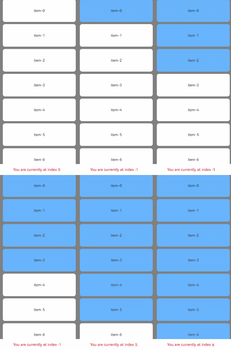
[h2]Example 7: Setting Edge Fading
This example demonstrates how to implement a Scroll component with an edge fading effect and set the length of the fading edge.
// xxx.ets
import { LengthMetrics } from '@kit.ArkUI';
@Entry
@Component
struct ScrollExample {
  scroller: Scroller = new Scroller();
  private arr: number[] = [0, 1, 2, 3, 4, 5, 6, 7, 8, 9, 10, 11, 12];

  build() {
    Stack({ alignContent: Alignment.TopStart }) {
      Scroll(this.scroller) {
        Column() {
          ForEach(this.arr, (item: number) => {
            Text(item.toString())
              .width('90%')
              .height(150)
              .backgroundColor(0xFFFFFF)
              .borderRadius(15)
              .fontSize(16)
              .textAlign(TextAlign.Center)
              .margin({ top: 10 })
          }, (item: number) => item.toString())
        }.width('100%')
      }
      .fadingEdge(true,{fadingEdgeLength:LengthMetrics.vp(80)})


    }.width('100%').height('100%').backgroundColor(0xDCDCDC)
  }
} 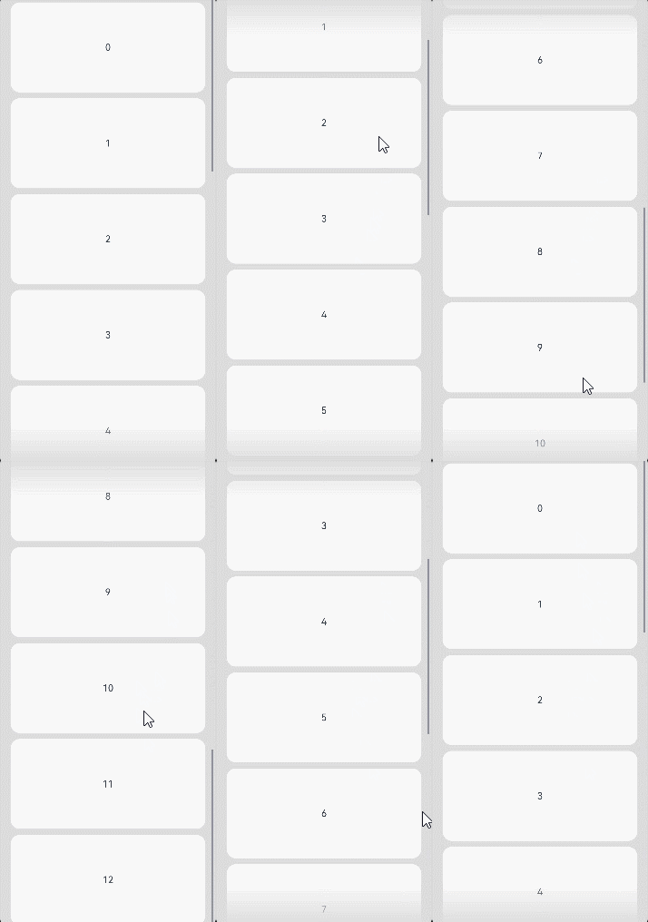
[h2]Example 8: Setting the Single-Side Edge Effect
This example demonstrates how to set a single-side edge effect for the Scroll component using the edgeEffect API.
// xxx.ets
@Entry
@Component
struct ScrollExample {
  scroller: Scroller = new Scroller();
  private arr: number[] = [0, 1, 2, 3, 4, 5, 6, 7, 8, 9, 10, 11, 12];

  build() {
    Stack({ alignContent: Alignment.TopStart }) {
      Scroll(this.scroller) {
        Column() {
          ForEach(this.arr, (item: number) => {
            Text(item.toString())
              .width('90%')
              .height(150)
              .backgroundColor(0xFFFFFF)
              .borderRadius(15)
              .fontSize(16)
              .textAlign(TextAlign.Center)
              .margin({ top: 10 })
          }, (item: number) => item.toString())
        }.width('100%')
      }
      .edgeEffect(EdgeEffect.Spring,{alwaysEnabled:true,effectEdge:EffectEdge.START})
    }.width('100%').height('100%').backgroundColor(0xDCDCDC)
  }
} 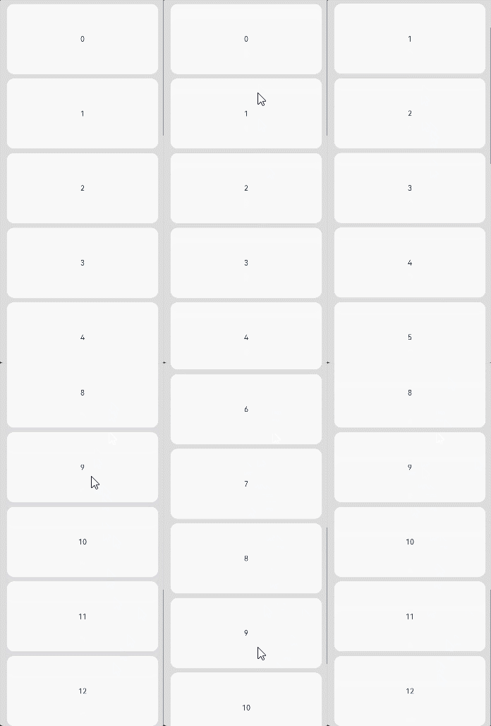
[h2]Example 9: Implementing the Swipe-to-Turn-Pages Effect
This example demonstrates how to implement the swipe-to-turn-pages feature for a Scroll component using the enablePaging API.
// xxx.ets
@Entry
@Component
struct EnablePagingExample {
  private arr: number[] = [0, 1, 2, 3, 4, 5, 6, 7, 8, 9]

  build() {
    Stack({ alignContent: Alignment.Center }) {
      Scroll() {
        Column() {
          ForEach(this.arr, (item: number) => {
            Text(item.toString())
              .width('100%')
              .height('100%')
              .borderRadius(15)
              .fontSize(16)
              .textAlign(TextAlign.Center)
              .backgroundColor(0xFFFFFF)
          }, (item: number) => item.toString())
        }
      }.width('90%').height('90%')
      .enablePaging(true)
    }.width('100%').height('100%').backgroundColor(0xDCDCDC)
  }
} 
[h2]Example 10: Implementing the Overscroll Stay Effect
This example demonstrates how to implement the overscroll stay effect for a Scroll component using the scrollTo API.
// xxx.ets
import { curves } from '@kit.ArkUI';

@Entry
@Component
struct StickyNestedScroll {
  scroller: Scroller = new Scroller();

  build() {
    Column() {
      Row() {
        Button('scrollTo: Animation').onClick(() => {
          let curve = curves.interpolatingSpring(0.5, 5, 10, 15) // Create a spring curve.
          const yOffset: number = this.scroller.currentOffset().yOffset;
          this.scroller.scrollTo({
            xOffset: 0,
            yOffset: yOffset - 100,
            animation: { duration: 1000, curve: curve, canOverScroll: true },
            canOverScroll: true
          })
        }).margin({ top: 10 })
        Button('scrollTo: No Animation').onClick(() => {
          const yOffset: number = this.scroller.currentOffset().yOffset;
          this.scroller.scrollTo({
            xOffset: 0,
            yOffset: yOffset - 100,
            animation: false,
            canOverScroll: true
          })
        }).margin({ top: 10, left: 20 })
      }.margin({ bottom: 20 })

      Scroll(this.scroller) {
        Column() {
          Text('Scroll Area')
            .width('100%')
            .height('100%')
            .backgroundColor('#0080DC')
            .textAlign(TextAlign.Center)
        }
        .width('100%')
        .height('100%')
      }
      .scrollable(ScrollDirection.Vertical)
      .edgeEffect(EdgeEffect.Spring) // Set the edge effect.
      .fadingEdge(false) // Disable the edge fading effect.
      .scrollBar(BarState.Auto)
      .friction(undefined)
      .backgroundColor('#DCDCDC')
      .width('100%')
      .height('50%')
    }
  }
} 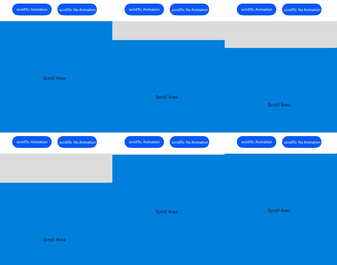
[h2]Example 11: Implementing Free Scrolling and Scaling
This example demonstrates how to implement free scrolling and scaling of the Scroll component. This functionality is supported since API version 20.
@Entry
@Component
struct ScrollZoomExample {
  @State currScale:number = 1;
  build() {
    Column() {
      Scroll() {
        Image($r('app.media.image1')) // 'app.media.image1' is only as an example. Replace it with the actual image.
      }
      .height(400)
      .scrollable(ScrollDirection.FREE)
      .minZoomScale(1)
      .maxZoomScale(2)
      .zoomScale(this.currScale!!)
      .enableBouncesZoom(true)
      .onDidZoom((scale: number) => {
        console.info(`onDidZoom:${scale}`);
      })
      .onZoomStart(() => {
        console.info('onZoomStart');
      })
      .onZoomStop(() => {
        console.info('onZoomStop');
      })
    }.width('100%').height('100%')
  }
} 
[h2]Example 12: Obtaining the Total Content Size
This example demonstrates how to obtain the total content size. This functionality is supported since API version 22.
import { BusinessError } from '@kit.BasicServicesKit';

@Entry
@Component
struct ScrollExample1 {
  scroller: Scroller = new Scroller();
  private arr: number[] = []

  aboutToAppear() {
    for (let j = 0; j < 10; j++) {
      this.arr.push(j);
    }
  }

  @State contentWidth: number = -1;
  @State contentHeight: number = -1;

  build() {
    Column() {
      Text('Set Scroller Controller and ForEach')
      Row() {
        // Button to obtain the content size.
        Button('GetContentSize')
          .onClick(() => {
            // Scroller throws an exception when not bound to a component; wrap with try-catch for safety.
            try {
              // Obtain the content width using contentSize.
              this.contentWidth = this.scroller.contentSize().width;
              // Obtain the content height using contentSize.
              this.contentHeight = this.scroller.contentSize().height;
            } catch (error) {
              let err: BusinessError = error as BusinessError;
              console.error(`Failed to get contentSize. Code: ${err.code}, message: ${err.message}`);
            }
          })
        // Display the obtained content size.
        Text('Width: ' + this.contentWidth + ', Height: ' + this.contentHeight)
          .fontColor(Color.Red)
          .height(50)
      }

      Stack({ alignContent: Alignment.TopStart }) {
        Scroll(this.scroller) {
          Column() {
            ForEach(this.arr, (item: number) => {
              Text(item.toString())
                .width('90%')
                .height(150)
                .backgroundColor(0xFFFFFF)
                .borderRadius(15)
                .fontSize(16)
                .textAlign(TextAlign.Center)
                .margin({ top: 10 })
            }, (item: number) => item.toString())
          }.width('100%')
        }
        .scrollable(ScrollDirection.Vertical) // The scrollbar scrolls in the vertical direction.
        .scrollBar(BarState.On) // The scrollbar is always displayed.
        .scrollBarColor(Color.Gray) // The scrollbar color is gray.
        .scrollBarWidth(10) // The scrollbar width is 10.
        .friction(0.6)
        .edgeEffect(EdgeEffect.None)
      }.width('100%').height('100%').backgroundColor(0xDCDCDC)
    }
  }
} 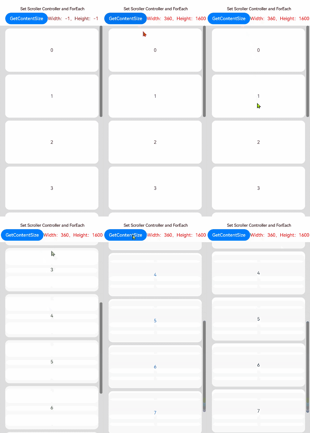
[h2]Example 13: Setting Scrolling Events
This example obtains a UIScrollEvent instance via getEvent('Scroll') on a FrameNode and sets scroll event callbacks for a Scroll component. This approach is intended for scenarios where the page code cannot be directly modified to use declarative callbacks.
The UIScrollEvent API is supported since API version 19.
import { NodeController, FrameNode, typeNode } from '@kit.ArkUI';

class MyNodeController extends NodeController {
  public rootNode: FrameNode | null = null;

  makeNode(uiContext: UIContext): FrameNode | null {
    this.rootNode = new FrameNode(uiContext);
    this.rootNode.commonAttribute.width(100);
    return this.rootNode;
  }

  addCommonEvent(frameNode: FrameNode) {
    // Obtain the Scroll event object.
    let scrollEvent: UIScrollEvent | undefined = typeNode.getEvent(frameNode, 'Scroll');

    // Set the OnWillScroll callback.
    scrollEvent?.setOnWillScroll((xOffset: number, yOffset: number, scrollState: ScrollState,
      scrollSource: ScrollSource) => {
      console.info(`onWillScroll xOffset = ${xOffset}, yOffset = ${yOffset}, scrollState = ${scrollState}, scrollSource = ${scrollSource}`);
    });

    // Set the OnDidScroll callback.
    scrollEvent?.setOnDidScroll((xOffset: number, yOffset: number, scrollState: ScrollState) => {
      console.info(`onDidScroll xOffset = ${xOffset}, yOffset = ${yOffset}, scrollState = ${scrollState}`);
    });

    // Set the OnReachStart callback.
    scrollEvent?.setOnReachStart(() => {
      console.info('onReachStart');
    });

    // Set the OnReachEnd callback.
    scrollEvent?.setOnReachEnd(() => {
      console.info('onReachEnd');
    });

    // Set the OnScrollStart callback.
    scrollEvent?.setOnScrollStart(() => {
      console.info('onScrollStart');
    });

    // Set the OnScrollStop callback.
    scrollEvent?.setOnScrollStop(() => {
      console.info('onScrollStop');
    });

    // Set the OnScrollFrameBegin callback.
    scrollEvent?.setOnScrollFrameBegin((offset: number, state: ScrollState) => {
      console.info(`onScrollFrameBegin offset = ${offset}, state = ${state}`);
      return undefined;
    });
  }
}

@Entry
@Component
struct Index {
  @State index: number = 0;
  private myNodeController: MyNodeController = new MyNodeController();
  @State numbers: string[] = [];

  aboutToAppear() {
    for (let i = 0; i < 30; i++) {
      this.numbers.push(`${i + 1}`);
    }
  }

  build() {
    Column() {
      Button('add CommonEvent to Scroll')
        .onClick(() => {
          this.myNodeController!.addCommonEvent(this.myNodeController!.rootNode!.getParent()!.getPreviousSibling()!)
        })
      Scroll() {
        Column() {
          ForEach(this.numbers, (day: string, index: number) => {
            Column() {
              Text(day)
                .fontSize(16)
                .backgroundColor(0xF9CF93)
                .width('90%')
                .height(80)
                .textAlign(TextAlign.Center)
                .margin({ top: 10 })
            }
            .width('100%')
            .justifyContent(FlexAlign.Center)
            .alignItems(HorizontalAlign.Center)
          }, (day: string, index: number) => index.toString() + day)
        }
      }
      .scrollable(ScrollDirection.Vertical)
      .edgeEffect(EdgeEffect.Spring)
      .width('90%')
      .backgroundColor(0xFAEEE0)
      .height(300)
      NodeContainer(this.myNodeController)
    }
  }
}