A styled string is an object that associates text styles with text content. Styles specify text ranges through start and length, and multiple styles can be applied to the same range in a stacked manner. A styled string is an object used to create rich text. It supports setting various style types such as font style, decoration line, shadow, line height, and paragraph style, and also supports inserting images and custom drawing content. It can be bound to a Text component through setStyledString in TextController, or bound to a RichEditor component through setStyledString in RichEditorStyledStringController. It is suitable for scenarios that require flexible text style settings, such as rich text editing, chat message display, and document annotation. It supports dynamic modification of style content, style stacking, and conflict handling.

-
The initial APIs of this module are supported since API version 12. Updates will be marked with a superscript to indicate their earliest API version.
-
The APIs of this module can be used only in the stage model.
-
Since API version 20, the text layout information of a styled string can be obtained through getParagraphs.
-
Styled strings are not supported in worker threads.
-
When a styled string is bound through a controller, the binding takes effect only after the layout is complete. When measure and setStyledString are used at the same time, developers need to determine that the layout is complete through @ohos.arkui.inspector (Layout Callback) before binding the styled string.
Rules of Use
-
If a styled string conflicts with the current style settings in a component, the style set in the styled string takes effect.
-
If a styled string conflicts with the child components in Text, the style set in the styled string is applied to the Text component, and style settings of the child components, including Span, are ignored.
-
The @State decorator is not supported.
-
Define StyledString as a member variable to prevent it from being destroyed when the application moves to the background.
-
Creation before loadContent() is not supported.
[h2]constructor
constructor(value: string | ImageAttachment | CustomSpan, styles?: Array<StyleOptions>)
A constructor used to create a styled string.
It is not supported to create it before loadContent().
Atomic service API: This API can be used in atomic services since API version 12.
System capability: SystemCapability.ArkUI.ArkUI.Full
Parameters
| Name | Type | Mandatory | Description |
|---|---|---|---|
| value | string | ImageAttachment | CustomSpan | Yes | Text content of the styled string. NOTE When the type of value is ImageAttachment or CustomSpan, the styles parameter does not take effect. To set styles, use methods such as setStyle. |
| styles | Array<StyleOptions> | No | Initialization options of the styled string. NOTE If start is an invalid value, the default value 0 is used. If length is an invalid value, length equals the actual length of the styled string after start. If StyledStringKey does not match StyledStringValue, styles does not take effect. |
[h2]Properties
System capability: SystemCapability.ArkUI.ArkUI.Full
| Name | Type | Read-Only | Optional | Description |
|---|---|---|---|---|
| length | number | Yes | No | Length of the styled string. NOTE The length of ImageAttachment and CustomSpan in the styled string is counted as 1. Atomic service API: This API can be used in atomic services since API version 12. |
[h2]getString
getString(): string
Obtains the text of this styled string.
Atomic service API: This API can be used in atomic services since API version 12.
System capability: SystemCapability.ArkUI.ArkUI.Full
Return value
| Type | Description |
|---|---|
| string | Text content of the styled string. NOTE When the styled string contains an image or CustomSpan, the returned result is represented by a space. |
[h2]equals
equals(other: StyledString): boolean
Checks whether this styled string is the same as another styled string.
Atomic service API: This API can be used in atomic services since API version 12.
System capability: SystemCapability.ArkUI.ArkUI.Full
Parameters
| Name | Type | Mandatory | Description |
|---|---|---|---|
| other | StyledString | Yes | StyledString object to compare. |
Return value
| Type | Description |
|---|---|
| boolean | Whether two styled strings are equal. The value true indicates that they are equal, and false indicates that they are not equal. NOTE Two styled strings are considered equal when their text and styles are identical. GestureStyle is not compared. Two styled strings are also considered equal when they have different events configured but the same text and other styles. When CustomSpan or LeadingMarginSpan is compared, the addresses are compared. If the addresses are equal, they are considered equal. |
[h2]subStyledString
subStyledString(start: number, length?: number): StyledString
Obtains a substring of this styled string. The specified range must not exceed the string's length.
Atomic service API: This API can be used in atomic services since API version 12.
System capability: SystemCapability.ArkUI.ArkUI.Full
Parameters
| Name | Type | Mandatory | Description |
|---|---|---|---|
| start | number | Yes | Subscript that corresponds to the start position of the sub-styled string. |
| length | number | No | Length of the sub-styled string. If not passed, the default value is the difference between the length of the queried styled string object and the value of start. |
Return value
| Type | Description |
|---|---|
| StyledString | Sub-styled string. NOTE When start is a valid input parameter, the default value of length is the difference between the length of the queried styled string object and the value of start. An exception is thrown when start and length are out of bounds or when a mandatory parameter is set to undefined. |
Error codes
For details about the error codes, see Universal Error Codes.
| ID | Error Message |
|---|---|
| 401 | Parameter error. Possible causes: 1. Mandatory parameters are left unspecified; 2.Incorrect parameters types; 3. Parameter verification failed. |
[h2]getStyles
getStyles(start: number, length: number, styledKey?: StyledStringKey): Array<SpanStyle>
Obtains the styles in the specified range of a styled string. The specified range must not exceed the string's length.
This API returns only styles explicitly set by the developer.
Atomic service API: This API can be used in atomic services since API version 12.
System capability: SystemCapability.ArkUI.ArkUI.Full
Parameters
| Name | Type | Mandatory | Description |
|---|---|---|---|
| start | number | Yes | Subscript that corresponds to the target range in the styled string. |
| length | number | Yes | Length of the target range in the styled string. |
| styledKey | StyledStringKey | No | Enumeration value of the string style of the attribute character in the specified range. Note: If this parameter is not passed, the styles of all enumeration values of StyledStringKey set by the developer are obtained by default. |
Return value
| Type | Description |
|---|---|
| Array<SpanStyle> | Array of style objects. Note: If no style is set for the styled string in the specified range, an empty array is returned. An exception is thrown if start and length are out of bounds or a mandatory parameter is undefined. An exception is thrown if an invalid value or undefined is passed to styledKey. If styledKey is CustomSpan, the style object passed when creating CustomSpan is returned, and modifying this style object also affects the actual display effect. |
Error codes
For details about the error codes, see Universal Error Codes.
| ID | Error Message |
|---|---|
| 401 | Parameter error. Possible causes: 1. Mandatory parameters are left unspecified; 2.Incorrect parameters types; 3. Parameter verification failed. |
[h2]fromHtml
static fromHtml(html: string): Promise<StyledString>
Converts an HTML-formatted string into a styled string. HTML tags are mapped to the corresponding styled string styles (for example, bold tags are mapped to TextStyle, and decoration tags are mapped to DecorationStyle). The HTML tags currently supported for conversion are: <p>, <span>, <img>, <br>, <strong>, <b>, <a>, <i>, <em>, <s>, <u>, <del>, <sup>, <sub>, <cite>, <dfn>, <small>, <h1>, <h2>, <h3>, <h4>, <h5>, <h6>, <ol>, <ul>, <li>. The style attribute in tags can be converted into the corresponding styled string styles.
For details about how to use this API, see Example 12: Implementing Conversion Using fromHtml and toHtml and Example 18: Conversion Using fromHtml.
| Tag Name | Description |
|---|---|
| <p> | Paragraph, separates text paragraphs. |
| <span> | Inline text supporting style configuration. In API version 17 and earlier, the background-color attribute set using <span> does not take effect. |
| <img> | Image. |
| <strong> | Bolds text. |
| <br>20+ | Line break. |
| <b>20+ | Bolds text. |
| <a>20+ | Hyperlink. |
| <i>20+ | Italic text. |
| <em>20+ | Italic text. |
| <s>20+ | Strikethrough. |
| <u>20+ | Underline. |
| <del>20+ | Strikethrough. |
| <sup>20+ | Superscript text. |
| <sub>20+ | Subscript text. |
| <cite> | Italic text. Since: 26.0.0 |
| <dfn> | Italic text. Since: 26.0.0 |
| <small> | Font‑size reduction tag. The font size is scaled to 0.8 times the parent container font size, and nesting is supported. Since: 26.0.0 |
| <h1> | Level-1 heading. Since: 26.0.0 |
| <h2> | Level-2 heading. Since: 26.0.0 |
| <h3> | Level-3 heading. Since: 26.0.0 |
| <h4> | Level-4 heading. Since: 26.0.0 |
| <h5> | Level-5 heading. Since: 26.0.0 |
| <h6> | Level-6 heading. Since: 26.0.0 |
| <ol> | Ordered list. Since: 26.0.0 |
| <ul> | Unordered list. Since: 26.0.0 |
| <li> | List item. Since: 26.0.0 |
Atomic service API: This API can be used in atomic services since API version 12.
System capability: SystemCapability.ArkUI.ArkUI.Full
Parameters
| Name | Type | Mandatory | Description |
|---|---|---|---|
| html | string | Yes | HTML-formatted string. |
Return value
| Type | Description |
|---|---|
| Promise<StyledString> | Styled string. resolve returns the converted styled string; reject throws an exception. |
Error codes
For details about the error codes, see Universal Error Codes and Styled String Error Codes.
| ID | Error Message |
|---|---|
| 401 | Parameter error. Possible causes: 1. Mandatory parameters are left unspecified; 2.Incorrect parameters types; 3. Parameter verification failed. |
| 170001 | Convert Error. |
[h2]toHtml14+
static toHtml(styledString: StyledString): string
Converts a styled string into an HTML-formatted string. Styled string styles are mapped to the corresponding HTML tags (for example, TextStyle is mapped to a span tag with the style attribute, and ImageAttachment is mapped to an img tag). The supported styled string keys for conversion, as detailed in StyledStringKey, include StyledStringKey.FONT, StyledStringKey.DECORATION, StyledStringKey.LETTER_SPACING, StyledStringKey.TEXT_SHADOW, StyledStringKey.LINE_HEIGHT, and StyledStringKey.IMAGE.
For details about how to use this API, see Example 12: Implementing Conversion Using fromHtml and toHtml.
Atomic service API: This API can be used in atomic services since API version 14.
System capability: SystemCapability.ArkUI.ArkUI.Full
Parameters
| Name | Type | Mandatory | Description |
|---|---|---|---|
| styledString | StyledString | Yes | Styled string object to be converted into an HTML format string. |
Return value
| Type | Description |
|---|---|
| string | HTML string. |
Error codes
For details about the error codes, see Universal Error Codes.
| ID | Error Message |
|---|---|
| 401 | Parameter error. Possible causes: 1. Mandatory parameters are left unspecified; 2.Incorrect parameters types; 3. Parameter verification failed. |
MutableStyledString
Inherits from the StyledString class.
An exception is thrown in the following cases:
If the values of start and length are out of the acceptable range or if any mandatory parameter is passed as undefined, an exception is thrown.
styledKey or styledValue is set to an invalid value or they do not match.
[h2]replaceString
replaceString(start: number , length: number , other: string): void
Replaces the string in the specified range of this styled string.
Atomic service API: This API can be used in atomic services since API version 12.
System capability: SystemCapability.ArkUI.ArkUI.Full
Parameters
| Name | Type | Mandatory | Description |
|---|---|---|---|
| start | number | Yes | Subscript of the target range. |
| length | number | Yes | Length of the target range. |
| other | string | Yes | New text content to replace. NOTE The replacement string uses the style of the character at the start position. |
Error codes
For details about the error codes, see Universal Error Codes.
| ID | Error Message |
|---|---|
| 401 | Parameter error. Possible causes: 1. Mandatory parameters are left unspecified; 2.Incorrect parameters types; 3. Parameter verification failed. |
[h2]insertString
insertString(start: number , other: string): void
Inserts a string.
Atomic service API: This API can be used in atomic services since API version 12.
System capability: SystemCapability.ArkUI.ArkUI.Full
Parameters
| Name | Type | Mandatory | Description |
|---|---|---|---|
| start | number | Yes | Subscript of the position where the string will be inserted. |
| other | string | Yes | New text content to insert. Note: The inserted string uses the style of the character at position start-1. If no style is set for the character at position start-1, the style of the character at position start is used. |
Error codes
For details about the error codes, see Universal Error Codes.
| ID | Error Message |
|---|---|
| 401 | Parameter error. Possible causes: 1. Mandatory parameters are left unspecified; 2.Incorrect parameters types; 3. Parameter verification failed. |
[h2]removeString
removeString(start: number , length: number): void
Removes the string in the specified range of this styled string.
This API equally works when the styled string contains an image or CustomSpan.
Atomic service API: This API can be used in atomic services since API version 12.
System capability: SystemCapability.ArkUI.ArkUI.Full
Parameters
| Name | Type | Mandatory | Description |
|---|---|---|---|
| start | number | Yes | Subscript of the target range. |
| length | number | Yes | Length of the target range. |
Error codes
For details about the error codes, see Universal Error Codes.
| ID | Error Message |
|---|---|
| 401 | Parameter error. Possible causes: 1. Mandatory parameters are left unspecified; 2.Incorrect parameters types; 3. Parameter verification failed. |
[h2]replaceStyle
replaceStyle(spanStyle: SpanStyle): void
Replaces the style in the specified range of this styled string.
Atomic service API: This API can be used in atomic services since API version 12.
System capability: SystemCapability.ArkUI.ArkUI.Full
Parameters
| Name | Type | Mandatory | Description |
|---|---|---|---|
| spanStyle | SpanStyle | Yes | Style object. NOTE By default, the original style is cleared and replaced with the new style. When the styledKey of SpanStyle is IMAGE or CUSTOM_SPAN, the style takes effect only when the content at the start position is currently an image or CustomSpan with a length of 1; otherwise, it has no effect. |
Error codes
For details about the error codes, see Universal Error Codes.
| ID | Error Message |
|---|---|
| 401 | Parameter error. Possible causes: 1. Mandatory parameters are left unspecified; 2.Incorrect parameters types; 3. Parameter verification failed. |
[h2]setStyle
setStyle(spanStyle: SpanStyle): void
Sets a new style for the specified range of this styled string.
Atomic service API: This API can be used in atomic services since API version 12.
System capability: SystemCapability.ArkUI.ArkUI.Full
Parameters
| Name | Type | Mandatory | Description |
|---|---|---|---|
| spanStyle | SpanStyle | Yes | Style object. By default, the original style is not cleared, and the new style is overlaid. If the StyledStringValue types are the same, the new style overrides the old style. When the styledKey of SpanStyle is IMAGE or CUSTOM_SPAN, the style takes effect only when the position of start is currently an image or CustomSpan and the length is 1; otherwise, it has no effect. |

The minimum granularity for applying the style is StyledStringValue. If multiple identical StyledStringValue settings are applied, only the last one takes effect. If two TextStyle attributes with different settings are applied, only the TextStyle set second takes effect.
Error codes
For details about the error codes, see Universal Error Codes.
| ID | Error Message |
|---|---|
| 401 | The parameter check failed. |
[h2]removeStyle
removeStyle(start: number , length: number , styledKey: StyledStringKey): void
Removes the style for the specified range of this styled string.
After a style is removed, the value set for the corresponding style attribute in the Text component is used. If the value is not set, the default value is used.
This API equally works when the styled string contains an image.
Atomic service API: This API can be used in atomic services since API version 12.
System capability: SystemCapability.ArkUI.ArkUI.Full
Parameters
| Name | Type | Mandatory | Description |
|---|---|---|---|
| start | number | Yes | Subscript that corresponds to the start position of the target range. |
| length | number | Yes | Length of the target range. |
| styledKey | StyledStringKey | Yes | Styled key. |
Error codes
For details about the error codes, see Universal Error Codes.
| ID | Error Message |
|---|---|
| 401 | Parameter error. Possible causes: 1. Mandatory parameters are left unspecified; 2.Incorrect parameters types; 3. Parameter verification failed. |
[h2]removeStyles
removeStyles(start: number , length: number): void
Removes all styles for the specified range of this styled string.
After a style is removed, the value set for the corresponding style attribute in the Text component is used. If the value is not set, the default value is used.
This API equally works when the styled string contains an image.
Atomic service API: This API can be used in atomic services since API version 12.
System capability: SystemCapability.ArkUI.ArkUI.Full
Parameters
| Name | Type | Mandatory | Description |
|---|---|---|---|
| start | number | Yes | Subscript that corresponds to the start position of the target range. |
| length | number | Yes | Length of the target range. |
Error codes
For details about the error codes, see Universal Error Codes.
| ID | Error Message |
|---|---|
| 401 | Parameter error. Possible causes: 1. Mandatory parameters are left unspecified; 2.Incorrect parameters types; 3. Parameter verification failed. |
[h2]clearStyles
clearStyles(): void
Removes all styles of this styled string.
After a style is removed, the value set for the corresponding style attribute in the Text component is used. If the value is not set, the default value is used.
Atomic service API: This API can be used in atomic services since API version 12.
System capability: SystemCapability.ArkUI.ArkUI.Full
[h2]replaceStyledString
replaceStyledString(start: number , length: number , other: StyledString): void
Replaces the styled string in the specified range.
Atomic service API: This API can be used in atomic services since API version 12.
System capability: SystemCapability.ArkUI.ArkUI.Full
Parameters
| Name | Type | Mandatory | Description |
|---|---|---|---|
| start | number | Yes | Subscript that corresponds to the start position of the target range. |
| length | number | Yes | Length of the target range. |
| other | StyledString | Yes | New styled string. |
Error codes
For details about the error codes, see Universal Error Codes.
| ID | Error Message |
|---|---|
| 401 | Parameter error. Possible causes: 1. Mandatory parameters are left unspecified; 2.Incorrect parameters types; 3. Parameter verification failed. |
[h2]insertStyledString
insertStyledString(start: number , other: StyledString): void
Inserts a new styled string at the specified position.
Atomic service API: This API can be used in atomic services since API version 12.
System capability: SystemCapability.ArkUI.ArkUI.Full
Parameters
| Name | Type | Mandatory | Description |
|---|---|---|---|
| start | number | Yes | Subscript of the position to insert the styled string. |
| other | StyledString | Yes | New styled string. |
Error codes
For details about the error codes, see Universal Error Codes.
| ID | Error Message |
|---|---|
| 401 | Parameter error. Possible causes: 1. Mandatory parameters are left unspecified; 2.Incorrect parameters types; 3. Parameter verification failed. |
[h2]appendStyledString
appendStyledString(other: StyledString): void
Appends a styled string.
Atomic service API: This API can be used in atomic services since API version 12.
System capability: SystemCapability.ArkUI.ArkUI.Full
Parameters
| Name | Type | Mandatory | Description |
|---|---|---|---|
| other | StyledString | Yes | New styled string. |
StyledStringValue
type StyledStringValue = TextStyle | DecorationStyle | BaselineOffsetStyle | LetterSpacingStyle |
TextShadowStyle | GestureStyle | ImageAttachment | ParagraphStyle | LineHeightStyle | UrlStyle | CustomSpan | UserDataSpan | BackgroundColorStyle | LineSpacingStyle
Defines the style for a styled string.
Atomic service API: This API can be used in atomic services since API version 12.
Model restriction: This API can be used only in the stage model.
System capability: SystemCapability.ArkUI.ArkUI.Full
| Type | Description |
|---|---|
| TextStyle | Text style. |
| DecorationStyle | Text decorative line style. |
| BaselineOffsetStyle | Text baseline offset style. |
| LetterSpacingStyle | Text letter spacing style. |
| LineHeightStyle | Text line height style. |
| TextShadowStyle | Text shadow style. |
| GestureStyle | Gesture style. |
| ParagraphStyle | Text paragraph style. |
| ImageAttachment | Image style. |
| CustomSpan | Custom span style. |
| UserDataSpan | User data span style. |
| UrlStyle | URL style. |
| BackgroundColorStyle | Text background color style. |
| LineSpacingStyle | Text line spacing style. Since: 26.0.0 |
StyleOptions
Atomic service API: This API can be used in atomic services since API version 12.
System capability: SystemCapability.ArkUI.ArkUI.Full
| Name | Type | Read-Only | Optional | Description |
|---|---|---|---|---|
| start | number | No | Yes | Start position for setting the style of the styled string. If the value of start is less than 0 or exceeds the string length, it is processed as 0. |
| length | number | No | Yes | Length for setting the style of the styled string. If the value of length is less than 0 or exceeds the difference between the string length and start, it is processed as the difference between the string length and start. |
| styledKey | StyledStringKey | No | No | Style key. |
| styledValue | StyledStringValue | No | No | Style object used to set the style of the styled string. |
SpanStyle
Atomic service API: This API can be used in atomic services since API version 12.
System capability: SystemCapability.ArkUI.ArkUI.Full
| Name | Type | Read-Only | Optional | Description |
|---|---|---|---|---|
| start | number | No | No | Start position of the styled string style. |
| length | number | No | No | Length of the styled string style. |
| styledKey | StyledStringKey | No | No | Style key. |
| styledValue | StyledStringValue | No | No | Style object used to match the style of the styled string. |
[h2]Properties
System capability: SystemCapability.ArkUI.ArkUI.Full
| Name | Type | Read-Only | Optional | Description |
|---|---|---|---|---|
| fontColor | ResourceColor | Yes | Yes | Text color of the styled string. Atomic service API: This API can be used in atomic services since API version 12. |
| fontFamily | string | Yes | Yes | Text font of the styled string. Default value: undefined. Atomic service API: This API can be used in atomic services since API version 12. |
| fontSize | number | Yes | Yes | Text font size of the styled string. Unit: vp Atomic service API: This API can be used in atomic services since API version 12. |
| fontWeight | number | Yes | Yes | Text font weight of the styled string. Default value: 400 NOTE The return value is of the string type. For details about the relationship between the return value and the set value, see the table below. Atomic service API: This API can be used in atomic services since API version 12. |
| fontStyle | FontStyle | Yes | Yes | Text font style of the styled string. Atomic service API: This API can be used in atomic services since API version 12. |
| fontConfigs24+ | FontConfigs | Yes | Yes | Font configuration of the styled string. Default value: undefined, indicating that fontConfigs is not set. Atomic service API: This API can be used in atomic services since API version 24. Model restriction: This API can be used only in the stage model. |
| strokeWidth20+ | number | Yes | Yes | Text stroke width of the styled string. Default value: 0, in vp. Atomic service API: This API can be used in atomic services since API version 20. |
| strokeColor20+ | ResourceColor | Yes | Yes | Text stroke color of the styled string. Default value: the font color. Atomic service API: This API can be used in atomic services since API version 20. |
| superscript20+ | SuperscriptStyle | Yes | Yes | Superscript and subscript of the styled string. Default value: SuperscriptStyle.NORMAL. Atomic service API: This API can be used in atomic services since API version 20. |
| fontVariations | Array<FontVariation> | Yes | Yes | Attribute array of the variable font. Default value: undefined, indicating that the variable font attributes are not set. Since: 26.0.0 Model restriction: This API can be used only in the stage model. Atomic service API: This API can be used in atomic services since API version 26.0.0. |
| strokeJoinStyle | StrokeJoinStyle | Yes | Yes | Text stroke join style of the styled string. For details about the enum values, see StrokeJoinStyle. Default value: StrokeJoinStyle.MITER_JOIN, indicating a miter join with a sharp corner. Since: 26.0.0 Model restriction: This API can be used only in the stage model. Atomic service API: This API can be used in atomic services since API version 26.0.0. |
The relationship between the fontWeight parameter and the return value is as follows.
| Parameter | Return Value |
|---|---|
| 100 | '0' |
| 200 | '1' |
| 300 | '2' |
| 400 | '3' |
| 500 | '4' |
| 600 | '5' |
| 700 | '6' |
| 800 | '7' |
| 900 | '8' |
| FontWeight.Bold or 'bold' | '9' |
| FontWeight.Normal or 'normal' | '10' |
| FontWeight.Bolder or 'bolder' | '11' |
| FontWeight.Lighter or 'lighter' | '12' |
| FontWeight.Medium or 'medium' | '13' |
| FontWeight.Regular or 'regular' | '14' |
[h2]constructor
constructor(value?: TextStyleInterface)
A constructor used to create a text style.
Atomic service API: This API can be used in atomic services since API version 12.
System capability: SystemCapability.ArkUI.ArkUI.Full
Parameters
| Name | Type | Mandatory | Description |
|---|---|---|---|
| value | TextStyleInterface | No | Font style setting item. Default value: when not passed, inherits the default values of the TextStyleInterface properties. |
TextStyleInterface
System capability: SystemCapability.ArkUI.ArkUI.Full
| Name | Type | Read-Only | Optional | Description |
|---|---|---|---|---|
| fontColor | ResourceColor | No | Yes | Font color. The default value is the theme color. Atomic service API: This API can be used in atomic services since API version 12. |
| fontFamily | ResourceStr | No | Yes | Text font. The default value is the theme font. Atomic service API: This API can be used in atomic services since API version 12. |
| fontSize | LengthMetrics | No | Yes | Font size. The default font size is 16fp. If the unit value of LengthMetrics is PERCENT, the current setting does not take effect and is processed as 16fp. Unit: fp Atomic service API: This API can be used in atomic services since API version 12. |
| fontWeight | number| FontWeight | string | No | Yes | Font weight. For the number type, the value ranges from 100 to 900 at an interval of 100. The default value is 400. A larger value indicates a heavier font. For the string type, only the string form of the number type value is supported, for example, "400", as well as "bold", "bolder", "lighter", "regular", and "medium", which correspond to the respective enum values in FontWeight. An excessively large value may be truncated in different fonts. If the value passed in is out of the value range or does not meet the interval requirement, the default value is used. Default value: FontWeight.Normal Atomic service API: This API can be used in atomic services since API version 12. |
| fontStyle | FontStyle | No | Yes | Font style. Default value: FontStyle.Normal Atomic service API: This API can be used in atomic services since API version 12. |
| fontConfigs24+ | FontConfigs | No | Yes | Font configuration. The default value inherits FontConfigs. Atomic service API: This API can be used in atomic services since API version 24. Model restriction: This API can be used only in the stage model. |
| strokeWidth20+ | LengthMetrics | No | Yes | Text stroke width. If the unit value of LengthMetrics is PERCENT, the current setting does not take effect and is processed as 0. If the value is less than 0, the text is solid; if the value is greater than 0, the text is hollow. The default value is 0. Atomic service API: This API can be used in atomic services since API version 20. |
| strokeColor20+ | ResourceColor | No | Yes | Text stroke color. The default value is the font color. If an abnormal value is set, the font color is used. Atomic service API: This API can be used in atomic services since API version 20. |
| superscript20+ | SuperscriptStyle | No | Yes | Text superscript and subscript. Default value: SuperscriptStyle.NORMAL Atomic service API: This API can be used in atomic services since API version 20. |
| fontVariations | Array<FontVariation> | No | Yes | Attribute of the variable font. Default value: undefined, indicating that the attribute of the variable font is not set. The fontVariations attribute has a higher priority than fontWeight. Since: 26.0.0 Model restriction: This API can be used only in the stage model. Atomic service API: This API can be used in atomic services since API version 26.0.0. |
| strokeJoinStyle | StrokeJoinStyle | No | Yes | Text stroke join style. For details about the enum values and their descriptions, see StrokeJoinStyle. Default value: StrokeJoinStyle.MITER_JOIN, indicating a miter join with a sharp corner. Since: 26.0.0 Model restriction: This API can be used only in the stage model. Atomic service API: This API can be used in atomic services since API version 26.0.0. |
GestureStyle
Describes the event gesture style.
System capability: SystemCapability.ArkUI.ArkUI.Full
[h2]constructor
constructor(value?: GestureStyleInterface)
A constructor used to create a gesture style.
Atomic service API: This API can be used in atomic services since API version 12.
System capability: SystemCapability.ArkUI.ArkUI.Full
Parameters
| Name | Type | Mandatory | Description |
|---|---|---|---|
| value | GestureStyleInterface | No | Event gesture settings. Default value: no gesture event is bound when this parameter is not passed. |
GestureStyleInterface
System capability: SystemCapability.ArkUI.ArkUI.Full
| Name | Type | Read-Only | Optional | Description |
|---|---|---|---|---|
| onClick | Callback<ClickEvent> | No | Yes | Click event. Atomic service API: This API can be used in atomic services since API version 12. |
| onLongPress | Callback<GestureEvent> | No | Yes | Long press event. Atomic service API: This API can be used in atomic services since API version 12. |
| onTouch20+ | Callback<TouchEvent> | No | Yes | Touch event. Atomic service API: This API can be used in atomic services since API version 20. |
DecorationOptions20+
Provides additional configuration options for the text decoration line style.
Atomic service API: This API can be used in atomic services since API version 20.
System capability: SystemCapability.ArkUI.ArkUI.Full
| Name | Type | Read-Only | Optional | Description |
|---|---|---|---|---|
| enableMultiType | boolean | No | Yes | Whether to enable the display of multiple decoration lines. Default value: undefined. The value true enables it, and false or undefined disables it. All decoration lines to be displayed must have this option enabled. In the intersection area of these decoration lines, the multi-decoration-line effect is displayed, and the style, color, and thickness of the last set decoration line are used. |
DecorationStyle
Describes the text decorative line style.
System capability: SystemCapability.ArkUI.ArkUI.Full
[h2]Properties
System capability: SystemCapability.ArkUI.ArkUI.Full
| Name | Type | Read-Only | Optional | Description |
|---|---|---|---|---|
| type | TextDecorationType | Yes | No | Type of the text decoration line of the styled string. Atomic service API: This API can be used in atomic services since API version 12. |
| color | ResourceColor | Yes | Yes | Color of the text decoration line of the styled string. Atomic service API: This API can be used in atomic services since API version 12. |
| style | TextDecorationStyle | Yes | Yes | Style of the text decoration line of the styled string. Atomic service API: This API can be used in atomic services since API version 12. |
| thicknessScale20+ | number | Yes | Yes | Scale value of the text decoration line thickness of the styled string. Atomic service API: This API can be used in atomic services since API version 20. |
| options20+ | DecorationOptions | Yes | Yes | Additional configuration options of the text decoration line style of the styled string. Atomic service API: This API can be used in atomic services since API version 20. |
[h2]constructor
constructor(value: DecorationStyleInterface)
A constructor used to create a text decoration line style. If this API is not used to set the style, the default decoration line type is TextDecorationType.None, the color is Color.Black, and the style is TextDecorationStyle.SOLID.
Atomic service API: This API can be used in atomic services since API version 12.
System capability: SystemCapability.ArkUI.ArkUI.Full
Parameters
| Name | Type | Mandatory | Description |
|---|---|---|---|
| value | DecorationStyleInterface | Yes | Text decoration settings. |
[h2]constructor20+
constructor(value: DecorationStyleInterface, options?: DecorationOptions)
A constructor used to create a text decoration line style, with additional configuration options. If this API is not used to set the style, the default decoration line type is TextDecorationType.None, the color is Color.Black, the style is TextDecorationStyle.SOLID, and the thickness scale is 1.0.
Atomic service API: This API can be used in atomic services since API version 20.
System capability: SystemCapability.ArkUI.ArkUI.Full
Parameters
| Name | Type | Mandatory | Description |
|---|---|---|---|
| value | DecorationStyleInterface | Yes | Text decoration line settings. |
| options | DecorationOptions | No | Additional configuration options for the text decoration line. |
DecorationStyleInterface
Describes the API object for text decoration line styles.
System capability: SystemCapability.ArkUI.ArkUI.Full
| Name | Type | Read-Only | Optional | Description |
|---|---|---|---|---|
| type | TextDecorationType | No | No | Type of the decoration line. For details about the enums and their descriptions, see TextDecorationType. Default value: TextDecorationType.None Atomic service API: This API can be used in atomic services since API version 12. |
| color | ResourceColor | No | Yes | Color of the decoration line. Default value: Color.Black Atomic service API: This API can be used in atomic services since API version 12. |
| style | TextDecorationStyle | No | Yes | Style of the decoration line. For details about the enums and their descriptions, see TextDecorationStyle. Default value: TextDecorationStyle.SOLID Atomic service API: This API can be used in atomic services since API version 12. |
| thicknessScale20+ | number | No | Yes | Scale ratio of the decoration line thickness. Default value: 1.0 Value range: [0, +∞) Note: A negative value is processed as the default value. Atomic service API: This API can be used in atomic services since API version 20. |

When the bottom contour of a character intersects with the decoration, underline avoidance is triggered, commonly affecting characters like "g", "j", "y", "q", and "p."
If the decoration color is set to Color.Transparent, it inherits the text color of the first character in each line. If the decoration color is set to "#00FFFFFF", the line becomes fully transparent.
BaselineOffsetStyle
Describes the text baseline offset object. It is suitable for scenarios that require fine-tuning the vertical position of text, such as aligning superscript and subscript text with normal text in chemical formulas and mathematical expressions.
System capability: SystemCapability.ArkUI.ArkUI.Full
[h2]Properties
Atomic service API: This API can be used in atomic services since API version 12.
System capability: SystemCapability.ArkUI.ArkUI.Full
| Name | Type | Read-Only | Optional | Description |
|---|---|---|---|---|
| baselineOffset | number | Yes | No | Text baseline offset of the styled string. Unit: vp |
[h2]constructor
constructor(value: LengthMetrics)
A constructor used to create a text baseline offset style.
Atomic service API: This API can be used in atomic services since API version 12.
System capability: SystemCapability.ArkUI.ArkUI.Full
Parameters
| Name | Type | Mandatory | Description |
|---|---|---|---|
| value | LengthMetrics | Yes | Setting item for the text baseline offset. If the unit value of LengthMetrics is PERCENT, this setting does not take effect. |
LetterSpacingStyle
Describes the text character spacing object. It is suitable for scenarios that require adjusting character spacing, such as widening the spacing of title text to enhance the visual effect and narrowing the spacing of dense text to save space.
System capability: SystemCapability.ArkUI.ArkUI.Full
[h2]Properties
Atomic service API: This API can be used in atomic services since API version 12.
System capability: SystemCapability.ArkUI.ArkUI.Full
| Name | Type | Read-Only | Optional | Description |
|---|---|---|---|---|
| letterSpacing | number | Yes | No | Text character spacing of the styled string. Unit: vp |
[h2]constructor
constructor(value: LengthMetrics)
A constructor used to create a text letter spacing style.
Atomic service API: This API can be used in atomic services since API version 12.
System capability: SystemCapability.ArkUI.ArkUI.Full
Parameters
| Name | Type | Mandatory | Description |
|---|---|---|---|
| value | LengthMetrics | Yes | Text character spacing setting. If the unit value of LengthMetrics is PERCENT, this setting does not take effect. |
LineHeightStyle
Describes the text line height style.
System capability: SystemCapability.ArkUI.ArkUI.Full
[h2]Properties
System capability: SystemCapability.ArkUI.ArkUI.Full
| Name | Type | Read-Only | Optional | Description |
|---|---|---|---|---|
| lineHeight | number | Yes | No | Text line height of the styled string. Unit: vp Atomic service API: This API can be used in atomic services since API version 12. |
| lineHeightMultiple | number | Yes | Yes | Multiple of the text line height. The actual line height is the product of the maximum font height of the line and the multiple. Note: When lineHeightMultiple is set together with lineHeight or LineSpacingStyle, only lineHeightMultiple takes effect. lineHeightMultiple does not take effect when it is less than 0 or undefined. When lineHeightMultiple is 0, it is equivalent to setting it to 1. Since: 26.0.0 Atomic service API: This API can be used in atomic services since API version 26.0.0. Model restriction: This API can be used only in the stage model. |
[h2]constructor
constructor(lineHeight: LengthMetrics)
A constructor used to create a text line height style.
Atomic service API: This API can be used in atomic services since API version 12.
System capability: SystemCapability.ArkUI.ArkUI.Full
Parameters
| Name | Type | Mandatory | Description |
|---|---|---|---|
| lineHeight | LengthMetrics | Yes | Text line height setting. If the unit value of LengthMetrics is PERCENT, the current setting does not take effect. When the value of LengthMetrics is greater than 0, the text line height setting takes effect; otherwise, the text line height adapts to the font size. |
[h2]constructor
constructor(lineHeight: LengthMetrics, lineHeightMultiple?: number)
A constructor used to create the text line height and multiple.

-
When lineHeightMultiple is set together with lineHeight or LineSpacingStyle, only lineHeightMultiple takes effect, and the line height is the product of the maximum font height of the line and the multiple.
-
When lineHeightMultiple is less than 0 or undefined, it does not take effect, and lineHeight and LineSpacingStyle are used to set the line height and line spacing.
-
When lineHeightMultiple is equal to 0, it is equivalent to setting it to 1.
Since: 26.0.0
Atomic service API: This API can be used in atomic services since API version 26.0.0.
System capability: SystemCapability.ArkUI.ArkUI.Full
Model restriction: This API can be used only in the stage model.
Parameters
| Name | Type | Mandatory | Description |
|---|---|---|---|
| lineHeight | LengthMetrics | Yes | Text line height setting. When the value of LengthMetrics is greater than 0, the text line height setting takes effect; otherwise, the text line height adapts to the font size. |
| lineHeightMultiple | number | No | Multiple of the text line height. Value range: [0, +∞), decimals supported. NOTE When set together with lineHeight or LineSpacingStyle, only lineHeightMultiple takes effect, and the line height is the product of the maximum font height of the line and the multiple. It does not take effect when the value is less than 0 or undefined. When the value is 0, it is equivalent to setting it to 1. |
LineSpacingStyle
Describes the text line spacing object. It is suitable for scenarios that require adjusting the spacing between lines within a paragraph, such as improving text reading comfort and adjusting document layout density.
[h2]Properties
Since: 26.0.0
Atomic service API: This API can be used in atomic services since API version 26.0.0.
System capability: SystemCapability.ArkUI.ArkUI.Full
Model restriction: This API can be used only in the stage model.
| Name | Type | Read-Only | Optional | Description |
|---|---|---|---|---|
| lineSpacing | number | Yes | No | Text line spacing. Value range: [0, +∞) Unit: vp |
| options | LineSpacingOptions | Yes | Yes | Line spacing configuration options. |
[h2]constructor
constructor(lineSpacing: LengthMetrics, options?: LineSpacingOptions)
A constructor used to create the text line spacing. If this API is not used to set the value, the default line spacing is 0.0. When the value of LengthMetrics is less than 0, the default value 0.0 is used. When it is set together with lineHeightMultiple of LineHeightStyle and lineHeightMultiple takes effect, this parameter does not take effect.
Since: 26.0.0
Atomic service API: This API can be used in atomic services since API version 26.0.0.
System capability: SystemCapability.ArkUI.ArkUI.Full
Model restriction: This API can be used only in the stage model.
Parameters
| Name | Type | Mandatory | Description |
|---|---|---|---|
| lineSpacing | LengthMetrics | Yes | Text line spacing. Value range: [0, +∞) |
| options | LineSpacingOptions | No | Line spacing configuration options. |
TextShadowStyle
Describes the text shadow style.
System capability: SystemCapability.ArkUI.ArkUI.Full
[h2]Properties
Atomic service API: This API can be used in atomic services since API version 12.
System capability: SystemCapability.ArkUI.ArkUI.Full
| Name | Type | Read-Only | Optional | Description |
|---|---|---|---|---|
| textShadow | Array<ShadowOptions> | Yes | No | Text shadow of the styled string. |
[h2]constructor
constructor(value: ShadowOptions | Array<ShadowOptions>)
A constructor used to create a text shadow style.
The ShadowOptions object does not support the fill field.
Atomic service API: This API can be used in atomic services since API version 12.
System capability: SystemCapability.ArkUI.ArkUI.Full
Parameters
| Name | Type | Mandatory | Description |
|---|---|---|---|
| value | ShadowOptions | Array<ShadowOptions> | Yes | Text shadow options. |
ImageAttachment
Describes the image attachment.
System capability: SystemCapability.ArkUI.ArkUI.Full
[h2]Properties
System capability: SystemCapability.ArkUI.ArkUI.Full
| Name | Type | Read-Only | Optional | Description |
|---|---|---|---|---|
| value | PixelMap | Yes | No | Image data source of the styled string. Atomic service API: This API can be used in atomic services since API version 12. |
| size | SizeOptions | Yes | Yes | Image size of the styled string. Atomic service API: This API can be used in atomic services since API version 12. The unit of the returned number value is px. |
| sizeInVp21+ | SizeOptions | Yes | Yes | Image size of the styled string. Atomic service API: This API can be used in atomic services since API version 21. The unit of the returned number value is vp. If the ImageAttachment size is set to a negative value or undefined, undefined is returned. |
| verticalAlign | ImageSpanAlignment | Yes | Yes | Image alignment mode of the styled string. Atomic service API: This API can be used in atomic services since API version 12. |
| objectFit | ImageFit | Yes | Yes | Image scale type of the styled string. Atomic service API: This API can be used in atomic services since API version 12. |
| layoutStyle | ImageAttachmentLayoutStyle | Yes | Yes | Image layout of the styled string. Atomic service API: This API can be used in atomic services since API version 12. |
| colorFilter15+ | ColorFilterType | Yes | Yes | Image color filter of the styled string. Atomic service API: This API can be used in atomic services since API version 15. |
| supportSvg222+ | boolean | Yes | Yes | Whether to enable enhanced SVG tag parsing capabilities. true: Enable enhanced SVG tag parsing. false: Use original SVG tag parsing. Default value: false Atomic service API: This API can be used in atomic services since API version 22. |
[h2]constructor
constructor(value: ImageAttachmentInterface)
A constructor used to create an image object.
Atomic service API: This API can be used in atomic services since API version 12.
System capability: SystemCapability.ArkUI.ArkUI.Full
Parameters
| Name | Type | Mandatory | Description |
|---|---|---|---|
| value | ImageAttachmentInterface | Yes | Image attachment options. |
[h2]constructor15+
constructor(attachment: Optional<AttachmentType>)
A constructor used to create an image object. Compared to the constructor with a value type parameter, this constructor with an attachment type parameter supports images of undefined and ResourceStr types.
Atomic service API: This API can be used in atomic services since API version 15.
System capability: SystemCapability.ArkUI.ArkUI.Full
Parameters
| Name | Type | Mandatory | Description |
|---|---|---|---|
| attachment | Optional<AttachmentType> | Yes | Image attachment, which can be of type PixelMap or ResourceStr. |
AttachmentType15+
type AttachmentType = ImageAttachmentInterface | ResourceImageAttachmentOptions
Defines the image attachment type, which is used to set images of PixelMap or ResourceStr type for styled strings.
Atomic service API: This API can be used in atomic services since API version 15.
System capability: SystemCapability.ArkUI.ArkUI.Full
| Type | Description |
|---|---|
| ImageAttachmentInterface | Settings for images of the PixelMap type. |
| ResourceImageAttachmentOptions | Settings for images of the ResourceStr type. |
ColorFilterType15+
type ColorFilterType = ColorFilter | DrawingColorFilter
Defines the type for image color filter settings.
Atomic service API: This API can be used in atomic services since API version 15.
System capability: SystemCapability.ArkUI.ArkUI.Full
| Type | Description |
|---|---|
| ColorFilter | Color filter settings of the ColorFilter type. |
| DrawingColorFilter | Color filter settings of the DrawingColorFilter type. |
ImageAttachmentInterface
System capability: SystemCapability.ArkUI.ArkUI.Full
| Name | Type | Read-Only | Optional | Description |
|---|---|---|---|---|
| value | PixelMap | No | No | Image data source. Atomic service API: This API can be used in atomic services since API version 12. |
| size | SizeOptions | No | Yes | Image size. Percentage values are not supported. Atomic service API: This API can be used in atomic services since API version 12. The default value of size is related to the value of objectFit. Different objectFit values correspond to different default values of size. For example, when objectFit is Cover, the image height is the component height minus the top and bottom padding of the component, and the image width is the component width minus the left and right padding of the component. |
| verticalAlign | ImageSpanAlignment | No | Yes | Alignment of the image relative to the text. Atomic service API: This API can be used in atomic services since API version 12. Default value: ImageSpanAlignment.BOTTOM |
| objectFit | ImageFit | No | Yes | Sets the scaling type of the image. The current enum type does not support ImageFit.MATRIX. For details about the enums, see ImageFit. Atomic service API: This API can be used in atomic services since API version 12. Default value: ImageFit.Cover |
| layoutStyle | ImageAttachmentLayoutStyle | No | Yes | Image layout. If this parameter is not passed, the default layout is used (the margin, padding, and corner radius are all 0). Atomic service API: This API can be used in atomic services since API version 12. |
| colorFilter15+ | ColorFilterType | No | Yes | Color filter effect of the image in the styled string. If this parameter is not passed, no color filter is applied and the image is displayed in its original color. Atomic service API: This API can be used in atomic services since API version 15. |
ImageAttachmentLayoutStyle
Atomic service API: This API can be used in atomic services since API version 12.
System capability: SystemCapability.ArkUI.ArkUI.Full
| Name | Type | Read-Only | Optional | Description |
|---|---|---|---|---|
| margin | LengthMetrics | Margin | No | Yes | Image margin. Default value: 0 Unit: vp |
| padding | LengthMetrics | Padding | No | Yes | Image padding. Default value: 0 Unit: vp |
| borderRadius | LengthMetrics | BorderRadiuses | No | Yes | Rounded corner. Default value: 0 Unit: vp |
ResourceImageAttachmentOptions15+
Defines the settings for images of the ResourceStr type.
System capability: SystemCapability.ArkUI.ArkUI.Full
| Name | Type | Read-Only | Optional | Description |
|---|---|---|---|---|
| resourceValue | Optional<ResourceStr> | No | No | Image data source. Atomic service API: This API can be used in atomic services since API version 15. |
| size | SizeOptions | No | Yes | Image size. Percentage values are not supported. The default value of size depends on the value of objectFit. Different objectFit values correspond to different default size values. Atomic service API: This API can be used in atomic services since API version 15. |
| verticalAlign | ImageSpanAlignment | No | Yes | Alignment of the image relative to the text. For details about the enums and their descriptions, see ImageSpanAlignment. Default value: ImageSpanAlignment.BOTTOM. Atomic service API: This API can be used in atomic services since API version 15. |
| objectFit | ImageFit | No | Yes | Scaling type of the image. The current enum type does not support ImageFit.MATRIX. For details about the enums and their descriptions, see ImageFit. Default value: ImageFit.Cover. Atomic service API: This API can be used in atomic services since API version 15. |
| layoutStyle | ImageAttachmentLayoutStyle | No | Yes | Image layout. Atomic service API: This API can be used in atomic services since API version 15. |
| colorFilter | ColorFilterType | No | Yes | Color filter effect of the image in the styled string. If this parameter is not passed, no color filter is applied and the image is displayed in its original color. Atomic service API: This API can be used in atomic services since API version 15. |
| syncLoad | boolean | No | Yes | Whether to load the image synchronously. By default, the image is loaded asynchronously. During synchronous loading, the UI thread is blocked and no placeholder image is displayed. true: synchronous loading; false: asynchronous loading. Default value: false Atomic service API: This API can be used in atomic services since API version 15. |
| supportSvg222+ | boolean | No | Yes | Whether to enable enhanced SVG tag parsing capabilities. true: Enable enhanced SVG tag parsing. false: Use original SVG tag parsing. Default value: false Atomic service API: This API can be used in atomic services since API version 22. |
CustomSpan
Defines a custom drawing span that provides only a base class, with the specific implementation defined by developers. It is suitable for scenarios that require embedding custom drawing content in the text flow, such as drawing custom icons, progress bars, and special decoration effects in text.
The drag preview of a custom span is blank.
System capability: SystemCapability.ArkUI.ArkUI.Full
[h2]onMeasure
abstract onMeasure(measureInfo: CustomSpanMeasureInfo): CustomSpanMetrics
Called to obtain the size of a custom span.
Atomic service API: This API can be used in atomic services since API version 12.
System capability: SystemCapability.ArkUI.ArkUI.Full
Parameters
| Name | Type | Mandatory | Description |
|---|---|---|---|
| measureInfo | CustomSpanMeasureInfo | Yes | Measurement information of the custom-drawn span. |
Return value
| Type | Description |
|---|---|
| CustomSpanMetrics | Size information of the custom drawing span. Note: The final height of CustomSpan is determined by the line height of the current Text component. If height is not set, the fontSize value of the Text component is used as the height of CustomSpan by default. If height is greater than the height of other child components in the current line, height is used as the line height of the Text component. |
[h2]onDraw
abstract onDraw(context: DrawContext, drawInfo: CustomSpanDrawInfo): void
Called to draw a custom span.
Atomic service API: This API can be used in atomic services since API version 12.
System capability: SystemCapability.ArkUI.ArkUI.Full
Parameters
| Name | Type | Mandatory | Description |
|---|---|---|---|
| context | DrawContext | Yes | Graphics drawing context. NOTE The canvas obtained through the canvas method of DrawContext is the canvas of the Text component, and the drawing will not exceed the range of the Text component. |
| drawInfo | CustomSpanDrawInfo | Yes | Drawing information of the custom span. |
[h2]invalidate13+
invalidate(): void
Manually triggers a refresh of the Text component that uses this CustomSpan.
Atomic service API: This API can be used in atomic services since API version 13.
System capability: SystemCapability.ArkUI.ArkUI.Full
CustomSpanMeasureInfo
System capability: SystemCapability.ArkUI.ArkUI.Full
| Name | Type | Read-Only | Optional | Description |
|---|---|---|---|---|
| fontSize | number | No | No | Font size of the text. Unit: fp Atomic service API: This API can be used in atomic services since API version 12. |
| maxWidth | number | No | Yes | Maximum width constraint of the content area of the parent component where the custom drawing span is located. Default value: uses its own width. Unit: px Since: 26.0.0 Atomic service API: This API can be used in atomic services since API version 26.0.0. Model restriction: This API can be used only in the stage model. |
| layoutPolicy | LayoutPolicy | No | Yes | Width layout policy of the parent component where the custom drawing span is located. NOTE When the value is null or undefined, it indicates that the parent component has no width layout policy set. Since: 26.0.0 Atomic service API: This API can be used in atomic services since API version 26.0.0. Model restriction: This API can be used only in the stage model. |
CustomSpanMetrics
Atomic service API: This API can be used in atomic services since API version 12.
System capability: SystemCapability.ArkUI.ArkUI.Full
CustomSpanDrawInfo
Atomic service API: This API can be used in atomic services since API version 12.
System capability: SystemCapability.ArkUI.ArkUI.Full
| Name | Type | Read-Only | Optional | Description |
|---|---|---|---|---|
| x | number | No | No | Offset of the custom drawing span relative to the mounted component. Unit: px |
| lineTop | number | No | No | Top margin of the custom drawing span relative to the Text component. Unit: px |
| lineBottom | number | No | No | Bottom margin of the custom drawing span relative to the Text component. Unit: px |
| baseline | number | No | No | Baseline offset of the line where the custom drawing span is located. Unit: px |
ParagraphStyle
Describes the text paragraph style.
Except the first paragraph, all paragraphs are formed using the escape character '\n'.
The style of a paragraph is the one (if any) set for the first element or the paragraph style of the bound component.
Before API version 26.0.0, if the first placeholder in a styled string paragraph is CustomSpan or ImageAttachment, the paragraph style set on that paragraph does not take effect. Since API version 26.0.0, the paragraph style takes effect.
System capability: SystemCapability.ArkUI.ArkUI.Full
[h2]Properties
System capability: SystemCapability.ArkUI.ArkUI.Full
| Name | Type | Read-Only | Optional | Description |
|---|---|---|---|---|
| textAlign | TextAlign | Yes | Yes | Horizontal alignment of the styled string text paragraph. Note: textAlign can only adjust the overall layout of the text and does not affect the display order of characters. Atomic service API: This API can be used in atomic services since API version 12. |
| textIndent | number | Yes | Yes | First-line text indent of the styled string text paragraph. Unit: vp Atomic service API: This API can be used in atomic services since API version 12. |
| maxLines | number | Yes | Yes | Maximum number of lines of the styled string text paragraph. Value range: [0, INT32_MAX]. A negative value means no limit. Atomic service API: This API can be used in atomic services since API version 12. |
| overflow | TextOverflow | Yes | Yes | Display mode of the styled string text paragraph when it is too long. Default value: TextOverflow.None. It must be used together with maxLines; setting it alone does not take effect. TextOverflow.MARQUEE is not supported. Atomic service API: This API can be used in atomic services since API version 12. |
| wordBreak | WordBreak | Yes | Yes | Line break rule of the styled string text paragraph. Atomic service API: This API can be used in atomic services since API version 12. |
| leadingMargin | number | LeadingMarginPlaceholder | Yes | Yes | Indent of the styled string text paragraph. When the return value is of the number type, the unit is vp. Atomic service API: This API can be used in atomic services since API version 12. |
| paragraphSpacing19+ | number | Yes | Yes | Paragraph spacing of the styled string text paragraph. Unit: vp Atomic service API: This API can be used in atomic services since API version 19. |
| textVerticalAlign20+ | TextVerticalAlign | Yes | Yes | Vertical alignment of the styled string text paragraph. The effect differs only when the same font size is used in a paragraph and the line height lineHeight is set at the same time, or when text of different font sizes is mixed in the same paragraph. Otherwise, setting any enum value of this attribute produces the same layout effect as not setting it. The SuperscriptStyle superscript and subscript style in TextStyle of the styled string takes effect only when the value of TextVerticalAlign is TextVerticalAlign.BASELINE. With other vertical alignment modes, superscript and subscript text behaves the same as normal text, with no superscript or subscript effect. Atomic service API: This API can be used in atomic services since API version 20. |
| leadingMarginSpan22+ | LeadingMarginSpan | Yes | Yes | Custom indent information of the styled string text paragraph. Atomic service API: This API can be used in atomic services since API version 22. |
| textDirection23+ | TextDirection | Yes | Yes | Text direction. Atomic service API: This API can be used in atomic services since API version 23. |
| shaderStyle | ShaderStyle | Yes | Yes | Text shader effect. Note: When this API is set together with strokeWidth of TextStyleInterface, this API does not take effect. shaderStyle has a higher priority than fontColor in TextStyleInterface. Since: 26.0.0 Model restriction: This API can be used only in the stage model. Atomic service API: This API can be used in atomic services since API version 26.0.0. |
| tailIndents | Array<number> | Yes | Yes | Tail indent distance of the styled string text paragraph. Unit: vp Value range: [0, INT32_MAX] The value 0 means no tail indent. Note: In the same paragraph, the tailIndents array takes values by array index in sequence for each line to perform indentation. For the first line of a new paragraph, the value is taken again from index 0 of the tailIndents array. Since: 26.0.0 Atomic service API: This API can be used in atomic services since API version 26.0.0. |

-
The maxLines and overflow of a styled string take effect only in Text. It is recommended to set them on the component side.
-
textAlign can only adjust the overall layout of text and does not affect the display order of characters. To adjust the display order of characters, see Mirrored Character Alignment.
-
The tailIndents array takes values by array index in sequence for indentation on each line within the same paragraph; the first line of a new paragraph starts taking values from index 0 of the tailIndents array again for indentation.
[h2]constructor
constructor(value?: ParagraphStyleInterface)
A constructor used to create a text paragraph style.
Atomic service API: This API can be used in atomic services since API version 12.
System capability: SystemCapability.ArkUI.ArkUI.Full
Parameters
| Name | Type | Mandatory | Description |
|---|---|---|---|
| value | ParagraphStyleInterface | No | Paragraph style setting item. Default value: If not passed, the default values of the properties of ParagraphStyleInterface are inherited. |
ParagraphStyleInterface
System capability: SystemCapability.ArkUI.ArkUI.Full
| Name | Type | Read-Only | Optional | Description |
|---|---|---|---|---|
| textAlign | TextAlign | No | Yes | Horizontal alignment of the text paragraph. Default value: TextAlign.Start Atomic service API: This API can be used in atomic services since API version 12. |
| textIndent | LengthMetrics | No | Yes | First-line text indentation of the text paragraph. Percentage is not supported. Default value: 0 Atomic service API: This API can be used in atomic services since API version 12. |
| maxLines | number | No | Yes | Maximum number of lines of the text paragraph. Note: This takes effect only in Text. It is recommended to set it on the component side. No limit by default. Value range: [0, INT32_MAX]. When a negative number is passed in, no limit is applied. Atomic service API: This API can be used in atomic services since API version 12. |
| overflow | TextOverflow | No | Yes | Display mode when the text paragraph is too long. Note: This takes effect only in Text. It is recommended to set it on the component side. Default value: TextOverflow.None It must be used together with maxLines; setting it alone does not take effect. TextOverflow.MARQUEE is not supported. Atomic service API: This API can be used in atomic services since API version 12. |
| wordBreak | WordBreak | No | Yes | Line breaking rule of the text paragraph. Default value: WordBreak.NORMAL Atomic service API: This API can be used in atomic services since API version 12. |
| leadingMargin | LengthMetrics | LeadingMarginPlaceholder | No | Yes | Indentation of the text paragraph. Percentage is not supported. Default value: 0 Atomic service API: This API can be used in atomic services since API version 12. |
| paragraphSpacing19+ | LengthMetrics | No | Yes | Paragraph spacing of the text paragraph. The default paragraph spacing is 0. Percentage is not supported. Atomic service API: This API can be used in atomic services since API version 19. |
| textVerticalAlign20+ | TextVerticalAlign | No | Yes | Vertical alignment of the text paragraph. Default value: TextVerticalAlign.BASELINE Atomic service API: This API can be used in atomic services since API version 20. |
| leadingMarginSpan22+ | LeadingMarginSpan | No | Yes | Custom indentation of the text paragraph. Percentage is not supported. Default value: 0 Atomic service API: This API can be used in atomic services since API version 22. |
| textDirection23+ | TextDirection | No | Yes | Text direction. Default value: TextDirection.DEFAULT Atomic service API: This API can be used in atomic services since API version 23. |
| shaderStyle | ShaderStyle | No | Yes | Text shader effect. Default effect: When not passed in, no shader effect is applied, and the color set by fontColor is used. When this API is set together with strokeWidth of TextStyleInterface, this API does not take effect, and shaderStyle has a higher priority than fontColor in TextStyleInterface. Since: 26.0.0 Model restriction: This API can be used only in the stage model. Atomic service API: This API can be used in atomic services since API version 26.0.0. |
| tailIndents | LengthMetrics | Array<LengthMetrics> | No | Yes | Tail indentation of the text paragraph. Percentage is not supported. When a single LengthMetrics value is provided, all lines share the same tail indentation; when an array is provided, the i-th element specifies the tail indentation of the i-th line; if the number of text lines exceeds the array length, the last element in the array is used for the remaining lines. Default value: 0 Since: 26.0.0 Atomic service API: This API can be used in atomic services since API version 26.0.0. |
UserDataSpan
Implements a UserDataSpan object for storing and obtaining user data. Only the base class is provided. You need to define the specific implementation.
The extended user data does not affect the display effect.
Atomic service API: This API can be used in atomic services since API version 12.
System capability: SystemCapability.ArkUI.ArkUI.Full
LeadingMarginSpan22+
Defines the custom indentation of a text paragraph, which provides only a base class, with the specific implementation defined by developers. It is suitable for scenarios that require drawing custom markers, icons, and other content at the beginning of the first line or each line of a paragraph, such as custom symbols before list items and decoration patterns at the beginning of a paragraph.
[h2]onDraw22+
abstract onDraw(context: DrawContext, drawInfo: LeadingMarginSpanDrawInfo): void
Draws a custom pattern. This API is triggered once for each line of text in a paragraph.
Atomic service API: This API can be used in atomic services since API version 22.
System capability: SystemCapability.ArkUI.ArkUI.Full
Parameters
| Name | Type | Mandatory | Description |
|---|---|---|---|
| context | DrawContext | Yes | Graphics drawing context. The canvas method of DrawContext obtains the canvas of the component, and drawing does not exceed the component bounds. |
| drawInfo | LeadingMarginSpanDrawInfo | Yes | Custom drawing information. |
[h2]getLeadingMargin22+
abstract getLeadingMargin(): LengthMetrics
Returns the indentation distance for a text paragraph.
Atomic service API: This API can be used in atomic services since API version 22.
System capability: SystemCapability.ArkUI.ArkUI.Full
Return value
| Type | Description |
|---|---|
| LengthMetrics | Indentation of the text paragraph. Percentage is not supported. Default value: 0 |
LeadingMarginSpanDrawInfo22+
Provides the custom drawing information.
Atomic service API: This API can be used in atomic services since API version 22.
System capability: SystemCapability.ArkUI.ArkUI.Full
| Name | Type | Read-Only | Optional | Description |
|---|---|---|---|---|
| x | number | No | No | Horizontal offset of the current line relative to the component. When direction is RTL, the distance between the right side of the current line and the right edge of the component is returned. Unit: px Value range: greater than or equal to 0. |
| top | number | No | No | Distance between the top of the line and the top edge of the component. Unit: px Value range: greater than or equal to 0. |
| bottom | number | No | No | Distance between the bottom of the line and the top edge of the component. Unit: px Value range: greater than or equal to 0. |
| baseline | number | No | No | Distance between the baseline of the current line and the top edge of the component. Unit: px Value range: greater than or equal to 0. |
| direction | TextDirection | No | No | Direction of the text content. |
| start | number | No | No | Start index of the current line. Value range: greater than or equal to 0. |
| end | number | No | No | End index of the current line. Value range: greater than or equal to 0. |
| first | boolean | No | No | Whether the current line is the first line of the paragraph. true: first line; false: not the first line. |
StyledStringKey
Sets the style for a range styled string.
System capability: SystemCapability.ArkUI.ArkUI.Full
| Name | Value | Description |
|---|---|---|
| FONT | 0 | Font style key. Key of TextStyle. Atomic service API: This API can be used in atomic services since API version 12. |
| DECORATION | 1 | Text decoration line style key. Key of DecorationStyle. Atomic service API: This API can be used in atomic services since API version 12. |
| BASELINE_OFFSET | 2 | Text baseline offset style key. Key of BaselineOffsetStyle. Atomic service API: This API can be used in atomic services since API version 12. |
| LETTER_SPACING | 3 | Text letter spacing style key. Key of LetterSpacingStyle. Atomic service API: This API can be used in atomic services since API version 12. |
| TEXT_SHADOW | 4 | Text shadow style key. Key of TextShadowStyle. Atomic service API: This API can be used in atomic services since API version 12. |
| LINE_HEIGHT | 5 | Text line height style key. Key of LineHeightStyle. Atomic service API: This API can be used in atomic services since API version 12. |
| BACKGROUND_COLOR14+ | 6 | Text background color style key. Key of BackgroundColorStyle. Atomic service API: This API can be used in atomic services since API version 14. |
| URL14+ | 7 | Hyperlink style key. Key of UrlStyle. Atomic service API: This API can be used in atomic services since API version 14. |
| LINE_SPACING | 8 | Text line spacing style key. Key of LineSpacingStyle. Since: 26.0.0 Atomic service API: This API can be used in atomic services since API version 26.0.0. Model restriction: This API can be used only in the stage model. |
| GESTURE | 100 | Event gesture key. Key of GestureStyle. Atomic service API: This API can be used in atomic services since API version 12. |
| PARAGRAPH_STYLE | 200 | Paragraph style key. Key of ParagraphStyle. Atomic service API: This API can be used in atomic services since API version 12. |
| IMAGE | 300 | Image key. Key of ImageAttachment. Atomic service API: This API can be used in atomic services since API version 12. |
| CUSTOM_SPAN | 400 | Custom drawing span key. Key of CustomSpan. Atomic service API: This API can be used in atomic services since API version 12. |
| USER_DATA | 500 | UserDataSpan key. Key of UserDataSpan. Atomic service API: This API can be used in atomic services since API version 12. |
BackgroundColorStyle14+
Describes the text background color style.
System capability: SystemCapability.ArkUI.ArkUI.Full
[h2]Properties
Atomic service API: This API can be used in atomic services since API version 14.
System capability: SystemCapability.ArkUI.ArkUI.Full
| Name | Type | Read-Only | Optional | Description |
|---|---|---|---|---|
| textBackgroundStyle | TextBackgroundStyle | Yes | No | Text background color of the styled string. Default value: { color: Color.Transparent, radius: 0 } |
[h2]constructor14+
constructor(textBackgroundStyle: TextBackgroundStyle)
A constructor used to create the text background color. If this API is not used to set the value, the default background color is Color.Transparent and the corner radius is 0.
Atomic service API: This API can be used in atomic services since API version 14.
System capability: SystemCapability.ArkUI.ArkUI.Full
Parameters
| Name | Type | Mandatory | Description |
|---|---|---|---|
| textBackgroundStyle | TextBackgroundStyle | Yes | Text background color setting item. |
UrlStyle14+
Describes the hyperlink style.
The default color, font size, and font weight are '#ff0a59f7', '16fp', and 'FontWeight.Regular', respectively. If the styled string has TextStyle set, the TextStyle settings take precedence.
System capability: SystemCapability.ArkUI.ArkUI.Full
[h2]Properties
Atomic service API: This API can be used in atomic services since API version 14.
System capability: SystemCapability.ArkUI.ArkUI.Full
| Name | Type | Read-Only | Optional | Description |
|---|---|---|---|---|
| url | string | Yes | No | Hyperlink content of the styled string. |
[h2]constructor14+
constructor(url: string)
A constructor used to create a URL object.
Atomic service API: This API can be used in atomic services since API version 14.
System capability: SystemCapability.ArkUI.ArkUI.Full
Parameters
| Name | Type | Mandatory | Description |
|---|---|---|---|
| url | string | Yes | Hyperlink URL setting. Must be a valid URL address. |
[h2]Example 1: Processing Styled Strings
This example shows how to perform insertion, deletion, replacement, and viewing of styled strings using the insertString, removeStyles, replaceStyle, and getStyles APIs, available since API version 12.
// xxx.ets
@Entry
@Component
struct StyledStringProcessDemo {
  @State color1: Color = Color.Blue;
  scroll: Scroller = new Scroller();
  fontStyleAttr1: TextStyle = new TextStyle({ fontColor: Color.Blue });
  fontStyleAttr2: TextStyle = new TextStyle({ fontColor: Color.Orange });
  // Create a readable and writable styled string object: mutableStyledString1.
  mutableStyledString1: MutableStyledString = new MutableStyledString('45-minute workout');
  // Create the mutableStyledString2 object whose input parameters contain strings and styles.
  mutableStyledString2: MutableStyledString = new MutableStyledString('test hello world', [{
    start: 0,
    length: 5,
    styledKey: StyledStringKey.FONT,
    styledValue: this.fontStyleAttr1
  }]);
  // Create a read-only styled string object: styledString2.
  styledString2: StyledString = new StyledString('45-minute workout');
  spanStyle1: SpanStyle = {
    start: 0,
    length: 5,
    styledKey: StyledStringKey.FONT,
    styledValue: new TextStyle({ fontColor: Color.Pink })
  };
  spanStyle2: SpanStyle = {
    start: 0,
    length: 2,
    styledKey: StyledStringKey.FONT,
    styledValue: new TextStyle({ fontColor: Color.Red })
  };
  @State string1: string = '';
  @State fontColor1: ResourceColor = Color.Red;
  controller1: TextController = new TextController();
  controller2: TextController = new TextController();
  controller3: TextController = new TextController();

  async onPageShow() {
    this.controller1.setStyledString(this.styledString2);
    this.controller2.setStyledString(this.mutableStyledString1);
    this.controller3.setStyledString(this.mutableStyledString2);
  }

  build() {
    Column() {
      Scroll(this.scroll) {
        Column() {
          // Display the styled string.
          Text(undefined, { controller: this.controller1 })
          Text(undefined, { controller: this.controller3 }).key('mutableStyledString2')
          Button('Change string1 Value')
            .onClick(() => {
              let result = this.mutableStyledString1.equals(this.styledString2);
              if (result) {
                this.string1 = this.mutableStyledString1.getString();
                console.info('mutableStyledString1 content:', this.mutableStyledString1.getString());
                console.info('mutableStyledString1 length:', this.mutableStyledString1.length);
              }
            })

          // If the styled string conflicts with the span, the span is ignored. The attributes of the Text component take effect if they do not conflict with the styled string.
          Text(undefined, { controller: this.controller2 }) {
            Span('span and styledString test')
              .fontColor(Color.Yellow)
              .decoration({ type: TextDecorationType.LineThrough })
            // Replace $r('app.media.startIcon') with the image resource file you use.
            ImageSpan($r('app.media.startIcon'))
          }
          .key('styledString2')
          .fontColor(this.fontColor1)
          .letterSpacing(10)
          .fontSize(32)
          .fontWeight(600)
          .fontStyle(FontStyle.Italic)
          .lineHeight(30)
          .textShadow({
            radius: 5,
            color: Color.Blue,
            offsetX: 5,
            offsetY: 5
          })
          .textCase(TextCase.UpperCase)
          .decoration({ type: TextDecorationType.LineThrough, color: Color.Yellow })
          .baselineOffset(2)
          .copyOption(CopyOptions.InApp)
          .margin({ top: 10 })
          .draggable(true)

          // The following is for comparison with the preceding.
          Text() {
            Span(this.string1)
              .fontColor(this.color1)
              .decoration({ type: TextDecorationType.LineThrough })
            // Replace $r('app.media.startIcon') with the image resource file you use.
            ImageSpan($r('app.media.startIcon'))
              .width(50).height(50)
          }
          .letterSpacing(10)
          .fontSize(32)
          .fontWeight(600)
          .fontStyle(FontStyle.Italic)
          .lineHeight(30)
          .textShadow({
            radius: 5,
            color: Color.Blue,
            offsetX: 5,
            offsetY: 5
          })
          .textCase(TextCase.UpperCase)
          .decoration({ type: TextDecorationType.LineThrough, color: Color.Yellow })
          .baselineOffset(2)

          Button('Set Style and Replace Text')
            .onClick(() => {
              this.mutableStyledString1.replaceStyle({
                start: 2,
                length: 2,
                styledKey: StyledStringKey.FONT,
                styledValue: this.fontStyleAttr1
              });
              this.mutableStyledString1.insertString(0, 'Blood Pressure: 85 (High), ');
              this.mutableStyledString1.setStyle({
                start: 2,
                length: 2,
                styledKey: StyledStringKey.FONT,
                styledValue: this.fontStyleAttr2
              });
              this.controller2.setStyledString(this.mutableStyledString1);
            })
            .margin({ top: 10 })

          Button('Query and Clear Style')
            .onClick(() => {
              let styles = this.mutableStyledString1.getStyles(0, this.mutableStyledString1.length);
              if (styles.length == 2) {
                for (let i = 0; i < styles.length; i++) {
                  console.info('StyledString style object start:' + styles[i].start);
                  console.info('StyledString style object length:' + styles[i].length);
                  console.info('StyledString style object key:' + styles[i].styledKey);
                  if (styles[i].styledKey === 0) {
                    let fontAttr = styles[i].styledValue as TextStyle;
                    console.info('StyledString fontColor:' + fontAttr.fontColor);
                  }
                }
              }
              if (styles[0] !== undefined) {
                this.mutableStyledString2.setStyle(styles[0]);
                this.controller3.setStyledString(this.mutableStyledString2);
              }
              this.mutableStyledString1.removeStyles(2, 3);
              this.controller2.setStyledString(this.mutableStyledString1);
            })
            .margin({ top: 10 })
        }.width('100%')

      }
      .expandSafeArea([SafeAreaType.KEYBOARD])
      .scrollable(ScrollDirection.Vertical)
      .scrollBar(BarState.On)
      .scrollBarColor(Color.Gray)
      .scrollBarWidth(10)
      .edgeEffect(EdgeEffect.None)
    }
    .width('100%')
  }
} 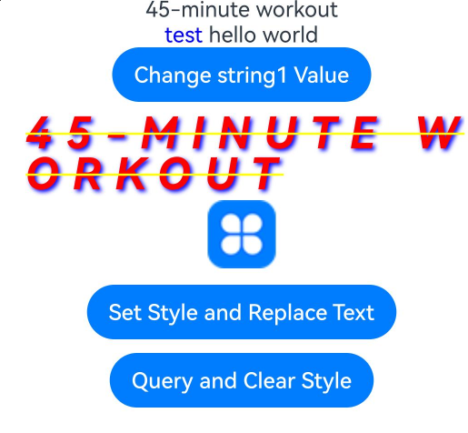
[h2]Example 2: Binding Events
This example demonstrates how to bind events to styled strings using the styledKey and styledValue APIs of StyleOptions, available since API version 12.
// xxx.ets
@Entry
@Component
struct StyledStringBindEventsDemo {
  scroll: Scroller = new Scroller();
  fontStyleAttr1: TextStyle = new TextStyle({ fontColor: Color.Blue });
  private uiContext: UIContext = this.getUIContext();
  clickGestureAttr: GestureStyle = new GestureStyle({
    onClick: () => {
      this.uiContext.getPromptAction().showToast({ message: 'clickGestureAttr object trigger click event' });
      this.backgroundColor1 = Color.Yellow;
    }
  })
  gestureStyleAttr: GestureStyle = new GestureStyle({
    onClick: () => {
      this.uiContext.getPromptAction().showToast({ message: 'gestureStyleAttr object trigger click event' });
      this.backgroundColor1 = Color.Green;
    },
    onLongPress: () => {
      this.uiContext.getPromptAction().showToast({ message: 'gestureStyleAttr object trigger long press event' });
      this.backgroundColor1 = Color.Orange;
    },
    onTouch: () => {
      this.uiContext.getPromptAction().showToast({ message: 'gestureStyleAttr object trigger touch event' });
      this.backgroundColor1 = Color.Red;
    }
  });
  // Create the event object mutableStyledString3.
  mutableStyledString3: MutableStyledString = new MutableStyledString('hello world', [{
    start: 0,
    length: 5,
    styledKey: StyledStringKey.GESTURE,
    styledValue: this.clickGestureAttr
  },
    {
      start: 0,
      length: 5,
      styledKey: StyledStringKey.FONT,
      styledValue: this.fontStyleAttr1
    },
    {
      start: 6,
      length: 5,
      styledKey: StyledStringKey.GESTURE,
      styledValue: this.gestureStyleAttr
    },
    {
      start: 6,
      length: 5,
      styledKey: StyledStringKey.FONT,
      styledValue: new TextStyle({ fontColor: Color.Pink })
    }]);
  @State backgroundColor1: ResourceColor | undefined = undefined;
  controller3: TextController = new TextController();

  async onPageShow() {
    this.controller3.setStyledString(this.mutableStyledString3);
  }

  build() {
    Column() {
      Scroll(this.scroll) {
        Column({ space: 30 }) {
          Button('Change Background Color in Response to Event').backgroundColor(this.backgroundColor1).width('80%')
          // Styled string that contains an event
          Text(undefined, { controller: this.controller3 }).fontSize(30)
            .copyOption(CopyOptions.InApp)
            .draggable(true)
            .clip(true)
        }.width('100%')
      }
      .expandSafeArea([SafeAreaType.KEYBOARD])
      .scrollable(ScrollDirection.Vertical)
      .scrollBar(BarState.On)
      .scrollBarColor(Color.Gray)
      .scrollBarWidth(10)
      .edgeEffect(EdgeEffect.None)
    }
    .width('100%')
  }
} 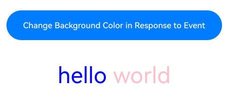
[h2]Example 3: Setting the Text Style
This example shows how to query and set styles for styled strings using the getStyles and setStyle APIs, available since API version 12.
// xxx.ets
import { LengthMetrics, LengthUnit } from '@kit.ArkUI';

@Entry
@Component
struct StyledStringSetTextStyleDemo {
  fontStyleAttr1: TextStyle = new TextStyle({ fontColor: Color.Blue });
  fontStyleAttr2: TextStyle = new TextStyle({
    fontColor: Color.Orange,
    fontSize: LengthMetrics.vp(20),
    fontWeight: FontWeight.Bolder,
    fontStyle: FontStyle.Italic,
    fontFamily: 'Arial',
    superscript: SuperscriptStyle.SUPERSCRIPT
  });
  fontStyleAttr3: TextStyle = new TextStyle({
    fontColor: Color.Orange,
    fontSize: LengthMetrics.vp(20),
    fontWeight: FontWeight.Lighter,
    fontStyle: FontStyle.Italic,
    fontFamily: 'Arial',
    superscript: SuperscriptStyle.SUBSCRIPT
  });
  // Create a styled string object with multiple text styles: mutableStyledString1.
  mutableStyledString1: MutableStyledString = new MutableStyledString('45-minute workout', [{
    start: 0,
    length: 2,
    styledKey: StyledStringKey.FONT,
    styledValue: this.fontStyleAttr3
  }, {
    start: 2,
    length: 2,
    styledKey: StyledStringKey.FONT,
    styledValue: this.fontStyleAttr2
  }
  ]);
  // Create a styled string object with multiple styles: mutableStyledString2.
  mutableStyledString2: MutableStyledString = new MutableStyledString('test hello world', [{
    start: 0,
    length: 5,
    styledKey: StyledStringKey.FONT,
    styledValue: this.fontStyleAttr1
  }, {
    start: 0,
    length: 5,
    styledKey: StyledStringKey.DECORATION,
    styledValue: new DecorationStyle({ type: TextDecorationType.LineThrough, color: Color.Blue })
  }, {
    start: 0,
    length: 5,
    styledKey: StyledStringKey.TEXT_SHADOW,
    styledValue: new TextShadowStyle({
      radius: 5,
      type: ShadowType.COLOR,
      color: Color.Yellow,
      offsetX: 10,
      offsetY: -10
    })
  }, {
    start: 0,
    length: 5,
    styledKey: StyledStringKey.BASELINE_OFFSET,
    styledValue: new BaselineOffsetStyle(LengthMetrics.px(20))
  }, {
    start: 0,
    length: 5,
    styledKey: StyledStringKey.LETTER_SPACING,
    styledValue: new LetterSpacingStyle(new LengthMetrics(10, LengthUnit.VP))
  }, {
    start: 6,
    length: 5,
    styledKey: StyledStringKey.BASELINE_OFFSET,
    styledValue: new BaselineOffsetStyle(LengthMetrics.fp(10))
  }
  ]);
  @State fontColor1: ResourceColor = Color.Red;
  controller: TextController = new TextController();
  options: TextOptions = { controller: this.controller };
  controller2: TextController = new TextController();
  spanStyle1: SpanStyle = {
    start: 0,
    length: 5,
    styledKey: StyledStringKey.FONT,
    styledValue: new TextStyle({ fontColor: Color.Pink })
  };

  async onPageShow() {
    this.controller.setStyledString(this.mutableStyledString1);
    this.controller2.setStyledString(this.mutableStyledString2);
  }

  build() {
    Column() {
      Column({ space: 10 }) {
        // Display the styled string with various font styles configured. For conflicting parts, the styled string configuration takes effect; for non-conflicting parts, the Text component attribute settings take effect.
        Text(undefined, this.options)
          .fontColor(this.fontColor1)
          .font({ size: 20, weight: 500, style: FontStyle.Normal })
        // Display the styled string for which the text shadow, text decorative line, letter spacing, and baseline offset are configured. If the styled string conflicts with the style settings in the Text component, the style set in the styled string takes effect.
        Text(undefined, { controller: this.controller2 })
          .fontSize(30)
          .copyOption(CopyOptions.InApp)
          .draggable(true)
          .decoration({ type: TextDecorationType.Overline, color: Color.Pink })
          .textShadow({
            radius: 10,
            type: ShadowType.COLOR,
            color: Color.Green,
            offsetX: -10,
            offsetY: 10
          })
        Button('Query Font Style')
          .onClick(() => {
            let styles = this.mutableStyledString1.getStyles(0, this.mutableStyledString1.length);
            if (styles.length !== 0) {
              for (let i = 0; i < styles.length; i++) {
                console.info('mutableStyledString1 style object start:' + styles[i].start);
                console.info('mutableStyledString1 style object length:' + styles[i].length);
                console.info('mutableStyledString1 style object key:' + styles[i].styledKey);
                if (styles[i].styledKey === 0) {
                  let fontAttr = styles[i].styledValue as TextStyle;
                  console.info('mutableStyledString1 fontColor:' + fontAttr.fontColor);
                  console.info('mutableStyledString1 fontSize:' + fontAttr.fontSize);
                  console.info('mutableStyledString1 fontWeight:' + fontAttr.fontWeight);
                  console.info('mutableStyledString1 fontStyle:' + fontAttr.fontStyle);
                  console.info('mutableStyledString1 fontFamily:' + fontAttr.fontFamily);
                  console.info('mutableStyledString1 superscript:' + fontAttr.superscript);
                }
              }
            }
          })
          .margin({ top: 10 })
        Button('Query Other Styles')
          .onClick(() => {
            let styles = this.mutableStyledString2.getStyles(0, this.mutableStyledString2.length);
            if (styles.length !== 0) {
              for (let i = 0; i < styles.length; i++) {
                console.info('mutableStyledString2 style object start:' + styles[i].start);
                console.info('mutableStyledString2 style object length:' + styles[i].length);
                console.info('mutableStyledString2 style object key:' + styles[i].styledKey);
                if (styles[i].styledKey === 1) {
                  let decoAttr = styles[i].styledValue as DecorationStyle;
                  console.info('mutableStyledString2 decoration type:' + decoAttr.type);
                  console.info('mutableStyledString2 decoration color:' + decoAttr.color);
                }
                if (styles[i].styledKey === 2) {
                  let baselineAttr = styles[i].styledValue as BaselineOffsetStyle;
                  console.info('mutableStyledString2 baselineOffset:' + baselineAttr.baselineOffset);
                }
                if (styles[i].styledKey === 3) {
                  let letterAttr = styles[i].styledValue as LetterSpacingStyle;
                  console.info('mutableStyledString2 letterSpacing:' + letterAttr.letterSpacing);
                }
                if (styles[i].styledKey === 4) {
                  let textShadowAttr = styles[i].styledValue as TextShadowStyle;
                  let shadowValues = textShadowAttr.textShadow;
                  if (shadowValues.length > 0) {
                    for (let j = 0; j < shadowValues.length; j++) {
                      console.info('mutableStyledString2 textShadow type:' + shadowValues[j].type);
                      console.info('mutableStyledString2 textShadow radius:' + shadowValues[j].radius);
                      console.info('mutableStyledString2 textShadow color:' + shadowValues[j].color);
                      console.info('mutableStyledString2 textShadow offsetX:' + shadowValues[j].offsetX);
                      console.info('mutableStyledString2 textShadow offsetY:' + shadowValues[j].offsetY);
                    }
                  }
                }
              }
            }
          })
          .margin({ top: 10 })
        Button('Update mutableStyledString1 Style')
          .onClick(() => {
            this.mutableStyledString1.setStyle(this.spanStyle1);
            this.controller.setStyledString(this.mutableStyledString1);
          })
          .margin({ top: 10 })
      }.width('100%')
    }
    .width('100%')
  }
} 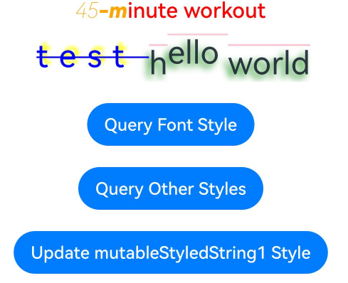
[h2]Example 4: Setting Images
This example illustrates how to set images in styled strings using the ImageAttachment API, available since API version 12.
// xxx.ets
import { image } from '@kit.ImageKit';
import { LengthMetrics } from '@kit.ArkUI';

@Entry
@Component
struct StyledStringSetImageDemo {
  @State message: string = 'Hello World';
  imagePixelMap: image.PixelMap | undefined = undefined;
  @State imagePixelMap3: image.PixelMap | undefined = undefined;
  mutableStr: MutableStyledString = new MutableStyledString('123');
  controller: TextController = new TextController();
  private uiContext: UIContext = this.getUIContext();
  mutableStr2: MutableStyledString = new MutableStyledString('This is set decoration line style to the mutableStr2', [{
    start: 0,
    length: 15,
    styledKey: StyledStringKey.DECORATION,
    styledValue: new DecorationStyle({
      type: TextDecorationType.Overline,
      color: Color.Orange,
      style: TextDecorationStyle.DOUBLE
    })
  }]);

  async aboutToAppear() {
    console.info('aboutToAppear initial imagePixelMap');
    // Replace $r('app.media.startIcon') with the image resource file you use.
    this.imagePixelMap =
      await this.getPixmapFromMedia($r('app.media.startIcon'));
  }

  private async getPixmapFromMedia(resource: Resource) {
    let unit8Array = await this.uiContext.getHostContext()?.resourceManager?.getMediaContent(resource.id);
    let imageSource = image.createImageSource(unit8Array?.buffer.slice(0, unit8Array.buffer.byteLength));
    let createPixelMap: image.PixelMap = await imageSource.createPixelMap({
      desiredPixelFormat: image.PixelMapFormat.RGBA_8888
    });
    await imageSource.release();
    return createPixelMap;
  }

  build() {
    Row() {
      Column({ space: 5 }) {
        Text(undefined, { controller: this.controller })
          .copyOption(CopyOptions.InApp)
          .draggable(true)
          .fontSize(30)
        Button('Set Image')
          .onClick(() => {
            if (this.imagePixelMap !== undefined) {
              this.mutableStr = new MutableStyledString(new ImageAttachment({
                value: this.imagePixelMap,
                size: { width: 50, height: 50 },
                layoutStyle: { borderRadius: LengthMetrics.vp(10) },
                verticalAlign: ImageSpanAlignment.BASELINE,
                objectFit: ImageFit.Contain
              }));
              this.controller.setStyledString(this.mutableStr);
            }
          })
        Button('Set Resource Type Image')
          .onClick(() => {
            if (this.imagePixelMap !== undefined) {
              this.mutableStr = new MutableStyledString(new ImageAttachment({
                // Replace $r('app.media.sky') with the image resource file you use.
                resourceValue: $r('app.media.sky'),
                size: { width: 50, height: 50 },
                layoutStyle: { borderRadius: LengthMetrics.vp(10) },
                verticalAlign: ImageSpanAlignment.BASELINE,
                objectFit: ImageFit.Contain,
                syncLoad: true
              }));
              this.controller.setStyledString(this.mutableStr);
            }
          })
        Button('Image: Get')
          .onClick(() => {
            let imageArray = this.mutableStr.getStyles(0, 1, StyledStringKey.IMAGE);
            for (let i = 0; i < imageArray.length; ++i) {
              console.info('mutableStr start ' + imageArray[i].start + ' length ' + imageArray[i].length + ' type ' +
                imageArray[i].styledKey);
              if (imageArray[i].styledKey === 300) {
                let attachment = imageArray[i].styledValue as ImageAttachment;
                this.imagePixelMap3 = attachment.value;
                console.info('mutableStr value ' + JSON.stringify(attachment.value));
                if (attachment.size !== undefined) {
                  console.info('mutableStr size width ' + attachment.size.width + ' height ' + attachment.size.height);
                }
                console.info('mutableStr vertical ' + attachment.verticalAlign);
                console.info('mutableStr fit ' + attachment.objectFit);
                if (attachment.layoutStyle !== undefined) {
                  let radius = attachment.layoutStyle.borderRadius as BorderRadiuses;
                  console.info('mutableStr radius ' + JSON.stringify(radius));
                }
              }
            }
          })
        Image(this.imagePixelMap3).width(50).height(50)
        Button('Image: Append')
          .onClick(() => {
            let str = new StyledString('123');
            this.mutableStr.appendStyledString(str);
            this.controller.setStyledString(this.mutableStr);
          })
        Button('Image: Before Insert')
          .onClick(() => {
            this.mutableStr.insertString(0, '123');
            this.controller.setStyledString(this.mutableStr);
          })
        Button('Image: After Insert')
          .onClick(() => {
            this.mutableStr.insertString(1, '123');
            this.controller.setStyledString(this.mutableStr);
          })
        Button('Image: Replace')
          .onClick(() => {
            this.mutableStr.replaceString(2, 5, '789');
            this.controller.setStyledString(this.mutableStr);
          })
      }
      .width('100%')
    }
    .height('100%')
  }
} 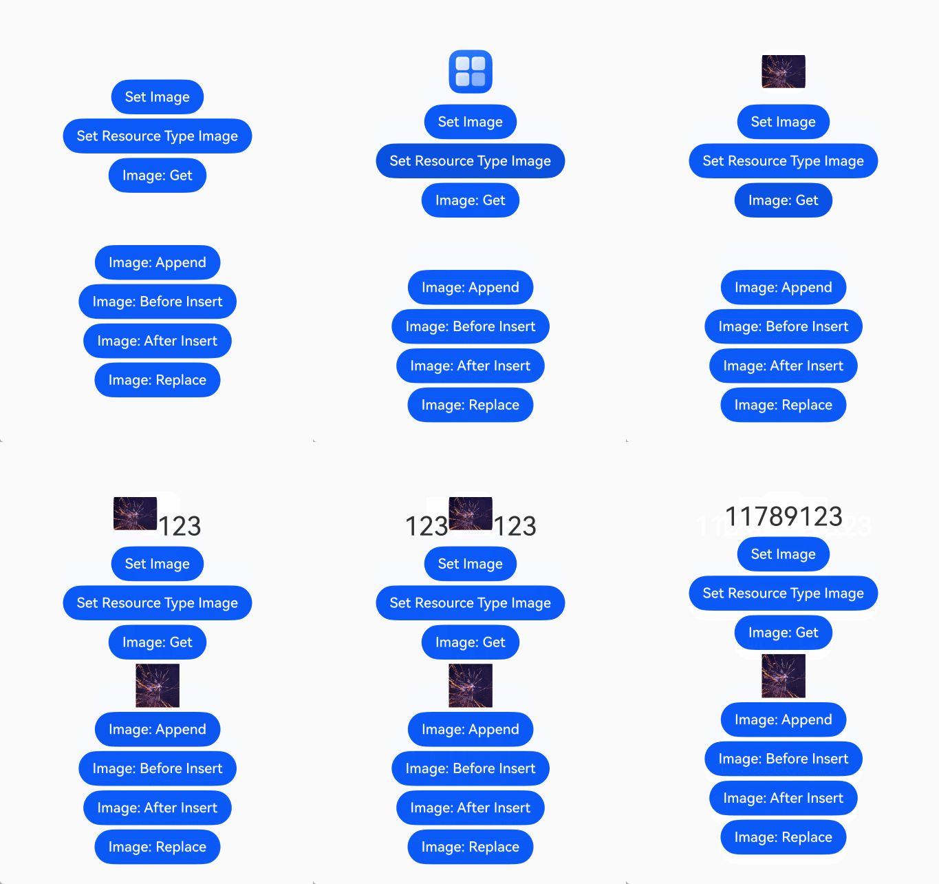
[h2]Example 5: Setting the Text Line Height and Paragraph Style
This example illustrates how to configure the line height and paragraph style of a styled string using the LineHeightStyle and ParagraphStyle APIs, available since API version 12.
import { LengthMetrics } from '@kit.ArkUI';

const canvasWidth = 1000;
const canvasHeight = 100;

class LeadingMarginCreator {
  private settings: RenderingContextSettings = new RenderingContextSettings(true);
  private offscreenCanvas: OffscreenCanvas = new OffscreenCanvas(canvasWidth, canvasHeight);
  private offContext: OffscreenCanvasRenderingContext2D = this.offscreenCanvas.getContext('2d', this.settings);
  public static instance: LeadingMarginCreator = new LeadingMarginCreator();

  public genSquareMark(fontSize: number): PixelMap {
    this.clearCanvas();
    const coordinate = fontSize * (1 - 1 / 1.5) / 2;
    const sideLength = fontSize / 1.5;
    this.offContext.fillRect(coordinate, coordinate, sideLength, sideLength);
    return this.offContext.getPixelMap(0, 0, fontSize, fontSize);
  }

  private clearCanvas() {
    this.offContext.clearRect(0, 0, canvasWidth, canvasHeight);
  }
}

@Entry
@Component
struct StyledStringSetLineheightParagraphstyleDemo {
  private leadingMarkCreatorInstance = LeadingMarginCreator.instance;
  leadingMarginPlaceholder1: LeadingMarginPlaceholder = {
    pixelMap: this.leadingMarkCreatorInstance.genSquareMark(24),
    size: [15, 15]
  };
  titleParagraphStyleAttr: ParagraphStyle =
    new ParagraphStyle({ textAlign: TextAlign.Center, paragraphSpacing: LengthMetrics.px(10) });
  // Indent the first line of the first paragraph by 15 vp.
  paragraphStyleAttr1: ParagraphStyle = new ParagraphStyle({ textIndent: LengthMetrics.vp(15) });
  // Indent the second paragraph by 15 vp, with a placeholder in the first line.
  paragraphStyleAttr2: ParagraphStyle =
    new ParagraphStyle({ textAlign: TextAlign.Start, leadingMargin: this.leadingMarginPlaceholder1 });
  // Set the maximum number of lines and text overflow mode for the third paragraph, without setting the indent.
  paragraphStyleAttr3: ParagraphStyle = new ParagraphStyle({
    textAlign: TextAlign.End,
    textVerticalAlign: TextVerticalAlign.BASELINE,
    maxLines: 1,
    wordBreak: WordBreak.BREAK_ALL,
    overflow: TextOverflow.Ellipsis
  });
  // Line height style object
  lineHeightStyle1: LineHeightStyle = new LineHeightStyle(new LengthMetrics(24));
  // Create a paragraph style object paragraphStyledString1.
  paragraphStyledString1: StyledString =
    new StyledString(
      'Paragraph title\nStart of the first paragraph 0123456789 End of the first paragraph\nStart of the second paragraph hello world End of the second paragraph\nThird paragraph ABCDEFGHIJKLMNOPQRSTUVWXYZ',
      [
        {
          start: 0,
          length: 4,
          styledKey: StyledStringKey.PARAGRAPH_STYLE,
          styledValue: this.titleParagraphStyleAttr
        },
        {
          start: 0,
          length: 4,
          styledKey: StyledStringKey.LINE_HEIGHT,
          styledValue: new LineHeightStyle(new LengthMetrics(50))
        }, {
        start: 0,
        length: 4,
        styledKey: StyledStringKey.FONT,
        styledValue: new TextStyle({ fontSize: LengthMetrics.vp(24), fontWeight: FontWeight.Bolder })
      },
        {
          start: 5,
          length: 3,
          styledKey: StyledStringKey.PARAGRAPH_STYLE,
          styledValue: this.paragraphStyleAttr1
        },
        {
          start: 5,
          length: 20,
          styledKey: StyledStringKey.LINE_HEIGHT,
          styledValue: this.lineHeightStyle1
        },
        {
          start: 32,
          length: 5,
          styledKey: StyledStringKey.PARAGRAPH_STYLE,
          styledValue: this.paragraphStyleAttr2
        },
        {
          start: 32,
          length: 20,
          styledKey: StyledStringKey.LINE_HEIGHT,
          styledValue: this.lineHeightStyle1
        },
        {
          start: 60,
          length: 5,
          styledKey: StyledStringKey.PARAGRAPH_STYLE,
          styledValue: this.paragraphStyleAttr3
        },
        {
          start: 60,
          length: 5,
          styledKey: StyledStringKey.LINE_HEIGHT,
          styledValue: this.lineHeightStyle1
        }
      ]);
  controller: TextController = new TextController();

  async onPageShow() {
    this.controller.setStyledString(this.paragraphStyledString1);
  }

  build() {
    Row() {
      Column({ space: 5 }) {
        Text(undefined, { controller: this.controller })
          .width(240)
          .borderWidth(1)
          .copyOption(CopyOptions.InApp)
          .draggable(true)

        // Query the paragraph style.
        Text()
          .onClick(() => {
            let styles = this.paragraphStyledString1.getStyles(0, this.paragraphStyledString1.length);
            if (styles.length !== 0) {
              for (let i = 0; i < styles.length; i++) {
                console.info('paragraphStyledString1 style object start:' + styles[i].start);
                console.info('paragraphStyledString1 style object length:' + styles[i].length);
                console.info('paragraphStyledString1 style object key:' + styles[i].styledKey);
                if (styles[i].styledKey === 200) {
                  let paraAttr = styles[i].styledValue as ParagraphStyle;
                  console.info('paragraphStyledString1 textAlign:' + paraAttr.textAlign);
                  console.info('paragraphStyledString1 textIndent:' + paraAttr.textIndent);
                  console.info('paragraphStyledString1 maxLines:' + paraAttr.maxLines);
                  console.info('paragraphStyledString1 wordBreak:' + paraAttr.wordBreak);
                  console.info('paragraphStyledString1 leadingMargin:' + paraAttr.leadingMargin);
                  console.info('paragraphStyledString1 overflow:' + paraAttr.overflow);
                }
              }
            }
          })
          .margin({ top: 10 })
      }
      .width('100%')
    }
    .height('100%')
  }
} 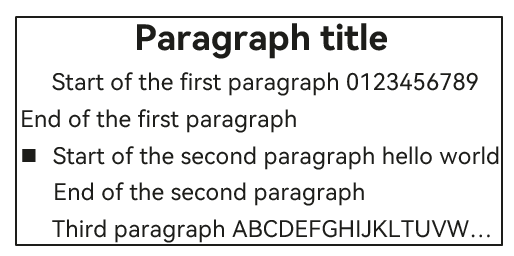
[h2]Example 6: Setting Custom Spans
This example illustrates how to configure custom spans for a styled string using CustomSpan and measureTextSize, supported since API version 12.
Since API version 26.0.0, the maxWidth and layoutPolicy properties are added to CustomSpanMeasureInfo.
// xxx.ets
import { drawing } from '@kit.ArkGraphics2D';
import { LengthMetrics } from '@kit.ArkUI';

let gUIContext: UIContext;

class MyCustomSpan extends CustomSpan {
  constructor(word: string, width: number, height: number) {
    super();
    this.word = word;
    this.width = width;
    this.height = height;
  }

  onMeasure(measureInfo: CustomSpanMeasureInfo): CustomSpanMetrics {
    this.setPx(gUIContext.vp2px(2));
    let textSize =
      gUIContext.getMeasureUtils().measureTextSize({ textContent: this.word, fontSize: this.wordFontSize });
    // Since API version 26.0.0, CustomSpanMeasureInfo supports the maxWidth and layoutPolicy attributes.
    if (measureInfo.layoutPolicy != LayoutPolicy.fixAtIdealSize) {
      this.width = Math.min(textSize.width as number, measureInfo.maxWidth as number);
    } else {
      this.width = textSize.width as number;
    }
    this.height = textSize.height as number;
    return {
      width: gUIContext.px2vp(this.width) + (this.paddingLeft + this.paddingRight) * 2,
      height: gUIContext.px2vp(this.height) + this.paddingTop + this.paddingBottom
    };
  }

  onDraw(context: DrawContext, options: CustomSpanDrawInfo) {
    let canvas = context.canvas;

    const brush = new drawing.Brush();
    brush.setColor({
      alpha: 255,
      red: 0,
      green: 74,
      blue: 175
    });
    const font = new drawing.Font();
    font.setSize(gUIContext.vp2px(this.wordFontSize));
    const textBlob = drawing.TextBlob.makeFromString(this.word, font, drawing.TextEncoding.TEXT_ENCODING_UTF8);
    canvas.attachBrush(brush);
    canvas.drawRect({
      // Center the drawn rectangle within the span size.
      left: options.x + gUIContext.vp2px(this.paddingLeft),
      right: options.x + this.width + 2 * gUIContext.vp2px(this.paddingLeft) + gUIContext.vp2px(this.paddingRight),
      top: options.lineTop,
      bottom: options.baseline
    });

    brush.setColor({
      alpha: 255,
      red: 23,
      green: 169,
      blue: 141
    });
    canvas.attachBrush(brush);
    // Center the text in the drawn rectangle.
    canvas.drawTextBlob(textBlob, options.x + 2 * gUIContext.vp2px(this.paddingLeft),
      options.baseline - gUIContext.vp2px(this.paddingBottom));
    canvas.detachBrush();
  }

  setWord(word: string) {
    this.word = word;
  }

  setPx(px: number) {
    this.paddingLeft = px;
    this.paddingRight = px;
    this.paddingTop = px;
    this.paddingBottom = px;
  }

  width: number = 160;
  word: string = 'drawing';
  height: number = 10;
  paddingLeft: number = 0;
  paddingRight: number = 0;
  paddingTop: number = 0;
  paddingBottom: number = 0;
  wordFontSize: number = 20;
}

@Entry
@Component
struct StyledStringSetCustomspanDemo {
  customSpan1: MyCustomSpan = new MyCustomSpan('Hello', 80, 10);
  customSpan2: MyCustomSpan = new MyCustomSpan('World', 80, 40);
  style: MutableStyledString = new MutableStyledString(this.customSpan1);
  textController: TextController = new TextController();
  isPageShow: boolean = true;

  aboutToAppear() {
    gUIContext = this.getUIContext();
  }

  async onPageShow() {
    if (!this.isPageShow) {
      return;
    }
    this.isPageShow = false;

    this.style.appendStyledString(new MutableStyledString('Text drawing Sample code CustomSpan', [
      {
        start: 0,
        length: 5,
        styledKey: StyledStringKey.FONT,
        styledValue: new TextStyle({ fontColor: Color.Pink })
      }, {
      start: 5,
      length: 5,
      styledKey: StyledStringKey.FONT,
      styledValue: new TextStyle({ fontColor: Color.Orange, fontStyle: FontStyle.Italic })
    }, {
      start: 10,
      length: 500,
      styledKey: StyledStringKey.FONT,
      styledValue: new TextStyle({ fontColor: Color.Green, fontWeight: FontWeight.Bold })
    }
    ]));
    this.style.appendStyledString(new StyledString(this.customSpan2));
    this.style.appendStyledString(new StyledString('Custom Drawing', [{
      start: 0,
      length: 5,
      styledKey: StyledStringKey.FONT,
      styledValue: new TextStyle({ fontColor: Color.Green, fontSize: LengthMetrics.px(50) })
    }]));
    this.textController.setStyledString(this.style);
  }

  build() {
    Row() {
      Column() {
        Text(undefined, { controller: this.textController })
          .copyOption(CopyOptions.InApp)
          .fontSize(30)

        Button('invalidate').onClick(() => {
          this.customSpan1.setWord('Hello');
          this.customSpan1.invalidate();
        })
      }
      .width('100%')
    }
    .height('100%')
  }
} 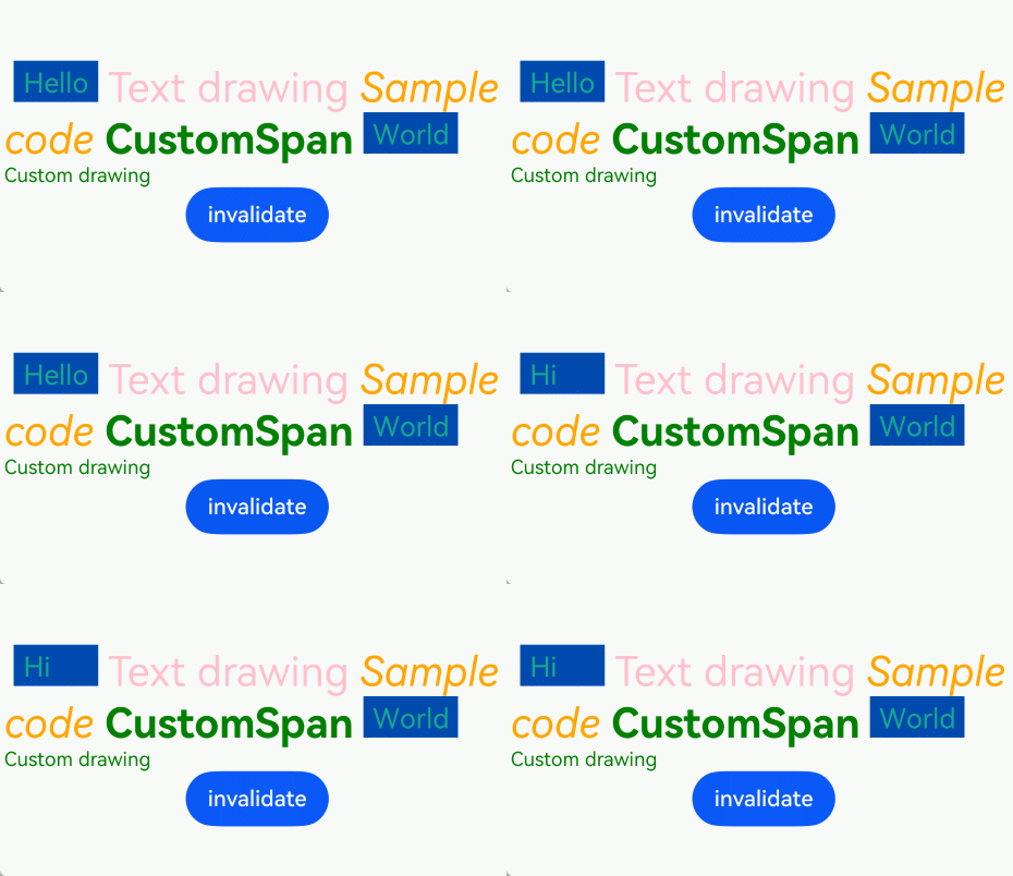
[h2]Example 7: Storing Custom Extension Information
This example illustrates how to store custom extension information within styled strings using the UserDataSpan API, available since API version 12.
// xxx.ets
class MyUserDataSpan extends UserDataSpan {
  constructor(name: string, age: number) {
    super();
    this.name = name;
    this.age = age;
  }

  name: string;
  age: number;
}

@Entry
@Component
struct StyledStringSetUserdataspanDemo {
  @State name: string = 'world';
  @State age: number = 10;
  controller: TextController = new TextController();
  styleString: MutableStyledString = new MutableStyledString('hello world', [{
    start: 0,
    length: 11,
    styledKey: StyledStringKey.USER_DATA,
    styledValue: new MyUserDataSpan('hello', 21)
  }]);

  onPageShow(): void {
    this.controller.setStyledString(this.styleString);
  }

  build() {
    Column() {
      Text(undefined, { controller: this.controller })
      Button('get user data').onClick(() => {
        let arr = this.styleString.getStyles(0, this.styleString.length);
        let userDataSpan = arr[0].styledValue as MyUserDataSpan;
        this.name = userDataSpan.name;
        this.age = userDataSpan.age;
      })
      Text('name:' + this.name + '  age: ' + this.age)
    }.width('100%').height(250).padding({ left: 35, right: 35, top: 35 })
  }
} 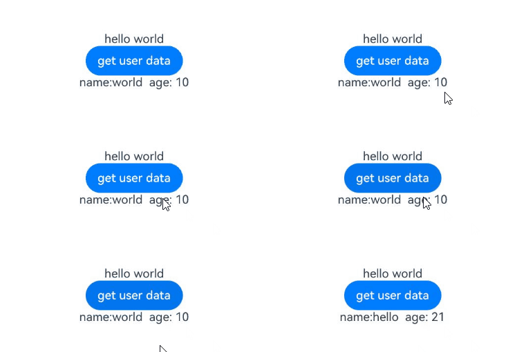
[h2]Example 8: Setting a Hyperlink
This example demonstrates how to set a hyperlink within a styled string using the UrlStyle API, available since API version 14.
// xxx.ets
@Entry
@Component
struct StyledStringSetUrlstyleDemo {
  urlString: UrlStyle = new UrlStyle('https://www.example.com');
  mutableStyledString: MutableStyledString = new MutableStyledString('Hello World', [{
    start: 0,
    length: 'Hello'.length,
    styledKey: StyledStringKey.URL,
    styledValue: this.urlString
  }]);
  controller: TextController = new TextController();

  async onPageShow() {
    this.controller.setStyledString(this.mutableStyledString);
  }

  build() {
    Column() {
      Column() {
        Text(undefined, { controller: this.controller }).key('mutableStyledString').fontSize(30)
      }
    }.width('100%').height(250).padding({ left: 35, right: 35, top: 35 })
  }
} 
[h2]Example 9: Setting a Color Filter for an Image
This example demonstrates how to apply a color filter to an image by setting colorFilter for ImageAttachment, available since API version 15.
// xxx.ets
import { LengthMetrics } from '@kit.ArkUI';
import { drawing, common2D } from '@kit.ArkGraphics2D';

@Entry
@Component
struct StyledStringSetImageColorfilterDemo {
  @State message: string = 'Hello World';
  mutableStr: MutableStyledString = new MutableStyledString('origin image:');
  mutableStr2: MutableStyledString = new MutableStyledString('with filter:');
  controller: TextController = new TextController();
  controller2: TextController = new TextController();
  private color: common2D.Color = {
    alpha: 125,
    red: 125,
    green: 125,
    blue: 255
  };

  build() {
    Row() {
      Column({ space: 5 }) {
        Text(undefined, { controller: this.controller })
          .copyOption(CopyOptions.InApp)
          .draggable(true)
          .fontSize(30)
          .onAppear(() => {
            this.mutableStr = new MutableStyledString(new ImageAttachment({
              // Replace $r('app.media.startIcon') with the image resource file you use.
              resourceValue: $r('app.media.startIcon'),
              size: { width: 50, height: 50 },
              layoutStyle: { borderRadius: LengthMetrics.vp(10) },
              verticalAlign: ImageSpanAlignment.BASELINE,
              objectFit: ImageFit.Contain,
              syncLoad: true
            }));
            this.controller.setStyledString(this.mutableStr);
          })
        Text(undefined, { controller: this.controller2 })
          .copyOption(CopyOptions.InApp)
          .draggable(true)
          .fontSize(30)
        Button('set image color filter')
          .onClick(() => {
            this.mutableStr2 = new MutableStyledString(new ImageAttachment({
              // Replace $r('app.media.startIcon') with the image resource file you use.
              resourceValue: $r('app.media.startIcon'),
              size: { width: 50, height: 50 },
              layoutStyle: { borderRadius: LengthMetrics.vp(10) },
              verticalAlign: ImageSpanAlignment.BASELINE,
              objectFit: ImageFit.Contain,
              colorFilter: drawing.ColorFilter.createBlendModeColorFilter(this.color, drawing.BlendMode.SRC_IN),
              syncLoad: true
            }));
            this.controller2.setStyledString(this.mutableStr2);
          })
      }
      .width('100%')
    }
    .height('100%')
  }
} 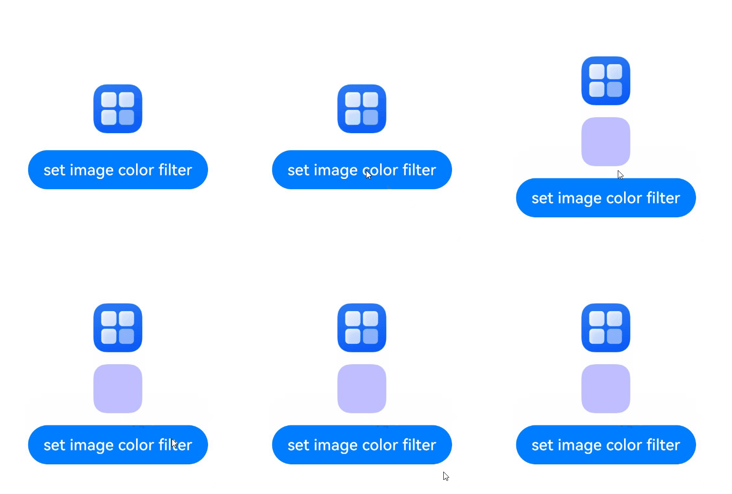
[h2]Example 10: Inserting, Deleting, and Replacing Styled Strings
This example demonstrates how to insert, delete, and replace styled strings using the subStyledString, removeString, removeStyle, clearStyles, replaceStyledString, and insertStyledString APIs, available since API version 12.
// xxx.ets
@Entry
@Component
struct StyledStringModifyDemo {
  @State message: string = 'Hello World';
  mutableStr: MutableStyledString = new MutableStyledString('123456', [{
    start: 0,
    length: 2,
    styledKey: StyledStringKey.FONT,
    styledValue: new TextStyle({ fontColor: Color.Red })
  }, {
    start: 0,
    length: 3,
    styledKey: StyledStringKey.DECORATION,
    styledValue: new DecorationStyle({ type: TextDecorationType.LineThrough })
  }]);
  controller: TextController = new TextController();
  controller2: TextController = new TextController();

  build() {
    Row() {
      Column({ space: 5 }) {
        Text(undefined, { controller: this.controller })
          .copyOption(CopyOptions.InApp)
          .draggable(true)
          .fontSize(30)
          .onAppear(() => {
            this.controller.setStyledString(this.mutableStr);
          })
        Text(undefined, { controller: this.controller2 })
          .copyOption(CopyOptions.InApp)
          .draggable(true)
          .fontSize(30)
        Button('GetSubStyledString (0,3)').onClick(() => {
          this.controller2.setStyledString(this.mutableStr.subStyledString(0, 3));
        })
        Button('RemoveStyle (0,1,Decoration)').onClick(() => {
          this.mutableStr.removeStyle(0, 1, StyledStringKey.DECORATION);
          this.controller.setStyledString(this.mutableStr);
        })
        Button('RemoveString (5,1)').onClick(() => {
          this.mutableStr.removeString(5, 1);
          this.controller.setStyledString(this.mutableStr);
        })
        Button('ClearStyles').onClick(() => {
          this.mutableStr.clearStyles();
          this.controller.setStyledString(this.mutableStr);
        })
        Button('replaceStyledString').onClick(() => {
          this.mutableStr.replaceStyledString(3, 1, new StyledString('abc', [{
            start: 0,
            length: 3,
            styledKey: StyledStringKey.FONT,
            styledValue: new TextStyle({ fontColor: Color.Blue })
          }]));
          this.controller.setStyledString(this.mutableStr);
        })
        Button('insertStyledString').onClick(() => {
          this.mutableStr.insertStyledString(4, new StyledString('A'));
          this.controller.setStyledString(this.mutableStr);
        })
      }
      .width('100%')
    }
    .height('100%')
  }
} 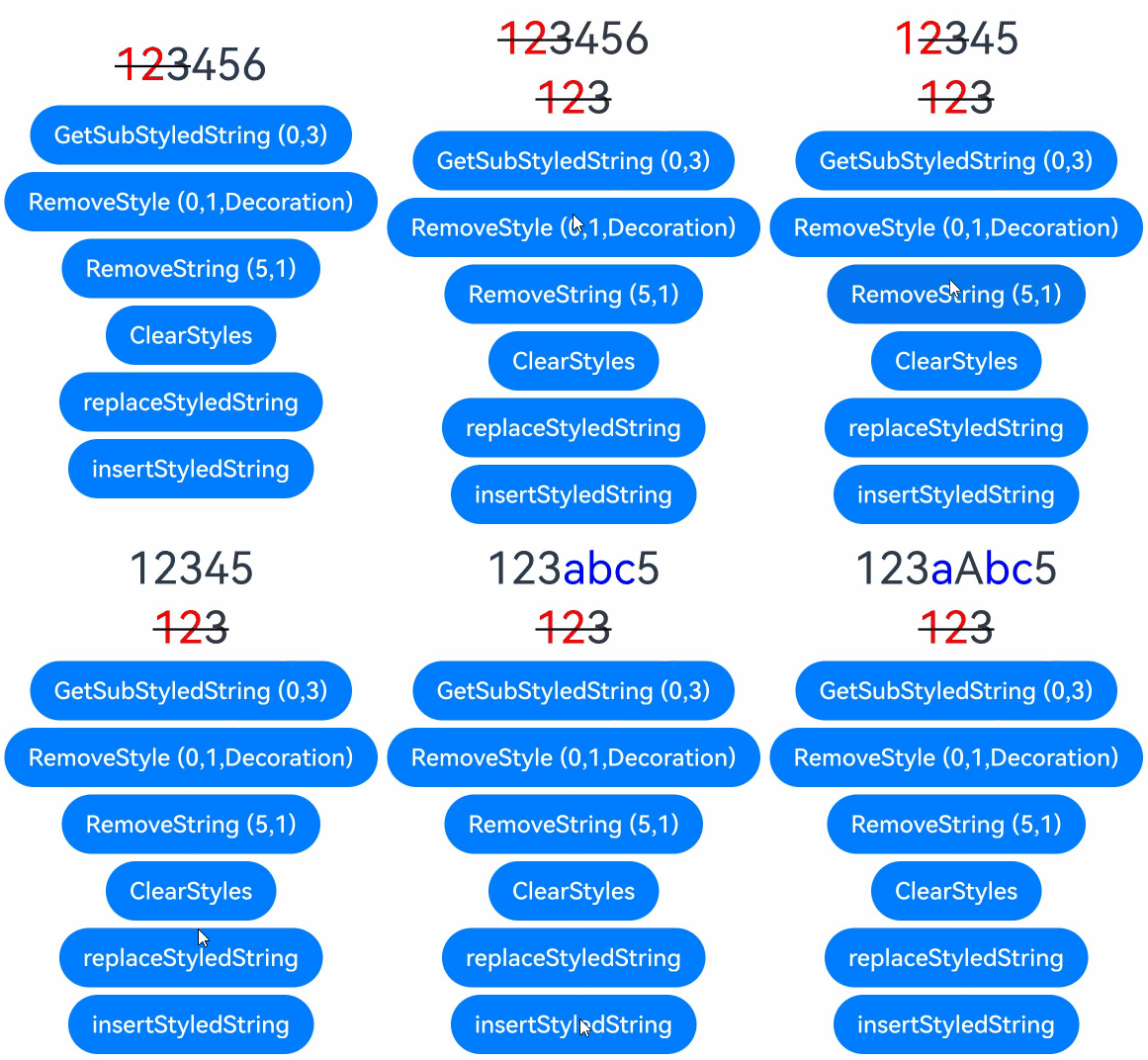
[h2]Example 11: Configuring the Text Stroke for a Styled String
This example illustrates how to configure the text stroke for a styled string by setting strokeWidth and strokeColor of TextStyle, available since API version 20.
Since API version 26.0.0, the strokeJoinStyle API is added to TextStyle to implement the text corner stroke style.
// xxx.ets
import { LengthMetrics } from '@kit.ArkUI';

@Entry
@Component
struct StyledStringStrokewidthStrokecolorDemo {
  @State string1: string = 'Hello';
  spanStyle: SpanStyle = {
    start: 0,
    length: 5,
    styledKey: StyledStringKey.FONT,
    styledValue: new TextStyle({
      fontColor: '#ff2787d9',
      strokeWidth: LengthMetrics.px(-5),
      strokeColor: Color.Black,
      fontWeight: FontWeight.Bolder,
      fontSize: LengthMetrics.px(100)
    })
  };
  spanStyle1: SpanStyle = {
    start: 0,
    length: 5,
    styledKey: StyledStringKey.FONT,
    styledValue: new TextStyle({
      fontColor: '#ff2787d9',
      strokeWidth: LengthMetrics.px(5),
      strokeJoinStyle: StrokeJoinStyle.MITER_JOIN,
      strokeColor: Color.Black,
      fontWeight: FontWeight.Bolder,
      fontSize: LengthMetrics.px(100)
    })
  };
  mutableStyledString: MutableStyledString = new MutableStyledString(this.string1, []);
  controller: TextController = new TextController();
  mutableStyledString1: MutableStyledString = new MutableStyledString(this.string1, []);
  controller1: TextController = new TextController();

  async onPageShow() {
    this.mutableStyledString.setStyle(this.spanStyle)
    this.controller.setStyledString(this.mutableStyledString);

    this.mutableStyledString1.setStyle(this.spanStyle1)
    this.controller1.setStyledString(this.mutableStyledString1);
  }

  build() {
    Column() {
      // Solid text
      Text(undefined, { controller: this.controller })
        .margin({ top: 10, bottom: 50 })
        .draggable(true)
        .onDragStart(() => {
        })
      // Hollow text
      Text(undefined, { controller: this.controller1 })
        .margin({ top: 10, bottom: 50 })
        .draggable(true)
        .onDragStart(() => {
        })
    }
    .height('100%')
    .width('100%')
  }
} 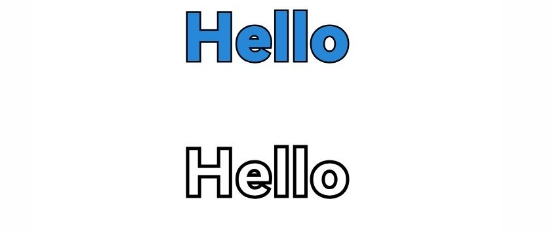
[h2]Example 12: Implementing Conversion Using fromHtml and toHtml
This example illustrates how to convert HTML content to styled strings and back using the fromHtml (available since API version 12) and toHtml (available since API version 14) APIs. Supported HTML tags include strong, b20+, em20+, i20+, u20+, del20+, s20+, a20+, sub20+, and sup20+, along with their background-color style attributes.
// xxx.ets
@Entry
@Component
struct StyledStringHtmlConvertDemo {
  // The b, em, i, u, del, s, a, sup, and sub tags are supported since API version 20.
  @State html: string =
    '<p>This is <b>b</b> <strong>strong</strong> <em>em</em> <i>i</i> <u>u</u> <del>del</del> <s>s</s> <span style = "foreground-color:blue"> <a href=\'https://www.example.com\'>www.example</a> </span> <span style="background-color: red;">red span</span> <sup>superscript</sup> and <sub>subscript</sub></p>';
  @State spanString: StyledString | undefined = undefined;
  @State resultText: string = ''; // State for saving the result text.
  controller: TextController = new TextController;

  build() {
    Column() {
      // Display the spanString after conversion.
      Text(undefined, { controller: this.controller }).height(100)

      // Display each step result in the text area.
      TextArea({ text: this.html })
        .width('100%')
        .height(100)
        .margin(5)

      // Button 1: Convert HTML to SpanString
      Button('Convert HTML to SpanString').onClick(async () => {
        this.spanString = await StyledString.fromHtml(this.html);
        this.controller.setStyledString(this.spanString);
        this.resultText = 'Converted HTML to SpanString successfully.';
      }).margin(5)

      // Button 2: Convert SpanString to HTML.
      Button('Convert SpanString to HTML').onClick(() => {
        if (this.spanString) {
          // Convert spanString to HTML and update state if content changes.
          const newHtml = StyledString.toHtml(this.spanString);
          if (newHtml !== this.html) { // Avoid redundant updates.
            this.html = newHtml;
          }
          this.resultText = 'Converted SpanString to HTML successfully.';
        } else {
          this.resultText = 'SpanString is undefined.';
        }
      }).margin(5)

      // Button 3: Convert HTML back to SpanString.
      Button('Convert HTML back to SpanString').onClick(async () => {
        this.spanString = await StyledString.fromHtml(this.html);
        this.controller.setStyledString(this.spanString);
        this.resultText = 'Converted HTML back to SpanString successfully.';
      }).margin(5)

      // Reset: Restore HTML and SpanString.
      Button('Reset').onClick(() => {
        this.html =
          '<p>This is <b>b</b> <strong>strong</strong> <em>em</em> <i>i</i> <u>u</u> <del>del</del> <s>s</s> <span style = "foreground-color:blue"> <a href=\'https: //www.example.com\'>www.example</a> </span> <span style="background-color: red;">red span</span> <sup>superscript</sup> and <sub>subscript</sub></p>';
        this.spanString = undefined;
        this.controller.setStyledString(new StyledString('')); // Use an empty StyledString instance.
        this.resultText = 'Reset HTML and SpanString successfully.';
      }).margin(5)
    }.width('100%').padding(20)
  }
} 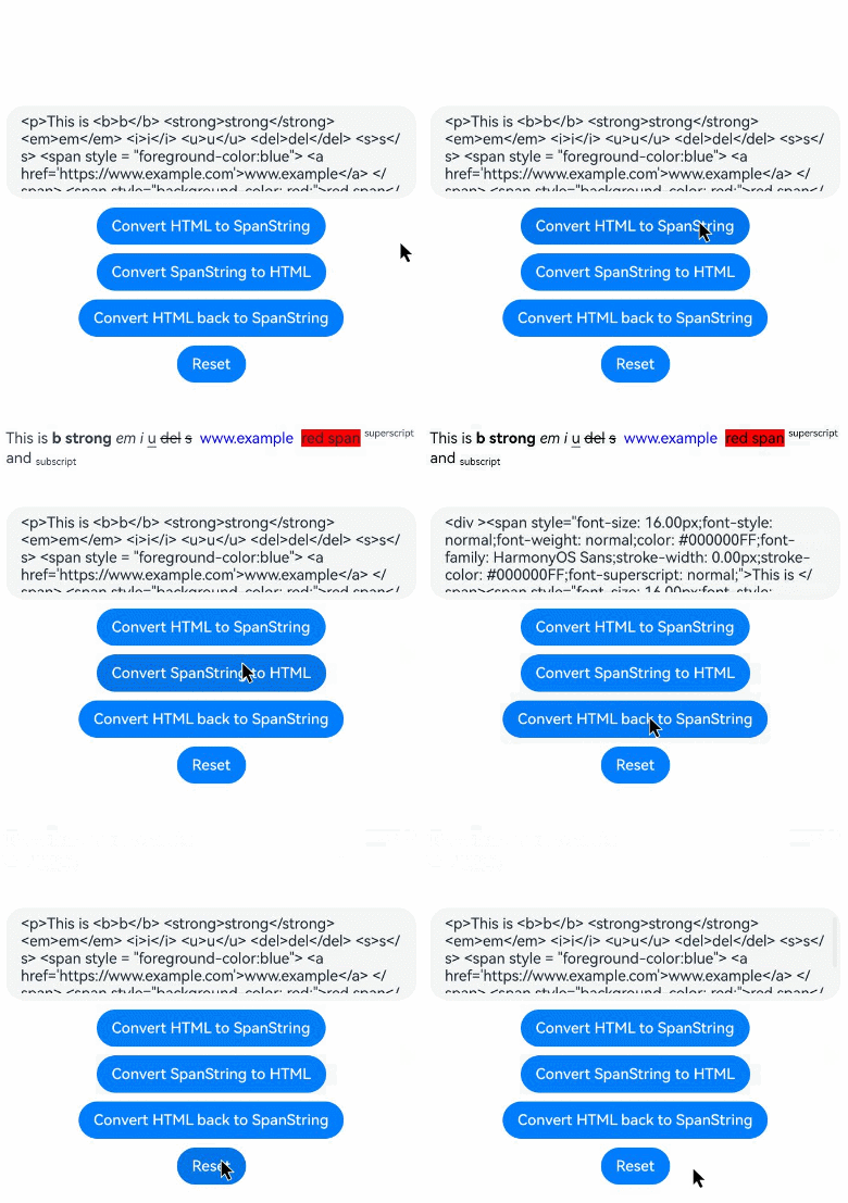
[h2]Example 13: Implementing Multiple Decoration Lines and Bold Decoration Lines
This example illustrates how to display multiple decoration lines and bold decoration lines by configuring enableMultiType and thicknessScale in the DecorationStyle API, available since API version 20.
// xxx.ets
import { LengthMetrics } from '@kit.ArkUI'
@Entry
@Component
struct StyledStringSetDecorationstyleDemo {
  controller : TextController = new TextController;
  thickness: number = 2.0;
  mutableStyledString1: MutableStyledString = new MutableStyledString('1234567890', [
    {
      start: 0,
      length: 10,
      styledKey: StyledStringKey.FONT,
      styledValue: new TextStyle({ fontColor: Color.Orange, fontSize: LengthMetrics.vp(30) })
    },
    {
      start: 0,
      length: 4,
      styledKey: StyledStringKey.DECORATION,
      styledValue: new DecorationStyle({type: TextDecorationType.LineThrough, thicknessScale: this.thickness}, {enableMultiType: true})
    },
    {
      start: 2,
      length: 5,
      styledKey: StyledStringKey.DECORATION,
      styledValue: new DecorationStyle({type: TextDecorationType.Underline, thicknessScale: this.thickness}, {enableMultiType: true})
    },
    {
      start: 0,
      length: 4,
      styledKey: StyledStringKey.DECORATION,
      styledValue: new DecorationStyle({type: TextDecorationType.Overline, thicknessScale: this.thickness}, {enableMultiType: true})
    },
    {
      start: 6,
      length: 2,
      styledKey: StyledStringKey.DECORATION,
      styledValue: new DecorationStyle({type: TextDecorationType.LineThrough})
    },
    {
      start: 7,
      length: 2,
      styledKey: StyledStringKey.DECORATION,
      styledValue: new DecorationStyle({type: TextDecorationType.LineThrough, color: Color.Green}, {enableMultiType: true})
    },
    {
      start: 8,
      length: 2,
      styledKey: StyledStringKey.DECORATION,
      styledValue: new DecorationStyle({type: TextDecorationType.Overline, color: Color.Green}, {enableMultiType: true})
    }
  ]);
  build() {
    Column({ space:3 }) {
      Text(undefined, { controller: this.controller })
        .height(100)
        .copyOption(CopyOptions.LocalDevice)
        .onAppear(()=>{
          this.controller.setStyledString(this.mutableStyledString1)
        })
    }.width('100%')
  }
} 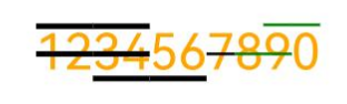
[h2]Example 14: Obtaining the Image Size in vp
This example illustrates how to configure styled strings with images and obtain the image size in vp using the ImageAttachmentInterface API, available since API version 21.
// xxx.ets
import { image } from '@kit.ImageKit';
import { LengthMetrics } from '@kit.ArkUI';

@Entry
@Component
struct StyledStringImageAttachmentInterfaceDemo {
  @State message: string = 'Image info: \n';
  imagePixelMap: image.PixelMap | undefined = undefined;
  @State mutableStr: MutableStyledString = new MutableStyledString('');
  controller: TextController = new TextController();

  async aboutToAppear() {
    this.imagePixelMap = await this.getPixmapFromMedia($r('app.media.startIcon'));
  }

  private async updateImageInfoStr() {
    this.message = 'Image info: \n';
    let imageArray = this.mutableStr.getStyles(0, this.mutableStr.length, StyledStringKey.IMAGE);
    for (let i = 0; i < imageArray.length; ++i) {
      this.message += (' Image ' + i + ':\n');
      if (imageArray[i].styledKey === StyledStringKey.IMAGE) {
        let attachment = imageArray[i].styledValue as ImageAttachment;
        if (attachment.size !== undefined) {
          let w: number = attachment.size.width as number;
          let h: number = attachment.size.height as number;
          this.message += ('    px size  width = ' + w.toFixed(2) + ' \theight = ' + h.toFixed(2) + '\n');
        }
        if (attachment.sizeInVp !== undefined) {
          let w: number = attachment.sizeInVp.width as number;
          let h: number = attachment.sizeInVp.height as number;
          this.message += ('    sizeInVp width = ' + w.toFixed(2) + ' \theight = ' + h.toFixed(2) + '\n\n');
        }
      }
    }
  }

  private async getPixmapFromMedia(resource: Resource) {
    let unit8Array =
      await this.getUIContext()?.getHostContext()?.resourceManager?.getMediaContent(resource.id);
    let imageSource = image.createImageSource(unit8Array?.buffer.slice(0, unit8Array.buffer.byteLength));
    let createPixelMap: image.PixelMap = await imageSource.createPixelMap({
      desiredPixelFormat: image.PixelMapFormat.RGBA_8888
    });
    await imageSource.release();
    return createPixelMap;
  }

  build() {
    Row() {
      Column({ space: 5 }) {
        Text(undefined, { controller: this.controller })
          .copyOption(CopyOptions.InApp)
          .draggable(true)
          .fontSize(30)
        Button('Set Image Size to 50 vp × 50 vp')
          .onClick(() => {
            if (this.imagePixelMap !== undefined) {
              this.mutableStr.appendStyledString(new MutableStyledString(new ImageAttachment({
                value: this.imagePixelMap,
                size: { width: 50, height: 50 },
                layoutStyle: { borderRadius: LengthMetrics.vp(10) },
                verticalAlign: ImageSpanAlignment.BASELINE,
                objectFit: ImageFit.Contain
              })));
              this.controller.setStyledString(this.mutableStr);
              this.updateImageInfoStr();
            }
          }).margin(10)
        Button('Set Image Size to 70 vp × 70 vp')
          .onClick(() => {
            if (this.imagePixelMap !== undefined) {
              this.mutableStr.appendStyledString(new MutableStyledString(new ImageAttachment({
                value: this.imagePixelMap,
                size: { width: 70, height: 70 },
                layoutStyle: { borderRadius: LengthMetrics.vp(10) },
                verticalAlign: ImageSpanAlignment.BASELINE,
                objectFit: ImageFit.Contain
              })));
              this.controller.setStyledString(this.mutableStr);
              this.updateImageInfoStr();
            }
          }).margin(10)
        Text(this.message).width('80%').padding(30)
      }
      .width('100%')
    }
    .height('100%')
  }
} 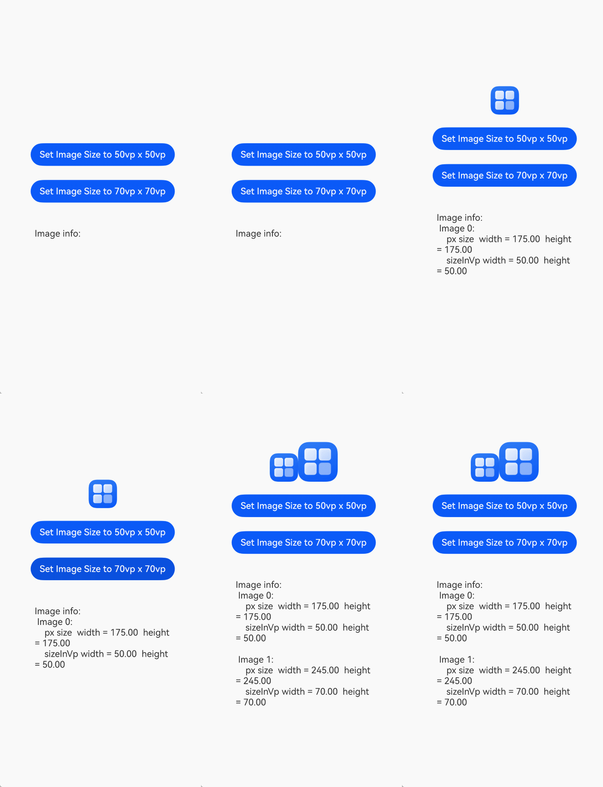
[h2]Example 15: Setting Custom Paragraph Indentation
This example illustrates how to set paragraph indentation and customize indentation patterns using the LeadingMarginSpan API, available since API version 22.
// xxx.ets
import { drawing } from '@kit.ArkGraphics2D';
import { LengthMetrics } from '@kit.ArkUI';

/**
 * Implement LeadingMarginSpan to define custom paragraph indentation.
 */
class MyLeadingMarginSpan extends LeadingMarginSpan {
  text: string = '';

  constructor(text: string) {
    super();
    this.text = text;
  }

  getText() {
    return this.text;
  }

  // Return the indentation distance.
  getLeadingMargin(): LengthMetrics {
    console.info('getLeadingMargin');
    return LengthMetrics.vp(10);
  }

  // Callback for drawing custom patterns in the indentation area. Triggered for each line in the paragraph.
  onDraw(context: DrawContext, options: LeadingMarginSpanDrawInfo) {
    console.info('x = ' + options.x + ', direction = ' + options.direction + ', top = ' + options.top
      + ', bottom = ' + options.bottom + ', baseline = ' + options.baseline
      + ', start = ' + options.start + ', end = ' + options.end + ', first = ' + options.first);
    let canvas = context.canvas;
    if (!options.first) {
      return;
    }

    // Draw a text symbol.
    const font = new drawing.Font();
    font.setSize(20);
    const textBlob = drawing.TextBlob.makeFromString(this.text, font, drawing.TextEncoding.TEXT_ENCODING_UTF8);
    canvas.drawTextBlob(textBlob, options.x - 30, options.top + (options.bottom - options.top) / 2);
  }
}

@Entry
@Component
struct leadingMarginSpanDemo {
  controller: RichEditorStyledStringController = new RichEditorStyledStringController();
  options: RichEditorStyledStringOptions = { controller: this.controller };
  textController: TextController = new TextController();
  leadingMarginSpan: LeadingMarginSpan = new MyLeadingMarginSpan('●');
  paragraphStyleAttr2: ParagraphStyle =
    new ParagraphStyle({ leadingMarginSpan: this.leadingMarginSpan });
  style: StyledString = new StyledString('Paragraph Title\nParagraph content 101234567890123456789012345678901234567890123456789',
    [
      {
        start: 0,
        length: 10,
        styledKey: StyledStringKey.PARAGRAPH_STYLE,
        styledValue: this.paragraphStyleAttr2
      }
    ]
  );

  build() {
    Column() {
      Text(undefined, { controller: this.textController })
        .width('90%')
        .height('20%')
        .margin({ top: 10 })
        .borderWidth(1)
        .copyOption(CopyOptions.InApp)
        .draggable(true)

      RichEditor(this.options)
        .width('90%')
        .height('20%')
        .margin({ top: 10 })
        .borderWidth(1)
      Column() {
        Button('setStyledString')
          .onClick(() => {
            this.textController.setStyledString(this.style);
            this.controller.setStyledString(this.style);
          }).margin({ top: 10 })
        // Query the paragraph style.
        Button('getStyles')
          .onClick(() => {
            let styles = this.style.getStyles(0, this.style.length);
            if (styles.length == 0) {
              return;
            }
            for (let i = 0; i < styles.length; i++) {
              console.info('getStyles style object start:' + styles[i].start);
              console.info('getStyles style object length:' + styles[i].length);
              console.info('getStyles style object key:' + styles[i].styledKey);
              if (styles[i].styledKey === 200) {
                let paraAttr = styles[i].styledValue as ParagraphStyle;
                console.info('getStyles leadingMarginSpan:' + paraAttr.leadingMarginSpan);
                let leadingMarginSpanClass = paraAttr.leadingMarginSpan as MyLeadingMarginSpan;
                if (leadingMarginSpanClass != null) {
                  console.info('getStyles leadingMarginSpan getText: ' + leadingMarginSpanClass.getText());
                }
              }
            }
          }).margin({ top: 10 })
      }
    }
    .width('100%')
  }
} 
[h2]Example 16: Displaying an SVG Image Using the supportSvg2 Property
Since API version 22, this example sets the supportSvg2 property for ResourceImageAttachmentOptions to enable the improved SVG usability capability of the Enhanced SVG Tag Parsing feature.
import { drawing } from '@kit.ArkGraphics2D';
import { LengthMetrics } from '@kit.ArkUI';

@Entry
@Component
struct StyledStringProcessDemo {
  controller: TextController = new TextController();
  controller1: TextController = new TextController();
  imageAttachment: ImageAttachment = new ImageAttachment({
    // Replace $r('app.media.ice') with the image resource file required by the developer.
    resourceValue: $r('app.media.ice'),
    size: { width: 50, height: 50 },
    layoutStyle: { borderRadius: LengthMetrics.vp(10) },
    verticalAlign: ImageSpanAlignment.BASELINE,
    objectFit: ImageFit.Contain,
    syncLoad: true,
    supportSvg2: true,
    colorFilter: drawing.ColorFilter.createBlendModeColorFilter(
      drawing.Tool.makeColorFromResourceColor(Color.Blue), drawing.BlendMode.SRC_IN)
  })
  imageAttachment1: ImageAttachment = new ImageAttachment({
    // Replace $r('app.media.ice') with the image resource file required by the developer.
    resourceValue: $r('app.media.ice'),
    size: { width: 50, height: 50 },
    layoutStyle: { borderRadius: LengthMetrics.vp(10) },
    verticalAlign: ImageSpanAlignment.BASELINE,
    objectFit: ImageFit.Contain,
    syncLoad: true,
    supportSvg2: false,
    colorFilter: drawing.ColorFilter.createBlendModeColorFilter(
      drawing.Tool.makeColorFromResourceColor(Color.Blue), drawing.BlendMode.SRC_IN)
  })
  scroller: Scroller = new Scroller();
  mutableStr: MutableStyledString = new MutableStyledString('');
  mutableStr1: MutableStyledString = new MutableStyledString('');

  aboutToAppear() {
    this.mutableStr = new MutableStyledString(this.imageAttachment);
    this.controller.setStyledString(this.mutableStr);
    this.mutableStr1 = new MutableStyledString(this.imageAttachment1);
    this.controller1.setStyledString(this.mutableStr1);
  }

  build() {
    Column() {
      Scroll(this.scroller) {
        Column() {
          Text('Styled string with supportSvg2: false')
          Text(undefined, { controller: this.controller1 })
            .draggable(true)
            .fontSize(30)
          Text('Styled string with supportSvg2: true')
          Text(undefined, { controller: this.controller })
            .draggable(true)
            .fontSize(30)
        }.width('100%')
      }
    }
    .width('100%')
  }
} 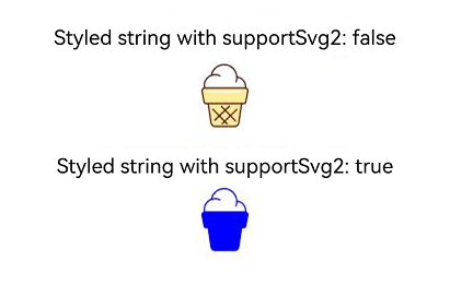
[h2]Example 17: Setting the Font Configuration
This example implements the font configuration of a styled string through fontConfigs in TextStyleInterface.
Since API version 24, the fontConfigs property is added to TextStyleInterface.
// xxx.ets
import { LengthMetrics } from '@kit.ArkUI';

@Entry
@Component
struct StyledStringFontConfigsDemo {
  controller1: TextController = new TextController();
  controller2: TextController = new TextController();
  scroller: Scroller = new Scroller();

  aboutToAppear() {
    // Example 1: Enable mutable font weights.
    let textStyle1: TextStyle = new TextStyle({
      fontColor: Color.Gray,
      fontSize: LengthMetrics.vp(18)
    });
    let styledString1: MutableStyledString = new MutableStyledString('StyledString with FontConfigs: ', [{
      start: 0,
      length: 30,
      styledKey: StyledStringKey.FONT,
      styledValue: textStyle1
    }]);
    // Set the font configuration for the text 'font weight 850'.
    let textStyle2: TextStyle = new TextStyle({
      fontColor: Color.Blue,
      fontSize: LengthMetrics.vp(24),
      fontWeight: 850,
      fontConfigs: {
        fontWeightConfigs: {
          enableVariableFontWeight: true
        }
      }
    });
    let styledString2: StyledString = new StyledString('Font weight: 850', [{
      start: 0,
      length: 7,
      styledKey: StyledStringKey.FONT,
      styledValue: textStyle2
    }]);
    styledString1.appendStyledString(styledString2);
    this.controller1.setStyledString(styledString1);

    // Example 2: Disable the text font weight from automatically updating with the device font weight level.
    let textStyle3: TextStyle = new TextStyle({
      fontColor: Color.Gray,
      fontSize: LengthMetrics.vp(18)
    });
    let styledString3: MutableStyledString = new MutableStyledString('StyledString with disabled FontConfigs: ', [{
      start: 0,
      length: 12,
      styledKey: StyledStringKey.FONT,
      styledValue: textStyle3
    }]);
    let textStyle4: TextStyle = new TextStyle({
      fontColor: Color.Blue,
      fontSize: LengthMetrics.vp(24),
      fontWeight: 600,
      fontConfigs: {
        fontWeightConfigs: {
          enableDeviceFontWeightCategory: false
        }
      }
    });
    let styledString4: StyledString = new StyledString('Font weight: 600', [{
      start: 0,
      length: 7,
      styledKey: StyledStringKey.FONT,
      styledValue: textStyle4
    }]);
    styledString3.appendStyledString(styledString4);
    this.controller2.setStyledString(styledString3);
  }

  build() {
    Scroll(this.scroller) {
      Column() {
        Text('Example 1: Enable mutable font weight adjustment and set the font weight to a non-hundred value.')
          .fontSize(16)
          .margin({ bottom: 5 })

        Text(undefined, { controller: this.controller1 })
          .fontSize(20)
          .margin({ bottom: 20 })

        Text('Example 2: Disable the text font weight from automatically updating with the device font weight level.')
          .fontSize(16)
          .margin({ bottom: 5 })

        Text(undefined, { controller: this.controller2 })
          .fontSize(20)
      }
      .width('100%')
      .padding(20)
    }
    .width('100%')
  }
} 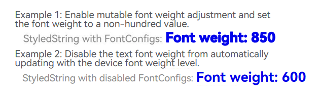
[h2]Example 18: Conversion Using fromHtml
This example converts the <cite>, <dfn>, <small>, <h1>, <h2>, <h3>, <h4>, <h5>, <h6>, <ol>, <ul>, and <li> tags in HTML into a styled string through the fromHtml API.
Since API version 26.0.0, fromHtml additionally supports the <cite>, <dfn>, <small>, <h1>, <h2>, <h3>, <h4>, <h5>, <h6>, <ol>, <ul>, and <li> tags.
@Entry
@Component
struct html_convert_demo {
  @State html: string = '<p><cite>cite</cite><dfn>dfn</dfn></p><p>normal<small>small<small>smaller</small></small></p><h1>Heading 1</h1><h2>Heading 2</h2><h3>Heading 3</h3><h4>Heading 4</h4><h5>Heading 5</h5><h6>Heading 6</h6><ol><li>Item 1</li><li>Item 2</li></ol><ul><li>Item A</li><li>Item B</li></ul>';
  @State spanString: StyledString | undefined = undefined;
  controller: TextController = new TextController;

  build() {
    Column() {
      // Display the converted spanString.
      Text(undefined, { controller: this.controller })
      // Display the result of each step in TextArea.
      TextArea({ text: this.html })
        .width('100%')
        .height(100)
        .margin(5)

      Button('Convert HTML to SpanString').onClick(async () => {
        this.spanString = await StyledString.fromHtml(this.html);
        this.controller.setStyledString(this.spanString);
      }).margin(5)
    }.width('100%').padding(20)
  }
}
[h2]Example 19: Setting the Properties of a Variable Font
This example sets the properties of a variable font through the fontVariations property of TextStyle.
Since API version 26.0.0, the fontVariations property is added to TextStyle.
// xxx.ets
@Entry
@Component
struct StyledStringExample {
  controller: TextController = new TextController();
  @State weightValue: number = 400;

  aboutToAppear() {
    let textStyle = new TextStyle({
      // wght represents the font weight attribute of a variable font.
      fontVariations: [{ axis: 'wght', value: this.weightValue }]
    });
    let styledString = new StyledString('Hello World !', [{
      styledKey: StyledStringKey.FONT,
      styledValue: textStyle
    }]);
    this.controller.setStyledString(styledString);
  }

  build() {
    Column() {
      Text(undefined, { controller: this.controller })
      Button('Font weight: ' + this.weightValue)
        .margin(10)
        .onClick(() => {
          this.weightValue += 100;
          let textStyle = new TextStyle({
            // wght represents the font weight attribute of a variable font.
            fontVariations: [{ axis: 'wght', value: this.weightValue }]
          });
          let styledString = new StyledString('Hello World !', [{
            styledKey: StyledStringKey.FONT,
            styledValue: textStyle
          }]);
          this.controller.setStyledString(styledString);
        })
    }
    .width('100%')
  }
}
[h2]Example 20: Setting the Text Shader Effect
This example implements the text shader effect through the shaderStyle API in ParagraphStyle.
Since API version 26.0.0, the shaderStyle API is added to ParagraphStyle.
@Entry
@Component
struct ShaderColorStyle {
  @State message: string = 'Hello World';
  @State linearGradientOptions1: LinearGradientOptions =
    {
      angle: 45,
      colors: [[Color.Red, 0.0], [Color.Blue, 0.3], [Color.Green, 0.5]]
    };
  @State linearGradientOptions2: LinearGradientOptions =
    {
      direction: GradientDirection.LeftTop,
      colors: [[Color.Red, 0.0], [Color.Blue, 0.3], [Color.Green, 0.5]],
      repeating: true,
    };
  @State radialGradientOptions: RadialGradientOptions =
    {
      center: [50, 50],
      radius: 20,
      colors: [[Color.Red, 0.0], [Color.Blue, 0.3], [Color.Green, 0.5]],
      repeating: true,
    };
  @State colorShaderStyle: ColorShaderStyle =
    {
      color: Color.Blue
    };
  paragraphStyle1: ParagraphStyle =
    new ParagraphStyle({ shaderStyle: this.linearGradientOptions1 });
  style1: StyledString =
    new StyledString(this.message,
      [
        {
          start: 0,
          length: this.message.length,
          styledKey: StyledStringKey.PARAGRAPH_STYLE,
          styledValue: this.paragraphStyle1
        }
      ]
    );
  paragraphStyle2: ParagraphStyle =
    new ParagraphStyle({ shaderStyle: this.linearGradientOptions2 });
  style2: StyledString =
    new StyledString(this.message,
      [
        {
          start: 0,
          length: this.message.length,
          styledKey: StyledStringKey.PARAGRAPH_STYLE,
          styledValue: this.paragraphStyle2
        }
      ]
    );
  paragraphStyle3: ParagraphStyle =
    new ParagraphStyle({ shaderStyle: this.radialGradientOptions });
  style3: StyledString =
    new StyledString(this.message,
      [
        {
          start: 0,
          length: this.message.length,
          styledKey: StyledStringKey.PARAGRAPH_STYLE,
          styledValue: this.paragraphStyle3
        }
      ]
    );
  paragraphStyle4: ParagraphStyle =
    new ParagraphStyle({ shaderStyle: this.colorShaderStyle });
  style4: StyledString =
    new StyledString(this.message,
      [
        {
          start: 0,
          length: this.message.length,
          styledKey: StyledStringKey.PARAGRAPH_STYLE,
          styledValue: this.paragraphStyle4
        }
      ]
    );
  controller1: TextController = new TextController();
  controller2: TextController = new TextController();
  controller3: TextController = new TextController();
  controller4: TextController = new TextController();

  aboutToAppear() {
    this.controller1.setStyledString(this.style1);
    this.controller2.setStyledString(this.style2);
    this.controller3.setStyledString(this.style3);
    this.controller4.setStyledString(this.style4);
  }

  build() {
    Column({ space: 5 }) {
      Text('Linear gradient with angle of 45°').fontSize(18).width('90%')
        .margin({ top: 40, left: 40 })
      Text(undefined, { controller: this.controller1 })
        .fontSize(20)
        .width('80%')
        .margin({ top: 10 })
      Text('Linear gradient with direction of LeftTop').fontSize(18).width('90%')
        .margin({ top: 40, left: 40 })
      Text(undefined, { controller: this.controller2 })
        .fontSize(20)
        .width('80%')
        .margin({ top: 10 })
      Text('Radial gradient').fontSize(18).width('90%')
        .margin({ top: 40, left: 40 })
      Text(undefined, { controller: this.controller3 })
        .fontSize(20)
        .width('80%')
        .margin({ top: 10 })
      Text('Solid color').fontSize(18).width('90%')
        .margin({ top: 40, left: 40 })
      Text(undefined, { controller: this.controller4 })
        .fontSize(20)
        .width('80%')
        .margin({ top: 10 })
    }
  }
}
[h2]Example 21: Setting the Text Tail Indentation
This example sets the text tail indentation for a styled string through the tailIndents property in ParagraphStyle.
Since API version 26.0.0, the tailIndents property is added to the ParagraphStyle API.
import { LengthMetrics } from '@kit.ArkUI';

@Entry
@Component
struct TailIndentsExample {
  styledString1:StyledString =
    new StyledString('tailIndents not set\ntailIndents not set\ntailIndents not set\ntailIndents not set\ntailIndents not set', [
      {
        start: 0,
        length: 120,
        styledKey: StyledStringKey.FONT,
        styledValue: new TextStyle({ fontSize: LengthMetrics.vp(20) }),
      },
    ])

  styledString2:StyledString =
    new StyledString('Set a single tailIndents value\nSet a single tailIndents value\nSet a single tailIndents value\nSet a single tailIndents value\nSet a single tailIndents value', [
      {
        start: 0,
        length: 120,
        styledKey: StyledStringKey.PARAGRAPH_STYLE,
        styledValue: new ParagraphStyle({
          tailIndents: LengthMetrics.vp(100),
        }),
      },
      {
        start: 0,
        length: 120,
        styledKey: StyledStringKey.FONT,
        styledValue: new TextStyle({ fontSize: LengthMetrics.vp(20) }),
      },
    ])

  styledString3:StyledString =
    new StyledString('Set tailIndents array_Set tailIndents array_Set tailIndents array_Set tailIndents array_Set tailIndents array_Set tailIndents array', [
      {
        start: 0,
        length: 120,
        styledKey: StyledStringKey.PARAGRAPH_STYLE,
        styledValue: new ParagraphStyle({
          tailIndents: [LengthMetrics.vp(100), LengthMetrics.vp(50), LengthMetrics.vp(20)],
        }),
      },
      {
        start: 0,
        length: 120,
        styledKey: StyledStringKey.FONT,
        styledValue: new TextStyle({ fontSize: LengthMetrics.vp(20) }),
      },
    ])

  txtController1 = new TextController();
  txtController2 = new TextController();
  txtController3 = new TextController();

  build() {
    Column() {
      Text(undefined, { controller: this.txtController1 })
        .onAppear(() => {
          this.txtController1.setStyledString(this.styledString1);
        })
        .textAlign(TextAlign.End)
        .borderWidth(1)
        .borderColor(Color.Blue)
        .width('100%')

      Text(undefined, { controller: this.txtController2 })
        .onAppear(() => {
          this.txtController2.setStyledString(this.styledString2);
        })
        .textAlign(TextAlign.End)
        .borderWidth(1)
        .borderColor(Color.Blue)
        .width('100%')

      Text(undefined, { controller: this.txtController3 })
        .onAppear(() => {
          this.txtController3.setStyledString(this.styledString3);
        })
        .textAlign(TextAlign.End)
        .borderWidth(1)
        .borderColor(Color.Blue)
        .width('100%')
    }
    .height('100%')
    .width('100%')
  }
}