A hover event is triggered when the cursor slides over a component or when a stylus hovers and moves over the screen.

- The initial APIs of this module are supported since API version 8. Updates will be marked with a superscript to indicate their earliest API version.
- Currently, only an external mouse device, stylus, or touchpad can be used to trigger a hover event.
onHover
onHover(event: (isHover: boolean, event: HoverEvent) => void): T
Triggered when the mouse pointer or stylus enters or leaves the component.
Atomic service API: This API can be used in atomic services since API version 11.
System capability: SystemCapability.ArkUI.ArkUI.Full
Parameters
| Name | Type | Mandatory | Description |
|---|---|---|---|
| event | (isHover: boolean, event: HoverEvent) => void | Yes | Callback for mouse or stylus hover status. event: event bubbling control and coordinates of the hover position; available since API version 11. isHover: whether the mouse pointer or stylus is hovering over the component. true: The mouse pointer or stylus has entered the component. false: The mouse pointer or stylus has left the component. |
Return value
| Type | Description |
|---|---|
| T | Current component. |
onHoverMove15+
onHoverMove(event: Callback<HoverEvent>): T
Triggered when a stylus hovers over the component.
Atomic service API: This API can be used in atomic services since API version 15.
System capability: SystemCapability.ArkUI.ArkUI.Full
Parameters
| Name | Type | Mandatory | Description |
|---|---|---|---|
| event | Callback<HoverEvent> | Yes | Callback that controls event bubbling blocking and obtains the stylus hover position coordinates. |
Return value
| Type | Description |
|---|---|
| T | Current component. |
HoverEvent10+
Inherits from BaseEvent.
System capability: SystemCapability.ArkUI.ArkUI.Full
| Name | Type | Read Only | Optional | Description |
|---|---|---|---|---|
| x15+ | number | No | Yes | X coordinate of the cursor or stylus position in the component coordinate system based on the current component. Unit: vp. Atomic service API: This API can be used in atomic services since API version 15. |
| y15+ | number | No | Yes | Y coordinate of the cursor or stylus position in the component coordinate system based on the current component. Unit: vp. Atomic service API: This API can be used in atomic services since API version 15. |
| windowX15+ | number | No | Yes | X coordinate of the cursor or stylus position in the coordinate system of the current application window. Unit: vp. Atomic service API: This API can be used in atomic services since API version 15. |
| windowY15+ | number | No | Yes | Y coordinate of the cursor or stylus position in the coordinate system of the current application window. Unit: vp. Atomic service API: This API can be used in atomic services since API version 15. |
| displayX15+ | number | No | Yes | X coordinate of the cursor or stylus position in the coordinate system of the current screen window. Unit: vp. Atomic service API: This API can be used in atomic services since API version 15. |
| displayY15+ | number | No | Yes | Y coordinate of the cursor or stylus position in the coordinate system of the current screen window. Unit: vp. Atomic service API: This API can be used in atomic services since API version 15. |
| stopPropagation | () => void | No | No | Disables event bubbling propagation. Atomic service API: This API can be used in atomic services since API version 11. |
| globalDisplayX20+ | number | No | Yes | X coordinate of the cursor or stylus position in the global coordinate system. Unit: vp. Value range: [0, +∞). Atomic service API: This API can be used in atomic services since API version 20. |
| globalDisplayY20+ | number | No | Yes | Y coordinate of the cursor or stylus position in the global coordinate system. Unit: vp. Value range: [0, +∞). Atomic service API: This API can be used in atomic services since API version 20. |
[h2]Example 1: Using onHover
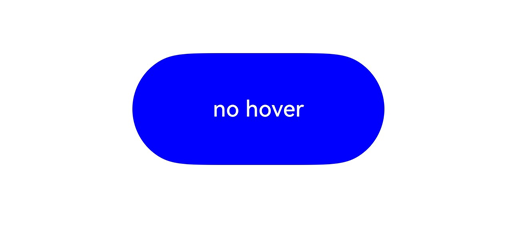
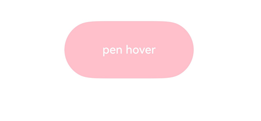
This example demonstrates how to set the onHover event on a button. When the mouse or stylus hovers over the button, the event is triggered to dynamically change the text content and background color of the button.
// xxx.ets
@Entry
@Component
struct HoverEventExample {
  @State hoverText: string = 'no hover';
  @State color: Color = Color.Blue;

  build() {
    Column({ space: 20 }) {
      Button(this.hoverText, { type: ButtonType.Capsule })
        .width(180).height(80)
        .backgroundColor(this.color)
        .onHover((isHover: boolean, event: HoverEvent) => {
          // Use the onHover event to dynamically change the text content and background color of a button when the mouse pointer or stylus is hovered on it.
          // Use event.sourceTool to determine whether the device is a mouse device or stylus.
          if (isHover) {
            if (event.sourceTool == SourceTool.Pen) {
              this.hoverText = 'pen hover';
              this.color = Color.Pink;
            } else if (event.sourceTool == SourceTool.MOUSE) {
              this.hoverText = 'mouse hover';
              this.color = Color.Red;
            }
          } else {
            this.hoverText = 'no hover';
            this.color = Color.Blue;
          }
        })
    }.padding({ top: 30 }).width('100%')
  }
}
Diagrams:
The figure below shows how the button looks in the non-hovered state.
The figure below shows how the button looks when a stylus hovers on it.
[h2]Example 2: Using onHoverMove
This example demonstrates how to configure the onHoverMove event on a button, available since API version 15. When a stylus hovers over the button, the UI displays the current stylus position.
// xxx.ets
@Entry
@Component
struct OnHoverMoveEventExample {
  @State hoverMoveText: string = '';

  build() {
    Column({ space: 20 }) {
      Button('onHoverMove', { type: ButtonType.Capsule })
        .width(180).height(80)
        .onHoverMove((event: HoverEvent) => {
          this.hoverMoveText = 'onHoverMove:\nXY = (' + event.x + ', ' + event.y + ')' +
                               '\nwindowXY = (' + event.windowX + ', ' + event.windowY + ')' +
                               '\ndisplayXY = (' + event.displayX + ', ' + event.displayY + ')';
        })

      Text(this.hoverMoveText)
    }.padding({ top: 30 }).width('100%')
  }
}
Diagrams:
When a stylus hovers over a button, the UI continuously updates to show the position of the stylus tip.