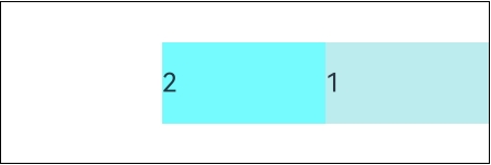
The Row component lays out child components horizontally.

This component is supported since API version 7. Updates will be marked with a superscript to indicate their earliest API version.
If no width or height is set for the Row component, the component automatically adapts to the size of its child components in the main axis and cross axis respectively.
[h2]Row
Row(options?: RowOptions)
Creates a horizontal linear layout container. You can set the spacing between child components.

Excessive component nesting (either too deep a hierarchy or too many nested components) incurs significant performance overhead. For performance purposes, you are advised to remove redundant nodes to simplify the component tree, use layout boundaries to reduce redundant layout calculations, properly apply rendering control syntax and layout component methods to minimize unnecessary re-renders and computations. For details about the best practices, see Layout Optimization.
Widget capability: This API can be used in ArkTS widgets since API version 9.
Atomic service API: This API can be used in atomic services since API version 11.
System capability: SystemCapability.ArkUI.ArkUI.Full
Parameters
| Name | Type | Mandatory | Description |
|---|---|---|---|
| options18+ | RowOptions | No | Spacing between elements in the horizontal layout. The value can be of the number or string type. |
[h2]Row18+
Row(options?: RowOptions | RowOptionsV2)
Creates a horizontal linear layout container. You can set the spacing between child components.
Widget capability: This API can be used in ArkTS widgets since API version 18.
Atomic service API: This API can be used in atomic services since API version 18.
System capability: SystemCapability.ArkUI.ArkUI.Full
Parameters
| Name | Type | Mandatory | Description |
|---|---|---|---|
| options | RowOptions | RowOptionsV2 | No | Spacing between elements in a horizontal layout. The value can be of the number, string, or Resource type. |
RowOptions18+
Sets the spacing between child components of the Row component.

To standardize anonymous object definitions, the element definitions here have been revised in API version 18. While starting version information is preserved for historical anonymous objects, there may be cases where the outer element's @since version number is higher than inner element's. This does not affect interface usability.
Widget capability: This API can be used in ArkTS widgets since API version 18.
Atomic service API: This API can be used in atomic services since API version 18.
System capability: SystemCapability.ArkUI.ArkUI.Full
| Name | Type | Read-Only | Optional | Description |
|---|---|---|---|---|
| space7+ | string | number | No | Yes | Spacing between child components. Since API version 9, this parameter does not take effect when it is set to a negative number or when justifyContent is set to FlexAlign.SpaceBetween, FlexAlign.SpaceAround or FlexAlign.SpaceEvenly. Default value: 0 Unit: vp. If an invalid value is set, the default value is used instead. NOTE The value of space can be a number greater than or equal to 0 or a string that can be converted to a number. Widget capability: This API can be used in ArkTS widgets since API version 9. Atomic service API: This API can be used in atomic services since API version 11. |
RowOptionsV218+
Sets the spacing between child components of the Row component. The spacing type SpaceType can be of the number, string, or Resource type.
Widget capability: This API can be used in ArkTS widgets since API version 18.
Atomic service API: This API can be used in atomic services since API version 18.
System capability: SystemCapability.ArkUI.ArkUI.Full
| Name | Type | Read-Only | Optional | Description |
|---|---|---|---|---|
| space | SpaceType | No | Yes | Spacing between child components. This parameter does not take effect if the value specified is a negative number, or if justifyContent is set to FlexAlign.SpaceBetween, FlexAlign.SpaceAround, or FlexAlign.SpaceEvenly. Default value: 0 Unit: vp. Invalid values are treated as the default value. NOTE The value of space can be a number greater than or equal to 0, a string that can be converted to a number, or a Resource type that can be converted to a number. |
[h2]alignItems
alignItems(value: VerticalAlign)
Sets the alignment mode of child components in the vertical direction.
Widget capability: This API can be used in ArkTS widgets since API version 9.
Atomic service API: This API can be used in atomic services since API version 11.
System capability: SystemCapability.ArkUI.ArkUI.Full
Parameters
| Name | Type | Mandatory | Description |
|---|---|---|---|
| value | VerticalAlign | Yes | Alignment mode of child components in the vertical direction. Default value: VerticalAlign.Center |
[h2]justifyContent8+
justifyContent(value: FlexAlign)
Sets the alignment mode of the child components in the horizontal direction.
Widget capability: This API can be used in ArkTS widgets since API version 9.
Atomic service API: This API can be used in atomic services since API version 11.
System capability: SystemCapability.ArkUI.ArkUI.Full
Parameters
| Name | Type | Mandatory | Description |
|---|---|---|---|
| value | FlexAlign | Yes | Alignment mode of child components in the horizontal direction. Default value: FlexAlign.Start |

During the row layout, if flexShrink is not set for a child component, the child component is not compressed by default. As a result, the total main-axis size of all child components may exceed the container's main-axis size, causing FlexAlign.Center and FlexAlign.End to become ineffective.
[h2]reverse12+
reverse(isReversed: Optional<boolean>)
Sets whether to reverse the horizontal arrangement of child components.
Widget capability: This API can be used in ArkTS widgets since API version 12.
Atomic service API: This API can be used in atomic services since API version 12.
System capability: SystemCapability.ArkUI.ArkUI.Full
Parameters
| Name | Type | Mandatory | Description |
|---|---|---|---|
| isReversed | Optional<boolean> | Yes | Whether to reverse the horizontal arrangement of child components. Default value: true. true: Child components are arranged in reverse order horizontally. false: Child components are arranged in normal order horizontally. |

If the reverse attribute is not set, the arrangement on the main axis remains in normal order. If the attribute is set to undefined, it defaults to true, which reverses the arrangement on the main axis.
Keep in mind that the main axis arrangement direction is also affected by the direction attribute. If reverse is set to true, it effectively reverses the arrangement that results from the direction attribute settings.
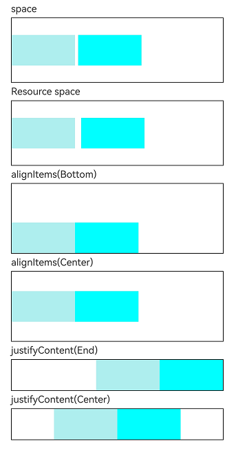
[h2]Example 1: Setting the Layout Attributes of the Row Component
This example demonstrates the effect of setting the layout attributes (such as the spacing and alignment mode) of the Row component.
// resources/base/element/string.json
{
  "string": [
    {
      "name": "stringSpace",
      "value": "5"
    }
  ]
}
// xxx.ets
@Entry
@Component
struct RowExample {
build() {
Column({ space: 5 }) {
// Set the horizontal spacing between two adjacent child components to 5.
Text('space').width('90%')
Row({ space: 5 }) {
Row().width('30%').height(50).backgroundColor(0xAFEEEE)
Row().width('30%').height(50).backgroundColor(0x00FFFF)
}.width('90%').height(107).border({ width: 1 })
// Set the spacing between child components using the Resource type.
Text('Resource space').width('90%')
Row({ space: $r('app.string.stringSpace') }) {
Row().width('30%').height(50).backgroundColor(0xAFEEEE)
Row().width('30%').height(50).backgroundColor(0x00FFFF)
}.width('90%').height(107).border({ width: 1 })
// Set the alignment mode of the child components in the vertical direction.
Text('alignItems(Bottom)').width('90%')
Row() {
Row().width('30%').height(50).backgroundColor(0xAFEEEE)
Row().width('30%').height(50).backgroundColor(0x00FFFF)
}.width('90%').alignItems(VerticalAlign.Bottom).height('15%').border({ width: 1 })
Text('alignItems(Center)').width('90%')
Row() {
Row().width('30%').height(50).backgroundColor(0xAFEEEE)
Row().width('30%').height(50).backgroundColor(0x00FFFF)
}.width('90%').alignItems(VerticalAlign.Center).height('15%').border({ width: 1 })
// Set the alignment mode of the child components in the horizontal direction.
Text('justifyContent(End)').width('90%')
Row() {
Row().width('30%').height(50).backgroundColor(0xAFEEEE)
Row().width('30%').height(50).backgroundColor(0x00FFFF)
}.width('90%').border({ width: 1 }).justifyContent(FlexAlign.End)
Text('justifyContent(Center)').width('90%')
Row() {
Row().width('30%').height(50).backgroundColor(0xAFEEEE)
Row().width('30%').height(50).backgroundColor(0x00FFFF)
}.width('90%').border({ width: 1 }).justifyContent(FlexAlign.Center)
}.width('100%')
}
} 
[h2]Example 2: Configuring the Reverse Attribute
This example demonstrates the effect of setting the reverse attribute of the Row component.
@Entry
@Component
struct RowReverseSample {
  build() {
    Row() {
      Text("1")
        .width(100)
        .height(50)
        .backgroundColor(0xAFEEEE)

      Text("2")
        .width(100)
        .height(50)
        .backgroundColor(0x00FFFF)
    }
    .height(100)
    .width(300)
    .border({ width: 1 })
    .reverse(true)
  }
}