This topic uses map navigation apps as a typical example to detail how the feature of one-time development for multi-device deployment is applied in actual development.
The core of a map navigation app is to implement smooth switching and stable collaboration among four modules: map canvas, place search, route planning, and navigation status. It is important to ensure that users have a consistent search and navigation experience when opening the app on different devices. This includes preventing the search panel from blocking the map logo, location button, or route information. Additionally, the large window capabilities of foldable devices, tablets, and PCs should be fully utilized to provide a better visual and interactive experience.
Currently, this app is compatible with the following devices: bar-type phones, bi-fold devices (Mate X series), tri-fold devices, widescreen foldable devices, tablets, and PCs.

Before developing a map navigation app, you need to make the following preparations:
- Apply for the required location permissions. For details, see Applying for Location Permissions (ArkTS).
- Enable Map Kit. For details, see Preparations in the Map Kit guide.
- To enable the live view feature, see Preparations in Live View Kit.
Before reading this topic, you are advised to learn the ArkUI framework and the capabilities of one-time development for multi-device deployment.
The following practices will focus on these product forms and provide examples from the perspectives of UX design, project management, and page development, helping you develop map navigation apps that can be deployed on multiple devices.
- UX Design: describes the interaction logic and design points of map navigation apps on different devices. It can be directly referenced and reused for developing map navigation apps of the same type.
- Project Management: uses a layered architecture of one-time development for multi-device deployment and uses a clear directory structure to organize the map container, place exploration, live view, and product entry.
- Mobile Pages and PC Pages: describe the design principles and specific implementation methods of window adaptation, page development, interactive development, and function development on mobile and PC pages by following the actual app development process, with pages as the basic unit.
UX Design
Travel navigation scenarios usually include core functions such as location information query, route suggestion, navigation, and ride hailing. Users can experience the interaction between the panel and the bottom-layer map through the floating panel. Based on this core scenario, this type of applications features the following:
- The semi-modal panel at the bottom is used on the phone, and the semi-modal side panel is used on other devices.
- Multi-Level Height Adjustment
- The default height of the panel needs to be differentiated based on the screen size to give full play to the screen size advantage.
- Users can drag the semi-modal side panel of a foldable screen or tablet to the left or right.
- It is recommended that tabs be placed in semi-modal panels on wide-screen devices such as foldable screens and tablets.
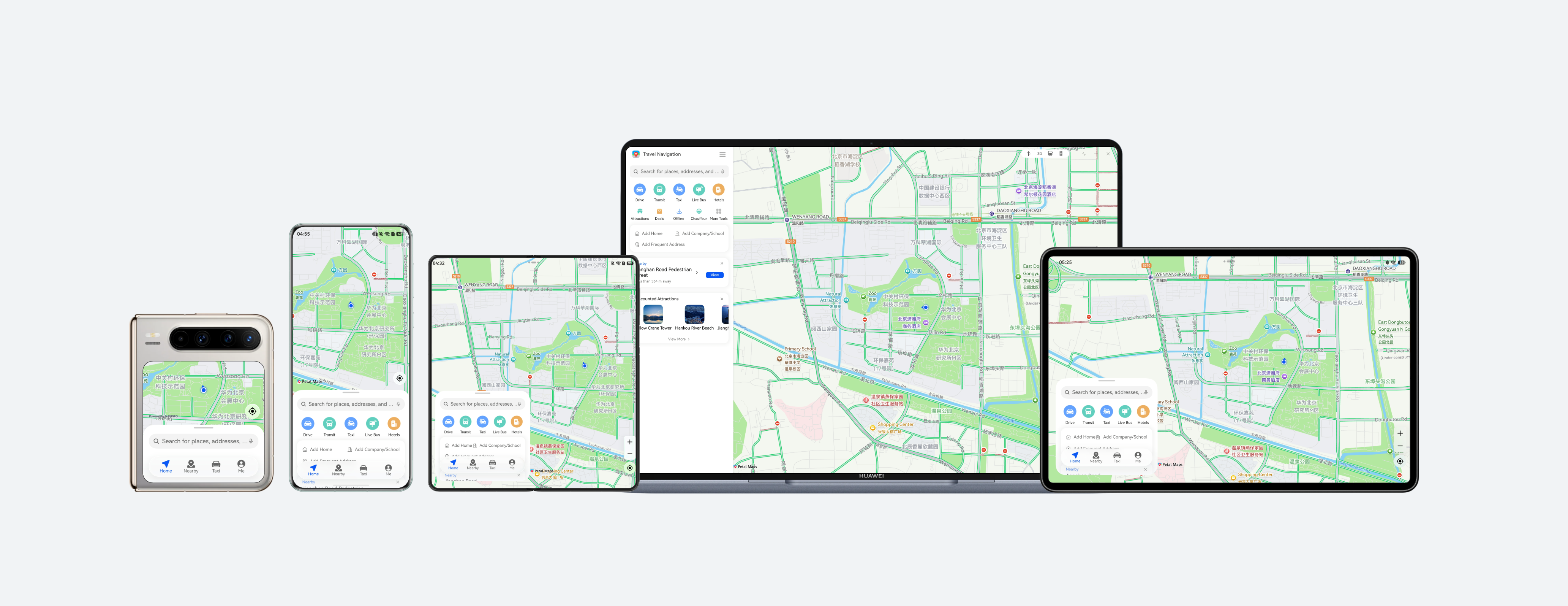
For details about the UX design of map navigation apps, see the multi-device responsive design guide for travel and navigation. See the following figure for reference.
Project Management
To ensure the reusability and maintainability of the project to implement one-time development for multi-device deployment, it is recommended that developers use a layered architecture to organize code projects. The architecture consists of three layers: common (common capability layer), features (basic feature layer), and products (product customization layer). Each layer has clear responsibilities, providing developers with a clear, efficient, and scalable design architecture. For details about the layered architecture design, see Layered Architecture Design.
[h2]Project Creation
You are advised to create a template project after learning how to create and configure a layered architecture project by referring to Cross-Device Project Deployment and Release. Then, modify the project based on the development requirements of the map navigation app to ensure that the project architecture meets the actual service requirements.
[h2]Project Structure
When creating a project, you may encounter the problem of how to divide the project structure directory. Considering the reusability and maintainability of the project, this topic uses the map navigation app as an example to provide a recommended solution for reference.
The HarmonyOS project architecture uses a tiered architecture encompassing three layers: product customization layer, basic feature layer, and common capability layer. It provides a clear, efficient, and scalable design architecture. For details, see the logical design in Layered Architecture Design.
The map navigation app organizes its directories based on the three-layer project architecture of common (common capability layer), features (basic feature layer), and products (product customization layer). The design of each layer is as follows:
- common layer: stores content that needs to be referenced by different pages, such as window management, breakpoint tools, location statuses, map statuses, and common constants, to enable code reuse and reduce redundancy.
- features layer: provides three independent service modules with different responsibilities, which are the map container (mapcontainer), place exploration (poiexplore), and live view (maplive) modules, respectively.
- products layer: The multi-device map navigation app needs to be compatible with the following devices: bar-type phones, bi-fold devices (Mate X series), tri-fold devices, widescreen foldable devices, tablets, and PCs. The UI layout of PCs is different from that of other devices. Therefore, a hap package named pc needs to be created separately as the app entry for PCs. The UI layouts of bar-type phones, bi-fold devices (Mate X series), tri-fold devices, widescreen foldable devices, and tablets are similar. Some differences can be adapted through the adaptive layout and responsive layout of one-time development for multi-device deployment. Therefore, a hap package named default is created as the app entry for these devices.
The project structure is as follows:
├──commons                                // Common capability layer
│  └──multitravelbase                     // Common basic module
│     └──src
│        └──main
│           ├──ets
│           │  ├──constants               // Common constants
│           │  ├──model                   // Cross-module sharing state and data model
│           │  └──utils                   // Common utilities for logs, locations, views, map scenarios, and resource text
│           └──resources                  // Public resources
├──features                               // Basic feature layer
│  ├──mapcontainer                        // Map container module
│  │  └──src
│  │     └──main
│  │        ├──ets
│  │        │  ├──model                   // Map container models such as the map viewport and margin
│  │        │  ├──pages                   // Entry to the main map page
│  │        │  ├──view                    // Views such as the map canvas, panel container, and PC decoration toolbar
│  │        │  └──viewmodel               // Status management of the main map page
│  │        └──resources                  // Map container resources
│  ├──maplive                             // Live view module
│  │  └──src
│  │     └──main
│  │        ├──ets
│  │        │  ├──constants               // Live view constants
│  │        │  └──viewmodel               // Live view control logic
│  │        └──resources                  // Live view resources
│  └──poiexplore                          // Point of interest (POI) exploration module
│     └──src
│        └──main
│           ├──ets
│           │  ├──constants               // POI exploration constants
│           │  ├──model                   // Data models for home page display, location details, search, and route planning
│           │  ├──view                    // Views for the home page, search, details, and route planning
│           │  └──viewmodel               // View models for search, location details, and route planning
│           └──resources                  // POI exploration resources
└──products                               // Product customization layer
   ├──default                             // Default product (phone/tablet)
   │  └──src
   │     └──main
   │        ├──ets
   │        │  ├──defaultability          // Default product entry
   │        │  └──pages                   // Default product pages
   │        └──resources                  // Default product resources
   └──pc                                  // PC product
      └──src
         └──main
            ├──ets
            │  ├──pages                   // PC product pages
            │  └──pcability               // PC product entry
            └──resources                  // PC product resources
Mobile Pages
This section describes how to use layout capabilities to adapt a set of pages in the map navigation app across different devices, such as bar-type phones, bi-fold devices (Mate X series), tri-fold devices, widescreen foldable devices, and tablets. In addition, this section describes the window adaptation solutions for the preceding mobile devices, as well as the interaction and function development of each page.
[h2]Window Adaptation
- Window Mode
The multi-device map navigation example provides the full-screen, split-screen, floating window, and freeform window modes for different devices. For details, see Window Mode. The split-screen and floating window modes can be easily accessed through the system without any special design. By monitoring window size changes, the app refreshes the UI based on the breakpoints to automatically apply layouts suitable for distinct window modes, such as the full-screen, split-screen, floating window, and freeform window modes.
- Window Orientation
You can set the window orientation of your app by using setPreferredOrientation(). For a map navigation app, set the Orientation parameter to FOLLOW_DESKTOP so that the app rotates with the desktop. With this rotation policy, on bar-type phones, only the portrait mode is recommended. On large screens, such as bi-fold (unfolded), tri-fold (unfolded), and tablets, rotation in four orientations controlled by the rotation switch in Control Panel is recommended. For details, see Controlling the Display Orientation Using Window Properties.
- Immersive Window
For better visual experience, the map canvas at the bottom of map navigation app is usually set to be globally immersive. You can implement the immersive windows in different modes (full-screen, split-screen, and floating window modes) based on the UX design. For details, see Immersive Window. You can implement the immersive windows in full-screen, split-screen, and floating window modes using setWindowLayoutFullscreen() and dynamically avoid the safe area.
[h2]Map Container Page
The map container page is the basic page of the map navigation app, which includes the map canvas, operation buttons, and service content panel. Below shows the effects on different devices.
| Horizontal/Vertical Breakpoint | sm/md | sm/lg | md | lg, xl |
| Map container |
|
|
|
|


UI Development
On the mobile map container page, the information panel covers the map canvas and consists of the following areas:
| No. | Description | Implementation |
| 1 | Map canvas | Use MapComponent of Map Kit to create a map, and use MapComponentController to update the location, marker, and route. |
| 2 | Information panel | The custom information panel carries service content and is displayed on the map using the Stack component. |
On different types of device, the device type and breakpoints can be mapped to different layouts of the map panel, shielding the direct perception of breakpoints by services. The overlay layout is further divided into the bottom panel, bottom mini panel, and floating panel based on breakpoints.
| Device or Window Scenario | Horizontal/Vertical Breakpoint | Content Panel | Design Description |
| Bar-type phone and Pura X internal screen | sm/lg | Bottom panel | Three levels of height are designed. The horizontal space of the map is limited. The panel is expanded from the bottom, retaining the main information of the map. |
| Pura X external screen | sm/md | Mini panel at the bottom | Two levels of height are designed. For small square screens, the panel needs to be reduced to avoid blocking the screen, and core information is displayed preferentially. |
| Bi-fold, tri-fold, tablet | md, lg, xl | Floating panel | The panel floats on the side of the map, allowing users to view both the information panel and sites on the map at the same time. |
Interactive Development
The map container page mainly processes container-level interactions and does not carry the interaction logic of specific service pages. The interactions include:
- Panel level/location switching: The bottom panel can be dragged up and down to adjust height. In addition to height adjustment, the floating panel can also be dragged left and right to switch the attachment position. After the panel interaction is complete, the map container recalculates the visible area of the map based on the panel height, side position, and visibility status to ensure that the map logo, location control, and route content are not overlapped by the panel area.
The bottom panel uses PanGesture to listen for vertical dragging, while the floating panel uses PanGesture to listen for both vertical and horizontal dragging. After the panel height or position changes, the map container recalculates the map padding and calls MapController.setPadding() of Map Kit to update the visible area of the map.
The following table shows the panel level/position switching (using the home page as an example).
| Horizontal/Vertical Breakpoint | sm/md | sm/lg | md | lg, xl |
| Low level | / |
|
|
|
| Middle level |
|
|
|
|
| High level |
|
|
|
|
| Location switching | / | / |
|
|


Functionality Development
The map container page initializes map instances and basic map capabilities, and maintains the association between the statuses of the map and the service panel. Service pages, such as the home page, place search, place details, and route planning pages, only update the service status. The map container updates the map content based on the current status in a unified manner, preventing map markers, selected places, and route drawing from being processed separately on each service page.
The process of developing the map container page is as follows:

The map container page provides the following functions:
- Creating a map component: Use MapComponent of Map Kit to create a map instance and obtain MapComponentController through a callback, providing a control entry for subsequent location, marking, route drawing, and map avoidance. After obtaining MapComponentController, enable basic map capabilities such as my-location, reset button, real-time traffic, and building display. The reset button is used to quickly return to the current location. For the bottom panel, the zoom control can be hidden to prevent the control from overlapping with the panel.
- Setting the current location: After the location is successfully obtained, the map container uses MapController.setMyLocation() to set the current location and uses MapController.animateCamera() to move the map camera after coordinate conversion. This ensures that users can quickly view the map content near the current location after opening the page.
- Updating the service status: The service page updates the current map status, selected place, search result, and route data. The map container listens for status changes and triggers map content update in a unified manner.
- Refreshing map content: The map container distinguishes between the home page, search results, place details, and route planning scenarios based on the current service scenario.
[h2]Home Page
The home page is the default service panel displayed when a user opens the app. It mainly provides the search entry, common travel functions, place recommendations, and quick operations. This page enables users to quickly initiate a search or select a destination without compromising the map browsing experience. Below shows the effects on different devices.
| Horizontal/Vertical Breakpoint | sm/md | sm/lg | md | lg, xl |
| Panel type | Mini panel at the bottom | Bottom panel | Floating panel | Floating panel |
| Home page |
|
|
|
|


UI Development
On bar-type phones and the Pura X internal screen, the home page content is placed in the bottom panel. At the low level, the search entry and core functions are displayed. At the high level, more recommendeations are displayed. On the Pura X external screen, the content density on the mini panel is reduced and only the search entry and key operations are retained. On bi-fold devices, tri-fold devices, and tablets, the home page panel is displayed in floating mode on the side of the map. Users can browse recommended places while observing map sites.
The home page consists of the following areas:
| No. | Description | Implementation |
| 1 | Search entry | The TextInput component is used to implement the search box. The search box is combined with the search icon, clear icon, and submission event to complete the place search entry. |
| 2 | Travel function area | The grid container Grid is used to display the travel function entry. The number of grid columns is set using the columnsTemplate attribute. In addition, the panel can be switched between the thumbnail display mode and the full display mode based on the panel level. |
| 3 | Frequent location area | The responsive component Column is used and displayed as a widget. |
| 4 | Scenic spot recommendation area | The responsive component List is used to display recommended places, and the listDirection attribute is used to implement horizontal browsing. |
| 5 | Bottom tab bar | The HdsTabs component is used to implement the transparent bottom tab bar. |
Interactive Development
The home page mainly involves the following interactions:
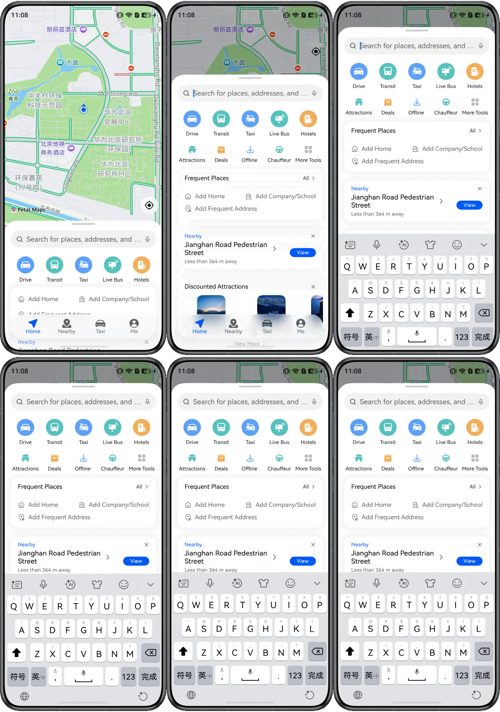
- Search entry interactions: When a user taps the search box, a callback is triggered through the tap event to automatically raise the panel to a higher level. Below shows that the search box panel automatically rises when the it is tapped on a bar-type phone.
[h2]Place search page
The place search page displays the result after a user enters a keyword. In the map navigation app, the search result list must be consistent with the map markers. The places in the list view must be displayed on the map. After a user selects an item in the list, the map should focus on the corresponding location. The following figure shows the effect.
| Horizontal/Vertical Breakpoint | sm/md | sm/lg | md | lg, xl |
| Panel type | Mini panel at the bottom | Bottom panel | Floating panel | Floating panel |
| Default Panel |
|
|
|
|


UI Development
In the bottom panel scenario, the search result is expanded with the panel level. At the middle level, the main result is displayed. At the high level, a more complete list is displayed. In the mini panel scenario, the result should be simplified to avoid excessive blocking of the map on the square screen. In the floating panel scenario, the search result list is fixed on the side of the map, allowing users to view both the list and the markers. The place search page consists of the following areas:
| No. | Description | Implementation |
| 1 | Search input area | Reuse TextInput in the search bar to display the search keyword and start place search again through a submission event. |
| 2 | Result list | Use the List component to display the search result. Vertical scrolling is supported at the high level. |
| 3 | Map marker | Use MapController.addMarker() to add a marker for the search result, and use MarkerOptions to configure the icon, position, and title of the marker. |
[h2]Place Details Page
The place details page connects place search and route planning. It is an intermediate page for users to confirm the destination, view address information, and start navigation. On this page, the name, address, and navigation entry of the place should be displayed preferentially in limited space, and more details should be displayed in wide-screen space. Below shows the effects on different devices.
| Horizontal/Vertical Breakpoint | sm/md | sm/lg | md | lg, xl |
| Panel type | Mini panel at the bottom | Bottom panel | Floating panel | Floating panel |
| Place details page (including long screenshots) |
|
|
|
|


UI Development
On bar-type phones and the Pura X internal screen, the details page is displayed in the bottom panel. At the low level, the place name and route button are retained. At the high level, complete details are displayed. On the Pura X external screen, the level of details needs to be controlled to avoid occupying too much map area. On bi-fold devices, tri-fold devices, and tablets, the details panel floats on the side of the map, allowing users to confirm both the place details and map location at the same time.
The place details page contains the following areas:
| No. | Description | Implementation |
| 1 | Basic place information area | Place the place name, business status, distance, address, entry label, and place image at the top of the details content. Use fixed padding, fixed line height, and maxLines to control the information density on the first screen, ensuring that core place information is displayed preferentially on the bottom panel, floating panel, and sidebar. |
| 2 | Extended content area | Place content such as ticket recommendations, Q&A, and recommended places in the same Scroll container. When the panel is at the high level or the sidebar on a PC, enable vertical scrolling. When the panel is not at the high level, disable content scrolling and prioritize panel position switching through vertical dragging. |
| 3 | Bottom operation area | Fix the favorites, share, route, and navigation operations at the bottom of the page. Allocate the remaining height to the details content area using layoutWeight. The bottom operation area maintains a fixed height and avoids the safe area to ensure that key operations are always reachable. |
[h2]Route Planning Page
The route planning page is the core service page of the map navigation app. After a user selects a destination, the page needs to display the start and end points, travel methods, and route solution list, and draw the route on the map. On this page, ensure that the route information is clear and sufficient map space is reserved for observing the route direction. Below shows the effects on different devices.
| Horizontal/Vertical Breakpoint | sm/md | sm/lg | md | lg, xl |
| Panel type | Mini panel at the bottom | Bottom panel | Floating panel | Floating panel |
| Route planning page |
|
|
|
|


UI Development
In the bottom panel scenario, the start and end points, current route summary, and route list are preferentially displayed at the middle level of the route planning page. In the mini panel scenario, the route information should focus on the start and end points to reduce the blocking of the map by the multi-solution list. In the floating panel scenario, the route panel is located on the side of the map, allowing users to view both the route summary and map route.
The following table describes the details and implementation solution of the route planning page.
| No. | Description | Implementation |
| 1 | Map route area | Call MapController.addPolyline() to draw the route polyline and use MapController.animateCamera() to focus the map camera on the route. |
| 2 | Start and end point information | Use the TextInput component to display the start and end points. The name of the selected place is displayed as the end point. |
| 3 | Travel method area | Use the Scroll container to display the travel method entry horizontally and distinguish the current travel method by the selected state. |
| 4 | Route solution list | When the panel is at the high level, use the List component to display the route solution list vertically. When the panel is at the middle level or is a mini panel, use a horizontal widget to display the first three routes. |
| 5 | Bottom action button area | Fix the favorites, share, and start navigation buttons at the bottom of the page. The bottom operation area maintains a fixed height and avoids the safe area to ensure that key operations are always reachable. |
| 6 | Back button | Use the Stack component to place the back button on top of the map canvas so that the map container focuses on the route information. |
Interactive Development
The route planning page mainly involves the following interactions:
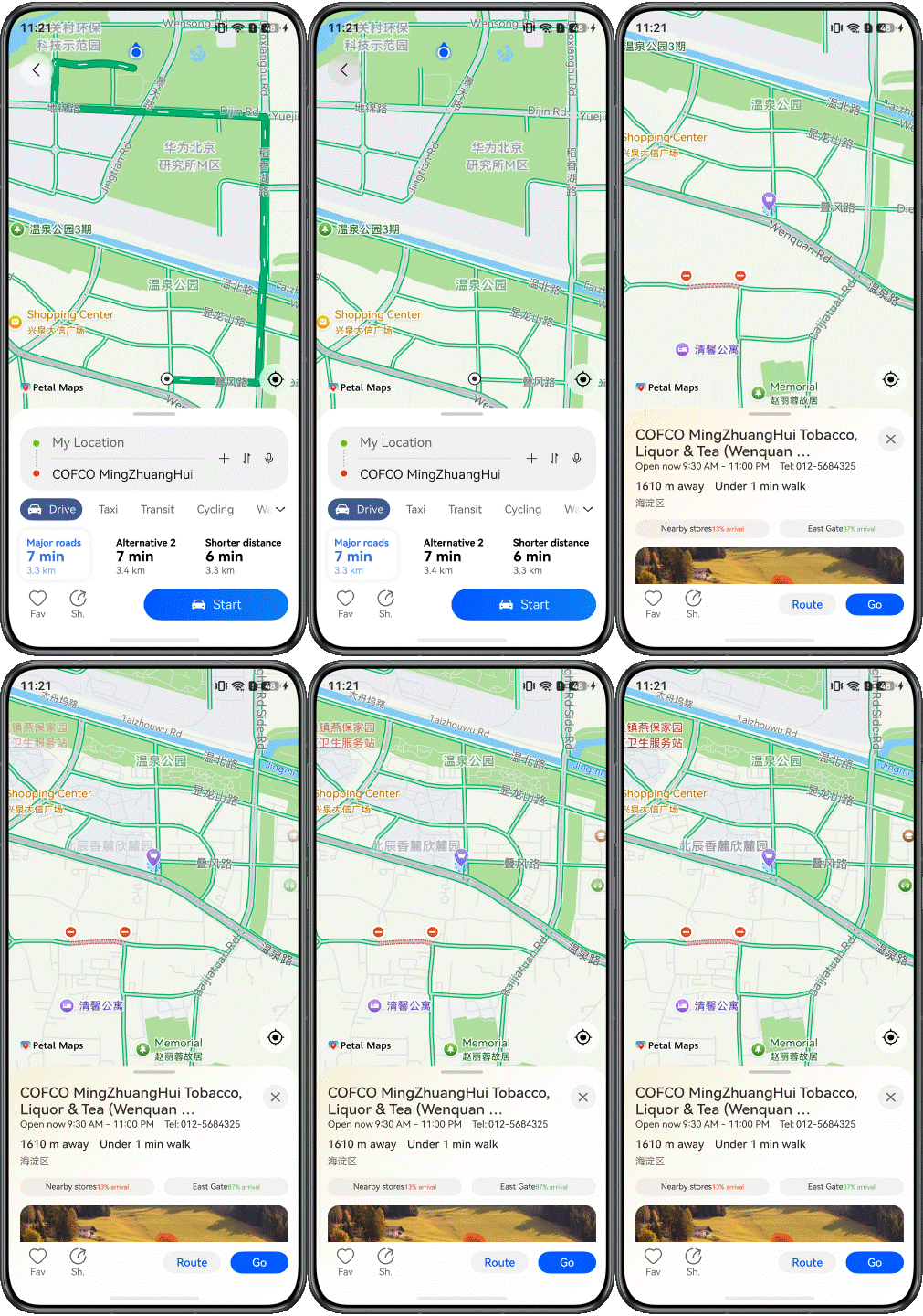
- Returning to the place details page: When the user taps the back button, the page triggers the return logic through the button tap event, calls the route clearing callback, restores the map status to place details, and returns to the previous page through NavPathStack.pop(). After the route is cleared, the map displays the current location marker again to prevent the route polyline from remaining in the details scenario.
Take a bar-type phone as an example. The following figure shows how to return to the previous page by clearing the route and restore the location marker.
Functionality Development
The route planning page is responsible for route request, route result processing, and map route synchronization.
- Route request: When the page is displayed, the map status is switched to route planning, and the old route is cleared. Then, the current location is preferentially used as the start point. If the current location is not ready, the app waits for the location result. The coordinates of the start point are converted using map.convertCoordinateSync(), and then navi.getDrivingRoutes() of Map Kit is used to start driving route planning. Parameters such as origins and destination are passed through DrivingRouteParams.
- Route result processing: After the route planning is successful, the page saves the route RouteResult.routes and extracts RouteRoad data from the steps of the first route to draw the route on the map. In addition, the total duration and distance are obtained based on the values of duration and distance in the route steps, and different route options are displayed in the route solution list.
- Route map synchronization: After the route road data is prepared, the page passes RouteRoad to the map container through the route ready callback. The map container converts RouteRoad.polyline into a route site set, calls the MapComponentController.addPolyline() API to draw the route polyline, and configures the polyline style and arrow texture using MapPolylineOptions. Then, the container calculates the northeast and southwest corners based on the route sites, passes the coordinates to map.newLatLngBounds() to generate a camera update object, and calls MapComponentController.animateCamera() to display the entire route within the visible area of the current map.
[h2]Live view
After the navigation app is switched to the background, the user may still want to view the distance, vehicle information, or navigation status. The live view can display key status in the notification center and capsule area, reducing the need for users to frequently return to the app.

Before reading this topic, you need to be familiar with the introduction to Live View Kit and applicable scenarios and make preparations. The following describes how to develop the live view.
UI Development
The live view page can be displayed in a widget or a capsule. The live view widget is displayed in the notification panel, and the live view capsule is displayed in the status bar. After a user taps the live view capsule, the live view widget is displayed. On bar-type phones and foldable devices, the following designs are available:
| Scenario | Live Widget | Live Capsule |
| Effect |
|
|


The following table describes the details and implementation solution of the live view in different scenarios.
| No. | Description | Implementation |
| 1 | Widget | By default, the live view widget can be displayed on multiple devices. This app uses the navigation template. When the live view widget is started, it is displayed on the notification panel. When you tap the live capsule, it is displayed on the status bar. |
| 2 | Capsule | By default, the live view capsule can be displayed on multiple devices. This app implements the TextCapsule effect. |
PC Pages
This section describes how to reuse the code logic and layout based on the existing mobile UI development solution to efficiently develop map navigation apps for PCs. Most of the interaction logic of map navigation apps on PCs is similar to that on mobile devices. This section only describes the differences.
[h2]Window Adaptation
- Window mode
Mapping navigation apps support full-screen and freeform window modes on PCs. For details, see Window Mode. By using responsive components within the app, the layout can automatically adapt to the window size in both full-screen and freeform window modes.
- Immersive Window
According to the UX design specifications, the immersive effect needs to be implemented in both full-screen and freeform window modes. For details, see Immersive Window. In full-screen mode, the immersive effect is implemented by calling window.setWindowLayoutFullscreen(). In freeform window mode, the title bar is hidden by calling window.setWindowDecorVisible(false), and only the three buttons in the upper right corner are retained. In this way, the page content extends to the title bar area, achieving an immersive display effect.
[h2]Map Container Page
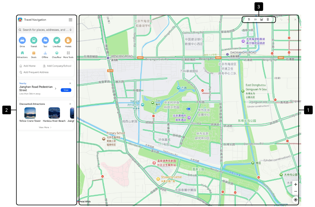
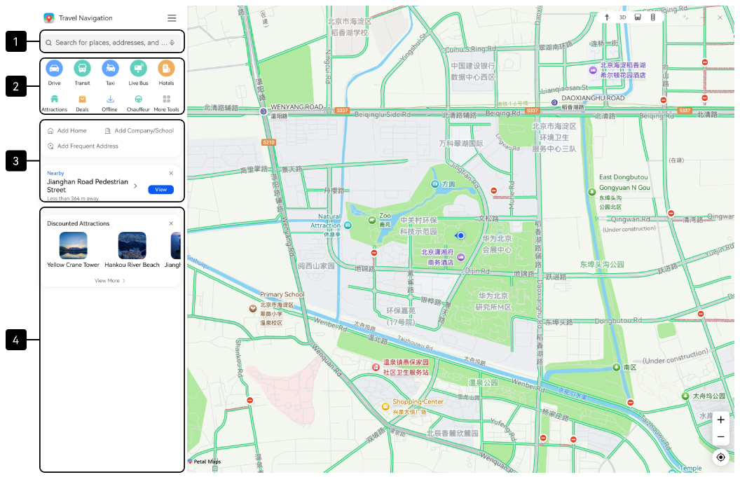
The map container page on the PC has the same functions as that on the mobile device. The information panel is fixed in the sidebar, and the map canvas and PC decoration toolbar are displayed on the right of the panel. The following figure shows the effect.
UI Development
The map container page on the PC uses an embedded layout to organize the sidebar, map canvas, and toolbar. It consists of the following areas:
| No. | Description | Implementation |
| 1 | Fixed sidebar | SideBarContainer is used to fix the width of the sidebar. The information panel inside the container is reused to display the service page. |
| 2 | Map canvas | The implementation solution is the same as that for implementing the layout of the map canvas area on the map container page. |
| 3 | Map operation area | The Stack component is used to overlay the toolbar area on the main map area. |
[h2]Home Page
The home page on the PC is always displayed in the sidebar, and the main area of the map is complete and can be browsed. The running effect is as follows:
UI Development
The home page on the PC is always displayed in the sidebar, which consists of the following areas:
| No. | Description | Implementation |
| 1 | Search entry | The implementation solution is the same as that for implementing the layout of the home page on mobile devices. |
| 2 | Travel function area | |
| 3 | Place recommendation area |
[h2]Place search page
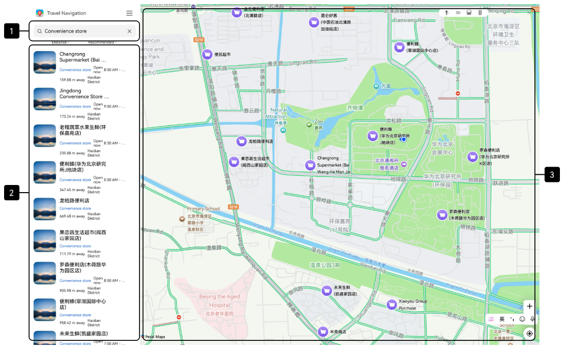
On the place search page on the PC, the search result list is displayed in the sidebar, and the search result markers are displayed in the main map area. The running effect is shown in the figure.
UI Development
| No. | Description | Implementation |
| 1 | Search input area | The implementation solution is the same as that for implementing the layout of the place search page on mobile devices. |
| 2 | Result list | |
| 3 | Map marker |
[h2]Place Details Page
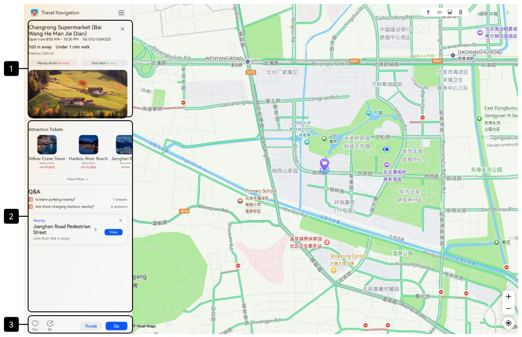
The place details page on the PC is fixed in the sidebar. Users can view the destination location on the map while confirming the location information. The running effect is as follows:
UI Development
The PC location details page contains the following areas:
| No. | Description | Implementation |
| 1 | Basic place information area | The implementation solution is the same as that for implementing the layout of the place details page on mobile devices. |
| 2 | Extended content area | |
| 3 | Bottom operation area |
[h2]Route Planning Page
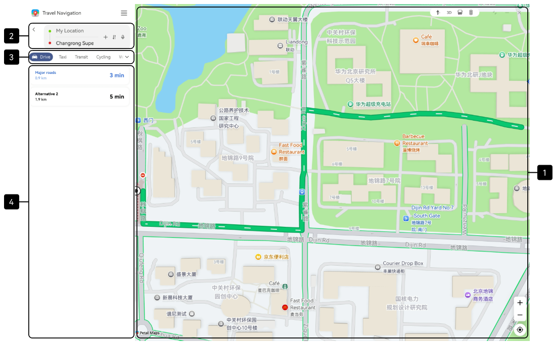
On the route planning page on the PC, the start and end points and route solutions are displayed in the sidebar, and the complete route is displayed in the main map area. The running effect is shown in the figure.
UI Development
The route planning page on the PC mainly consists of the following areas:
| No. | Description | Implementation |
| 1 | Start and end point information | The implementation solution is the same as that for implementing the layout of the route planning page on mobile devices, except for the position of the back button. |
| 2 | Travel mode area | |
| 3 | Route solution list | Use a vertical list to display the route solutions, including the route policy, total distance, and total time required. |
| 4 | Map route area | The implementation solution is the same as that for implementing the layout of the route planning page on mobile devices. |