Binds a popup to a component and sets the popup content, interaction logic, and display status.

-
The feature is supported since API version 7. Updates will be marked with a superscript to indicate their earliest API version.
-
The display status of the popup is reported in the onStateChange callback of PopupOptions or CustomPopupOptions. When the component bound to the popup is destroyed, the popup disappears, but the display status is not reported through onStateChange.
-
The maximum height of the popup is calculated as follows: Current window height – Top/Bottom safe area height (status bar and navigation bar) – 80 vp.
-
When multiple popups are displayed at the same time, popups displayed in child windows have a higher z-index than those in the main window. When in the same window, popups displayed later have a higher z-index than those displayed earlier.
-
By default, the PC/2-in-1 device has double outlines, while other devices do not.
-
Nested subwindow dialog boxes are not supported. For example, when bindPopup has showInSubWindow set to true, another dialog box with showInSubWindow=true cannot be displayed.
-
When the component bound to the popup is destroyed, the screen is rotated, or the application enters the background, the popup automatically disappears, and the onWillDismiss event is not triggered.
bindPopup
bindPopup(show: boolean, popup: PopupOptions | CustomPopupOptions): T
Binds a popup to the component.

-
bindPopup with subwindow display (showInSubWindow set to true) is not supported in input method windows. For details, see the constraints in createPanel of the input method framework documentation.
-
This API cannot be called within attributeModifier.
Atomic service API: This API can be used in atomic services since API version 11.
System capability: SystemCapability.ArkUI.ArkUI.Full
Parameters
| Name | Type | Mandatory | Description |
|---|---|---|---|
| show | boolean | Yes | Popup display status. Do not set the show attribute to true during page construction. Otherwise, the position and shape of the popup will be incorrect. Instead, wait until the page is fully constructed and then display the popup. Since API version 18, this parameter supports two-way binding through the !! syntax. true: The popup is displayed; false: The popup is closed. Default value: false |
| popup | PopupOptions | CustomPopupOptions8+ | Yes | Configuration options of the popup. |
Return value
| Type | Description |
|---|---|
| T | Returns the current component to support method chaining. |
PopupOptions
Provides the configuration options for the popup.
System capability: SystemCapability.ArkUI.ArkUI.Full
| Name | Type | Read-Only | Optional | Description |
|---|---|---|---|---|
| message | string | No | No | Content of the popup. Atomic service API: This API can be used in atomic services since API version 11. |
| primaryButton | { value: string, action: () => void } | No | Yes | Primary button. value: text of the primary button in the popup. action: callback function for clicking of the primary button. Atomic service API: This API can be used in atomic services since API version 11. |
| secondaryButton | { value: string, action: () => void } | No | Yes | Secondary button. value: text of the secondary button in the popup. action: callback function for clicking of the secondary button. Atomic service API: This API can be used in atomic services since API version 11. |
| onStateChange | (event: { isVisible: boolean }) => void | No | Yes | Callback for popup visibility state changes. The parameter isVisible indicates the visibility of the popup. It returns true when the popup transitions from closed to open, and false when the popup transitions from open to closed. Atomic service API: This API can be used in atomic services since API version 11. |
| showInSubWindow9+ | boolean | No | Yes | Whether the popup is displayed in the created subwindow. true: The popup is displayed in the created subwindow; false: The popup is displayed in the corresponding main window. Default value: false Atomic service API: This API can be used in atomic services since API version 11. |
| mask10+ | boolean | { color : ResourceColor } | No | Yes | Whether to apply a mask with the specified color to the popup. true: A transparent mask is applied; false: No mask is applied. Color: A mask with the specified color is applied. Default value: true Atomic service API: This API can be used in atomic services since API version 11. Model restriction: This API can be used only in the stage model. |
| messageOptions10+ | PopupMessageOptions | No | Yes | Configuration options of the popup message. Atomic service API: This API can be used in atomic services since API version 11. Model restriction: This API can be used only in the stage model. |
| targetSpace10+ | Length | No | Yes | Spacing between the popup and the host node. Percentage values are not supported. Default value: 8 Unit: vp Atomic service API: This API can be used in atomic services since API version 11. Model restriction: This API can be used only in the stage model. |
| placement10+ | Placement | No | Yes | Display position of the popup relative to the host node. The default value is Placement.Bottom. If both placementOnTop and placement are set, the latter prevails. If the popup cannot be completely displayed in the specified position, the popup automatically adjusts its position to completely show itself. Atomic service API: This API can be used in atomic services since API version 11. Model restriction: This API can be used only in the stage model. |
| offset10+ | Position | No | Yes | Offset of the popup relative to the display position specified by placement. Default value: {x:0, y:0} Unit: vp NOTE Percentage values are not supported. Atomic service API: This API can be used in atomic services since API version 11. Model restriction: This API can be used only in the stage model. |
| enableArrow10+ | boolean | No | Yes | Whether to display the arrow. true: The arrow is displayed; false: The arrow is not displayed. Default value: true NOTE If the available space on the screen is insufficient, the popup will cover part of the component and the arrow will not be displayed. If the length of the popup on the side where the arrow is located is insufficient to display the down arrow, the arrow will not be displayed. Atomic service API: This API can be used in atomic services since API version 11. Model restriction: This API can be used only in the stage model. |
| arrowPointPosition11+ | ArrowPointPosition | No | Yes | Position of the tooltip arrow relative to its parent component. Available positions are Start, Center, and End, in both vertical and horizontal directions. All these positions are within the parent component area. NOTE When arrowPointPosition is set, the arrowOffset attribute does not take effect. When arrowPointPosition is not set or set to null or undefined, the arrowOffset attribute takes effect. Default value: ArrowPointPosition.CENTER Atomic service API: This API can be used in atomic services since API version 12. Model restriction: This API can be used only in the stage model. |
| arrowWidth11+ | Dimension | No | Yes | Arrow thickness. If the arrow thickness exceeds the length of the edge minus twice the size of the popup rounded corner, the arrow is not drawn. Default value: 16 Unit: vp NOTE Percentage values are not supported. Atomic service API: This API can be used in atomic services since API version 12. Model restriction: This API can be used only in the stage model. |
| arrowOffset9+ | Length | No | Yes | Offset of the popup arrow relative to the popup. When the arrow is above or below the popup, the offset is the distance from the arrow to the leftmost position. The default value indicates that the arrow is centered. When the arrow is on the left or right side of the popup, the offset is the distance from the arrow to the top. The default value indicates that the arrow is in the middle. When the popup is displayed on either edge of the screen, it automatically adjusts horizontally. When the value is 0, the arrow always points to the bound component. Unit: vp NOTE 1. If arrowOffset is not set, the distance between the popup arrow and the four corners must be no less than the corner radius. 2. The arrowOffset attribute takes effect only when arrowPointPosition is not set or is set to null or undefined. 3. Percentage values are not supported. Atomic service API: This API can be used in atomic services since API version 11. |
| arrowHeight11+ | Dimension | No | Yes | Arrow height. Default value: 8 Unit: vp NOTE Percentage values are not supported. Atomic service API: This API can be used in atomic services since API version 12. Model restriction: This API can be used only in the stage model. |
| popupColor11+ | Color | string | Resource | number | No | Yes | Color of the popup. To remove the background blur, set backgroundBlurStyle to BlurStyle.NONE. Default value: TRANSPARENT plus COMPONENT_ULTRA_THICK Atomic service API: This API can be used in atomic services since API version 12. Model restriction: This API can be used only in the stage model. |
| autoCancel11+ | boolean | No | Yes | Whether the popup is automatically closed when an operation is performed on the page. true: The popup is automatically closed; false: The popup is not automatically closed. Default value: true Atomic service API: This API can be used in atomic services since API version 12. Model restriction: This API can be used only in the stage model. |
| width11+ | Dimension | No | Yes | Width of the popup. If this parameter is not set or the value is invalid, the popup width is automatically adjusted to adapt to the content width. Unit: vp Atomic service API: This API can be used in atomic services since API version 12. Model restriction: This API can be used only in the stage model. |
| radius11+ | Dimension | No | Yes | Rounded corner radius of the popup. Default value: 20 Unit: vp Atomic service API: This API can be used in atomic services since API version 12. Model restriction: This API can be used only in the stage model. |
| shadow11+ | ShadowOptions | ShadowStyle | No | Yes | Popup shadow. Default value: ShadowStyle.OUTER_DEFAULT_MD Atomic service API: This API can be used in atomic services since API version 12. Model restriction: This API can be used only in the stage model. |
| backgroundBlurStyle11+ | BlurStyle | No | Yes | Background blur style of the popup. Default value: BlurStyle.COMPONENT_ULTRA_THICK Atomic service API: This API can be used in atomic services since API version 12. Model restriction: This API can be used only in the stage model. |
| transition12+ | TransitionEffect | No | Yes | Transition animations for the entrance and exit of the popup. NOTE 1. If this parameter is not set, the default entrance and exit animations are used. 2. Touching the back button during the entrance animation interrupts it and starts the exit animation. The final effect is one obtained after the curves of the entrance and exit animations are combined. 3. Touching the back button during the exit animation does not affect the animation playback; the back button is unresponsive. Atomic service API: This API can be used in atomic services since API version 12. Model restriction: This API can be used only in the stage model. |
| onWillDismiss12+ | boolean | Callback<DismissPopupAction > | No | Yes | Interactive dismissal behavior. The default value is true, meaning that the popup responds to clicks, swipes (left or right), and the back button. 1. For the boolean type, if this parameter is set to false, the popup ignores clicks, swipes, back button, route navigation, and Esc key events, and can only be dismissed by setting the show parameter to false; if this parameter is set to true, the popup responds to dismissal events. 2. If this parameter is set to a function, the dismissal event is intercepted and the callback function is executed. For swipes, back button, route navigation, and the Esc key, the value of reason returned in the callback function is PRESS_BACK. For clicks, the value is TOUCH_OUTSIDE. NOTE No more onWillDismiss callback is allowed in an onWillDismiss callback. Atomic service API: This API can be used in atomic services since API version 12. Model restriction: This API can be used only in the stage model. |
| followTransformOfTarget13+ | boolean | No | Yes | Whether the popup aligns with the transformed position of the target when the target component or its parent container has transformations (such as rotation and scaling). true: The popup aligns with the transformed position of the target; false: The popup does not track such transformations, which may result in incorrect display. Default value: false Atomic service API: This API can be used in atomic services since API version 13. Model restriction: This API can be used only in the stage model. |
| keyboardAvoidMode15+ | KeyboardAvoidMode | No | Yes | Whether to avoid the soft keyboard. By default, the popup does not avoid the soft keyboard. When configured to avoid the soft keyboard, if the popup display space is insufficient, the display mode of the popup changes from being centered over the parent component to being translated and covering the parent component. In addition, if the popup arrow does not point to the host, the arrow will not be displayed. Default value: KeyboardAvoidMode.NONE Atomic service API: This API can be used in atomic services since API version 15. Model restriction: This API can be used only in the stage model. |
| enableHoverMode18+ | boolean | No | Yes | Whether the popup responds when the device is in hover mode (semi-folded state), that is, whether it triggers avoidance of the crease area in hover mode. true: The hover state change is responded. false: The hover state change is not responded. Default value: false (true for 2-in-1 devices by default). If this parameter is not set or set to an invalid value, the default value is used. NOTE 1. If the popup position is within the crease area in hover mode, it will not respond in hover mode. 2. This parameter is supported on 2-in-1 devices since API version 20. 3. This parameter only takes effect in window waterfall mode for 2-in-1 devices. Atomic service API: This API can be used in atomic services since API version 18. Model restriction: This API can be used only in the stage model. |
| outlineWidth20+ | Dimension | No | Yes | Width of the outer outline of the popup. Default value: 1 Unit: vp NOTE 1. Percentage values are not supported. If a percentage value is set, the value 0 is used. 2. If the outer outline is not set, this parameter must be used together with outlineLinearGradient. 3. For double outlines, it is recommended that the outer outline width should not exceed 10 vp. Atomic service API: This API can be used in atomic services since API version 20. Model restriction: This API can be used only in the stage model. |
| borderWidth20+ | Dimension | No | Yes | Width of the inner outline of the popup. Default value: 1 Unit: vp NOTE 1. Percentage values are not supported. If a percentage value is set, the value 0 is used. 2. If the inner outline width of the Popup component is not set using this attribute, this API must be used together with borderLinearGradient. 3. For double outlines, it is recommended that the inner outline width should not exceed 10 vp. Atomic service API: This API can be used in atomic services since API version 20. Model restriction: This API can be used only in the stage model. |
| outlineLinearGradient20+ | PopupBorderLinearGradient | No | Yes | Linear gradient color of the outer outline of the popup. NOTE 1. If outlineLinearGradient is not set or set to null or undefined, the linear gradient color of the outer outline does not take effect. 2. When outlineLinearGradient is set, the default value of direction is GradientDirection.Bottom. Atomic service API: This API can be used in atomic services since API version 20. Model restriction: This API can be used only in the stage model. |
| borderLinearGradient20+ | PopupBorderLinearGradient | No | Yes | Linear gradient color of the inner outline of the popup. NOTE 1. If borderLinearGradient is not set or set to null or undefined, the linear gradient color of the inner outline does not take effect. 2. When borderLinearGradient is set, the default value of direction is GradientDirection.Bottom. Atomic service API: This API can be used in atomic services since API version 20. Model restriction: This API can be used only in the stage model. |
| avoidTarget20+ | AvoidanceMode | No | Yes | Whether the popup covers the pointing component during avoidance. Default value: AvoidanceMode.COVER_TARGET Atomic service API: This API can be used in atomic services since API version 20. Model restriction: This API can be used only in the stage model. |
| systemMaterial | SystemUiMaterial | No | Yes | System material for a component. Default value: undefined. The material effect set by this API will be cleared. NOTE Different system materials have different attribute effects. This API affects the background color backgroundColor, border color borderColor, border width borderWidth, and shadow shadow. When the system material is set, the preceding APIs do not take effect. Since: 26.0.0 Model restriction: This API can be used only in the stage model. Atomic service API: This API can be used in atomic services since API version 26.0.0. |
| backgroundBlurStyleOptions | BackgroundBlurStyleOptions | No | Yes | Options for customizing the background blur style. For details about the default value, see BackgroundBlurStyleOptions. Since: 26.0.0 Model restriction: This API can be used only in the stage model. Atomic service API: This API can be used in atomic services since API version 26.0.0. |
| backgroundEffect | BackgroundEffectOptions | No | Yes | Options for customizing the background effect. For details about the default value, see BackgroundEffectOptions. Since: 26.0.0 Model restriction: This API can be used only in the stage model. Atomic service API: This API can be used in atomic services since API version 26.0.0. |
| placementOnTop(deprecated) | boolean | No | Yes | Whether to display the popup above the component. The default value is false. true: The popup is displayed above the bound component; false: The popup is displayed below the bound component. NOTE This parameter is supported since API version 7 and deprecated since API version 10. You are advised to use placement instead. |
| colorMode | AnchoredColorMode | No | Yes | Dark/light color mode of the popup. By default, the popup follows the dark/light color mode of the bound component. Default value: AnchoredColorMode.FOLLOW_TARGET NOTE 1. This attribute takes effect only when the bound component uses the WithTheme tag. 2. This attribute affects only the default style of the component and the attributes that you set and involve dark light color resources. 3. If this parameter is set to AnchoredColorMode.FOLLOW_SYSTEM, the fuzzy material can be followed, and the text color and attributes involving the light color resources still follow the light color configuration of the bound component. Since: 26.0.0 Atomic service API: This API can be used in atomic services since API version 26.0.0. Model restriction: This API can be used only in the stage model. |
| levelMode | LevelMode | No | Yes | Display layer mode of the popup. Default value: LevelMode.OVERLAY Since: 26.0.0 Atomic service API: This API can be used in atomic services since API version 26.0.0. Model restriction: This API can be used only in the stage model. |
PopupMessageOptions10+
Describes the popup message text style.
Atomic service API: This API can be used in atomic services since API version 11.
Model restriction: This API can be used only in the stage model.
System capability: SystemCapability.ArkUI.ArkUI.Full
| Name | Type | Read-Only | Optional | Description |
|---|---|---|---|---|
| textColor | ResourceColor | No | Yes | Text color of the popup message. |
| font | Font | No | Yes | Font settings of the popup message. NOTE 1. Setting family is not supported. 2. The weight attribute in Font does not support the number type. |
DismissPopupAction12+
Provides information about the dismissal of the popup.
Atomic service API: This API can be used in atomic services since API version 12.
Model restriction: This API can be used only in the stage model.
System capability: SystemCapability.ArkUI.ArkUI.Full
| Name | Type | Read-Only | Optional | Description |
|---|---|---|---|---|
| dismiss | Callback<void> | No | No | Callback for dismissing the popup. This API is called only when the popup needs to be dismissed. |
| reason | DismissReason | No | No | Reason why the popup is dismissed. |
DismissReason12+
Enumerates the reasons for popup dismissal.
Model restriction: This API can be used only in the stage model.
System capability: SystemCapability.ArkUI.ArkUI.Full
| Name | Value | Description |
|---|---|---|
| PRESS_BACK | 0 | Touching the Back button, swiping left or right on the screen, or pressing the Esc key. Atomic service API: This API can be used in atomic services since API version 12. |
| TOUCH_OUTSIDE | 1 | Touching the mask layer. Atomic service API: This API can be used in atomic services since API version 12. |
| CLOSE_BUTTON | 2 | Touching the close button. Atomic service API: This API can be used in atomic services since API version 12. |
| SLIDE_DOWN | 3 | Swiping down. NOTE This API is effective only in sheet transition. Atomic service API: This API can be used in atomic services since API version 12. |
| SLIDE20+ | 4 | Swiping left or right on the screen. By default, swiping right dismisses the popup, while swiping left is used in the mirror scenario. This setting is not user-defined. NOTE This API is effective only in sheet transition. Atomic service API: This API can be used in atomic services since API version 20. |
CustomPopupOptions8+
Provides information for displaying a custom popup.
System capability: SystemCapability.ArkUI.ArkUI.Full
| Name | Type | Read-Only | Optional | Description |
|---|---|---|---|---|
| builder | CustomBuilder | No | No | Popup builder. NOTE 1. The Popup attribute is a universal attribute. A custom popup does not support display of another popup. The Position attribute cannot be used for the first-layer container component under the builder. If this attribute is used, the popup will not be displayed. 2. If a custom component is used in the builder, the aboutToAppear and aboutToDisappear lifecycle of the custom component is irrelevant to the display and hiding of the popup. Therefore, the lifecycle of the custom component cannot be used to determine whether the popup is displayed or hidden. 3. The builder of this constructor can be defined only in UI components, such as the Builder function/method or the build method. Atomic service API: This API can be used in atomic services since API version 11. |
| placement | Placement | No | Yes | Preferred position of the popup. If the set position is insufficient for holding the popup, it will be automatically adjusted. Default value: Placement.Bottom Atomic service API: This API can be used in atomic services since API version 11. |
| popupColor | Color | string | Resource | number | No | Yes | Color of the popup. To remove the background blur, set backgroundBlurStyle to BlurStyle.NONE. The default value is '#4d4d4d' since API version 10. Starting from API version 11, the default value is the transparent color TRANSPARENT with a blurred background effect COMPONENT_ULTRA_THICK. Atomic service API: This API can be used in atomic services since API version 11. |
| autoCancel | boolean | No | Yes | Whether the popup is automatically closed when an operation is performed on the page. true: The popup is automatically closed; false: The popup is not automatically closed. Default value: true NOTE To dismiss the popup upon a click on it, place a layout component in the builder, place the Popup component in the layout component, and set show to false in the onClick event of the layout component. Atomic service API: This API can be used in atomic services since API version 11. |
| onStateChange | (event: { isVisible: boolean }) => void | No | Yes | Callback for popup visibility state changes. The parameter indicates the visibility of the popup. It returns true when the popup transitions from closed to open, and false when the popup transitions from open to closed. Atomic service API: This API can be used in atomic services since API version 11. |
| enableArrow | boolean | No | Yes | Whether to display the arrow. true: The arrow is displayed; false: The arrow is not displayed. Since API version 9, if the position set for the popup is not large enough, the arrow will not be displayed. For example, if placement is set to Left, and the popup height is less than the sum of the arrow width (32 vp) and twice the popup corner radius (48 vp), that is, 80 vp, the arrow will not be displayed. Default value: true Atomic service API: This API can be used in atomic services since API version 11. |
| arrowOffset9+ | Length | No | Yes | Offset of the popup arrow relative to the popup. When the arrow is at the top or bottom of the popup: The value 0 indicates that the arrow is located on the leftmost, and any other value indicates the distance from the arrow to the leftmost; the arrow is centered by default. When the arrow is on the left or right side of the popup: The value indicates the distance from the arrow to the top; the arrow is centered by default. When the popup is displayed on either edge of the screen, it automatically adjusts horizontally. When the value is 0, the arrow always points to the bound component. Unit: vp NOTE 1. If arrowOffset is not set, the distance between the popup arrow and the four corners must be no less than the corner radius. 2. The arrowOffset attribute takes effect only when arrowPointPosition is not set or is set to null or undefined. 3. Percentage values are not supported. Atomic service API: This API can be used in atomic services since API version 11. |
| arrowPointPosition11+ | ArrowPointPosition | No | Yes | Position of the tooltip arrow relative to its parent component. Available positions are Start, Center, and End, in both vertical and horizontal directions. All these positions are within the parent component area. Default value: ArrowPointPosition.CENTER Atomic service API: This API can be used in atomic services since API version 12. Model restriction: This API can be used only in the stage model. |
| arrowWidth11+ | Dimension | No | Yes | Arrow thickness. If the arrow thickness exceeds the length of the edge minus twice the size of the popup rounded corner, the arrow is not drawn. Default value: 16 Unit: vp NOTE Percentage values are not supported. Atomic service API: This API can be used in atomic services since API version 12. Model restriction: This API can be used only in the stage model. |
| arrowHeight11+ | Dimension | No | Yes | Arrow height. Default value: 8 Unit: vp NOTE Percentage values are not supported. Atomic service API: This API can be used in atomic services since API version 12. Model restriction: This API can be used only in the stage model. |
| showInSubWindow9+ | boolean | No | Yes | Whether the popup is displayed in the created subwindow. true: The popup is displayed in the created subwindow; false: The popup is displayed in the corresponding main window. Default value: false Atomic service API: This API can be used in atomic services since API version 11. |
| maskColor(deprecated) | Color | string | Resource | number | No | Yes | Color of the popup mask. NOTE This API is supported since API version 8 and deprecated since API version 10. You are advised to use mask instead. |
| mask10+ | boolean | { color : ResourceColor } | No | Yes | Whether to apply a mask with the specified color to the popup. The value true means to apply a transparent mask to the popup, false means not to apply a mask to the popup, and a color value means to apply a mask in the corresponding color to the popup. Default value: true Atomic service API: This API can be used in atomic services since API version 11. Model restriction: This API can be used only in the stage model. |
| targetSpace10+ | Length | No | Yes | Spacing between the popup and the host node. Percentage values are not supported. Default value: 8 Unit: vp Atomic service API: This API can be used in atomic services since API version 11. Model restriction: This API can be used only in the stage model. |
| offset10+ | Position | No | Yes | Offset of the popup relative to the display position specified by placement. NOTE Percentage values are not supported. Default value: {x:0, y:0} Unit: vp Atomic service API: This API can be used in atomic services since API version 11. Model restriction: This API can be used only in the stage model. |
| width11+ | Dimension | No | Yes | Width of the popup. If this parameter is not set or the value is invalid, the popup width is automatically adjusted to adapt to the content width. Unit: vp Atomic service API: This API can be used in atomic services since API version 12. Model restriction: This API can be used only in the stage model. |
| radius11+ | Dimension | No | Yes | Rounded corner radius of the popup. Default value: 20 Unit: vp Atomic service API: This API can be used in atomic services since API version 12. Model restriction: This API can be used only in the stage model. |
| shadow11+ | ShadowOptions | ShadowStyle | No | Yes | Popup shadow. Default value: ShadowStyle.OUTER_DEFAULT_MD Atomic service API: This API can be used in atomic services since API version 12. Model restriction: This API can be used only in the stage model. |
| backgroundBlurStyle11+ | BlurStyle | No | Yes | Background blur style of the popup. Default value: BlurStyle.COMPONENT_ULTRA_THICK Atomic service API: This API can be used in atomic services since API version 12. Model restriction: This API can be used only in the stage model. |
| focusable11+ | boolean | No | Yes | Whether the popup obtains focus when displayed. true: The popup can obtain the focus; false: The popup cannot obtain the focus. Default value: false Atomic service API: This API can be used in atomic services since API version 12. Model restriction: This API can be used only in the stage model. |
| transition12+ | TransitionEffect | No | Yes | Transition animations for the entrance and exit of the popup. NOTE 1. If this parameter is not set, the default effect is used. 2. Touching the back button during the entrance animation interrupts it and starts the exit animation. The final effect is one obtained after the curves of the entrance and exit animations are combined. 3. Touching the back button during the exit animation does not affect the animation playback; the back button is unresponsive. Atomic service API: This API can be used in atomic services since API version 12. Model restriction: This API can be used only in the stage model. |
| onWillDismiss12+ | boolean | Callback<DismissPopupAction | No | Yes | Interactive dismissal behavior. The default value is true, meaning that the popup responds to clicks, swipes (left or right), and the back button. 1. For the boolean type, if this parameter is set to false, the popup ignores clicks, swipes, back button, route navigation, and Esc key events, and can only be dismissed by setting the show parameter to false; if this parameter is set to true, the popup responds to dismissal events. 2. If this parameter is set to a function, the dismissal event is intercepted and the callback function is executed. For swipes, back button, route navigation, and the Esc key, the value of reason returned in the callback function is PRESS_BACK. For clicks, the value is TOUCH_OUTSIDE. NOTE No more onWillDismiss callback is allowed in an onWillDismiss callback. Atomic service API: This API can be used in atomic services since API version 12. Model restriction: This API can be used only in the stage model. |
| followTransformOfTarget13+ | boolean | No | Yes | Whether the popup aligns with the transformed position of the target when the target component or its parent container has transformations (such as rotation and scaling). true: The popup aligns with the transformed position of the target; false: The popup does not track such transformations, which may result in incorrect display. Default value: false Atomic service API: This API can be used in atomic services since API version 13. Model restriction: This API can be used only in the stage model. |
| keyboardAvoidMode15+ | KeyboardAvoidMode | No | Yes | Whether to avoid the soft keyboard. By default, the popup does not avoid the soft keyboard. When configured to avoid the soft keyboard, if the popup display space is insufficient, the display mode of the popup changes from being centered over the parent component to being translated and covering the parent component. In addition, if the popup arrow does not point to the host, the arrow will not be displayed. Default value: KeyboardAvoidMode.NONE Atomic service API: This API can be used in atomic services since API version 15. Model restriction: This API can be used only in the stage model. |
| enableHoverMode18+ | boolean | No | Yes | Whether the popup responds when the device is in hover mode (semi-folded state), that is, whether it triggers avoidance of the crease area in hover mode. Default value: false (true for 2-in-1 devices by default). If this parameter is not set or set to an invalid value, the default value is used. NOTE 1. If the popup position is within the crease area in hover mode, it will not respond in hover mode. 2. This parameter is supported on 2-in-1 devices since API version 20. 3. This parameter only takes effect in window waterfall mode for 2-in-1 devices. Atomic service API: This API can be used in atomic services since API version 18. Model restriction: This API can be used only in the stage model. |
| outlineWidth20+ | Dimension | No | Yes | Width of the outer outline of the popup. Default value: 1 Unit: vp NOTE 1. Percentage values are not supported. If a percentage value is set, the value 0 is used. 2. If the outer outline is not set, this parameter must be used together with outlineLinearGradient. 3. For double outlines, it is recommended that the outer outline width should not exceed 10 vp. Atomic service API: This API can be used in atomic services since API version 20. Model restriction: This API can be used only in the stage model. |
| borderWidth20+ | Dimension | No | Yes | Width of the inner outline of the popup. Default value: 1 Unit: vp NOTE 1. Percentage values are not supported. If a percentage value is set, the value 0 is used. 2. If no inner outline is set, this parameter must be used together with borderLinearGradient. 3. For double outlines, it is recommended that the inner outline width should not exceed 10 vp. Atomic service API: This API can be used in atomic services since API version 20. Model restriction: This API can be used only in the stage model. |
| outlineLinearGradient20+ | PopupBorderLinearGradient | No | Yes | Linear gradient color of the outer outline of the popup. NOTE 1. If outlineLinearGradient is not set or set to null or undefined, the linear gradient color of the outer outline does not take effect. 2. When outlineLinearGradient is set, the default value of direction is GradientDirection.Bottom. Atomic service API: This API can be used in atomic services since API version 20. Model restriction: This API can be used only in the stage model. |
| borderLinearGradient20+ | PopupBorderLinearGradient | No | Yes | Linear gradient color of the inner outline of the popup. NOTE 1. If borderLinearGradient is not set or set to null or undefined, the linear gradient color of the inner outline does not take effect. 2. When borderLinearGradient is set, the default value of direction is GradientDirection.Bottom. Atomic service API: This API can be used in atomic services since API version 20. Model restriction: This API can be used only in the stage model. |
| avoidTarget20+ | AvoidanceMode | No | Yes | Whether the popup covers the pointing component during avoidance. NOTE When avoidTarget is set to AvoidanceMode.AVOID_AROUND_TARGET, the popup is compressed if the remaining display space is insufficient. In this case, the popup content needs to be used together with Scroll. Otherwise, the popup content will be blocked. Default value: AvoidanceMode.COVER_TARGET Atomic service API: This API can be used in atomic services since API version 20. Model restriction: This API can be used only in the stage model. |
| colorMode | AnchoredColorMode | No | Yes | Dark/light color mode of the popup. By default, the popup follows the dark/light color mode of the bound component. Default value: AnchoredColorMode.FOLLOW_TARGET NOTE 1. This attribute takes effect only when the bound component uses the WithTheme tag. 2. This attribute affects only the default style of the component and the attributes related to the dark light color resources set by the developer. Since: 26.0.0 Atomic service API: This API can be used in atomic services since API version 26.0.0. Model restriction: This API can be used only in the stage model. |
| systemMaterial | SystemUiMaterial | No | Yes | System material for a component. Default value: undefined. The material effect set by this API will be cleared. NOTE Different system materials have different attribute effects. This API affects the background color backgroundColor, border color borderColor, border width borderWidth, and shadow shadow. When the system material is set, the preceding APIs do not take effect. Since: 26.0.0 Model restriction: This API can be used only in the stage model. Atomic service API: This API can be used in atomic services since API version 26.0.0. |
| backgroundBlurStyleOptions | BackgroundBlurStyleOptions | No | Yes | Background blur effect. For details about the default value, see BackgroundBlurStyleOptions. Since: 26.0.0 Model restriction: This API can be used only in the stage model. Atomic service API: This API can be used in atomic services since API version 26.0.0. |
| backgroundEffect | BackgroundEffectOptions | No | Yes | Options for customizing the background effect. For details about the default value, see BackgroundEffectOptions. Since: 26.0.0 Model restriction: This API can be used only in the stage model. Atomic service API: This API can be used in atomic services since API version 26.0.0. |
| levelMode | LevelMode | No | Yes | Display level mode of a popup. Default value: LevelMode.OVERLAY Since: 26.0.0 Atomic service API: This API can be used in atomic services since API version 26.0.0. Model restriction: This API can be used only in the stage model. |
PopupCommonOptions18+
Configures the parameters of a popup. You can use the getPromptAction() method in UIContext to obtain the PromptAction object, and then pass the options parameter to the openPopup and updatePopup methods invoked by the object.
Model restriction: This API can be used only in the stage model.
System capability: SystemCapability.ArkUI.ArkUI.Full
| Name | Type | Read-Only | Optional | Description |
|---|---|---|---|---|
| placement | Placement | No | Yes | Preferred position of the popup. If the set position is insufficient for holding the popup, it will be automatically adjusted. Default value: Placement.Bottom Atomic service API: This API can be used in atomic services since API version 18. |
| popupColor | ResourceColor | No | Yes | Color of the popup. To remove the background blur, set backgroundBlurStyle to BlurStyle.NONE. Default value: TRANSPARENT plus COMPONENT_ULTRA_THICK Atomic service API: This API can be used in atomic services since API version 18. |
| autoCancel | boolean | No | Yes | Whether the popup is automatically closed when an operation is performed on the page. true: The popup is automatically closed; false: The popup is not automatically closed. Default value: true Atomic service API: This API can be used in atomic services since API version 18. |
| onStateChange | PopupStateChangeCallback | No | Yes | Represents the callback invoked when the popup state changes. NOTE updatePopup cannot be used for update. Atomic service API: This API can be used in atomic services since API version 18. |
| arrowOffset | Length | No | Yes | Offset of the popup arrow relative to the popup. When the arrow is at the top or bottom of the popup: The value 0 indicates that the arrow is located on the leftmost, and any other value indicates the distance from the arrow to the leftmost; the arrow is centered by default. When the arrow is on the left or right side of the popup: The value indicates the distance from the arrow to the top; the arrow is centered by default. When the popup is displayed on either edge of the screen, it automatically adjusts horizontally. When the value is 0, the arrow always points to the bound component. Unit: vp NOTE 1. If arrowOffset is not set, the distance between the popup arrow and the four corners must be no less than the corner radius. 2. The arrowOffset attribute takes effect only when arrowPointPosition is not set or set to null or undefined. 3. Percentage values are not supported. Atomic service API: This API can be used in atomic services since API version 18. |
| enableArrow | boolean | No | Yes | Whether to display the arrow. The value true means to display the arrow, and false means the opposite. If the position set for the popup is not large enough, the arrow will not be displayed. For example, if placement is set to Left, and the popup height is less than the sum of the arrow width (32 vp) and twice the popup corner radius (48 vp), that is, 80 vp, the arrow will not be displayed. Default value: true Atomic service API: This API can be used in atomic services since API version 18. |
| arrowPointPosition | ArrowPointPosition | No | Yes | Position of the tooltip arrow relative to its parent component. Available positions are Start, Center, and End, in both vertical and horizontal directions. All these positions are within the parent component area. Default value: ArrowPointPosition.CENTER Atomic service API: This API can be used in atomic services since API version 18. |
| arrowWidth | Dimension | No | Yes | Arrow thickness. If the arrow thickness exceeds the length of the edge minus twice the size of the popup rounded corner, the arrow is not drawn. Default value: 16 Unit: vp NOTE Percentage values are not supported. Atomic service API: This API can be used in atomic services since API version 18. |
| arrowHeight | Dimension | No | Yes | Arrow height. Default value: 8 Unit: vp NOTE Percentage values are not supported. Atomic service API: This API can be used in atomic services since API version 18. |
| showInSubWindow | boolean | No | Yes | Whether the popup is displayed in the created subwindow. true: The popup is displayed in the created subwindow; false: The popup is displayed in the corresponding main window. Default value: false NOTE updatePopup cannot be used for update. Atomic service API: This API can be used in atomic services since API version 18. |
| mask | boolean | PopupMaskType | No | Yes | Whether to apply a mask with the specified color to the popup. The value false means that no mask is applied, true means that a transparent mask is applied, and PopupMaskType means that a mask with the specified color is applied. Default value: true Atomic service API: This API can be used in atomic services since API version 18. |
| targetSpace | Length | No | Yes | Spacing between the popup and the host node. Percentage values are not supported. Default value: 8 Unit: vp Atomic service API: This API can be used in atomic services since API version 18. |
| offset | Position | No | Yes | Offset of the popup relative to the display position specified by placement. NOTE Percentage values are not supported. Default value: {x:0, y:0} Unit: vp Atomic service API: This API can be used in atomic services since API version 18. |
| width | Dimension | No | Yes | Width of the popup. If this parameter is not set or the value is invalid, the popup width is automatically adjusted to adapt to the content width. Unit: vp Atomic service API: This API can be used in atomic services since API version 18. |
| radius | Dimension | No | Yes | Rounded corner radius of the popup. Default value: 20 Unit: vp Atomic service API: This API can be used in atomic services since API version 18. |
| shadow | ShadowOptions | ShadowStyle | No | Yes | Popup shadow. Default value: ShadowStyle.OUTER_DEFAULT_MD Atomic service API: This API can be used in atomic services since API version 18. |
| backgroundBlurStyle | BlurStyle | No | Yes | Background blur style of the popup. Default value: BlurStyle.COMPONENT_ULTRA_THICK Atomic service API: This API can be used in atomic services since API version 18. |
| focusable | boolean | No | Yes | Whether the popup obtains focus when displayed. true: The popup can obtain the focus; false: The popup cannot obtain the focus. Default value: false NOTE updatePopup cannot be used for update. Atomic service API: This API can be used in atomic services since API version 18. |
| transition | TransitionEffect | No | Yes | Transition animations for the entrance and exit of the popup. NOTE 1. If this parameter is not set, the default effect is used. 2. Touching the back button during the entrance animation interrupts it and starts the exit animation. The final effect is one obtained after the curves of the entrance and exit animations are combined. 3. Touching the back button during the exit animation does not affect the animation playback; the back button is unresponsive. 4. updatePopup cannot be used for update. Atomic service API: This API can be used in atomic services since API version 18. |
| onWillDismiss | boolean|Callback<DismissPopupAction> | No | Yes | Interactive dismissal behavior. The default value is true, meaning that the popup responds to clicks, swipes (left or right), and the back button. 1. For the boolean type, if this parameter is set to false, the popup ignores clicks, swipes, back button, route navigation, and Esc key events, and can only be dismissed by setting the show parameter to false; if this parameter is set to true, the popup responds to dismissal events. 2. If this parameter is set to a function, the dismissal event is intercepted and the callback function is executed. For swipes, back button, route navigation, and the Esc key, the value of reason returned in the callback function is PRESS_BACK. For clicks, the value is TOUCH_OUTSIDE. NOTE 1. No more onWillDismiss callback is allowed in an onWillDismiss callback. 2. updatePopup cannot be used for update. Atomic service API: This API can be used in atomic services since API version 18. |
| followTransformOfTarget | boolean | No | Yes | Whether the popup aligns with the transformed position of the target when the target component or its parent container has transformations (such as rotation and scaling). true: The popup aligns with the transformed position of the target; false: The popup does not track such transformations, which may result in incorrect display. Default value: false Atomic service API: This API can be used in atomic services since API version 18. |
| enableHoverMode | boolean | No | Yes | Whether the popup responds when the device is in hover mode (semi-folded state), that is, whether it triggers avoidance of the crease area in hover mode. Default value: false (true for 2-in-1 devices by default). If this parameter is not set or set to an invalid value, the default value is used. NOTE 1. If the popup position is within the crease area in hover mode, it will not respond in hover mode. 2. This parameter is supported on 2-in-1 devices since API version 20. 3. This parameter only takes effect in window waterfall mode for 2-in-1 devices. Atomic service API: This API can be used in atomic services since API version 18. |
| outlineWidth20+ | Dimension | No | Yes | Width of the outer outline of the popup. Default value: 1 Unit: vp NOTE 1. Percentage values are not supported. If a percentage value is set, the value 0 is used. 2. If the outer outline is not set, this parameter must be used together with outlineLinearGradient. 3. For double outlines, it is recommended that the outer outline width should not exceed 10 vp. Atomic service API: This API can be used in atomic services since API version 20. Model restriction: This API can be used only in the stage model. |
| borderWidth20+ | Dimension | No | Yes | Width of the inner outline of the popup. Default value: 1 Unit: vp NOTE 1. Percentage values are not supported. If a percentage value is set, the value 0 is used. 2. If no inner outline is set, this parameter must be used together with borderLinearGradient. 3. For double outlines, it is recommended that the inner outline width should not exceed 10 vp. Atomic service API: This API can be used in atomic services since API version 20. Model restriction: This API can be used only in the stage model. |
| outlineLinearGradient20+ | PopupBorderLinearGradient | No | Yes | Linear gradient color of the outer outline of the popup. NOTE 1. If outlineLinearGradient is not set or set to null or undefined, the linear gradient color of the outer outline does not take effect. 2. When outlineLinearGradient is set, the default value of direction is GradientDirection.Bottom. Atomic service API: This API can be used in atomic services since API version 20. Model restriction: This API can be used only in the stage model. |
| borderLinearGradient20+ | PopupBorderLinearGradient | No | Yes | Linear gradient color of the inner outline of the popup. NOTE 1. If borderLinearGradient is not set or set to null or undefined, the linear gradient color of the inner outline does not take effect. 2. When borderLinearGradient is set, the default value of direction is GradientDirection.Bottom. Atomic service API: This API can be used in atomic services since API version 20. Model restriction: This API can be used only in the stage model. |
| avoidTarget20+ | AvoidanceMode | No | Yes | Whether the popup covers the pointing component during avoidance. NOTE When avoidTarget is set to AvoidanceMode.AVOID_AROUND_TARGET, the popup is compressed if the remaining display space is insufficient. In this case, the popup content needs to be used together with Scroll. Otherwise, the popup content will be blocked. Default value: AvoidanceMode.COVER_TARGET Atomic service API: This API can be used in atomic services since API version 20. Model restriction: This API can be used only in the stage model. |
| colorMode | AnchoredColorMode | No | Yes | Dark/light color mode of the popup. By default, the popup follows the dark/light color mode of the bound component. Default value: AnchoredColorMode.FOLLOW_TARGET NOTE 1. This attribute takes effect only when the bound component uses the WithTheme tag. 2. This attribute affects only the default style of the component and the attributes related to the dark light color resources set by the developer. Since: 26.0.0 Atomic service API: This API can be used in atomic services since API version 26.0.0. Model restriction: This API can be used only in the stage model. |
| systemMaterial | SystemUiMaterial | No | Yes | System material for a component. Default value: undefined. The material effect set by this API will be cleared. NOTE Different system materials have different attribute effects. This API affects the background color backgroundColor, border color borderColor, border width borderWidth, and shadow shadow. When the system material is set, the preceding APIs do not take effect. Since: 26.0.0 Model restriction: This API can be used only in the stage model. Atomic service API: This API can be used in atomic services since API version 26.0.0. |
| backgroundBlurStyleOptions | BackgroundBlurStyleOptions | No | Yes | Background blur effect. For details about the default value, see BackgroundBlurStyleOptions. Since: 26.0.0 Model restriction: This API can be used only in the stage model. Atomic service API: This API can be used in atomic services since API version 26.0.0. |
| backgroundEffect | BackgroundEffectOptions | No | Yes | Background effect parameters. For details about the default value, see BackgroundEffectOptions. Since: 26.0.0 Model restriction: This API can be used only in the stage model. Atomic service API: This API can be used in atomic services since API version 26.0.0. |
| levelMode | LevelMode | No | Yes | Display level mode of the popup. Default value: LevelMode.OVERLAY Since: 26.0.0 Atomic service API: This API can be used in atomic services since API version 26.0.0. Model restriction: This API can be used only in the stage model. |
PopupStateChangeParam18+
Display state of the popup.
Atomic service API: This API can be used in atomic services since API version 18.
Model restriction: This API can be used only in the stage model.
System capability: SystemCapability.ArkUI.ArkUI.Full
| Name | Type | Read-Only | Optional | Description |
|---|---|---|---|---|
| isVisible | boolean | No | No | Display state of the popup. The value true indicates that the popup is enabled, and the value false indicates that the popup is disabled. |
PopupStateChangeCallback18+
type PopupStateChangeCallback = (event: PopupStateChangeParam) => void
Represents the callback invoked when the popup state changes.
Atomic service API: This API can be used in atomic services since API version 18.
Model restriction: This API can be used only in the stage model.
System capability: SystemCapability.ArkUI.ArkUI.Full
Parameters
| Name | Type | Mandatory | Description |
|---|---|---|---|
| event | PopupStateChangeParam | Yes | Display state of the popup. |
PopupMaskType18+
Sets the color of the mask.
Atomic service API: This API can be used in atomic services since API version 18.
Model restriction: This API can be used only in the stage model.
System capability: SystemCapability.ArkUI.ArkUI.Full
| Name | Type | Read-Only | Optional | Description |
|---|---|---|---|---|
| color | ResourceColor | No | No | Color of the mask. |
PopupBorderLinearGradient20+
Sets the color and direction of the linear gradient for the outlines.
Atomic service API: This API can be used in atomic services since API version 20.
Model restriction: This API can be used only in the stage model.
System capability: SystemCapability.ArkUI.ArkUI.Full
| Name | Type | Read-Only | Optional | Description |
|---|---|---|---|---|
| direction | GradientDirection | No | Yes | Direction of the linear gradient. Default value: GradientDirection.Bottom NOTE When the direction is set to GradientDirection.None, the default value is used. |
| colors | Array<[ResourceColor, number]> | No | No | Array of color stops, each of which consists of a color and its stop position. Invalid colors are automatically skipped. NOTE For details about how to set colors, see ResourceColor. Colors that are not within the types of ResourceColor are invalid. If the color in the array is set to undefined or null, the default color is black. When using the colors parameter, take note of the following: ResourceColor indicates the color, and number indicates the color's position, which ranges from 0 to 1.0: 0 indicates the start of the gradient color container, and 1.0 indicates the end of the container. To create a gradient with multiple color stops, you are advised to set the number values in ascending order. If a value of number in an array is smaller than that in the previous one, the value of number in the previous array is used. |
KeyboardAvoidMode12+
Enumerates modes in which a popup responds when the keyboard is displayed.
Atomic service API: This API can be used in atomic services since API version 12.
Model restriction: This API can be used only in the stage model.
System capability: SystemCapability.ArkUI.ArkUI.Full
| Name | Value | Description |
|---|---|---|
| DEFAULT | 0 | Automatically avoids the soft keyboard and compresses the height when reaching the maximum limit. |
| NONE | 1 | Does not avoid the soft keyboard. |
AnchoredColorMode
Sets the color mode that the component theme follows.
Since: 26.0.0
Atomic service API: This API can be used in atomic services since API version 26.0.0.
System capability: SystemCapability.ArkUI.ArkUI.Full
Model restriction: This API can be used only in the stage model.
| Name | Value | Description |
|---|---|---|
| FOLLOW_SYSTEM | 0 | System color mode. |
| FOLLOW_TARGET | 1 | Component color mode. |
[h2]Example 1: Displaying Different Types of Popups
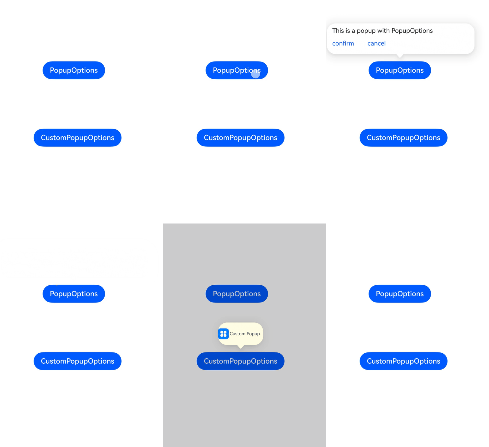
This example shows how to configure the keyboardAvoidMode attribute in PopupOptions or CustomPopupOptions to determine whether the popup avoids the soft keyboard.
The keyboardAvoidMode attribute is added to PopupOptions and CustomPopupOptions since API version 15.
// xxx.ets
@Entry
@Component
struct PopupExample {
  @State handlePopup: boolean = false;
  @State customPopup: boolean = false;

  // Popup builder
  @Builder popupBuilder() {
    Row({ space: 2 }) {
      // Replace $r('app.media.icon') with the image resource file you use.
      Image($r('app.media.icon')).width(24).height(24).margin({ left: -5 })
      Text('Custom Popup').fontSize(10)
    }.width(100).height(50).padding(5)
  }

  build() {
    Flex({ direction: FlexDirection.Column }) {
      // PopupOptions for setting the popup
      Button('PopupOptions')
        .onClick(() => {
          this.handlePopup = !this.handlePopup;
        })
        .bindPopup(this.handlePopup, {
          message: 'This is a popup with PopupOptions',
          placement: Placement.Top,
          showInSubWindow: false,
          keyboardAvoidMode: KeyboardAvoidMode.DEFAULT, // Set the popup to avoid the soft keyboard.
          primaryButton: {
            value: 'confirm',
            action: () => {
              this.handlePopup = !this.handlePopup;
              console.info('confirm Button click');
            }
          },
          // Secondary button
          secondaryButton: {
            value: 'cancel',
            action: () => {
              this.handlePopup = !this.handlePopup;
              console.info('cancel Button click');
            }
          },
          onStateChange: (e) => {
            console.info(JSON.stringify(e.isVisible));
            if (!e.isVisible) {
              this.handlePopup = false;
            }
          }
        })
        .position({ x: 100, y: 150 })


      // CustomPopupOptions for setting the popup
      Button('CustomPopupOptions')
        .onClick(() => {
          this.customPopup = !this.customPopup;
        })
        .bindPopup(this.customPopup, {
          builder: this.popupBuilder,
          placement: Placement.Top,
          mask: { color: '#33000000' },
          popupColor: Color.Yellow,
          enableArrow: true,
          keyboardAvoidMode: KeyboardAvoidMode.DEFAULT, // Set the popup to avoid the soft keyboard.
          showInSubWindow: false,
          onStateChange: (e) => {
            if (!e.isVisible) {
              this.customPopup = false;
            }
          }
        })
        .position({ x: 80, y: 300 })
    }.width('100%').padding({ top: 5 })
  }
} 
[h2]Example 2: Setting the Popup Text Style
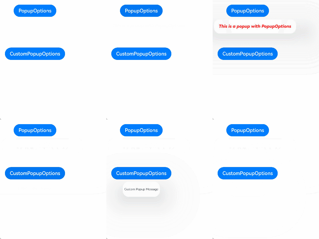
In this example, the messageOptions attribute in PopupOptions is configured to display a popup with a custom text style.
// xxx.ets

@Entry
@Component
struct PopupExample {
  @State handlePopup: boolean = false;

  build() {
    Column({ space: 100 }) {
      Button('PopupOptions').margin(100)
        .onClick(() => {
          this.handlePopup = !this.handlePopup;
        })
        .bindPopup(this.handlePopup, {
          // Popup of the PopupOptions type
          message: 'This is a popup with PopupOptions',
          messageOptions: {
            // Text style of the popup
            textColor: Color.Red,
            font: {
              size: '14vp',
              style: FontStyle.Italic,
              weight: FontWeight.Bolder
            }
          },
          placement: Placement.Bottom,
          enableArrow: false, // Set the arrow not to display.
          targetSpace: '15vp',
          onStateChange: (e) => {
            console.info(JSON.stringify(e.isVisible));
            if (!e.isVisible) {
              this.handlePopup = false;
            }
          }
        })
    }.margin(20)
  }
} 
[h2]Example 3: Setting the Popup Style
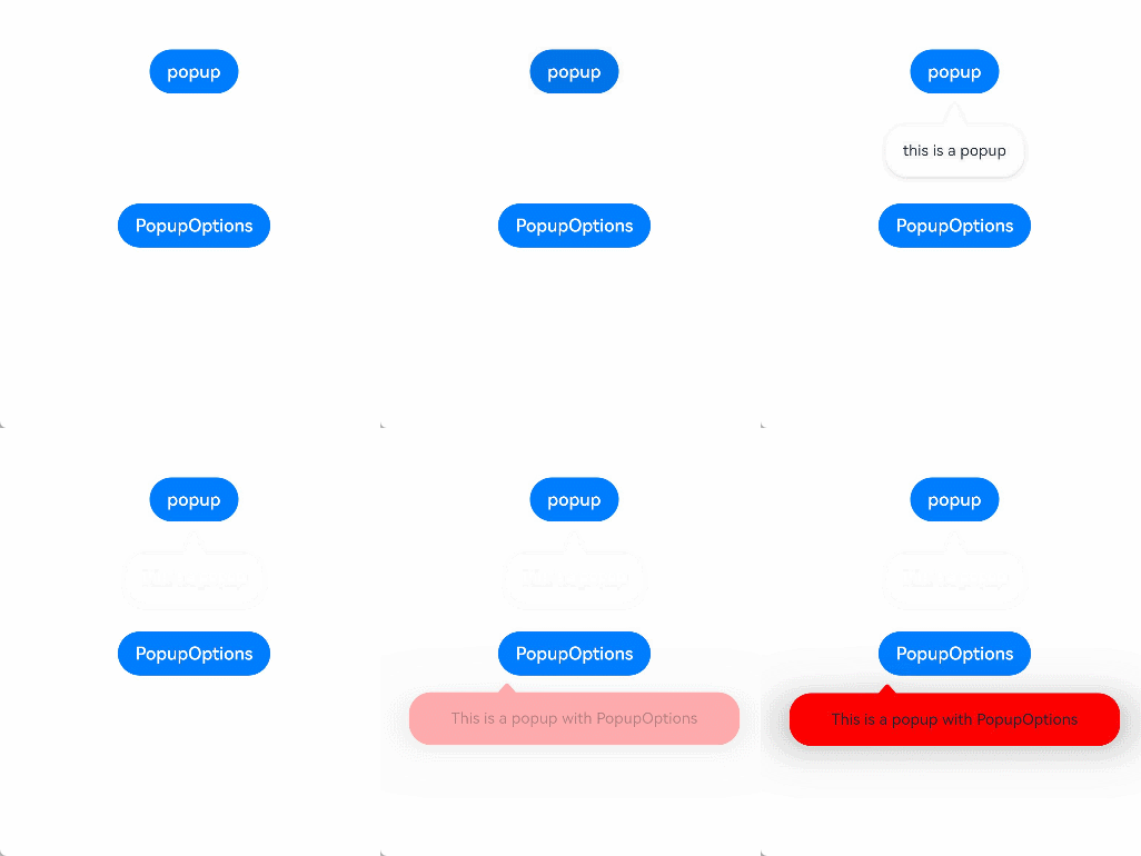
This example sets the arrowHeight, arrowWidth, radius, shadow, and popupColor attributes in PopupOptions to implement the style of the popup arrow and the popup itself.
// xxx.ets

@Entry
@Component
struct PopupExample {
  @State customPopup: boolean = false;
  @State handlePopup: boolean = false;

  build() {
    Column({ space: 100 }) {
      Button('popup')
        .margin({ top: 50 })
        .onClick(() => {
          this.customPopup = !this.customPopup;
        })
        .bindPopup(this.customPopup!!, {
          message: 'this is a popup',
          arrowHeight: 20, // Set the height for the popup arrow.
          arrowWidth: 20, // Set the width for the popup arrow.
          radius: 20, // Set the corner radius of the popup.
          shadow: ShadowStyle.OUTER_DEFAULT_XS, // Set the shadow for the popup.
        })

      Button('PopupOptions')
        .onClick(() => {
          this.handlePopup = !this.handlePopup;
        })
        .bindPopup(this.handlePopup!!, {
          width: 300,
          message: 'This is a popup with PopupOptions',
          arrowPointPosition: ArrowPointPosition.START, // Set the position for the popup arrow.
          backgroundBlurStyle: BlurStyle.NONE, // Disable the background blur for the popup.
          popupColor: Color.Red, // Set the background color for the popup.
          autoCancel: true,
        })
    }
    .width('100%')
  }
} 
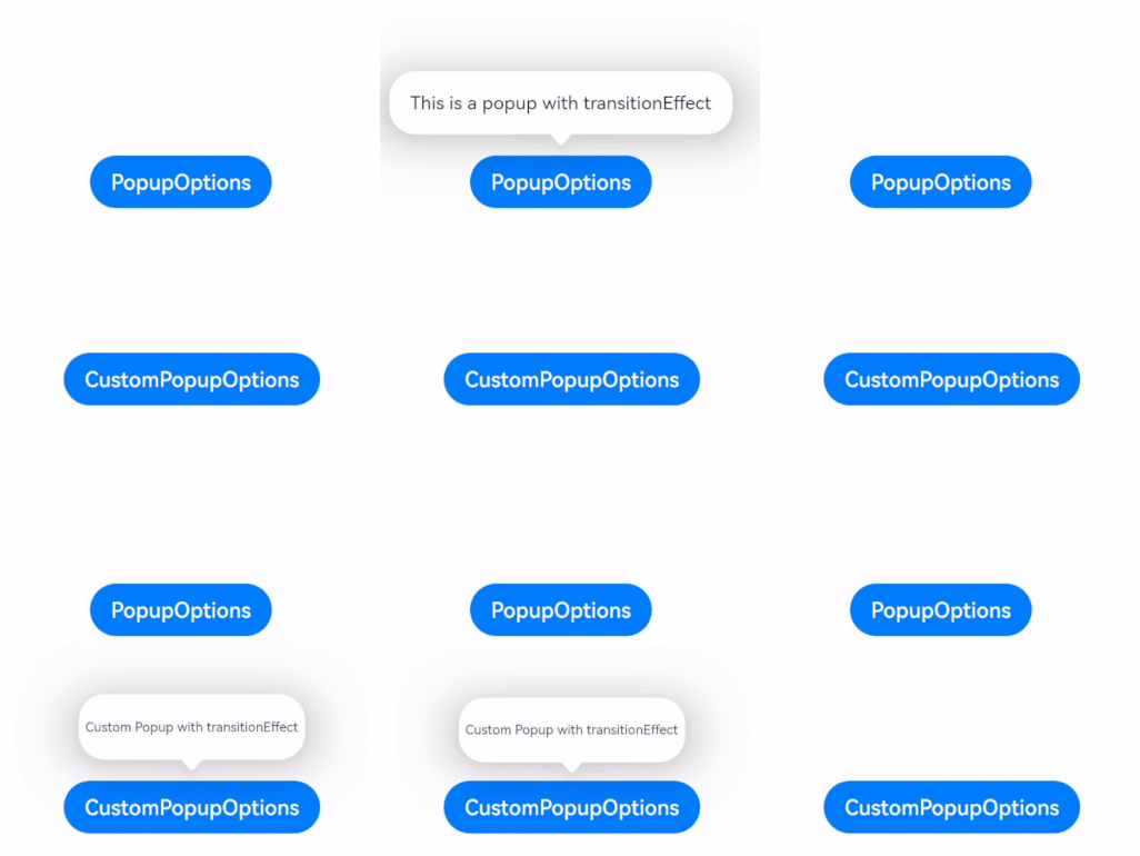
[h2]Example 4: Setting the Popup Animation
This example shows how to configure the transition attribute in PopupOptions or CustomPopupOptions to implement the entrance and exit animations on the popup.
// xxx.ets
@Entry
@Component
struct PopupExample {
  @State handlePopup: boolean = false;
  @State customPopup: boolean = false;

  // Popup builder
  @Builder
  popupBuilder() {
    Row() {
      Text('Custom Popup with transitionEffect').fontSize(10)
    }.height(50).padding(5)
  }

  build() {
    Flex({ direction: FlexDirection.Column }) {
      // PopupOptions for setting the popup
      Button('PopupOptions')
        .onClick(() => {
          this.handlePopup = !this.handlePopup;
        })
        .bindPopup(this.handlePopup, {
          message: 'This is a popup with transitionEffect',
          placement: Placement.Top,
          showInSubWindow: false,
          onStateChange: (e) => {
            console.info(JSON.stringify(e.isVisible));
            if (!e.isVisible) {
              this.handlePopup = false;
            }
          },
          // Set the popup animation to a combination of opacity and translation effects, with no exit animation.
          transition: TransitionEffect.asymmetric(
            TransitionEffect.OPACITY.animation({ duration: 1000, curve: Curve.Ease }).combine(
              TransitionEffect.translate({ x: 50, y: 50 })),
            TransitionEffect.IDENTITY)
        })
        .position({ x: 100, y: 150 })

      // CustomPopupOptions for setting the popup
      Button('CustomPopupOptions')
        .onClick(() => {
          this.customPopup = !this.customPopup;
        })
        .bindPopup(this.customPopup, {
          builder: this.popupBuilder,
          placement: Placement.Top,
          showInSubWindow: false,
          onStateChange: (e) => {
            if (!e.isVisible) {
              this.customPopup = false;
            }
          },
          // Set the popup entrance and exit animations to be a scaling effect.
          transition: TransitionEffect.scale({ x: 1, y: 0 }).animation({ duration: 500, curve: Curve.Ease })
        })
        .position({ x: 80, y: 300 })
    }.width('100%').padding({ top: 5 })
  }
} 
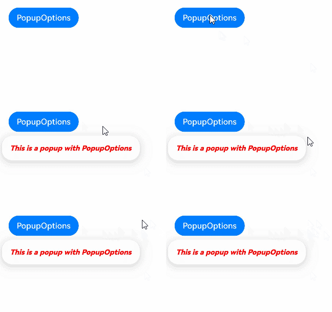
[h2]Example 5: Adding an Event to a Popup
This example shows how to use the onWillDismiss attribute in PopupOptions to intercept popup dismissal events and execute callback functions.
// xxx.ets

@Entry
@Component
struct PopupExample {
  @State handlePopup: boolean = false;
  build() {
    Column() {
      Button('PopupOptions')
        .onClick(() => {
          this.handlePopup = true;
        })
        .bindPopup(this.handlePopup, {
          message: 'This is a popup with PopupOptions',
          messageOptions: {
            textColor: Color.Red,
            font: {
              size: '14vp',
              style: FontStyle.Italic,
              weight: FontWeight.Bolder
            }
          },
          placement: Placement.Bottom,
          enableArrow: false,
          targetSpace: '15vp',
          onStateChange: (e) => {
            if (!e.isVisible) {
              this.handlePopup = false;
            }
          },
          /**
           * Callback for intercepting the popup before it is closed.
           * dismissPopupAction: popup closing behavior object, containing the closing reason and method.
           */
          onWillDismiss: (
            (dismissPopupAction: DismissPopupAction) => {
              console.info('dismissReason:' + JSON.stringify(dismissPopupAction.reason));
              if (dismissPopupAction.reason === DismissReason.PRESS_BACK) {
                dismissPopupAction.dismiss();
              }
            }
          )
        })
    }.margin(20)
  }
} 
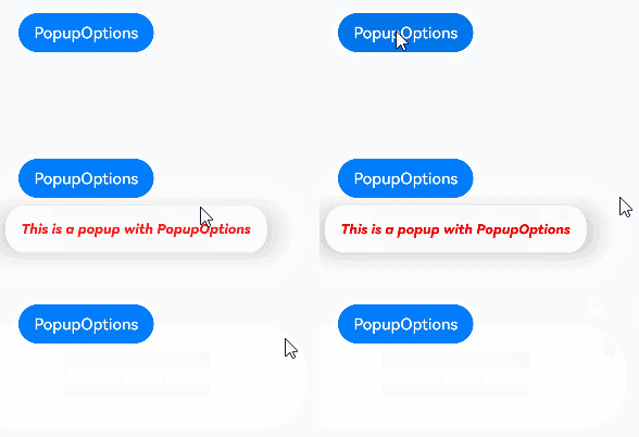
[h2]Example 6: Intercepting the Popup Dismissal Event
In this example, the onWillDismiss attribute in PopupOptions is set to false, so that the popup does not respond to the exit event. In addition, you can set the followTransformOfTarget attribute of PopupOptions to determine whether the popup follows the changes of the host component.
// xxx.ets

@Entry
@Component
struct PopupExample {
  @State handlePopup: boolean = false;
  private timer: number = -1;

  build() {
    Column() {
      Button('PopupOptions')
        .onClick(() => {
          this.handlePopup = true;
        })
        .bindPopup(this.handlePopup, {
          message: 'This is a popup with PopupOptions',
          messageOptions: {
            textColor: Color.Red,
            font: {
              size: '14vp',
              style: FontStyle.Italic,
              weight: FontWeight.Bolder
            }
          },
          placement: Placement.Bottom,
          enableArrow: false,
          targetSpace: '15vp',
          // The popup changes synchronously with the translation and scaling of the button.
          followTransformOfTarget: true,
          onStateChange: (e) => {
            // Set the popup to automatically close after 6 seconds.
            if (e.isVisible) {
              this.timer = setTimeout(() => {
                this.handlePopup = false;
              }, 6000);
            } else {
              this.handlePopup = false;
              if (this.timer !== -1) {
                clearTimeout(this.timer);
                this.timer = -1;
              }
            }
          },
          // The popup does not respond to the tap, swipe (left or right), three-key back, route redirection, or keyboard ESC exit events. The popup exits only when the value of the popup display status parameter is set to false.
          onWillDismiss: false
        })
    }.margin(20)
  }
} 
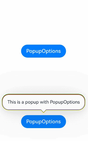
[h2]Example 7: Setting the Linear Gradient for the Inner and Outer Outlines of a Popup
This example configures the outlineWidth, borderWidth, outlineLinearGradient, and borderLinearGradient attributes in PopupOptions to set the color and direction of the linear gradient of the inner and outer outlines of the popup.
The outlineWidth, borderWidth, outlineLinearGradient, and borderLinearGradient attributes are added to PopupOptions since API version 20.
// xxx.ets
@Entry
@Component
struct PopupExample {
  @State handlePopup: boolean = false

  build() {
    Flex({ direction: FlexDirection.Column }) {
      Button('PopupOptions')
        .onClick(() => {
          this.handlePopup = !this.handlePopup
        })
        /**
         * Bind a popup to the button.
         * First parameter: variable for controlling the popup display.
         * message: text displayed in the popup.
         * placement.Top: The popup is displayed above the button.
         * outlineWidth: width of the outside outline (1 vp).
         * outlineLinearGradient: vertical linear gradient from yellow to green for the outside outline.
         * borderWidth: width of the inner border of the popup window (1 vp).
         * borderLinearGradient: vertical linear gradient from red to blue for the inner border.
         */
        .bindPopup(this.handlePopup!!, {
          message: 'This is a popup with PopupOptions',
          placement: Placement.Top,
          outlineWidth: 1,
          outlineLinearGradient: {
            direction: GradientDirection.Top,
            colors: [[Color.Yellow, 0.0], [Color.Green, 1.0]]
          },
          borderWidth: 1,
          borderLinearGradient: {
            direction: GradientDirection.Bottom,
            colors: [[Color.Red, 0.0], [Color.Blue, 1.0]]
          }
        })
        .position({ x: 100, y: 150 })
    }.width('100%').padding({ top: 5 })
  }
} 
[h2]Example 8: Setting the Mode for the Popup to Avoid the Bound Component
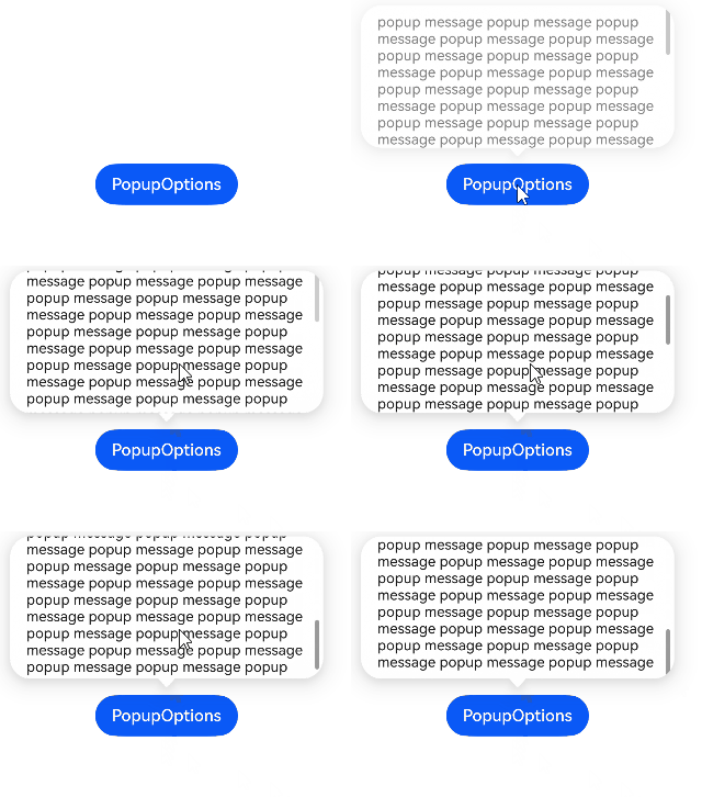
This example configures the avoidTarget attribute of PopupOptions to enable the popup to avoid the bound component.
The avoidTarget attribute is added to PopupOptions since API version 20.
// xxx.ets
@Entry
@Component
struct PopupExample {
  @State handlePopup: boolean = false;

  build() {
    Flex({ direction: FlexDirection.Column }) {
      Button('PopupOptions')
        .onClick(() => {
          this.handlePopup = !this.handlePopup
        })
        .bindPopup(this.handlePopup!!, {
          message: 'popup message '.repeat(200),
          placement: Placement.Top,
          // When the remaining display space is insufficient, the popup is compressed and displayed in the maximum space.
          avoidTarget: AvoidanceMode.AVOID_AROUND_TARGET,
        })
        .position({ x: 100, y: 150 })
    }.width('100%').padding({ top: 5 })
  }
} 
[h2]Example 9: Setting the System Material Effect of a Popup
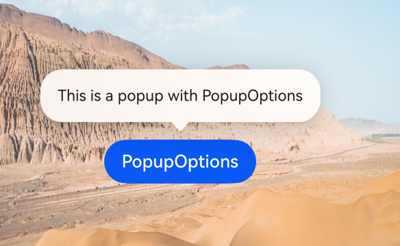
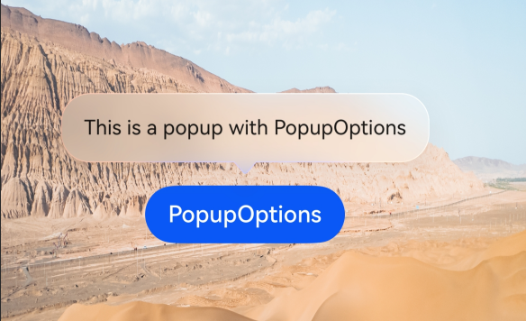
This example demonstrates how to implement the system material effect of a popup by setting the systemMaterial attribute in PopupOptions.
The systemMaterial attribute is added to PopupOptions as of API version 26.0.0.
import { uiMaterial } from '@kit.ArkUI';

@Entry
@Component
struct PopupExample {
  @State handlePopup: boolean = false;

  build() {
    Flex({ direction: FlexDirection.Column }) {
      Button('PopupOptions')
        .onClick(() => {
          this.handlePopup = !this.handlePopup
        })
        /**
         * Bind a popup to a button.
         * The first parameter is a Boolean value that indicates whether to display the popup.
         * message: text displayed in the popup.
         * placement.Top: The popup is displayed above the button.
         * systemMaterial: configures an immersive frosted material for the popup.
         * ImmersiveStyle.THIN: thin frosted material with medium transparency.
         */
        .bindPopup(this.handlePopup!!, {
          message: 'This is a popup with PopupOptions',
          placement: Placement.Top,
          // Control whether to set the system material.
          systemMaterial: new uiMaterial.ImmersiveMaterial({
            style: uiMaterial.ImmersiveStyle.THIN
          })
        })
        .position({ x: 100, y: 300 })
    }.width('100%')
    // Replace the resource file with the actual one.
    .backgroundImage($r('app.media.img'))
    .backgroundImageSize({ width: '100%', height: '100%' })
  }
}
Menu without system material
Menu with system material
[h2]Example 10: Customizing the Background Effect of a Popup
This example customizes the popup background effect by setting the backgroundBlurStyleOptions and backgroundEffect attributes of PopupOptions.
In API version 26.0.0 and later, the backgroundBlurStyleOptions and backgroundEffect attributes are added to PopupOptions.
// xxx.ets
@Entry
@Component
struct PopupExample {
  @State handlePopup: boolean = false;

  build() {
    Flex({ direction: FlexDirection.Column }) {
      Button('Popup custom background effect 1')
        .onClick(() => {
          this.handlePopup = !this.handlePopup
        })
        /**
         * Bind the popup and use the system criterion frosted blur style.
         * message: long text content of the popup. The repeated concatenation of long text is used to test the line break and blur effect.
         * backgroundBlurStyleOptions: immersive blur configuration item of the system.
         * colorMode.LIGHT: light theme color mode.
         * adaptiveColor.AVERAGE: The average color of the background is used as the base color for frosted effect.
         * scale: transparency scaling coefficient of the frosted effect, which is 0.5 in this example.
         * blurOptions.grayscale: grayscale filter range [minimum value, maximum value].
         */
        .bindPopup(this.handlePopup!!, {
          message: 'popup message '.repeat(20),
          backgroundBlurStyleOptions: {
            colorMode: ThemeColorMode.LIGHT,
            adaptiveColor: AdaptiveColor.AVERAGE,
            scale: 0.5,
            blurOptions: { grayscale: [20, 20] },
          }
        })
        .position({ x: 100, y: 150 })

      Button('Popup custom background effect 2')
        .onClick(() => {
          this.handlePopup = !this.handlePopup
        })
        /**
         * Bind the popup and use the fully customized mixed background effect.
         * radius: The background blur radius is 60, indicating a higher blur degree.
         * saturation: saturation 0, indicating that the image is desaturated and displayed in black and white.
         * brightness: brightness 1, indicating that the original brightness remains unchanged.
         * color: pink background color is added.
         * blurOptions.grayscale: grayscale filter parameters.
         */
        .bindPopup(this.handlePopup!!, {
          message: 'popup message '.repeat(20),
          backgroundEffect: {
            radius: 60,
            saturation: 0,
            brightness: 1,
            color: Color.Pink,
            blurOptions: { grayscale: [20, 20] }
          }
        })
        .position({ x: 100, y: 400 })
    }.width('100%')
    // Replace the resource file with the actual one.
    .backgroundImage($r('app.media.img'))
    .backgroundImageSize({ width: '100%', height: '100%' })
  }
}
[h2]Example 11: Setting the Display Level Mode of a Popup
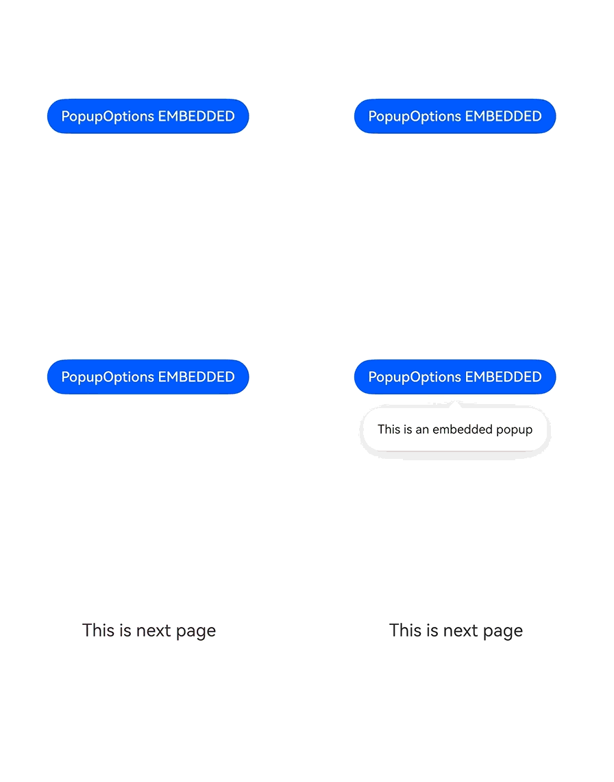
This example configures the levelMode attribute of PopupOptions to display a popup on the page. After the button is clicked, the page-level popup will not be displayed on the next route page.
From API version 26.0.0, the levelMode attribute is added to PopupOptions.
import { LevelMode } from '@kit.ArkUI';

@Entry
@Component
struct PopupExample {
  @State handlePopup: boolean = false;

  build() {
    Column() {
      Button('PopupOptions EMBEDDED')
        .id('targetButton')
        .onClick(() => {
          // Switch the popup display or hiding status.
          this.handlePopup = !this.handlePopup;
          // Delay the route redirection for 500 ms to ensure that the popup animation is played.
          setTimeout(() => {
            // pages/PageTwo needs to be replaced with the actual route name.
            this.getUIContext().getRouter().pushUrl({ url: 'pages/PageTwo'}).catch(() => {
              console.error("route to PageTwo error!")
            })
          }, 500)
        })
        /**
         * Bind the popup to the current button.
         * First parameter: Boolean value for popup display control.
         * message: text displayed in the popup.
         * levelMode: EMBEDDED. The popup belongs to the current page. When the page is redirected, the popup is destroyed synchronously.
         */
        .bindPopup(this.handlePopup!!, {
          message: 'This is an embedded popup',
          levelMode: LevelMode.EMBEDDED,
        })
        .position({ x: 60, y: 300 })
    }.width('100%').padding({ top: 5 })
  }
}
PageTwo:
@Entry
@Component
struct PageTwo {
  build() {
    Column() {
      Text("This is next page")
    }
    .position({ x: 120, y: 300 })
  }
}