Developers can use the focus management capability of the Web component to effectively manage focus gain and focus loss of the Web component, and use the W3C standard APIs on the H5 side to manage focus gain and focus loss of the only interactive element on the web page.
-
Application scenarios of common APIs for controlling the focus of the Web component and ArkUI component:
- Use requestFocus to request the focus for a Web component: When an application has multiple components, you can use requestFocus of the Web component to move the focus to the Web component.
- Change the Web component style based on the focus state: The component listens for focus event to modify the component style, such as the border and background color. This provides visual and interactive feedback.
-
Application scenarios of common APIs for controlling the focus of the HTML5 element in the Web component:
- Use the tabindex attribute to manage the element focus: You can define the focus sequence of elements in the Web component through the tabindex attribute. For example, by setting it to -1, you can focus the element through the script and control the visibility of the element in CSS.
- Update the focus position based on keyboard events: Listen for keyboard events, such as the Tab key, so that the focus position can be updated based on user operations.
- Change the element style in the Web component based on the focus state: Add styles, such as the border and background color, to the focus element to provide visual and interaction feedback.
Basic Concepts
For details about the focus, focus chain, and focus navigation of the Web component, see Basic Concepts of ArkUI Focus.
- Focus:
- Component focus: unique interactive element on the current application UI.
- Element focus: unique interactive element on the current web page.
- Focus navigation:
- Focus navigation: refers to the behavior of focus shifting between components in an application. This process is transparent to the user but can be monitored through onFocus and onBlur events.
- Element focus navigation: refers to the behavior of focus shifting between elements on a web page. This behavior complies with the W3C standard. You can obtain the changes by listening for the focus (triggered when the element obtains the focus) and blur (triggered when the element loses the focus) events.
Focus Traversal Guidelines
Focus traversal can be divided into active and passive based on how it is triggered. For details, see Focus Traversal Guidelines.
[h2]Active Focus Traversal
Refers to focus movement initiated by deliberate actions, such as keyboard shortcuts (Tab or Shift+Tab) and clicks or touches through (the gesture, mouse, or touchpad).
-
requestFocus
Moves focus to a specific component. For details, see Controlling the Focus of the Web Component and ArkUI Component.
-
Keyboard traversal
- Supports focus navigation between the Web component and other components through the TAB and Shift+TAB keys.
- Supports focus navigation among web page elements inside the Web component through the TAB and Shift+TAB keys. After the focus navigation of page elements is complete, focus is returned to ArkUI to continue the focus navigation in the framework.
-
Click/Touch for focus
Users can use gestures, the mouse, or touchpad to click/touch a Web component to obtain the focus. Elements in the Web component can also be focused when being clicked/touched. For example, an input box in a web page can be clicked/touched to change from a non-editable state to an editable state and activate the input method.
[h2]Passive Focus Traversal
Passive focus traversal occurs when the focus automatically shifts due to system actions or other operations without manual intervention, reflecting the default behavior of the focus system.
Passive focus traversal occurs in the following scenarios:
-
Component removal: When the focused Web component is removed, the system shifts focus to an adjacent sibling component following a back-to-front order. If no sibling components can gain focus, the focus is released and the parent component is notified to handle the focus.
-
Attribute change: If the focusable or enabled attribute of a focused component is set to false, or the visibility attribute is set to invisible, the system automatically moves focus to another focusable component, using the same method as component removal.
-
Invisible Web components: After the Web component gains focus, in scenarios such as app foreground and background switchover, page switchover, and navigation, the Web component loses focus and then gains focus again.
-
Web page loading: When the Web component loads a web page through src, loadUrl, and loadData, it gains focus by default. However, if the Web component is not focusable at this time, focus gain fails (common reasons for the non-focusable state include: the parent component is not focusable during a transition animation, or the app sets the Web component or its parent component to non-focusable). The app can call the focus request API requestFocus to try to make the Web component gain focus again. After focus is gained successfully, both the app-side onFocus event and the W3C focus event are reported.
-
autofocus: Elements with the autofocus style are focused by default after web pages are loaded. If the element supports text input, the cursor blinks in the text box, but the soft keyboard is not displayed. For details about how to automatically display the soft keyboard, see Automatically Displaying the Soft Keyboard.
-
Menu popup: ArkUI components of the overlay attribute type grab focus by default. In scenarios where the Web component is combined with such components (Menu, DatePicker, TimePicker, drop-down boxes, dialog boxes, and so on), the Web component loses focus.
Controlling the Focus of the Web Component and ArkUI Component
- onFocus: common focus obtaining callback API on the application side. When a component bound to this API is focused, the callback responses.
- onBlur: common defocus callback API on the application side. When a component bound to this API loses focus, the callback responses.
- To enable the component to proactively obtain focus, invoke the requestFocus API on the application side.
- To set whether a Web component can obtain the focus, set the focusable attribute. The Web component can obtain the focus by default.
Example
- Use the requestFocus API to allow the Web component to proactively obtain the focus.
- The onFocus and onBlur APIs are usually used in pairs to listen for the focus changes of the component.
import { webview } from '@kit.ArkWeb';
import { BusinessError } from '@kit.BasicServicesKit';

@Entry
@Component
struct WebComponent {
  controller: webview.WebviewController = new webview.WebviewController();
  controller2: webview.WebviewController = new webview.WebviewController();
  @State webBorderColor: Color = Color.Red;
  @State webBorderColor2: Color = Color.Red;

  build() {
    Column() {
      Row() {
        Button('web1 requestFocus')
          .onClick(() => {
            try {
              this.controller.requestFocus();
            } catch (error) {
              console.error(`ErrorCode: ${(error as BusinessError).code},  Message: ${(error as BusinessError).message}`);
            }
          });
        Button('web2 requestFocus')
          .onClick(() => {
            try {
              this.controller2.requestFocus();
            } catch (error) {
              console.error(`ErrorCode: ${(error as BusinessError).code},  Message: ${(error as BusinessError).message}`);
            }
          });
      }
      Web({ src: 'www.example.com', controller: this.controller })
        .onFocus(() => {
          this.webBorderColor = Color.Green;
        })
        .onBlur(() => {
          this.webBorderColor = Color.Red;
        })
        // ···
        .margin(3)
        .borderWidth(10)
        .borderColor(this.webBorderColor)
        .height('45%')

      Web({ src: 'www.example.com', controller: this.controller2 })
        .onFocus(() => {
          this.webBorderColor2 = Color.Green;
        })
        .onBlur(() => {
          this.webBorderColor2 = Color.Red;
        })
        .margin(3)
        .borderWidth(10)
        .borderColor(this.webBorderColor2)
        .height('45%')
    }
  }
}
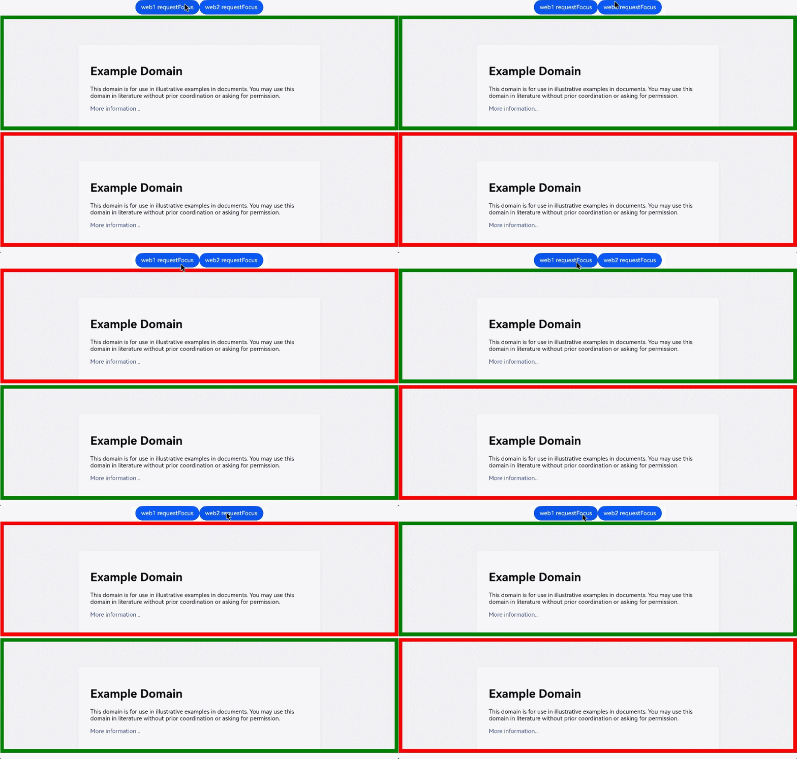
Figure 1 Component focus gain/loss events
Use requestFocus to request focus, and change the border color of the Web component by listening for the onFocus and onBlur events.
Controlling the Focus of HTML5 Elements in the Web Component
- Use the focus event of the W3C standards to detect whether an element is focused on a web page.
addEventListener("focus", (event) => {});

onfocus = (event) => {}; - Use the blur event of the W3C standards to detect whether an element loses focus on a web page.
addEventListener("blur", (event) => {});

onblur = (event) => {}; - W3C autofocus, indicating that the element should gain focus when the page is loaded or when its dialog is displayed.
<input name="q" autofocus />
In a document or dialog box, only one element can have the autofocus attribute. If you apply this attribute to multiple elements, the first element will be focused.
Example
import { webview } from '@kit.ArkWeb';

@Entry
@Component
struct WebComponent {
  controller: webview.WebviewController = new webview.WebviewController();

  build() {
    Column() {
      Web({ src: $rawfile('test.html'), controller: this.controller })
    }
  }
}
HTML file to be loaded:
<!-- test.html -->
<!DOCTYPE html>
<html>
<head>
<meta charset="utf-8">
<title>test</title>
</head>
<body>
  <form id="form">
    <input type="text" placeholder="text input" />
    <input type="password" placeholder="password" />
  </form>
</body>
<script>
const form = document.getElementById("form");

form.addEventListener(
  "focus",
  (event) => {
    event.target.style.background = "pink";
  },
  true,
);

form.addEventListener(
  "blur",
  (event) => {
    event.target.style.background = "";
  },
  true,
);
</script>
</html>
Example 2 focus/blur events
Change the input background color by listening for the W3C focus and blur events.
