pushOptions
| Parameter | Mandatory | Type | Description |
|---|---|---|---|
| testMessage | No | Boolean | Indicates whether a message is a test message. The options are as follows: - false (default): formal message - true: test message Note: When testMessage is set to true, a maximum of 1000 test messages can be pushed for a single project on a daily basis, and a maximum of 10 tokens can be carried in each push message. Please note that the quantity (1000) here indicates the number of requests successfully sent by the REST API, but not necessarily the number of messages that successfully reach the devices. Only one token can be carried each time a widget update message is pushed. |
| ttl | No | Integer | Message cache duration, in seconds. When a user device is offline, the Push Kit server caches messages. If the user device goes online within the message cache duration, the messages are delivered. Otherwise, the messages are discarded. The default value is 86400 (1 day), and the maximum value is 1296000 (15 days). Note: When pushing an in-app call message or pushing a notification message or text-to-speech message for a VoIP call, you are advised to set ttl to a duration within 30 to 60 seconds. |
| biTag | No | String | Tag of a message in a batch delivery task. The tag is returned to the app server when Push Kit sends the message receipt. The value contains a maximum of 64 bytes. |
| receiptId | No | String | Unique receipt ID, specifying the receipt address and configuration for the current downlink message. You can check the receipt ID in Setting Receipt Parameters. |
| collapseKey | No | Integer | Mode for the Push Kit server to cache messages sent to an offline device. These cached messages will be delivered once the device goes online again. The options are as follows: -1 (default): All messages are cached. 0-100: offline message cache group ID. Offline messages are cached by group. In each group, only the latest offline message can be cached for each app. For example, if you send 10 messages and set collapseKey to 1 for the first five messages and to 2 for the rest, the latest message whose value of collapseKey is 1 and the latest message whose value of collapseKey is 2 are sent to the user after the user's device goes online. Note: The collapseKey parameter takes effect only for messages whose push-type is set to one of the following values: 0: notification message 2: text-to-speech message |
target
| Parameter | Mandatory | Type | Description |
|---|---|---|---|
| token | Yes | Array [String] | Token used to push messages to target users. Note: Only one token can be carried each time a widget update message is sent. In other scenarios, a maximum of 1000 tokens can be carried each time a message is sent. |
AlertPayload (Notification Message)
For details about the request body example, please refer to Notification Message.
| Parameter | Mandatory | Type | Description |
|---|---|---|---|
| notification | Yes | Notification Object | Notification message structure. For details, please refer to Notification. |
[h2]Notification
| Parameter | Mandatory | Type | Description |
|---|---|---|---|
| category | Yes | String | Notification message type. After the message self-classification permission has been obtained, this parameter is used to identify the message type. Different notification message types will affect the message display and alerting styles. The options are as follows: Service and communication · IM: instant messaging · VoIP: voice or video call invitation · MISS_CALL: missed call notification · SUBSCRIPTION: subscription · TRAVEL: travel · HEALTH: health · WORK: work reminder · ACCOUNT: account updates · EXPRESS: order & logistics · FINANCE: finance · DEVICE_REMINDER: device reminder · MAIL: email · PLAY_VOICE: voice broadcast Note: The PLAY_VOICE type can be used for sending only text-to-speech messages whose push-type is 2. News and marketing · MARKETING: news, content recommendation, social media feeds, product promotion, financial news, life news, survey, function recommendation, and operational activities (for content marking only; no message sending acceleration). Note: If you need to send only MARKETING messages, you do not need to apply for the message self-classification permission. The frequency control rule for MARKETING messages is different from that for other types of notification messages. For details, please refer to Notification Message Frequency Control Rules. If frequency control is triggered, rectify the fault by referring to Message Frequency Control Problems. |
| title | Yes | String | Notification message title. (Note the message body size limits. For details, please refer to Restrictions.) |
| body | Yes | String | Notification message content. (Note the message body size limits. For details, please refer to Restrictions.) |
| image | No | String | URL of the large icon on the right of a notification. The URL must use the HTTPS protocol. (Note the message body size limits. For details, please refer to Restrictions.) Note: · Wearables do not support the large icon style on the right. · The supported image formats are PNG, JPG, JPEG, and BMP. The total byte count of the image pixels must not exceed 192 KB. If it exceeds this limit, the image will not be displayed. · Since version 6.1.0(23), WEBP images are supported. |
| overlayIcon | No | String | URL of the notification overlay icon. The URL must use the HTTPS protocol. (Note the message body size limits. For details, please refer to Restrictions.) Note: · The supported image formats are PNG, JPG, JPEG, BMP, and WEBP. The total byte count of the image pixels must not exceed 192 KB. If it exceeds this limit, the image will not be displayed. · This parameter only applies to messages with category set to IM, VOIP, or MISS_CALL. Since: 6.1.0(23) |
| style | No | Integer | Notification message style. 0 (default): common notification 1: large text style 3: multi-line text style (For details about the application scenarios, please refer to the development guide.) Note: · The large text style (style = 1) will be deprecated. You are advised to use the common notification style (style = 0). · Wearables do not support the large text style or multi-line text style. |
| bigTitle | No | String | Title of a notification in the large text style. This parameter is mandatory when style is set to 1. After bigTitle is specified, the value of bigTitle instead of that of title will be displayed in the notification panel. (Note the message body size limits. For details, please refer to Restrictions.) Note: · This parameter will be deprecated. You are advised to use the title parameter. · Wearables do not support the large text style. |
| bigBody | No | String | Content of a notification in the large text style. This parameter is mandatory when style is set to 1. After bigBody is specified, the value of bigBody instead of that of body will be displayed in the notification panel. (Note the message body size limits. For details, please refer to Restrictions.) Note: · This parameter will be deprecated. You are advised to use the body parameter. · Wearables do not support the large text style. |
| notifyId | No | Integer | Unique notification ID of a message. If a message does not contain the ID or the ID is -1, Push Kit will generate a unique ID for the message. Different notification messages can use the same notification ID, so that new messages can overwrite old messages. This parameter is mandatory if the message may need to be revoked later, and the value range is [0, 2147483647]. For details, please refer to Message Revocation. |
| appMessageId | No | String | Unique ID of an app message. If a message does not contain the ID, no value will be assigned to appMessageId by default. The value is a string of 1–64 characters, including uppercase letters, lowercase letters, digits, spaces, and the following special characters: + / = - _ Note: · When multiple app messages with the same appMessageId are received through multiple channels (Push Kit, Near Field Communications, app-initiated data fetch from the cloud, or local notification sending), the target device displays only the earliest message within the validity period (24 hours by default). · notifyId is used as the basis for overwriting old messages with new messages. However, if two messages have the same notifyId and same appMessageId, the old message will be displayed. |
| profileId | No | String | Anonymous identifier of an account in the app's account system. The value contains a maximum of 64 characters. |
| inboxContent | No | Array [String] | Content of a notification in the multi-line text style. This parameter is mandatory when style is set to 3. A message supports a maximum of three lines of text, and each line can contain up to 1024 characters, with an ellipsis (...) indicating truncated content. For details, please refer to inboxContent. Note: Wearables do not support the multi-line text style. |
| clickAction | Yes | ClickAction Object | Action to be triggered upon message tapping. For details, please refer to ClickAction. |
| badge | No | AlertBadge Object | Badge of a notification message. For details, please refer to AlertBadge. If this parameter is not set, the app will not display the badge if no badge exists before, and the badge number remains unchanged if a badge exists. Note: Wearables and TVs do not support the notification badge style. |
| sound | No | String | Custom ringtone. The ringtone file specified here must be stored in the /resources/rawfile directory of the app. For example, the value alert.mp3 corresponds to the /resources/rawfile/alert.mp3 file of the app on the device. The ringtone file format can be MP3, WAV, or MPEG. If this parameter is not set, the default ringtone will be used. If a request does not contain the soundDuration parameter, it is recommended that the ringtone duration not exceed 30 seconds. Any portion exceeding 30 seconds will be truncated. If a request contains the soundDuration parameter, see the description of the soundDuration parameter for details. Note: · Wearables, TVs, and PCs/2-in-1 devices do not support custom ringtones. · When category is set to MARKETING, the notification is silent, and the custom ringtone does not take effect. |
| soundDuration | No | Integer | Custom ringtone duration. The soundDuration parameter must be used together with the sound parameter, and takes effect only when a request contains the sound parameter. The value can contain only digits. The value range is [1, 60], in seconds. The custom ringtone specified by the sound parameter will be played until the duration reaches the value of soundDuration. If the duration of the custom ringtone is shorter than the value of soundDuration, it will loop until the specified time is reached. |
| foregroundShow | No | Boolean | Indicates whether to display notification messages when an app is running in the foreground. true: default value. Notification messages are displayed when the app is running in the foreground or background. In this case, receiveMessage will not be triggered, and message data cannot be obtained. false: Notifications are displayed only when the app is in the background. When an app is in the foreground, notifications will not be displayed; however, the app can use receiveMessage to receive the message content to handle its own service logic. For details, please refer to Processing Notification Messages When the App is Running in the Foreground. Note: The foregroundShow parameter takes effect only for notification messages whose push-type is set to 0. |
| priorityScene | No | String | Priority notification type of a message. The options are as follows: · PRIMARY_CONTACT: important contact message · AT_ME: "@ me" message · URGENT_MESSAGE: urgent message · SCHEDULE_REMINDER: schedule reminder Note: To send priority notification messages, you need to enable the priority notification permission. |
[h2]Example of inboxContent
"inboxContent": [
  "1. Message styles",
  "2. Message reminder and display modes",
  "3. Support notification message localization"
]
[h2]ClickAction
| Parameter | Mandatory | Type | Description |
|---|---|---|---|
| actionType | Yes | Integer | Action to be triggered upon message tapping. The options are as follows: 0: open the app home page 1: open a custom app page 3: delete a notification message 5: open the dialer screen The supported action types vary depending on the scenario. For details, please refer to Actions Upon Message Tapping in Different Scenarios. |
| action | No | String | Action corresponding to the ability of an in-app page. When actionType is set to 1, either uri or action must be set. If the page path corresponding to action does not exist, the app home page is displayed by default. For details about how to set action, please refer to Opening an In-app Page upon Message Tapping. |
| uri | No | String | URI corresponding to the ability of an in-app page. For details about the internal structure of the URI object, please refer to the skills tag. When actionType is set to 1, either uri or action must be set. If there are multiple abilities, set action or uri for each ability. The action parameter is preferentially used to search for the corresponding in-app page. For details about how to set uri, please refer to Opening an In-app Page upon Message Tapping. |
| data | No | Object | Data transferred to an app upon message tapping. The value is a JSON object. For details about how to obtain the data, please refer to Transmitting Data. (Note the message body size limits. For details, please refer to Restrictions.) When actionType is set to 5, data is mandatory. The value is in {"tel": "xxx"} format, where xxx is a phone number which contains a maximum of 20 characters, including the following: · + (can only be the first character) · - · Space character · 0-9 · # Note: When actionType is set to 5, the first character must be the plus sign (+) or a digit ranging from 0 to 9. |
[h2]Actions Upon Message Tapping in Different Scenarios
| push-type | Parameter | Enumerated Values of actionType |
|---|---|---|
| 0 (alert message) | notification.clickAction | 0: open the app home page 1: open a custom app page |
| 2 (text-to-speech message) | notification.clickAction | 0: open the app home page 1: open a custom app page |
| 7 (live view) | notificationData.clickAction | 0: open the app home page 1: open a custom app page |
| 7 (live view) | notificationData.extend.clickAction | 0: open the app home page 1: open a custom app page 3: delete a notification message 5: open the dialer screen Note: If a device does not support the dialer function, no live view can be created even if actionType is set to 5. |
[h2]AlertBadge
| Parameter | Mandatory | Type | Description |
|---|---|---|---|
| addNum | No | Integer | Increment to the badge number, which is an integer ranging from 1 to 99. Note: · Suppose an app currently has N unread messages. If addNum is set to 3, the number displayed on the app badge increases by 3 each time a message that contains addNum is received, that is, the number equals N + 3. (If the sum of N + 3 is greater than 99, 99+ will be displayed on the app badge.) · If addNum is not set, the default value 0 is used, and the number displayed in the app badge does not increase. |
| setNum | No | Integer | Badge number, which is an integer ranging from 0 to 99. This is the actual number displayed in the app badge. Note: The priority of setNum is higher than that of addNum. · If setNum is not passed, addNum will be used. · If setNum is greater than or equal to 0, setNum is passed and will be used. The notification will not contain the addNum parameter. |
BadgePayload (Badge Update Message)
For details about the request body example, please refer to Badge Update Message.
| Parameter | Mandatory | Type | Description |
|---|---|---|---|
| notification | Yes | BadgeNotification Object | Badge update message structure. For details, please refer to BadgeNotification. |
[h2]Badge
| Parameter | Mandatory | Type | Description |
|---|---|---|---|
| setNum | Yes | Integer | Badge number, which is an integer ranging from 0 to 99. This is the actual number displayed in the app badge. |
ExtensionPayload (Text-to-Speech Message)
For details about the request body example, please refer to Text-to-Speech Message.
| Parameter | Mandatory | Type | Description |
|---|---|---|---|
| notification | Yes | Notification Object | Notification message structure. For details, please refer to Notification. Note: notification.category is mandatory and its value must be PLAY_VOICE. Before sending a text-to-speech message, you need to apply for the text-to-speech message permission. |
| extraData | Yes | String | Extra data of the text-to-speech message. (Note the message body size limits. For details, please refer to Restrictions.) For details about how to obtain extraData, please refer to Sample Code. |
FormUpdatePayload (Widget Update Message)
For details about the request body example, please refer to Widget Update Message.
| Parameter | Mandatory | Type | Description |
|---|---|---|---|
| formId | Yes | Long | Instance ID of a service widget, which is obtained when onAddForm is called (when a user adds the widget to the home screen). Note that the maximum value of formId generated by a device is 231-1, and the maximum value of formId you can set is 263-1. |
| version | Yes | Integer | Version number of a widget update message. The value ranges from 0 to 231-1. · The version number of a new widget update message must be greater than that of the current widget update message. Otherwise, the update fails. · If the version number of a new widget update message is 0, the widget update version number is reset and this widget update is still valid. The version number of the next widget update message must be greater than 0. |
| images | No | Array [FormImage Object] | Image data of a service widget, which is an array of objects. For details, please refer to FormImage. Currently, the array can contain only one object. For details, please refer to Sample Code. |
| moduleName | Yes | String | Module name of a service widget. The value is the value of name under module in src/main/module.json5 at the project module level. |
| formName | Yes | String | Name of a service widget. The data comes from name of a certain widget configuration under forms in the widget configuration file, which is located in src/main/resources/base/profile at the project module level. For details, please refer to Guide. |
| abilityName | Yes | String | Ability name of a service widget. The value is the ability name of the service widget under extensionAbilities in src/main/module.json5 at the project module level. |
| formData | Yes | Object | Service data of the service widget to be updated, in key-value format. The data comes from the declarative paradigm component name in the widget page file, which is located in src/main/ets/widgets at the project module level. For details, please refer to Guide. Note: · The key in formData cannot start with datashareproxy://. · If the value in formData is of the numeric type, the value cannot exceed 253-1. · The value in formData cannot be null. |
[h2]FormImage
| Parameter | Mandatory | Type | Description |
|---|---|---|---|
| keyName | No | String | Image key. The value must be different from the key of the custom variable data in formData. The data comes from the image component name in the widget page file, which is located in src/main/ets/widgets at the project module level. For details, please refer to Guide. |
| url | No | String | Image download URL. The URL must use the HTTPS protocol. Note: The supported image formats are PNG, JPG, JPEG, and WEBP, with a maximum size of 512 KB. Images exceeding this limit will not be displayed. (Note the message body size limits. For details, please refer to Restrictions.) |
| require | No | Integer | Image update policy. 1: If an image fails to be downloaded, the widget will not be updated. (This is the default value.) 0: If an image fails to be downloaded, only the text of the widget will be updated. |
BackgroundPayload (Background Message)
For details about the request body example, please refer to Background Message.
| Parameter | Mandatory | Type | Description |
|---|---|---|---|
| extraData | Yes | String | Data transferred to an app. (Note the message body size limits. For details, please refer to Restrictions.) Push Kit checks whether the app is in the foreground. If so, Push Kit transfers the data to the target app. If not, Push Kit caches the data or silently writes the data to the app cache. For details about how to obtain extraData, please refer to Sample Code. |
| proxyData | No | String | Indicates whether to use the data proxy to silently write data to the app cache when the app process is not in the foreground. To use the data proxy, you must pass ENABLE. If you do not want to enable the proxy to write data, do not set this parameter in the message body. |
LiveViewPayload (Live View Message)
For details about the live view request example, please refer to Live View Creation Message and Live View Update Message. For details about the api parameter mapping Between Live View Kit and Push Kit, please refer to API Parameter Mapping Between Live View Kit and Push Kit.
Note:
To ensure the timeliness of live view messages, be sure to update the live view content promptly. If a live view is not updated for more than 2 hours, the system will hide the live view display on the status bar and lock screen, but retain its display in the notification panel. If a live view is not updated for more than 4 hours, the system considers that the live view ends and clears the live view from all display entrances.
| Parameter | Mandatory | Type | Description |
|---|---|---|---|
| activityId | Yes | Integer | Unique ID of a live view, which is generated by you. The value range is [–2147483648, 2147483647]. This parameter corresponds to the id field in Live View Kit. Note: If the live view corresponding to a specific activityId does not exist in the scenario of updating or ending a live view, the use of this activityId to send live view messages will be banned for 24 hours. |
| operation | Yes | Integer | Live view message operation type. The options are as follows: 0: live view creation message. (For details, see Restrictions on Live View Creation.) 1: live view update message. (Ensure that the live view corresponding to a specific activityId exists.) 2: live view ending message. (Ensure that the live view corresponding to a specific activityId exists.) 4: message to trigger delayed live view creation (only one geofence for each live view activity) 6: message to trigger delayed live view ending (only one geofence for each live view activity) For live view update or ending, if an optional field has no special instructions or default value, omitting it will default to inheriting its previous state. |
| event | Yes | String | The value must be one of the scenarios listed in Applicable Scenarios. To use specific scenarios, you need to apply for corresponding permissions. For details, please refer to Live View Kit Permission. Note: When a live view message is created via Push Kit (with operation set to 0), event values are supported only for specific service scenarios. For details, see Restrictions on Creating and Updating Live Views via Push Kit. |
| status | No | String | Current service phase or status of a live view message. This parameter is mandatory when operation is set to 0 or 1 and the live view to be updated is created through the REST API. The value range of status depends on the scenario type. For details, please refer to status Value Range. For details about how to use the placeholder {{status}} in the message body, please refer to Parameters That Support Placeholders. If the requirements are met, the placeholder in the parameter will be replaced with the target value. |
| title | No | String | Title displayed in the notification panel when the system does not support live view notifications. This parameter is optional. (Note the message body size limits. For details, please refer to Restrictions.) |
| content | No | String | Content displayed in the notification panel when the system does not support live view notifications. This parameter is optional. (Note the message body size limits. For details, please refer to Restrictions.) |
| mute | No | Boolean | Indicates whether to trigger an alert when the message is updated. true (default): silent alert false: ringtone and vibration alert |
| version | No | Integer | Version number of a live view update notification, which is greater than or equal to 0. The version number of a new live view update notification must be greater than that of the current live view notification. Otherwise, the update fails. |
| activityData | Yes | ActivityData Object | Detailed data of a live view notification. For details, please refer to ActivityData. |
| subEvent | No | String | Sub-scenario value. The value can contain only letters, digits, and underscores (_). It is primarily used for operational statistics in sub-service scenarios. No additional permissions are required to use the corresponding sub-scenarios. For details about the values in related scenarios, please refer to subEvent of the Live View Kit. Since: 26.0.0 |
| trigger | No | Trigger Object | Geofence information for delayed triggering of live views. Note: Wearables do not support this feature. Messages containing this parameter will be displayed as common live view messages. |
| shareUrl | No | String | URL of the live view sharing HTML5 page. The URL must start with https://, and its length range is [1, 127]. If the URL does not meet the requirements, the shareUrl parameter does not take effect. Since: 26.0.0 |
[h2]Restrictions on Live View Creation
For details about the live view creation message example, please refer to Live View Creation Message.
-
For the allowed value range of event for live view creation via REST APIs, please refer to Restrictions on Creating and Updating Live Views via Push Kit.
-
Only one live view can be created for a same activityId through the REST API within 12 hours.
-
For live view creation for different event types, the following scenario constraints apply to layout types (activityData.notificationData.type) and mandatory fields. (For scenarios not listed in the table, all layout types are supported during creation, and no mandatory field restrictions apply during creation or update.)
Event Supported Layout During Creation Mandatory Parameters During Creation Mandatory Parameters for Update of a Live View Created Through the REST API FLIGHT Left-right text template activityData.notificationData.keywords
status TAXI Progress visualization
Emphasized text template
Left-right text template
Live scores
status status TRAIN Left-right text template activityData.notificationData.keywords
status SUBSCRIBE_TIMER Emphasized text template
Left-right text template
N/A N/A -
For different layout types (activityData.notificationData.type), the placeholder {{status}} of status must be included at least once in the parameters that support placeholders. If the keywords parameter is also mandatory for that specific event, its corresponding placeholder must also be included at least once in the parameters that support placeholders. For details about the placeholder, please refer to keywords.
-
The update of live views created through the REST API must meet the requirements of both status and keywords. For live views created using Live View Kit, the status and keywords parameters are optional when you update the live views through the REST API. However, if you choose to set the parameters, ensure that the settings meet their requirements.
[h2]Parameters That Support Placeholders
| Layout Type | Parameter |
|---|---|
| Progress visualization Live scores | activityData.notificationData.contentTitle activityData.notificationData.contentText.text |
| Emphasized text template | activityData.notificationData.contentTitle activityData.notificationData.contentText.text activityData.notificationData.extend.text activityData.notificationData.singleTextBlock.firstLine activityData.notificationData.singleTextBlock.secondLine |
| Left-right text template | activityData.notificationData.contentTitle activityData.notificationData.contentText.text activityData.notificationData.extend.text activityData.notificationData.firstTextBlock.firstLine activityData.notificationData.firstTextBlock.secondLine activityData.notificationData.lastTextBlock.firstLine activityData.notificationData.lastTextBlock.secondLine |
[h2]status Value Range
| Event | Value of status | Content to Replace the {{status}} Placeholder in the Message Body | Scenario Description |
|---|---|---|---|
| FLIGHT | DEPART | Scheduled departure | Scheduled departure. This status reminds the user to prepare for departure a certain time prior to the scheduled flight takeoff. |
| FLIGHT | WAITING_FOR_CHECK_IN | Not checked in | The user has not checked in for the flight. |
| FLIGHT | CHECKED_IN | Checked in | The user has checked in for the flight. |
| FLIGHT | PASSED_SECURITY_CHECK | Security check completed | The user has completed security check. |
| FLIGHT | START_BOARDING | Boarding started | Boarding has started for the flight. |
| FLIGHT | URGE_BOARDING | Last boarding call | This is the last boarding call for the flight. |
| FLIGHT | BOARDED | Aboard | The user is aboard the plane. |
| FLIGHT | END_BOARDING | Boarding complete | Boarding is complete. |
| FLIGHT | ABOUT_TO_TAKE_OFF | About to depart | The flight is about to take off. |
| FLIGHT | TAKEN_OFF | Taken off | The flight has taken off. Users who have followed a flight are notified that the flight has taken off. |
| FLIGHT | ARRIVED | Arrived | The flight has arrived. |
| FLIGHT | TRANSFER | Connecting flight reminder | Connecting flight reminder. It is the reminder to notify the user of the next flight's information upon arrival at their transfer airport. You are advised to create a new live view for a different flight. |
| FLIGHT | NEW_ITINERARY | Next flight started | Reminder to notify the user that the next flight has started. |
| FLIGHT | GATE_CHANGE | Boarding gate change | The boarding gate has changed. |
| FLIGHT | FLIGHT_DELAY | Delayed | The flight is delayed. |
| FLIGHT | FLIGHT_CANCEL | Canceled | The flight is canceled. |
| FLIGHT | FLIGHT_DIVERSION | Diversion | The flight is diverted to another airport. |
| FLIGHT | FLIGHT_RETURN | Return | The flight has returned. |
| TAXI | CALLING | Searching for a driver | The system is searching for a driver. |
| TAXI | ABOUT_TO_BEGIN | Ride about to start | The ride is about to start. This status is used in scheduled ride-hailing and hitchhiking scenarios to remind the user a certain time before the ride starts. |
| TAXI | DRIVER_ON_THE_WAY | Driver on the way | The driver is on the way. |
| TAXI | DRIVER_ARRIVE | Driver arrived | The driver has arrived at the pickup point. |
| TAXI | HEADING_TO_DESTINATION | Heading to the destination | The vehicle is heading to the destination. If an order has multiple waypoints, this status can be used continuously until the trip is completed. |
| TAXI | COMPLETED | Trip completed | The trip is completed. |
| TAXI | RE_CALLING | Searching for a new driver | The system is searching for a new driver. This status is used when the order is reassigned or the driver cancels the order. |
| TAXI | CANCELED | Order canceled | The order is canceled. Orders canceled by users or due to insufficient driver availability in the area are both categorized as canceled orders. |
| TRAIN | DEPART | Scheduled departure | A reminder will be sent to the user a certain period of time before the scheduled train departure. |
| TRAIN | PASSED_SECURITY_CHECK | Security check completed | The user has completed security check. |
| TRAIN | TICKET_CHECK | Ticket check reminder | Ticket checking for the train has started. |
| TRAIN | CHECKED | Checked | The user has completed ticket validation. |
| TRAIN | CHECK_IN_CLOSED | Ticket check closed | Ticket checking has closed. |
| TRAIN | SET_OFF | Departed | The train has departed. |
| TRAIN | HEADING_TO_DESTINATION | Train on the move | As the train is moving, the system can provide real-time updates on the upcoming stations and how long it will take to get there. |
| TRAIN | ARRIVED | Arrived | The train has arrived at the destination. |
| TRAIN | GATE_CHANGE | Gate changed | The gate has changed. |
| TRAIN | TRAIN_DELAY | Train delayed | The train is delayed. |
| TRAIN | TRAIN_CANCEL | Train canceled | The train is canceled. |
[h2]ActivityData
| Parameter | Mandatory | Type | Description |
|---|---|---|---|
| notificationData | Yes | NotificationData Object | Message notification layout data. For details, please refer to NotificationData. |
| capsuleData | No | CapsuleData Object | Capsule notification layout data. For details, please refer to CapsuleData. |
| externalData | No | ExternalData Object | Cover screen display data. For details, please refer to ExternalData. |
[h2]Trigger
| Parameter | Mandatory | Type | Description |
|---|---|---|---|
| type | Yes | Integer | Geofence trigger type. 1: geofence (default value) |
| condition | Yes | Geofence Object | Geofence structure or other trigger condition structure. |
| displayTime | No | Long | Display duration of a condition-triggered live view, in seconds. The value ranges from 15 to 1800, and the default value is 900. |
[h2]Geofence
| Parameter | Mandatory | Type | Description |
|---|---|---|---|
| longitude | Yes | Long | Longitude of the geofence center. The value ranges from -180 to 180. |
| latitude | Yes | Long | Latitude of the geofence center. The value ranges from -90 to 90. |
| coordinateSystemType | Yes | Integer | Coordinate system type of the geofence center. 1: WGS84 (default value) 2: GCJ02. |
| monitorEvent | Yes | Integer | Event type for triggering a geofence. 1: entering the geofence 2: exiting the geofence |
| radius | Yes | Long | Geofence radius, in meters. The value ranges from 200 to 2000. |
| delayTime | No | Integer | Trigger delay, in seconds. To be specific, it is the continuous duration spent inside or outside the geofence before a trigger occurs. The value ranges from 0 to 300. The default value is 0. |
[h2]NotificationData
| Parameter | Mandatory | Type | Description |
|---|---|---|---|
| type | Yes | Integer | Layout type. The options are as follows: 3: progress visualization, which is applicable to activities involving progress updates, such as takeout delivery, fresh food delivery, and ride hailing. 4: emphasized text template, which is applicable to activities that display key information such as meal pickup codes, delivery pickup codes, and license plate numbers. 5: left-right text template, which is applicable to activities involving the display of departure and arrival points, such as high-speed rail, trains, and flights. 7: live scores, which is applicable to sports and game events. 100: custom live view widget. Since: 26.0.0 -1: basic template, which displays only the fixed area and auxiliary area. Since: 6.1.0(23) (Wearables do not support this template layout type. After receiving a message of this type, the device will not display it.) Note: · For live view update, if an invalid value is passed for type, the device will use the basic template for display. · For live view creation, each event can only use a specific layout type. For details, please refer to Restrictions on Live View Creation. (The basic template is not restricted, meaning that each event can use the basic template for creation.) For live view update, each event can use any layout type. |
| keywords | No | Map<String, String> | Live view keyword. This parameter is mandatory when operation is set to 0 and event is set to any of the following values: · FLIGHT: There is only one keyword flightNo, indicating the flight number. The placeholder format is {{flightNo}}. · TRAIN: There is only one keyword trainNo, indicating the train number. The placeholder format is {{trainNo}}. For details about how to use placeholders in the message body, please refer to Parameters That Support Placeholders. |
| additionalText | No | String | Prompt information or disclaimer. This parameter is available only when NotificationData.type is set to 5. (Note the message body size limits. For details, please refer to Restrictions.) |
| keepTime | No | Long | Duration for storing live view notifications in the notification panel after a live view ends. The default value is 0, indicating that the notifications are not stored. The maximum value is 3600, in seconds. The storage period is subject to the value of this parameter carried in the live view ending message. The live view cannot be updated or ended again during the storage period. |
| CustomLayout | No | CustomLayout Object | Custom extension area of the live view widget. This parameter is mandatory when type is set to 100. For details, please refer to CustomLayout. Since: 26.0.0 |
| contentTitle | No | String | Notification title. The value contains a maximum of 1024 characters. When operation is set to 0, this parameter is mandatory and cannot be an empty string. |
| contentText | No | Array [RichText Object] | Notification content, which consists of multiple rich text segments. The total text length cannot exceed 1024 characters. If text colors are specified, all segments must be set to the same color. When operation is set to 0, this parameter is mandatory and cannot be an empty array. |
| richProgress | No | RichProgress Object | Rich progress information. This parameter is mandatory when type is set to 3. For details, please refer to RichProgress. |
| singleTextBlock | No | SingleTextBlock Object | Emphasized text block in the emphasized text template style. This parameter is mandatory when type is set to 4. By default, the text block occupies the left extension area. For details, please refer to SingleTextBlock. |
| firstTextBlock | No | FirstTextBlock Object | Left text block in the multi-text block layout. This parameter is mandatory when type is set to 5. For details, please refer to FirstTextBlock. |
| lastTextBlock | No | LastTextBlock Object | Right text block in the multi-text block layout. This parameter is mandatory when type is set to 5. For details, please refer to LastTextBlock. |
| displayHorizontalLine | No | Boolean | Indicates whether to display the dividing line of an extension area. If this parameter is not set, the dividing line is displayed by default. The options are as follows: true: yes false: no Note: The dividing line is displayed only when type is set to 5 or 7. |
| spaceIcon | No | String | File name of the spacing icon. When type is set to 5, the icon is displayed in the middle of an extension area. When operation is set to 0, type is set to 5, and spaceType is not specified or is set to 0, this parameter is mandatory and cannot be an empty string. The value is a file name in the specified path. Example: For the icon file icon.png stored in /resources/rawfile of the app, the value is icon.png. |
| spaceIconUrl | No | String | URL of the spacing icon. When type is set to 5, the icon is displayed in the middle of an extension area. The URL must use the HTTPS protocol, and cannot be an empty string. (Note the message body size limits. For details, please refer to Restrictions.) Note: The image specified by spaceIconUrl takes priority. If it cannot be displayed, the image specified by spaceIcon will be shown instead. The supported image formats are PNG, JPG, JPEG, BMP, and WEBP, with a maximum size of 512 KB. Images exceeding this limit will not be displayed. Since: 26.0.0 |
| spaceText | No | String | Spacing text. When type is set to 5, the text occupies the middle of an extension area. When operation is set to 0, type is set to 5, and spaceType is set to 1, this parameter is mandatory and cannot be an empty string. (Note the message body size limits. For details, please refer to Restrictions.) |
| style | No | Integer | Left-right text style type. The options are as follows: 0: emphasized 1: balanced Note: If the style parameter is not passed during live view creation, the emphasized style will be used by default. |
| spaceType | No | Integer | Spacing type. The options are as follows: 0: icon 1: text Note: If the spaceType parameter is not passed during live view creation, the spacing icon will be used by default. |
| extend | No | Extend Object | Auxiliary area style. This parameter is optional if there is no update. For details, please refer to Extend. Note: When type is updated to a new layout, this parameter must be set. During the live view update, if the display type of the auxiliary area is image but the image path is incorrect, the update may fail. |
| game | No | Game Object | Extension area for game information. This parameter is mandatory when type is set to 7. For details, please refer to Game. |
| descPic | No | String | File name of the description image in an extension area. By default, the image is stored in the /resources/rawfile directory of the app. When operation is set to 0 and type is set to 4, this parameter is mandatory and cannot be an empty string. When type is set to 4 and descPic is specified, the image is displayed on the right extension area. If this parameter is not carried and the description image needs to be displayed, the image from the last update will be used. Example: For the icon file icon.png stored in /resources/rawfile of the app, the value is icon.png. |
| descPicUrl | No | String | URL of the description image in an extension area. By default, this image is not displayed. When type is set to 4 and descPic is specified, the image is displayed on the right extension area. The URL must use the HTTPS protocol, and cannot be an empty string. If this parameter is not carried and the description image needs to be displayed, the image from the last update will be used. (Note the message body size limits. For details, please refer to Restrictions.) Note: The image specified by descPicUrl takes priority. If it cannot be displayed, the image specified by descPic will be shown instead. The supported image formats are PNG, JPG, JPEG, BMP, and WEBP, with a maximum size of 512 KB. Images exceeding this limit will not be displayed. Since: 26.0.0 |
| clickAction | Yes | ClickAction Object | Action triggered upon message tapping. For details about the parameters, please refer to ClickAction. |
| lockScreen | No | LiveViewLockScreen Object | Parameters related to the lock screen immersive live view. For details, please refer to LiveViewLockScreen. Note: This feature is not supported on wearables. Messages containing this parameter will not be displayed. |
| weather | No | Weather Object | Weather information structure. The weather will be displayed on the widget only when the weather type, weather location type, and highest and lowest temperatures are all passed. Only the left-right text template (type = 5) is supported. When a special weather type such as rain or snow is passed and the value of backgroundType passed to the live view widget indicates the moon-viewing flight or sunset flight, the weather background is preferentially displayed on the widget. (For details about the valid values of backgroundType, please refer to enumerated values of BackgroundType in Live View Kit.) For other non-special weather types, the moon-viewing flight or sunset flight background is preferentially displayed on the widget. Note: This feature is not supported on wearables. Messages containing this parameter will not be displayed. |
| backgroundType | No | Integer | Background type of a live view widget. The background can be displayed only using the left-right text template (type = 5). For details about the supported values, please refer to enumerated values of BackgroundType in Live View Kit. When the background type passed to the live view widget is the moon-viewing flight or sunset flight and a special weather type such as rain or snow (defined in Weather) is passed, the weather background is preferentially displayed on the widget. For other non-special weather types, the moon-viewing flight or sunset flight background is preferentially displayed on the widget. Note: This feature is not supported on wearables. Messages containing this parameter will not be displayed. |
[h2]CustomLayout
| Parameter | Mandatory | Type | Description |
|---|---|---|---|
| abilityName | Yes | String | Name of the LiveViewCardExtensionAbility (extension ability of the custom extension area of the live view widget). The string length must be less than 128. The value cannot be null, undefined, or an empty string. Since: 26.0.0 |
| abilityParameters | No | Map<String, String> | Custom parameters passed into LiveViewCardExtensionAbility (extension ability of the custom extension area of the live view widget). The value can be empty. A maximum of 50 key-value pairs are supported. The value can be empty, and a maximum of 50 key-value pairs are allowed. Once passed, these parameters can be retrieved via param in the onRender() callback of the LiveViewCardExtensionAbility. Since: 26.0.0 |
[h2]Extend

-
- Auxiliary area type of the live view widget, corresponding to the type parameter:
- When the auxiliary area type is 1, the auxiliary area displays common text. The API parameter text is used to pass the text content.
- When the auxiliary area type is 2, the auxiliary area displays capsule text. The API parameter text is used to pass the text content.
- When the auxiliary area type is 3, the auxiliary area displays an image. The API parameters image and imageUrl are used to pass the image resource.
- When the auxiliary area type is 4, the auxiliary area displays an icon. The API parameters image and imageUrl are used to pass the image resource.
| Parameter | Mandatory | Type | Description |
|---|---|---|---|
| type | No | Integer | Display type of the auxiliary area. The options are as follows: 0 (default): Do not display the auxiliary area. 1: Display common text. 2: Display text in capsule mode. 3: Display an image. (The size of an auxiliary area is 44 × 44 vp. The image is scaled with its aspect ratio retained for the content to be completely displayed within the boundaries of the auxiliary area.) 4: Display an icon. (The size of an auxiliary area is 44 × 44 vp. The image is displayed with its aspect ratio retained, in a size less than or equal to the original size.) |
| text | No | String | Text information in the auxiliary area. This parameter is mandatory and cannot be an empty string when type is set to 1 or 2. (Note the message body size limits. For details, please refer to Restrictions.) |
| pic | No | String | Image information in the auxiliary area. This parameter is mandatory and cannot be an empty string when type is set to 3 or 4. The value is a file name in the specified path. Example: For the icon file icon.png stored in /resources/rawfile of the app, the value is icon.png. Note: This parameter will no longer be maintained in the near future. Please switch to the image parameter promptly. |
| image | No | String | Name of the image file in the auxiliary area. By default, the image file is stored in the /resources/rawfile directory of the app. When type is set to 3 or 4, this parameter is mandatory and cannot be an empty string. Example: For the icon file icon.png stored in /resources/rawfile of the app, the value is icon.png. |
| imageUrl | No | String | URL of the image in the auxiliary area. The URL must use the HTTPS protocol and cannot be an empty string. (Note the message body size limits. For details, please refer to Restrictions.) Note: The image specified by imageUrl takes priority. If it cannot be displayed, the image specified by image will be shown instead. The supported image formats are PNG, JPG, JPEG, BMP, and WEBP, with a maximum size of 512 KB. Images exceeding this limit will not be displayed. Since: 26.0.0 |
| clickAction | No | ClickAction Object | Action to be triggered upon auxiliary area tapping. For details about the parameters, please refer to ClickAction. If this parameter is not provided, the auxiliary area does not support tap-to-redirect. |
[h2]Game
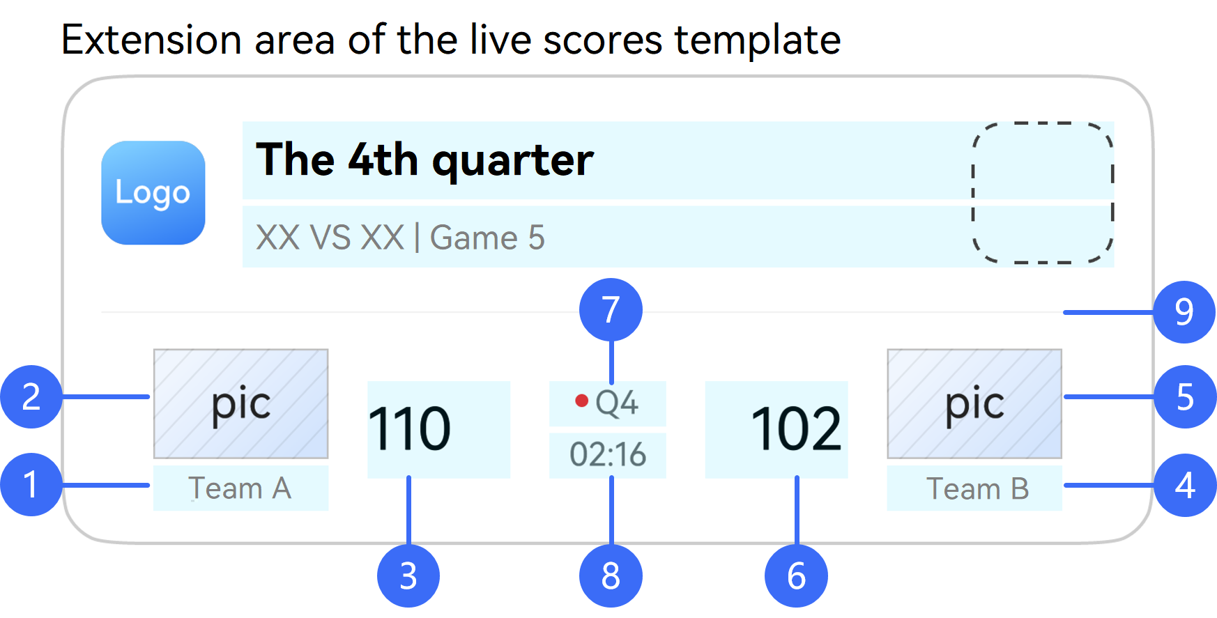
-
- Left team name, corresponding to the name parameter in host.
-
- Left team score, corresponding to the score parameter in host.
-
- Right team name, corresponding to the name parameter in guest.
-
- Right team score, corresponding to the score parameter in guest.
-
- Competition description text, corresponding to the desc parameter in competition.
-
- Competition time, corresponding to the time parameter in competition.
-
- Whether to display the dividing line of an extension area, corresponding to the displayHorizontalLine parameter in notificationData.
| Parameter | Mandatory | Type | Description |
|---|---|---|---|
| host | Yes | Team Object | Style of the left part of the extension area. For details, please refer to Team. |
| guest | Yes | Team Object | Style of the right part of the extension area. For details, please refer to Team. |
| competition | Yes | Competition Object | Style of the middle part of the extension area. For details, please refer to Competition. |
[h2]Team
| Parameter | Mandatory | Type | Description |
|---|---|---|---|
| icon | No | String | File name of the team icon in the display area. By default, the file is stored in the /resources/rawfile directory of the app. When operation is set to 0, this parameter is mandatory and cannot be an empty string. Example: For the icon file icon.png stored in /resources/rawfile of the app, the value is icon.png. |
| iconUrl | No | String | URL of the team icon in the display area. The URL must use the HTTPS protocol and cannot be an empty string. (Note the message body size limits. For details, please refer to Restrictions.) Note: The image specified by iconUrl takes priority. If it cannot be displayed, the image specified by icon will be shown instead. The supported image formats are PNG, JPG, JPEG, BMP, and WEBP, with a maximum size of 512 KB. Images exceeding this limit will not be displayed. Since: 26.0.0 |
| name | No | String | Team name. When operation is set to 0, this parameter is mandatory and cannot be an empty string. (Note the message body size limits. For details, please refer to Restrictions.) |
| score | No | String | Live score. When operation is set to 0, this parameter is mandatory and cannot be an empty string. (Note the message body size limits. For details, please refer to Restrictions.) |
[h2]Competition
| Parameter | Mandatory | Type | Description |
|---|---|---|---|
| desc | No | String | Text description in the upper-middle part of an extension area. When operation is set to 0, either this parameter or richDesc must be set. If this parameter is set, its value cannot be an empty string. (Note the message body size limits. For details, please refer to Restrictions.) |
| richDesc | No | Array [RichText Object] | Rich text description in the upper-middle part of an extension area. When operation is set to 0, either this parameter or desc must be set. If this parameter is set, its value cannot be an empty array, and the concatenated result of all text in the array cannot be an empty string. (Note the message body size limits. For details, please refer to Restrictions.) |
| time | No | String | Competition time in the lower-middle part of an extension area. When operation is set to 0, this parameter is mandatory and cannot be an empty string. (Note the message body size limits. For details, please refer to Restrictions.) |
[h2]LiveViewLockScreen
| Parameter | Mandatory | Type | Description |
|---|---|---|---|
| picture | No | String | Image displayed in the lock screen immersive live view. The value is a file name in the specified path. Example: For the icon file icon.png stored in /resources/rawfile of the app, the value is icon.png. |
[h2]CapsuleData
The following describes the three capsule templates and their parameters.
| Illustration | Description |
|---|---|
 | Base class for defining basic attributes of the live view capsule. · 1: Capsule layout type, corresponding to the type parameter. · 2. Live view capsule icon, corresponding to the icon and iconUrl parameters. · 3. Tail icon of the live view capsule, corresponding to the tailicon and tailiconUrl parameters. · 4. Whether to display the secondary text of the live view capsule, corresponding to the isContentDisplayed parameter. · 5. Whether to display the tail icon of the live view capsule, corresponding to the isTailIconDisplayed parameter. |
 | The following content is displayed when type is set to 1: · 1. Primary text of the capsule status, corresponding to the title parameter. · 2. Capsule content, corresponding to the content parameter. |
 | The following content is displayed when type is set to 2: · 1. Capsule content, corresponding to the content parameter. · 2. Initial value of the capsule timer, corresponding to the time parameter in capsuleTimer. · 3. Whether to display the countdown timer, corresponding to the countDown parameter in capsuleTimer. · 4. Whether the capsule timer is paused, corresponding to the pause parameter in capsuleTimer. |
 | The following content is displayed when type is set to 3: · 1. Maximum progress value, corresponding to the max parameter in progress. · 2. Current progress value, corresponding to the progress parameter in progress. · 3. Progress display type, corresponding to the indeterminate parameter in progress. · 4. Capsule content, corresponding to the content parameter. |
| Parameter | Mandatory | Type | Description |
|---|---|---|---|
| type | Yes | Integer | Capsule layout type. The options are as follows: 1: icon + text. The capsule displays the icon on the left and text on the right. 2: timer. The capsule displays the icon on the left and the timing text on the right. 3: progress. The capsule displays the overall progress with the icon on the left and the percentage or ratio on the right. |
| status | Yes | Integer | Display status of a live view capsule on the status bar. The options are as follows: 1: The capsule is displayed. -1: The capsule is not displayed. |
| icon | Yes | String | File name of the live view capsule icon. A pure-color vector icon with a size of 18 × 18 vp is recommended. Example: For the icon file icon.png stored in /resources/rawfile of the app, the value is icon.png. |
| iconUrl | No | String | URL of the live view capsule icon. The URL must use the HTTPS protocol and cannot be an empty string. (Note the message body size limits. For details, please refer to Restrictions.) Note: The image specified by iconUrl takes priority. If it cannot be displayed, the image specified by icon will be shown instead. The supported image formats are PNG, JPG, JPEG, BMP, and WEBP, with a maximum size of 512 KB. Images exceeding this limit will not be displayed. Since: 26.0.0 |
| tailIcon | No | String | File name of the tail icon of a live view capsule. A pure-color vector icon with a size of 18 × 18 vp is recommended. Example: For the icon file icon.png stored in /resources/rawfile of the app, the value is icon.png. Since: 26.0.0 |
| tailIconUrl | No | String | URL of the tail icon of a live view capsule. The URL must use the HTTPS protocol and cannot be an empty string. (Note the message body size limits. For details, please refer to Restrictions.) Note: The image specified by tailIconUrl takes priority. If it cannot be displayed, the image specified by tailIcon will be shown instead. The supported image formats are PNG, JPG, JPEG, BMP, and WEBP, with a maximum size of 512 KB. Images exceeding this limit will not be displayed. Since: 26.0.0 |
| isTailIconDisplayed | No | Boolean | Indicates whether to display the tail icon of a live view capsule. If this parameter is not set, the value passed during the previous live view creation or update will be used. If this parameter is not passed in other cases, the value false is used by default. · true: yes · false: no Since: 26.0.0 |
| bgColor | Yes | String | Background color of a capsule. The value is in #ARGB format, with a number sign (#) and 8 hexadecimal digits. To avoid conflicts with the background color of the live view capsule and ensure the display effect, the following colors cannot be used: #FF000000 #FFFFFFFF #FFF1F3F5 |
| remind | No | String | Dynamic effect of a capsule on the status bar. If this parameter is not specified, there is no special effect by default. · DEFAULT: No special effect. · FLIP: Animation that temporarily preempts the capsule position (supported up to 5 times per activity). · EXPAND: Animation where the capsule automatically expands into a floating widget (supported up to 2 times per activity). |
| title | No | String | Main text of the capsule status. The value contains a maximum of 128 characters This parameter is mandatory when operation is set to 0 and type is set to 1. When type is 1, this parameter is used to set the capsule title. |
| content | No | String | Capsule content. The value contains a maximum of 128 characters. The extended text specified by this parameter is displayed when a device uses the widescreen or is in landscape orientation. This parameter is mandatory when operation is set to 0 and type is set to 1 or 2. |
| isContentDisplayed | No | Boolean | Indicates whether to display the secondary text of a live view capsule. If this parameter is not set, the value passed during the previous live view creation or update will be used. If this parameter is not passed in other cases, the value true is used by default. · true: yes · false: no Since: 26.0.0 |
| capsuleTimer | No | CapsuleTimer Object | Capsule timer. For details, please refer to CapsuleTimer. When type is set to 2, this parameter is mandatory, specifying the timer information in the capsule. |
| progress | No | Progress Object | Capsule progress information. For details, please refer to Progress. When type is set to 3, this parameter is mandatory, specifying the progress information in the capsule. |
[h2]Progress
| Parameter | Mandatory | Type | Description |
|---|---|---|---|
| max | No | Integer | Maximum progress value. The default value is 1. The value range is [1, 2147483647]. |
| progress | Yes | Integer | Current progress value. The value range is [0, 2147483647]. The value of this parameter must be less than or equal to the maximum progress value. |
| indeterminate | No | Boolean | Progress display type. The progress is displayed as a ratio by default. true: percentage false: ratio |
[h2]SingleTextBlock

-
- Auxiliary label text, corresponding to the firstLine parameter.
-
- Emphasized text content, corresponding to the secondLine parameter.
- 3: Highlight underline, corresponding to the underlineColor parameter.
-
- Image area, corresponding to the descPic and descPicUrl parameters in notificationData.
| Parameter | Mandatory | Type | Description |
|---|---|---|---|
| firstLine | Yes | String | Text in the first line. The value contains a maximum of 128 characters and cannot be an empty string. |
| secondLine | Yes | String | Text in the second line. The value contains a maximum of 128 characters and cannot be an empty string. |
| underlineColor | No | String | Underline color of the text in the second line. The value is in #ARGB format, with a number sign (#) and 8 hexadecimal digits. If this parameter is not set, no underline is displayed. |
[h2]FirstTextBlock
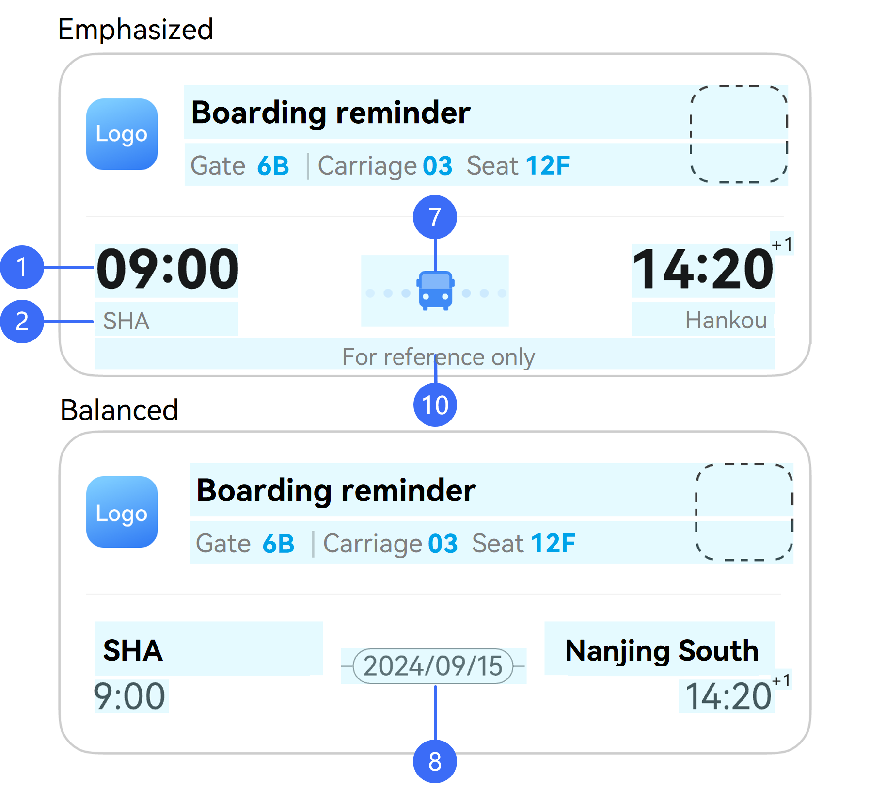
-
- First-line text on the left, corresponding to the firstLine parameter.
-
- Second-line text content on the left, corresponding to the secondLine parameter.
-
- Spacing icon, corresponding to the spaceIcon and spaceIconUrl parameters in notificationData.
-
- Spacing text, corresponding to the spaceText parameter in notificationData.
- 10 Prompt message or disclaimer, corresponding to the additionalText parameter in notificationData.
| Parameter | Mandatory | Type | Description |
|---|---|---|---|
| firstLine | Yes | String | Text in the first line. The value contains a maximum of 128 characters and cannot be an empty string. |
| secondLine | Yes | String | Text in the second line. The value contains a maximum of 128 characters and cannot be an empty string. |
[h2]LastTextBlock
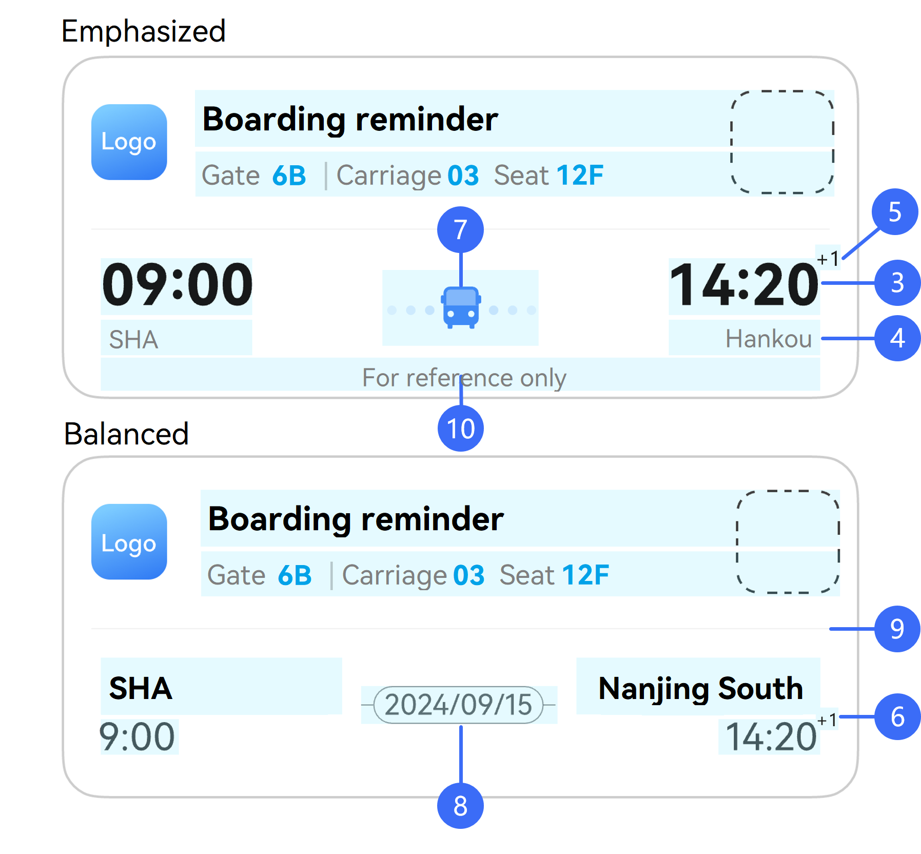
-
- First-line text on the right, corresponding to the firstLine parameter.
-
- Second-line text content on the right, corresponding to the secondLine parameter.
-
- Superscript in the upper right corner of the first-line text on the right, corresponding to the firstLineSuperscript parameter.
-
- Superscript in the upper right corner of the second-line text on the right, corresponding to the secondLineSuperscript parameter.
-
- Spacing icon, corresponding to the spaceIcon and spaceIconUrl parameters in notificationData.
-
- Spacing text, corresponding to the spaceText parameter in notificationData.
-
- Whether to display the dividing line of an extension area, corresponding to the displayHorizontalLine parameter in notificationData.
- 10 Prompt message or disclaimer, corresponding to the additionalText parameter in notificationData.
| Parameter | Mandatory | Type | Description |
|---|---|---|---|
| firstLine | Yes | String | Text in the first line. The value contains a maximum of 128 characters and cannot be an empty string. |
| secondLine | Yes | String | Text in the second line. The value contains a maximum of 128 characters and cannot be an empty string. |
| firstLineSuperscript | No | String | Superscript in the upper right corner of the first-line text. The value is in +x format, where x ranges from 1 to 9. Values out of this range will not be displayed. |
| secondLineSuperscript | No | String | Superscript in the upper right corner of the second-line text. The value is in +x format, where x ranges from 1 to 9. Values out of this range will not be displayed. |
[h2]RichProgress
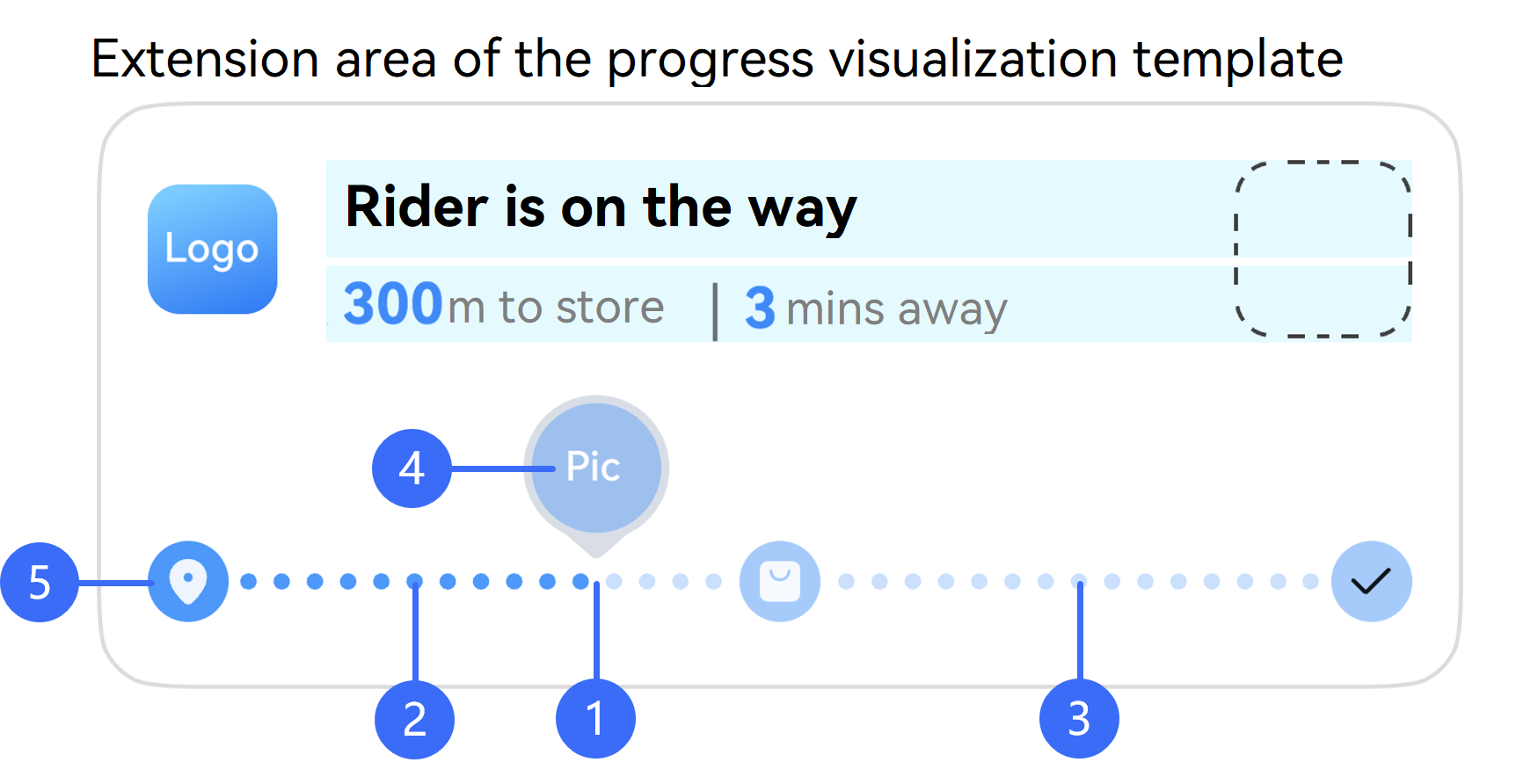
-
- Progress percentage, corresponding to the progress parameter.
-
- Color of the progress points and node icons on the left of the progress indicator, corresponding to the color parameter.
-
- Color of the progress points and node icons on the right of the progress indicator, corresponding to the bgColor parameter.
-
- Progress indicator icon, corresponding to the indicatorIcon parameter.
-
- Icons of progress bar nodes, corresponding to the nodeIcons parameter.
| Parameter | Mandatory | Type | Description |
|---|---|---|---|
| indicatorIcon | No | String | Icon of the progress bar indicator, which is a local resource. If this parameter is not specified, the system uses the last updated image. When operation is set to 0 and indicatorType is set to 1 or 2, this parameter is mandatory and cannot be an empty string. The value is a file name in the specified path. Example: For the icon file icon.png stored in /resources/rawfile of the app, the value is icon.png. |
| progress | Yes | Integer | Progress percentage, which determines the position of the indicator in the progress bar. The value ranges from 0 to 100. |
| color | No | String | Color of the progress dots and node icons on the left side of the progress indicator. The value is in #ARGB format, with a number sign (#) and 8 hexadecimal digits. The default value is #FF317AF7, indicating blue. |
| bgColor | No | String | Color of the progress dots and node icons on the right side of the progress indicator. The value is in #ARGB format, with a number sign (#) and 8 hexadecimal digits. The default value is #19000000, indicating gray. In dark mode, the default value of this parameter is #19FFFFFF, indicating white. |
| nodeIcons | No | Array [String] | Icon of each node in the progress bar, which is a local resource. The array length range is [2, 5]. If this parameter is not specified, the system uses the last updated image. When operation is set to 0, this parameter is mandatory and cannot be an empty array. The value is a file name in the specified path. Example: For the icon file icon.png stored in /resources/rawfile of the app, the value is icon.png. |
| type | No | Integer | Progress display type in an extension area. The options are as follows: 0 (default): dotted line 1: common solid line 2: thick solid line |
| indicatorType | No | Integer | Display type of a small indicator icon in an extension area. The options are as follows: 0 (default): The small indicator icon is not displayed. 1: The small indicator icon is displayed above the progress line. 2: The small indicator icon is displayed on the progress line. |
[h2]CapsuleTimer
| Parameter | Mandatory | Type | Description |
|---|---|---|---|
| time | No | Long | Initial value of the capsule timer, which is updated every second. The unit is millisecond (ms) and the default value is 0. |
| countDown | No | Boolean | Indicates whether a timer is a countdown timer. The default value is false. false: no true: yes |
| pause | No | Boolean | Indicates whether a capsule timer is paused. The default value is false. false: no true: yes. A paused timer displays the time when it is paused. |
[h2]ExternalData
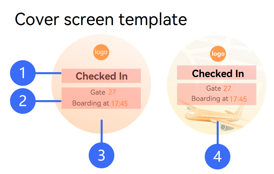
-
- Custom notification title on a cover screen, corresponding to the title parameter.
-
- Custom notification content on a cover screen, corresponding to the body parameter.
-
- Cover screen background color, corresponding to the bgColor parameter.
-
- Cover screen background image, corresponding to the bgImage parameter.
| Parameter | Mandatory | Type | Description |
|---|---|---|---|
| type | No | Integer | Cover screen template type. 0 (default): background color 1: background image |
| bgColor | No | String | Background color of a cover screen. The value is in #RGB hex format, with a number sign (#) and 6 hexadecimal digits. If this parameter is not set, the default color of the system is used. |
| bgImage | No | String | Background image of a cover screen, which is a local resource. When type is set to 1, this parameter is mandatory when a live view is created and does not need to be set when the live view is not updated. When operation is set to 0 and type is set to 1, this parameter is mandatory and cannot be an empty string. The value is a file name in the specified path. Example: For the icon file icon.png stored in /resources/rawfile of the app, the value is icon.png. |
| title | No | String | Custom notification title on a cover screen. The value contains a maximum of 128 characters. When operation is set to 0, this parameter is mandatory and cannot be an empty string. |
| body | No | Array [RichText Object] | Custom notification content on a cover screen, which consists of multiple rich text segments. The total text length cannot exceed 128 characters. If text colors are specified, all segments must be set to the same color. When operation is set to 0, this parameter is mandatory and cannot be an empty array. |
[h2]RichText
| Parameter | Mandatory | Type | Description |
|---|---|---|---|
| text | Yes | String | Text. (Note the message body size limits. For details, please refer to Restrictions.) |
| foregroundColor | No | String | Text color. The value is in #ARGB format, with a number sign (#) and 8 hexadecimal digits. If foregroundColor is not set, the default text color #FF000000 will be used. If foregroundColor is set, the values for all objects in the array must be the same. |
[h2]Weather
| Parameter | Mandatory | Type | Description |
|---|---|---|---|
| weatherType | No | Integer | Weather type. If weatherType is not passed or an invalid value is passed, the weather will not be displayed. For details about the supported values, please refer to the enumerated values of WeatherType in Live View Kit. |
| locationType | No | Integer | Weather location type. If locationType is not passed or an invalid value is passed, the weather will not be displayed. For details about the supported values, please refer to the enumerated values of WeatherLocationType in Live View Kit. |
| highTemperature | No | Integer | Highest temperature. Only Celsius is supported. The highest temperature must be less than or equal to 58°C and greater than the lowest temperature (specified by lowTemperature). If this parameter is not passed or an invalid value is passed, the weather will not be displayed. |
| lowTemperature | No | Integer | Lowest temperature. Only Celsius is supported. The lowest temperature must be greater than or equal to –95°C and less than the highest temperature (specified by highTemperature). If this parameter is not passed or an invalid value is passed, the weather will not be displayed. |
VoIPCallPayload (In-App Call Message)
For details about the request body example, please refer to In-App Call Message.
| Parameter | Mandatory | Type | Description |
|---|---|---|---|
| extraData | Yes | String | Data transferred to an app. The app processes related logic based on the data and displays in-app call message information. (Note the message body size limits. For details, please refer to Restrictions.) For details about how to obtain extraData, please refer to Sample Code. |