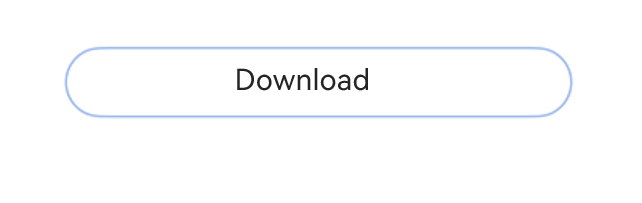
The ProgressButtonV2 component is a text-based download button with a progress indicator that shows the download progress.
This component is implemented based on state management V2. Compared with state management V1, V2 offers a higher level of observation and management over data objects beyond the component level. You can now more easily manage download button data and states with greater flexibility, leading to faster UI updates.

-
This component is supported since API version 18. Updates will be marked with a superscript to indicate their earliest API version.
-
This component can be used only in the stage model.
-
If the ProgressButtonV2 component has universal attributes and universal events configured, the compiler toolchain automatically generates an additional __Common__ node and mounts the universal attributes and universal events on this node rather than the ProgressButtonV2 component itself. As a result, the configured universal attributes and universal events may fail to take effect or behave as intended. For this reason, avoid using universal attributes and events with the ProgressButtonV2 component.
Modules to Import
import { ColorMetrics, LengthMetrics, ProgressButtonV2, ProgressButtonV2Color } from '@kit.ArkUI'; ProgressButtonV2
ProgressButtonV2({progress: number, content: ResourceStr, progressButtonWidth?: LengthMetrics, onClicked: ClickCallback, isEnabled: boolean, colorOptions?: ProgressButtonColorOptions, progressButtonRadius?: LengthMetrics})
Creates a text-based download button with a progress indicator that shows the download progress.
Decorator: @ComponentV2
Atomic service API: This API can be used in atomic services since API version 18.
System capability: SystemCapability.ArkUI.ArkUI.Full
Device behavior differences: On wearables, calling this API results in a runtime exception indicating that the API is undefined. On other devices, the API works correctly.
| Name | Type | Mandatory | Decorator | Description |
|---|---|---|---|---|
| progress | number | Yes | @Require @Param | Current download progress. The value ranges from 0 to 100. Values less than 0 are adjusted to 0, and values greater than 100 are capped at 100. Default value: 0 |
| content | ResourceStr | Yes | @Require @Param | Button text. |
| progressButtonWidth | LengthMetrics | No | @Param @Once | Width of the button. Default value: 44vp |
| onClicked | ClickCallback | Yes | @Param | Callback invoked when the button is clicked. |
| isEnabled | boolean | Yes | @Param | Whether the button can be clicked. true: yes false: no |
| colorOptions | ProgressButtonV2Color | No | @Param | Color options for the button. |
| progressButtonRadius18+ | LengthMetrics | No | @Param | Corner radius of the button. It cannot be set in percentage. Value range: [0, height/2] Default value: height/2 If an invalid value is set, the default value is used. |
ClickCallback
type ClickCallback = () => void
Callback invoked when the button is clicked.
Atomic service API: This API can be used in atomic services since API version 18.
System capability: SystemCapability.ArkUI.ArkUI.Full
Device behavior differences: On wearables, calling this API results in a runtime exception indicating that the API is undefined. On other devices, the API works correctly.
ProgressButtonV2Color
Defines the color options for the download button.
Decorator type: @ObservedV2
[h2]Properties
Atomic service API: This API can be used in atomic services since API version 18.
System capability: SystemCapability.ArkUI.ArkUI.Full
Device behavior differences: On wearables, calling this API results in a runtime exception indicating that the API is undefined. On other devices, the API works correctly.
| Name | Type | Read-Only | Optional | Description |
|---|---|---|---|---|
| progressColor | ColorMetrics | No | Yes | Color of the progress indicator. Default value: #330A59F7 Decorator type: @Trace |
| borderColor | ColorMetrics | No | Yes | Border color of the button. Default value: #330A59F7 Decorator type: @Trace |
| textColor | ColorMetrics | No | Yes | Text color of the button. Default value: system default value #CE000000 Decorator type: @Trace |
| backgroundColor | ColorMetrics | No | Yes | Background color of the button. Default value: $r('sys.color.ohos_id_color_foreground_contrary') Decorator type: @Trace |
[h2]constructor
constructor(options: ProgressButtonV2ColorOptions);
A constructor used to create a ProgressButtonV2Color object.
Atomic service API: This API can be used in atomic services since API version 18.
System capability: SystemCapability.ArkUI.ArkUI.Full
Device behavior differences: On wearables, calling this API results in a runtime exception indicating that the API is undefined. On other devices, the API works correctly.
Parameters
| Name | Type | Mandatory | Description |
|---|---|---|---|
| options | ProgressButtonV2ColorOptions | Yes | Color settings. |
ProgressButtonV2ColorOptions
Provides options for customizing the color of the download button.
Atomic service API: This API can be used in atomic services since API version 18.
System capability: SystemCapability.ArkUI.ArkUI.Full
Device behavior differences: On wearables, calling this API results in a runtime exception indicating that the API is undefined. On other devices, the API works correctly.
| Name | Type | Read-Only | Optional | Description |
|---|---|---|---|---|
| progressColor | ColorMetrics | No | Yes | Color of the progress indicator. Default value: #330A59F7 |
| borderColor | ColorMetrics | No | Yes | Border color of the button. Default value: #330A59F7 |
| textColor | ColorMetrics | No | Yes | Text color of the button. Default value: system default value #CE000000 |
| backgroundColor | ColorMetrics | No | Yes | Background color of the button. Default value: $r('sys.color.ohos_id_color_foreground_contrary') |
Example
This example demonstrates how to create a simple download button with a progress indicator that shows the loading status of a text file.
import { LengthMetrics, ProgressButtonV2 } from '@kit.ArkUI';

@Entry
@ComponentV2
struct Index {
  @Local progressIndex: number = 0;
  @Local textState: string = 'Download';
  @Local buttonWidth: LengthMetrics = LengthMetrics.vp(200);
  @Local isRunning: boolean = false;
  @Local enableState: boolean = true;

  build() {
    Column() {
      Scroll() {
        Column({ space: 20 }) {
          ProgressButtonV2({
            progress: this.progressIndex,
            progressButtonWidth: this.buttonWidth,
            content: this.textState,
            isEnabled: this.enableState,
            onClicked: () => {
              if (this.textState && !this.isRunning && this.progressIndex < 100) {
                this.textState = 'Continue';
              }
              this.isRunning = !this.isRunning;
              let timer = setInterval(() => {
                if (this.isRunning) {
                  if (this.progressIndex === 100) {
                    clearInterval(timer);
                  } else {
                    this.progressIndex++;
                    if (this.progressIndex === 100) {
                      this.textState = 'Completed';
                      this.enableState = false;
                    }
                  }
                } else {
                  clearInterval(timer);
                }
              }, 20);
            }
          })
        }.alignItems(HorizontalAlign.Center).width('100%').margin({ top: 20 });
      }
    }
  }
}