Significance of Adapting the Application Layout to Multi-Window
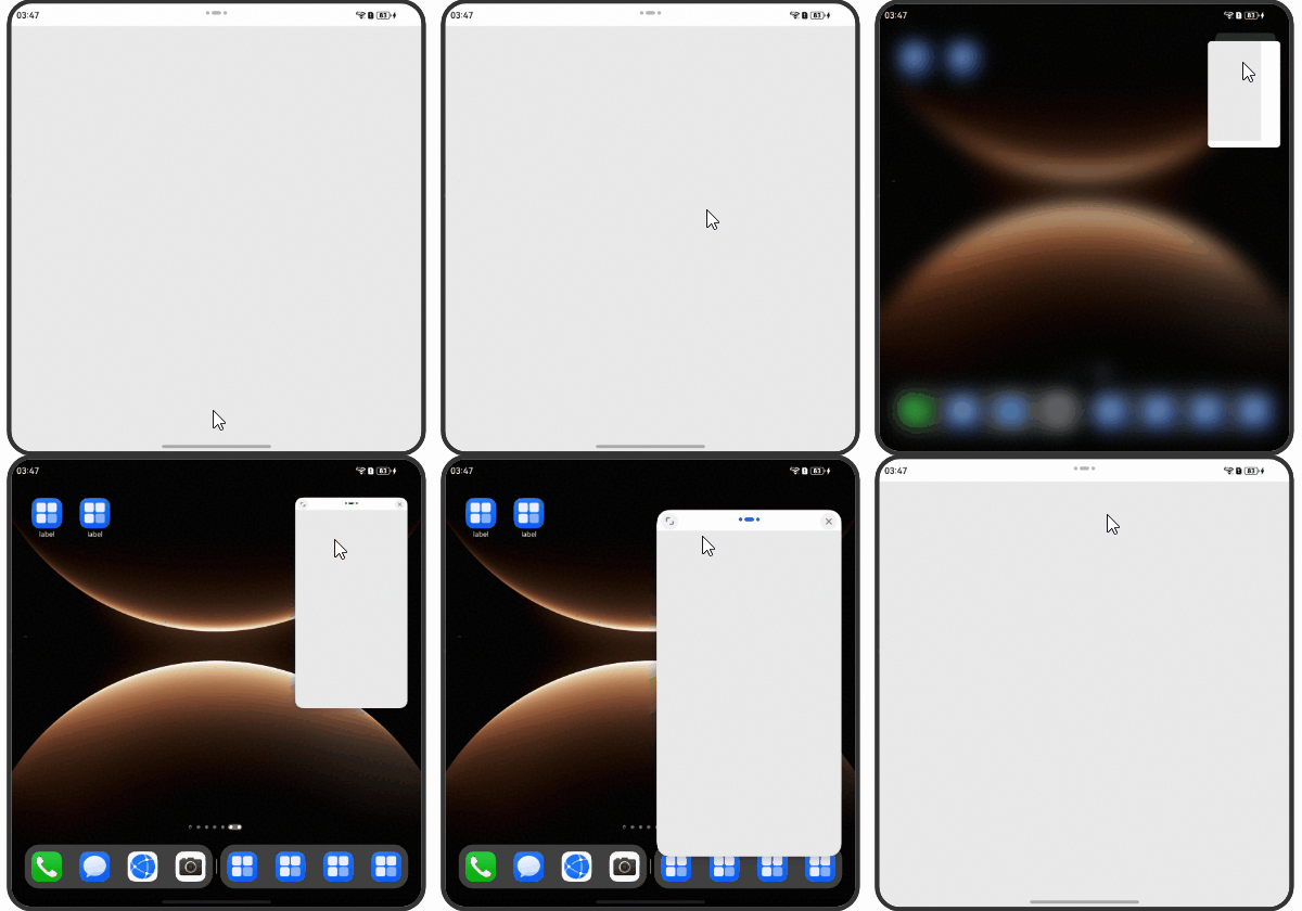
After an application enters the Multi-Window (floating window or split-screen) mode from the full-screen mode, the window size and aspect ratio change. As such, you need to develop the adaptive layout of the application window in different sizes and aspect ratios, to ensure that the application window can deliver the best visual effect and user experience.
[h2]Aspect Ratios of Floating Windows
The following table lists the aspect ratios of floating windows supported by different devices.
| Version | Device | Aspect Ratio of a Portrait Floating Window | Aspect Ratio of a Landscape Floating Window |
|---|---|---|---|
| - | Mobile phone | 3:4.575 | 16:9 |
| - | Bifold phone (unfolded) and trifold phone (dual-screen, M state) | 9:16 | 16:9 |
| Earlier than HarmonyOS 7.0.0 | Trifold phone (triple-screen, G state) and tablet | 9:16 | 16:9 |
| HarmonyOS 7.0.0 or later | Trifold phone (triple-screen, G state) and tablet | 9:16, 3:4, 3:2 | 16:9 |

The avoid area of the window-top control bar is not included in the application layout area. The height of the application layout area is equal to the window height minus the 32 vp of the avoid area.
Mobile phone: In floating window mode, the actual width of the application window is the screen width. The height is dynamically adjusted based on the aspect ratio 3:4.575 in portrait mode and 16:9 in landscape mode. (If the 16:9 ratio goes beyond the screen's dimensions, the current full-screen ratio is used for calculations). By default, mobile phones support the preceding two aspect ratios. The following uses special device forms as examples:
Bifold phone (unfolded) and trifold phone (dual-screen, M state): In floating window mode, the actual width of the application window is the screen width measured when the screens are folded. The height is dynamically adjusted based on the aspect ratio 9:16 in portrait mode and 16:9 in landscape mode.
Trifold phone (three-screen, G state) running HarmonyOS earlier than 7.0.0, and tablet: In floating window mode, the window size is dynamically adjusted based on the screen size.
Trifold phone (three-screen, G state) running HarmonyOS 7.0.0 or later, and tablet: The aspect ratios 3:4 and 3:2 are added for floating windows in portrait mode. The window size is dynamically adjusted based on the screen size. Users can drag the border of a floating window to adjust the aspect ratio.
For a widescreen foldable phone with a small square external screen, Multi-Window is not supported on the external screen. For details about the folded state of a widescreen foldable phone, see Widescreen Foldable Phone App Development. For details about the folded state of a trifold phone, see Tri-Fold Phone App Development.
[h2]Ratios of Split Screens
Currently, both top-bottom split screens and left-right split screens are supported.
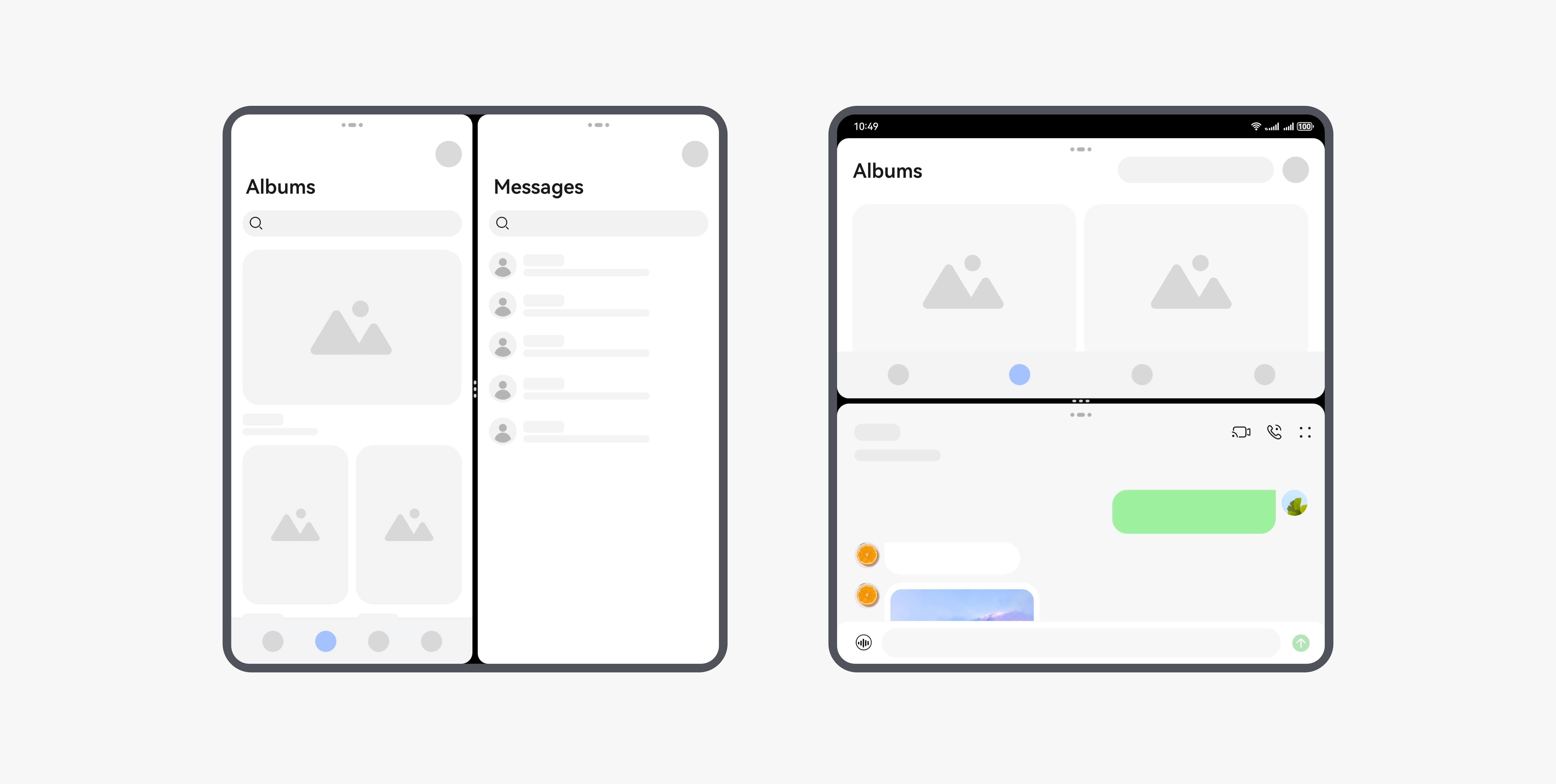
The split-screen ratio refers to the ratio of the sizes of two application windows in split-screen mode. Adjusting this ratio will adjust the sizes of the application windows.
By default, the split-screen ratio is 1:1. Users can drag the divider in the middle to change this ratio. The ratio of top-bottom split screens can be 1:2, 1:1, or 2:1, and that of the left-right split screens can only be 1:1. The ratio for unfolded screens of a foldable mobile phone can only be 1:1.
| Device | Default Split-Screen Ratio | Adjustable Split-Screen Ratio |
|---|---|---|
| Mobile phone | 1:1 | Top-bottom split screens: 1:1, 1:2, and 2:1 Left-right split screens: 1:1 |
| Unfolded screens of a foldable mobile phone | 1:1 | Top-bottom split screen and left-right split screen: 1:1 |
The application layout can be updated in adaptive layout and responsive layout modes to avoid truncation, extrusion, and stacking.
Solutions of Adapting the Application Layout to Multi-Window
When an application enters the Multi-Window mode (regardless of whether it is in floating window or split-screen mode), its window size changes. Therefore, the application needs to adjust its layout based on the window size.
The application can call the on('windowSizeChange') API to listen for window size changes, and then adjust its layout based on the changed window size.
The procedure is as follows:
Obtain a Window object from the onWindowStageCreate callback.
Obtain the window size from windowRect in the return value of the getWindowProperties API and write the window size into the AppStorage as the initial window size on the UI side.
Use on('windowSizeChange') to listen for window size changes and write the changes into the AppStorage for layout on the UI side.
Use @StorageLink to bind the UI side to the AppStorage. Once the binding is successful, changes in the data corresponding to the key values in the AppStorage will be synchronized to the UI side.
As the data decorated by @StorageLink is a state variable, components are re-rendered if the window size changes. You need to dynamically adjust the application layout based on the latest window size.
// EntryAbility.ets
import { UIAbility } from '@kit.AbilityKit';
import { window } from '@kit.ArkUI';

export default class EntryAbility extends UIAbility {
  onWindowStageCreate(windowStage: window.WindowStage): void {
    console.info('Ability onWindowStageCreate.');
    windowStage.getMainWindow().then((windowClass) => {
      // Obtain the window size and write it into the AppStorage.
      AppStorage.setOrCreate('winWidth', windowClass.getWindowProperties().windowRect.width);
      AppStorage.setOrCreate('winHeight', windowClass.getWindowProperties().windowRect.height);
      // Listen for window size changes.
      windowClass.on('windowSizeChange', (windowSize) => {
        AppStorage.setOrCreate('winWidth', windowSize.width);
        AppStorage.setOrCreate('winHeight', windowSize.height);
      });
    });
    windowStage.loadContent('pages/Index', (err) => {
      if (err.code) {
        console.error('Failed to load the content. Cause: ' + JSON.stringify(err));
        return;
      }
      console.info('Succeeded in loading the content.');
    });
  }
}
// Index.ets
@Entry
@Component
struct Index {
// Initialize parameter settings, which are initialized to the values stored in the AppStorage.
@StorageLink('winWidth') winWidth: number = 1260;
@StorageLink('winHeight') winHeight: number = 2224;
aboutToAppear() {
console.info('Current window size. width: ' + this.winWidth + ', height: ' + this.winHeight);
}
build() {
Row() {
// Dynamically adjust the application layout based on the winWidth and winHeight.
// ...
}
.size({
width: this.getUIContext().px2vp(this.winWidth),
height: this.getUIContext().px2vp(this.winHeight)
})
.backgroundColor('#fceaeaea')
}
}