Overview
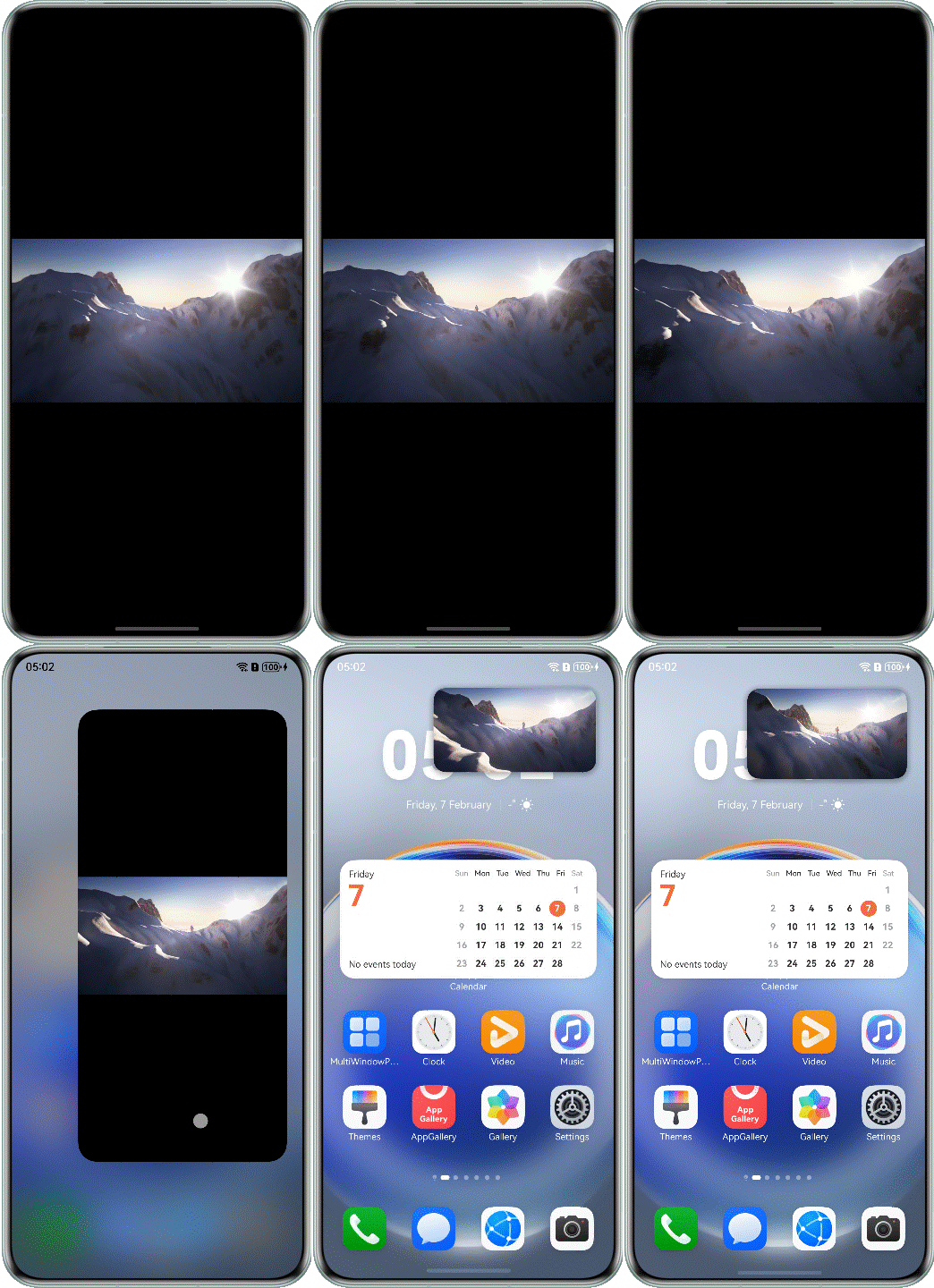
Window mode refers to the display mode of an app's main window upon startup. HarmonyOS supports three app window modes: full-screen, split-screen, and freeform/floating window. The support for multiple window modes is referred to as the OS's multi-window capability.
- Full-screen: The app's main window fills the entire screen upon startup.
- Split-screen: The app's main window occupies a portion of the screen upon startup. Currently, a 2-pane layout is supported, with a movable divider that allows users to resize the panes.
Freeform/Floating window:
- Freeform window: A freeform window can be flexibly resized and repositioned. Multiple freeform windows can be simultaneously displayed on the screen, stacked along the z-axis in the order of being opened or gaining focus. When a freeform window is touched or clicked, its Z-axis height increases and the window gains the focus.
- Floating window: A floating window is a non-full-screen app window that floats on the device screen. Generally, it is used to temporarily process another task on top of an ongoing full-screen task, or to concurrently run multiple tasks within a short period of time. For example, users can reply to messages while browsing web pages in this mode.

[h2]Implementing the Window Mode
The window mode is provided by the system and hence does not need to be developed separately. Therefore, you only need to consider the app UI adaptation after the floating window or split-screen feature is enabled.
If an app needs to support the floating window or split-screen mode, you can add the supportWindowMode field under the abilities tag in the module.json5 file. The supportWindowMode property specifies the window modes supported by the current UIAbility. For details, refer to Declaring the Support for Multi-Window.
The default value of supportWindowMode is ["fullscreen", "split", "floating"], indicating that all the three window modes are supported. You can configure the supportWindowMode property to customize the supported window modes. The following table describes the supported fields.
| Field | Description |
|---|---|
| fullscreen | A window in full-screen mode is supported. |
| split | A window in split-screen mode is supported. |
| floating | For a mobile phone or foldable screen, a window in floating mode is supported. For a tablet, a window in floating mode and multiple freeform windows are supported. For a PC, multiple freeform windows are supported. |

- If the current window is in freeform mode, the app can dynamically update its supported window modes via the setSupportedWindowModes() method. This method only works properly on 2-in-1 devices and tablets.
- For details about Multi-Window, see Adapting Your App to Multi-Window.
[h2]Obtaining the Window Mode
You can obtain the value of windowStatusType to determine the current window mode of the device.
public onStatusTypeChange: (statusType: window.WindowStatusType) => void = (statusType: window.WindowStatusType) => {
  this.mainWindowInfo.windowStatusType = statusType;
}
// ...
updateWindowInfo(): void {
  try {
    // First time get window status.
    this.mainWindowInfo.windowStatusType = this.mainWindow.getWindowStatus();
    this.mainWindow.on('windowStatusChange', this.onStatusTypeChange);
    // ...
  } catch (error) {
    let err = error as BusinessError;
    hilog.error(0x0000, `TestLog`, `Failed to update window info. Code: ${err.code}, message: ${err.message}`);
  }
}
[h2]Window Modes Supported by Different Devices
Window modes are closely related to product design. Different products support different window modes.
| Device | Full Screen | Split-Screen | Freeform Window | Floating Window |
|---|---|---|---|---|
| Smartphone | Supported (default) | Supported | Unsupported | Supported |
| Bi-fold phone | Supported (default) | Supported | Unsupported | Supported |
| Tri-fold phone | Supported (default) | Supported | Unsupported (supported by Mate XTs) | Supported |
| Widescreen foldable phone | Supported (default) | Supported | Unsupported | Supported |
| Tablet | Supported (default) | Supported | Supported | Supported |
| Computer | Supported | Supported | Supported (default) | Supported |

For devices which support both freeform window and floating window modes, FLOATING indicates the freeform window mode, and FLOATING indicates the floating window mode.
[h2]Differences Between WindowType and WindowStatusType
- WindowType indicates the enumeration of window types.
The window module of HarmonyOS provides system windows and app windows.
- System window: a window that implements specific system functionalities, such as the volume bar, wallpaper, notification panel, status bar, and navigation bar.
- Application window: a window responsible for app display. Based on the displayed content, app windows are further classified into main windows and subwindows.
- Main window: displays the app UI on the task manager page.
- Subwindow: displays auxiliary windows such as dialog boxes and floating windows of an app, and is not displayed on the task management page. The subwindow lifecycle is the same as that of the main window.
- WindowStatusType indicates the enumeration of window modes.
Window mode refers to the display mode of an app's main window upon startup. HarmonyOS supports three app window modes: full-screen, split-screen, and freeform window. This capability to support multiple window modes is referred to as the operating system's multi-window capability.
- Full-screen: The app's main window fills the entire screen upon startup.
- Split-screen: The app's main window occupies a portion of the screen upon startup. Currently, a 2-pane layout is supported, with a movable divider that allows users to resize the panes.
- Freeform/Floating window:
- Freeform window: A freeform window can be flexibly resized and repositioned. Multiple freeform windows can be simultaneously displayed on the screen, stacked along the z-axis in the order of being opened or gaining focus. When a freeform window is touched or clicked, its Z-axis height increases and the window gains the focus.
- Floating window: A floating window is a non-full-screen app window that floats on the device screen. Generally, it is used to temporarily process another task on top of an ongoing full-screen task, or to concurrently run multiple tasks within a short period of time. For example, users can reply to messages while browsing web pages in this mode.
Window Mode Development Scenarios
When the window mode of an app changes, the window size, page layout, and functionalities may change. When adapting to different window modes on multiple devices, the app responds to window changes as required.
You can call on('windowStatusChange') to listen for window mode changes. When windowStatusType of a window changes, a notification is sent.
public onStatusTypeChange: (statusType: window.WindowStatusType) => void = (statusType: window.WindowStatusType) => {
  this.mainWindowInfo.windowStatusType = statusType;
}
// ...
updateWindowInfo(): void {
  try {
    // First time get window status.
    this.mainWindowInfo.windowStatusType = this.mainWindow.getWindowStatus();
    this.mainWindow.on('windowStatusChange', this.onStatusTypeChange);
    // ...
  } catch (error) {
    let err = error as BusinessError;
    hilog.error(0x0000, `TestLog`, `Failed to update window info. Code: ${err.code}, message: ${err.message}`);
  }
} 
When the window mode changes, the window size in the system is not updated. If you need to obtain the new window size, obtain it in the on('windowSizeChange') event callback.
Obtain a Window object, and use getWindowProperties() of the object to obtain the window properties. The windowRect field in the properties specifies the window width and height. To obtain the window width and height information on a page, timing is crucial. The sample code is as follows:
// First time get window size.
let width: number = this.mainWindow.getWindowProperties().windowRect.width;
let height: number = this.mainWindow.getWindowProperties().windowRect.height;
let windowSize: window.Size = {
  width: width,
  height: height
}
this.mainWindowInfo.windowSize = windowSize; 
- The aboutToAppear phase in the page lifecycle does not indicate that the window is visible. It only indicates that the component has been created. As such, the window size information (specified by windowRect) obtained in this phase may be incorrect. To obtain the correct window width and height, you are advised to obtain the information in the onPageShow phase, which is triggered once the window is visible.
- The obtained value of windowRect is the actual window size. If the app is in small window mode, the actual display effect is based on the scale.
[h2]Listening for Window Size Changes
Obtain a Window instance, and call window.on('windowSizeChange') to listen for window size changes.
public onWindowSizeChange: (windowSize: window.Size) => void = (windowSize: window.Size) => {
  this.mainWindowInfo.windowSize = windowSize;
  this.mainWindowInfo.widthBp = this.uiContext!.getWindowWidthBreakpoint();
  this.mainWindowInfo.heightBp = this.uiContext!.getWindowHeightBreakpoint();
};
// ...
updateWindowInfo(): void {
  try {
    // ...
    // Register for window size change monitoring, update window size and width/height breakpoint.
    this.mainWindow.on('windowSizeChange', this.onWindowSizeChange);
    // ...
  } catch (error) {
    let err = error as BusinessError;
    hilog.error(0x0000, `TestLog`, `Failed to update window info. Code: ${err.code}, message: ${err.message}`);
  }
} 
Note that this event is not triggered if the window size does not change. For example, if the window is rotated by 180 degrees without any size change, the callback is not invoked. In this case, the app can listen for the display.on('change') event to detect the screen orientation change.
When the Multi-Window feature is used, the window size changes, which may affect the layout. The following are detailed descriptions of the two cases:
- Split-screen mode: When the phone enters the split-screen mode, the window height is reduced to 1/2 or 1/3 of the original height, and the width remains unchanged. The content page size is not adjusted accordingly. As a result, the content in the vertical direction may be truncated, and users cannot scroll the page to view the complete content. For details, see Common Problems in Window Mode Changes.
- Vertical floating window mode: In this mode, the content in the window is scaled proportionally based on the window size. However, the aspect ratio of the window changes to 3:4.575, which is different from the full-screen mode (usually 16:9 or 4:3). The vertical ratio is less than the horizontal ratio, which may also cause content truncation. For details, see Common Problems in Window Mode Changes.
[h2]Customizing Window Mode Policies
To support different window modes on different devices, you can refer to Multi-HAP Project.
In a single-HAP project, you can customize only one window support policy in the module.json5 file. In a multi-HAP project, you can customize a window support policy for each HAP by adding the supportWindowMode field under the abilities tag in the module.json5 file.

[h2]Suggestions on Status Listening in the Folding and Unfolding Scenarios
Callbacks that can be perceived by apps during the folding and unfolding
| Listening Method | Description |
|---|---|
| display.on('foldStatusChange') | Listens for the physical folding state (such as folding, unfolding, and semi-folding) changes of the device. |
| display.on('foldDisplayModeChange') | Listens for the display mode changes of the device, such as the changes between the primary screen display, secondary screen display, full screen display, and dual-screen display. |
| window.on('windowRectChange') | Listens for the changes of window position information, that is, the coordinates or width and height of the window. |
| window.on('avoidAreaChange') | Listens for the changes of the window avoidance area, that is, the overlapping area between the window and the system UI such as the status bar and navigation bar. |
| window.on('displayIdChange') | Listens for the event of the screen where the current window is located. For example, this event is triggered when the window is moved to a different screen. |
The following figure shows the lifecycle of screen management.
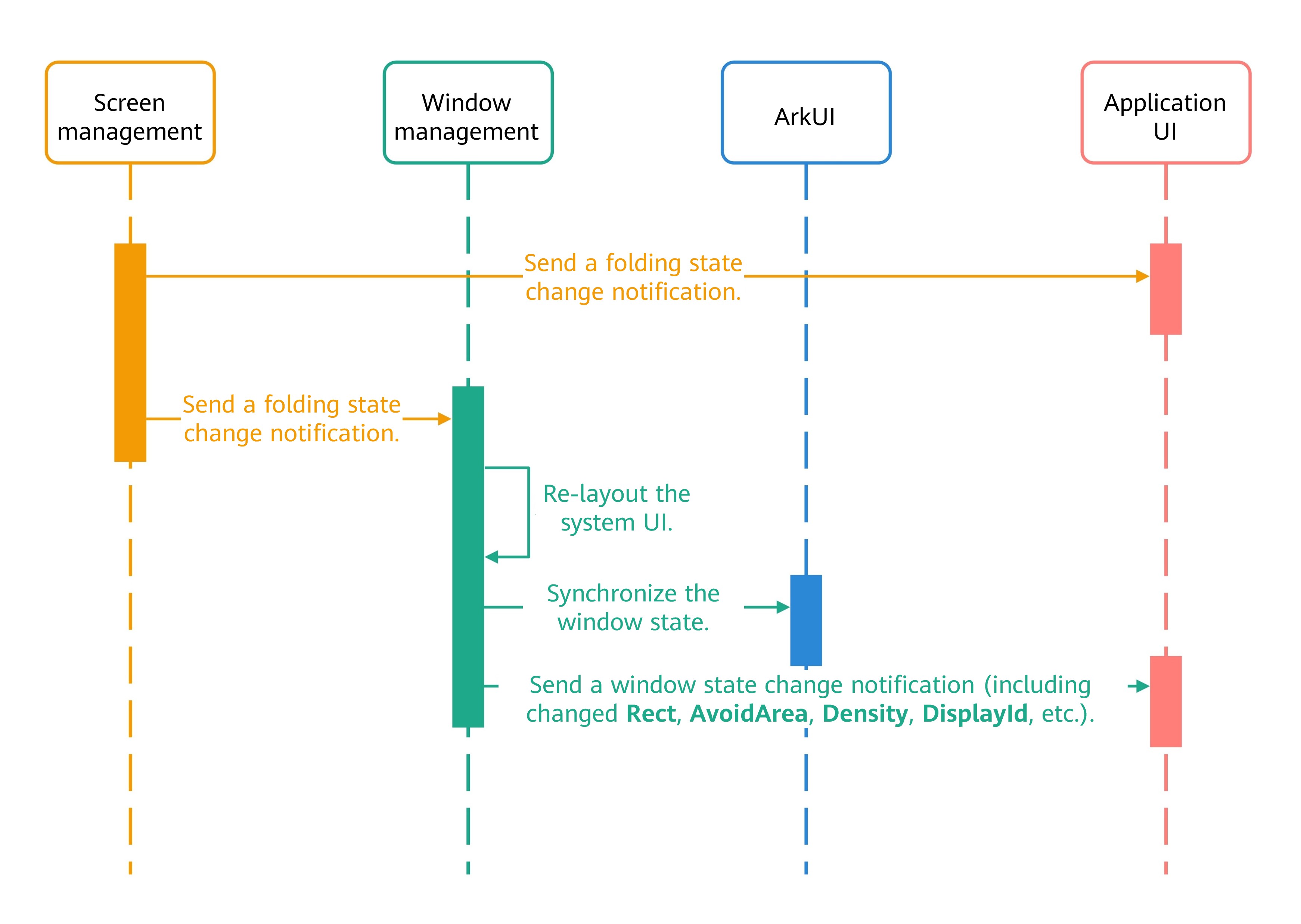

- During the folding and unfolding process, it is recommended that you listen only for window.on('windowSizeChange') for window size and breakpoint updates.
- It is recommended that the logic related to the window content layout be implemented in the corresponding listening API. Do not proactively obtain window status data (rect, displayId, avoidArea, and density) in the screen status change callback. You can use the corresponding information change listening API.
- It is recommended that each listener callback only processes the data that the callback is designed to receive. Do not rely on data queried from other APIs within a callback, as it may be outdated or inconsistent. For instance, within a windowRectChange callback, avoid actively calling getWindowAvoidArea to query the window avoidance area. Instead, use the on('avoidAreaChange') listener for this purpose.
- It is recommended that only the UI refresh logic be performed in the callback related to layout data. Do not perform time-consuming logic such as I/O.
[h2]Split-Screen Layout Adaptation
Currently, both horizontal and vertical split-screen modes are supported.
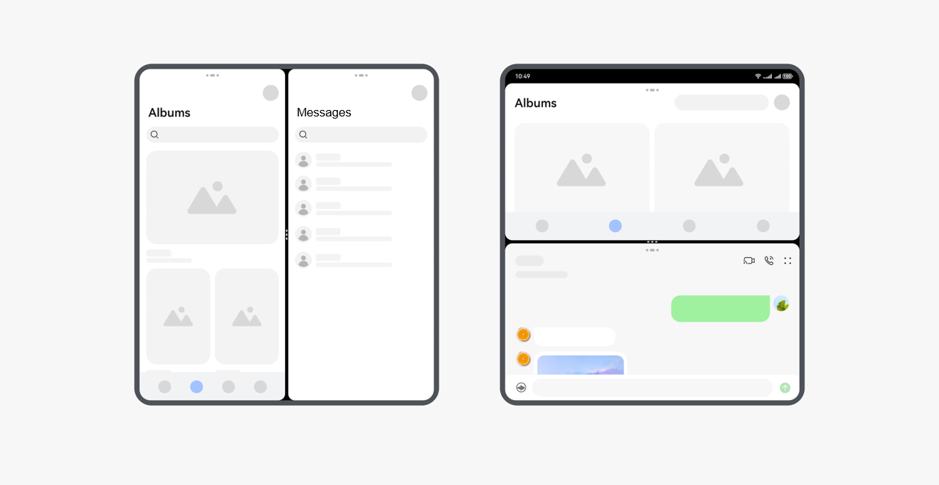
The split-screen ratio refers to the ratio of the sizes of two app windows. Adjusting this ratio will adjust the sizes of the app windows.
The split-screen ratio is defined by the product and cannot be modified by developers. The following table lists the split-screen ratios of common products.
| Device | Default Split-Screen Ratio | Adjustable Split-Screen Ratio |
|---|---|---|
| Phone, tablet, Pura X (unfolded), and tri-fold phone (F state) | 1:1 | Horizontal split screen: 1:1, 1:2, and 2:1 Vertical split screen: 1:1 |
| Bi-fold phone (unfolded) and tri-fold phone (M state) | 1:1 | Horizontal split screen and vertical split screen: 1:1 |
| Tri-fold phone (G state) | 1:1 | When a tri-fold phone is in landscape mode: Horizontal split screen: not supported Horizontal split screen: 1:1, 1:2, and 2:1 When a tri-fold phone is in portrait mode: Horizontal split screen: 1:1, 1:2, and 2:1 Horizontal split screen: not supported |

When a smartphone enters the split-screen mode, the window height is reduced to 1/2 or 1/3 of the original height, and the width remains unchanged. The content page size is not adjusted accordingly. As a result, the content in the vertical direction may be truncated, and users cannot scroll the page to view the complete content. For details, see Common Problems in Window Mode Changes.
[h2]In-App Split-Screen
The split-screen mode applies to scenarios where two apps are concurrently running on the same screen for a long time. For example, users can watch shopping guides while browsing through products, watch videos while playing games, or take notes while watching videos. In addition to the gesture-based split-screen mode, an app can choose to start split-screen mode by itself.
The in-app split-screen mode allows an app that declares its support for the split-screen mode to launch the UIAbility and create a split-screen view by calling startAbility while it is in full-screen mode. This mode enhances the multi-task processing capability of the app and improves user experience.
Development procedure
- Obtain a UIAbilityContext object within the app. The object is the context required for starting the split-screen mode and calling startAbility.
let context = this.uiContext?.getHostContext() as common.UIAbilityContext;
- Call startAbility to start a UIAbility and create a split-screen view. When calling startAbility, configure a StartOptions object, including its windowMode (set to either WINDOW_MODE_SPLIT_PRIMARY or WINDOW_MODE_SPLIT_SECONDARY), and adjust other StartOptions attributes or parameters of startAbility as required, for example, the Want object.
setSplitScreen(bundleName: string, abilityName: string, moduleName: string): void { // ... // Create StartOptions and set them to the main window mode. let option: StartOptions = { windowMode: AbilityConstant.WindowMode.WINDOW_MODE_SPLIT_PRIMARY }; let want: Want = { bundleName: bundleName, abilityName: abilityName, moduleName: moduleName }; context.startAbility(want, option).catch((err: BusinessError) => { hilog.error(0x0000, 'TestLog', `Failed to start ability. Code: ${err.code}, message: ${err.message}`); }); } - Repeat the preceding step to launch other UIAbility windows to achieve a dual-screen layout or to replace an existing split-screen panel.
- To end the in-app split-screen display, call terminateSelf ().
cancelSplitScreen(): void { let context = this.uiContext?.getHostContext() as common.UIAbilityContext; context.terminateSelf().catch((err: BusinessError) => { hilog.error(0x0000, 'TestLog', `Failed to terminate self. Code: ${err.code}, message: ${err.message}`); }); } - In-app split-screen display supports only the left-right split-screen mode. Since bi-fold phones in folded state and bar phones only support top-bottom split-screen mode, the app does not enter split-screen. Bi-fold phones in unfolded state, however, allow the app to enter split-screen. For details, refer to Declaring the Support for Multi-Window.

Freeform Window Mode Adaptation
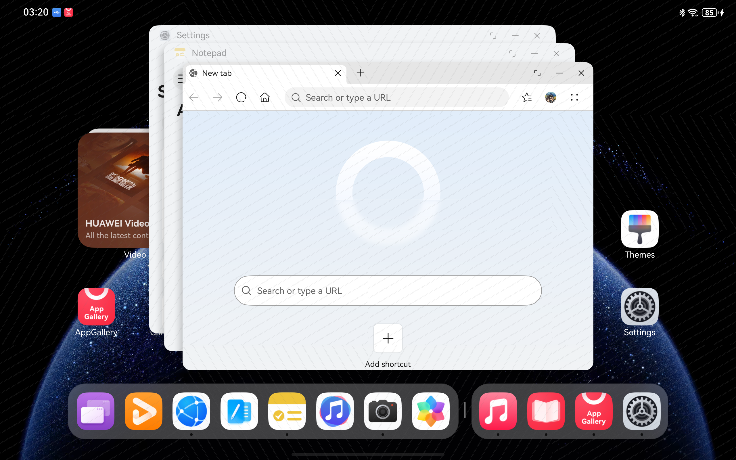
Freeform windows are of a multi-window display mode that allows users to run multiple windows on the same screen at the same time. Freeform windows are started in the center of the screen by default, stacked in the lower right corner, and can be scaled without limits. The size and position of the window can be changed freely after the window is launched. Multiple freeform windows can be simultaneously displayed on the screen, stacked along the z-axis in the order of being opened or gaining focus. When a freeform window is touched or clicked, its Z-axis height increases and the window gains the focus. By default, on the top of the freeform window is a title bar, which displays an app icon on the left and three buttons (zoom-in, zoom-out, and close) on the right. You can press and hold or hover the mouse to display a menu for switching to the split-screen mode.
- On a computer, the app should be started in freeform window mode instead of full-screen mode by default. When adapting the app to a computer, ensure proper page display by avoiding overly small freeform windows caused by dragging. You can refer to Limiting the Size of a Freeform Window ensure that the page is properly displayed.
- On a tablet, users need to swipe down from the top of the screen to display the control center, touch the freeform window icon, and switch to the freeform window mode. By default, windows are displayed in freeform window mode in a cascading manner. The device is then forcibly switched to the landscape mode and cannot be switched to the portrait mode. To optimize the window display, the DPI is adjusted to the minimum level by default, and the previous setting is preserved. Users can adjust the DPI as required in Settings > Display & brightness > Font size and UI scaling. When users exit the freeform window mode, the remembered DPI is restored. If users have manually adjusted the DPI in freeform window mode, the current setting is retained.
[h2]Limiting the Size of a Freeform Window
The adaptive layout ensures that the page is displayed properly as the window size changes within a certain range. When the window size changes greatly, you need to use the responsive layout capabilities, such as breakpoints, to adjust the page structure to ensure normal display. Generally, each breakpoint requires careful adaptation by developers to achieve the optimal display effect. However, considering practical constraints such as design and development costs, it is impossible for apps to adapt to all window widths from zero to infinity.
The default adjustable range for freeform window sizes may vary across different devices or device states. You can specify the window size range in the abilities tag of the module.json5 configuration file for each ability within an app. The following table describes the fields that affect the adjustable range of the freeform window size in the configuration file.
| Field | Data Type | Description |
|---|---|---|
| minWindowWidth | Number | Minimum window width supported by the ability, in vp. |
| minWindowHeight | Number | Minimum window height supported by the ability, in vp. |
| maxWindowWidth | Number | Maximum window width supported by the ability. The unit is vp. |
| maxWindowHeight | Number | Maximum window height supported by the ability, in vp. |
| minWindowRatio | Number | Minimum aspect ratio supported by the ability. |
| maxWindowRatio | Number | Maximum aspect ratio supported by the ability. |
You can use either of the following methods to limit the maximum and minimum sizes of a freeform window:
- In the configuration file, configure the maximum and minimum sizes of the freeform window.
{ "module": { // ... "abilities": [ { // ... "minWindowWidth": 320, "minWindowHeight": 240, "maxWindowWidth": 1440, "maxWindowHeight": 900, "minWindowRatio": 0.5, "maxWindowRatio": 2 } ], // ... } } - Use the setWindowLimits() API to set the size limit of the current app window.
setWindowLimits(maxWidth: number, maxHeight: number, minWidth: number, minHeight: number): void {
  let windowLimits: window.WindowLimits = {
    maxWidth: maxWidth,
    maxHeight: maxHeight,
    minWidth: minWidth,
    minHeight: minHeight
  }
  this.mainWindow.setWindowLimits(windowLimits).then((data: window.WindowLimits) => {
    hilog.info(0x0000, 'testLog', `Succeeded in changing the window limits. Cause: ${JSON.stringify(data)}`);
  }).catch((err: BusinessError) => {
    hilog.error(0x0000, 'testLog',
      `Failed to change the window limits. Cause code: ${err.code}, message: ${err.message}`);
  });
}

If you want to configure different minimum values for different device types, you can use the Multi-HAP Project.
[h2]Adjusting the Window Size
There are two approaches to window resizing:
- Resizing the window by dragging its hot zone
Application window dragging is a common interaction when freeform windows are used on PCs and tablets. It refers to the behavior where users click and drag the edge of the window with a mouse, or touch and drag it with a finger, causing the window to resize dynamically as the mouse or finger moves, as shown in the figure below.
There are two methods to restrict window drag-resizing:
- setWindowLimits(): Restricts the window size.
- setResizeByDragEnabled(): Sets whether to enable the main window or child window with decorations to resize itself by dragging.

By default, the main window and child windows with a title bar support resizing via hot zone dragging. Child windows without a title bar and floating windows do not support this feature.
- Modifying the window size via the resize() method
resize(width: number, height: number): void {
  this.mainWindow.resize(width, height, (err: BusinessError) => {
    const errCode: number = err.code;
    if (errCode) {
      hilog.error(0x0000, 'testLog',
        `Failed to change the window size. Cause code: ${err.code}, message: ${err.message}`);
      return;
    }
    hilog.info(0x0000, 'testLog', 'Succeeded in changing the window size.');
  });
}
Modifying the floating window based on the component content size
You can use the component's onAreaChange() method to listen for changes in the component area and resize the floating window according to the returned content size.
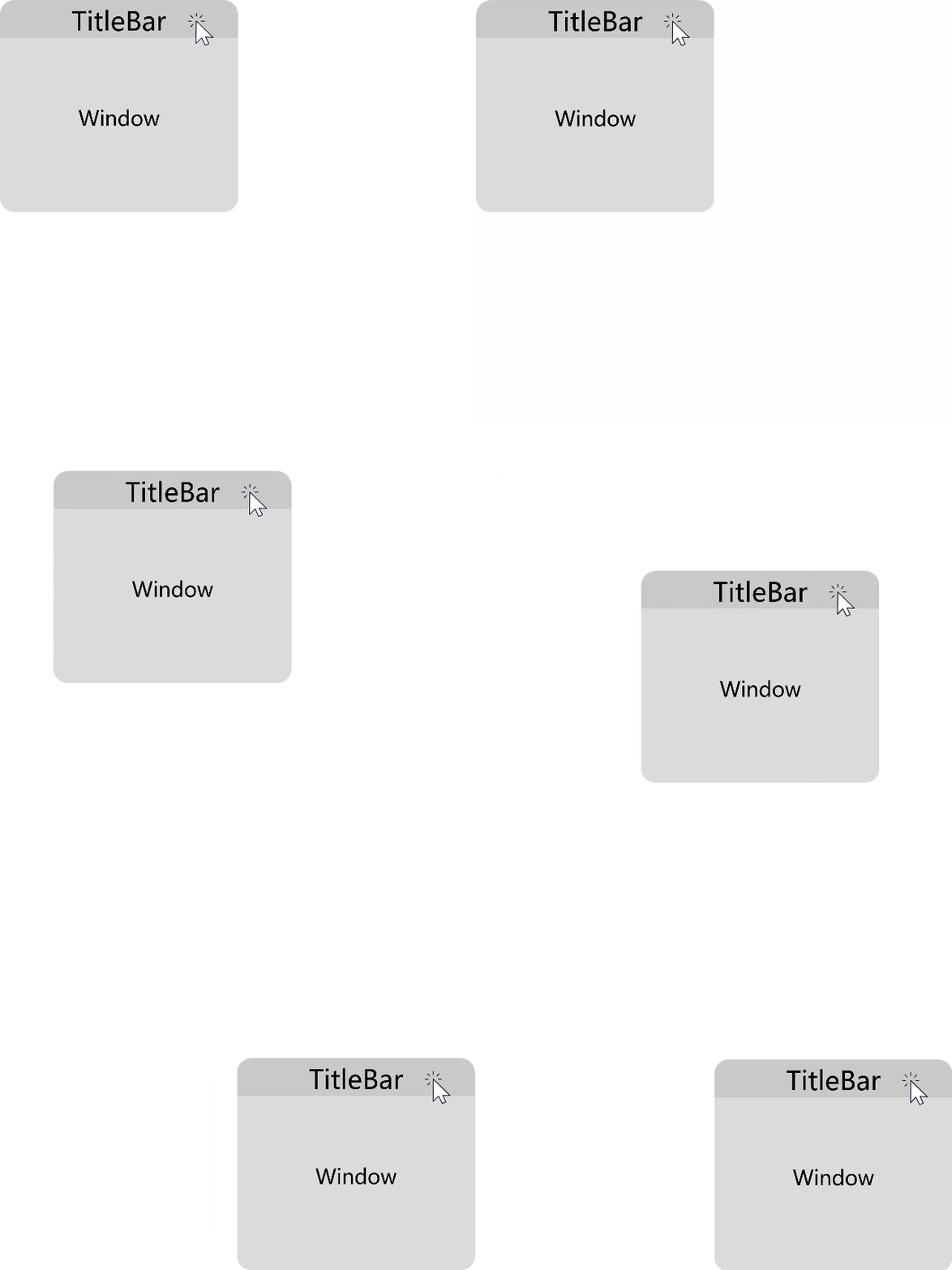
Application window dragging is a common operation when freeform windows are used on computers or tablets. It refers to the action of clicking or tapping the window with a mouse or finger on the screen, causing the window to follow the movement of the mouse or finger, as shown in the figure below. For windows with the default title bar, the system provides high-performance app window dragging capabilities. If a window does not have a title bar or requires a customized title bar, you need to call the dragging capability provided by the system. This section focuses on high-performance development methods for this type of window dragging scenario.
How to Implement
Using moveWindowTo() for window movement can cause laggy (unresponsive to input) issues and does not support cross-screen movement in extended display scenarios. Therefore, if you build an app with the ArkUI framework, the startMoving() API is recommended to achieve high-performance app window dragging. You can register a custom callback in the onTouch() method of any component. When a TouchType.Down event is received, the startMoving() API is called to implement window dragging.
| API | Description | When to Use |
|---|---|---|
| Moves this window. | In freeform window mode, the window moves relative to the screen. In non-freeform window mode, the window moves relative to the parent window. It can also be used to set the initial position of child windows. | |
| Starts window movement. | The window will follow the pointer/finger until release, with no restrictions on window type. | |
| Specifies the pointer position within the window and moves the window. | If the pointer moves rapidly and exits the window bounds, this method allows you to specify an offset from the window's top-left corner. The window is first moved to the expected pointer position before dragging. | |
| Stops window movement. | This API can be used to halt window dragging, for example, by binding it to a shortcut key or when terminating a drag event. |
Sample code
If you use ArkUI to develop apps, the following code shows how to drag the window along with the title bar component. When the title bar component receives a click event, you can obtain the window object corresponding to the title bar component by using getMainWindowSync() and then call the startMoving() API on the window object to enter the window dragging logic.
import { BusinessError } from '@kit.BasicServicesKit';
import { window } from '@kit.ArkUI';

const COLUMN_WIDTH: number = 108;
const COLUMN_TOP: number = 50;
const COLUMN_LEFT: number = 100;

@Entry
@Component
struct Index {
  // get the window manager from AppStorage
  windowStage: window.WindowStage = AppStorage.get('window') as window.WindowStage;

  build() {
    Column() {
      Blank('60')
        .color(Color.Blue)
        .onTouch((event: TouchEvent) => {
          if (event.type === TouchType.Down) {
            try {
              let wnd: window.Window = this.windowStage.getMainWindowSync();
              if (canIUse('SystemCapability.Window.SessionManager')) {
                wnd.startMoving().then(() => {
                  console.info('wnd Succeeded in starting moving window');
                }).catch((err: BusinessError) => {
                  console.error(`Failed to start moving. Cause code: ${err.code}, message: ${err.message}`);
                });
              }
            } catch (exception) {
              console.error(`Failed to start moving. Cause code: ${exception.code}, message: ${exception.message}`);
            }
          }
        })
    }.width(COLUMN_WIDTH).position({ top: COLUMN_TOP, left: COLUMN_LEFT }).alignItems(HorizontalAlign.Center);
  }
}
[h2]Setting the Window Mode, Size, and Position for Application Launch
An app window can be launched on a PC in two ways:
- By double-clicking the desktop app icon or selecting the icon in the app center.
- Via the UIAbilityContext.startAbility() API, where the startOption parameter specifies the window mode, target screen ID, window position, window size, and other information at launch.
When a freeform window is launched, there are multiple approaches to set the main window's position and size, ordered from highest to lowest precedence: full-screen display > using startOptions to specify the window size and position at launch > using the setWindowRectAutoSave() method to enable window size auto-save > using the metadata tag to configure maximization > using the metadata tag to configure size and position.
- Full-screen display
- In the abilities tag in the module.json5 file, remove floating from the supportWindowMode field, and configure [fullscreen] or [fullscreen, split].
"abilities": [ { "name": "EntryAbility", "srcEntry": "./ets/entryability/EntryAbility.ets", "supportWindowMode": [ "fullscreen" ], // ... "description": "$string:EntryAbility_desc", "icon": "$media:layered_image", "label": "$string:EntryAbility_label", "startWindowIcon": "$media:startIcon", "startWindowBackground": "$color:start_window_background", "exported": true, "skills": [ { "entities": [ "entity.system.home" ], "actions": [ "action.system.home" ] } ] }, { "name": "SubEntryAbility", "srcEntry": "./ets/entryability/SubEntryAbility.ets", "supportWindowMode": [ "fullscreen", "floating" ], "launchType": "specified", "description": "$string:EntryAbility_desc", "icon": "$media:layered_image", "label": "$string:EntryAbility_label", "startWindowIcon": "$media:startIcon", "startWindowBackground": "$color:start_window_background", "exported": true, "skills": [ { "entities": [ "entity.system.home" ], "actions": [ "action.system.home" ] } ] } ], - Set windowMode in the input parameter StartOptions of the startAbility() API to WINDOW_MODE_FULLSCREEN.
let want: Want = { bundleName: 'com.example.pcproject', abilityName: 'SubEntryAbility' }; try { (this.getUIContext().getHostContext() as common.UIAbilityContext).startAbility(want, { windowMode: AbilityConstant.WindowMode.WINDOW_MODE_FULLSCREEN, supportWindowModes: [bundleManager.SupportWindowMode.FULL_SCREEN] }) .then(() => { // Carry out normal business operations hilog.info(DOMAIN, TAG, '%{public}s', 'startAbility succeed'); }) .catch((err: BusinessError) => { // Handle business logic errors hilog.error(DOMAIN, TAG, '%{public}s', `startAbility failed. Cause code: ${err.code}, message: ${err.message}`); }); } catch (err) { // Handle the err of incorrect input parameters hilog.error(DOMAIN, TAG, '%{public}s', `startAbility failed. Cause code: ${err.code}, message: ${err.message}`); } - Set supportWindowModes in the input parameter StartOptions of the startAbility() API to [bundleManager.SupportWindowMode.FULL_SCREEN], or [bundleManager.SupportWindowMode.FULL_SCREEN, bundleManager.SupportWindowMode.SPLIT].
let want: Want = {
  bundleName: 'com.example.pcproject',
  abilityName: 'SubEntryAbility'
};
try {
  (this.getUIContext().getHostContext() as common.UIAbilityContext).startAbility(want, {
    supportWindowModes: [bundleManager.SupportWindowMode.FULL_SCREEN]
  })
    .then(() => {
      // Carry out normal business operations
      hilog.info(DOMAIN, TAG, '%{public}s', 'startAbility succeed');
    })
    .catch((err: BusinessError) => {
      // Handle business logic errors
      hilog.error(DOMAIN, TAG, '%{public}s',
        `startAbility failed. Cause code: ${err.code}, message: ${err.message}`);
    });
} catch (err) {
  // Handle the err of incorrect input parameters
  hilog.error(DOMAIN, TAG, '%{public}s',
    `startAbility failed. Cause code: ${err.code}, message: ${err.message}`);
}
When the UIAbility launch mode is set to specified, configuring the supportWindowModes parameter in StartOptions does not take effect.
- In the abilities tag in the module.json5 file, remove floating from the supportWindowMode field, and configure [fullscreen] or [fullscreen, split].
- Specifying the window size and position via StartOptions
Set the windowLeft, windowTop, windowWidth, and windowHeight properties in StartOptions.
let want: Want = { bundleName: 'com.example.pcproject', abilityName: 'SubEntryAbility' }; try { (this.getUIContext().getHostContext() as common.UIAbilityContext).startAbility(want, { windowLeft: 700, windowTop: 300, windowWidth: 1600, windowHeight: 1000, minWindowWidth: 800, minWindowHeight: 600 }) .then(() => { // Carry out normal business operations hilog.info(DOMAIN, TAG, '%{public}s', 'startAbility succeed'); }) .catch((err: BusinessError) => { // Handle business logic errors hilog.error(DOMAIN, TAG, '%{public}s', `startAbility failed. Cause code: ${err.code}, message: ${err.message}`); }); } catch (err) { // Handle the err of incorrect input parameters hilog.error(DOMAIN, TAG, '%{public}s', `startAbility failed. Cause code: ${err.code}, message: ${err.message}`); } - Auto-save of window sizes (currently supported only on PCs)
Within the same UIAbility, an app can enable window size auto-save by calling the setWindowRectAutoSave() method, which saves the size of the last closed main window. When that main window is launched again, it opens according to the saved dimensions based on predefined rules.
Alternatively, within the same UIAbility, the setWindowRectAutoSave(enabled: boolean, isSaveBySpecifiedFlag: boolean) method can be used to save the size of each main window individually. This individual saving only takes effect when the UIAbility launch mode is specified and isSaveBySpecifiedFlag is set to true.
For details about the auto-save rules and sample code, see setWindowRectAutoSave() and setWindowRectAutoSave(enabled: boolean, isSaveBySpecifiedFlag: boolean).
- Configuring the window size and position via metadata tags
To configure whether the main window launches in its maximized state, add a configuration item in the metadata tag of the module.json5 file with the name ohos.ability.window.isMaximize and a value of true. The value can be true (launch maximized) or false (launch normally). If not configured, the default value is false. This approach prevents the visual flicker that can occur when maximize is called in onWindowStageCreate.
Window size and position at launch can also be configured via the metadata tag. For details, see Window Metadata Configuration.

For the main window to launch maximized, the supportWindowMode configuration must include both the fullscreen and floating options.
If the configured window size or position extends beyond the screen bounds, the system will automatically adjust it to fit within the current screen.
If both left and top are not configured or their configuration does not take effect, the window is displayed according to the system's cascading rules.
- Window cascading specifications
Specification
Description
Default window size
On first launch, the default window size is 67% of the screen's width and height, centered within the work area (screen area excluding the Dock and status bar).
System size limits
The system default minimum width for a freeform window is 320 vp, the minimum height is 72 vp, and the maximum width and height are both 3840 vp. If the app does not set windowLimits, the getWindowLimits() API returns these default system limits.
Default window mode
Windows supporting the floating mode open as freeform windows by default.
Multi-freeform window cascading rules:- Identify the top-most window (including background windows), excluding any always-on-top windows, as the reference. New windows cascade from this reference (offset to the right and downward).
- If the cascaded position of a window falls partially outside the work area, the coordinates in the exceeding direction are reset to the work area's starting point.
- For apps supporting multiple instances, the position of the second (and subsequent) window is cascaded relative to the previous instance's window position.
Floating Window Mode Adaptation
If page content is truncated, squeezed, or stacked after an app enters the floating window mode, you can refer to Responsive UI Layout and Adaptive UI Element in multi-device UI development to make the app adapt to the window size changes.
Common floating layout adaptation problems are classified into the following types:
- Layout adaptation: layout disorder or page truncation due to the reduced window height when the page enters the split-screen or floating window mode.
- Implementing the avoid area for the window-top control bar in immersive mode: no response to operations in the app split-screen view and the overlapping area on top of the floating window.
- Horizontal floating window adaptation: horizontal floating window adaptation for games and video apps.
[h2]What Should I Do If the Screen Content Is Not Completely Displayed in Split-screen Mode and Cannot Be Displayed by Swiping Up or Down?
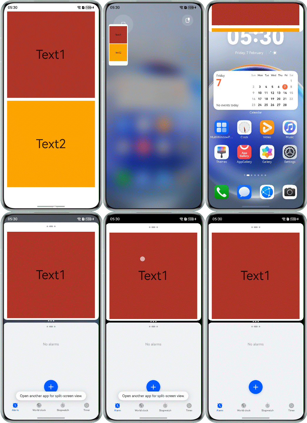
Cause
The app is adapted only to the full-screen size. When the app enters the split-screen or floating window mode, the window becomes smaller. As a result, the page is not completely displayed, and the content in the area beyond the window cannot be displayed.
@Component
export struct Question1Incorrect {
  build() {
    NavDestination() {
      Column({ space: 12 }) {
        Text('Text1')
          .fontSize(50)
          .width('100%')
          .textAlign(TextAlign.Center)
          .height(350)
          .backgroundColor(Color.Brown)

        Text('Text2')
          .fontSize(50)
          .width('100%')
          .textAlign(TextAlign.Center)
          .height(350)
          .backgroundColor(Color.Orange)
      }
      // ...
    }
    // ...
  }
}
Solution
Use the extension capability to add the Scroll component for the list or text area for scrolling in a specified direction. The sample code is as follows:
@Component
export struct Question1Correct {
  build() {
    NavDestination() {
      Scroll() {
        Column({ space: 12 }) {
          Text('Text1')
            .fontSize(50)
            .width('100%')
            .textAlign(TextAlign.Center)
            .height(350)
            .backgroundColor(Color.Brown)

          Text('Text2')
            .fontSize(50)
            .width('100%')
            .textAlign(TextAlign.Center)
            .height(350)
            .backgroundColor(Color.Orange)
        }
      }
      // ...
    }
    // ...
  }
}
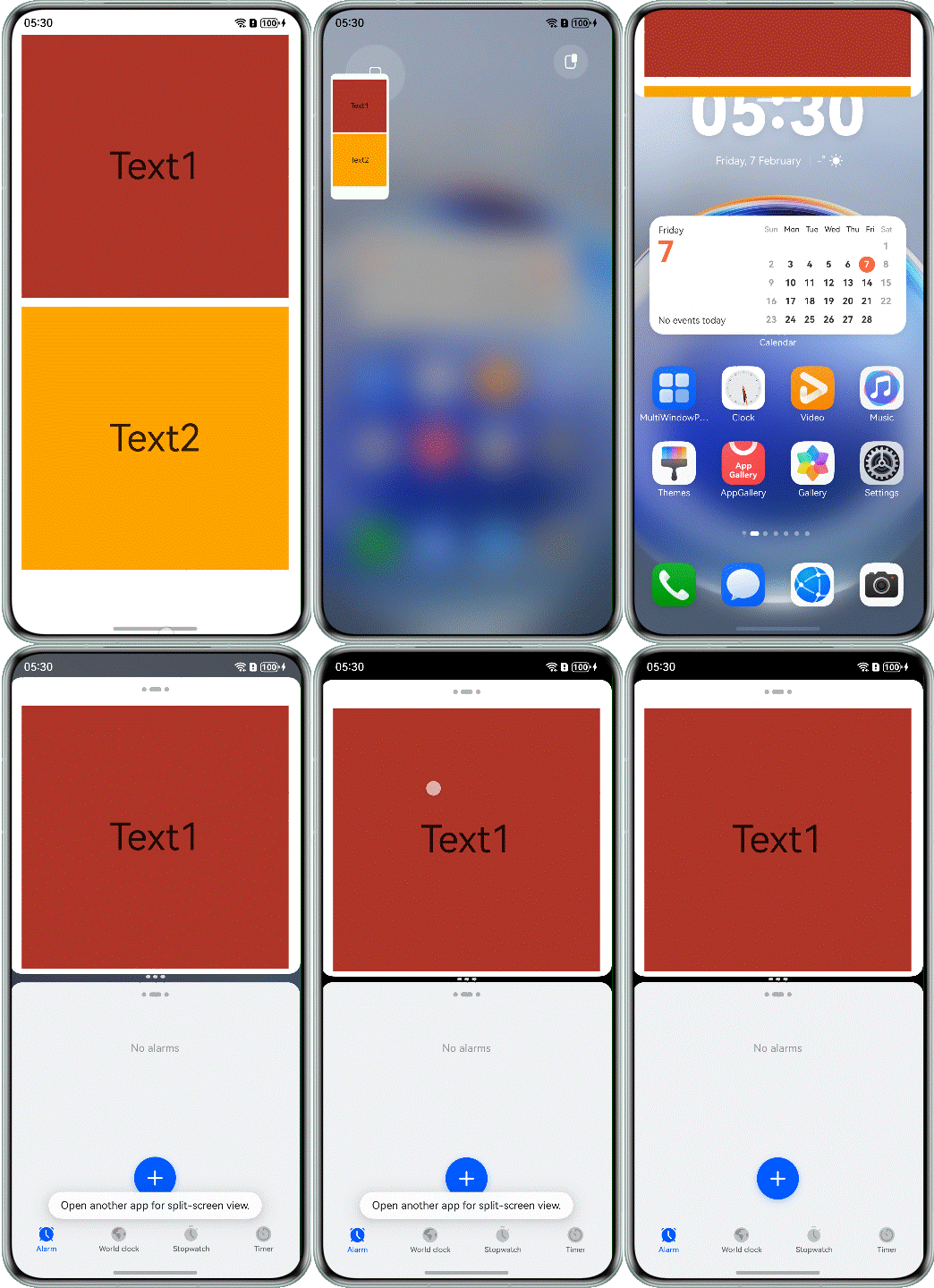
The following figure shows the effect after optimization.
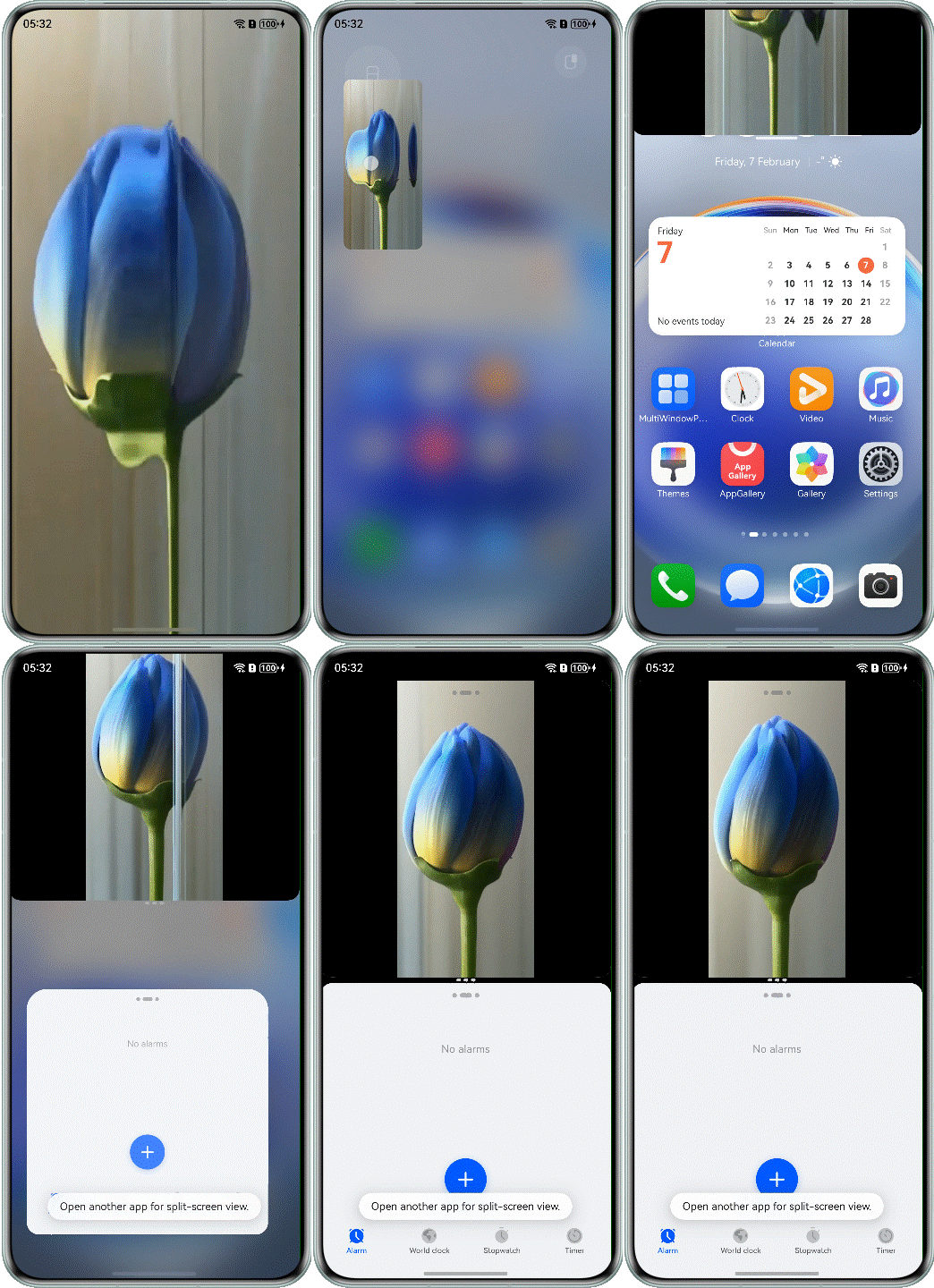
[h2]What Should I Do If the Video Image of XComponent Is Not Completely Displayed in Split-screen Mode?
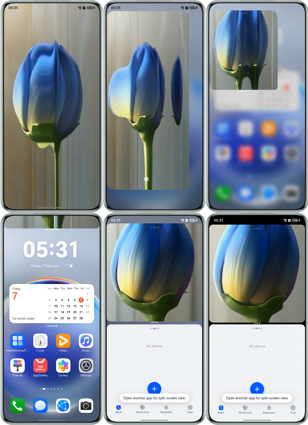
Cause
When the split-screen page is displayed, the height of the window changes to 1/2 of the screen. The app does not adapt to this situation. As a result, the width of XComponent does not change to 1/2 of the original width, causing the video page to be deformed.
@Component
export struct Question2Incorrect {
  @State aspect: number = 9 / 16; // default video height/width ratio value
  @State xComponentWidth: number = this.getUIContext().px2vp(display.getDefaultDisplaySync().width);
  @State xComponentHeight: number = this.getUIContext().px2vp(display.getDefaultDisplaySync().width * this.aspect);
  // ...

  build() {
    NavDestination() {
      Stack() {
        XComponent({ id: 'video_player_id', type: XComponentType.SURFACE, controller: this.xComponentController })
          // ...
          .width(this.xComponentWidth)
          .height(this.xComponentHeight)
      }
      .width('100%')
      .height('100%')
      .backgroundColor(Color.Black)
    }
    .hideTitleBar(true)
  }
}
Solution
Use aspectRatio to specify the aspect ratio of the XComponent component. After aspectRatio is set, the width and height of the component are constrained by the size of the parent component's content area.
@Component
export struct Question2Correct {
  @State aspect: number = 9 / 16; // default video width/height ratio value
  // ...

  build() {
    NavDestination() {
      Stack() {
        XComponent({ id: 'video_player_id', type: XComponentType.SURFACE, controller: this.xComponentController })
          // ...
          .aspectRatio(this.aspect)
      }
      .width('100%')
      .height('100%')
      .backgroundColor(Color.Black)
    }
    // ...
  }
}
The following figure shows the effect after optimization.
[h2]What Should I Do If the Video Component Is Truncated in Split-screen Mode and the Video Playback Screen Is Not Completely Displayed?
Cause
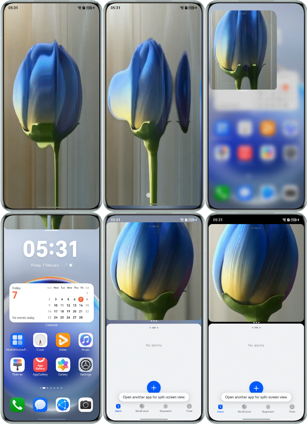
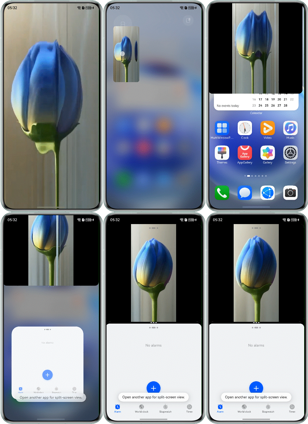
The width and height of the Video component are set to 100%. By default, the Video component is scaled up or down based on the aspect ratio so that the video can cover the entire screen. After screen splitting, the window width remains unchanged, but the height changes to half of the original height. The height of the Video component exceeds the window height. As a result, the video is not completely displayed.
@Component
export struct Question3Incorrect {
  build() {
    NavDestination() {
      Column() {
        Video({ src: $rawfile('testVideo2.mp4') })
          .height('100%')
          .width('100%')
          .autoPlay(true)
          .controls(false)
      }
      .height('100%')
      .width('100%')
    }
    .hideTitleBar(true)
  }
}
Solution
Set the .objectFit(ImageFit.Contain) attribute for the Video component to be scaled up or down with the fixed aspect ratio so that the video is completely displayed within the boundary of the Video component.
@Component
export struct Question3Correct {
  build() {
    NavDestination() {
      Column() {
        Video({ src: $rawfile('testVideo2.mp4') })
          // ...
          .objectFit(ImageFit.Contain)
      }
      .height('100%')
      .width('100%')
    }
    .hideTitleBar(true)
  }
}
The following figure shows the effect after optimization.
[h2]What Should I Do If the Child Component Is Displayed Beyond the Scope of the Parent Component and Cannot Be Completely Displayed by Swiping Up or Down?

Cause
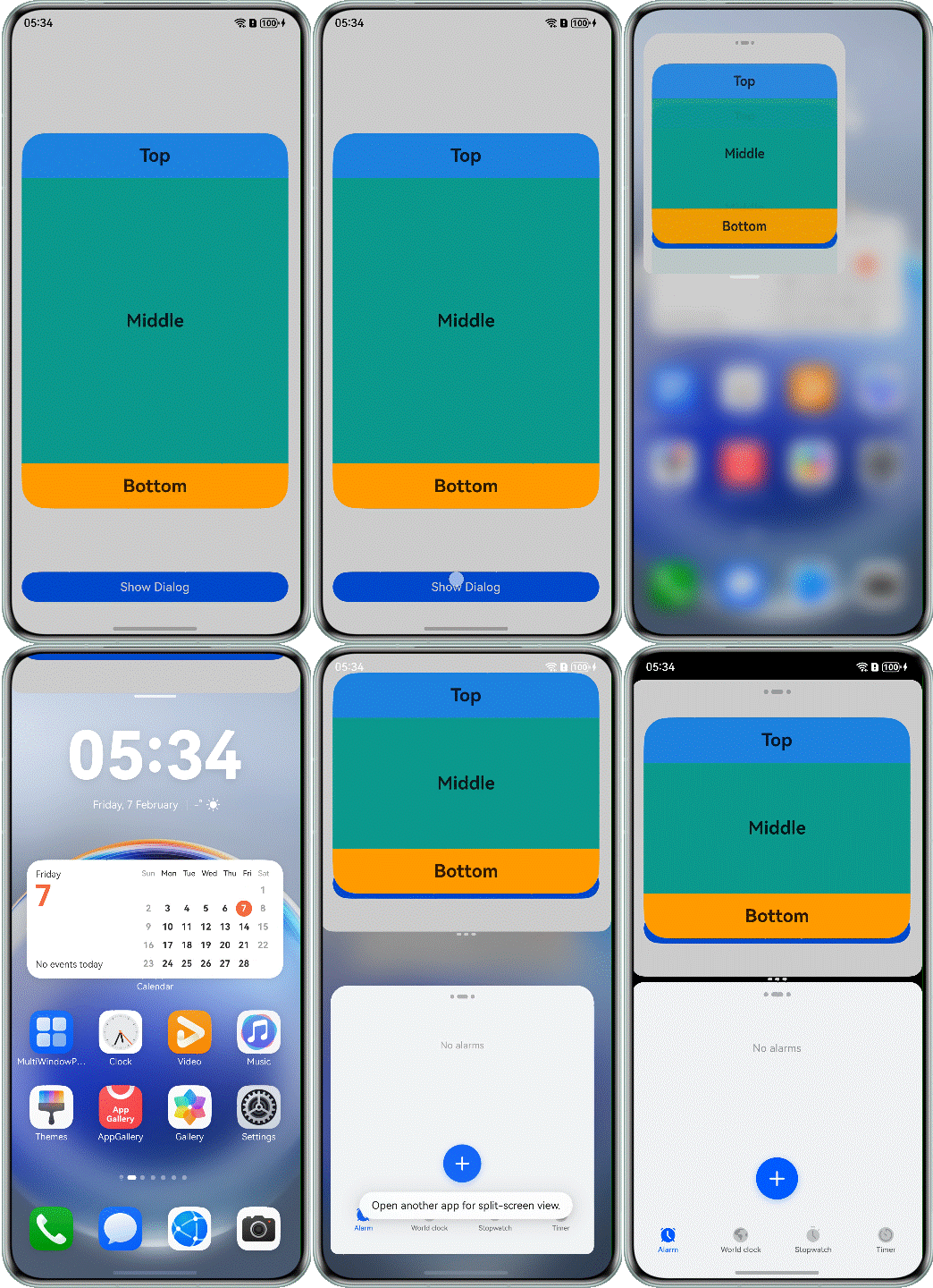
The child component is set to a fixed value. When the app is displayed in split-screen mode, the screen height changes to 1/2 of the original height, and the height of the parent component decreases accordingly. If the height of the child component is greater than that of the parent component, the child component cannot be completely displayed.
@Component
export struct Question4Incorrect {

  @Builder
  customDialogComp() {
    Column() {
      Text('Top')
        // ...

      Scroll() {
        Text('Middle')
          // ...
      }
      .layoutWeight(1)

      Text('Bottom')
        // ...
    }
    .height(500)
    .justifyContent(FlexAlign.SpaceBetween)
  }

  build() {
    // ...
  }
}
Solution
You can use constraintSize for the child component to ensure that the child component follows the size of the parent container. You are advised to use the percentage of the child component's height relative to the parent component rather than an absolute value.
@Builder
customDialogComp() {
  Column() {
    Text('Top')
      // ...

    Scroll() {
      Text('Middle')
        // ...
    }
    .layoutWeight(1)

    Text('Bottom')
      // ...
  }
  .height(500)
  .justifyContent(FlexAlign.SpaceBetween)
  .constraintSize({
    maxHeight: '90%'
  })
}
The following figure shows the effect after optimization.
[h2]What Should I Do If the Image Component Is Not Completely Displayed As the Window Becomes Smaller and the Page Layout Is Displayed Abnormally After the Split-screen Mode Is Enabled?
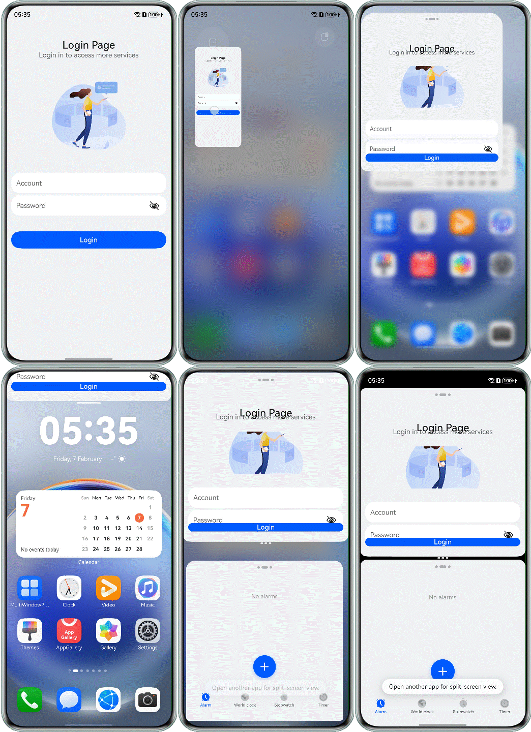
Cause
On the split-screen page, the height of the window changes to half of the screen. As a result, the height of the Image component decreases and the image is deformed.
@Component
export struct Question5Incorrect {
  build() {
    NavDestination() {
      Flex({ direction: FlexDirection.Column, alignItems: ItemAlign.Center }) {
        Text("Login Page")
          // ...
        Text("Login in to access more services")
          // ...

        Image($r('app.media.login_pic'))
          // ...

        Column() {
          TextInput({ placeholder:  "Account" })
            // ...

          TextInput({ placeholder:"Password" })
            // ...
        }
        // ...

        Button($r('app.string.login'))
          // ...
      }
      // ...
    }
    // ...
  }
}
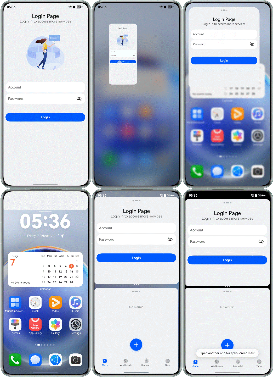
Solution
Use the hiding capability to display or hide the container component as its size changes based on the preset display priority. You can set the layout priority (through the displayPriority attribute) to control the visibility of container components.
@Component
export struct Question5Correct {
  build() {
    NavDestination() {
      Flex({ direction: FlexDirection.Column, alignItems: ItemAlign.Center }) {
        Text("Login Page")
          // ...
          .displayPriority(4)

        Text("Login in to access more services")
          // ...
          .displayPriority(3)

        Image($r('app.media.login_pic'))
          // ...
          .displayPriority(2)

        Column() {
          TextInput({ placeholder: "Account" })
            // ...

          TextInput({ placeholder: "Password" })
            // ...
        }
        // ...
        .displayPriority(5)
        // ...
        Button($r('app.string.login'))
          // ...
          .displayPriority(5)
      }
      // ...
    }
    // ...
  }
}
The following figure shows the effect after optimization.
[h2]What Should I Do If the Layout of the Pop-up Window Is Disordered in Split-screen Mode and the Buttons at the Bottom Block the Content in the Pop-up Window?
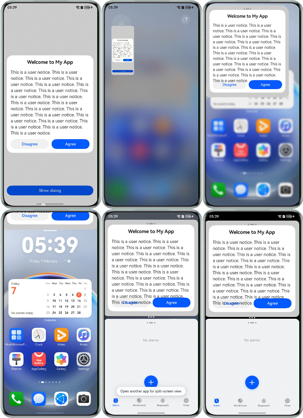
Cause
The app does not consider the scenario where the split-screen window size becomes smaller. The height of the dialog box is set to a fixed value, and the position attribute is used to set the fixed position of the bottom button. As a result, the overall layout is disordered.
@CustomDialog
struct CustomDialogComp1 {
  controller: CustomDialogController = new CustomDialogController({ 'builder': '' });

  build() {
    Column() {
      Text($r('app.string.welcome'))
        // ...

      Column() {
        Scroll() {
          Text($r('app.string.dialog_content'))
            // ...
        }
      }

      Row({ space: 12 }) {
        Button($r('app.string.disagree'))
          // ...
        Button($r('app.string.agree'))
          // ...
      }
      .height(56)
      .alignItems(VerticalAlign.Top)
      .position({
        bottom: 0,
        left: 0
      })
    }
    .constraintSize({
      maxHeight: '80%'
    })
    // ...
  }
}
Solution
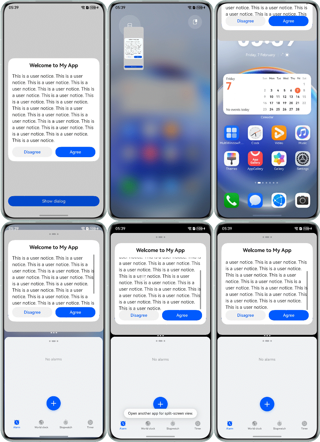
Use the constraintSize attribute to limit the maximum height of the dialog box, use the Scroll component to wrap the content area of the dialog box (through the extension capability), and set the layoutWeight attribute (through the proportion capability) for the Column component in the content area to occupy the remaining space so that the operation buttons are displayed at the bottom. When the content height exceeds the content area height, you can scroll to view the content.
@CustomDialog
struct CustomDialogComp {
  controller: CustomDialogController = new CustomDialogController({ 'builder': '' });

  build() {
    Column() {
      Text($r('app.string.welcome'))
        // ...

      Column() {
        Scroll() {
          Text($r('app.string.dialog_content'))
            // ...
        }
      }
      .layoutWeight(1)

      Row({ space: 12 }) {
        Button($r('app.string.disagree'))
          // ...
        Button($r('app.string.agree'))
          // ...
      }
      .height(56)
      .alignItems(VerticalAlign.Top)
    }
    .constraintSize({
      maxHeight: '80%'
    })
    .height(400)
    // ...
  }
}
The following figure shows the effect after optimization.
[h2]Implementing the Avoid Area for the Window-top Control Bar in Immersive Mode
In the floating window scenario of an immersive app, the operation bar on the top cannot be operated. After the app screen is split, the area where the view overlaps with the top of the floating window cannot respond to operations.
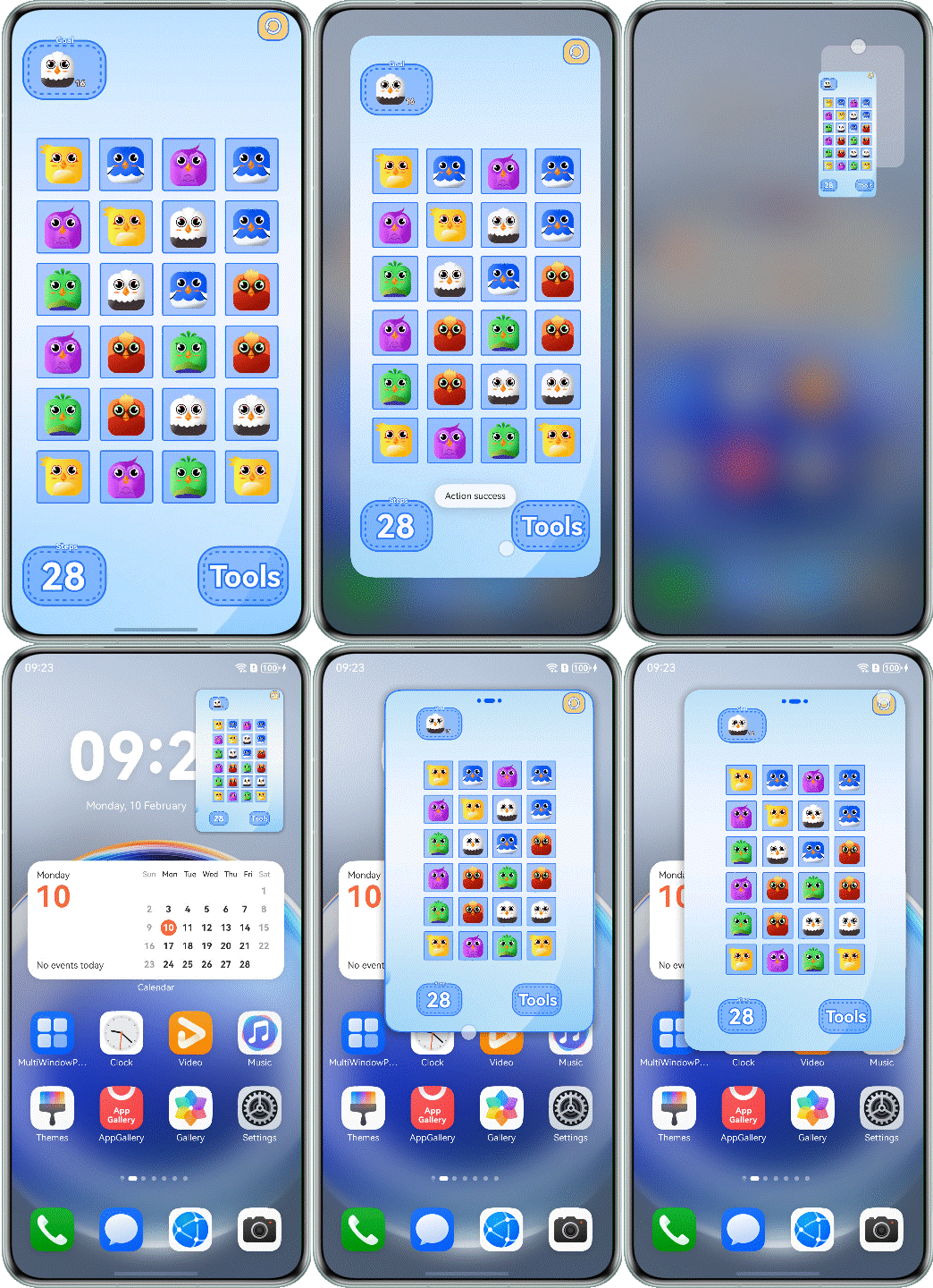
Cause
The bar on the top of the floating window overlaps with the top area of the immersive app, which, however, should be avoided. The buttons in the overlapping area cannot respond to the tap event.
@Component
export struct Question7Incorrect {
  private windowClass: window.Window | undefined = undefined;

  aboutToAppear(): void {
    try {
      this.windowClass=(this.getUIContext().getHostContext() as common.UIAbilityContext).windowStage.getMainWindowSync();
      this.windowClass.setSpecificSystemBarEnabled('status', false).catch((error:BusinessError) => {
        Logger.error(TAG, `setSpecificSystemBarEnabled err, code: ${error.code}, mesage: ${error.message}`);
      });
    } catch (err) {
      let error = err as BusinessError;
      Logger.error(TAG, `aboutToAppear err, code: ${error.code}, mesage: ${error.message}`);
    }
  }

  aboutToDisappear(): void {
    this.windowClass?.setSpecificSystemBarEnabled('status', true).catch((error:BusinessError) => {
      Logger.error(TAG, `setSpecificSystemBarEnabled err, code: ${error.code}, mesage: ${error.message}`);
    });
  }

  build() {
    NavDestination() {
      Stack() {
        // ...

        Row() {
          Image($r('app.media.icon_pause'))
            // ...
            .onClick(() => {
              try {
                this.getUIContext().getPromptAction().showToast({
                  message: 'Action success'
                });
              } catch (err) {
                let error = err as BusinessError;
                Logger.error(TAG, `showToast err, code: ${error.code}, mesage: ${error.message}`);
              }
            })
        }
        .height('100%')
        .width('100%')
        .justifyContent(FlexAlign.End)
        .alignItems(VerticalAlign.Top)
      }
    }
    .hideTitleBar(true)
  }
}
Solution
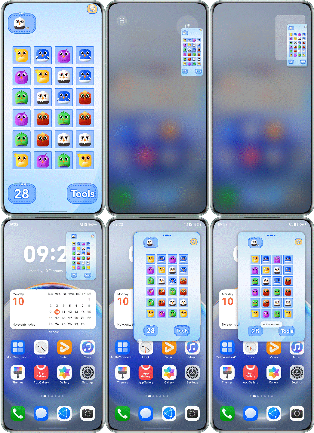
Use the getWindowAvoidArea() API to obtain the topRect value of the matrix area to be avoided at the top of the screen. After the value is obtained, layout avoidance can be implemented for the app. In addition, the app can use on('avoidAreaChange') to listen for avoidance area changes in the system for dynamic layout adjustment. For details, refer to Implementing the Avoid Area for the Window-top Control Bar.
@Component
export struct Question7Correct {
  private windowClass: window.Window | undefined = undefined;
  @State topSafeHeight: number = 0;
  @State windowStatus: WindowStatusType = window.WindowStatusType.FULL_SCREEN;

  aboutToAppear(): void {
    try {
      this.windowClass=(this.getUIContext().getHostContext() as common.UIAbilityContext).windowStage.getMainWindowSync();
      this.windowClass.setSpecificSystemBarEnabled('status', false).catch((error:BusinessError) => {
        Logger.error(TAG, `setSpecificSystemBarEnabled err, code: ${error.code}, mesage: ${error.message}`);
      });
      this.windowStatus = this.windowClass.getWindowStatus();

      if (this.windowStatus === window.WindowStatusType.FLOATING) {
        this.topSafeHeight = this.getUIContext()
          .px2vp(this.windowClass.getWindowAvoidArea(window.AvoidAreaType.TYPE_SYSTEM).topRect.height);
      }

      this.windowClass.on('windowStatusChange', data => {
        if (data === window.WindowStatusType.FLOATING) {
          this.topSafeHeight =
            this.getUIContext()
              .px2vp(this.windowClass?.getWindowAvoidArea(window.AvoidAreaType.TYPE_SYSTEM).topRect.height);
        } else {
          this.topSafeHeight = 0;
        }
      })
    } catch (err) {
      let error = err as BusinessError;
      Logger.error(TAG, `aboutToAppear err, code: ${error.code}, mesage: ${error.message}`);
    }
  }

  aboutToDisappear(): void {
    this.windowClass?.setSpecificSystemBarEnabled('status', true).catch((error:BusinessError) => {
      Logger.error(TAG, `setSpecificSystemBarEnabled err, code: ${error.code}, mesage: ${error.message}`);
    });
  }

  build() {
    // ...
  }
}
The following figure shows the effect after optimization.
[h2]If a video or game app has not adapted to a floating window in landscape mode, the content may not be completely displayed, affecting user experience.
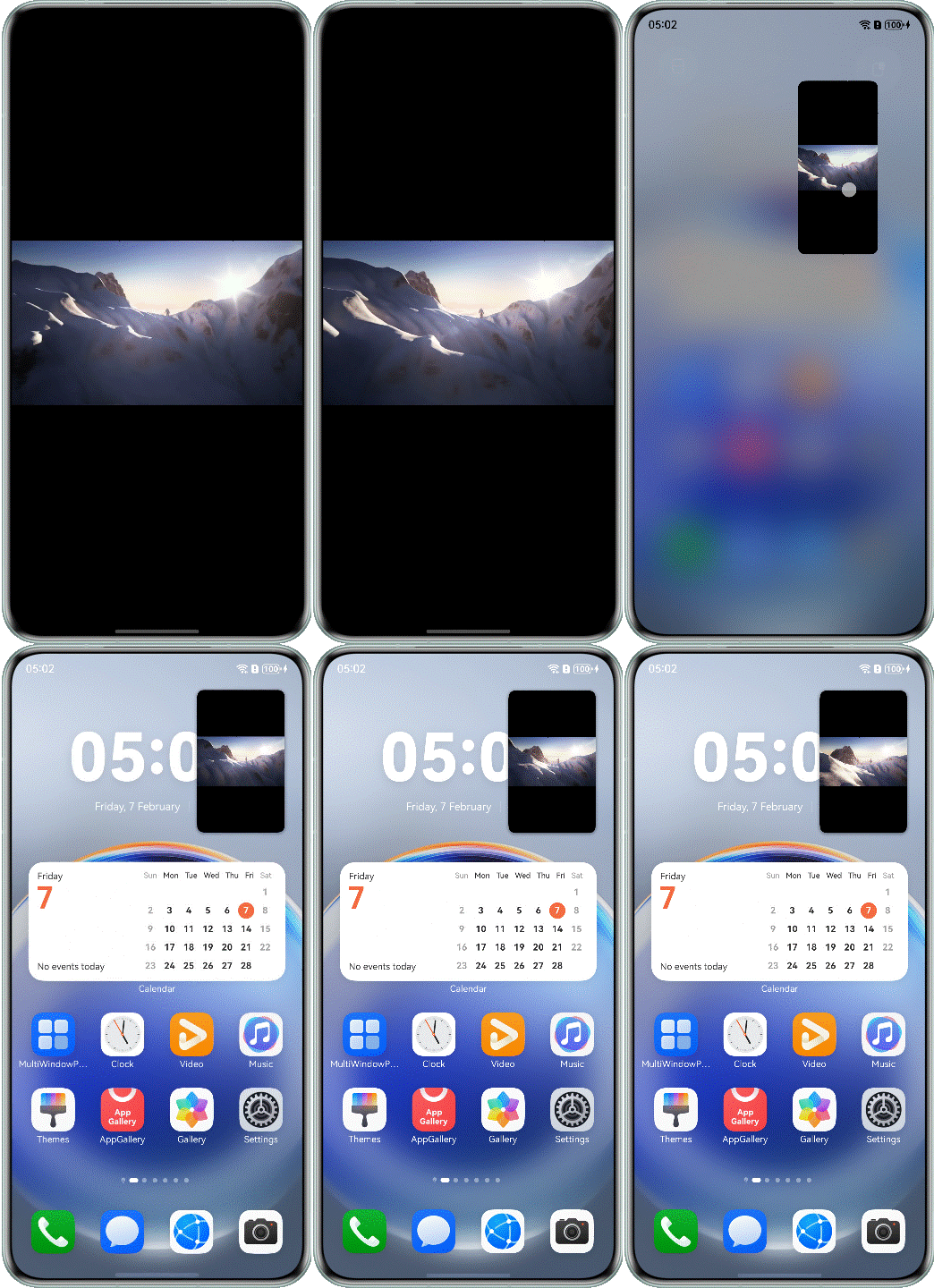
Cause
By default, the floating window is in portrait mode. The app needs to proactively adapt to the attribute value of the landscape mode.
@Component
export struct Question8Incorrect {
  build() {
    NavDestination() {
      Column() {
        Video({ src: $rawfile('testVideo1.mp4') })
          .height('100%')
          .width('100%')
          .autoPlay(true)
          .objectFit(ImageFit.Contain)
          .controls(false)
      }
      .height('100%')
      .width('100%')
    }
    .hideTitleBar(true)
  }
}
Solution
Add landscape_auto to the preferMultiWindowOrientation attribute under the abilities tag in the module.json5 configuration file.
{
  "module": {
    // ...
    "abilities": [
      {
        "name": "EntryAbility",
        // ...
        "preferMultiWindowOrientation": "landscape_auto",
        // ...
      }
    ],
    // ...
  }
}
In this scenario, the multi-window layout can be dynamically changed to the horizontal layout, and APIs (enableLandscapeMultiWindow() and disableLandscapeMultiWindow()) need to be used.
@Component
export struct Question8Correct {
  private windowClass: window.Window | undefined = undefined;

  aboutToAppear(): void {
    try {
      this.windowClass=(this.getUIContext().getHostContext() as common.UIAbilityContext).windowStage.getMainWindowSync();
      this.windowClass.enableLandscapeMultiWindow().catch((error:BusinessError) => {
        Logger.error(TAG, `enableLandscapeMultiWindow err, code: ${error.code}, mesage: ${error.message}`);
      });
    } catch (err) {
      let error = err as BusinessError;
      Logger.error(TAG, `aboutToAppear err, code: ${error.code}, mesage: ${error.message}`);
    }


  }

  aboutToDisappear(): void {
    this.windowClass?.disableLandscapeMultiWindow().catch((error:BusinessError) => {
      Logger.error(TAG, `disableLandscapeMultiWindow err, code: ${error.code}, mesage: ${error.message}`);
    });
  }

  build() {
    // ...
  }
}
The following figure shows the effect after optimization.