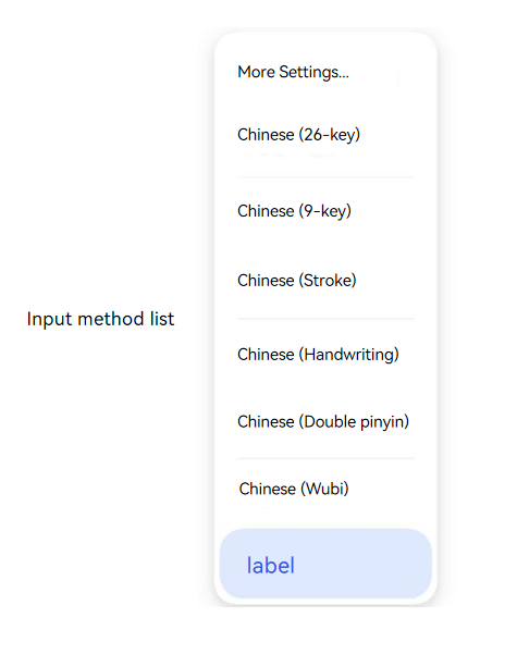
The @ohos.inputMethodList module is a UI control module oriented to system apps and input method apps. It provides an input method list dialog component.
This module is a declarative UI component module. It provides the InputMethodListDialog custom dialog component, which is used to display the default input method subtypes and the list of third-party input method apps. It optionally provides an entry for switching input method modes (such as one-handed mode and full-screen mode).
Through the dialog component provided by this module, users can view all input methods installed in the current system in the input method list and switch from the default input method to another input method. For preset system input methods, mode options (such as one-handed mode and full-screen mode) can also be displayed in the list for users to switch the display mode of the input method keyboard.
This module is used when a system app or an input method app needs to provide an entry for input method switching. Typical scenarios include the input method management page in the system settings app, the settings interface of an input method app, or other system-level interfaces that require users to select and switch input methods. This component can be called only by system apps and input method apps. The patternOptions parameter is supported only by preset system input methods.
The relationship between this module and other modules in the input method framework is as follows:
@ohos.inputMethod: Targeted at general foreground apps. Provides input method control and management capabilities (such as showing/hiding the soft keyboard and switching input methods). It can switch input methods through the switchInputMethod API, and is suitable for scenarios that do not require an interactive selection interface.
@ohos.inputMethodEngine: Targeted at input method apps. Provides input method server capabilities such as creating soft keyboard windows and inserting/deleting characters.
@ohos.inputMethodList (this module): Targeted at system apps and input method apps. Provides a visualized input method list dialog component, and is suitable for scenarios that require an interactive selection interface.

This component is supported since API version 11. New APIs in later versions are marked with a superscript to indicate their initial version.
This module contains the following key components and interfaces:
| Interface/Struct | Description |
|---|---|
| InputMethodListDialog | Input method list dialog component, declared using the @CustomDialog decorator. Displays the input method list and an optional mode switching entry, which is the core UI component of this module. A CustomDialogController must be passed in to control the opening and closing of the dialog, and PatternOptions can be optionally passed in to configure the mode switching feature. |
| PatternOptions | Input method mode option configuration interface, which defines the resource array of mode options, the index of the mode selected by default, and the mode switching callback. Only preset system input methods support passing in this parameter. |
| Pattern | Icon definition interface for a single input method mode, containing two resource properties: the default icon and the selected-state icon. |
Using InputMethodListDialog requires the combination of multiple APIs: create a CustomDialogController > configure PatternOptions (optional) > build InputMethodListDialog in the builder of CustomDialogController > open the dialog through CustomDialogController.open().
// The following is pseudo code for describing the calling logic.

// 1. Define mode options (required only for preset system input methods).
let patternOptions = {
  defaultSelected: 1, // Index of the mode selected by default.
  patterns: [ // Array of mode option resources.
    { icon: handed mode icon, selectedIcon: selected icon in handed mode },
    { icon: full-screen mode icon, selectedIcon: selected icon in full-screen mode }
  ],
  action: (index) => { // Callback for mode switching.
    // Handle the mode switching logic.
  }
};

// 2. Create a CustomDialogController and build InputMethodListDialog in the builder.
let listController = new CustomDialogController({
  builder: InputMethodListDialog({ patternOptions: patternOptions }),
  customStyle: true
});

// 3. Open the dialog in the user interaction event.
listController.open(); InputMethodListDialog
InputMethodListDialog({controller: CustomDialogController, patternOptions?: PatternOptions})
Represents the input method list dialog component. It displays the list of input method apps installed in the current system in the form of a dialog, allowing users to switch between input methods. For the default input method, it also provides an entry for switching keyboard modes (such as one-handed mode and full-screen mode).
Usage scenarios: This component is used when a system app or an input method app needs to provide users with a visualized input method selection and switching feature. For example, in the system settings app, users are allowed to select different input methods, or in an input method app, users are allowed to switch to another input method or switch the keyboard mode of the current input method.
Use effect: After this component is invoked, an input method list dialog is displayed. After the user selects an input method in the dialog, the system switches to the specified input method. If the user selects a mode option of the default input method, the system displays the keyboard layout in the specified mode.
Differences between similar APIs and selection principles: Compared with the inputMethod.switchInputMethod API, this component provides a visualized input method selection interface, which is suitable for scenarios that require an interactive selection interface. The switchInputMethod API is suitable for scenarios where the input method is switched programmatically without requiring manual selection by the user.
Usage restrictions: This component can be called only by system apps and input method apps. The patternOptions parameter is supported only by preset input methods.
NOTE
Preconditions: Create a CustomDialogController instance and associate it with InputMethodListDialog, and then open the dialog through the open() method of the controller.
This component does not support universal attributes and universal events.
Decorator type: @CustomDialog
System capability: SystemCapability.MiscServices.InputMethodFramework
Parameters
| Name | Type | Mandatory | Decorator | Description |
|---|---|---|---|---|
| controller | CustomDialogController | Yes | - | Controller of the input method list dialog, used to control the opening and closing of the dialog. Usage scenarios: This parameter must be provided when the showing and hiding of the input method list dialog need to be controlled through code. Use effect: After setting, the dialog can be opened via a call to the open() method of the controller, and closed via a call to the close() method. NOTE A CustomDialogController instance must be created first and associated with InputMethodListDialog, and then the dialog is opened through controller.open(). |
| patternOptions | PatternOptions | No | - | Input method mode option configuration. Supported only by preset system input methods. Usage scenarios: Pass this parameter when a preset system input method needs to support the mode switching feature (such as one-handed mode and full-screen mode), to configure the mode icon resources and switching callback. Default value: When the parameter is not passed, the component displays only the input method list and does not provide the mode switching feature. NOTE Third-party input method apps cannot use this parameter. |
PatternOptions
Represents the configuration of input method mode options, used to define the switching options for keyboard modes.
System capability: SystemCapability.MiscServices.InputMethodFramework
| Name | Type | Read-Only | Optional | Description |
|---|---|---|---|---|
| defaultSelected | number | No | Yes | Default selected mode index, corresponding to the index value in the patterns array. Usage scenarios: Use this parameter when the default input method needs to preset an initially selected keyboard mode. Use effect: After setting, the mode option corresponding to this index is selected by default when the input method list dialog is opened. Value range: [0, patterns.length - 1]. If the value is out of this range, it does not take effect, and no mode option is selected when the dialog opens. Default value: If the parameter is not set, no mode option is selected when the dialog opens. Note: This index value must be within the valid range of the patterns array; otherwise, the setting does not take effect. |
| patterns | Array<Pattern> | No | No | Array of mode option resources. Each Pattern defines the icon and selected state icon of a keyboard mode. Usage scenarios: Configure this parameter when the default input method needs to provide multiple keyboard modes (such as one-handed mode and full-screen mode) for users to choose from. Use effect: After setting, the input method list dialog displays all mode options defined in this array in the default input method area for users to select. Note: The icon and selectedIcon of each Pattern in the patterns array must be valid Resource references. It is recommended that you configure at least 2 mode options to provide a meaningful selection feature. |
| action | (index: number) => void | No | No | Callback invoked when the mode option changes. Usage scenarios: Set this callback when corresponding logic needs to be executed when the user switches the keyboard mode (such as updating the keyboard layout or saving user preferences). Use effect: When the user taps a mode option in the input method list dialog, the system invokes this callback and passes the index value of the selected mode in the patterns array. Note: The callback parameter index is the index value of the selected mode in the patterns array, consistent with the value range of defaultSelected. In the callback, defaultSelected can be updated based on the index value to keep the selected state consistent with the user's choice the next time the dialog is opened. |
Pattern
Represents the definition of the icon resources for input method mode options, used to configure the visual representation of keyboard modes in the dialog. Available only to the current input method (that is, the system preset input method).
System capability: SystemCapability.MiscServices.InputMethodFramework
| Name | Type | Read-Only | Optional | Description |
|---|---|---|---|---|
| icon | Resource | No | No | Icon resource for the default (unselected) state of the input method mode option. Usage scenarios: Identify the visual representation of each keyboard mode when it is unselected, allowing users to recognize different mode options in the dialog. Use effect: After setting, this icon is displayed for the mode option in the dialog when it is in the unselected state. Note: A Resource type reference such as $r('app.media.xxx') must be used, and the corresponding icon resource file must be added to the project's resource directory. Image resources of the string and PixelMap types are not supported. |
| selectedIcon | Resource | No | No | Icon resource for the selected state of the input method mode option. Usage scenarios: Identify the visual representation of each keyboard mode when it is selected, forming a selected/unselected visual distinction with icon to help users recognize the currently selected mode. Use effect: After setting, this icon is displayed for the mode option in the dialog when it is in the selected state. Usage with related parameters: selectedIcon should remain visually consistent with icon, differing only by the selected state indicator (such as adding highlighting or a border), so users can recognize the currently selected mode. The icon and selectedIcon in each Pattern must be set at the same time; neither can be omitted. |
Example
import { PatternOptions, InputMethodListDialog } from '@kit.IMEKit';

@Entry
// Configure the component.
@Component
struct SettingsItem {
  @State defaultPattern: number = 1;
  private oneHandAction: PatternOptions = {
    defaultSelected: this.defaultPattern,
    patterns: [ // Icons in patterns can be used only after the corresponding icon resources have been added to the resource directory of the project.
      {
        icon: $r('app.media.hand_icon'), // Icon resource for the input method mode option, for example, the icon for the one-handed mode.
        selectedIcon: $r('app.media.hand_icon_selected') // Icon resource for the input method mode option in the selected state, for example, the icon for the one-handed mode in the selected state.
      },
      {
        icon: $r('app.media.hand_icon1'),
        selectedIcon: $r('app.media.hand_icon_selected1')
      },
      {
        icon: $r('app.media.hand_icon2'),
        selectedIcon: $r('app.media.hand_icon_selected2')
      }],
    // Callback invoked when the mode option changes.
    action: (index: number) => {
      console.info(`pattern is changed, current is ${index}`);
      this.defaultPattern = index; // Update the default selected mode.
    }
  };
  // Create a custom dialog controller.
  private listController: CustomDialogController = new CustomDialogController({
    builder: InputMethodListDialog({ patternOptions: this.oneHandAction }), // Build the input method list dialog.
    customStyle: true,
    maskColor: '#00000000'
  });

  build() {
    Column() {
      Flex({
        direction: FlexDirection.Column,
        alignItems: ItemAlign.Center,
        justifyContent: FlexAlign.Center
      }) {
        Text('Input method list').fontSize(20)
      }
    }
    .width('13%')
    .id('bindInputMethod')
    .onClick((event?: ClickEvent) => {
      this.listController.open();
    })
  }
}
Effect