You can set the background for a component.

The initial APIs of this module are supported since API version 7. Updates will be marked with a superscript to indicate their earliest API version.
background10+
background(content: CustomBuilder | ResourceColor, options?: BackgroundOptions): T
Sets the background of the component. Since API version 20, the content parameter supports the ResourceColor type, and the ability to extend the background into the safe area of the parent component is added. When only the background color needs to be set and safe area extension is not required, backgroundColor is recommended. When the background color needs to extend into the safe area, use background(content: ResourceColor) together with the ignoresLayoutSafeAreaEdges attribute.

-
Events related to node mounting and unmounting, such as onAppear and onDisAppear, are not supported.
-
Since API version 20, this API can be called in attributeModifier only when the input type of content is ResourceColor.
Atomic service API: This API can be used in atomic services since API version 11.
Model restriction: This API can be used only in the stage model.
System capability: SystemCapability.ArkUI.ArkUI.Full
Parameters
| Name | Type | Mandatory | Description |
|---|---|---|---|
| content | CustomBuilder | ResourceColor | Yes | Background content, supporting a custom background of the CustomBuilder type and a color background of the ResourceColor type. |
| options | BackgroundOptions | No | Custom background options. Note: Before API version 20, options: { align?: Alignment } |
Return value
| Type | Description |
|---|---|
| T | Current component, used for chained calls. |

- The custom background takes some time to render and cannot respond to events during this rendering period. This property cannot be nested.
- A CustomBuilder background cannot be previewed in the previewer.
- Since API version 20, the background can be updated dynamically.
- When background, backgroundColor, and backgroundImage are set at the same time, they are displayed in the following stacking order:
- If background is of the ResourceColor type, or the ignoresLayoutSafeAreaEdges attribute is set, background is at the bottom layer, and backgroundColor is below backgroundImage.
- In other cases, background is at the top layer, and backgroundColor is below backgroundImage.
- When the content parameter of background is set to the CustomBuilder type, background does not change as the CustomBuilder content is updated.
BackgroundOptions20+
Provides background options.
Model restriction: This API can be used only in the stage model.
System capability: SystemCapability.ArkUI.ArkUI.Full
| Name | Type | Read-Only | Optional | Description |
|---|---|---|---|---|
| align10+ | Alignment | No | Yes | Alignment between the custom background and the component. This attribute takes effect only for backgrounds of the CustomBuilder type. Setting the align attribute for backgrounds of the ResourceColor type is invalid. If ignoresLayoutSafeAreaEdges is set, the layout area of the background includes the extended safe area. If null/undefined is set, the value Alignment.TopStart is used. Default value: Alignment.Center Atomic service API: Since API version 11, this API supports use in atomic services. |
| ignoresLayoutSafeAreaEdges | Array<LayoutSafeAreaEdge> | No | Yes | Safe areas to which the background is extended, including the status bar, the navigation bar, and safeAreaPadding. After this attribute is set, the alignment layout area of the background includes the extended safe area. Default value: - CustomBuilder background: [], not extended. - ResourceColor background: [LayoutSafeAreaEdge.ALL], extended in all directions. Atomic service API: Since API version 20, this API supports use in atomic services. |

The default value of clip of the Shape, RowSplit, ColumnSplit, SideBarContainer, Stepper, List, Grid, WaterFlow, Scroll, Refresh, Swiper, and Tabs components is true, and the background extension of the child component is clipped.
backgroundColor
backgroundColor(value: ResourceColor): T
Sets the background color of the component.

When background, backgroundColor, and backgroundImage are set at the same time, the stacking order is as follows: if background is of the ResourceColor type, or the ignoresLayoutSafeAreaEdges attribute is set, background is at the bottom layer; in other cases, background is at the top layer.
Widget capability: This API can be used in ArkTS widgets since API version 9.
Atomic service API: This API can be used in atomic services since API version 11.
System capability: SystemCapability.ArkUI.ArkUI.Full
Parameters
| Name | Type | Mandatory | Description |
|---|---|---|---|
| value | ResourceColor | Yes | Background color of the component. |
Return value
| Type | Description |
|---|---|
| T | Current component, used for chained calls. |
backgroundColor18+
backgroundColor(color: Optional<ResourceColor>): T
Sets the background color of the component. Compared to backgroundColor, the color parameter supports the undefined type.
Widget capability: This API can be used in ArkTS widgets since API version 18.
Atomic service API: This API can be used in atomic services since API version 18.
Model restriction: This API can be used only in the stage model.
System capability: SystemCapability.ArkUI.ArkUI.Full
Parameters
| Name | Type | Mandatory | Description |
|---|---|---|---|
| color | Optional<ResourceColor> | Yes | Background color of the component. When the value of color is undefined, the default transparent background color is restored. |
Return value
| Type | Description |
|---|---|
| T | Current component, used for chained calls. |

If the background color is specified through inactiveColor in backgroundBlurStyle, avoid setting the background color again using backgroundColor.
backgroundColor20+
backgroundColor(color: Optional<ResourceColor | ColorMetrics>): T
Sets the background color of the component. Compared with backgroundColor, this API supports the ColorMetrics type for the color parameter.

When the background color is specified through inactiveColor in backgroundBlurStyle, it is not recommended to set the background color through backgroundColor.
Widget capability: This API can be used in ArkTS widgets since API version 20.
Atomic service API: This API can be used in atomic services since API version 20.
Model restriction: This API can be used only in the stage model.
System capability: SystemCapability.ArkUI.ArkUI.Full
Parameters
| Name | Type | Mandatory | Description |
|---|---|---|---|
| color | Optional<ResourceColor | ColorMetrics> | Yes | Background color of the component. When the value of color is undefined, the default transparent background color is restored. To set a P3 wide color gamut background color, use a ColorMetrics type parameter. Note: When using ColorMetrics to set a P3 color gamut color, set the current window to the wide color gamut through the setColorSpace API first; otherwise, the P3 color gamut color cannot be displayed correctly. |
Return value
| Type | Description |
|---|---|
| T | Current component, used for chained calls. |
backgroundImage
backgroundImage(src: ResourceStr | PixelMap, repeat?: ImageRepeat): T
Sets the background image of the component, which supports network images, local images, Base64, and PixelMap resources.
Widget capability: This API can be used in ArkTS widgets since API version 9.
Atomic service API: This API can be used in atomic services since API version 11.
System capability: SystemCapability.ArkUI.ArkUI.Full
Parameters
| Name | Type | Mandatory | Description |
|---|---|---|---|
| src | ResourceStr | PixelMap12+ | Yes | Image source. In API version 22 and earlier, network image resource addresses, local image resource addresses, Base64, and PixelMap resources are supported. SVG images and animated images such as GIF and WebP are not supported. Since API version 23, animated images of the WebP and GIF types are supported, and the first frame of the animated image is displayed. Other types of animated images are not supported. |
| repeat | ImageRepeat | No | Repeat style of the background image. The default value is no repeat. If a valid backgroundImageResizable is set, this parameter does not take effect. When the background image has a transparent background and backgroundColor is also set, the two are displayed in an overlay, with the background color at the bottom. |
Return value
| Type | Description |
|---|---|
| T | Current component, used for chained calls. |
backgroundImage18+
backgroundImage(src: ResourceStr | PixelMap, options?: BackgroundImageOptions): T
Sets the background image of the component. Compared with backgroundImage, this API allows you to specify synchronous or asynchronous loading modes for images.

Widget capability: This API can be used in ArkTS widgets since API version 18.
Atomic service API: This API can be used in atomic services since API version 18.
Model restriction: This API can be used only in the stage model.
System capability: SystemCapability.ArkUI.ArkUI.Full
Parameters
| Name | Type | Mandatory | Description |
|---|---|---|---|
| src | ResourceStr | PixelMap | Yes | Image source. In API version 22 and earlier, network image resource addresses, local image resource addresses, Base64, and PixelMap resources are supported, while SVG images and animated images such as GIF and WebP are not supported. Since API version 23, animated images of the WebP and GIF types are supported, with the first frame of the animated image displayed; other types of animated images are not supported. |
| options | BackgroundImageOptions | No | Background image options, which are used to configure parameters such as the synchronous or asynchronous loading mode of the image. |
Return value
| Type | Description |
|---|---|
| T | Current component, used for chained calls. |
backgroundImageSize
backgroundImageSize(value: SizeOptions | ImageSize): T
Sets the width and height of the background image for the component. If backgroundImageSize is not set, the ImageSize.Auto effect is applied.
Widget capability: This API can be used in ArkTS widgets since API version 9.
Atomic service API: This API can be used in atomic services since API version 11.
System capability: SystemCapability.ArkUI.ArkUI.Full
Parameters
| Name | Type | Mandatory | Description |
|---|---|---|---|
| value | SizeOptions | ImageSize | Yes | Height and width of the background image. The aspect ratio of the original image is retained by default. Value range of width and height: [0, +∞) ImageSize is used to control the image scaling display mode, such as maintaining the aspect ratio and filling the boundary. Note: When both width and height are set to a value less than or equal to 0, the value 0 is used for display. When only one of width and height is not set or is set to a value less than or equal to 0, the other is adjusted based on the original aspect ratio of the image. |
Return value
| Type | Description |
|---|---|
| T | Current component, used for chained calls. |
backgroundImagePosition
backgroundImagePosition(value: Position | Alignment): T
Sets the position of the background image. When backgroundImagePosition is not set, the default position of the background image is the upper left corner of the current component.
Widget capability: This API can be used in ArkTS widgets since API version 9.
Atomic service API: This API can be used in atomic services since API version 11.
System capability: SystemCapability.ArkUI.ArkUI.Full
Parameters
| Name | Type | Mandatory | Description |
|---|---|---|---|
| value | Position | Alignment | Yes | Display position of the background image in the component, that is, the coordinates relative to the upper left corner of the component. When x and y are set as percentages, the offset is calculated relative to the width and height of the component itself. |
Return value
| Type | Description |
|---|---|
| T | Current component, used for chained calls. |
BlurStyle9+
Enumerates blur styles.
System capability: SystemCapability.ArkUI.ArkUI.Full
| Name | Value | Description |
|---|---|---|
| Thin | - | Thin material blur. Widget capability: This API can be used in ArkTS widgets since API version 9. Atomic service API: This API can be used in atomic services since API version 11. |
| Regular | - | Regular material blur. Widget capability: This API can be used in ArkTS widgets since API version 9. Atomic service API: This API can be used in atomic services since API version 11. |
| Thick | - | Thick material blur. Widget capability: This API can be used in ArkTS widgets since API version 9. Atomic service API: This API can be used in atomic services since API version 11. |
| BACKGROUND_THIN10+ | 3 | Near depth-of-field blur. Widget capability: This API can be used in ArkTS widgets since API version 11. Atomic service API: This API can be used in atomic services since API version 11. Model restriction: This API can be used only in the stage model. |
| BACKGROUND_REGULAR10+ | 4 | Medium depth-of-field blur. Widget capability: This API can be used in ArkTS widgets since API version 11. Atomic service API: This API can be used in atomic services since API version 11. Model restriction: This API can be used only in the stage model. |
| BACKGROUND_THICK10+ | 5 | Far depth-of-field blur. Widget capability: This API can be used in ArkTS widgets since API version 11. Atomic service API: This API can be used in atomic services since API version 11. Model restriction: This API can be used only in the stage model. |
| BACKGROUND_ULTRA_THICK10+ | 6 | Ultra-far depth-of-field blur. Widget capability: This API can be used in ArkTS widgets since API version 11. Atomic service API: This API can be used in atomic services since API version 11. Model restriction: This API can be used only in the stage model. |
| NONE10+ | 7 | No blur. Widget capability: This API can be used in ArkTS widgets since API version 10. Atomic service API: This API can be used in atomic services since API version 11. Model restriction: This API can be used only in the stage model. |
| COMPONENT_ULTRA_THIN11+ | 8 | Ultra-thin material blur of the component. Widget capability: This API can be used in ArkTS widgets since API version 11. Atomic service API: This API can be used in atomic services since API version 12. Model restriction: This API can be used only in the stage model. |
| COMPONENT_THIN11+ | 9 | Thin material blur of the component. Widget capability: This API can be used in ArkTS widgets since API version 11. Atomic service API: This API can be used in atomic services since API version 12. Model restriction: This API can be used only in the stage model. |
| COMPONENT_REGULAR11+ | 10 | Regular material blur of the component. Widget capability: This API can be used in ArkTS widgets since API version 11. Atomic service API: This API can be used in atomic services since API version 12. Model restriction: This API can be used only in the stage model. |
| COMPONENT_THICK11+ | 11 | Thick material blur of the component. Widget capability: This API can be used in ArkTS widgets since API version 11. Atomic service API: This API can be used in atomic services since API version 12. Model restriction: This API can be used only in the stage model. |
| COMPONENT_ULTRA_THICK11+ | 12 | Ultra-thick material blur of the component. Widget capability: This API can be used in ArkTS widgets since API version 11. Atomic service API: This API can be used in atomic services since API version 12. Model restriction: This API can be used only in the stage model. |
SystemAdaptiveOptions19+
Provides parameters for system adaptive adjustments. By default, the system performs adaptive adjustments based on chip performance.
Widget capability: This API can be used in ArkTS widgets since API version 19.
Atomic service API: This API can be used in atomic services since API version 19.
Model restriction: This API can be used only in the stage model.
System capability: SystemCapability.ArkUI.ArkUI.Full
| Name | Type | Read-Only | Optional | Description |
|---|---|---|---|---|
| disableSystemAdaptation | boolean | No | Yes | System adaptive adjustment parameter. It is recommended not to carry this parameter. The value true means to disable the system adaptive adjustment, and false means to enable it. This parameter affects only low-computing-power devices, and the definition of low-computing-power devices is determined by device vendors. On devices with low chip computing power, the system automatically decides whether to use a low-computing-power approximate effect to replace the original effect based on conditions such as computing power and load. For example, the blur effect is adaptively degraded by combining the blur-related parameter values carried in the API with other low-computing-power processing logic. Default value: false |
backgroundBlurStyle9+
backgroundBlurStyle(value: BlurStyle, options?: BackgroundBlurStyleOptions): T
Defines the background material blur style. It encapsulates various blur radius, mask color, mask opacity, saturation, and brightness values through enum values.

backgroundBlurStyle, backdropBlur, and backgroundEffect are all background blur APIs that provide different levels of blur customization: backgroundBlurStyle quickly sets a predefined blur style through enum values; backdropBlur supports custom blur radius and grayscale parameters; backgroundEffect supports more custom parameters such as blur radius, brightness, saturation, and color. When multiple background blur APIs are set on the same component at the same time, only the last one set takes effect, and the previous blur effect is overwritten.
Widget capability: This API can be used in ArkTS widgets since API version 9.
Atomic service API: This API can be used in atomic services since API version 11.
System capability: SystemCapability.ArkUI.ArkUI.Full
Parameters
| Name | Type | Mandatory | Description |
|---|---|---|---|
| value | BlurStyle | Yes | Background blur style, including the blur radius, mask color, mask opacity, saturation, and brightness. |
| options | BackgroundBlurStyleOptions | No | Background blur options, used to configure the blur activation policy and the background color when the blur is not effective. If not passed, the default activation policy BlurStyleActivePolicy.ALWAYS_ACTIVE is used. This parameter is not supported in ArkTS widgets. |
Return value
| Type | Description |
|---|---|
| T | Current component, used for chained calls. |
backgroundBlurStyle18+
backgroundBlurStyle(style: Optional<BlurStyle>, options?: BackgroundBlurStyleOptions): T
Defines the background material blur style. It encapsulates various blur radius, mask color, mask opacity, saturation, and brightness values through enum values. Compared to backgroundBlurStyle9+, the style parameter supports the undefined type.
Widget capability: This API can be used in ArkTS widgets since API version 18.
Atomic service API: This API can be used in atomic services since API version 18.
Model restriction: This API can be used only in the stage model.
System capability: SystemCapability.ArkUI.ArkUI.Full
Parameters
| Name | Type | Mandatory | Description |
|---|---|---|---|
| style | Optional<BlurStyle> | Yes | Background blur style. The blur style encapsulates five parameters: blur radius, mask color, mask opacity, saturation, and brightness. When the value of style is undefined, the background is restored to the default state with blur disabled. |
| options | BackgroundBlurStyleOptions | No | Background blur options. Used to configure the blur activation policy and the background color when the blur does not take effect. If not passed, the default activation policy BlurStyleActivePolicy.ALWAYS_ACTIVE is used. This parameter is not supported in ArkTS widgets. |
Return value
| Type | Description |
|---|---|
| T | Current component, used for chained calls. |

If the background color is specified through inactiveColor in backgroundBlurStyle, avoid setting the background color again using backgroundColor.
backgroundBlurStyle19+
backgroundBlurStyle(style: Optional<BlurStyle>, options?: BackgroundBlurStyleOptions, sysOptions?: SystemAdaptiveOptions): T
Defines the background material blur style. It encapsulates various blur radius, mask color, mask opacity, saturation, and brightness values through enum values. Compared with backgroundBlurStyle18+, this API adds the sysOptions parameter, which allows for system adaptive adjustments.
Widget capability: This API can be used in ArkTS widgets since API version 19.
Atomic service API: This API can be used in atomic services since API version 19.
Model restriction: This API can be used only in the stage model.
System capability: SystemCapability.ArkUI.ArkUI.Full
Parameters
| Name | Type | Mandatory | Description |
|---|---|---|---|
| style | Optional<BlurStyle> | Yes | Background blur style. The blur style encapsulates five parameters: blur radius, mask color, mask opacity, saturation, and brightness. When the value of style is undefined, the background is restored to the default state with blur disabled. |
| options | BackgroundBlurStyleOptions | No | Background blur options. Used to configure the blur activation policy and the background color when the blur does not take effect. If not passed, the default activation policy BlurStyleActivePolicy.ALWAYS_ACTIVE is used. This parameter is not supported in ArkTS widgets. |
| sysOptions | SystemAdaptiveOptions | No | System adaptive adjustment parameter. Default value: { disableSystemAdaptation: false } |
Return value
| Type | Description |
|---|---|
| T | Current component, used for chained calls. |

If the background color is specified through inactiveColor in backgroundBlurStyle, avoid setting the background color again using backgroundColor.
backdropBlur
backdropBlur(value: number, options?: BlurOptions): T
Adds a background blur effect to the component by sampling and blurring the visual content behind the component. It supports custom blur radius and grayscale parameters.
Widget capability: This API can be used in ArkTS widgets since API version 9.
Atomic service API: This API can be used in atomic services since API version 11.
System capability: SystemCapability.ArkUI.ArkUI.Full
Parameters
| Name | Type | Mandatory | Description |
|---|---|---|---|
| value | number | Yes | Background blur effect for the current component. The input parameter is the blur radius. A larger blur radius produces a stronger blur effect, and a blur radius of 0 means no blur. If a negative value is passed in, it is automatically corrected to 0. Value range: [0, +∞) Default value: 0 |
| options11+ | BlurOptions | No | Grayscale blur parameters. It is used to adjust the black and white levels in the image to make them tend toward gray, reducing the black-white contrast. It has no effect on the adjustment of colors in the image. Default value: grayscale: [0,0] |
Return value
| Type | Description |
|---|---|
| T | Current component, used for chained calls. |
backdropBlur18+
backdropBlur(radius: Optional<number>, options?: BlurOptions): T
Adds a background blur effect to the component by sampling and blurring the visual content behind the component. It supports custom blur radius and grayscale parameters. Compared to backdropBlur, the radius parameter additionally supports the undefined type.
Widget capability: This API can be used in ArkTS widgets since API version 18.
Atomic service API: This API can be used in atomic services since API version 18.
Model restriction: This API can be used only in the stage model.
System capability: SystemCapability.ArkUI.ArkUI.Full
Parameters
| Name | Type | Mandatory | Description |
|---|---|---|---|
| radius | Optional<number> | Yes | Background blur effect for the current component. The input parameter is the blur radius. A larger blur radius produces a stronger blur effect, and a value of 0 means no blur. When the value of radius is undefined, the background is restored to the default state without blur. Value range: [0, +∞) Default value: 0 Unit: px |
| options | BlurOptions | No | Grayscale blur parameters. It is used to adjust the black and white levels in the image to make them tend toward gray and produce softer transitions. It has no effect on the color adjustment in the image. Default value: grayscale: [0,0] |
Return value
| Type | Description |
|---|---|
| T | Current component, used for chained calls. |

backgroundBlurStyle, blur, and backdropBlur are real-time blur APIs that perform real-time rendering per frame, resulting in high performance overhead. When neither the blur content nor the blur radius needs to change, use the static blur API blur.
backdropBlur19+
backdropBlur(radius: Optional<number>, options?: BlurOptions, sysOptions?: SystemAdaptiveOptions): T
Applies a background blur effect to the component. You can customize the blur radius and grayscale parameters. Compared with backdropBlur18+, this API adds the sysOptions parameter, which allows for system adaptive adjustments.
Widget capability: This API can be used in ArkTS widgets since API version 19.
Atomic service API: This API can be used in atomic services since API version 19.
Model restriction: This API can be used only in the stage model.
System capability: SystemCapability.ArkUI.ArkUI.Full
Parameters
| Name | Type | Mandatory | Description |
|---|---|---|---|
| radius | Optional<number> | Yes | Background blur effect of the current component. The input parameter is the blur radius. A larger blur radius produces a stronger blur effect, and 0 means no blur. A negative value is automatically corrected to 0. When the value of radius is undefined, the background is restored to the default non-blurred state. Value range: [0, +∞) Default value: 0 |
| options | BlurOptions | No | Grayscale blur parameter. It is used to adjust the levels of black and white in the image to make them tend toward gray with softer transitions. It has no effect on the color adjustment of the image. Default value: grayscale: [0,0] |
| sysOptions | SystemAdaptiveOptions | No | System adaptive adjustment parameter. Default value: { disableSystemAdaptation: false } |
Return value
| Type | Description |
|---|---|
| T | Current component, used for chained calls. |

backgroundBlurStyle, blur, and backdropBlur are real-time APIs that perform real-time rendering per frame, resulting in high performance overhead. When neither the blur content nor the blur radius needs to change, use the static blur API blur. For best practices, see When to Use in Comparing Dynamic Blur and Static Blur.
backgroundEffect11+
backgroundEffect(options: BackgroundEffectOptions): T
Sets the background attributes of the component, which are processed in real-time rendering, including the background blur radius, brightness, saturation, and color.

backgroundEffect is a real-time API that performs real-time rendering of the blur effect per frame, resulting in high performance overhead. When the component background blur effect does not need to change, use the static blur API blur to implement the blur effect.
Atomic service API: This API can be used in atomic services since API version 12.
Model restriction: This API can be used only in the stage model.
System capability: SystemCapability.ArkUI.ArkUI.Full
Parameters
| Name | Type | Mandatory | Description |
|---|---|---|---|
| options | BackgroundEffectOptions | Yes | Background effect of the component, including the blur radius, brightness, saturation, and color. |
Return value
| Type | Description |
|---|---|
| T | Current component, used for chained calls. |
backgroundEffect18+
backgroundEffect(options: Optional<BackgroundEffectOptions>): T
Sets the background attributes of the component, including the background blur radius, brightness, saturation, and color. Compared to backgroundEffect11+, the options parameter adds support for the undefined type.
Atomic service API: This API can be used in atomic services since API version 18.
Model restriction: This API can be used only in the stage model.
System capability: SystemCapability.ArkUI.ArkUI.Full
Parameters
| Name | Type | Mandatory | Description |
|---|---|---|---|
| options | Optional<BackgroundEffectOptions> | Yes | Component background properties, including the background blur radius, brightness, saturation, and color. When the value of options is undefined, the background is restored to no effect. |
Return value
| Type | Description |
|---|---|
| T | Current component, used for chained calls. |
backgroundEffect19+
backgroundEffect(options: Optional<BackgroundEffectOptions>, sysOptions?: SystemAdaptiveOptions): T
Sets the background effect of the component, including the blur radius, brightness, saturation, and color. Compared with backgroundEffect18+, this API adds the sysOptions parameter, which allows for system adaptive adjustments.

backgroundEffect is a real-time API that performs real-time rendering of the blur effect per frame, resulting in high performance overhead. When the component background blur effect does not need to change, use the static blur API blur to implement the blur effect. For best practices, see When to Use in Comparing Dynamic Blur and Static Blur.
Atomic service API: This API can be used in atomic services since API version 19.
Model restriction: This API can be used only in the stage model.
System capability: SystemCapability.ArkUI.ArkUI.Full
Parameters
| Name | Type | Mandatory | Description |
|---|---|---|---|
| options | Optional<BackgroundEffectOptions> | Yes | Background properties of the component, including the background blur radius, brightness, saturation, and color. When the value of options is undefined, the background is restored to no effect. |
| sysOptions | SystemAdaptiveOptions | No | System adaptive adjustment parameters. Default value: { disableSystemAdaptation: false } |
Return value
| Type | Description |
|---|---|
| T | Current component, used for chained calls. |
BackgroundEffectOptions11+
Describes the background effect.
Model restriction: This API can be used only in the stage model.
System capability: SystemCapability.ArkUI.ArkUI.Full
| Name | Type | Read-Only | Optional | Description |
|---|---|---|---|---|
| radius | number | No | No | Blur radius, in vp. Value range: [0, +∞). Default value: 0. Atomic service API: Since API version 12, this API supports use in atomic services. |
| saturation | number | No | Yes | Saturation. Value range: [0, +∞). Default value: 1. Recommended value range: [0, 50]. If a negative value is passed, the default value 1 is restored. If the value exceeds the recommended range, the effect may not meet expectations. Atomic service API: Since API version 12, this API supports use in atomic services. |
| brightness | number | No | Yes | Brightness. Value range: [0, +∞). Default value: 1. Recommended value range: [0, 2]. If a negative value is passed, the default value 1 is restored. If the value exceeds the recommended range, the effect may not meet expectations. Atomic service API: Since API version 12, this API supports use in atomic services. |
| color | ResourceColor | No | Yes | Mask color of the background effect. The default value is transparent. When adaptiveColor is AVERAGE, color must have opacity for the color sampling mode to take effect. Setting different color values superimposes a mask layer of the corresponding color on the background blur effect. Atomic service API: Since API version 12, this API supports use in atomic services. |
| adaptiveColor | AdaptiveColor | No | Yes | Color sampling mode used for the background blur effect. The default value is DEFAULT. When AVERAGE is used, color must have opacity for the color sampling mode to take effect; if color does not have opacity, the color sampling mode does not take effect. Atomic service API: Since API version 12, this API supports use in atomic services. |
| blurOptions | BlurOptions | No | Yes | Grayscale blur parameters. The default value is [0,0]. Atomic service API: Since API version 12, this API supports use in atomic services. |
| policy14+ | BlurStyleActivePolicy | No | Yes | Blur activation policy. Default value: BlurStyleActivePolicy.ALWAYS_ACTIVE Atomic service API: Since API version 14, this API supports use in atomic services. |
| inactiveColor14+ | ResourceColor | No | Yes | Background color used when the blur does not take effect. This parameter must be used together with the policy parameter. When policy disables the blur, the component blur effect is removed. If inactiveColor is set, it is used as the component background color; if inactiveColor is not set, the component background color is restored to the default transparent color. By default, inactiveColor is not set. Atomic service API: Since API version 14, this API supports use in atomic services. |
backgroundImageResizable12+
backgroundImageResizable(value: ResizableOptions): T
Sets the resizable image options for the background image when it is stretched, that is, defines the stretchable region and the fixed region of the image to implement a 9-patch-like slice stretching effect.
When ResizableOptions is set to a valid value, the repeat parameter in backgroundImage does not take effect.
When the sum of the values of top and bottom is greater than the source image height, or the sum of the values of left and right is greater than the source image width, the ResizableOptions attribute does not take effect.
Atomic service API: This API can be used in atomic services since API version 12.
Model restriction: This API can be used only in the stage model.
System capability: SystemCapability.ArkUI.ArkUI.Full
Parameters
| Name | Type | Mandatory | Description |
|---|---|---|---|
| value | ResizableOptions | Yes | Resizable image options. |
Return value
| Type | Description |
|---|---|
| T | Current component, used for chained calls. |
BackgroundBlurStyleOptions10+
Inherits from BlurStyleOptions.
Atomic service API: This API can be used in atomic services since API version 11.
Model restriction: This API can be used only in the stage model.
System capability: SystemCapability.ArkUI.ArkUI.Full
| Name | Type | Read-Only | Optional | Description |
|---|---|---|---|---|
| policy14+ | BlurStyleActivePolicy | No | Yes | Blur activation policy. Default value: BlurStyleActivePolicy.ALWAYS_ACTIVE Atomic service API: Since API version 14, this API supports use in atomic services. |
| inactiveColor14+ | ResourceColor | No | Yes | Background color used when the blur does not take effect. This parameter must be used together with the policy parameter. When the policy disables the blur, the component blur effect is removed. If inactiveColor is set, it is used as the component background color. By default, inactiveColor is not set. Atomic service API: Since API version 14, this API supports use in atomic services. |
BlurStyleActivePolicy14+
Enumerates the activation policies for the background blur effect.
Atomic service API: This API can be used in atomic services since API version 14.
Model restriction: This API can be used only in the stage model.
System capability: SystemCapability.ArkUI.ArkUI.Full
| Name | Value | Description |
|---|---|---|
| FOLLOWS_WINDOW_ACTIVE_STATE | 0 | The blur effect changes according to the window's focus state; it is inactive when the window is not in focus and active when the window is in focus. |
| ALWAYS_ACTIVE | 1 | The blur effect is always active. |
| ALWAYS_INACTIVE | 2 | The blur effect is always inactive. |
backgroundBrightness12+
backgroundBrightness(params: BackgroundBrightnessOptions): T
Sets the background brightening effect of the component, which changes the brightness performance of the component background by adjusting the brightness change rate and the brightening degree.
Atomic service API: This API can be used in atomic services since API version 12.
Model restriction: This API can be used only in the stage model.
System capability: SystemCapability.ArkUI.ArkUI.Full
Parameters
| Name | Type | Mandatory | Description |
|---|---|---|---|
| params | BackgroundBrightnessOptions | Yes | Background brightening effect of the component, including the brightness change rate and brightening degree. |
Return value
| Type | Description |
|---|---|
| T | Current component, used for chained calls. |
backgroundBrightness18+
backgroundBrightness(options: Optional<BackgroundBrightnessOptions>): T
Sets the background brightening effect of the component, which changes the brightness performance of the component background by adjusting the brightness change rate and the brightening degree. Compared to backgroundBrightness12+, the options parameter adds support for the undefined type.
Atomic service API: This API can be used in atomic services since API version 18.
Model restriction: This API can be used only in the stage model.
System capability: SystemCapability.ArkUI.ArkUI.Full
Parameters
| Name | Type | Mandatory | Description |
|---|---|---|---|
| options | Optional<BackgroundBrightnessOptions> | Yes | Background brightening effect of the component, including the brightness change rate and the brightening degree. When the value of options is undefined, the background is restored to the state without the brightening effect. |
Return value
| Type | Description |
|---|---|
| T | Current component, used for chained calls. |
BackgroundBrightnessOptions12+
Provides background brightness options.
Atomic service API: This API can be used in atomic services since API version 12.
Model restriction: This API can be used only in the stage model.
System capability: SystemCapability.ArkUI.ArkUI.Full
| Name | Type | Read-Only | Optional | Description |
|---|---|---|---|---|
| rate | number | No | No | Rate of brightness change. A larger value means the brightening degree decreases faster. If rate is 0, lightUpDegree does not take effect, that is, no brightening effect is produced. Default value: 0.0 Value range: [0.0, +∞) |
| lightUpDegree | number | No | No | Brightening degree. A larger value means a more obvious brightness increase. Note: When rate is 0, lightUpDegree does not take effect. Default value: 0.0 Value range: [-1.0, 1.0] |

For the component background content, the brightness (grayscale value) of each pixel is calculated as follows:
Y = (0.299R + 0.587G + 0.114B) / 255.0 (R, G, and B represent the red, green, and blue channel values of the pixel, respectively, and Y represents the grayscale value). The grayscale value of the pixel is normalized to the range of 0 to 1 using the formula above.
The brightness enhancement is calculated as follows: ΔY = -rate*Y + lightUpDegree. For example, when rate=0.5 and lightUpDegree=0.5, the brightness increment of a pixel with a grayscale value of 0.2 is -0.5*0.2 + 0.5 = 0.4, and the brightness increment of a pixel with a grayscale value of 1 is -0.5*1 + 0.5 = 0.
[h2]Example 1: Setting Basic Background Styles
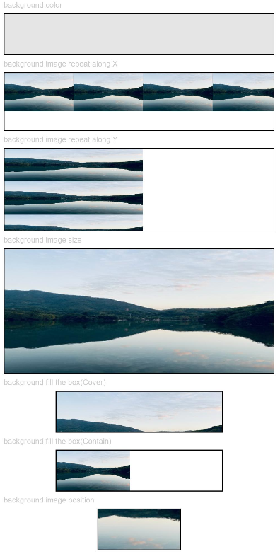
This example shows how to configure basic background styles by setting backgroundColor, backgroundImage, backgroundImageSize, and backgroundImagePosition.
// xxx.ets
@Entry
@Component
struct BackgroundExample {
  build() {
    Column({ space: 5 }) {
      Text('background color').fontSize(9).width('90%').fontColor(0xCCCCCC)
      Row().width('90%').height(50).backgroundColor(0xE5E5E5).border({ width: 1 })

      Text('background image repeat along X').fontSize(9).width('90%').fontColor(0xCCCCCC)
      Row()
      // Replace $r('app.media.image') with the image resource file you use.
        .backgroundImage($r('app.media.image'), ImageRepeat.X)
        .backgroundImageSize({ width: '250px', height: '140px' })
        .width('90%')
        .height(70)
        .border({ width: 1 })

      Text('background image repeat along Y').fontSize(9).width('90%').fontColor(0xCCCCCC)
      Row()
      // Replace $r('app.media.image') with the image resource file you use.
        .backgroundImage($r('app.media.image'), ImageRepeat.Y)
        .backgroundImageSize({ width: '500px', height: '120px' })
        .width('90%')
        .height(100)
        .border({ width: 1 })

      Text('background image size').fontSize(9).width('90%').fontColor(0xCCCCCC)
      Row()
        .width('90%')
        .height(150)
        // Replace $r('app.media.image') with the image resource file you use.
        .backgroundImage($r('app.media.image'), ImageRepeat.NoRepeat)
        .backgroundImageSize({ width: 1000, height: 500 })
        .border({ width: 1 })

      Text('background fill the box(Cover)').fontSize(9).width('90%').fontColor(0xCCCCCC)
      // Occupy all the space of the container, without ensuring that the image is completely displayed.
      Row()
        .width(200)
        .height(50)
        // Replace $r('app.media.image') with the image resource file you use.
        .backgroundImage($r('app.media.image'), ImageRepeat.NoRepeat)
        .backgroundImageSize(ImageSize.Cover)
        .border({ width: 1 })

      Text('background fill the box(Contain)').fontSize(9).width('90%').fontColor(0xCCCCCC)
      // Maximize the image while ensuring that it can be completely displayed.
      Row()
        .width(200)
        .height(50)
        // Replace $r('app.media.image') with the image resource file you use.
        .backgroundImage($r('app.media.image'), ImageRepeat.NoRepeat)
        .backgroundImageSize(ImageSize.Contain)
        .border({ width: 1 })

      Text('background image position').fontSize(9).width('90%').fontColor(0xCCCCCC)
      Row()
        .width(100)
        .height(50)
        // Replace $r('app.media.image') with the image resource file you use.
        .backgroundImage($r('app.media.image'), ImageRepeat.NoRepeat)
        .backgroundImageSize({ width: 1000, height: 560 })
        .backgroundImagePosition({ x: -500, y: -300 })
        .border({ width: 1 })
    }
    .width('100%').height('100%').padding({ top: 5 })
  }
} 
[h2]Example 2: Setting the Background Blur Style
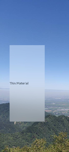
This example sets the background blur style using backgroundBlurStyle.
// xxx.ets
@Entry
@Component
struct BackgroundBlurStyleDemo {
  build() {
    Column() {
      Row() {
        Text('Thin Material')
      }
      .width('50%')
      .height('50%')
      .backgroundBlurStyle(BlurStyle.Thin,
        { colorMode: ThemeColorMode.LIGHT, adaptiveColor: AdaptiveColor.DEFAULT, scale: 1.0 })
      .position({ x: '15%', y: '30%' })
    }
    .height('100%')
    .width('100%')
    // Replace $r('app.media.bg') with the image resource file you use.
    .backgroundImage($r('app.media.bg'))
    .backgroundImageSize(ImageSize.Cover)
  }
} 
[h2]Example 3: Setting the Component Background
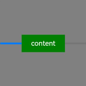
This example shows how to set the component background using background.
// xxx.ets
@Entry
@Component
struct BackgroundExample {
  @Builder
  renderBackground() {
    Column() {
      Progress({ value: 50 })
    }
  }

  build() {
    Column() {
      Text("content")
        .width(100)
        .height(40)
        .fontColor("#FFF")
        .position({ x: 50, y: 80 })
        .textAlign(TextAlign.Center)
        .backgroundColor(Color.Green)
    }
    .width(200).height(200)
    .background(this.renderBackground)
    .backgroundColor(Color.Gray)
  }
} 
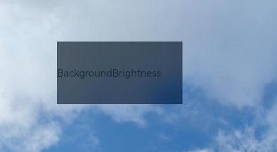
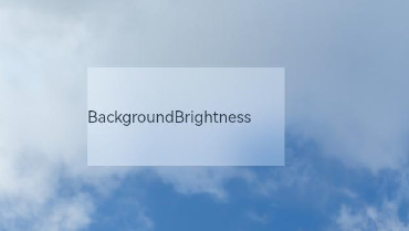
[h2]Example 4: Setting Component Background Brightness
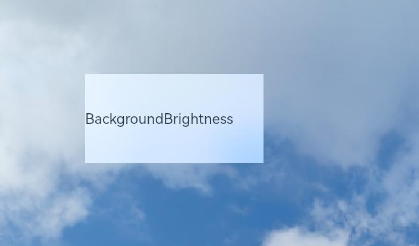
This example sets the component background brightness using backgroundBrightness.
// xxx.ets
@Entry
@Component
struct BackgroundBrightnessDemo {
  build() {
    Column() {
      Row() {
        Text("BackgroundBrightness")
      }
      .width(200)
      .height(100)
      .position({ x: 100, y: 100 })
      .backgroundBlurStyle(BlurStyle.Thin, { colorMode: ThemeColorMode.LIGHT, adaptiveColor: AdaptiveColor.DEFAULT})
      .backgroundBrightness({rate:0.5,lightUpDegree:0.5}) // Background brightness
    }
    .width('100%')
    .height('100%')
    // Replace $r('app.media.image') with the image resource file you use.
    .backgroundImage($r('app.media.image'))
    .backgroundImageSize(ImageSize.Cover)
  }
}
The following figures show how the component looks with the background brightness set.
When rate and lightUpDegree are both set to 0.5
When rate is set to 0.5 and lightUpDegree -0.1
The following figure shows how the component looks without the background brightness set.
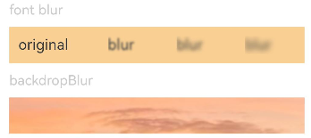
[h2]Example 5: Setting Blur Effects
This example shows how to use blur to apply a foreground blur effect and backdropBlur to apply a background blur effect.
// xxx.ets
@Entry
@Component
struct BlurEffectsExample {
  build() {
    Column({ space: 10 }) {
      // Blur the font.
      Text('font').fontSize(15).fontColor(0xCCCCCC).width('90%')
      Flex({ alignItems: ItemAlign.Center }) {
        Text('original').margin(10)
        Text('blur')
          .blur(5).margin(10)
        Text('blur')
          .blur(10, undefined).margin(10) // Content blur radius is 10, no grayscale is set.
        Text('blur')
          .blur(15).margin(10)
      }.width('90%').height(40)
      .backgroundColor(0xF9CF93)


      // Blur the background.
      Text('backdropBlur').fontSize(15).fontColor(0xCCCCCC).width('90%')
      Text()
        .width('90%')
        .height(40)
        .fontSize(16)
        .backdropBlur(3)
        // Replace $r('app.media.image') with the image resource file you use.
        .backgroundImage($r('app.media.image'))
        .backgroundImageSize({ width: 1200, height: 160 })
    }.width('100%').margin({ top: 5 })
  }
} 
[h2]Example 6: Setting Text Blur Effects
This example uses blendMode and backgroundEffect to implement an irregular text blur effect.
If line omission occurs, you should first ensure that the components where the two blendMode attributes are applied are exactly the same size. If the sizes are confirmed to be identical, the issue may be caused by component boundaries falling on floating-point coordinates. In this case, try setting the pixelRound universal attribute to align the component boundaries on both sides of the generated white or dark lines to integer pixel coordinates.
// xxx.ets
@Entry
@Component
struct Index {
  @State shadowColor: Color = Color.White;
  @State dateFontSize: number = 20;
  @State redValue: number = 255;
  @State greenValue: number = 255;
  @State blueValue: number = 255;
  @State alphaValue: number = 0.1;
  @State blurRadius: number = 40;
  @State saturationValue: number = 0.8;
  @State brightnessValue: number = 1.5;
  build() {
    Stack() {
      // Replace $r('app.media.image') with the image resource file you use.
      Image($r('app.media.image'))
      Column() {
        Column({ space: 0 }) {
          Column() {
            Text('11')
              .fontSize(144)
              .fontWeight(FontWeight.Bold)
              .fontColor('rgba(255,255,255,1)')
              .fontFamily('HarmonyOS-Sans-Digit')
              .maxLines(1)
              .lineHeight(120 * 1.25)
              .height(120 * 1.25)
              .letterSpacing(4 * 1.25)
            Text('42')
              .fontSize(144)
              .fontWeight(FontWeight.Bold)
              .fontColor('rgba(255,255,255,1)')
              .fontFamily('HarmonyOS-Sans-Digit')
              .maxLines(1)
              .lineHeight(120 * 1.25)
              .height(120 * 1.25)
              .letterSpacing(4 * 1.25)
              .shadow({
                color: 'rgba(0,0,0,0)',
                radius: 20,
                offsetX: 0,
                offsetY: 0
              })
            Row() {
              Text('October 16')
                .fontSize(this.dateFontSize)
                .height(22)
                .fontWeight('medium')
                .fontColor('rgba(255,255,255,1)')
              Text('Monday')
                .fontSize(this.dateFontSize)
                .height(22)
                .fontWeight('medium')
                .fontColor('rgba(255,255,255,1)')
            }
          }
          // Use offscreen rendering for blendMode. In DST_IN mode, only the overlapping area of the current component and the underlying canvas is displayed.
          .blendMode(BlendMode.DST_IN, BlendApplyType.OFFSCREEN)
          .pixelRound({
            start: PixelRoundCalcPolicy.FORCE_FLOOR ,
            top: PixelRoundCalcPolicy.FORCE_FLOOR ,
            end: PixelRoundCalcPolicy.FORCE_CEIL,
            bottom: PixelRoundCalcPolicy.FORCE_CEIL
          })
        }
        // Use offscreen rendering for blendMode. In SRC_OVER mode, the content of the current component is displayed over the underlying canvas.
        .blendMode(BlendMode.SRC_OVER, BlendApplyType.OFFSCREEN)
        // Configure the blur radius, saturation, brightness, and dynamic RGBA color of the component background through backgroundEffect.
        .backgroundEffect({
          radius: this.blurRadius,
          saturation: this.saturationValue,
          brightness: this.brightnessValue,
          color: this.getVolumeDialogWindowColor()
        })
        .justifyContent(FlexAlign.Center)
        .pixelRound({
          start: PixelRoundCalcPolicy.FORCE_FLOOR ,
          top: PixelRoundCalcPolicy.FORCE_FLOOR ,
          end: PixelRoundCalcPolicy.FORCE_CEIL,
          bottom: PixelRoundCalcPolicy.FORCE_CEIL
        })
      }
    }
  }
  getVolumeDialogWindowColor(): ResourceColor | string {
    return `rgba(${this.redValue.toFixed(0)}, ${this.greenValue.toFixed(0)}, ${this.blueValue.toFixed(0)}, ${this.alphaValue.toFixed(2)})`;
  }
}
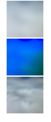
[h2]Example 7: Comparing Blur Effects
This example compares three different blur effects: backgroundEffect11+, backdropBlur, and backgroundBlurStyle9+.
// xxx.ets
@Entry
@Component
struct BackgroundBlur {
  private imageSize: number = 150;

  build() {
    Column({ space: 5 }) {
      // Use backgroundBlurStyle with an enum value to set blur parameters.
      Stack() {
        // Replace $r('app.media.test') with the image resource file you use.
        Image($r('app.media.test'))
          .width(this.imageSize)
          .height(this.imageSize)
        Column()
          .width(this.imageSize)
          .height(this.imageSize)
          .backgroundBlurStyle(BlurStyle.Thin)
      }

      // backgroundEffect can customize the blur radius, brightness, saturation, and other parameters.
      Stack() {
        // Replace $r('app.media.test') with the image resource file you use.
        Image($r('app.media.test'))
          .width(this.imageSize)
          .height(this.imageSize)
        Column()
          .width(this.imageSize)
          .height(this.imageSize)
          .backgroundEffect({ radius: 20, brightness: 0.6, saturation: 15 })
      }

      // backdropBlur only sets blur radius and grayscale parameters.
      Stack() {
        // Replace $r('app.media.test') with the image resource file you use.
        Image($r('app.media.test'))
          .width(this.imageSize)
          .height(this.imageSize)
        Column()
          .width(this.imageSize)
          .height(this.imageSize)
          .backdropBlur(20, { grayscale: [30, 50] })
      }
    }
    .width('100%')
    .padding({ top: 5 })
  }
} 
[h2]Example 8: Applying a P3 Color Gamut Background Effect
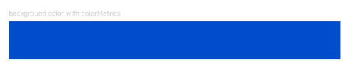
This example demonstrates how to apply a P3 color gamut background effect using backgroundColor, available since API version 20.
// xxx.ets
// To set the P3 color gamut, use the setColorSpace API in ets/entryability/EntryAbility.ets to set the current window to a wide color gamut.
import { ColorMetrics } from '@kit.ArkUI';

@Entry
@Component
struct P3BackgroundDemo {
  @State p3Color: ColorMetrics = ColorMetrics.colorWithSpace(ColorSpace.DISPLAY_P3, 0, 0.3, 0.8, 1);

  build() {
    Column({ space: 5 }) {
      Text('background color with colorMetrics').fontSize(9).width('90%').fontColor(0xCCCCCC)
      Row().width('90%').height(50).backgroundColor(this.p3Color)
    }
    .width('100%')
    .height('100%')
  }
} 
[h2]Example 9: Setting Component Background Extension
This example shows how to use background to extend the component's background to the parent component's safe area, supported since API version 20.
import { LengthMetrics } from '@kit.ArkUI';

@Entry
@Component
struct BackgroundExtension {
  @Builder
  myImages() {
    Column() {
      Image($r('app.media.startIcon'))
        .width('100%')
        .height('100%')
    }
  }

  build() {
    Column({space: 10}) {
      Stack() {
        // A background of the CustomBuilder type with the ignoresLayoutSafeAreaEdges property set extends to the parent component's safe area.
        Column()
          .size({ width: '100%', height: '100%' })
          .border({ width: 1, color: Color.Red })
          .background(
            this.myImages(),
            { align: Alignment.Center , ignoresLayoutSafeAreaEdges: [ LayoutSafeAreaEdge.START, LayoutSafeAreaEdge.TOP ] }
          )
      }
      .size({ width: 300, height: 300 })
      .backgroundColor('#004aaf')
      .safeAreaPadding(LengthMetrics.vp(50))

      Stack() {
        // A background of the ResourceColor type without the ignoresLayoutSafeAreaEdges property set extends to the parent component's safe area by default.
        Column()
          .size({ width: '100%', height: '100%' })
          .border({ width: 1, color: Color.Red })
          .background('#d5d5d5', { align: Alignment.Center })
      }
      .size({ width: 300, height: 300 })
      .backgroundColor('#707070')
      .safeAreaPadding(LengthMetrics.vp(50))
    }
    .margin(10)
  }
} 